Turso Design System
Turso's marketing site as a DESIGN.md. Turso Aqua (#4ff8d2) as both display color and CTA fill, deep-blue hero canvas inverting to white below the fold, Inter at weight 800 for display. Tokens for React, Next.js, and AI tools.
Add shadcn.io to your AI agent. · Pro It installs blocks, icons and templates in your design system from a prompt, with Pro.
Set up MCP- Primary
- #4ff8d2
- Typeface
- Inter
- Shape
- Soft
- Base radius
- 12px
- Colors
- 14
- Type tokens
- 11
- Components
- 14
- Spacing values
- 9
About
About Turso DESIGN.md
Curated by Dov Azencot · Updated May 18, 2026 · Source turso.tech (opens in a new tab)
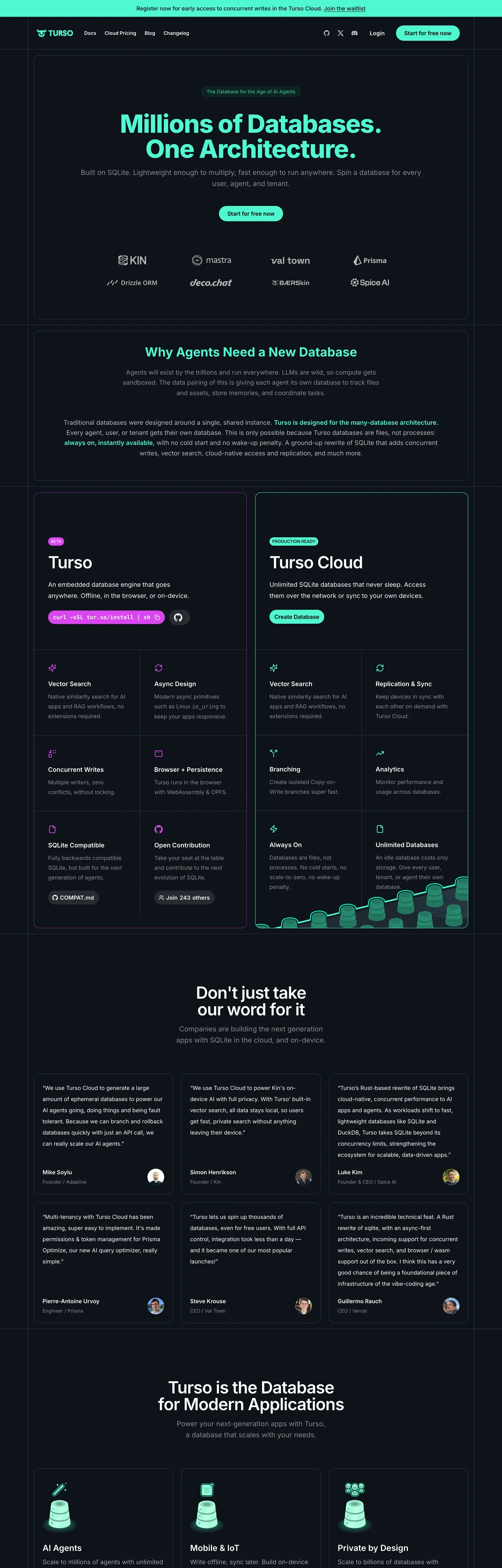
Turso's marketing site does something almost no developer-infrastructure brand attempts: it makes the brand voltage the headline color. The hero h2 — "Millions of Databases. One Architecture." — is rendered at 72px in Inter weight 800 with -1.8px tracking, and the color of that headline is Turso Aqua (#4ff8d2), a saturated turquoise that doubles as the brand's signature voltage. Beneath, a fully-rounded aqua pill labelled "Start for free now" carries the same hue as a solid background fill. The hero floor is a deep blue-black, almost-but-not-quite navy, and the entire above-fold composition reads as two tones — deep blue and electric aqua. Where Linear holds violet for the smallest UI accents and Supabase holds emerald for inline highlights, Turso commits the brand color to the display tier and the primary CTA simultaneously.
The DESIGN.md file packages the system into a machine-readable spec for React tooling. Inside: 14 colors tokens organized into a hero-canvas tier (deep blue-black, surface-elevated dark gray, dark-blue hairlines), a body-canvas tier (pure white, dark navy text), a brand-voltage tier (Turso Aqua plus a Turso Aqua text variant), and a product-split magenta reserved for Turso Cloud chips. 11 typography tokens running Inter exclusively — display at 72px in weight 800, large-section h2 at 48px in weight 600, body at 16-18px in weight 400, labels at 14px in weight 500 with uppercase transform. 4 corner-radius tokens dominated by a 9999px pill (31 occurrences) plus a 12px / 16px / 24px ladder. 14 components definitions covering the aqua CTA pill, hairline-bordered feature cards, the dark dropdown surface, and the magenta-coded product-split chip.
Feed this file to an AI coding tool and it reproduces Turso's specific moves: deep-blue hero canvas inverting to white below the fold, Turso Aqua as both display color and primary CTA fill, Inter at weight 800 for display (not the modest weight 500 most dev-tools brands run), and full-pill geometry across every interactive surface. The one move worth borrowing only if your brand voltage is itself a high-luminance color: rendering display in the brand color rather than in white. At Turso's aqua luminance the contrast against the deep blue floor reads cleanly; at a darker brand color the same composition would collapse.
What makes it distinct
5
- Display-color = brand-colorthe 72px Inter weight-800 hero headline is rendered in Turso Aqua, not white; the brand voltage IS the display tier
- Dual-canvas inversiondeep blue-black hero floor inverts to pure white below the fold, with the same aqua voltage carrying both
- Inter at weight 800display sits at 72px in weight 800 with -1.8px tracking, the heaviest hero weight in the dev-infra category
- Full-pill CTA geometry9999px radius appears 31 times across primary buttons, chips, and badges
- Magenta accent for product splitTurso Cloud chips carry a magenta voltage distinct from the aqua brand color, scoping enterprise-tier elements to a second hue
turso.tech
Live at turso.tech
A snapshot of the brand in production. Scroll the frame to see the whole page.
Colors
14 colors
Turso's system runs on #4ff8d2 as its primary voltage, used in 3 of 14 components. Type is set in Inter across 11 tokens from 12px to 72px, weights 400–800. Shape language is soft — components average 15px corner radius, with no sharp interactive edges.
Brand & Accent
Sparing, CTA-only voltage · 4
Surface
Page and card backgrounds · 4
Text
Headlines, body, captions · 3
Borders & Hairlines
Dividers, outlines, rules · 2
Other
Specialty colors · 1
Typography
11 type tokens
Set in Inter across 11 tokens, from 12px to 72px, weights 400–800. Shown in its own stack: where the font isn't installed, the fallback the file names stands in.
- display-xl72px · weight 800 · lh 72px · tracking -1.8pxThe quick brown fox jumps over the lazy dog
- display-lg48px · weight 600 · lh 48px · tracking -1.2pxThe quick brown fox jumps over the lazy dog
- display-md36px · weight 700 · lh 40pxThe quick brown fox jumps over the lazy dog
- heading-md30px · weight 600 · lh 36pxThe quick brown fox jumps over the lazy dog
- heading-sm24px · weight 600 · lh 32pxThe quick brown fox jumps over the lazy dog
- heading-xs18px · weight 600 · lh 28pxThe quick brown fox jumps over the lazy dog
- body-lg18px · weight 400 · lh 32pxThe quick brown fox jumps over the lazy dog
- body-md16px · weight 400 · lh 28pxThe quick brown fox jumps over the lazy dog
- body-sm14px · weight 400 · lh 20pxThe quick brown fox jumps over the lazy dog
- button-md16px · weight 600 · lh 24pxThe quick brown fox jumps over the lazy dog
- label-caps12px · weight 500 · lh 16pxThe quick brown fox jumps over the lazy dog
Layout
Radii and spacing
5 corner radii and 9 spacing values. Shape language: soft.
Radii
- none0px
- md12px
- lg16px
- xl24px
- full9999px
Spacing
- xs2px
- sm8px
- md12px
- base16px
- lg24px
- xl32px
- 2xl40px
- 3xl56px
- 4xl128px
Components
14 components
Each rendered from its tokens (color, type, radius, padding) on Turso's own canvas.
- Button Primarybutton-primaryButton Primary
- Button Secondarybutton-secondaryButton Secondary
- Top Navtop-navTop Nav
- Nav Linknav-linkNav Link
- Hero Headinghero-headingHero Heading
- Section Headingsection-headingSection Heading
- Body Paragraphbody-paragraphBody Paragraph
- Body Paragraph Mutedbody-paragraph-mutedBody Paragraph Muted
- Label Uppercaselabel-uppercaseLabel Uppercase
- Card Darkcard-darkCard Dark
- Card Lightcard-lightCard Light
- Card Product Cloudcard-product-cloudCard Product Cloud
- Chip Aquachip-aquaChip Aqua
- Chip Magentachip-magentaChip Magenta
In use
The system, in use
Turso's tokens on the kind of product it builds.
Build something people actually use.
A short paragraph of marketing copy that previews how the brand's display tier and body tier read together. Two sentences is usually enough.
FAQ
Turso design system FAQ
Common questions about Turso's tokens, components, and how to use this DESIGN.md in your project.
Read next
Related reading
Specs, directories, and component libraries that pair with this design system.
- Browse all design systemsThe full directory of DESIGN.md files on shadcn.io, with live mockups for each.shadcn.io
- Turso — official siteTurso's public marketing site — the source of truth for the live tokens captured in this file.turso.tech (opens in a new tab)
- The DESIGN.md specificationGoogle Labs' open spec for machine-readable design system files — the format this page is built on.github.com (opens in a new tab)
Use it
Use Turso in your project
One machine-readable file. Drop it into Claude, Cursor, or any AI tool that reads DESIGN.md.
Download the DESIGN.md
One machine-readable file: every color, type, radius, spacing, and component token of Turso.
Feed it to your AI tool
Drop it into Claude, Cursor, or GitHub Copilot. The agent writes React components and Tailwind classes that match Turso's visual language.
Reference the tokens directly
Or paste the values into your Tailwind config, CSS variables, or component library: every color, size and radius is a quoted, ready-to-copy value.
Read the full DESIGN.md: overview, rationale, do’s and don’ts
Overview
Turso's marketing site does something almost no developer-infrastructure brand attempts. Display-as-voltage. The hero h2 — "Millions of Databases. One Architecture." — is rendered at 72px in Inter weight 800 with -1.8px tracking, and the color of that headline is Turso Aqua ({colors.primary} — #4ff8d2), a saturated turquoise that simultaneously serves as the brand's primary-CTA fill. The display tier IS the brand tier. Where Linear holds violet for the smallest UI accents and Supabase holds emerald for inline highlights, Turso commits the brand color to the display headline and the primary CTA pill at the same time.
The canvas system is a dual-canvas inversion. The hero floor is a deep blue-black ({colors.canvas} — #162129) — chosen because the saturated aqua needs maximum contrast to read as both display color and CTA fill. Below the fold, the canvas inverts to pure white ({colors.surface-light} — #ffffff), where the same aqua voltage carries the primary CTA against dark-navy body text ({colors.ink-on-light} — #162129). The deep-blue floor returns later for the Turso Cloud product-split section. This inversion lets the brand voltage occupy two different roles (display color on dark, accent color on light) without forcing a single-canvas neutral to mediate.
Typography runs Inter exclusively — no second family, no monospace tier in the captured chrome. Display at 72px in weight 800 with -1.8px tracking is the heaviest hero treatment in the dev-infra category — where Vercel, Linear, and Cloudflare hold display at weight 500-600, Turso commits to weight 800. The weight choice reads as confident-bold rather than editorial-restrained, and the -1.8px negative tracking keeps the letterforms from bloating at that scale.
Key Characteristics:
- Display-color equals brand-color: the 72px hero h2 is rendered in
{colors.primary}(#4ff8d2), not in white — the brand voltage IS the display tier. - Dual canvas:
{colors.canvas}(#162129 deep blue-black) on the hero, inverting to{colors.surface-light}(#ffffff) below the fold, with the same aqua voltage carrying both surfaces. - Inter at weight 800 with -1.8px tracking on the 72px hero — the heaviest display treatment in the dev-infra category.
- Full-pill geometry: 9999px radius appears 31 times across primary buttons, chips, and small badges.
- Magenta product-split accent:
{colors.accent-magenta}(#d946ef) reserved for Turso Cloud product chips, distinct from the aqua brand voltage. - Hairline-bordered cards:
{colors.hairline}(#283945) on dark surfaces and{colors.hairline-light}(#e5e7eb) on light surfaces — elevation comes from outlines, not from a second surface fill. - Inter-only system with no monospace voice in the captured chrome — code blocks would inherit from the system mono stack on demand.
Colors
Brand
- Turso Aqua (
{colors.primary}— #4ff8d2): frequency 32 — 14 as background, 10 as border, 8 as text. Wired as--turso-primary-aqua. The single brand voltage, doing triple duty: it is the color of the 72px hero h2 display, the fill of the primary CTA pill, and the brand-decoration color on feature-card chips and inline accents. - Turso Aqua Text (
{colors.primary-text}— #88ffe4): wired as--turso-aqua-text. A slightly-brighter text-grade variant reserved for situations where the primary aqua reads heavy. Not used in the captured hero but declared for typography contexts. - Accent Magenta (
{colors.accent-magenta}— #d946ef): frequency 6 as background. The product-split accent reserved for Turso Cloud chips and the Cloud product-card border. Distinct from the aqua brand voltage — scopes enterprise-tier elements to a second hue without inviting confusion. - Accent Purple (
{colors.accent-purple}— #a21caf): frequency 2 as border. The deeper companion to the magenta, used as a hairline border on Cloud product cards when the magenta border tone needs to read softer.
Surface
- Canvas (
{colors.canvas}— #162129): frequency 19 as background. The deep blue-black hero floor, wired as--turso-dark-blue,--turso-blue-2,--turso-blue-3. A near-navy with enough blue to feel atmospheric rather than charcoal; pairs with the saturated aqua voltage at maximum contrast. - Surface-1 (
{colors.surface-1}— #283945): frequency 74 — 6 as background, 68 as border. Wired as--turso-dark-gray. The elevated dark surface tier — used for elevated card fills and as the dominant hairline on dark surfaces. - Surface Deep (
{colors.surface-deep}— #0d1318): frequency 8 — used as the deepest fill on inset surfaces like code-snippet wells. The "below midnight" tier that anchors stacked dark surfaces. - Surface Light (
{colors.surface-light}— #ffffff): frequency 551 — 310 as text, 4 as background, 237 as border. The body-canvas floor that inverts the page below the fold. Pure white, no warmth.
Text
- Ink (
{colors.ink}— #ffffff): the same hex as the light-canvas surface, doing double duty as the white text color on dark canvases. The dominant text tone on the hero floor. - Ink Muted (
{colors.ink-muted}— #c5cace): frequency 54 — 27 as text, 27 as border. Wired as--turso-light-gray. The secondary running-text tone on dark canvases — used for body paragraphs and caption rows beneath the hero. - Ink on Light (
{colors.ink-on-light}— #162129): the same hex as the dark canvas, doing double duty as the dark text color on the white body canvas below the fold.
Hairline
- Hairline (
{colors.hairline}— #283945): the same hex as{colors.surface-1}, functioning as the border-only tone on dark canvases. The dominant border across feature cards, dropdowns, and dividers on the hero floor. - Hairline Light (
{colors.hairline-light}— #e5e7eb): frequency 1 in gradient — the light-canvas border tone used on white-background feature cards below the fold.
Semantic
- Shadow (
{colors.shadow}— #000000): frequency 28 — 14 as text, 14 as border. Pure black, reserved for the primary-CTA text color (the dark text on the aqua pill) and for the deepest inset borders.
Typography
Font Family
The system runs Inter across every display, heading, body, button, and label tier — one family, no second voice. Fallbacks walk to an Inter Fallback declaration and then to system-ui, sans-serif. Inter is open-source from Google Fonts and embedded directly; no proprietary licensing.
There is no monospace family declared in the captured marketing chrome. Inline code or terminal-style examples would inherit the browser's system-mono stack on demand; the marketing surface itself has no code-block tier.
Hierarchy
| Token | Size | Weight | Line Height | Letter Spacing | Use |
|---|---|---|---|---|---|
{typography.display-xl} | 72px | 800 | 72px | -1.8px | Hero h2 ("Millions of Databases. One Architecture.") |
{typography.display-lg} | 48px | 600 | 48px | -1.2px | Section h2 / h3 ("Don't just take our word for it") |
{typography.display-md} | 36px | 700 | 40px | 0 | Sub-section displays on light-canvas bands |
{typography.heading-md} | 30px | 600 | 36px | 0 | Feature-row section titles |
{typography.heading-sm} | 24px | 600 | 32px | 0 | Product-card titles ("Turso", "Turso Cloud") |
{typography.heading-xs} | 18px | 600 | 28px | 0 | Feature-card sub-titles |
{typography.body-lg} | 18px | 400 | 32px | 0 | Lead paragraphs beneath display headlines |
{typography.body-md} | 16px | 400 | 28px | 0 | Default running text |
{typography.body-sm} | 14px | 400 | 20px | 0 | Caption rows, nav links |
{typography.button-md} | 16px | 600 | 24px | 0 | Primary CTA pill label |
{typography.label-caps} | 12px | 500 | 16px | 0 | Uppercase product-tier chips (transformed at render time) |
Principles
The 72px display at weight 800 with -1.8px tracking is the system's signature typographic moment. Weight 800 is two steps heavier than the dev-infra category default (weight 500-600); the negative tracking keeps the letters from bloating at the larger size. The weight commitment reads as confident-bold rather than editorial-restrained — the inverse of the magazine-style display weight 500 that Cloudflare and Stripe run.
Body and lead-paragraph tiers sit at weight 400 with generous 28-32px line-heights. The rhythm is loose enough to keep dense feature-card copy readable without compressing.
Note on Font Substitutes
Inter is open-source from Google Fonts and can be embedded directly — no substitute needed. If you must swap: Geist (Vercel's open-source sans) has comparable proportions at the display tier; General Sans is slightly more humanist if you want a softer body grade.
Layout
Spacing System
- Base unit: 8px (with 24px and 16px as the dominant section modules).
- Tokens:
{spacing.xs}2px ·{spacing.sm}8px ·{spacing.md}12px ·{spacing.base}16px ·{spacing.lg}24px ·{spacing.xl}32px ·{spacing.2xl}40px ·{spacing.3xl}56px ·{spacing.4xl}128px. - Section padding (vertical): ~128px between major bands — the captured composite spacing of "128px 40px 40px" and "128px 0px 48px" appears repeatedly, anchoring the page on a generous 128px section rhythm.
- Card internal padding: 40px on light-canvas product-card variants (
{component.card-light}), 40x24x24 on dark-canvas feature cards. Both push toward generous internal space rather than tight chrome. - Top-nav padding: ~0x40 horizontal, with a 64px nav height.
Grid & Container
- Max content width: ~1280px on the hero headline (which spans nearly full-bleed at 72px), ~1100px on body copy beneath, ~1080px on feature grids.
- Hero: centered headline at 72px, with a centered lead paragraph and aqua-pill CTA stacked vertically. The hero terminates at a uniform-tint logo wall below the CTA.
- Product-split section: 2-column 50/50 grid pairing the Turso (open-source) card with the Turso Cloud (managed-service) card. The Cloud card carries the magenta accent border that distinguishes it from the aqua-coded open-source side.
- Feature grid: 3-column responsive grid for the lower-page feature rows.
- Testimonial wall: 3-up grid of customer-quote cards on the white canvas band.
Rhythm
The page alternates between dense dark-canvas display moments (the hero, the Turso Cloud product split) and breathable light-canvas editorial bands (the testimonial wall, the feature grids). The canvas inversion is the page's structural device — bands either commit to the dark hero floor or to the white body floor; there is no gradient-mediated middle.
Elevation
The system has essentially no shadow tier. Elevation comes from hairline borders and from the canvas-inversion contrast between the dark hero floor and the white body floor.
- Flat (no shadow): the entire hero, body bands, feature grids — 99% of surfaces.
- Hairline outlines:
{colors.hairline}(#283945) carries 68 border occurrences on the dark canvas, and{colors.hairline-light}(#e5e7eb) handles the borders on light-canvas cards. - Tonal lift:
{colors.surface-1}(#283945) cards sit on{colors.canvas}(#162129) — a small but readable contrast that lifts feature cards off the hero floor. - Magenta product-split border: the Turso Cloud card carries an
{colors.accent-magenta}1px border that does the elevation work the brand-aqua border would do on the open-source side. The border tells you "this is the paid tier" without filling the card with a different color.
Shapes
The radius scale is full-pill plus generous-soft middle.
{rounded.none}0px — only on display headlines and inline text spans.{rounded.md}12px — frequency 20. The default feature-card radius on dark canvases.{rounded.lg}16px — frequency 15. Larger surface tiles, the light-canvas product cards, the testimonial wall cards.{rounded.xl}24px — frequency 1. The largest single-card variant; reserved for split-panel hero cards.{rounded.full}9999px — frequency 31. Every interactive surface: the primary CTA pill, the secondary buttons, the product-tier chips, the small badges.
There is no 4-8px tight tier. Even small UI surfaces start at 12px. The combination of full pills on interactive elements and 12-16px softness on content surfaces reads as approachable rather than industrial.
Components
button-primary — The signature CTA. {colors.primary} (Turso Aqua) fill, dark {colors.ink-on-light} (#162129) text, {rounded.full} pill radius, 12x24 padding, 44px height. "Start for free now" is the canonical instance. The dark-text-on-aqua composition reads as the highest-contrast affordance on the hero floor.
button-secondary — Transparent fill, white text, 1px {colors.hairline} border, same pill radius, 10x14 padding, 40px height. Used for "Read the docs" / "Learn more" secondary actions.
top-nav — {colors.canvas} (deep blue) surface continuation, 64px height, 0x40 padding. Carries the Turso wordmark flush-left and product-nav links center-right, with the Sign-in / Get-started actions far right. No bottom border — the nav and the page floor share a surface color.
nav-link — Transparent fill, white text in {typography.body-sm} (14px / 400), 6px padding.
hero-heading — {colors.primary} (Turso Aqua) text on the transparent canvas, {typography.display-xl} (72px / 800) with -1.8px tracking. 0 padding — the headline overflows to the container edges. The display-color-equals-brand-color move is the system's signature.
section-heading — Dark {colors.ink-on-light} text on the white-canvas body bands, {typography.display-lg} (48px / 600). Used for the testimonial section title and the closing-band display ("Turso is the Database for…") that anchors the inverted lower page.
body-paragraph — White text at {typography.body-lg} (18px / 400) on dark canvases, inverting to {colors.ink-on-light} on light canvases.
body-paragraph-muted — {colors.ink-muted} (#c5cace) text at {typography.body-md} for secondary copy on dark canvases.
label-uppercase — Muted text at {typography.label-caps} (12px / 500) with uppercase transform applied at render time. Carries section-marker labels above feature blocks.
card-dark — {colors.canvas} fill, white text, 1px {colors.hairline} border, {rounded.md} 12px radius, 40x24x24 padding. The default feature card on the dark hero floor; depth comes from the hairline outline rather than a fill shift.
card-light — White {colors.surface-light} fill, dark text, 1px {colors.hairline-light} border, {rounded.lg} 16px radius, 40px internal padding. The default content card on the inverted body canvas.
card-product-cloud — Dark {colors.canvas} fill, white text, 1px {colors.accent-magenta} border, {rounded.lg} 16px radius, 40px padding. The Turso Cloud product-tier card — the magenta border is the visual cue that distinguishes the paid-tier side from the open-source side.
chip-aqua — {colors.primary} fill, dark text, {rounded.full} pill, 4x8 padding, 24px height. Used for "Open Source" / feature-availability chips on the Turso (open-source) product card.
chip-magenta — {colors.accent-magenta} fill, white text, same pill geometry. Used for "Cloud" / managed-tier chips on the Turso Cloud product card, paired with {component.card-product-cloud}.
Do's and Don'ts
Do render the hero display in {colors.primary} (Turso Aqua), not white. The display-color-equals-brand-color move is the system's defining gesture; pulling the headline to white reduces the brand voltage to a single CTA pill and erases the hero's chromatic statement.
Do invert the canvas at the section break. The deep-blue hero floor inverting to pure white below the fold is the page's structural device — flattening to a single canvas (either dark or light throughout) collapses the dual-role brand-voltage move that depends on aqua reading differently on each surface.
Do use {colors.accent-magenta} (#d946ef) as the product-split accent on Turso Cloud chips and card borders, never as a primary-action voltage. The magenta scopes the paid-tier elements without competing with the brand aqua for action-color attention.
Do commit to Inter weight 800 on the 72px hero. The bold display weight is the system's distinguishing typographic move in a category where most peers hold display at weight 500-600.
Don't soften the hero display from weight 800 to weight 500 or 600. The bold weight is what reads as confident-Turso rather than editorial-dev-tool; dropping the weight makes the page look like every other Inter-based dev-infra brand.
Don't use {colors.primary} (Turso Aqua) as a small-label or text-emphasis color at body sizes. It is reserved for the display tier, the CTA fill, and the feature-card chip fill — at body sizes the saturated turquoise reads as a hyperlink rather than as brand voltage. For text emphasis, use {colors.primary-text} (#88ffe4) instead.
Don't mix the aqua and magenta voltages in the same composition. Each color has a single semantic role (brand voltage vs. product-tier split); placing them adjacent reads as a chromatic accident rather than as an intentional dual-color statement.
Don't introduce a 4-8px tight radius tier. The system is binary — full pills on interactive elements or 12-16px softness on content surfaces. A 6px button radius would feel borrowed from a Material design library rather than from Turso's own approachable-by-default geometry.
Known Gaps
- Light mode (full coverage): the captured surface uses canvas inversion as a section-rhythm device, not as a theme switch. A user-toggleable light theme variant is not represented here.
- Hover and focus states: the full state matrix (hover backgrounds, active press, focus rings, disabled tints) was not visible on the captured marketing surface.
- Form input states: the text-input component is not exposed in the captured marketing chrome and is not declared in this spec; input styling lives inside the Turso Cloud product console.
- Monospace tier: the captured marketing surface has no rendered code blocks. The Turso Cloud console and the developer documentation (
docs.turso.tech) carry their own monospace styling that is not represented here. - Motion: the hero headline and the product-split section animate on scroll-into-view but the spec captures end-state values only. Easing curves, duration, and stagger live in the live page runtime.
- Product surfaces: this DESIGN.md captures the marketing site only. The Turso Cloud console (
app.turso.tech) carries a richer token system — query-result tables, database-explorer panels, latency-graph colors — that is not represented here. - Subscription-tier accents: the Turso Cloud Starter / Scaler / Enterprise tiers carry their own pill colors and badge treatments inside the console; only the umbrella magenta accent appears in the marketing chrome captured here.
Backend, Database & DevOps
More systems like this
More DESIGN.md files in Backend, Database & DevOps.
Pricing
Build it with Pro
The DESIGN.md files are free. Pro adds 6,000+ blocks, premium templates and the MCP server, so your AI editor builds in your system for you.
4.9/5 out of 5 · 150+ reviewsfrom 150+ founders and developers.
Billing
Billed once a year in USD. Cancel anytime.
- How many people can use the license.
- Client work, SaaS products and anything you charge for.
- Production-ready React sections: hero, pricing, features, dashboards and more.
- Complete multi-page sites you can ship as they are.
- React icons from every major library, installable with one command.
- Presets that restyle every block, in light and dark.
- Lets your AI editor search, preview and install blocks for you.
- Priority requests are answered first.
Individual
For personal projects & open source
$32instead of $49/mo
$389 billed yearly
- Seats: 1 seat
- Commercial use: Personal & open source only
- Pro blocks: 6,000+ blocks
- Templates: All 14 templates
- React icons: 294k+ icons
- Themes: All 59 themes
- MCP server: Basic usage
- Support: Standard
Team
Most popularFor freelancers, agencies & startups
$66instead of $99/mo
$789 billed yearly · ≈ $13/dev/mo
- Seats: Up to 5 seats
- Commercial use: Included
- Pro blocks: 6,000+ blocks
- Templates: All 14 templates
- React icons: 294k+ icons
- Themes: All 59 themes
- MCP server: High usage
- Support: Priority
Organization
For companies with larger teams
$132instead of $199/mo
$1,589 billed yearly
- Seats: Unlimited seats
- Commercial use: Included
- Pro blocks: 6,000+ blocks
- Templates: All 14 templates
- React icons: 294k+ icons
- Themes: All 59 themes
- MCP server: Unlimited usage
- Support: Priority
Billed once a year in USD. Cancel anytime.
Individual
For personal projects & open source
$32instead of $49/mo
$389 billed yearly
- How many people can use the license.Seats: 1 seat
- Client work, SaaS products and anything you charge for.Commercial use: Personal & open source only
- Production-ready React sections: hero, pricing, features, dashboards and more.Pro blocks: 6,000+ blocks
- Complete multi-page sites you can ship as they are.Templates: All 14 templates
- React icons from every major library, installable with one command.React icons: 294k+ icons
- Presets that restyle every block, in light and dark.Themes: All 59 themes
- Lets your AI editor search, preview and install blocks for you.MCP server: Basic usage
- Priority requests are answered first.Support: Standard
Team
Most popularFor freelancers, agencies & startups
$66instead of $99/mo
$789 billed yearly · ≈ $13/dev/mo
Everything in Individual, plus
- How many people can use the license.Seats: Up to 5 seats
- Client work, SaaS products and anything you charge for.Commercial use: Included
- Lets your AI editor search, preview and install blocks for you.MCP server: High usage
- Priority requests are answered first.Support: Priority
Organization
For companies with larger teams
$132instead of $199/mo
$1,589 billed yearly
Everything in Team, plus
- How many people can use the license.Seats: Unlimited seats
- Lets your AI editor search, preview and install blocks for you.MCP server: Unlimited usage
- Secure checkout via Stripe
- Code lives in your repo
- Keep what you've shipped if you cancel
- License terms
Your system, built for you
Every block, template and icon, installed by your AI agent in your design system. The DESIGN.md files stay free.