Tumblr Design System
Tumblr's design system as a DESIGN.md file. Navy #001935 chrome, cyan #00b8ff accent, Favorit type, 22 colors, 17 components. For React, Next.js, and AI tools.
Add shadcn.io to your AI agent. · Pro It installs blocks, icons and templates in your design system from a prompt, with Pro.
Set up MCP- Primary
- #00b8ff
- Typeface
- Favorit
- Shape
- Mixed
- Base radius
- 8px
- Colors
- 22
- Type tokens
- 9
- Components
- 17
- Spacing values
- 8
About
About Tumblr DESIGN.md
Curated by Dov Azencot · Updated May 13, 2026 · Source tumblr.com (opens in a new tab)
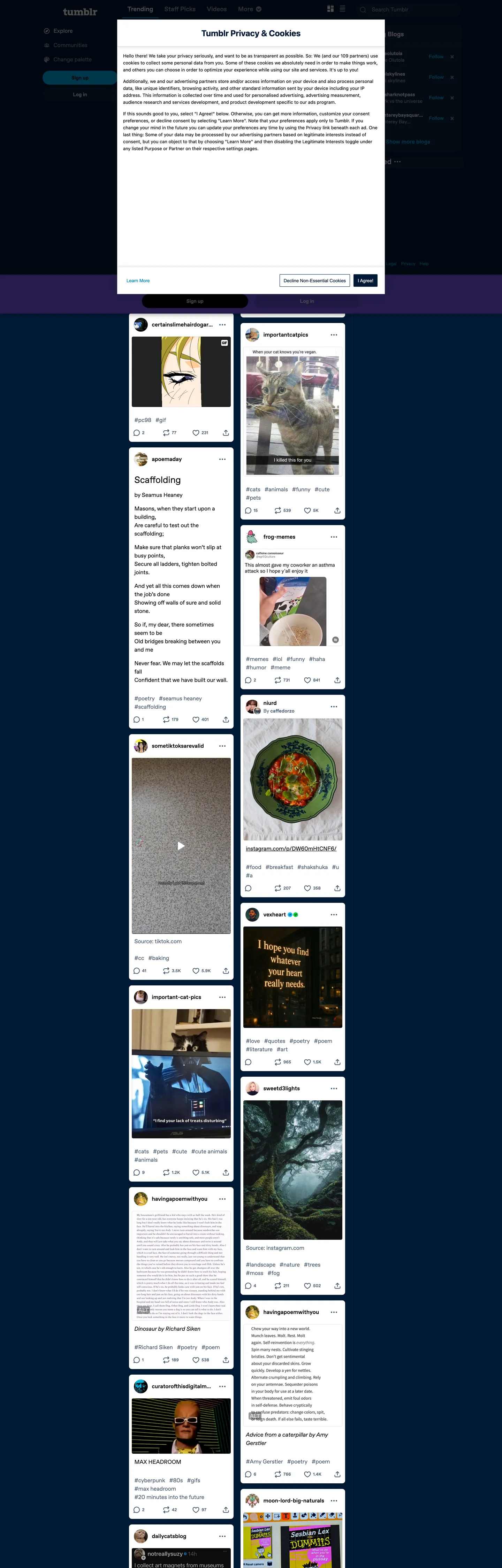
Tumblr's logged-out home page is two surfaces stacked on the same screen. The outer chrome is a deep navy ("#001935", wired to `--chrome`, `--top-menu`, `--side-menu`, and `--content-tint`) holding a sticky login modal in white at the top of the viewport, and beneath that a scrolling dashboard feed of light "#ffffff" post-cards — gifs, fan-art, text quotes, fandom screenshots — each at a 16px corner radius with #4c5e72 secondary text and #000000 titles. Where most social marketing pages reserve the dark band for a single hero, Tumblr commits its entire chrome to dark and lets the post imagery carry every warm tone on the page. The single chromatic CTA is cyan ("#00b8ff", `--brand-blue` / `--accent`), shaped as a fully-rounded pill at 40px tall — every button on every surface inherits that geometry.
This page packages the system as a single Google Labs DESIGN.md file. Inside: 22 colors tokens grouped into chrome (navy register), content (post-card register), brand (the documented rainbow), and structural neutrals; 9 Favorit typography levels covering 26px hero down to "12px" caption Favorit Modern; a 5-step radius scale where pill ("9999px") and card ("16px") carry 412 of the page's 613 rounded surfaces; an 8-step spacing scale tuned to the "4 / 6 / 8 / 12 / 16" rhythm the extractor pulls straight from CSS variables; and 17 components recipes covering the cyan pill CTA, the dark top-nav, the floating login modal, the post-card variants, the rainbow tag chip, and the borderless text input the welcome modal uses.
Feed the file to Claude, Cursor, or GitHub Copilot and the model produces React components that match Tumblr's specific split — the dark navy chrome, the floating white post-card feed, the cyan pill CTA, the rainbow tag register used scarcely — rather than a generic dark social theme. Or reference the tokens directly: every hex is quoted, every component recipe paste-ready for Tailwind config or CSS custom properties. The system is worth studying because it inverts the typical social-app rule that the brand color is the load-bearing tone; here the navy carries the page, and the cyan is allowed to be small.
What makes it distinct
5
- Two-tier canvas systemnavy "#001935" outer chrome hosts the page, white "#ffffff" post-cards float as the content surface, the contrast doing all the figure-ground work
- Single-accent pill CTAcyan "#00b8ff" carries the Sign-up button (40px tall, 9999px radius, 10/16 padding) and nothing else on chrome
- Documented rainbow registerseven explicit `--color-rainbow-N` brand hexes wired up as CSS vars, used scarcely (counts of 1-2) for tag chips and badges
- Dual-Favorit typeface splitFavorit for reading body at 16/24, Favorit Modern at weight 500 for buttons and 12/18 labels
- Pill-everywhere geometry9999px radius appears 239 times, 16px card radius 173 times, 8px chip radius 119 times; the 4 / 8 / 16 / pill scale is the entire shape vocabulary
tumblr.com
Live at tumblr.com
A snapshot of the brand in production. Scroll the frame to see the whole page.
Colors
22 colors
Tumblr's system runs on #00b8ff as its primary voltage, used in 3 of 17 components. Type is set in Favorit across 9 tokens from 12px to 26px, weights 400–700. Shape language is mixed across 17 components, blending pills, soft rounds, and squarer corners.
Brand & Accent
Sparing, CTA-only voltage · 7
Surface
Page and card backgrounds · 2
Text
Headlines, body, captions · 6
Borders & Hairlines
Dividers, outlines, rules · 1
Other
Specialty colors · 6
Typography
9 type tokens
Set in Favorit across 9 tokens, from 12px to 26px, weights 400–700. Shown in its own stack: where the font isn't installed, the fallback the file names stands in.
- display-md26px · weight 400 · lh 34pxThe quick brown fox jumps over the lazy dog
- heading-md18px · weight 700 · lh 24pxThe quick brown fox jumps over the lazy dog
- body-lg16px · weight 400 · lh 24pxThe quick brown fox jumps over the lazy dog
- body-strong16px · weight 700 · lh 24pxThe quick brown fox jumps over the lazy dog
- body-md14px · weight 400 · lh 20pxThe quick brown fox jumps over the lazy dog
- body-sm12.5px · weight 400 · lh 19pxThe quick brown fox jumps over the lazy dog
- label-md16px · weight 500 · lh 24pxThe quick brown fox jumps over the lazy dog
- label-sm12px · weight 500 · lh 18pxThe quick brown fox jumps over the lazy dog
- button-md14px · weight 500 · lh 20pxThe quick brown fox jumps over the lazy dog
Layout
Radii and spacing
5 corner radii and 8 spacing values. Shape language: mixed.
Radii
- none0px
- xs4px
- sm8px
- card16px
- full9999px
Spacing
- xxs2px
- xs4px
- sm6px
- md8px
- base12px
- lg16px
- xl24px
- xxl32px
Components
17 components
Each rendered from its tokens (color, type, radius, padding) on Tumblr's own canvas.
- Button Primarybutton-primaryButton Primary
- Button Primary Hoverbutton-primary-hoverButton Primary Hover
- Button Secondarybutton-secondaryButton Secondary
- Button Ghostbutton-ghostButton Ghost
- Top Navtop-navTop Nav
- Side Navside-navSide Nav
- Login Modallogin-modalLogin Modal
- Post Cardpost-cardPost Card
- Post Card Titlepost-card-titlePost Card Title
- Post Card Bylinepost-card-bylinePost Card Byline
- Type here…text-inputText Input
- Tag Chiptag-chipTag Chip
- Reaction Badgereaction-badgeReaction Badge
- Link Inlinelink-inlineLink Inline
- DividerdividerDivider
- Overlay Scrimoverlay-scrimOverlay Scrim
- Hero Headinghero-headingHero Heading
In use
The system, in use
Tumblr's tokens on the kind of product it builds.
Build something people actually use.
A short paragraph of marketing copy that previews how the brand's display tier and body tier read together. Two sentences is usually enough.
FAQ
Tumblr design system FAQ
Common questions about Tumblr's tokens, components, and how to use this DESIGN.md in your project.
Read next
Related reading
Specs, directories, and component libraries that pair with this design system.
- Browse all design systemsThe full directory of DESIGN.md files on shadcn.io, with live mockups for each.shadcn.io
- Tumblr — official siteMicroblogging and social-blogging platform for fandom, GIFs, art, and long-form posts.tumblr.com (opens in a new tab)
- The DESIGN.md specificationGoogle Labs' open spec for machine-readable design system files — the format this page is built on.github.com (opens in a new tab)
Use it
Use Tumblr in your project
One machine-readable file. Drop it into Claude, Cursor, or any AI tool that reads DESIGN.md.
Download the DESIGN.md
One machine-readable file: every color, type, radius, spacing, and component token of Tumblr.
Feed it to your AI tool
Drop it into Claude, Cursor, or GitHub Copilot. The agent writes React components and Tailwind classes that match Tumblr's visual language.
Reference the tokens directly
Or paste the values into your Tailwind config, CSS variables, or component library: every color, size and radius is a quoted, ready-to-copy value.
Read the full DESIGN.md: overview, rationale, do’s and don’ts
Overview
Tumblr's logged-out home page is one of the few mainstream social surfaces that commits its entire chrome to dark and lets the content cards carry every warm tone. The outer frame is navy ("#001935", wired through --chrome, --top-menu, --side-menu, --content-tint, and --overlay-tint), with a sticky white login modal floating at the top of the viewport and a scrolling feed of light "#ffffff" post-cards beneath it — gifs, fan-art quotes, fandom screenshots, reblog chains — each at a 16px corner radius with #4c5e72 secondary text. Where most social marketing chrome opens with a hero band and stacks the feed below, Tumblr presents the feed as the hero — the dashboard preview is the pitch.
Two-tier canvas: the navy chrome carries the application shell (nav, scrim, side-rail) while the white post-cards carry the content. This is not a single dark canvas with brighter sections — it is two distinct surfaces, each with its own type color, its own button geometry, and its own role. The cyan accent ("#00b8ff", --brand-blue / --accent / --color-primary-link) lives in exactly two roles across both surfaces: the Sign-up pill CTA in the welcome modal, and the inline-link color inside post-card bodies. The brand voltage is small on purpose; the dual-canvas figure-ground does the page's heavy lifting.
Rainbow as register, not accent: Tumblr exposes seven brand hexes (#00b8ff, #7c5cff, #e8d73a, #ff8a00, #ff4930, #ff61ce, #01cf35) wired through --color-rainbow-0 through --color-rainbow-10 and 19 tint/shade aliases per color. The rainbow is documented but used scarcely — most colors appear only 1-2 times on the captured chrome — which means the system is built to host high-chroma in-product features (tag chips, post-type badges, reaction icons) without those features falling off-system.
Key Characteristics:
- Navy "#001935" application chrome with white "#ffffff" post-cards floating as the content surface — the two-tier canvas is the load-bearing visual decision
- Single-accent cyan "#00b8ff" reserved for the Sign-up pill CTA and inline links — nothing else on chrome carries chroma
- Documented rainbow register (cyan, purple "#7c5cff", yellow "#e8d73a", orange "#ff8a00", red "#ff4930", pink "#ff61ce", green "#01cf35") wired across 100+ CSS variables for in-product feature color
- Dual-Favorit typeface split — Favorit for reading body and the 26px weight-400 hero, Favorit Modern at weight 500 for UI labels and the pill CTA
- Pill-first shape geometry: "9999px" radius on every button, "16px" on cards and modals, "8px" on chips, "4px" on the smallest atoms
- Light hero treatment — the h1 (
Trending) renders Favorit at 26px weight 400, the lightest hero weight a major social brand ships - Welcome-modal-as-hero pattern: a 16px-radius white card pinned to the top of the dark feed, not a banner above the feed
Colors
The palette divides into chrome (navy register), content (post-card register), and brand (the documented rainbow). Quoted hex on every token because YAML treats unquoted #000 as a comment.
- Navy chrome (
#001935) — frequency 10. Used as background (6), gradient (4). The load-bearing application surface; wired to--chrome,--top-menu,--side-menu,--content-tint,--overlay-tint. Every dark surface on the captured page resolves to this one hex. - Chrome panel (
#0d243f) — frequency 2. Used as background (2). Slightly elevated navy for--chrome-panel; the next step up the navy register before flipping to a content surface. - Ink (
#000000) — frequency 3429. Used as text (1710), border (1708), background (10). The dominant text color on white post-cards and the border tone for every hairline; wired through 30+ CSS variables. - Body (
#4c5e72) — frequency 1238. Used as text (619), border (619). The post-card secondary text and metadata color (--content-fg-secondary,--color-navy-70); the workhorse non-headline tone on every white card. - Canvas (
#ffffff) — frequency 402. Used as text (182), background (32), border (182), gradient (6). The post-card surface and the welcome-modal fill; appears in 50+ CSS variables across--content-fg,--chrome-fg, and the white-tint scale. - Body soft (
#99a3ae) — frequency 108. Used as text (49), background (10), border (49). The placeholder and tertiary-metadata tone (--content-fg-tertiary,--color-navy-40); appears on the email-input placeholder and the smallest post-card timestamps. - Accent (
#00b8ff) — frequency 23. Used as text (11), background (1), border (10), shadow (1). Reserved for the Sign-up pill CTA, inline link color, and focus-ring; wired through--brand-blue,--accent,--color-primary-link,--chrome-ui-focus, and 25+ tint aliases. The system's only chrome chroma. - Brand purple (
#7c5cff) — frequency 2. Used as background (2). The--color-rainbow-10slot;--brand-purple,--education. Scoped to in-product features. - Brand yellow (
#e8d73a) — frequency 2. Used as background (2). The--color-rainbow-3slot;--brand-yellow. Reserved for premium / highlight features in-product. - Brand orange (
#ff8a00) — frequency 2. Used as background (2). The--color-rainbow-4slot;--brand-orange. Reserved for in-product feature accents. - Brand red (
#ff4930) — frequency 2. Used as background (2). The--color-rainbow-6slot; doubles as--danger. The error / destructive register. - Brand pink (
#ff61ce) — frequency 2. Used as background (2). The--color-rainbow-8slot;--brand-pink. Reserved for in-product feature accents. - Brand green (
#01cf35) — frequency 1. Used as background (1). The--color-rainbow-1slot; doubles as--success. The success / live register. - Hairline (
#e7e6e7) — frequency 2. Used as border (1), gradient (1). The post-card divider hex (--color-gray-10); the only neutral border tone on white surfaces. - Rainbow lilac (
#cab7d8) — frequency 1. Used as gradient (1). An in-product feature gradient stop; not wired to a stable CSS variable.
Typography
Tumblr runs two Favorit faces — Favorit for reading copy and Favorit Modern for UI labels. The split is mechanical: any text the reader scans (post body, hero heading, link copy) takes Favorit; any text the reader operates (buttons, tag chips, metadata) takes Favorit Modern at weight 500. Where most fintech and consumer brands push hero weight to 600-800, Tumblr renders its h1 (Trending) in Favorit at 26px weight 400 with 34px leading — the lightest hero weight in this category. The display tier doesn't exist as a separate face; there is no Favorit Display, no condensed variant, no italic register on the captured chrome.
Body-md (16/24 weight 400) is the dominant reading tier — 193 occurrences on the captured page, used inside post-cards, the welcome modal copy, and the side-rail descriptions. Body-strong (16/24 weight 700) carries post titles and emphasis (10 occurrences). Label-sm (Favorit Modern 12/18 weight 500) carries every metadata atom — post bylines, tag chips, timestamp text — at 51 occurrences. Button-md (Favorit Modern 14/20 weight 500) is the single button typography. If Favorit isn't licensed, Inter at the same sizes is the closest open substitute; preserve the weight-500 ceiling on UI labels — do not bump button text to weight 600 the way most dark social brands do.
Layout
The page is a single scrolling column at the captured 1440px width: a sticky welcome modal ({rounded.card} 16px, white surface) pinned to the upper portion of the viewport, then a one-column dashboard feed of white post-cards beneath it on the navy chrome. The post-cards are not edge-to-edge — they sit inside a center column with the navy showing as a vertical gutter on both sides at desktop. Each card carries 16px internal padding, separated vertically by a consistent gap; the rhythm reads at "12 / 16 / 24" based on the extracted spacing register where 16px (35 occurrences), 12px (21), and 24px each carry the section-break work.
The chrome has a top-nav band at the very top (56px tall, navy fill, white type) and a left-side rail (extracted at 280px wide) carrying the welcome modal CTA. Side-rail and feed share the same navy ground; the only horizontal boundary between them is the cyan accent dot on the active nav item. Mobile breakpoints collapse the side rail into a drawer; the feed itself stays a single column at every viewport size.
Elevation & Depth
Tumblr's depth system is figure-ground, not shadow. White post-cards on a navy chrome read as elevated without any cast shadow — the contrast difference (#ffffff over #001935) does the entire job. The captured page contains exactly one shadow color (#000000 at 1 occurrence) and zero blurred shadows on post-cards or buttons. The welcome modal carries a soft 1px navy hairline (--chrome-panel-border) but otherwise floats by virtue of canvas inversion: dark-on-light surfaces beneath, light-on-dark surfaces above.
The overlay scrim that backs the login modal on mobile is the navy chrome at 0.7 opacity — same hex as the application chrome, just turned semi-transparent. There is no separate scrim color, no dimmer overlay, no glass blur. Unlike the convention of layering shadow + hairline + tint to signal depth, Tumblr commits to one move: switch the canvas color, let the contrast carry.
Shapes
Four radii cover the entire system. Pill (9999px) is the dominant shape (239 occurrences) — every button, every chip, every pill-shaped tag inherits this geometry. Card (16px, 173 occurrences) is the post-card and modal radius. Chip (8px, 119 occurrences) handles inline reaction badges and post-type badges. Micro (4px, 45 occurrences) is the smallest atom radius — counter pills, status dots, the inner indicator on the active-nav cyan dot.
There is no sharp-cornered interactive element anywhere on the captured chrome. The system never goes flat (0px) on a button, a chip, or a card; the only 0px surfaces are dividers and the hero-heading text block. The 4 / 8 / 16 / pill scale is the entire vocabulary — there is no 12px middle radius, no 24px step before the pill, no 32px large-card register that Pinterest or Discord introduce.
Components
Each recipe references declared tokens; component states (-hover, -pressed) only override what changes from the base.
button-primary— cyan "#00b8ff" fill, ink "#000000" text, button-md typography (Favorit Modern 14/20 weight 500), pill9999px, padding 10/16, height 40px. The Sign-up CTA.button-primary-hover— same fill, opacity "0.85".button-secondary— white canvas fill, ink text, button-md typography, pill, same height and padding as primary. The "Use email" button inside the welcome modal.button-ghost— transparent fill, white-on-chrome text, button-md typography, pill. Used for the chrome-nav action buttons.top-nav— navy "#001935" chrome fill, white text, body-strong typography, no radius, 56px tall, 16px horizontal padding. Sticky to the viewport top.side-nav— same navy chrome, white text, label-md typography, no radius, 12/16 internal padding per row.login-modal— white canvas fill, ink text, body-lg typography, 16px card radius, 24px padding. The floating welcome card pinned to the top of the feed.post-card— white canvas fill, ink text, body-lg typography, 16px radius, 16px padding. The dashboard-feed atom.post-card-title— heading-md (Favorit 18/24 weight 700) on ink. Inherits the post-card fill.post-card-byline— label-sm (Favorit Modern 12/18 weight 500) on body "#4c5e72". The byline and reblog-count rail beneath the title.text-input— white canvas fill, body-soft "#99a3ae" placeholder, label-md typography, no radius (extractor reports 0px), 8px padding, 40px tall. The email input inside the welcome modal.tag-chip— hairline "#e7e6e7" fill, ink text, label-sm typography, pill radius, padding 2/6. The smallest interactive surface.reaction-badge— white fill, ink text, label-sm typography, 8px radius, padding 4/6. Reblog and like counter pill on each post-card.link-inline— accent "#00b8ff" text, body-lg typography. The inline-link tone inside post bodies.divider— hairline fill, 1px tall. Internal post-card dividers between the body and the reaction rail.overlay-scrim— navy chrome at 0.7 opacity. Backs the welcome modal on mobile.hero-heading— ink text, display-md typography (Favorit 26/34 weight 400). TheTrendingh1 above the feed.
Do's and Don'ts
Do keep the cyan accent scarce — three on-page surfaces (Sign-up CTA fill, inline links, focus ring) is the system's discipline. The brand voltage is small on purpose.
Do treat the rainbow register (#7c5cff, #e8d73a, #ff8a00, #ff4930, #ff61ce, #01cf35) as available for in-product features — tag chips, post-type badges, reaction icons — and out-of-scope for chrome.
Do render every button as a pill (9999px) at 40px tall with 10/16 padding. The page contains zero square-cornered or 12px-radius buttons.
Don't bump the hero heading to weight 600 or 700. Tumblr ships the h1 in Favorit weight 400 — pushing it heavier flips the page's voice from social-blog to fintech.
Don't use #001935 as a card background. It is the chrome surface only; cards always invert to #ffffff. The two-tier canvas is the system's signature move and collapsing it breaks the figure-ground that carries every depth cue.
Don't apply box-shadow to post-cards. The captured page contains exactly one shadow occurrence and zero cast shadows on cards or buttons; depth comes from the canvas inversion (white card over navy chrome), not from blur.
Don't use #4c5e72 for primary body text on white surfaces. It is the secondary text tone (post bylines, metadata, reblog counters); primary post-titles and reading copy land on #000000.
Don't introduce a third radius between 8px and 16px. The shape vocabulary is 4 / 8 / 16 / pill — adding a 12px intermediate breaks the chip-vs-card distinction the system relies on.
Known Gaps
- Authenticated dashboard chrome — the captured surfaces are the logged-out marketing home and trending feed; the in-product post composer, settings panes, message inbox, and tumblr-blog layout are out of scope.
- Mobile screenshots — desktop 1440px only; mobile responsive behavior is inferred from the documented breakpoint stack and the side-rail-to-drawer pattern.
- Hover and pressed states — most interactive states (post-card hover, button pressed, tag-chip selected) are inferred from the tint/shade CSS variable register, not directly captured.
- Post composer typography — the rich-text editor, the GIF picker, and the post-type tabs (text / photo / quote / link / chat / audio / video) carry their own component recipes not represented here.
- Theme system — Tumblr historically supported user-installed blog themes with full CSS override; this DESIGN.md captures only the default chrome and dashboard.
- Dark/light theme toggle — the chrome is presented as dark-default; the system does ship a light-mode variant inside the app shell, not captured here.
Social & Community
More systems like this
More DESIGN.md files in Social & Community.
Pricing
Build it with Pro
The DESIGN.md files are free. Pro adds 6,000+ blocks, premium templates and the MCP server, so your AI editor builds in your system for you.
4.9/5 out of 5 · 150+ reviewsfrom 150+ founders and developers.
Billing
Billed once a year in USD. Cancel anytime.
- How many people can use the license.
- Client work, SaaS products and anything you charge for.
- Production-ready React sections: hero, pricing, features, dashboards and more.
- Complete multi-page sites you can ship as they are.
- React icons from every major library, installable with one command.
- Presets that restyle every block, in light and dark.
- Lets your AI editor search, preview and install blocks for you.
- Priority requests are answered first.
Individual
For personal projects & open source
$32instead of $49/mo
$389 billed yearly
- Seats: 1 seat
- Commercial use: Personal & open source only
- Pro blocks: 6,000+ blocks
- Templates: All 14 templates
- React icons: 294k+ icons
- Themes: All 59 themes
- MCP server: Basic usage
- Support: Standard
Team
Most popularFor freelancers, agencies & startups
$66instead of $99/mo
$789 billed yearly · ≈ $13/dev/mo
- Seats: Up to 5 seats
- Commercial use: Included
- Pro blocks: 6,000+ blocks
- Templates: All 14 templates
- React icons: 294k+ icons
- Themes: All 59 themes
- MCP server: High usage
- Support: Priority
Organization
For companies with larger teams
$132instead of $199/mo
$1,589 billed yearly
- Seats: Unlimited seats
- Commercial use: Included
- Pro blocks: 6,000+ blocks
- Templates: All 14 templates
- React icons: 294k+ icons
- Themes: All 59 themes
- MCP server: Unlimited usage
- Support: Priority
Billed once a year in USD. Cancel anytime.
Individual
For personal projects & open source
$32instead of $49/mo
$389 billed yearly
- How many people can use the license.Seats: 1 seat
- Client work, SaaS products and anything you charge for.Commercial use: Personal & open source only
- Production-ready React sections: hero, pricing, features, dashboards and more.Pro blocks: 6,000+ blocks
- Complete multi-page sites you can ship as they are.Templates: All 14 templates
- React icons from every major library, installable with one command.React icons: 294k+ icons
- Presets that restyle every block, in light and dark.Themes: All 59 themes
- Lets your AI editor search, preview and install blocks for you.MCP server: Basic usage
- Priority requests are answered first.Support: Standard
Team
Most popularFor freelancers, agencies & startups
$66instead of $99/mo
$789 billed yearly · ≈ $13/dev/mo
Everything in Individual, plus
- How many people can use the license.Seats: Up to 5 seats
- Client work, SaaS products and anything you charge for.Commercial use: Included
- Lets your AI editor search, preview and install blocks for you.MCP server: High usage
- Priority requests are answered first.Support: Priority
Organization
For companies with larger teams
$132instead of $199/mo
$1,589 billed yearly
Everything in Team, plus
- How many people can use the license.Seats: Unlimited seats
- Lets your AI editor search, preview and install blocks for you.MCP server: Unlimited usage
- Secure checkout via Stripe
- Code lives in your repo
- Keep what you've shipped if you cancel
- License terms
Your system, built for you
Every block, template and icon, installed by your AI agent in your design system. The DESIGN.md files stay free.