Threads Design System
Threads' design system as a DESIGN.md file. System-ui 15px, full-pill geometry, 19 colors, 18 components. For React, Next.js, and AI tools.
Add shadcn.io to your AI agent. · Pro It installs blocks, icons and templates in your design system from a prompt, with Pro.
Set up MCP- Primary
- #424242
- Typeface
- system-ui
- Shape
- Pill
- Base radius
- 18px
- Colors
- 19
- Type tokens
- 9
- Components
- 18
- Spacing values
- 8
About
About Threads DESIGN.md
Curated by Dov Azencot · Updated May 13, 2026 · Source threads.com (opens in a new tab)
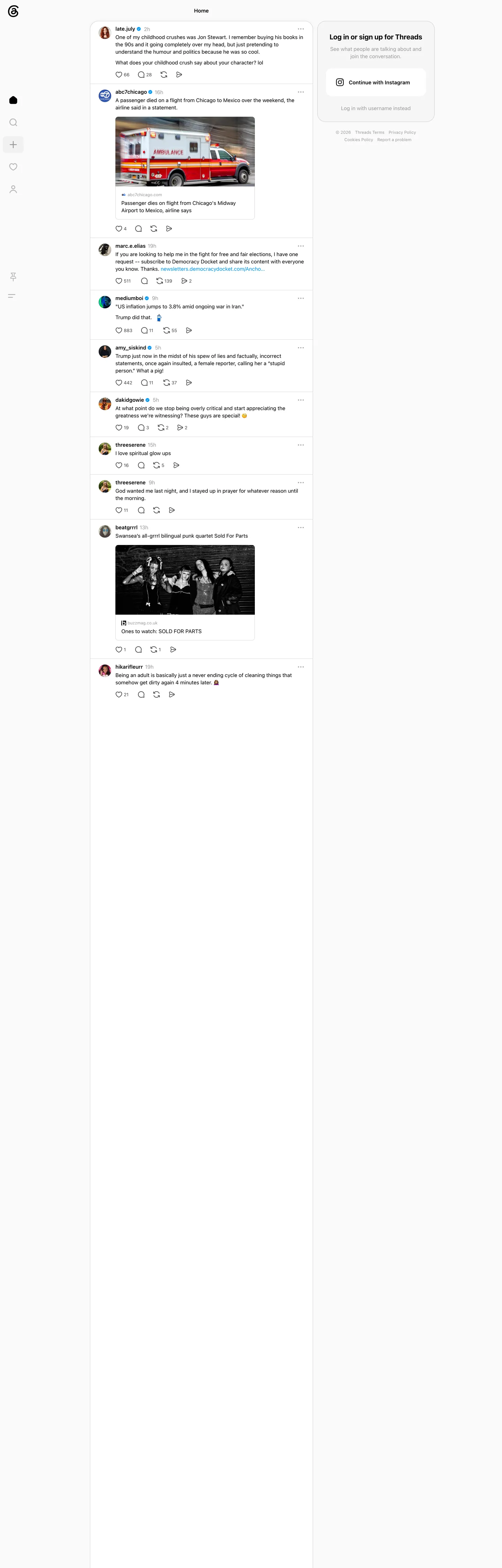
Threads renders its logged-out home as the feed itself — no marketing hero, no testimonial wall, no pricing band. The viewport is a centered 540px-wide post column on a pure white canvas, framed by a 68px-wide left icon rail and a 240px right-side sign-in card. The post bodies run system-ui at 15px weight 400 in pure black "#000000" against the white surface; usernames step up to weight 600; timestamps drop to 12px "#999999"; embedded link cards round to "18px" with an inline ambulance photograph or punk-quartet portrait; reply, repost, like, and share icons stack as four "1000px"-radius full-pill targets beneath every post. The only chromatic chrome is the Instagram-blue "Continue with Instagram" pill in the right rail and the Meta-inherited "#d24294" focus pink that appears only as the keyboard-focus ring.
This file packages the signed-out feed surface as a single Google Labs DESIGN.md spec. Inside: 19 colors tokens covering the load-bearing "#000000" ink that hits 1258 page renders, the "#fafafa" page wash clustered from three near-whites, three structural greys ("#999999" / "#65676b" / "#424242") for secondary text and disabled labels, the inherited Instagram blue "#0095f6" and Facebook blue "#1877f2" exposed through legacy Meta variables, the Meta focus pink "#d24294" reserved for the keyboard-focus indicator, and a Pinterest-cherry "#fa383e" reserved for the liked-heart icon; 11 system-ui typography roles from 20px weight 700 page heading down to 12px weight 400 caption; a four-step radius scale where "1000px" full-pills hit 60 occurrences against "18px" link-card corners and "8px" form inputs; and 18 components recipes covering the icon rail, the post card, the inline action bar, and the Instagram-handoff CTA pill.
Feed this file to Claude, Cursor, or GitHub Copilot and the agent reproduces Threads' restraint — the monochrome ink ladder, the 540px feed column, the full-pill chrome, the Instagram-blue handoff CTA — instead of inventing a generic social-app theme. Or reference the tokens directly when building a federated-feed or threaded-comments UI: every hex is quoted, every component recipe ready to paste into Tailwind config or CSS custom properties. The system is worth studying because it argues that a social network's signed-out marketing surface can be the feed itself, dimmed by nothing, framed by nothing — that the strongest first impression is letting the timeline carry the entire pitch.
What makes it distinct
5
- Black-on-white monochrome'#000000' carries 1258 page occurrences across text (629) and hairlines (624), while no chromatic accent breaks 110
- Full-pill chrome at every tier'1000px' radius hits 60 occurrences, '999px' adds 20 more, leaving zero square edges on interactive surfaces
- System-ui at 15px weight 400/600the typography stack ships zero proprietary faces and lets the OS render every label, post body, and button
- Meta focus pink '#d24294' as accessibility-onlythe brand-layer hex appears solely as the '--primary-web-focus-indicator' ring, never on a CTA fill
- 540px single-column feedthe post stream stays centered on a true white canvas with a 240px right-rail sign-in card, no marketing band above the fold
threads.com
Live at threads.com
A snapshot of the brand in production. Scroll the frame to see the whole page.
Colors
19 colors
Threads's system anchors on #424242 (ink-charcoal) as its primary color. Type is set in system-ui across 9 tokens from 11px to 20px, weights 400–700. Shape language leans on pill geometry — fully rounded surfaces dominate the component library.
Surface
Page and card backgrounds · 2
Text
Headlines, body, captions · 9
Borders & Hairlines
Dividers, outlines, rules · 1
Semantic
Status, errors, success, links · 1
Other
Specialty colors · 6
Typography
9 type tokens
Set in system-ui across 9 tokens, from 11px to 20px, weights 400–700. Shown in its own stack: where the font isn't installed, the fallback the file names stands in.
- display-md20px · weight 700 · lh 25px · tracking normalThe quick brown fox jumps over the lazy dog
- body-md15px · weight 400 · lh 21px · tracking normalThe quick brown fox jumps over the lazy dog
- body-md-strong15px · weight 600 · lh 21px · tracking normalThe quick brown fox jumps over the lazy dog
- body-md-button15px · weight 600 · lh 20px · tracking normalThe quick brown fox jumps over the lazy dog
- body-sm13px · weight 400 · lh 18.2px · tracking normalThe quick brown fox jumps over the lazy dog
- label-md13px · weight 500 · lh 18px · tracking normalThe quick brown fox jumps over the lazy dog
- caption12px · weight 400 · lh 16.8px · tracking normalThe quick brown fox jumps over the lazy dog
- caption-strong12px · weight 600 · lh 16.8px · tracking normalThe quick brown fox jumps over the lazy dog
- micro11px · weight 400 · lh 14px · tracking normalThe quick brown fox jumps over the lazy dog
Layout
Radii and spacing
6 corner radii and 8 spacing values. Shape language: pill.
Radii
- none0px
- xs2px
- sm8px
- md18px
- lg24px
- full1000px
Spacing
- xxs2px
- xs4px
- sm6px
- base8px
- md12px
- lg16px
- xl24px
- xxl32px
Components
18 components
Each rendered from its tokens (color, type, radius, padding) on Threads's own canvas.
- Button Primarybutton-primaryButton Primary
- Button Primary Hoverbutton-primary-hoverButton Primary Hover
- Button Secondarybutton-secondaryButton Secondary
- Instagram Handoff Pillinstagram-handoff-pillInstagram Handoff Pill
- Side Nav Railside-nav-railSide Nav Rail
- Side Nav Iconside-nav-iconSide Nav Icon
- Side Nav Icon Hoverside-nav-icon-hoverSide Nav Icon Hover
- Post Cardpost-cardPost Card
- Post Avatarpost-avatarPost Avatar
- Post Usernamepost-usernamePost Username
- Post Timestamppost-timestampPost Timestamp
- Post Bodypost-bodyPost Body
- Post Action Iconpost-action-iconPost Action Icon
- Post Action Countpost-action-countPost Action Count
- Embed Link Cardembed-link-cardEmbed Link Card
- Sidebar Signin Cardsidebar-signin-cardSidebar Signin Card
- Inline Linkinline-linkInline Link
- Focus Ringfocus-ringFocus Ring
In use
The system, in use
Threads's tokens on the kind of product it builds.
Build something people actually use.
A short paragraph of marketing copy that previews how the brand's display tier and body tier read together. Two sentences is usually enough.
FAQ
Threads design system FAQ
Common questions about Threads's tokens, components, and how to use this DESIGN.md in your project.
Read next
Related reading
Specs, directories, and component libraries that pair with this design system.
- Browse all design systemsThe full directory of DESIGN.md files on shadcn.io, with live mockups for each.shadcn.io
- Threads — official siteMeta's text-first social network — share ideas, ask questions, post random thoughts, and log in with your Instagram account.threads.com (opens in a new tab)
- The DESIGN.md specificationGoogle Labs' open spec for machine-readable design system files — the format this page is built on.github.com (opens in a new tab)
Use it
Use Threads in your project
One machine-readable file. Drop it into Claude, Cursor, or any AI tool that reads DESIGN.md.
Download the DESIGN.md
One machine-readable file: every color, type, radius, spacing, and component token of Threads.
Feed it to your AI tool
Drop it into Claude, Cursor, or GitHub Copilot. The agent writes React components and Tailwind classes that match Threads's visual language.
Reference the tokens directly
Or paste the values into your Tailwind config, CSS variables, or component library: every color, size and radius is a quoted, ready-to-copy value.
Read the full DESIGN.md: overview, rationale, do’s and don’ts
Overview
Threads' signed-out home is the feed itself. The viewport opens directly into the public timeline: a centered 540px-wide post column on a true white {colors.canvas} ("#ffffff") canvas, flanked by a 68px-wide icon rail on the left (home, search, create, activity, profile, pinned, menu) and a 240px sign-in card on the right titled "Log in or sign up for Threads." There is no marketing band, no hero illustration, no feature grid, no pricing card. The chrome lets the timeline carry the pitch — a childhood-crush thread from @late.july, an ABC7 Chicago news embed about an airline incident, an election-newsletter ask from @marc.e.elias, a punk-quartet recommendation from @beatgrrrl — each rendered as a {components.post-card} with a 36px circular avatar, a 15px weight 600 username, a 12px {colors.ink-soft} ("#999999") timestamp, and four {components.post-action-icon} full-pills (like, reply, repost, share) underneath.
Feed-as-marketing: where most social networks lead with a signed-out marketing hero — Bluesky's auth modal over a darkened photo wash, Discord's starfield-and-Blurple-pill landing band, Pinterest's 70px display headline with alternating feature cards — Threads collapses the entire signed-out experience to the timeline itself. The decision argues that a text-first social network's strongest first impression is the work: actual posts from actual users, rendered at the same density they'd appear at signed in, with the conversion surface relegated to a sidebar card. Unlike the convention of pairing a saturated marketing band with a separate sign-in button, Threads has neither — the chrome is the feed, and the only saturated hex on the page is the Instagram-blue {colors.link-blue} ("#0095f6") on the "Continue with Instagram" handoff CTA.
The second discipline is the monochrome ink ladder. Black-as-voltage: where most signed-out social pages spend their saturation budget on a colored CTA pill, Threads spends it on nothing — the {colors.ink} ("#000000") that carries 1258 page hits is both the text color and the hairline color, and the chrome interactive surfaces (icon-rail buttons, post-action pills, the "Continue with Instagram" CTA) all render at {colors.canvas} ("#ffffff") with a {colors.hairline} ("#d5d5d5") 1px border. The Meta focus pink {colors.meta-focus-pink} ("#d24294") is declared as the keyboard-focus ring through the --primary-web-focus-indicator CSS variable but never renders on a CTA fill. Where Discord runs a singular Blurple voltage and Bluesky runs a singular #006aff pill, Threads runs no voltage at all on chrome — the only blue the feed shows is the Instagram link inside the right-rail card, inherited from Meta's app vocabulary.
Key Characteristics:
- Black-on-white monochrome —
{colors.ink}("#000000") hits 1258 page occurrences (629 text, 624 border, 4 shadow), while no chromatic accent breaks 110 - Full-pill chrome —
{rounded.full}("1000px") radius hits 60 page occurrences,999pxadds 20, leaving every interactive control fully rounded - 540px single-column feed — the post stream stays centered with a 68px left icon rail and a 240px right sign-in card, no marketing band above the fold
- System-ui at 15px — the typography stack ships zero proprietary faces; the OS renders every label, post body, and button at 15px weight 400/600
- Meta focus pink as accessibility-only —
{colors.meta-focus-pink}("#d24294") is the singular brand-layer hex, declared as the focus ring and never used as a CTA fill - Instagram-blue handoff CTA —
{colors.link-blue}("#0095f6") appears only on the "Continue with Instagram" pill and the inline link text, never on a chrome surface fill - Two-radius card system — embedded link previews step to
{rounded.md}("18px"), forms drop to{rounded.sm}("8px"), and pills resolve to1000px
Colors
The palette splits along function lines: one load-bearing black for ink and hairlines, a four-step structural grey ladder for secondary text, two off-whites for surfaces, the inherited Meta blue family for link text, a Meta focus pink reserved for the keyboard-focus ring, and a Pinterest-cherry red for the liked-heart icon.
- Ink (
#000000) — frequency 1258. Used as text (629), border (624), background (1), shadow (4). The dominant chrome color and the load-bearing structural hex; carries every headline, username, post body, hairline, and icon glyph. Lives across more than 100 CSS variables including--text-primary,--icon-primary,--lines-primary,--fds-black, and--barcelona-primary-button. The brand IS this black. - Ink-soft (
#999999) — frequency 152. Used as text (76), border (76). The secondary grey for post timestamps, like-count subscripts, and disabled-state labels. Declared as--text-secondaryand--barcelona-secondary-text-loading. Sits squarely halfway up the structural ladder. - Ink-charcoal (
#424242) — frequency 120. Used as text (60), border (60). The dark-grey one step lighter than black, exposed through--fds-button-text,--barcelona-charcoal-text, and--media-hover. Carries the secondary button-text and the hovered-media tint. - History-blue (
#385898) — frequency 106. Used as text (57), border (49). The visited-link slate-blue inherited from Meta's link vocabulary; appears on visited inline links and on a small set of legacy footer chrome. Not declared on a CSS variable in the captured surface. - Page (
#fafafa) — frequency 26. Used as background (24), shadow (2). Clustered from three near-white variants (#fafafa,#ffffff,#f5f5f5) in the extraction. The page wash and the background of every elevated surface — modal, popover, card-flat. Declared across more than 100 CSS variables including--background-primary,--canvas,--surface-background, and--fds-white. - Surface-wash (
#efefef) — frequency 10. Used as background (10). The very-light grey for icon-rail hover backgrounds, secondary-button fills, and toggle-active surfaces. Declared as--secondary-button-background,--wash, and--barcelona-newspaper-back-page-1. Pure fill token; never used as text or border. - Hairline (
#d5d5d5) — frequency 4. Used as border (4). The 1px boundary color around every card, button, and input frame. Declared as--divider,--input-border-color, and--switch-inactive. Pure border-only token; sits between page-wash and ink-soft on the lightness scale. - Link-blue (
#0095f6) — frequency 4. Used as text (2), border (2). The Instagram-link blue, declared as--barcelona-link-textand--barcelona-verified-badge-background. Carries the "Continue with Instagram" pill text, the inline newsletter-link text inside post bodies, and the verified-badge fill. The only saturated chromatic chrome on the captured feed surface. - Ink-mute (
#65676b) — declared on--secondary-text,--placeholder-text,--input-label-color-inside, and--barcelona-bar-chart-gradient-top. The Facebook-inherited muted grey for placeholder text, secondary icons, and label color on inactive form fields. - Ink-stone (
#8a8d91) — declared on--barcelona-newspaper-masthead-barand--xzdavdm. The stone-grey one step warmer than ink-soft; reserved for masthead-bar accents and one structural divider variant. - Link-blue-deep (
#216fdb) — declared on--blue-link,--primary-button-background, and--toast-text-link. The deeper blue exposed through Meta's primary-button-background variable, but the captured signed-out feed never renders it — the live CTA is the lighter#0095f6Instagram pill. - Meta-blue (
#1877f2) — declared on--fds-blue-60,--accent,--base-blue,--text-highlight, and--focus-ring-blue. The Facebook-vocabulary primary blue; lives on legacy Meta variables but never renders on the signed-out Threads feed chrome. - Facebook-blue (
#0866ff) — declared on--fb-wordmark,--fb-logo, and--buttonSendBackgroundColor. The newer Facebook brand blue inherited through the shared Meta CSS pipeline; reserved for cross-app surfaces, not used on Threads chrome. - Meta-focus-pink (
#d24294) — frequency 0 on the captured render, declared on--primary-web-focus-indicator. The singular brand-layer hex in the extraction; exists exclusively as the keyboard-focus ring color and never appears on a CTA fill, card surface, or text layer. Accessibility-only voltage. - Liked-cherry (
#fa383e) — declared on--barcelona-liked-text,--barcelona-notification-badge-background,--barcelona-error-text, and--red-primary. The cherry-red reserved for the liked-heart icon fill, error states, and the notification badge dot. Never used on chrome surfaces beyond those three roles. - Success-green (
#31a24c) — declared on--positive,--fds-green-60, and--text-badge-success-background. The success-state green inherited from Meta; reserved for verified-state icons and positive-status badges. - History-blue (extended) — declared on the visited-link slate variant in addition to the count above; serves as the only non-Meta-blue link tone on the page.
- Canvas (
#ffffff) — the true white surface for elevated chrome (the icon-rail background, the post-card background, the "Continue with Instagram" pill fill). One step brighter than the#fafafapage wash; identical to--always-whiteand--primary-button-textin the captured CSS. - Shadow-rgba (
rgba(0,0,0,0.08)) — declared as--shadow-1and--barcelona-box-shadow-04. The translucent black wash used on the rare card-elevation shadow and on the icon-rail edge below the masthead.
Typography
Every text role on the page sits inside the platform system-ui stack: system-ui, -apple-system, "system-ui", Roboto, Helvetica, Arial, sans-serif. There is no proprietary face, no editorial serif, no monospace, and no display-tier swap. The chrome renders in San Francisco on macOS / iOS, Roboto on Android / Chrome OS, and Segoe UI on Windows — whatever the operating system serves at native rendering quality.
The display tier is a single role: 20px weight 700 with 25px line-height, used exclusively for the centered "Home" page heading at the top of the feed column. Beneath that, body and UI run six roles. The workhorse is body-md at 15px weight 400 with 21px line-height (count 22 in the extraction) — the post-body text, the inline-link text, the right-rail sign-in card copy. The strong variant body-md-strong at 15px weight 600 (count 12) carries usernames, the "Continue with Instagram" button label, and section headers inside the sign-in card.
The smaller roles are: body-sm at 13px weight 400 with 18.2px leading (count 4) for embed-link captions and footer-link text; caption at 12px weight 400 with 16.8px leading (count 7) for post timestamps, like-count subscripts, and inline action-count labels; caption-strong at 12px weight 600 for emphasis variants; and micro at 11px weight 400 for the footer legal rail ("© 2026 Threads Terms Privacy Policy"). Line-heights run wider than Bluesky's 17-on-15 rhythm — 21px on 15px gives post bodies more breathing room, which makes the dense feed feel less cramped than a stricter ratio would.
Layout
The page is a three-column grid pinned around a centered 540px-wide feed column. The left column is a 68px-wide icon rail anchored to the viewport edge, the middle column is the post stream, and the right column is a 240px-wide sign-in card flush against the right edge. There is no header bar — the page-heading "Home" sits inside the feed column at the very top, centered above the first post. The footer is also collapsed: a single row of legal links ("© 2026 Threads Terms Privacy Policy Cookies Policy Report a problem") sits inside the right-rail card beneath the auth buttons.
Inside the feed column, each {components.post-card} follows a vertical stack: a 36px circular {colors.surface-wash}-tinted avatar at the top-left, the username at body-md-strong immediately to the right, a 12px {colors.ink-soft} timestamp pushed to the far right, the post body underneath at body-md, an optional embedded link-card or photograph at {rounded.md} ("18px") corner radius, then a row of four {components.post-action-icon} full-pills (like, reply, repost, share) with caption-tier counts to their right. Post padding is 16px 16px 15px per the extraction spacing — slightly asymmetric to give the bottom action-row room above the next post's hairline.
Spacing tokens lean on a tight 2-4-6-8-12-16-24 ladder. The 0px 12px step dominates (32 occurrences) for icon-rail padding and post-card horizontal rhythm, while normal 4px (24 occurrences) and normal 6px (21 occurrences) carry inline-action gap spacing. The 12px 24px step (10 occurrences) is the button-padding standard for the Instagram-handoff CTA. The largest single spacing step on the captured chrome is 24px — there is no 32px or 48px section spacing because the page has no section structure, just an infinite feed of post cards.
Elevation & Depth
Threads' signed-out chrome doesn't use drop shadows on the main feed surface. The post cards stack vertically with {colors.hairline} ("#d5d5d5") 1px boundaries between them; the icon rail, the post column, and the sign-in card all sit flat on the {colors.canvas} ("#ffffff") page surface with no cast shadow and no elevation lift.
The only elevation effect on the page is on the rare card-edge shadow declared as --shadow-1 and --barcelona-box-shadow-04 (rgba(0,0,0,0.08)), used by a small number of legacy modal and popover components inherited from Meta's design pipeline. The captured signed-out feed surface never renders these shadows — the feed is a single layer of post cards on a true-white page, separated by hairlines, with no z-stacking and no atmospheric depth.
Hairline-as-shadow: where most social-feed designs use a 0-4px box-shadow on each post card to lift it off the page, Threads relies on a single 1px #d5d5d5 hairline between posts. The hairline does the entire boundary work — there's no card surface elevation, no rounded corners on the outer post frame, and no separation other than the single-pixel divider. The result is that the feed reads as one continuous scroll surface rather than a stack of floating cards, which is the inverse of the Twitter/X / Bluesky convention of card-shadow-on-page-wash.
Shapes
The radius scale is dominated by full-pills — {rounded.full} ("1000px") at 60 page occurrences, plus another 20 hits for 999px (the same geometry at one-pixel less). Every interactive control on the chrome resolves to a full-pill: the four left-rail icon buttons (home, search, create, activity), the four inline post-action icons (like, reply, repost, share), the 36px avatar circles, and the "Continue with Instagram" CTA. The radius hits a third occurrence count of 10 for 1px (used as a faint inner-border tier) and 6 for 8px (used on the single text-input variant inside the auth-fallback form).
The two load-bearing radii are 1000px and 18px. Pill-at-1000, embed-at-18 is the entire system: every interactive control inside the feed is a full-pill (reads as "tap target"), every embedded link-preview card or photograph is an 18px rounded card (reads as "content frame"), and the post-card itself has no radius (reads as "scroll surface"). The 24px radius appears on a single variant of the create-button overlay; the 2px and 10px tiers exist for a small set of legacy Meta-shared chrome (focus rings, image inner borders) and never render on the captured feed surface.
Components
- button-primary — Canvas-white
{colors.canvas}("#ffffff") fill, ink text, 15px weight 600 body-md-button typography, 1000px full-pill radius, 12px × 24px padding, 44px tall, 1px hairline border. The neutral button shape; "Log in with username instead" inside the sign-in card is the on-page render. - button-primary-hover — Page-wash
{colors.page}("#fafafa") fill, ink text, same body-md-button typography, 1000px radius, 12px × 24px padding, 44px tall, 1px hairline border. The hover state lifts to the off-white page surface rather than a tint of the canvas-white. - button-secondary — Transparent fill, ink-mute
{colors.ink-mute}("#65676b") text at body-md 15px weight 400, 1000px full-pill radius, 12px × 24px padding, 44px tall, no border. The ghost variant for tertiary actions inside the sign-in card. - instagram-handoff-pill — Canvas-white fill, ink text at body-md-button 15px weight 600, 1000px full-pill radius, 12px × 16px padding, 44px tall, 1px hairline border. The "Continue with Instagram" CTA inside the sign-in card; the Instagram-glyph icon sits to the left of the label.
- side-nav-rail — Canvas-white fill, ink icon glyphs, 0px corner radius,
0px 12pxpadding, 68px wide, full-height left rail. Anchors seven icon buttons: home, search, create, activity, profile, pinned, menu. - side-nav-icon — Transparent fill, ink glyph color, 1000px full-pill radius, 8px padding, 48px tall. Each rail icon is a fully-rounded tap target with the icon centered.
- side-nav-icon-hover — Surface-wash
{colors.surface-wash}("#efefef") fill, ink glyph, 1000px radius, 8px padding, 48px tall. The hover state lifts to the very-light grey fill without a border or shadow. - post-card — Canvas-white fill, ink text at body-md, 0px corner radius,
16px 16px 15pxpadding, no border (the bottom 1px hairline between posts is rendered as the next card's top border). The scroll-surface frame for each feed post. - post-avatar — Surface-wash placeholder fill, 1000px full-pill radius, 0 padding, 36px × 36px. The circular author thumbnail at the top-left of each post card.
- post-username — Transparent fill, ink text at body-md-strong 15px weight 600, no padding. The handle like
@late.julyor@beatgrrrlto the right of the avatar. - post-timestamp — Transparent fill, ink-soft
{colors.ink-soft}("#999999") text at caption 12px weight 400, no padding. The time-ago indicator like "2h" or "5h" pushed to the post-card's right edge. - post-body — Transparent fill, ink text at body-md 15px weight 400 with 21px line-height, no padding. The post-content text rendered with inline-link runs in
{colors.link-blue}and emoji inline at native size. - post-action-icon — Transparent fill, ink glyph color, 1000px full-pill radius, 8px padding, 36px tall. The four inline icons (like, reply, repost, share) underneath each post body; tap area is fully rounded.
- post-action-count — Transparent fill, ink-mute text at body-sm 13px weight 400, no padding. The numeric count to the right of each action icon ("66", "28", "511", "883").
- embed-link-card — Canvas-white fill, ink text at body-sm, 18px corner radius, 0 padding, 1px hairline border. The wrapper for shared-link previews showing a photograph plus a caption (e.g. the abc7chicago.com news embed).
- sidebar-signin-card — Canvas-white fill, ink text at body-md, 0px corner radius, 16px padding, 240px wide, no border. The right-rail "Log in or sign up for Threads" container holding the Instagram-handoff pill and the username-fallback link.
- inline-link — Transparent fill, link-blue
{colors.link-blue}("#0095f6") text at body-md weight 400. The inline link inside post bodies (e.g.newsletters.democracydocket.com/Ancho...). - focus-ring — Transparent fill, 2px meta-focus-pink
{colors.meta-focus-pink}("#d24294") border, 1000px radius matching the focused element's geometry, 0 padding. The keyboard-focus indicator wraps any focused pill or input.
Do's and Don'ts
Do keep the chrome monochrome on the signed-out feed surface. The captured page renders zero saturated chromatic chrome — only {colors.link-blue} ("#0095f6") appears, and only on the "Continue with Instagram" CTA and inline link runs. Adding a colored primary CTA to the right-rail sign-in card would collapse the feed-as-marketing discipline into a generic social-app landing band.
Do stack every interactive control as a 1000px full-pill. The icon rail, the inline post actions, the avatars, and the Instagram-handoff CTA all share the full-pill geometry — 60 page occurrences against zero square interactive surfaces. Introducing a square-cornered control on the feed would visually shatter the pill-monopoly the page depends on.
Do render every text role in the system-ui stack. The platform-native typography is load-bearing — swapping in Inter or a proprietary face would lose the "this is the OS rendering its own text" register that makes the feed read as a chat-like surface rather than a marketing page.
Don't use Meta focus pink #d24294 as a CTA fill or chrome background. Its entire role is the --primary-web-focus-indicator keyboard ring with zero render budget outside accessibility. Promoting it to chrome creates a second saturated voltage on a page that explicitly carries none.
Don't introduce a third radius between {rounded.sm} ("8px") and {rounded.md} ("18px"). Forms sit at 8px, embedded link-preview cards at 18px, and pills at 1000px. The gap encodes "form input" versus "content card" versus "tap target," and adding 12px in the middle erases the boundary.
Don't add a drop shadow to the post cards. The boundary work is done by 1px {colors.hairline} ("#d5d5d5") between posts — the entire feed is one continuous scroll surface, not a stack of floating cards. A shadow on each post would push the chrome toward a Twitter/X card register the design refuses.
Don't use #000000 as a button background fill on chrome. Black appears as the dominant text and border color (1258 occurrences) but never as a button fill — the primary chrome action is canvas-white-with-hairline, and a black pill would read as a system-error state or an unintended dark-mode preview.
Don't widen the feed column beyond 540px. The single-column rhythm at this width is the design — wider columns push post bodies into magazine-paragraph territory and break the chat-like density Threads is reaching for.
Known Gaps
- Signed-in shell (post composer, reply thread tree, activity tab, profile pages, settings) is out of scope — the captured surface is the signed-out feed only. The component recipes here cover the post card, the icon rail, the inline action row, the embedded link preview, and the right-rail sign-in card, not the in-product compose or thread-reply chrome.
- Mobile breakpoint behavior is not captured. The signed-out feed is known to collapse to a single full-bleed column on small screens with the right-rail sign-in card pinned as a sticky bottom bar, but the exact responsive pixel values aren't in the extracted tokens.
- Dark mode for the in-product surface is real on iOS, Android, and web, but the signed-out home renders only the light-canvas variant. The dark-mode ink ladder (white-on-black with
#101010and#1c1c1cdeclared on--background-inverseand--fds-gray-100) is partially declared in CSS but not active on the captured surface. - Motion — the feed scroll behavior, the like-icon fill-and-burst transition, the repost-confirmation pulse, and the load-more spinner animations are not in the captured tokens.
- Form validation — error-state borders, helper-text styles, and inline form-validation messaging on the auth-fallback inputs are not captured beyond the default focus-ring color.
- Verified badge and notification dot — the badge geometry, the
#fa383enotification-dot positioning, and the verified-state checkmark inside the Instagram-handoff CTA are partially declared but not rendered on the captured feed.
Social & Community
More systems like this
More DESIGN.md files in Social & Community.
Pricing
Build it with Pro
The DESIGN.md files are free. Pro adds 6,000+ blocks, premium templates and the MCP server, so your AI editor builds in your system for you.
4.9/5 out of 5 · 150+ reviewsfrom 150+ founders and developers.
Billing
Billed once a year in USD. Cancel anytime.
- How many people can use the license.
- Client work, SaaS products and anything you charge for.
- Production-ready React sections: hero, pricing, features, dashboards and more.
- Complete multi-page sites you can ship as they are.
- React icons from every major library, installable with one command.
- Presets that restyle every block, in light and dark.
- Lets your AI editor search, preview and install blocks for you.
- Priority requests are answered first.
Individual
For personal projects & open source
$32instead of $49/mo
$389 billed yearly
- Seats: 1 seat
- Commercial use: Personal & open source only
- Pro blocks: 6,000+ blocks
- Templates: All 14 templates
- React icons: 294k+ icons
- Themes: All 59 themes
- MCP server: Basic usage
- Support: Standard
Team
Most popularFor freelancers, agencies & startups
$66instead of $99/mo
$789 billed yearly · ≈ $13/dev/mo
- Seats: Up to 5 seats
- Commercial use: Included
- Pro blocks: 6,000+ blocks
- Templates: All 14 templates
- React icons: 294k+ icons
- Themes: All 59 themes
- MCP server: High usage
- Support: Priority
Organization
For companies with larger teams
$132instead of $199/mo
$1,589 billed yearly
- Seats: Unlimited seats
- Commercial use: Included
- Pro blocks: 6,000+ blocks
- Templates: All 14 templates
- React icons: 294k+ icons
- Themes: All 59 themes
- MCP server: Unlimited usage
- Support: Priority
Billed once a year in USD. Cancel anytime.
Individual
For personal projects & open source
$32instead of $49/mo
$389 billed yearly
- How many people can use the license.Seats: 1 seat
- Client work, SaaS products and anything you charge for.Commercial use: Personal & open source only
- Production-ready React sections: hero, pricing, features, dashboards and more.Pro blocks: 6,000+ blocks
- Complete multi-page sites you can ship as they are.Templates: All 14 templates
- React icons from every major library, installable with one command.React icons: 294k+ icons
- Presets that restyle every block, in light and dark.Themes: All 59 themes
- Lets your AI editor search, preview and install blocks for you.MCP server: Basic usage
- Priority requests are answered first.Support: Standard
Team
Most popularFor freelancers, agencies & startups
$66instead of $99/mo
$789 billed yearly · ≈ $13/dev/mo
Everything in Individual, plus
- How many people can use the license.Seats: Up to 5 seats
- Client work, SaaS products and anything you charge for.Commercial use: Included
- Lets your AI editor search, preview and install blocks for you.MCP server: High usage
- Priority requests are answered first.Support: Priority
Organization
For companies with larger teams
$132instead of $199/mo
$1,589 billed yearly
Everything in Team, plus
- How many people can use the license.Seats: Unlimited seats
- Lets your AI editor search, preview and install blocks for you.MCP server: Unlimited usage
- Secure checkout via Stripe
- Code lives in your repo
- Keep what you've shipped if you cancel
- License terms
Your system, built for you
Every block, template and icon, installed by your AI agent in your design system. The DESIGN.md files stay free.