Temporal Design System
Temporal's marketing-site design system as DESIGN.md. Near-black #141414 canvas, Aeonik weight-300 display at 68px, purple-indigo gradient voltage, Noto Sans Mono buttons, 16 colors tokens, 17 components. For React, Next.js, AI tools.
Add shadcn.io to your AI agent. · Pro It installs blocks, icons and templates in your design system from a prompt, with Pro.
Set up MCP- Primary
- #444ce7
- Typeface
- Aeonik
- Shape
- Sharp
- Base radius
- 0px
- Colors
- 16
- Type tokens
- 12
- Components
- 17
- Spacing values
- 9
About
About Temporal DESIGN.md
Curated by Dov Azencot · Updated May 19, 2026 · Source temporal.io (opens in a new tab)
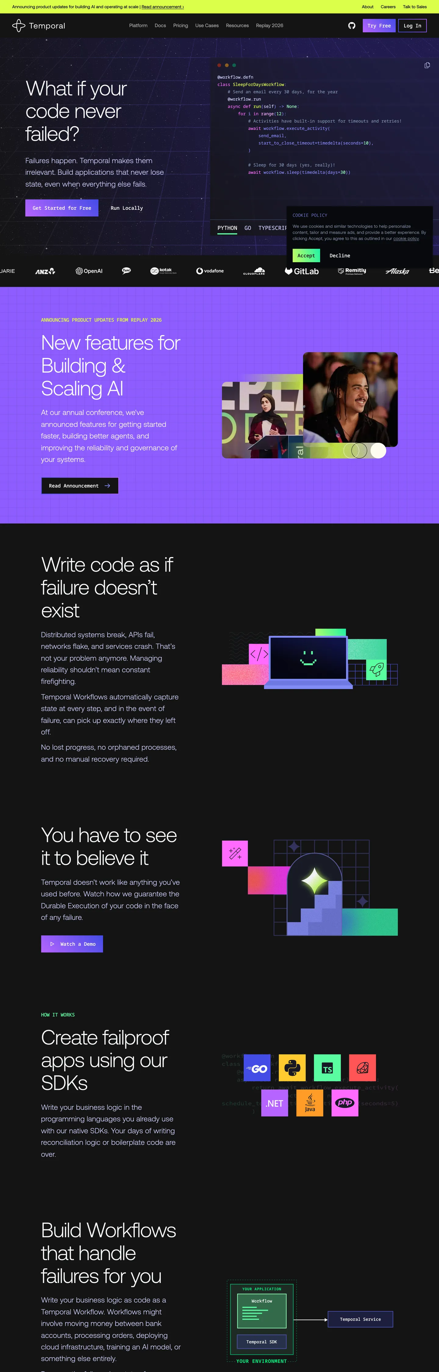
Temporal's marketing page holds one temperature across the entire scroll: near-true-black. The canvas is #141414, not the slightly-blue charcoal that Linear and Vercel use, not the navy that Storybook deploys — true near-black with near-white text on every surface. The hero headline "What if your code never failed?" sits at 68px in Aeonik weight 300, a light-weight display choice that goes against every enterprise infrastructure convention. No CTA uses the brand's purple-indigo gradient as a fill; the gradient runs only through the hero background band and inside product-feature illustrations. The primary CTA is a pill shape with no gradient, no color — just a white pill on the near-black canvas.
The DESIGN.md file packages the system into a machine-readable spec for React and AI tools. Inside: 16 colors tokens organized around a true-black canvas, a slate-blue-gray hairline dominant at 467 occurrences, two brand gradient hues (violet #b664ff and indigo #444ce7), and a neon-yellow accent (#dbff4b) that appears in exactly five places as a status signal and text highlight. Twelve typography tokens run Aeonik at weight 300 across every tier — display to caption — with Noto Sans Mono as the system's second voice for CTAs, code panels, and interactive labels. The radius system has exactly one value: 9999px pill, used once on the primary CTA. Everything else is square.
Feed this file to Claude or Cursor and it reproduces Temporal's disciplined moves: near-black canvas, light-weight display that signals confidence through restraint rather than mass, monospace buttons that read as infrastructure rather than marketing, and a gradient that stays inside illustrations rather than decorating the chrome. The key learning from this system is that a gradient does not have to touch the CTA to register as the brand's chromatic signal — Temporal proves a gradient can live in the background and still define the visual identity.
What makes it distinct
5
- Weight-300 across all tiersAeonik renders every tier from 68px hero to 12px caption at light weight, the most extreme typographic restraint in the enterprise dev-tools category
- Mono buttonsNoto Sans Mono carries CTA labels, not a sans; the monospace voice signals infrastructure authenticity over marketing warmth
- Zero corner roundingthe entire marketing surface has no rounded cards, no rounded inputs, no rounded sections; the only radius is 9999px on the single pill CTA
- Purple-indigo gradient as the brand's only chromatic moment#b664ff to #444ce7 appears in the hero gradient band and feature illustrations but never as a flat color fill on any CTA or card
- Near-true-black canvas#141414 rather than the tinted dark blues that Linear and Vercel use; text reads as near-white #f8fafc across the full page
temporal.io
Live at temporal.io
A snapshot of the brand in production. Scroll the frame to see the whole page.
Colors
16 colors
Temporal's system anchors on #444ce7 (primary) as its primary color. Type is set in Aeonik across 12 tokens from 12px to 68px, weights 300–500. Shape language is sharp — components average 0px corner radius, favoring crisp rectangles.
Brand & Accent
Sparing, CTA-only voltage · 3
Surface
Page and card backgrounds · 4
Text
Headlines, body, captions · 4
Borders & Hairlines
Dividers, outlines, rules · 2
Semantic
Status, errors, success, links · 1
Other
Specialty colors · 2
Typography
12 type tokens
Set in Aeonik across 12 tokens, from 12px to 68px, weights 300–500. Shown in its own stack: where the font isn't installed, the fallback the file names stands in.
- display-xl68px · weight 300 · lh 74.8px · tracking -2pxThe quick brown fox jumps over the lazy dog
- display-lg32px · weight 400 · lh 38.4pxThe quick brown fox jumps over the lazy dog
- heading-md24px · weight 300 · lh 38.4px · tracking 0.2pxThe quick brown fox jumps over the lazy dog
- body-lg24px · weight 300 · lh 38.4px · tracking 0.2pxThe quick brown fox jumps over the lazy dog
- body-md20px · weight 300 · lh 28pxThe quick brown fox jumps over the lazy dog
- body-sm16px · weight 300 · lh 24pxThe quick brown fox jumps over the lazy dog
- body-xs14px · weight 300 · lh 20px · tracking 0.35pxThe quick brown fox jumps over the lazy dog
- caption12px · weight 300 · lh 16pxThe quick brown fox jumps over the lazy dog
- button-md18px · weight 400 · lh 28pxThe quick brown fox jumps over the lazy dog
- nav-link14px · weight 400 · lh 20pxThe quick brown fox jumps over the lazy dog
- code-md14px · weight 400 · lh 20pxThe quick brown fox jumps over the lazy dog
- label-mono16px · weight 500 · lh 24px · tracking -0.4pxThe quick brown fox jumps over the lazy dog
Layout
Radii and spacing
2 corner radii and 9 spacing values. Shape language: sharp.
Radii
- none0px
- full9999px
Spacing
- xs8px
- sm12px
- base16px
- md20px
- lg24px
- xl32px
- 2xl48px
- 3xl64px
- 4xl96px
Components
17 components
Each rendered from its tokens (color, type, radius, padding) on Temporal's own canvas.
- Button Primarybutton-primaryButton Primary
- Button Primary Hoverbutton-primary-hoverButton Primary Hover
- Button Secondarybutton-secondaryButton Secondary
- Top Navtop-navTop Nav
- Nav Linknav-linkNav Link
- Hero Headinghero-headingHero Heading
- Section Headingsection-headingSection Heading
- Body Paragraphbody-paragraphBody Paragraph
- Body Paragraph Mutedbody-paragraph-mutedBody Paragraph Muted
- Hero Sectionhero-sectionHero Section
- CardcardCard
- Code Blockcode-blockCode Block
- Type here…text-inputText Input
- Feature Illustrationfeature-illustrationFeature Illustration
- Logo Lockuplogo-lockupLogo Lockup
- Badge Limebadge-limeBadge Lime
- FooterfooterFooter
In use
The system, in use
Temporal's tokens on the kind of product it builds.
Build something people actually use.
A short paragraph of marketing copy that previews how the brand's display tier and body tier read together. Two sentences is usually enough.
FAQ
Temporal design system FAQ
Common questions about Temporal's tokens, components, and how to use this DESIGN.md in your project.
Read next
Related reading
Specs, directories, and component libraries that pair with this design system.
- Browse all design systemsThe full directory of DESIGN.md files on shadcn.io, with live mockups for each.shadcn.io
- Temporal — official siteTemporal's public marketing site — the source of truth for the live tokens captured in this file.temporal.io (opens in a new tab)
- The DESIGN.md specificationGoogle Labs' open spec for machine-readable design system files — the format this page is built on.github.com (opens in a new tab)
Use it
Use Temporal in your project
One machine-readable file. Drop it into Claude, Cursor, or any AI tool that reads DESIGN.md.
Download the DESIGN.md
One machine-readable file: every color, type, radius, spacing, and component token of Temporal.
Feed it to your AI tool
Drop it into Claude, Cursor, or GitHub Copilot. The agent writes React components and Tailwind classes that match Temporal's visual language.
Reference the tokens directly
Or paste the values into your Tailwind config, CSS variables, or component library: every color, size and radius is a quoted, ready-to-copy value.
Read the full DESIGN.md: overview, rationale, do’s and don’ts
Overview
Temporal's marketing page runs on a single disciplined dark register from top to bottom. Weight-as-confidence: the 68px hero headline "What if your code never failed?" renders in Aeonik weight 300 — the lightest display weight in the enterprise-infrastructure category. Where Cloudflare signals authority at weight 500 and AWS relies on weight 700, Temporal holds at 300 across every tier from the hero display to the 12px caption. The brand's thesis is that a system confident enough to handle production workflow failures doesn't need typographic muscle to make its case.
Monospace buttons as infrastructure signal: the primary CTAs on temporal.io use Noto Sans Mono rather than the display Aeonik. This is the system's most distinctive move — rendering "Talk to an expert" and "Try Temporal Cloud" in a code-surface typeface signals to the developer audience that this product lives closer to the terminal than to the marketing page. Not Cloudflare's editorial grotesk, not Storybook's humanist rounded sans — the typeface your IDE uses. The gradient voltage (violet #b664ff to indigo #444ce7, both brand-layer colors) stays inside the hero gradient band and product-feature illustrations, never touching the CTA chrome.
The shape language is square-or-pill with nothing in between: 0px radius everywhere except the one pill badge. No 6px, no 12px, no softened card corners. The squareness reinforces the infrastructure-seriousness signal; the single pill exception (the accent-lime badge) is the only organic shape on the page.
Key Characteristics:
- Near-true-black
{colors.canvas}(#141414) — not the tinted dark blues of Linear and Vercel; maximum text contrast with near-white{colors.ink}(#f8fafc). - Aeonik weight 300 across every typographic tier — display, heading, body, caption all share the same light weight. No semibold or bold tier on the marketing surface.
- Noto Sans Mono for CTA button labels — monospace type on interactive elements is the brand's infrastructure-authenticity signal.
- Purple-to-indigo gradient (
{colors.primary-violet}through{colors.primary}) confined to hero background and illustration fills; never applied as a flat color fill on chrome. - Neon-chartreuse accent
{colors.accent-lime}(#dbff4b) — 5 total occurrences, used as a "success signal" highlight in product narrative sections. - Slate-blue-gray
{colors.hairline}(#7c8fb1) dominates borders at 467 occurrences — every card edge, grid line, and section divider uses this single mid-tone. - Binary radius: 0px everywhere, 9999px pill on the accent badge. The squareness is deliberate.
Colors
Brand Gradient
- Primary Indigo (
{colors.primary}— #444ce7): frequency 14, all as gradient fills. The deeper end of the brand gradient, wired as--color-surface-brand,--color-interactive-surface. Does not appear as a flat fill on any interactive surface. - Primary Violet (
{colors.primary-violet}— #b664ff): frequency 14, all as gradient fills. The lighter, more saturated end of the brand gradient. Paired with{colors.primary}to form the purple-to-indigo sweep in the hero band. - Accent Lime (
{colors.accent-lime}— #dbff4b): frequency 5. Used as text (3), background (1), gradient (1). The system's "success signal" — the neon-chartreuse moment in product narrative sections that says "your workflow succeeded."
Surface
- Canvas (
{colors.canvas}— #141414): frequency 48. The dominant surface — background fills (17), gradient fills (22), text (9). The page floor, wired as--color-surface-background. Near-true black; not pure black but as close as the system gets. - Canvas Deep (
{colors.canvas-deep}— #07090d): frequency 1. The footer surface — slightly deeper than the canvas for a subtle visual terminus. - Surface-1 (
{colors.surface-1}— #243349): frequency 9, all as borders. Wired as--color-surface-table,--shiki-color-background. The elevated dark surface for code panels, feature cards, and the syntax-highlighted code section. - Surface-2 (
{colors.surface-2}— #374761): frequency 5. A mid-dark elevated surface, wired as--color-surface-subtle,--color-interactive-secondary-active.
Text
- Ink (
{colors.ink}— #f8fafc): frequency 346 — dominant text color. Near-white on the near-black canvas. Wired as--color-text-primary,--shiki-color-text. The single text color for all headline, body, and nav copy on the dark surfaces. - Ink Muted (
{colors.ink-muted}— #92a4c3): frequency 38 — mid-lightness slate-blue for secondary text, descriptions, and muted metadata. - Ink Subtle (
{colors.ink-subtle}— #465a78): frequency 5. Tertiary text, wired as--color-text-subtle,--color-text-secondary.
Hairlines
- Hairline (
{colors.hairline}— #7c8fb1): frequency 467 — the dominant border tone. 464 border occurrences. Every card edge, grid line, feature divider, and section rule uses this single slate-blue-gray. Wired as--color-border-primary. - Hairline Dark (
{colors.hairline-dark}— #243349): frequency 9, all as borders. Used for borders on the code-surface dark cards.
Syntax
- Syntax Function (
{colors.syntax-function}— #cacbf9): frequency 58, all as text. Wired as--shiki-token-function. Lavender-blue code tokens in the inline syntax-highlighted examples. - Syntax Mint (
{colors.syntax-mint}— #59fda0): frequency 6. Wired as--shiki-token-constant. Mint-green code constants. - Syntax Pink (
{colors.syntax-pink}— #ff6bff): frequency 7. Wired as text color; a hot-pink code-surface token. - Status Success (
{colors.status-success}— #34d399): frequency 3. A mid-saturation green used for success-state indicators in product narrative sections.
Typography
Font Families
The system runs two voices: Aeonik (a custom geometric sans, fallback ui-sans-serif, system-ui, sans-serif) for every editorial surface — display, heading, body, caption, nav — and Noto Sans Mono (fallback ui-monospace, SFMono-Regular, Menlo, Monaco, Consolas) for every code-adjacent surface — CTA buttons, interactive labels, code panels. The defining rule of the type system is that Aeonik never rises above weight 300 on the marketing surface; 300 is both the lightest and heaviest weight the system uses.
Hierarchy
| Token | Size | Weight | Line Height | Letter Spacing | Use |
|---|---|---|---|---|---|
{typography.display-xl} | 68px | 300 | 74.8px | -2px | Hero h1 ("What if your code never failed?") |
{typography.display-lg} | 32px | 400 | 38.4px | 0 | Section h2 headings |
{typography.heading-md} | 24px | 300 | 38.4px | 0.2px | Sub-section leads |
{typography.body-lg} | 24px | 300 | 38.4px | 0.2px | Primary body / lead paragraph |
{typography.body-md} | 20px | 300 | 28px | 0 | Secondary body copy |
{typography.body-sm} | 16px | 300 | 24px | 0 | Default running text |
{typography.body-xs} | 14px | 300 | 20px | 0.35px | Caption, metadata |
{typography.caption} | 12px | 300 | 16px | 0 | Smallest labels, footnotes |
{typography.button-md} | 18px | 400 | 28px | 0 | CTA button labels (Noto Sans Mono) |
{typography.nav-link} | 14px | 400 | 20px | 0 | Top-nav link labels (Aeonik) |
{typography.code-md} | 14px | 400 | 20px | 0 | Inline code (Noto Sans Mono) |
{typography.label-mono} | 16px | 500 | 24px | -0.4px | Interactive labels, uppercase mono (Noto Sans Mono) |
Principles
Weight 300 universally — not weight 400 for body, not weight 700 for display. The -2px letter-spacing on the 68px hero headline is the only typographic compression in the system; all other tiers track normally. The mono typeface at weight 400 on CTAs is the system's single weight exception: the button is the only surface where 400 reads rather than 300.
Note on Font Substitutes
Aeonik is a licensed typeface from Aeonik foundry. Inter at weight 300 with font-optical-sizing: auto is the most practical substitute; it reads similarly at body sizes though it lacks Aeonik's slightly wider geometric proportions at display. For the mono voice, Noto Sans Mono is open-source and freely available from Google Fonts; JetBrains Mono is a close alternative with slightly more technical character.
Layout
Spacing System
- Base unit: 8px.
- Tokens:
{spacing.xs}8px ·{spacing.sm}12px ·{spacing.base}16px ·{spacing.md}20px ·{spacing.lg}24px ·{spacing.xl}32px ·{spacing.2xl}48px ·{spacing.3xl}64px ·{spacing.4xl}96px. - Section padding (vertical): 96px top/bottom on major sections.
- Card internal padding:
{spacing.lg}(24px) on feature cards and code panels. - Nav padding: 16px vertical, 24px horizontal.
Grid & Container
- Max content width: ~1280px on the hero text; feature sections constrain to ~960px two-column.
- Hero: full-bleed near-black canvas with the gradient band behind. Hero text left-aligned, code panel right-aligned in a 50/50 split.
- Feature sections: alternating 50/50 text-left/visual-right or text-right/visual-left layouts.
- Logo wall: single-row integration logos (AWS, Kubernetes, TypeScript, Golang, Java, Databricks, etc.) at muted
{colors.ink-muted}opacity.
Rhythm
The page holds one dark register across all sections — no light interlude, no alternating background bands. Sections are divided by {colors.hairline} (slate-blue-gray) horizontal rules at 1px. The rhythm is horizontal-rule-only rather than background-color shifts; the entire scroll feels like one continuous dark editorial.
Elevation
The system has no shadow tier. On a near-true-black canvas, shadows are invisible regardless of value. Elevation comes entirely from surface-color contrast: {colors.surface-1} (#243349) cards against the {colors.canvas} (#141414) floor. The slate-blue border {colors.hairline} (#7c8fb1) is the single edge-defining element — 467 occurrences, almost all borders. No tinted shadows, no glow effects.
Shapes
The radius scale is binary: 0px everywhere, pill on one surface.
{rounded.none}0px — every card, every input, every section, every panel, the nav bar, the footer. The square corners are the system's infrastructure-seriousness signal.{rounded.full}9999px — the accent-lime badge only. The single organic shape on the page.
The system's decision to use 0px corners everywhere is distinct from the 3–8px small-step tiers that Cloudflare and Storybook use, and from the generous-soft 16px defaults of Spline. Square corners at this scale read as "production infrastructure" rather than "consumer product."
Components
button-primary — White {colors.ink} fill, dark text, Noto Sans Mono {typography.button-md}, full pill {rounded.full}, 12×24px padding, 52px height. The mono typeface on the button is the brand's most distinctive component-level move.
button-primary-hover — Shifts to {colors.ink-muted} background; otherwise identical.
button-secondary — Transparent fill, near-white text, 1px {colors.hairline} border, full pill, same dimensions. Used for secondary CTAs.
top-nav — Transparent over the canvas, 80px height (--site-nav-height: 5rem), 16×24px padding. Houses the Temporal wordmark, product links (Product, Cloud, Community, About, Blog), and right-aligned "Talk to an expert" + "Log in" cluster.
nav-link — Transparent, black text ({colors.canvas} — the nav renders on a lighter background variant), {typography.nav-link} (14px / 400), no rounded corners, no padding.
hero-heading — Near-white text at {typography.display-xl} (68px / 300 / -2px tracking). "What if your code never failed?" — the entire brand proposition in one light-weight question.
section-heading — {typography.display-lg} (32px / 400), near-white. Section leads like "New features for Building & Scaling AI."
body-paragraph — {typography.body-lg} (24px / 300). The primary reading voice for all below-fold copy.
body-paragraph-muted — {colors.ink-muted} text at {typography.body-sm} for secondary descriptions.
hero-section — Near-black {colors.canvas} fill, 96px vertical padding. The purple-indigo gradient band runs as a background layer behind the text, not as a surface fill.
card — {colors.surface-1} fill, near-white text, no rounded corners, 24px padding, 1px {colors.hairline-dark} border. Used for feature cards, product-capability panels, and the workflow diagram tiles.
code-block — {colors.surface-1} fill, syntax-colored text in {typography.code-md}, no rounded corners, 24px padding. The code panels show Go and TypeScript workflow examples; syntax colors use Shiki's dark theme (lavender for functions, mint for constants, pink for special tokens).
text-input — White {colors.ink} fill, dark text, {typography.body-sm}, no rounded corners, 8px padding, 40px height. The email/newsletter input field in the conversion sections.
feature-illustration — {colors.surface-1} square panel holding the workflow diagram animations. Square corners, 32px padding; the internal animation uses the brand gradient voltage.
logo-lockup — Transparent surface, {colors.ink-muted} text, {typography.body-xs} size. Integration partner logos rendered at muted opacity — AWS, Kubernetes, TypeScript, Java, etc.
badge-lime — Neon-chartreuse {colors.accent-lime} fill, dark text, Noto Sans Mono {typography.label-mono}, full pill, 4×12px padding. The one organic rounded element on the page; used for "NEW" and feature-highlight callouts.
footer — Deep canvas {colors.canvas-deep}, muted text {colors.ink-muted}, 64×24px padding. No surface contrast from the page floor — the footer continues the near-black without visual break.
Do's and Don'ts
Do hold Aeonik at weight 300 across every tier, including the hero display. The lightness is the brand's confidence signal — adding weight 700 for "impact" undercuts the entire "infrastructure that handles failure" narrative.
Do use Noto Sans Mono for CTA button labels. The mono typeface is not a font nerd's preference — it is the brand's signal that the product lives where developers live. A sans CTA would erase the distinction.
Do use {colors.hairline} (#7c8fb1) as the single border tone across the entire page. The 467-occurrence frequency makes this slate-blue-gray the structural definition of the system; introducing a second hairline tone would fracture the grid.
Do confine the purple-indigo gradient to background bands and illustration fills. The gradient is the brand's chromatic identity precisely because it does not touch the interactive surfaces — keeping it in the background lets the near-white text and mono buttons carry the chrome.
Don't add corner rounding to cards, code panels, or input fields. The 0px radius is architectural — it signals production infrastructure. Adding 6px or 12px rounding would soften the system toward a consumer-product aesthetic the brand explicitly does not want.
Don't use {colors.syntax-function} (#cacbf9), {colors.syntax-mint} (#59fda0), or {colors.syntax-pink} (#ff6bff) outside code blocks. These are Shiki syntax-highlighting tokens, not brand accents; applying them to card fills or section headings would read as a system error.
Don't apply the accent-lime {colors.accent-lime} (#dbff4b) as a primary CTA background or section fill. It appears 5 times on the page as a deliberate flash; saturating the page with it would turn a success signal into a wall of neon.
Don't introduce tinted shadows or glow effects. The system has zero drawn elevation — surface-color contrast and the hairline border are the only elevation tools. A purple glow around cards would break the "no unnecessary decoration" constraint.
Known Gaps
- Light mode: the captured marketing surface is dark-only. Temporal's product may expose light-mode UI surfaces, but the marketing site does not toggle.
- Hover and focus states: the full interaction matrix (focus rings, active press, disabled opacity) is not captured beyond the button-primary hover. The CTA hover shifts background color only.
- Motion and animation: the hero code panel animates to show workflow execution, and the feature illustration tiles animate on scroll. Easing, duration, and step timing are not captured.
- Form validation states: the text-input resting state is captured; error and success validation states are not exposed on the marketing surface.
- Product surfaces: this DESIGN.md captures the marketing site only. The Temporal Cloud UI and the Temporal SDK documentation sites carry their own surface tokens, sidebar navigation, and workflow-visualization components.
- Typography at 128px: the extraction captures one instance of Aeonik at 128px / 300 weight on a decorative counter element. This display-xxl size is not included as a standard token because it appears in one illustration only; add if building a data-display feature section.
Backend, Database & DevOps
More systems like this
More DESIGN.md files in Backend, Database & DevOps.
Pricing
Build it with Pro
The DESIGN.md files are free. Pro adds 6,000+ blocks, premium templates and the MCP server, so your AI editor builds in your system for you.
4.9/5 out of 5 · 150+ reviewsfrom 150+ founders and developers.
Billing
Billed once a year in USD. Cancel anytime.
- How many people can use the license.
- Client work, SaaS products and anything you charge for.
- Production-ready React sections: hero, pricing, features, dashboards and more.
- Complete multi-page sites you can ship as they are.
- React icons from every major library, installable with one command.
- Presets that restyle every block, in light and dark.
- Lets your AI editor search, preview and install blocks for you.
- Priority requests are answered first.
Individual
For personal projects & open source
$32instead of $49/mo
$389 billed yearly
- Seats: 1 seat
- Commercial use: Personal & open source only
- Pro blocks: 6,000+ blocks
- Templates: All 14 templates
- React icons: 294k+ icons
- Themes: All 59 themes
- MCP server: Basic usage
- Support: Standard
Team
Most popularFor freelancers, agencies & startups
$66instead of $99/mo
$789 billed yearly · ≈ $13/dev/mo
- Seats: Up to 5 seats
- Commercial use: Included
- Pro blocks: 6,000+ blocks
- Templates: All 14 templates
- React icons: 294k+ icons
- Themes: All 59 themes
- MCP server: High usage
- Support: Priority
Organization
For companies with larger teams
$132instead of $199/mo
$1,589 billed yearly
- Seats: Unlimited seats
- Commercial use: Included
- Pro blocks: 6,000+ blocks
- Templates: All 14 templates
- React icons: 294k+ icons
- Themes: All 59 themes
- MCP server: Unlimited usage
- Support: Priority
Billed once a year in USD. Cancel anytime.
Individual
For personal projects & open source
$32instead of $49/mo
$389 billed yearly
- How many people can use the license.Seats: 1 seat
- Client work, SaaS products and anything you charge for.Commercial use: Personal & open source only
- Production-ready React sections: hero, pricing, features, dashboards and more.Pro blocks: 6,000+ blocks
- Complete multi-page sites you can ship as they are.Templates: All 14 templates
- React icons from every major library, installable with one command.React icons: 294k+ icons
- Presets that restyle every block, in light and dark.Themes: All 59 themes
- Lets your AI editor search, preview and install blocks for you.MCP server: Basic usage
- Priority requests are answered first.Support: Standard
Team
Most popularFor freelancers, agencies & startups
$66instead of $99/mo
$789 billed yearly · ≈ $13/dev/mo
Everything in Individual, plus
- How many people can use the license.Seats: Up to 5 seats
- Client work, SaaS products and anything you charge for.Commercial use: Included
- Lets your AI editor search, preview and install blocks for you.MCP server: High usage
- Priority requests are answered first.Support: Priority
Organization
For companies with larger teams
$132instead of $199/mo
$1,589 billed yearly
Everything in Team, plus
- How many people can use the license.Seats: Unlimited seats
- Lets your AI editor search, preview and install blocks for you.MCP server: Unlimited usage
- Secure checkout via Stripe
- Code lives in your repo
- Keep what you've shipped if you cancel
- License terms
Your system, built for you
Every block, template and icon, installed by your AI agent in your design system. The DESIGN.md files stay free.