sweetgreen Design System
sweetgreen design system as a DESIGN.md file. Cream #f4f3e7, forest #00473c, chartreuse #e6ff55, SweetSans, 22 components. For React, Next.js, and AI tools.
Add shadcn.io to your AI agent. · Pro It installs blocks, icons and templates in your design system from a prompt, with Pro.
Set up MCP- Primary
- #00473c
- Typeface
- SweetSansText
- Shape
- Soft
- Base radius
- 10px
- Colors
- 18
- Type tokens
- 15
- Components
- 22
- Spacing values
- 9
About
About sweetgreen DESIGN.md
Curated by Dov Azencot · Updated May 13, 2026 · Source sweetgreen.com (opens in a new tab)
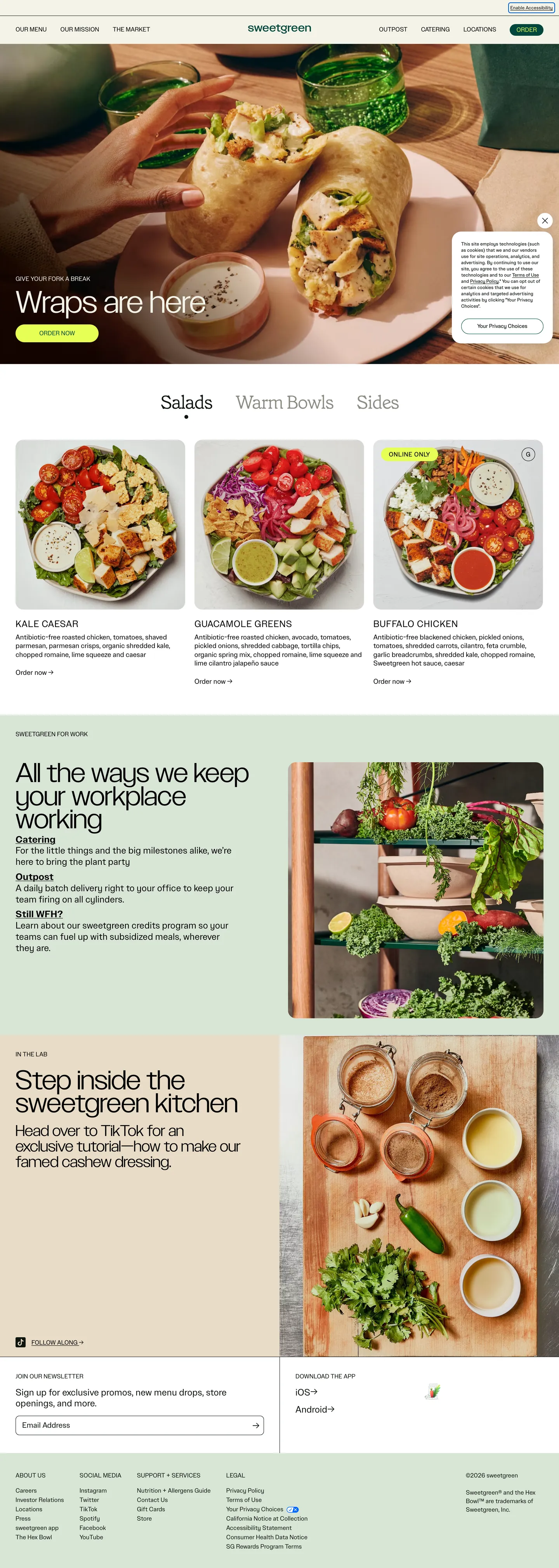
sweetgreen's web flagship reads like a printed café menu translated to the screen — a cream paper canvas ("#f4f3e7") instead of pure white, near-black ink ("#0e150e") for body, a single forest voltage ("#00473c") on the order button, and one electric chartreuse note ("#e6ff55") locked to that button's label. The hero word "Wraps" renders at 80px / 400 in SweetSans Display over a wrap-on-cutting-board photograph; a tiny Grenette italic serif at weight 200 hides inside the in-image CTA — the single editorial flourish in an otherwise photographic, uppercase, sans-only page.
This DESIGN.md packages the system into a single machine-readable spec. Inside: 18 colors tokens grouped into canvas, forest, chartreuse, ink, oxblood-footer, and sage-em roles; 15 SweetSans typography tiers running from 12px footer fine print to an 80px hero display plus the lone 48px Grenette italic CTA face; 4 spacing tokens anchored on an 8px / 24px rhythm; 6 radii tokens dominated by 20px food cards (18 occurrences) and 1000px pill buttons (5 occurrences); and 22 components covering the photo-hero, food card grid, day-part tabs ("Salads / Warm Bowls / Sides"), workplace order rail, kitchen tutorial split, newsletter input, and footer surface.
Feed the file to Claude, Cursor, or GitHub Copilot and the agent reproduces sweetgreen's restraint — the cream canvas, the forest-green pill with chartreuse label, the uppercase 16px nav voice, the photo-first food cards — rather than a generic shadcn theme. Where most quick-service-restaurant brands stack a tomato-red CTA over a white canvas with a bold sans-serif marquee, sweetgreen inverts every default: cream over white, forest over red, photography over typography, lowercase wordmark over an all-caps logotype. The lesson worth studying is the two-token CTA discipline — most brands ship one accent and tint it for the label; sweetgreen ships two non-overlapping voltages and pairs them only inside the one shape they want you to tap.
What makes it distinct
5
- Cream paper canvas (`#f4f3e7`)the brand never uses pure white as the page floor, even on product cards
- Two-token CTAforest green ("#00473c") fill with electric chartreuse ("#e6ff55") label, the only chartreuse moment on the page
- Universal 1000px full-pill buttons paired with 20px rounded-rectangle food cardsappearing 18 times in the radii table
- Two-typeface splitSweetSans handles 14 of 15 type tiers; Grenette serif italic at weight 200 surfaces only inside the wraps-CTA button
- Oxblood ("#a72700") scoped to footer surface onlynever a CTA, never a section header
sweetgreen.com
Live at sweetgreen.com
A snapshot of the brand in production. Scroll the frame to see the whole page.
Colors
18 colors
sweetgreen's system runs on #00473c as its primary voltage, used in 1 of 22 components. Type is set in SweetSansText across 15 tokens from 12px to 80px, weights 200–700. Shape language is soft — components average 18px corner radius, with no sharp interactive edges.
Brand & Accent
Sparing, CTA-only voltage · 2
Surface
Page and card backgrounds · 4
Text
Headlines, body, captions · 6
Borders & Hairlines
Dividers, outlines, rules · 1
Other
Specialty colors · 5
Typography
15 type tokens
Set in SweetSansText across 15 tokens, from 12px to 80px, weights 200–700. Shown in its own stack: where the font isn't installed, the fallback the file names stands in.
- display-hero80px · weight 400 · lh 0.85The quick brown fox jumps over the lazy dog
- display-lg70px · weight 400 · lh 0.85The quick brown fox jumps over the lazy dog
- display-md40px · weight 400 · lh 1The quick brown fox jumps over the lazy dog
- cta-serif48px · weight 200 · lh 1 · tracking -2.25pxThe quick brown fox jumps over the lazy dog
- heading-uppercase24px · weight 400 · lh 1.2 · tracking 0.72pxThe quick brown fox jumps over the lazy dog
- heading-emphasis24px · weight 700 · lh 1.2The quick brown fox jumps over the lazy dog
- body-lg24px · weight 400 · lh 1.2The quick brown fox jumps over the lazy dog
- body-md18px · weight 400 · lh 1.25The quick brown fox jumps over the lazy dog
- body-sm16px · weight 400 · lh 1.375The quick brown fox jumps over the lazy dog
- eyebrow16px · weight 400 · lh 1 · tracking 0.8pxThe quick brown fox jumps over the lazy dog
- nav-link16px · weight 400 · lh 1The quick brown fox jumps over the lazy dog
- button-md16px · weight 400 · lh 1The quick brown fox jumps over the lazy dog
- input-md20px · weight 400 · lh 1.2The quick brown fox jumps over the lazy dog
- caption12px · weight 400 · lh 1.33 · tracking 0.2pxThe quick brown fox jumps over the lazy dog
- footer-link14px · weight 400 · lh 1.3The quick brown fox jumps over the lazy dog
Layout
Radii and spacing
6 corner radii and 9 spacing values. Shape language: soft.
Radii
- none0px
- sm4px
- md10px
- lg20px
- xl24px
- full1000px
Spacing
- xxs4px
- xs8px
- sm16px
- md24px
- base40px
- lg60px
- xl100px
- gutter24px
- nav-height72px
Components
22 components
Each rendered from its tokens (color, type, radius, padding) on sweetgreen's own canvas.
- Button Primarybutton-primaryButton Primary
- Button Primary Hoverbutton-primary-hoverButton Primary Hover
- Button Secondarybutton-secondaryButton Secondary
- Button Hero Photobutton-hero-photoButton Hero Photo
- Top Navtop-navTop Nav
- Nav Linknav-linkNav Link
- Hero Photo Blockhero-photo-blockHero Photo Block
- Hero Headlinehero-headlineHero Headline
- Hero Eyebrowhero-eyebrowHero Eyebrow
- Day Part Tab Activeday-part-tab-activeDay Part Tab Active
- Day Part Tab Inactiveday-part-tab-inactiveDay Part Tab Inactive
- Food Cardfood-cardFood Card
- Food Card Titlefood-card-titleFood Card Title
- Food Card Metafood-card-metaFood Card Meta
- Feature Band Workplacefeature-band-workplaceFeature Band Workplace
- Feature Band Kitchenfeature-band-kitchenFeature Band Kitchen
- Feature Headlinefeature-headlineFeature Headline
- Type here…text-inputText Input
- Newsletter Submitnewsletter-submitNewsletter Submit
- FooterfooterFooter
- Footer Linkfooter-linkFooter Link
- Social Iconsocial-iconSocial Icon
In use
The system, in use
sweetgreen's tokens on the kind of product it builds.
Build something people actually use.
A short paragraph of marketing copy that previews how the brand's display tier and body tier read together. Two sentences is usually enough.
FAQ
sweetgreen design system FAQ
Common questions about sweetgreen's tokens, components, and how to use this DESIGN.md in your project.
Read next
Related reading
Specs, directories, and component libraries that pair with this design system.
- Browse all design systemsThe full directory of DESIGN.md files on shadcn.io, with live mockups for each.shadcn.io
- sweetgreen — official siteThe cream-canvas fast-casual flagship this DESIGN.md was extracted from.sweetgreen.com (opens in a new tab)
- The DESIGN.md specificationGoogle Labs' open spec for machine-readable design system files.github.com (opens in a new tab)
Use it
Use sweetgreen in your project
One machine-readable file. Drop it into Claude, Cursor, or any AI tool that reads DESIGN.md.
Download the DESIGN.md
One machine-readable file: every color, type, radius, spacing, and component token of sweetgreen.
Feed it to your AI tool
Drop it into Claude, Cursor, or GitHub Copilot. The agent writes React components and Tailwind classes that match sweetgreen's visual language.
Reference the tokens directly
Or paste the values into your Tailwind config, CSS variables, or component library: every color, size and radius is a quoted, ready-to-copy value.
Read the full DESIGN.md: overview, rationale, do’s and don’ts
Overview
sweetgreen's web flagship reads like printed café signage put on a screen — a warm paper cream ({colors.canvas} — #f4f3e7) replaces the default white canvas, near-black ink ({colors.ink} — #0e150e) carries body and nav, a deep forest ({colors.primary} — #00473c) fills the single primary CTA pill, and an electric chartreuse ({colors.primary-on} — #e6ff55) sits on top of that fill as the button's label. The chartreuse appears nowhere else on the page; total occurrence in the extracted palette is 5, all bound to the Order pill. Where most quick-service restaurant brands stack a tomato-red CTA over a white canvas and shout in 700-weight headings, sweetgreen inverts every default: cream over white, forest over red, weight 400 across nearly the entire type system, photography over typographic muscle.
Type runs SweetSans (display) and SweetSansText (body and chrome) — a single in-house family carrying 14 of 15 type tiers. Display tucks at 80px / 400 over the hero photo; supporting headings render at 24px / 400 uppercase with a tight 0.72px tracking. The lone exception is the in-photo CTA button, which switches to Grenette — a serif italic at weight 200 with -2.25px letter-spacing — for exactly one editorial flourish. The button-level type contrast (sans-uppercase 16px voice everywhere, serif-italic 48px voice once) is the system's signature typographic moment.
The shape language is consistent. Buttons sit on a 1000px full-pill radius ({rounded.full}, five extracted occurrences), food cards take a 20px rounded-rectangle ({rounded.lg}, 18 extracted occurrences — the dominant radius on the page), the newsletter input softens to 10px ({rounded.md}), and there are essentially no hard 0px corners except the full-bleed footer band and the hero photo crop. Section feature bands (workplace, kitchen) use sage paper ({colors.surface-sage} — #d8e5d6) and a wheat paper tint ({colors.surface-paper} — #e8dcc6) to break the cream canvas without introducing a new chromatic voltage.
Key Characteristics:
- Two-token CTA discipline: forest fill plus chartreuse label, never used apart. The page has exactly one repeating button voltage — the Order pill at 30px height with
7px 16px 5pxpadding. Where most brands ship one accent and tint it for the label, sweetgreen ships two non-overlapping voltages and pairs them inside one shape. - Cream as canvas:
--body-coloris#f4f3e7in CSS, not#ffffff. Pure white only appears inside the newsletter input and a few tiny icon backgrounds. - Uppercase 16px nav voice: nav links, day-part tabs ("Salads / Warm Bowls / Sides"), food-card titles, and footer column heads all render at 16px / 400 uppercase. The page reads as a printed menu board.
- 80px hero, 24px everything else: a single dramatic display tier (80px / 400) at the top of the page; every other heading drops to 24px. The system has no mid-tier display weight — it is hero or it is chrome.
- Photo-first food cards: 20px-rounded photo with the dish name beneath in uppercase, no card surface, no shadow, no hairline. The photograph IS the card.
- Sage paper feature bands: long horizontal bands use
{colors.surface-sage}(#d8e5d6) or{colors.surface-paper}(#e8dcc6) instead of color washes — neutral paper tints rather than chromatic backgrounds keep the cream-page temperature consistent. - Oxblood scoped to footer:
{colors.footer-bg}(#a72700) reverses the entire footer band against cream chrome above — the only red surface on the page, never used as a CTA.
Menu-as-page: sweetgreen's homepage treats every heading like a printed menu board — uppercase, weight 400, 0.72px tracking, sans-serif — and lets photography carry every visual claim. This is not a marketing site that happens to sell food; it is a digital menu that happens to be a marketing site.
Colors
Brand & Accent
- Forest Green (
{colors.primary}—#00473c) — frequency 15. Used as text (8), border (6), background (1). The CTA fill for the Order pill and the small forest chrome around the order rail. The system's load-bearing brand voltage. - Electric Chartreuse (
{colors.primary-on}—#e6ff55) — frequency 5. Used as background (4), text (1). The Order pill label color and nothing else — the brightest single moment on the page, paired only with{colors.primary}and never used independently.
Canvas & Surfaces
- Cream Canvas (
{colors.canvas}—#f4f3e7) — frequency 41. Used as text-on-dark (19), border (19), background (3). Defined in CSS as--body-color. The page floor and the footer text color when reversed. - Surface Sage (
{colors.surface-sage}—#d8e5d6) — frequency 3. Used as background (3). Long horizontal feature band background for "All the ways we keep your workplace working" — paper-toned, not chromatic. Also wired into--em-color. - Surface Paper (
{colors.surface-paper}—#e8dcc6) — frequency 1. Used as background (1). Second-tier feature band tint for "Step inside the sweetgreen kitchen" — a wheat-paper warm. - White (
{colors.surface-white}—#ffffff) — frequency 3. Used as background (3). Scoped to the newsletter input field, social-icon plates, and a few tight surface fills. Never the page floor.
Text & Ink
- Ink (
{colors.ink}—#0e150e) — frequency 185. Used as text (92), border (91), shadow (2). The dominant text color and hairline tone. Wired to--text-color,--border-color,--button-hover-color,--button-hover-border-color. Not pure black — a very dark green-tinted ink. - Pure Black (
{colors.ink-pure}—#000000) — frequency 440. Used as text (220), border (220). Scoped to food card titles like "Kale Caesar", "Shroomami", "Buffalo Chicken" and the tap-highlight color — the highest-contrast text tier reserved for product names only. - Muted (
{colors.muted}—#8c8c82) — frequency 4. Used as text (2), border (2). Caption color for fine print and inline metadata. - Muted Mid (
{colors.muted-mid}—#555555) — frequency 2. Used as text (1), border (1). A secondary muted tone for legal small caps. - Placeholder (
{colors.placeholder}—#b2b2b2). Used as text (placeholder only). Wired to--placeholder-txt— newsletter input placeholder color.
Footer & Scoped Chrome
- Oxblood (
{colors.footer-bg}—#a72700). Used as background (footer band only). Wired to--footer-color. Reverses the entire footer against the cream chrome above — the only red surface on the page. Never a CTA, never a section header. - Tap Highlight (
{colors.tap-highlight}—rgba(0, 0, 0, 0.35)) — the touch ripple color wired to--tap-highlight-color. - Focus Ring (
{colors.focus-ring}—#e59700) — an amber outline wired to--outline-color. Appears only on keyboard focus, scoped to a11y states.
Typography
Font Families
The system runs SweetSans (display) and SweetSansText (body, nav, chrome) — a single in-house family covering 14 of 15 tokens. Fallbacks walk system-ui, -apple-system, "Segoe UI", Roboto, "Helvetica Neue", Arial, sans-serif.
Grenette (a serif italic at weight 200 with -2.25px letter-spacing) surfaces in exactly one place: the in-photo CTA button on the hero block. Fallbacks walk Georgia, Cambria, Palatino, "Times New Roman", Times, serif.
Hierarchy
| Token | Size | Weight | Line Height | Letter Spacing | Use |
|---|---|---|---|---|---|
{typography.display-hero} | 80px | 400 | 0.85 | 0 | Hero word ("Wraps") over the food photograph |
{typography.display-lg} | 70px | 400 | 0.85 | 0 | Feature-band headlines ("All the ways we keep your workplace working") |
{typography.display-md} | 40px | 400 | 1 | 0 | Secondary feature headings |
{typography.cta-serif} | 48px | 200 | 1 | -2.25px | Grenette serif italic, used only inside the in-photo CTA button — "Wraps are here" |
{typography.heading-uppercase} | 24px | 400 | 1.2 | 0.72px (UC) | Food-card titles inside the day-part grid; uppercase nav-style |
{typography.heading-emphasis} | 24px | 700 | 1.2 | 0 | A single weight-700 emphasis variant — used on emphasized inline anchor text |
{typography.body-lg} | 24px | 400 | 1.2 | 0 | Large running body inside feature bands |
{typography.body-md} | 18px | 400 | 1.25 | 0 | Default body paragraph copy |
{typography.body-sm} | 16px | 400 | 1.375 | 0 | Card meta lines and short descriptive copy |
{typography.eyebrow} | 16px | 400 | 1 | 0.8px (UC) | Small uppercase eyebrow labels above hero headings |
{typography.nav-link} | 16px | 400 | 1 | 0 (UC) | Top-nav links and day-part tabs |
{typography.button-md} | 16px | 400 | 1 | 0 | Standard CTA pill label |
{typography.input-md} | 20px | 400 | 1.2 | 0 | Newsletter input typed value |
{typography.caption} | 12px | 400 | 1.33 | 0.2px | Fine print, legal, footer micro-copy |
{typography.footer-link} | 14px | 400 | 1.3 | 0 | Footer column link rows |
Principles
Weight 400 carries the entire system. Display does not lean on bold weight to assert hierarchy — it scales up (24 → 70 → 80px) instead. The only weight-700 token is a single emphasis variant used inline on anchors; there is no h1 / h2 / h3 weight ladder in the traditional sense.
The single typographic flourish is the 48px Grenette serif italic at weight 200, used inside one button on the hero photo. That contrast — the entire page in confident sans-uppercase, one button in whisper-light serif italic — is the system's signature moment. Whisper-as-signature: the loudest CTA on the page also carries the lightest font weight.
Note on Font Substitutes
If SweetSans / SweetSansText are unavailable, Inter or Manrope are reasonable open-source substitutes; both sit at similar x-height and stroke weight at 400. For Grenette, the closest open-source matches are Italiana or Cormorant Garamond at Light Italic — both share the high-contrast serif-italic feel at weight 200.
Layout
Spacing System
- Base unit: 8px (with 4px micro-step).
- Tokens:
{spacing.xxs}4px ·{spacing.xs}8px ·{spacing.sm}16px ·{spacing.md}24px ·{spacing.base}40px ·{spacing.lg}60px ·{spacing.xl}100px. - Extracted dominant spacings:
8pxappears 24 times (the workhorse),24pxappears 11 times (gutter),4px10 times (micro),0px 40px8 times (top-nav horizontal padding shorthand). - Top nav padding:
0px 40px(left/right). Nav height--nav-heightis locked to 72px. - Feature band padding:
60px 0pxvertical. Wide horizontal bands sit at60pxof stacked breathing room — wider than a typical SaaS marketing page. - Hero CTA button padding:
15px 60px 13px— generous horizontal stretch so the serif italic word reads as a typographic moment, not a button.
Grid & Container
- Max content width:
--maxwidth90rem (1440px). - Narrow content cap:
--maxwidth-narrow40.5625rem (650px) — used inside long-form editorial paragraphs. - Grid:
--gridisrepeat(12, minmax(10px, 1fr))— a 12-column system with 24px gutters (--gutter). - Day-part grid: 3-column food card stack at desktop ("Kale Caesar / Shroomami / Buffalo Chicken"), collapsing to 1-column at mobile.
- Feature bands: 2-column at desktop (text left, photograph right) — bands stack to 1-column at narrow widths.
Whitespace Philosophy
The page reads as a printed menu — generous vertical air between bands (60px), tight rhythm within cards (8px / 16px), and a 1440px content cap that lets the cream canvas breathe at the page edges. Food cards sit tight to one another in the day-part grid (24px gutter) so the menu reads as a single composition rather than three isolated dishes.
Elevation
The system has no shadow tier in the extracted page. Surfaces separate via tonal contrast and corner rounding rather than layered shadows.
- Flat (no shadow): every band, every card, every button, the footer. The system either has no elevation cue or relies on color separation.
- Cards float on photography: food cards have no card surface — the photograph itself is the elevation cue, clipped at
{rounded.lg}(20px). The cream page beneath shows through where the photo ends. - Feature bands use tonal steps: workplace band sits on
{colors.surface-sage}paper, kitchen band on{colors.surface-paper}wheat — these are color-contrast surfaces, not shadow-elevated ones. - Focus ring: the single elevated state is the keyboard focus outline at
{colors.focus-ring}(#e59700). Reserved for a11y only.
Photo-as-elevation: where most consumer brands ship a shadow definition and apply it everywhere, sweetgreen ships zero shadows and relies on the food photograph against the cream page floor to do the elevation work. The shape sits on the page; the page does not lift.
Shapes
{rounded.full}(1000px) — 5 occurrences: every CTA button, the social icon plates, and the in-photo serif CTA. The full pill is the universal button shape.{rounded.lg}(20px) — 18 occurrences: the dominant page radius. Used on food cards, hero photo block, feature-band photographs, and the workplace / kitchen split images.{rounded.xl}(24px) — 1 occurrence: a single oversized card on the workplace feature band.{rounded.md}(10px) — 1 occurrence: the newsletter input field.{rounded.sm}(4px) — 4 occurrences: small micro-radii on inline chips and footer locator components.{rounded.none}(0px): the hero photo crop edge and the full-bleed oxblood footer band.
The shape system is bimodal: buttons are fully round, cards are softly rounded at 20px, and a tiny 4px / 10px tail covers inputs and small chips. There are no mid-tier radii between 10px and 20px.
Components
Buttons
button-primary — Forest fill ({colors.primary} — #00473c), chartreuse label ({colors.primary-on} — #e6ff55), 1000px pill ({rounded.full}), 7px 16px 5px padding (note the asymmetric vertical), 30px height, 16px SweetSansText label, weight 400. The single most identifiable component — the "Order" CTA.
button-primary-hover — On hover the fill flips to {colors.ink} and the label flips to {colors.canvas} — wired via CSS variables --button-hover-color and --button-hover-text-color. The chartreuse voltage drops out on hover, which preserves it as a rest-state-only signal.
button-secondary — Transparent fill, ink text, 1px hairline border at {colors.hairline}, same 30px / 1000px geometry as the primary.
button-hero-photo — The single Grenette serif italic CTA. Cream fill ({colors.canvas}), ink label in {typography.cta-serif} (48px / 200, -2.25px tracking, capitalize), 15px 60px 13px padding. Sits on top of the hero food photograph — the system's signature typographic moment.
Top Navigation
top-nav — Cream surface ({colors.canvas} — matches the page canvas), 72px height (--nav-height), 0px 40px horizontal padding, no bottom hairline. The lowercase wordmark sits flush left, primary nav links sit centered ("Menu", "Locations", "Careers", "Values"), the Order pill sits flush right.
nav-link — Ink text in {typography.nav-link} (16px / 400 uppercase). No underline, no chip background, no active rule.
Hero
hero-photo-block — A full-width photograph of food in a 20px-clipped rectangle ({rounded.lg}), occupying the full width above the day-part grid. No overlay, no scrim — the photograph carries the entire hero.
hero-eyebrow — Cream uppercase eyebrow text in {typography.eyebrow} (16px / 400, 0.8px tracking, uppercase), placed over the photograph above the hero word.
hero-headline — Cream display text in {typography.display-hero} (80px / 400). One word per hero ("Wraps"), letting the photograph beneath dominate.
Day-Part Section
day-part-tab-active — Ink fill, cream text, 1000px pill, 5px 30px 40px padding (the asymmetric vertical creates a generous below-button area where the active state breathes against the cream page). Carries the day-part name in {typography.nav-link} (16px / 400 uppercase).
day-part-tab-inactive — Transparent fill, ink text. Becomes active on click.
food-card — A photo-first card. 20px-clipped photograph ({rounded.lg}), uppercase product name in {typography.heading-uppercase} beneath at 24px / 400 with 0.72px tracking. No card surface, no shadow, no border — the photograph is the card.
food-card-title — Pure-black text ({colors.ink-pure} — #000000), the highest-contrast tier in the system, scoped to product names only.
food-card-meta — Muted text ({colors.muted} — #8c8c82) for kcal / price / "Order now" type metadata.
Feature Bands
feature-band-workplace — Sage paper surface ({colors.surface-sage} — #d8e5d6), 20px rounded outer ({rounded.lg}), 60px 0px vertical padding. Holds the "All the ways we keep your workplace working" headline and a paired photograph of food on a counter.
feature-band-kitchen — Wheat paper surface ({colors.surface-paper} — #e8dcc6), same geometry as workplace. Holds the "Step inside the sweetgreen kitchen" headline and a tutorial photograph.
feature-headline — Ink text in {typography.display-lg} (70px / 400). The largest typographic moment outside the hero word.
Forms
text-input — White surface ({colors.surface-white}), 1px hairline outline at {colors.hairline} (#0e150e), 10px radius ({rounded.md}), 50px height, 12px 50px 12px 16px padding (the asymmetric right padding leaves room for the inline submit button). Typed value in {typography.input-md} (20px / 400 SweetSansText).
newsletter-submit — Ink fill, cream text — sits inline-right inside the input field; same 1000px pill geometry as {component.button-primary} but uses the ink/cream voltage instead of forest/chartreuse, because it's a secondary action that shouldn't compete with the Order CTA.
Footer
footer — Oxblood surface ({colors.footer-bg} — #a72700), cream text ({colors.footer-ink} — #f4f3e7), 60px 40px padding. The only red surface on the page; reverses the entire footer band against the cream chrome above.
footer-link — Cream text in {typography.footer-link} (14px / 400). No underline at rest.
social-icon — A 24px circular ink icon. Sits flush-right inside the footer band.
Do's and Don'ts
Do
- Use
{colors.canvas}(#f4f3e7) as the page floor, never#ffffff. Pure white is reserved for the newsletter input and small icon plates. - Pair
{colors.primary}(#00473c) and{colors.primary-on}(#e6ff55) only inside the Order pill. The two voltages are one CTA token, not two color tokens. - Render food card titles in
{colors.ink-pure}(#000000) — the only place pure black should appear as text. - Use
{rounded.lg}(20px) on every card, hero photo, and feature-band image. It's the dominant radius (18 of 30 extracted occurrences). - Keep the 16px uppercase voice on nav links, day-part tabs, food-card titles, and footer column heads — the page reads as a printed menu board.
- Use
{colors.surface-sage}and{colors.surface-paper}to break the cream canvas — they are paper tints, not color washes.
Don't
- Don't use
{colors.primary-on}(#e6ff55) anywhere outside the Order pill label. Chartreuse total page occurrence is 5; spreading it across badges or hover washes flattens the only true brand voltage on the page. - Don't use
{colors.footer-bg}(#a72700) as a CTA fill — oxblood is wired to--footer-colorand is the only red surface on the page; reusing it elsewhere fights the menu-board palette discipline. - Don't render product names like "Kale Caesar" in
{colors.ink}(#0e150e) — they specifically use pure black#000000at 220 / 220 text/border occurrences. The single-step contrast jump from ink to pure black is the system's product-emphasis cue. - Don't reach for a weight-700 display heading. The system caps display at weight 400 and scales for hierarchy. Bold display weights read as a different brand.
- Don't ship a 12px or 16px radius on cards — the system jumps from 10px (input only) straight to 20px. Mid-tier radii read off-brand.
- Don't add a shadow tier. The extracted system has zero shadow definitions; food cards float on the cream page floor via 20px corner clipping and tonal contrast alone.
- Don't substitute Grenette with a standard text serif at weight 400. The whole point is the weight-200 italic whisper at
-2.25pxtracking — a Georgia regular kills the effect.
Known Gaps
- Order flow surfaces: the extracted page is the marketing homepage only — menu detail, customization sheet, bowl builder, cart, and account dashboard are not captured. The bowl-builder interaction patterns, size selector, and ingredient swap chips are missing from this spec.
- Loyalty / SG Rewards: status surfaces and the rewards dashboard are not included; gold or rewards-tier ceremony colors are not present in the extracted palette.
- Mobile breakpoint tuning: CSS tokens (
--nav-height72px,--maxwidth90rem,--gutter1.5rem) describe the system, but actual mobile sheet behavior and tap-target padding aren't visible in the desktop capture. - Dark mode: the system ships light-only; no dark palette is declared in
:rootCSS variables. - Hover and focus state coverage: the primary button hover flip (
--button-hover-colorto ink) is captured, but full input focus state combinations, link hover treatments, and tab focus-visible patterns are partially documented from CSS variables. - Sub-brand and partnership palettes: any co-branded or sub-brand surfaces (corporate catering, Outpost, etc.) live on separate paths and are not captured here.
Food & Delivery
More systems like this
More DESIGN.md files in Food & Delivery.
Pricing
Build it with Pro
The DESIGN.md files are free. Pro adds 6,000+ blocks, premium templates and the MCP server, so your AI editor builds in your system for you.
4.9/5 out of 5 · 150+ reviewsfrom 150+ founders and developers.
Billing
Billed once a year in USD. Cancel anytime.
- How many people can use the license.
- Client work, SaaS products and anything you charge for.
- Production-ready React sections: hero, pricing, features, dashboards and more.
- Complete multi-page sites you can ship as they are.
- React icons from every major library, installable with one command.
- Presets that restyle every block, in light and dark.
- Lets your AI editor search, preview and install blocks for you.
- Priority requests are answered first.
Individual
For personal projects & open source
$32instead of $49/mo
$389 billed yearly
- Seats: 1 seat
- Commercial use: Personal & open source only
- Pro blocks: 6,000+ blocks
- Templates: All 14 templates
- React icons: 294k+ icons
- Themes: All 59 themes
- MCP server: Basic usage
- Support: Standard
Team
Most popularFor freelancers, agencies & startups
$66instead of $99/mo
$789 billed yearly · ≈ $13/dev/mo
- Seats: Up to 5 seats
- Commercial use: Included
- Pro blocks: 6,000+ blocks
- Templates: All 14 templates
- React icons: 294k+ icons
- Themes: All 59 themes
- MCP server: High usage
- Support: Priority
Organization
For companies with larger teams
$132instead of $199/mo
$1,589 billed yearly
- Seats: Unlimited seats
- Commercial use: Included
- Pro blocks: 6,000+ blocks
- Templates: All 14 templates
- React icons: 294k+ icons
- Themes: All 59 themes
- MCP server: Unlimited usage
- Support: Priority
Billed once a year in USD. Cancel anytime.
Individual
For personal projects & open source
$32instead of $49/mo
$389 billed yearly
- How many people can use the license.Seats: 1 seat
- Client work, SaaS products and anything you charge for.Commercial use: Personal & open source only
- Production-ready React sections: hero, pricing, features, dashboards and more.Pro blocks: 6,000+ blocks
- Complete multi-page sites you can ship as they are.Templates: All 14 templates
- React icons from every major library, installable with one command.React icons: 294k+ icons
- Presets that restyle every block, in light and dark.Themes: All 59 themes
- Lets your AI editor search, preview and install blocks for you.MCP server: Basic usage
- Priority requests are answered first.Support: Standard
Team
Most popularFor freelancers, agencies & startups
$66instead of $99/mo
$789 billed yearly · ≈ $13/dev/mo
Everything in Individual, plus
- How many people can use the license.Seats: Up to 5 seats
- Client work, SaaS products and anything you charge for.Commercial use: Included
- Lets your AI editor search, preview and install blocks for you.MCP server: High usage
- Priority requests are answered first.Support: Priority
Organization
For companies with larger teams
$132instead of $199/mo
$1,589 billed yearly
Everything in Team, plus
- How many people can use the license.Seats: Unlimited seats
- Lets your AI editor search, preview and install blocks for you.MCP server: Unlimited usage
- Secure checkout via Stripe
- Code lives in your repo
- Keep what you've shipped if you cancel
- License terms
Your system, built for you
Every block, template and icon, installed by your AI agent in your design system. The DESIGN.md files stay free.