Supabase Inspired Design System
Supabase's design system as a DESIGN.md file. Emerald #3ecf8e, Circular at weight 500, 27 colors, 16 components. For React, Next.js, and AI tools.
Add shadcn.io to your AI agent. · Pro It installs blocks, icons and templates in your design system from a prompt, with Pro.
Set up MCP- Primary
- #3ecf8e
- Typeface
- Circular
- Shape
- Mixed
- Base radius
- 8px
- Colors
- 27
- Type tokens
- 12
- Components
- 16
- Spacing values
- 8
About
About Supabase Inspired DESIGN.md
Curated by Dov Azencot · Updated May 12, 2026 · Source supabase.com (opens in a new tab)
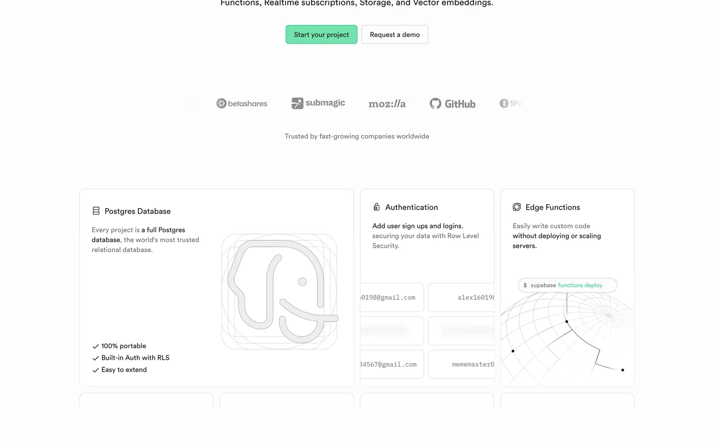
Supabase's design language is the open-source Postgres platform translated into a near-monochrome marketing surface. The canvas commits to pure white (#ffffff), text sits in near-black (#171717), and the only chromatic event across the entire page is a single emerald green (#3ecf8e) — used as the filled CTA background, the dot accent in the wordmark, and an occasional indicator. Everything else is a calibrated grey ladder from #ededed hairlines through #707070 mute text up to #171717 ink. There is no atmospheric gradient, no full-bleed photography, no dark marketing track. The brand commits to white the way Stripe commits to indigo gradients — with conviction.
This page packages the system into a single DESIGN.md file in the Google Labs open spec. Inside: 27 colors tokens (3 emerald variants, 8 accent points reserved for chart and logo work, 5 surface fills, 6 text grades), 13 typography styles running Circular at weight 500 for display and 400 for body, 6 radius tokens topping out at 16px, an 8-token spacing scale anchored at 8px, and 16 components recipes spanning the green primary button, the inverted dark pricing tier, the canvas-night code block at #1c1c1c, and the composited product UI mockup pattern that does most of the page's visual work.
Feed the file to Claude, Cursor, or GitHub Copilot and the agent reproduces Supabase's specific restraint — square-ish 6px buttons, near-black text on emerald (never white), display tracking pulled tight at -1.92px, and a white canvas that refuses to fill itself with gradients. Reference the tokens directly inside Tailwind config or use it as a brand audit checklist. The system is worth studying because it proves a developer-facing brand can ship marketing without a single decorative flourish — the product screenshots ARE the decoration.
What makes it distinct
5
- Single emerald voltage#3ecf8e fills CTAs, dot accents, and the wordmark; nothing else is chromatic on the page
- Near-black text on greenthe primary button uses #171717 ink on #3ecf8e, not white, which reads as a lit surface
- Display tier at weight 500 with -1.92px tracking at 64pxCircular pulled into engineered editorial density
- Composited product UI mockups are the brand's argumentdashboards and SQL editors replace illustrations and photography entirely
- Square-ish 6px button radiusnever pill-shaped; the brand reads as technical, not friendly
supabase.com
Live at supabase.com
A snapshot of the brand in production. Scroll the frame to see the whole page.
Colors
27 colors
Supabase Inspired's system runs on #3ecf8e as its primary voltage, used in 2 of 16 components. Type is set in Circular across 12 tokens from 12px to 64px, weights 400–500. Shape language is mixed across 16 components, blending pills, soft rounds, and squarer corners.
Brand & Accent
Sparing, CTA-only voltage · 11
Surface
Page and card backgrounds · 4
Text
Headlines, body, captions · 7
Borders & Hairlines
Dividers, outlines, rules · 5
Typography
12 type tokens
Set in Circular across 12 tokens, from 12px to 64px, weights 400–500. Shown in its own stack: where the font isn't installed, the fallback the file names stands in.
- display-xxl64px · weight 500 · lh 1.1 · tracking -1.92pxThe quick brown fox jumps over the lazy dog
- display-xl48px · weight 500 · lh 1.1 · tracking -1.44pxThe quick brown fox jumps over the lazy dog
- display-lg36px · weight 500 · lh 1.15 · tracking -0.72pxThe quick brown fox jumps over the lazy dog
- display-md28px · weight 500 · lh 1.2 · tracking -0.42pxThe quick brown fox jumps over the lazy dog
- heading-lg22px · weight 500 · lh 1.2The quick brown fox jumps over the lazy dog
- heading-md18px · weight 500 · lh 1.4The quick brown fox jumps over the lazy dog
- body-lg18px · weight 400 · lh 1.55The quick brown fox jumps over the lazy dog
- body-md16px · weight 400 · lh 1.5The quick brown fox jumps over the lazy dog
- button-md14px · weight 500 · lh 1The quick brown fox jumps over the lazy dog
- caption13px · weight 400 · lh 1.45The quick brown fox jumps over the lazy dog
- micro12px · weight 400 · lh 1.45The quick brown fox jumps over the lazy dog
- code14px · weight 400 · lh 1.5The quick brown fox jumps over the lazy dog
Layout
Radii and spacing
6 corner radii and 8 spacing values. Shape language: mixed.
Radii
- xs4px
- sm6px
- md8px
- lg12px
- xl16px
- full9999px
Spacing
- xxs2px
- xs4px
- sm8px
- md12px
- lg16px
- xl24px
- xxl32px
- huge64px
Components
16 components
Each rendered from its tokens (color, type, radius, padding) on Supabase's own canvas.
- Button Primary Greenbutton-primary-greenButton Primary Green
- Button Primary Green Pressedbutton-primary-green-pressedButton Primary Green Pressed
- Button Secondary Outlinebutton-secondary-outlineButton Secondary Outline
- Button On Darkbutton-on-darkButton On Dark
- Button Linkbutton-linkButton Link
- Type here…text-inputText Input
- Card Feature Lightcard-feature-lightCard Feature Light
- Card Pricingcard-pricingCard Pricing
- Card Pricing Featuredcard-pricing-featuredCard Pricing Featured
- Card Feature Darkcard-feature-darkCard Feature Dark
- Code Blockcode-blockCode Block
- Pill Tag Greenpill-tag-greenPill Tag Green
- Pill Tag Softpill-tag-softPill Tag Soft
- Nav Bar Lightnav-bar-lightNav Bar Light
- Link On Lightlink-on-lightLink On Light
- Footer Lightfooter-lightFooter Light
In use
The system, in use
Supabase's tokens on the kind of product it builds.
Build something people actually use.
A short paragraph of marketing copy that previews how the brand's display tier and body tier read together. Two sentences is usually enough.
FAQ
Supabase Inspired design system FAQ
Common questions about Supabase's tokens, components, and how to use this DESIGN.md in your project.
Read next
Related reading
Specs, directories, and component libraries that pair with this design system.
Use it
Use Supabase Inspired in your project
One machine-readable file. Drop it into Claude, Cursor, or any AI tool that reads DESIGN.md.
Download the DESIGN.md
One machine-readable file: every color, type, radius, spacing, and component token of Supabase Inspired.
Feed it to your AI tool
Drop it into Claude, Cursor, or GitHub Copilot. The agent writes React components and Tailwind classes that match Supabase Inspired's visual language.
Reference the tokens directly
Or paste the values into your Tailwind config, CSS variables, or component library: every color, size and radius is a quoted, ready-to-copy value.
Read the full DESIGN.md: overview, rationale, do’s and don’ts
Overview
Supabase's design language is engineered for clarity above all else. The marketing surfaces sit on {colors.canvas} (pure white #ffffff), with text rendered in {colors.ink} (#171717 — near-black, never pure black). Across the entire system the only consistent chromatic event is the emerald green primary ({colors.primary} — #3ecf8e) — used as the filled CTA, occasional accent dot, and the signature highlight color in the wordmark. Everything else is a calibrated grey ladder from #ededed hairline-cool to #171717 ink, with thin black-on-white typography doing most of the visual work.
Typography runs Circular at weight 500 for display and 400 for body. The display tier uses tight negative letter-spacing (-1.92px at 64px) to pull the rounded humanist letterforms into editorial density. There's no atmospheric gradient, no full-bleed photography, no dark-canvas marketing track — the brand commits to white.
The product itself appears as composited UI screenshots on every page: dashboard tables, SQL editors, query builders, log streams. These screenshots are the brand's argument. They sit inside {rounded.lg} 12px containers with subtle 1px hairlines, often arranged 2-up or in a floating "stacked panes" composition above the hero band.
Key Characteristics:
- Single emerald primary (
{colors.primary}#3ecf8e) as the only chromatic event; everything else is monochrome. - White canvas marketing track with greyscale hierarchy from
{colors.hairline-cool}(#ededed) to{colors.ink}(#171717). - Custom humanist sans display tier at weight 500 with negative letter-spacing of
-1.92pxto-0.42px. - Composited product UI screenshots (dashboard, SQL editor, log stream) are the dominant decorative element — never photography, never illustrations.
- Tight 6px / 8px button radii — square-ish, technical, never pill-shaped.
- Code blocks rendered in deep
{colors.canvas-night}(#1c1c1c) with monospace inline code; the brand's developer DNA is visible in every snippet. - Pricing tiers use a dark inverted
{colors.canvas-night}featured tier, not a green one — the green is reserved for buttons and dot accents. - Near-black
#171717text on the emerald button (not white) — the green reads as a "lit" surface with dark type, which is the brand's idiosyncratic choice.
Known Gaps
- In-product dashboard chrome: table header densities, SQL-editor syntax-highlighting palette, and log-stream row treatments live inside the product app and weren't captured on the public marketing surfaces.
- Focus rings: form inputs document the border and padding but not the focus-ring color, width, or offset on
:focus-visible. - Hover-state colors: beyond the documented pressed state at
{colors.primary-deep}(#24b47e), hover-state lifts on cards and link rows were not consistently observable. - Empty / loading / skeleton screens: not visible on the captured marketing pages.
- Toast and inline-alert system: semantic info / success / warning / error treatments aren't represented in the marketing track.
- Dark-mode marketing variant: the product app defaults to dark but the marketing site commits to white; the inverse mapping (which tokens swap in a dark marketing build) isn't captured.
Backend, Database & DevOps
More systems like this
More DESIGN.md files in Backend, Database & DevOps.
Pricing
Build it with Pro
The DESIGN.md files are free. Pro adds 6,000+ blocks, premium templates and the MCP server, so your AI editor builds in your system for you.
4.9/5 out of 5 · 150+ reviewsfrom 150+ founders and developers.
Billing
Billed once a year in USD. Cancel anytime.
- How many people can use the license.
- Client work, SaaS products and anything you charge for.
- Production-ready React sections: hero, pricing, features, dashboards and more.
- Complete multi-page sites you can ship as they are.
- React icons from every major library, installable with one command.
- Presets that restyle every block, in light and dark.
- Lets your AI editor search, preview and install blocks for you.
- Priority requests are answered first.
Individual
For personal projects & open source
$32instead of $49/mo
$389 billed yearly
- Seats: 1 seat
- Commercial use: Personal & open source only
- Pro blocks: 6,000+ blocks
- Templates: All 14 templates
- React icons: 294k+ icons
- Themes: All 59 themes
- MCP server: Basic usage
- Support: Standard
Team
Most popularFor freelancers, agencies & startups
$66instead of $99/mo
$789 billed yearly · ≈ $13/dev/mo
- Seats: Up to 5 seats
- Commercial use: Included
- Pro blocks: 6,000+ blocks
- Templates: All 14 templates
- React icons: 294k+ icons
- Themes: All 59 themes
- MCP server: High usage
- Support: Priority
Organization
For companies with larger teams
$132instead of $199/mo
$1,589 billed yearly
- Seats: Unlimited seats
- Commercial use: Included
- Pro blocks: 6,000+ blocks
- Templates: All 14 templates
- React icons: 294k+ icons
- Themes: All 59 themes
- MCP server: Unlimited usage
- Support: Priority
Billed once a year in USD. Cancel anytime.
Individual
For personal projects & open source
$32instead of $49/mo
$389 billed yearly
- How many people can use the license.Seats: 1 seat
- Client work, SaaS products and anything you charge for.Commercial use: Personal & open source only
- Production-ready React sections: hero, pricing, features, dashboards and more.Pro blocks: 6,000+ blocks
- Complete multi-page sites you can ship as they are.Templates: All 14 templates
- React icons from every major library, installable with one command.React icons: 294k+ icons
- Presets that restyle every block, in light and dark.Themes: All 59 themes
- Lets your AI editor search, preview and install blocks for you.MCP server: Basic usage
- Priority requests are answered first.Support: Standard
Team
Most popularFor freelancers, agencies & startups
$66instead of $99/mo
$789 billed yearly · ≈ $13/dev/mo
Everything in Individual, plus
- How many people can use the license.Seats: Up to 5 seats
- Client work, SaaS products and anything you charge for.Commercial use: Included
- Lets your AI editor search, preview and install blocks for you.MCP server: High usage
- Priority requests are answered first.Support: Priority
Organization
For companies with larger teams
$132instead of $199/mo
$1,589 billed yearly
Everything in Team, plus
- How many people can use the license.Seats: Unlimited seats
- Lets your AI editor search, preview and install blocks for you.MCP server: Unlimited usage
- Secure checkout via Stripe
- Code lives in your repo
- Keep what you've shipped if you cancel
- License terms
Your system, built for you
Every block, template and icon, installed by your AI agent in your design system. The DESIGN.md files stay free.