Stripe Inspired Design System
Stripe's design system as a DESIGN.md file. Indigo #533afd, Sohne 300, 20 colors, 15 components. For React, Next.js, and AI tools.
Add shadcn.io to your AI agent. · Pro It installs blocks, icons and templates in your design system from a prompt, with Pro.
Set up MCP- Primary
- #533afd
- Typeface
- sohne-var
- Shape
- Mixed
- Base radius
- 8px
- Colors
- 20
- Type tokens
- 15
- Components
- 15
- Spacing values
- 8
About
About Stripe Inspired DESIGN.md
Curated by Dov Azencot · Updated May 12, 2026 · Source stripe.com (opens in a new tab)
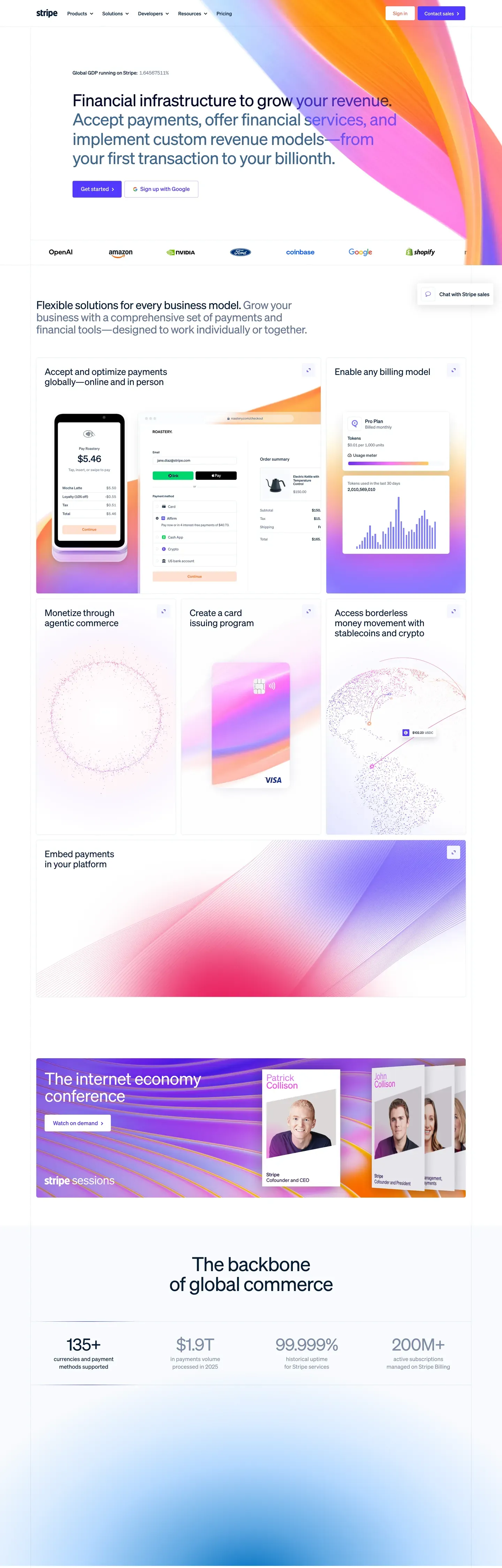
Stripe's design language is the modern reference for fintech marketing. One brand voltage (indigo #533afd). One proprietary typeface (Sohne at weight 300). One atmospheric gradient mesh — cream, sherbet orange, lavender, indigo, and ruby pink — washed across the upper third of nearly every marketing page. Deep navy ink #0d253d does all the body work, never pure black. Pill-shaped CTAs with tight 8x16px padding sit one-per-band, never two filled buttons competing in the same hero.
This page packages the full system into a single DESIGN.md file. Inside: 20 colors, 15 type tokens, 6 corner radii, 8 spacing values, and 15 components — buttons, dashboard mockup chrome, pricing card variants, the gradient mesh backdrop, and the tabular-figure body type that quietly signals the brand's financial DNA. Every hex is quoted; every token name is reproducible.
Feed the file to Claude, Cursor, or GitHub Copilot. The AI writes React components and Tailwind classes that match Stripe's editorial air — single-indigo CTA hierarchy, Sohne thin display tier, negative letter-spacing, dark-app dashboard composites — instead of a generic fintech theme. Inter at weight 300 with `font-feature-settings: "ss01"` substitutes for Sohne if you need an open-source path.
What makes it distinct
5
- Single voltage CTAindigo #533afd is the only filled button on marketing surfaces, one per band
- Sohne thin weight (300) display tiernegative tracking from -1.4px at 56px down to -0.2px at 20px
- Tabular figures via tnumevery money and numeric cell carries the brand's quiet financial-data signal
- Gradient mesh herocream, sherbet orange, lavender, indigo, and ruby pink washed across the upper third
- Dark-app dashboard trackdeep navy #1c1e54 mockups composited above the white canvas
stripe.com
Live at stripe.com
A snapshot of the brand in production. Scroll the frame to see the whole page.
Colors
20 colors
Stripe Inspired's system runs on #533afd as its primary voltage, used in 3 of 15 components. Type is set in sohne-var across 15 tokens from 10px to 56px, weights 300–400. Shape language is mixed across 15 components, blending pills, soft rounds, and squarer corners.
Brand & Accent
Sparing, CTA-only voltage · 6
Surface
Page and card backgrounds · 3
Text
Headlines, body, captions · 5
Borders & Hairlines
Dividers, outlines, rules · 2
Other
Specialty colors · 4
Typography
15 type tokens
Set in sohne-var across 15 tokens, from 10px to 56px, weights 300–400. Shown in its own stack: where the font isn't installed, the fallback the file names stands in.
- display-xxl56px · weight 300 · lh 1.03 · tracking -1.4pxThe quick brown fox jumps over the lazy dog
- display-xl48px · weight 300 · lh 1.15 · tracking -0.96pxThe quick brown fox jumps over the lazy dog
- display-lg32px · weight 300 · lh 1.1 · tracking -0.64pxThe quick brown fox jumps over the lazy dog
- display-md26px · weight 300 · lh 1.12 · tracking -0.26pxThe quick brown fox jumps over the lazy dog
- heading-lg22px · weight 300 · lh 1.1 · tracking -0.22pxThe quick brown fox jumps over the lazy dog
- heading-md20px · weight 300 · lh 1.4 · tracking -0.2pxThe quick brown fox jumps over the lazy dog
- heading-sm18px · weight 300 · lh 1.4The quick brown fox jumps over the lazy dog
- body-lg16px · weight 300 · lh 1.4The quick brown fox jumps over the lazy dog
- body-md15px · weight 300 · lh 1.4The quick brown fox jumps over the lazy dog
- body-tabular14px · weight 300 · lh 1.4 · tracking -0.42pxThe quick brown fox jumps over the lazy dog
- button-md16px · weight 400 · lh 1The quick brown fox jumps over the lazy dog
- button-sm14px · weight 400 · lh 1The quick brown fox jumps over the lazy dog
- caption13px · weight 400 · lh 1.4 · tracking -0.39pxThe quick brown fox jumps over the lazy dog
- micro11px · weight 300 · lh 1.4The quick brown fox jumps over the lazy dog
- micro-cap10px · weight 400 · lh 1.15 · tracking 0.1pxThe quick brown fox jumps over the lazy dog
Layout
Radii and spacing
6 corner radii and 8 spacing values. Shape language: mixed.
Radii
- xs4px
- sm6px
- md8px
- lg12px
- xl16px
- pill9999px
Spacing
- xxs2px
- xs4px
- sm8px
- md12px
- lg16px
- xl24px
- xxl32px
- huge64px
Components
15 components
Each rendered from its tokens (color, type, radius, padding) on Stripe's own canvas.
- Button Primary Pillbutton-primary-pillButton Primary Pill
- Button Primary Pill Pressedbutton-primary-pill-pressedButton Primary Pill Pressed
- Button Secondarybutton-secondaryButton Secondary
- Button On Darkbutton-on-darkButton On Dark
- Type here…text-inputText Input
- Type here…text-input-focusedText Input Focused
- Card Feature Lightcard-feature-lightCard Feature Light
- Card Pricingcard-pricingCard Pricing
- Card Pricing Featuredcard-pricing-featuredCard Pricing Featured
- Card Cream Bandcard-cream-bandCard Cream Band
- Card Dashboard Mockupcard-dashboard-mockupCard Dashboard Mockup
- Pill Tag Softpill-tag-softPill Tag Soft
- Nav Bar On Meshnav-bar-on-meshNav Bar On Mesh
- Link On Lightlink-on-lightLink On Light
- Footer Lightfooter-lightFooter Light
In use
The system, in use
Stripe's tokens on the kind of product it builds.
Build something people actually use.
A short paragraph of marketing copy that previews how the brand's display tier and body tier read together. Two sentences is usually enough.
FAQ
Stripe Inspired design system FAQ
Common questions about Stripe's tokens, components, and how to use this DESIGN.md in your project.
Read next
Related reading
Specs, directories, and component libraries that pair with this design system.
Use it
Use Stripe Inspired in your project
One machine-readable file. Drop it into Claude, Cursor, or any AI tool that reads DESIGN.md.
Download the DESIGN.md
One machine-readable file: every color, type, radius, spacing, and component token of Stripe Inspired.
Feed it to your AI tool
Drop it into Claude, Cursor, or GitHub Copilot. The agent writes React components and Tailwind classes that match Stripe Inspired's visual language.
Reference the tokens directly
Or paste the values into your Tailwind config, CSS variables, or component library: every color, size and radius is a quoted, ready-to-copy value.
Read the full DESIGN.md: overview, rationale, do’s and don’ts
Overview
Stripe's design language opens with the gradient mesh. A wide horizontal band of pastel cream #f5e9d4, sherbet orange #9b6829, lavender, electric indigo #533afd, and ruby pink #ea2261 occupies the upper third of nearly every marketing page — the brand's instantly-recognizable atmospheric backdrop. Type and product UI mockups float above it on {colors.canvas} (#ffffff), with the gradient acting as both decoration and visual anchor. The lower portion of the page returns to white, with feature explanations on {colors.canvas-soft} (#f6f9fc — a barely-tinted cool off-white) and dashboard product mockups composited as faux IDE/console panels in deep navy #1c1e54.
The color system has two primary roles. Indigo ({colors.primary} — #533afd) is the brand's signature CTA color, used sparingly: one filled pill per band. Deep navy ({colors.ink} — #0d253d) is the universal body text color and the fill of dashboard mockups, the featured pricing tier, and the dark-app surfaces on the dashboard track. Ruby ({colors.ruby} — #ea2261) and magenta ({colors.magenta} — #f96bee) appear inside the gradient mesh and as accent dots in product UI mockups; they are not used as button colors.
Typography is built around Sohne at weight 300 with negative letter-spacing — the brand's editorial-density display signature. Display sizes (32–56px) use -1.4px to -0.64px tracking; body sizes use 0; tabular caption sizes (where money and numerics matter) use the OpenType tnum feature plus a tightening -0.36 to -0.42px tracking. The ss01 stylistic set is enabled across all 16 type tokens.
Key Characteristics:
- Gradient-mesh backdrop on every marketing hero — cream #f5e9d4, sherbet orange #9b6829, lavender, indigo #533afd, and ruby pink #ea2261 horizontally washed across the upper third of the page.
- Single-indigo CTA hierarchy: filled
{colors.primary}(#533afd) pill is the only filled button on marketing surfaces, one per band. - Sohne thin (weight 300) display tier with negative tracking from -1.4px at 56px down to -0.2px at 20px.
- Tabular-figure body type (
body-tabular— 14px / 300 /tnum) for any cell containing money or numerics — the brand's quiet financial-data signal. - Dark-app dashboard track: deep navy #1c1e54 product UI mockups sit composited above the white canvas, frequently with rendered code or dashboard tables inside.
- Pill-shaped buttons (
{rounded.pill}9999px) with tight 8x16px padding — short, decisive, transactional. - Cream-band feature cards (
{colors.canvas-cream}— #f5e9d4) introduce a warm interlude between blue/white sections without breaking the brand's chromatic logic.
Colors
Source pages: home (
/),/payments,/pricing,dashboard.stripe.com/register/payments.
Brand & Accent
- Indigo (
{colors.primary}— #533afd): The brand's signature CTA color. Filled-pill button, link emphasis, gradient anchor. - Indigo Deep (
{colors.primary-deep}— #4434d4): A deeper indigo used in gradient mid-stops and as the press-state warmer alternative. - Indigo Press (
{colors.primary-press}— #2e2b8c): Pressed-state lift of the primary. - Indigo Soft (
{colors.primary-soft}— #665efd): A lighter indigo used in product-UI accents and chart highlights. - Indigo Subdued (
{colors.primary-bg-subdued-hover}— #b9b9f9): Pale indigo fill used as soft tag background. - Brand Dark 900 (
{colors.brand-dark-900}— #1c1e54): The deep navy used on the featured pricing tier and dashboard chrome. - Ruby (
{colors.ruby}— #ea2261): Gradient accent and chart highlight; never a button. - Magenta (
{colors.magenta}— #f96bee): Brighter pink stop in gradient meshes. - Lemon (
{colors.lemon}— #9b6829): Warm sherbet stop in gradient backdrops.
Surface
- Canvas (
{colors.canvas}— #ffffff): Default page background. - Canvas Soft (
{colors.canvas-soft}— #f6f9fc): Cool-tinted off-white used on feature bands beneath the gradient hero. - Canvas Cream (
{colors.canvas-cream}— #f5e9d4): Warm cream used as a feature-band fill — the brand's chromatic interlude. - Hairline (
{colors.hairline}— #e3e8ee): 1px borders on cards and tables. - Hairline Input (
{colors.hairline-input}— #a8c3de): Slightly cooler hairline used on form inputs.
Text
- Ink (
{colors.ink}— #0d253d): Default body text color across the brand. Deep navy, never pure black. - Ink Secondary (
{colors.ink-secondary}— #273951): Secondary text on white. - Ink Mute (
{colors.ink-mute}— #64748d): Helper text, captions, table labels. - Ink Mute 2 (
{colors.ink-mute-2}— #61718a): Near-equivalent to ink-mute used in nav. - On Primary (
{colors.on-primary}— #ffffff): Text on indigo / dark-navy surfaces.
Semantic
The brand does not use a separate semantic color palette in the marketing system — error / success states live in dashboard-product UI specifically.
Typography
Font Family
The display and UI tier is Sohne (proprietary, licensed from Klim Type Foundry) at weights 300 (thin) and 400 (regular). The variable font (sohne-var) is loaded with font-feature-settings: "ss01" enabled globally — the stylistic set substitutes a single-story a and other character variants that are part of the brand's typographic signature.
When Sohne is unavailable, fall back to SF Pro Display at thin weights, then system-ui. For maximum brand fidelity, Inter (open-source) at weight 300 with font-feature-settings: "ss01" and letter-spacing: -1.4px on display sizes approximates the rhythm closely.
Hierarchy
| Token | Size | Weight | Line Height | Letter Spacing | Use |
|---|---|---|---|---|---|
{typography.display-xxl} | 56px | 300 | 1.03 | -1.4px | Hero headline |
{typography.display-xl} | 48px | 300 | 1.15 | -0.96px | Section opener |
{typography.display-lg} | 32px | 300 | 1.1 | -0.64px | Card title / sub-section |
{typography.display-md} | 26px | 300 | 1.12 | -0.26px | Compact card title |
{typography.heading-lg} | 22px | 300 | 1.1 | -0.22px | Pricing tier name |
{typography.heading-md} | 20px | 300 | 1.4 | -0.2px | Section sub-heading |
{typography.heading-sm} | 18px | 300 | 1.4 | 0 | Mini-section label |
{typography.body-lg} | 16px | 300 | 1.4 | 0 | Marketing body lead |
{typography.body-md} | 15px | 300 | 1.4 | 0 | Default UI body |
{typography.body-tabular} | 14px | 300 | 1.4 | -0.42px | Money / numeric tables (uses tnum) |
{typography.button-md} | 16px | 400 | 1.0 | 0 | Pill button label |
{typography.button-sm} | 14px | 400 | 1.0 | 0 | Compact pill label |
{typography.caption} | 13px | 400 | 1.4 | -0.39px | Helper, table labels |
{typography.micro} | 11px | 300 | 1.4 | 0 | Fine print |
{typography.micro-cap} | 10px | 400 | 1.15 | 0.1px | All-caps eyebrow |
Principles
- Thin weight is the brand. Display tiers always render at weight 300. Bumping to 400+ removes the brand's editorial air.
- Negative tracking on display. -1.4px at 56px, scaling proportionally down to -0.2px at 20px. The negative tracking is the brand's typographic signature.
- Tabular figures for money. Any cell rendering currency, transaction amounts, or numeric counts uses
font-feature-settings: "tnum"plus a tightening tracking. The brand quietly signals its financial DNA through this micro-detail. ss01globally. Applyfont-feature-settings: "ss01"to the body element so the stylistic-set substitution is on for every text role.
Note on Font Substitutes
Sohne is proprietary. Use Inter (open-source via Google Fonts) at weight 300 with letter-spacing: -1.4px and font-feature-settings: "ss01" for display tiers — Inter is the closest open-source analogue. For body sizes, Inter at 300 weight with font-feature-settings: "tnum" (where applicable) is the canonical substitute. Avoid Helvetica or system-ui defaults — they're heavier than the brand needs.
Layout
Spacing System
- Base unit: 8px (with 2 / 4 / 12 sub-tokens for fine work).
- Tokens:
{spacing.xxs}2px ·{spacing.xs}4px ·{spacing.sm}8px ·{spacing.md}12px ·{spacing.lg}16px ·{spacing.xl}24px ·{spacing.xxl}32px ·{spacing.huge}64px. - Section padding: 64–96px on marketing surfaces; 32–48px on dashboard / product surfaces.
- Card internal padding: 32px on feature cards; 24px on dashboard mockups.
Grid & Container
- Marketing pages center in a ~1200px container with the gradient mesh extending edge-to-edge above.
- Pricing collapses 4-up → 2-up → 1-up at 1024 / 768 breakpoints.
- Dashboard product mockups use their own internal grids (12-col tables, 3-col card grids) rendered as static composites.
Whitespace Philosophy
The gradient mesh occupies the upper third of the page; the white canvas below is generously padded. Section gaps tend toward 96px, with content tightening to 32px on dashboard / pricing pages where users compare and act.
Elevation & Depth
| Level | Treatment | Use |
|---|---|---|
| 0 | Flat | Default surface |
| 1 | box-shadow: rgba(0,55,112,0.08) 0 1px 3px | Card lift on white |
| 2 | box-shadow: rgba(0,55,112,0.08) 0 8px 24px, rgba(0,55,112,0.04) 0 2px 6px | Floating panels, dashboard mockup chrome |
| 3 | Gradient mesh backdrop | The brand's primary depth medium — atmospheric color rather than literal shadow |
Decorative Depth
The gradient mesh IS the depth system. Implemented as a layered SVG or large background image rather than CSS gradients (the actual mesh has organic blob shapes that aren't CSS-renderable). The mesh provides the brand's signature lift; literal shadows are reserved for product-UI mockups and stay subtle.
Shapes
Border Radius Scale
| Token | Value | Use |
|---|---|---|
{rounded.xs} | 4px | Hairline tags, table chrome |
{rounded.sm} | 6px | Form inputs |
{rounded.md} | 8px | Compact cards, alerts |
{rounded.lg} | 12px | Pricing cards, feature cards |
{rounded.xl} | 16px | Dashboard product mockup chrome |
{rounded.pill} | 9999px | All buttons, tag pills |
Photography Geometry
The brand uses product UI mockups more than photography. Dashboard composites render as faux IDE/terminal/dashboard chrome inside {rounded.lg} 12px containers with a subtle box-shadow. Real photography appears in customer logo strips and the rare case-study card; treated as inset 4:3 with no shadow.
Components
Buttons
button-primary-pill — the dominant CTA system-wide.
- Background
{colors.primary}(#533afd), text{colors.on-primary}(#ffffff), type{typography.button-md}, padding{spacing.sm} {spacing.lg}(8px 16px), rounded{rounded.pill}9999px. - Pressed state
button-primary-pill-pressedshifts background to{colors.primary-press}(#2e2b8c).
button-secondary — outline-style alternative.
- Background
{colors.canvas}(#ffffff), text{colors.primary}(#533afd), 1px solid{colors.primary}border, same pill geometry.
button-on-dark — used on dashboard / dark surfaces.
- Background
{colors.brand-dark-900}(#1c1e54), text{colors.on-primary}, same pill geometry.
Cards & Containers
card-feature-light — feature explanation card on white.
- Background
{colors.canvas}(#ffffff), padding{spacing.xxl}(32px), rounded{rounded.lg}12px, 1px{colors.hairline}(#e3e8ee) border, optional Level 1 shadow.
card-pricing — standard pricing tier.
- Background
{colors.canvas}(#ffffff), padding{spacing.xxl}(32px), rounded{rounded.lg}, 1px{colors.hairline}border. Title{typography.heading-lg}, price{typography.display-md}, body{typography.body-md}, CTA pinned bottom asbutton-primary-pill.
card-pricing-featured — the inverted dark featured tier.
- Background
{colors.brand-dark-900}(#1c1e54), text{colors.on-primary}, otherwise identical structure tocard-pricing. The deep-navy fill is the brand's distinctive featured-tier choice.
card-cream-band — warm interlude card.
- Background
{colors.canvas-cream}(#f5e9d4), text{colors.ink}(#0d253d), padding 32px, rounded{rounded.lg}. Used to break up the indigo / white rhythm with warmth.
card-dashboard-mockup — composited dashboard / product UI screenshot.
- Background
{colors.canvas}, type{typography.body-tabular}(withtnum), padding{spacing.xl}24px, rounded{rounded.lg}12px, Level 2 shadow. Often contains nested mini-mockups: code preview + dashboard table + chart card.
Inputs & Forms
text-input — standard form field.
- Background
{colors.canvas}(#ffffff), text{colors.ink}(#0d253d), type{typography.body-md}, padding{spacing.sm} {spacing.md}(8px 12px), rounded{rounded.sm}6px, 1px{colors.hairline-input}(#a8c3de) border. - Focus state
text-input-focused: border swaps to{colors.primary}(#533afd).
Navigation
nav-bar-on-mesh — top nav floating over the gradient hero.
- Background
{colors.canvas}(or transparent depending on scroll), text{colors.ink}, padding{spacing.lg} {spacing.xl}(16px 24px). Logo wordmark on the left, primary nav center, sign-in + filledbutton-primary-pillon the right.
Pills, Tags, and Chips
pill-tag-soft — subdued indigo tag.
- Background
{colors.primary-bg-subdued-hover}(#b9b9f9), text{colors.primary-deep}(#4434d4), type{typography.micro-cap}, padding 4px 8px, rounded{rounded.pill}.
Signature Components
Gradient Mesh Backdrop — pastel cream #f5e9d4 → sherbet orange #9b6829 → lavender → indigo #533afd → ruby pink #ea2261 stops blurred horizontally across the upper third of the page. Implemented as SVG or a large background image — not a flat CSS gradient (the real mesh has organic blob shapes).
Composited Dashboard Mockup — multi-layer faux-product-UI compositions: an IDE panel on the left, a dashboard table center, a chart card on the right, all rendered at small scale inside {rounded.lg} containers with subtle Level 2 shadows. The composite is the brand's most-photographed feature.
Tabular-Figure Money Type — every number rendering money, count, or transaction value uses font-feature-settings: "tnum". The brand's quiet signal that it's a financial-infrastructure platform.
link-on-light — inline links on light surfaces.
- Text
{colors.primary}(#533afd) rendered in{typography.body-md}, no underline by default.
footer-light — site-wide footer.
- Background
{colors.canvas}(#ffffff), text{colors.ink-mute}(#64748d), type{typography.caption}, padding{spacing.huge} {spacing.xl}(64px 24px). Holds 4–6 columns of link groups, social icons, and a small legal row.
Do's and Don'ts
Do
- Reserve
{colors.primary}(#533afd) for filled CTAs and inline link emphasis — it should appear sparingly, one filled button per band. - Apply the gradient mesh to every marketing hero; bare-canvas heroes feel off-brand.
- Render display tiers at weight 300 with negative letter-spacing — the thin tracking is the typographic signature.
- Use
font-feature-settings: "tnum"on every money / numeric cell. - Apply
font-feature-settings: "ss01"globally on the body element. - Pair every feature explanation with a composited product UI mockup; the brand's argument is "look at the actual product."
Don't
- Don't bump display weight above 300 — at 400 the brand's editorial air collapses.
- Don't add new accent colors outside the documented gradient stops (cream / orange / lavender / indigo / ruby / magenta).
- Don't use the indigo
{colors.primary}(#533afd) as a body-text color — it's a CTA and link color, not a type color at body size. - Don't shrink button padding below 8px 16px — the tight pill is part of the brand's transactional feel.
- Don't render money cells without
tnum— it breaks the quiet financial-data signature. - Don't replace the pill shape with rounded-rectangles for buttons.
Responsive Behavior
Breakpoints
| Name | Width | Key Changes |
|---|---|---|
| Wide | ≥ 1440px | Full gradient mesh edge-to-edge; dashboard composite at full scale |
| Desktop | 1024–1440px | Default content max-width; pricing 4-up |
| Tablet | 768–1023px | Pricing 2-up; dashboard composite simplifies to 2 panels |
| Mobile | < 768px | Pricing 1-up; hamburger nav; display drops 56 → 36px |
Touch Targets
- Pill buttons hit ≥ 40×40px on mobile via padding scaling. On smaller screens, buttons size up to 44×44px to maintain WCAG AAA.
- Form fields stay at 40px minimum height.
Collapsing Strategy
- Display tiers stair-step 56 → 48 → 32 → 26 → 22px through the breakpoints.
- Gradient mesh re-tiles on mobile to preserve the wash without disappearing.
- Dashboard composites simplify to single-panel mockups on mobile; the multi-layer composition only renders at desktop+.
- Pricing tiers stair-step 4-up → 2-up → 1-up.
Image Behavior
Product UI composites use srcset with art-direction crops at major breakpoints. Mobile crops focus on the most actionable inner panel; desktop crops show the full multi-layer composition.
Known Gaps
- Hover state colors: only press states (
button-primary-pill-pressed→ #2e2b8c) are documented. Marketing hover specs were not reliably extractable from the captured surfaces. - Dashboard product semantic palette: error / success / warning states live inside the authenticated dashboard product (
dashboard.stripe.com) and are not part of this marketing-system spec. - Sub-brand accents: Stripe Atlas, Climate, Connect, Terminal, and Issuing each carry small accent palettes layered on top of the core indigo system — not captured here.
- Loading skeletons: the dashboard skeleton screens (gray-shimmer placeholders sized to match
body-tabularrows) were not extracted in full. - Motion specs: the gradient mesh has a subtle drift animation on the homepage; precise easing and duration tokens are not captured.
- Code-block / syntax highlighting: the inline code preview inside dashboard composites uses a custom Stripe palette (purple keywords, peach strings) that lives in its own token set, not the core marketing one.
Fintech & Crypto
More systems like this
More DESIGN.md files in Fintech & Crypto.
Pricing
Build it with Pro
The DESIGN.md files are free. Pro adds 6,000+ blocks, premium templates and the MCP server, so your AI editor builds in your system for you.
4.9/5 out of 5 · 150+ reviewsfrom 150+ founders and developers.
Billing
Billed once a year in USD. Cancel anytime.
- How many people can use the license.
- Client work, SaaS products and anything you charge for.
- Production-ready React sections: hero, pricing, features, dashboards and more.
- Complete multi-page sites you can ship as they are.
- React icons from every major library, installable with one command.
- Presets that restyle every block, in light and dark.
- Lets your AI editor search, preview and install blocks for you.
- Priority requests are answered first.
Individual
For personal projects & open source
$32instead of $49/mo
$389 billed yearly
- Seats: 1 seat
- Commercial use: Personal & open source only
- Pro blocks: 6,000+ blocks
- Templates: All 14 templates
- React icons: 294k+ icons
- Themes: All 59 themes
- MCP server: Basic usage
- Support: Standard
Team
Most popularFor freelancers, agencies & startups
$66instead of $99/mo
$789 billed yearly · ≈ $13/dev/mo
- Seats: Up to 5 seats
- Commercial use: Included
- Pro blocks: 6,000+ blocks
- Templates: All 14 templates
- React icons: 294k+ icons
- Themes: All 59 themes
- MCP server: High usage
- Support: Priority
Organization
For companies with larger teams
$132instead of $199/mo
$1,589 billed yearly
- Seats: Unlimited seats
- Commercial use: Included
- Pro blocks: 6,000+ blocks
- Templates: All 14 templates
- React icons: 294k+ icons
- Themes: All 59 themes
- MCP server: Unlimited usage
- Support: Priority
Billed once a year in USD. Cancel anytime.
Individual
For personal projects & open source
$32instead of $49/mo
$389 billed yearly
- How many people can use the license.Seats: 1 seat
- Client work, SaaS products and anything you charge for.Commercial use: Personal & open source only
- Production-ready React sections: hero, pricing, features, dashboards and more.Pro blocks: 6,000+ blocks
- Complete multi-page sites you can ship as they are.Templates: All 14 templates
- React icons from every major library, installable with one command.React icons: 294k+ icons
- Presets that restyle every block, in light and dark.Themes: All 59 themes
- Lets your AI editor search, preview and install blocks for you.MCP server: Basic usage
- Priority requests are answered first.Support: Standard
Team
Most popularFor freelancers, agencies & startups
$66instead of $99/mo
$789 billed yearly · ≈ $13/dev/mo
Everything in Individual, plus
- How many people can use the license.Seats: Up to 5 seats
- Client work, SaaS products and anything you charge for.Commercial use: Included
- Lets your AI editor search, preview and install blocks for you.MCP server: High usage
- Priority requests are answered first.Support: Priority
Organization
For companies with larger teams
$132instead of $199/mo
$1,589 billed yearly
Everything in Team, plus
- How many people can use the license.Seats: Unlimited seats
- Lets your AI editor search, preview and install blocks for you.MCP server: Unlimited usage
- Secure checkout via Stripe
- Code lives in your repo
- Keep what you've shipped if you cancel
- License terms
Your system, built for you
Every block, template and icon, installed by your AI agent in your design system. The DESIGN.md files stay free.