Starling Bank Design System
Starling Bank's marketing system as a DESIGN.md file. Aubergine ink with mint-cyan voltage, Avantt display paired with CoFo Sans Semi-Mono for buttons and labels, app-screenshot-led product cards. Tokens for React, Next.js, and AI coding tools.
Add shadcn.io to your AI agent. · Pro It installs blocks, icons and templates in your design system from a prompt, with Pro.
Set up MCP- Primary
- #19d3c5
- Typeface
- Avantt
- Shape
- Mixed
- Base radius
- 16px
- Colors
- 15
- Type tokens
- 12
- Components
- 18
- Spacing values
- 9
About
About Starling Bank DESIGN.md
Curated by Dov Azencot · Updated May 18, 2026 · Source starlingbank.com (opens in a new tab)
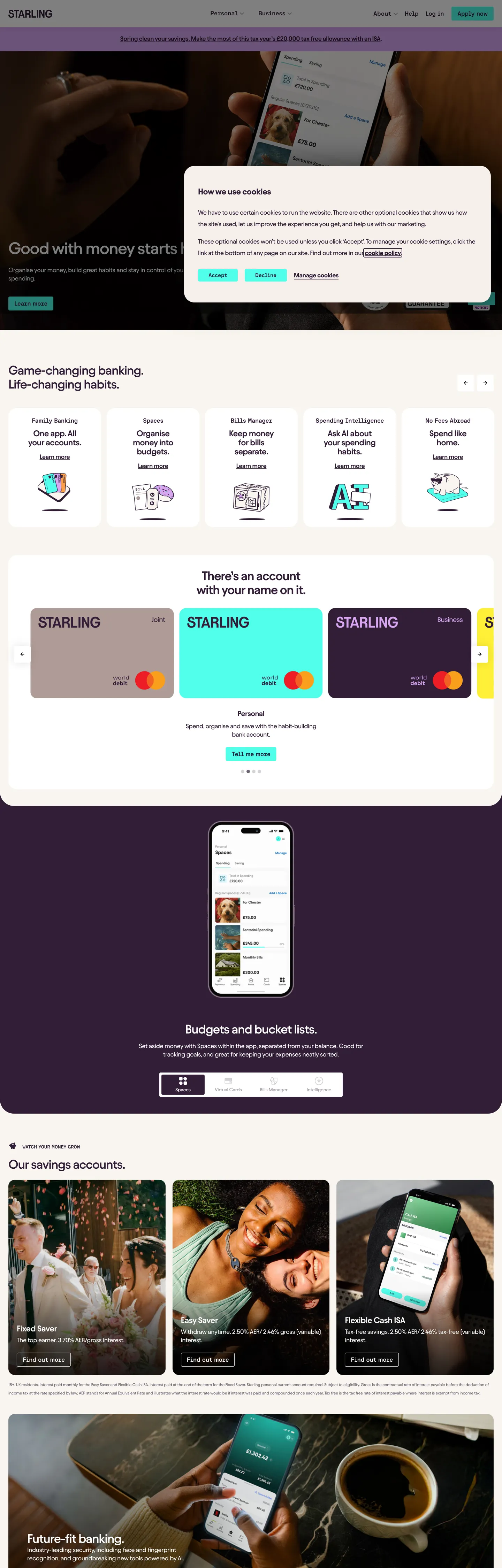
Starling Bank's marketing site refuses the neobank-as-startup aesthetic in two specific ways. First, it picks aubergine #321e37 — a near-purple very-dark plum — as the universal text and border color instead of off-black or a slate gray; the tone appears 611 times in the captured page, more than any other color, and quietly tints every surface that would otherwise read as institutional. Second, it splits the accent voltage in two: a deep mint-cyan #19d3c5 fills the primary CTA pill, and a brighter neon mint #50ffeb does the secondary-button border and the inline link highlight. The two mints look almost identical at a glance, but Starling uses them in strictly opposite roles — the saturated one outlines, the deeper one fills.
The DESIGN.md file packages the system into a machine-readable spec for React tooling. Inside: 15 colors tokens drawn from the aubergine-ink tier, the two-tone mint accent, the customer-photography lavenders and sands, and the structural cream-modal surface; 12 typography tokens split across two families — Avantt for every spoken surface at weights 450, 550, and 600, and CoFo Sans Semi-Mono for buttons, labels, and small-caps annotations at weight 550; 5 radius tokens centered on a tight 4px corner with a 24px tier for cards; an 8px base spacing scale with the 3.75px gap unit Starling uses inside its category-tab strip; and 18 components covering the mint CTA, the cream cookie modal, the dark photographic hero, the card-color picker, and the app-screenshot savings tile.
Feed this file to Claude or Cursor and it reproduces Starling's specific moves: aubergine ink instead of off-black, two-tone mint accent with strict fill-vs-border discipline, the Avantt-plus-mono typographic split, tight 4px corner radius on body chrome with a 24px lift on cards, and the willingness to let an in-app phone screenshot carry an entire feature band. The one move worth borrowing only if you have a real card-color SKU lineup: the 5-up card-picker that doubles as the brand-palette gallery. Most neobanks need that band to be a feature-strip; Starling makes it a product configurator.
What makes it distinct
5
- Aubergine-as-ink#321e37 carries 611 occurrences as the universal text and border color, replacing what most banks would render as off-black
- Two-tone mint voltage#19d3c5 fills the primary CTA, #50ffeb borders the secondary; the brighter neon never fills, the deeper mint never outlines
- Avantt + CoFo Sans Semi-Mono pairingAvantt at unusual weights (450, 550, 600) for spoken surfaces, CoFo Sans Semi-Mono at 550 for every button and label
- Card-color picker as featurea 5-up scrolling row showing the Starling debit card in mint, lavender, aubergine, sand, and cream lets the brand palette double as a product configurator
- App-screenshot-led savings bandthree lifestyle photographs with phone-screen overlays let the product UI carry the marketing band, no decorative illustration
starlingbank.com
Live at starlingbank.com
A snapshot of the brand in production. Scroll the frame to see the whole page.
Colors
15 colors
Starling Bank's system runs on #19d3c5 as its primary voltage, used in 1 of 18 components. Type is set in Avantt across 12 tokens from 12px to 48px, weights 450–600. Shape language is mixed across 18 components, blending pills, soft rounds, and squarer corners.
Brand & Accent
Sparing, CTA-only voltage · 6
Surface
Page and card backgrounds · 4
Text
Headlines, body, captions · 3
Borders & Hairlines
Dividers, outlines, rules · 1
Other
Specialty colors · 1
Typography
12 type tokens
Set in Avantt across 12 tokens, from 12px to 48px, weights 450–600. Shown in its own stack: where the font isn't installed, the fallback the file names stands in.
- display-xl48px · weight 550 · lh 54px · tracking -1.44pxThe quick brown fox jumps over the lazy dog
- display-lg36px · weight 550 · lh 40px · tracking -1.08pxThe quick brown fox jumps over the lazy dog
- display-md28px · weight 450 · lh 28px · tracking -0.56pxThe quick brown fox jumps over the lazy dog
- heading-md24px · weight 600 · lh 26px · tracking -0.48pxThe quick brown fox jumps over the lazy dog
- heading-sm21.06px · weight 600 · lh 24px · tracking -0.36pxThe quick brown fox jumps over the lazy dog
- body-md18px · weight 450 · lh 24px · tracking -0.36pxThe quick brown fox jumps over the lazy dog
- body-sm15px · weight 450 · lh 25.5px · tracking -0.36pxThe quick brown fox jumps over the lazy dog
- body-emphasis18px · weight 600 · lh 24px · tracking -0.36pxThe quick brown fox jumps over the lazy dog
- caption12px · weight 450 · lh 19.2px · tracking -0.36pxThe quick brown fox jumps over the lazy dog
- button-md18px · weight 550 · lh 18px · tracking -0.36pxThe quick brown fox jumps over the lazy dog
- mono-label14px · weight 500 · lh 30px · tracking -0.28pxThe quick brown fox jumps over the lazy dog
- mono-md18px · weight 500 · lh 24px · tracking -0.36pxThe quick brown fox jumps over the lazy dog
Layout
Radii and spacing
6 corner radii and 9 spacing values. Shape language: mixed.
Radii
- none0px
- sm4px
- md16px
- card17.904px
- lg24px
- hero30px
Spacing
- xs3.75px
- sm6px
- md12px
- base16px
- lg20px
- xl24px
- 2xl32px
- 3xl48px
- 4xl96px
Components
18 components
Each rendered from its tokens (color, type, radius, padding) on Starling Bank's own canvas.
- Hero Sectionhero-sectionHero Section
- Hero Headinghero-headingHero Heading
- Section Headingsection-headingSection Heading
- Body Paragraphbody-paragraphBody Paragraph
- Body Paragraph Mutedbody-paragraph-mutedBody Paragraph Muted
- Mono Labelmono-labelMono Label
- Button Primarybutton-primaryButton Primary
- Button Primary Hoverbutton-primary-hoverButton Primary Hover
- Button Secondarybutton-secondaryButton Secondary
- Button Secondary Hoverbutton-secondary-hoverButton Secondary Hover
- Top Navtop-navTop Nav
- Nav Linknav-linkNav Link
- Cookie Modalcookie-modalCookie Modal
- Card Colorcard-colorCard Color
- Card Photocard-photoCard Photo
- Link Highlightlink-highlightLink Highlight
- Type here…text-inputText Input
- FooterfooterFooter
In use
The system, in use
Starling Bank's tokens on the kind of product it builds.
Build something people actually use.
A short paragraph of marketing copy that previews how the brand's display tier and body tier read together. Two sentences is usually enough.
FAQ
Starling Bank design system FAQ
Common questions about Starling Bank's tokens, components, and how to use this DESIGN.md in your project.
Read next
Related reading
Specs, directories, and component libraries that pair with this design system.
- Browse all design systemsThe full directory of DESIGN.md files on shadcn.io, with live mockups for each.shadcn.io
- Starling Bank — official siteStarling Bank's public marketing site — the source of truth for the live tokens captured in this file.starlingbank.com (opens in a new tab)
- The DESIGN.md specificationGoogle Labs' open spec for machine-readable design system files — the format this page is built on.github.com (opens in a new tab)
Use it
Use Starling Bank in your project
One machine-readable file. Drop it into Claude, Cursor, or any AI tool that reads DESIGN.md.
Download the DESIGN.md
One machine-readable file: every color, type, radius, spacing, and component token of Starling Bank.
Feed it to your AI tool
Drop it into Claude, Cursor, or GitHub Copilot. The agent writes React components and Tailwind classes that match Starling Bank's visual language.
Reference the tokens directly
Or paste the values into your Tailwind config, CSS variables, or component library: every color, size and radius is a quoted, ready-to-copy value.
Read the full DESIGN.md: overview, rationale, do’s and don’ts
Overview
Starling Bank's marketing system makes two unusual choices for a UK neobank. Aubergine ink. Where Monzo runs a near-black navy on its display text and Revolut commits to flat black, Starling picks deep aubergine {colors.ink} (#321e37) as the universal text and border color — 611 occurrences across the captured page, including the body of every paragraph and the outline of every input. The tone is almost-but-not-quite a near-black; it adds a quiet purple undertone to the page that you read as warmth before you read as color. Wired in CSS as --cm-font-colour, --cm-link-font-colour, and --cm-focus-colour, it does the load-bearing work that off-black would normally do.
The chromatic voltage splits in two. Deep mint-cyan {colors.primary} (#19d3c5) is the fill color — it sits behind the primary CTA pill and behind product cards in the card-color picker, wired as --cm-primary-btn-bg and --cm-accent-colour. Brighter neon mint {colors.accent} (#50ffeb) is the border and highlight color — it outlines the secondary CTA pill, marks the inline link-text background, and renders behind the keyboard-focus ring, wired as --cm-secondary-btn-bg, --cm-secondary-btn-border, and --cm-link-bg-colour. The two mints look almost identical at a glance, but Starling uses them in strictly opposite roles. The two-tone mint discipline is the move; collapse it into one mint and the system loses its identity.
Typography is the second distinguishing move: Avantt at three non-standard weights (450, 550, 600) for every spoken surface, plus CoFo Sans Semi-Mono at weight 550 for every button label and small-caps annotation. The split is unusual in two ways — first, weight 450 and 550 are deliberately in-between the conventional 400/500/600 stops, which gives Avantt a slightly heavier feel without committing to the visual weight of a full medium or semibold; second, the mono never appears in body, only in actions and labels. Where Cloudflare runs FT Kunst Grotesk plus Apercu Mono and lets the mono carry footnotes and caption strips, Starling restricts the mono to buttons and labels alone — the body never touches it.
Key Characteristics:
- Aubergine ink (
{colors.ink}— #321e37) carries 611 occurrences as the universal text and border color, replacing what most banks would render as off-black or slate. - Two-tone mint accent:
{colors.primary}(#19d3c5) fills the primary CTA,{colors.accent}(#50ffeb) borders the secondary and highlights inline links — strict fill-vs-border discipline. - Avantt at unusual weights (450, 550, 600) for spoken surfaces; CoFo Sans Semi-Mono at weight 550 for every button and small-caps label.
- 4px corner radius (
{rounded.sm}) on inputs, buttons, and chips — distinctively non-pill, which separates Starling from Monzo and Revolut whose CTAs are fully rounded. - Card-color picker as feature band — a 5-up scrolling row showing the Starling debit card in five colorways (mint, lavender, aubergine, sand, cream) that doubles as the brand-palette gallery.
- Photographic savings-account grid — three lifestyle photographs each with a phone-screen overlay; the in-app UI carries the marketing copy without any decorative illustration layer.
- Cream cookie-consent modal (
{component.cookie-modal}) sits flush against the dark hero in a{colors.surface-cream}(#f6efea) surface — the modal is the first warm element a visitor sees, not a generic light-gray banner. - 3.75px gap unit (
{spacing.xs}) inside the category-tab strip — Starling's tightest module, used to pack mono-label chips together.
Colors
Brand voltage (two-tone mint)
- Mint Cyan Fill (
{colors.primary}— #19d3c5): the primary fill color. Wired as--cm-primary-btn-bgand--cm-accent-colour. Fills the primary CTA pill ("Apply now"), the active card in the card-color picker, and the focus-glow on form fields. Strict fill role — never outlines. - Mint Hover Soft (
{colors.primary-hover}— #b1eddf): the primary CTA's hover state, wired as--cm-primary-btn-bg-hover. A paler mint that lifts the pill without changing its hue. - Mint Pressed (
{colors.primary-pressed}— #277463): the pressed state on the primary CTA, wired as--cm-primary-btn-bg-active. Drops in lightness to mark the press without losing the mint family. - Neon Mint Border (
{colors.accent}— #50ffeb): frequency 15 — used as background (8) and border (7). The secondary-button background and the inline link-background highlight. Wired as--cm-secondary-btn-bg,--cm-secondary-btn-border,--cm-link-bg-colour. Strict border / highlight role; never fills a primary action. - Mint Bright Hover (
{colors.accent-bright}— #29e6d1): the secondary-button hover state, wired as--cm-secondary-btn-bg-hoverand--cm-secondary-btn-bg-active. - Mint Tint (
{colors.accent-tint}— #a7fff5): the palest mint in the system, used as a subtle background wash inside the card-color picker.
Text & Hairlines
- Aubergine Ink (
{colors.ink}— #321e37): frequency 611 — the universal text and border color. Used as text (306), border (299), background (4), and shadow (2). Wired as--cm-font-colour,--cm-link-font-colour,--cm-primary-btn-font-colour,--cm-focus-colour. Carries every body paragraph, every nav link, every input outline. - Ink Muted (
{colors.ink-muted}— #706273): frequency 25 — secondary text under headlines, the back-button icon color, footer category sub-labels. Wired as--cm-back-btn-svg-colorand--cm-back-btn-color-hover. - Ink Soft (
{colors.ink-soft}— #9a97ab): frequency 4 — the legal-copy footer color, used for the bottom-bound regulatory text that has to be visible but quiet. - Hairline (
{colors.hairline}— #d6d2d7): the structural border tone — used on input outlines, neutral-button backgrounds, and card edges. Wired as--cm-neutral-btn-bg-activeand--cm2.
Surfaces
- Canvas (
{colors.canvas}— #ffffff): frequency 407 — the body floor below the dark hero, the surface inside white cards, and the top-nav surface on scroll. Wired as--cm1and the cluster of--_9o5tl81-2aliases. - Surface Cream (
{colors.surface-cream}— #f6efea): frequency 2 — the cookie-consent modal background and the modal surface. Wired as--cm-modal-bgand--cm5. The single warm surface on the page; everywhere else is canvas or aubergine. - Surface Warm (
{colors.surface-warm}— #f2dac5): the sand-colored card variant in the card-color picker — one of the five card finishes Starling sells. - Surface Violet (
{colors.surface-violet}— #d7a5f0): the lavender card variant in the card-color picker — another of the five physical card finishes, rendered here at 50% opacity (theD7A5F080value in the CSS).
Feedback
- Feedback Critical (
{colors.feedback-critical}— #de352d): the system's error tone for form validation and warning states. Not rendered on the captured marketing page but declared for the product surfaces.
Typography
Font Families
The system runs two voices in strict role separation. Avantt (with Inter tight as fallback, wired as --cm-font-family and --cm-font-family-body) carries every spoken surface — display, heading, body, and caption. CoFo Sans Semi-Mono (with Roboto Mono as fallback, wired as --cm-font-family-btn and --cm-alt-font-family) carries every button label, every category chip, and every small-caps annotation.
The split is the typographic signature. Where Cloudflare runs FT Kunst Grotesk plus Apercu Mono and lets the mono carry footnotes, Starling restricts the mono to actions and labels — body text never touches it. The result reads quietly technical at the action level (the mono is the most distinctive thing about the CTA) while keeping body copy in a contemporary editorial sans.
Hierarchy
| Token | Size | Weight | Line Height | Letter Spacing | Use |
|---|---|---|---|---|---|
{typography.display-xl} | 48px | 550 | 54px | -1.44px | Hero h1 ("Good with money starts here.") |
{typography.display-lg} | 36px | 550 | 40px | -1.08px | Section h2 ("Game-changing banking. Life-changing habits.") |
{typography.display-md} | 28px | 450 | 28px | -0.56px | Sub-section spans on photographic bands |
{typography.heading-md} | 24px | 600 | 26px | -0.48px | h4 / card-row titles |
{typography.heading-sm} | 21.06px | 600 | 24px | -0.36px | h3 sub-titles |
{typography.body-md} | 18px | 450 | 24px | -0.36px | Default running text |
{typography.body-sm} | 15px | 450 | 25.5px | -0.36px | Top-nav links, secondary copy |
{typography.body-emphasis} | 18px | 600 | 24px | -0.36px | Inline emphasis, span highlights |
{typography.caption} | 12px | 450 | 19.2px | -0.36px | Footer regulatory text |
{typography.button-md} | 18px | 550 | 18px | -0.36px | Primary and secondary CTA labels (mono) |
{typography.mono-label} | 14px | 500 | 30px | -0.28px | Uppercase category labels (mono) |
{typography.mono-md} | 18px | 500 | 24px | -0.36px | Inline mono spans inside body copy |
Principles
The unusual weights (450, 550, 600 for Avantt; 550 for CoFo Sans Semi-Mono) are the typographic move. Avantt at weight 550 is a half-step between medium 500 and semibold 600, which gives the display a slightly heavier optical density without committing to the muscle of a true semibold. The hero h1 at 48px / 550 with -1.44px tracking is the loudest typographic moment in the system. Body text at weight 450 is similarly a half-step above regular 400, giving the page a slightly more confident rendering at the 18px body size.
The button label always sits in the mono, never in Avantt. This is the strictest typographic rule in the system: if you see CoFo Sans Semi-Mono, you can tap it.
Note on Font Substitutes
Avantt is licensed; the closest open-source substitute is Inter — though Inter doesn't ship the in-between 450 and 550 weights, so use 400 / 500 / 600 as approximations (the system will read slightly lighter on display and slightly heavier on body). General Sans is closer in feel but not free. For CoFo Sans Semi-Mono, JetBrains Mono or IBM Plex Mono at weight 500 transfers cleanly at the same sizes; both have the slightly-wider-than-mono feel that defines the semi-mono category.
Layout
Spacing System
- Base unit: 8px, with a distinctive 3.75px sub-unit used inside the category-tab strip.
- Tokens:
{spacing.xs}3.75px ·{spacing.sm}6px ·{spacing.md}12px ·{spacing.base}16px ·{spacing.lg}20px ·{spacing.xl}24px ·{spacing.2xl}32px ·{spacing.3xl}48px ·{spacing.4xl}96px. - Section padding (vertical):
{spacing.4xl}(96px) between major bands. - Card internal padding:
{spacing.xl}(24px) default, with{spacing.2xl}(32px) on the larger photographic tiles. - Hero block padding: 96×24 — generous vertical on the dark photographic band.
Grid & Container
- Max content width: ~1200px on most bands; ~1080px on display headlines for measure-control.
- Hero block: dark
{colors.ink}photographic canvas with{rounded.hero}(30px) rounded top corners, full-bleed photograph with white display text floating over it and a cream cookie modal flush in the lower-right. - Card-color picker: 5-up scrolling row of
{rounded.card}(17.9px) card tiles in mint, lavender, aubergine, sand, and cream — the radius matches the physical-card geometry. - Savings-account grid: 3-column grid of
{rounded.lg}(24px) photographic tiles each carrying a full-bleed lifestyle photograph at the top and an editorial caption beneath. - Top-nav band: dark aubergine
{colors.ink}bar at the very top of the page (above the rounded hero corners), 64px tall, with white nav links and the mint "Apply now" CTA flush right.
Rhythm
The page alternates between dark photographic bands and light card bands. The hero is photographic on aubergine; the card-color picker drops to white; the savings-account grid returns to photographic-tile-on-white; the "Future fit banking" band returns to a photographic tile with the aubergine continuing inside it. There is no atmospheric gradient between bands — every section terminates flush on either canvas, aubergine, or a photograph, and the cream cookie modal is the only warm surface on the page.
Elevation
The system uses near-flat elevation with very subtle shadow accents. The captured page has 2 occurrences of aubergine {colors.ink} used as shadow ink and 4 occurrences of pure black — all confined to the cookie-consent modal (which lifts off the hero with a 12px aubergine-tinted shadow at ~3% alpha) and to a faint card-hover treatment.
- Flat (no shadow): hero photograph, body cards, savings-grid tiles, footer — 95% of surfaces.
- Cookie modal elevation: the cream
{component.cookie-modal}sits with a0px 0px 12px rgba(0,0,0,0.12)shadow — readable as the only meaningfully-elevated element on the page. - Hover lift: a subtle
0px 3px 24px rgba(0,0,0,0.03)shadow appears on card-hover but is so faint it functions as a state change more than a lift. - Tinted shadows: Starling uses aubergine-tinted shadows rather than pure black on most elements — the shadow color echoes the brand ink rather than introducing a neutral gray.
Shapes
The radius scale is tight body with card lift:
{rounded.none}0px — section dividers and the hero photograph's bottom edge.{rounded.sm}4px — the dominant body radius. 23 occurrences across inputs, dropdowns, primary CTA pills, and small chips. The primary CTA at 4px is the move that separates Starling from Monzo and Revolut.{rounded.md}16px — 9 occurrences. Used on the cookie-modal surface and mid-size cards.{rounded.card}17.904px — 5 occurrences. The card-color picker's card tiles use this exact radius to match the geometry of the physical Starling debit card.{rounded.lg}24px — 9 occurrences. The larger photographic savings-account tiles.{rounded.hero}30px — 1 occurrence. The top corners of the dark photographic hero band.
There is no fully-rounded pill (9999px) anywhere on the captured page. The CTA-as-pill convention from other neobanks is deliberately rejected — every Starling button corner stays at 4px.
Components
hero-section — Dark aubergine {colors.ink} photographic canvas, 96×24 padding, {rounded.hero} (30px) on top corners. Holds the hero h1 in white at {typography.display-xl}, a sub-paragraph beneath, the mint CTA pill, and the cream cookie-consent modal flush in the lower-right.
hero-heading — White {colors.canvas} text on the dark photographic hero, Avantt 48px / 550, -1.44px tracking. The display tier — confidence by tracking and color contrast.
section-heading — Aubergine {colors.ink} text at {typography.display-lg} (36px / 550) — the section h2s below the fold ("Game-changing banking. Life-changing habits.", "There's an account with your name on it.", "Our savings accounts.").
body-paragraph — Default aubergine {colors.ink} text at {typography.body-md} (18px / 450) — the workhorse paragraph style.
body-paragraph-muted — Soft {colors.ink-soft} (#9a97ab) variant at {typography.caption} (12px / 450) — used for the footer regulatory text where contrast has to be readable but quiet.
mono-label — CoFo Sans Semi-Mono at {typography.mono-label} (14px / 500, line-height 30px, uppercased) — used for category chips above feature cells.
button-primary — The signature CTA. Mint {colors.primary} (#19d3c5) fill, aubergine {colors.ink} text, 1px mint border (same color as fill), {rounded.sm} 4px radius, 10×16 padding, 40px height. Label in CoFo Sans Semi-Mono 18px / 550. "Apply now" is the canonical instance.
button-primary-hover — Background flips to {colors.primary-hover} (#b1eddf) — a pale mint that lifts the pill. Pressed state drops to {colors.primary-pressed} (#277463).
button-secondary — Neon mint {colors.accent} (#50ffeb) fill, aubergine text, 1px neon-mint border, {rounded.sm} 4px radius, same 40px height. The brighter mint is the secondary-button signature.
button-secondary-hover — Background shifts to {colors.accent-bright} (#29e6d1) on hover and active states.
top-nav — Dark {colors.ink} aubergine bar at the very top, white text in {typography.body-sm}, 64px height, 12×24 padding. Sits above the rounded-corner hero band so the dark continues into the photograph.
nav-link — White {colors.canvas} text on the aubergine top-nav, Avantt 15px / 450, 6×12 padding. Hover treatment is text-color shift; no background change.
cookie-modal — Cream {colors.surface-cream} surface, aubergine text, {rounded.md} 16px radius, 24px padding. Sits flush in the lower-right corner of the hero band, casting a 12px aubergine-tinted shadow. The first warm element a visitor sees.
card-color — White {colors.canvas} surface, {rounded.card} 17.904px radius (matched to physical card geometry), 0 padding. The product cards in the 5-up card-color picker — each carries an image of the Starling debit card in a different finish (mint, lavender, aubergine, sand, cream).
card-photo — White {colors.canvas} surface, {rounded.lg} 24px radius, 0 padding (the photograph fills the tile edge-to-edge). Used in the 3-up savings-account grid below the fold.
link-highlight — Inline text on a neon-mint {colors.accent} background, aubergine text. The brand's inline link treatment — instead of an underline, the link gets a mint highlight band behind the text.
text-input — White {colors.canvas} fill, aubergine text, 1px {colors.hairline} border, {rounded.sm} 4px radius, 10×16 padding, 40px height. Focus state thickens the border and shifts color to aubergine {colors.ink}.
footer — White {colors.canvas} background, aubergine text, 48×24 padding. The regulatory copy at the very bottom uses {colors.ink-soft} (#9a97ab) — the quietest tone in the system.
Do's and Don'ts
Do keep the two-tone mint discipline strict. {colors.primary} (#19d3c5) fills, {colors.accent} (#50ffeb) outlines and highlights — and the rule never inverts. Filling a button with #50ffeb or outlining with #19d3c5 collapses the two-tone system into one mint and erases Starling's distinguishing chromatic move.
Do use aubergine {colors.ink} (#321e37) — never pure black or a slate gunmetal — for body text and input borders. The slight purple undertone is the warmth carrier of the entire system; substituting off-black removes the quiet brand voltage that runs across 611 captured occurrences.
Do render every button label in CoFo Sans Semi-Mono at weight 550. The mono-only button label is the strictest typographic rule in the system; if you see CoFo Sans Semi-Mono, you can tap it. Putting an Avantt label on a CTA breaks the signal.
Do match the card-tile radius to physical product geometry. The 17.904px radius ({rounded.card}) on the card-color picker tiles isn't a coincidence — it matches the corner radius of the physical Starling debit card. Use it on card-product surfaces only; for generic content cards, drop to {rounded.md} 16px or {rounded.lg} 24px.
Don't introduce a fully-rounded pill (9999px) anywhere. The captured page has no pill-rounded element — every CTA, every chip, every input stays at 4px corners. Adding a pill button makes Starling read like Monzo and erases the financial-product geometry signature.
Don't use the warmer surfaces ({colors.surface-warm} #f2dac5, {colors.surface-violet} #d7a5f0) outside the card-color picker. They are physical-card-finish accent tones, not structural surfaces. Using them as background fills elsewhere will read as if the page is sampling the product palette rather than running its own.
Don't use Avantt weight 700 or 800 anywhere. The system tops out at weight 600 — the unusual 450/550 in-between weights are the typographic identity; bumping to 700+ erases that identity and pulls the page into a generic semibold/bold convention.
Don't use the neon mint {colors.accent} (#50ffeb) as a body-text color. The captured page has zero text uses of #50ffeb — it is exclusively a fill/highlight tone. Rendering text in neon mint creates accessibility issues on the white canvas and breaks the strict fill-vs-border discipline.
Known Gaps
- Form input states:
{component.text-input}carries the resting state; error / validation styling uses{colors.feedback-critical}(#de352d) but the full state matrix is not exposed on the captured marketing surface. - Dark mode: the captured marketing surface uses dark photographic bands but has no true dark-mode variant. The product app's dark theme is not represented here.
- Hover and focus rings:
{component.button-primary-hover}and{component.button-secondary-hover}are documented; the keyboard-focus-ring treatment uses{colors.ink}(--cm-focus-colour) but the exact ring thickness and offset are not exposed. - Motion: the card-color picker scrolls horizontally on tap; the savings-grid photographs have a subtle scale-on-hover. The spec captures end-state values only; easing curves and durations live in the page's runtime JS.
- Product surfaces: this DESIGN.md captures the marketing site only. The Starling app itself, the business-account onboarding, and the Marketplace partner UI all carry richer token systems that are not represented here.
- Iconography: the system uses a custom
fontelloicon font, wired as--_140qdu62with woff/woff2/eot/svg formats. The icon glyphs are not exposed as named SVGs in the captured marketing surface. - The other three card-finish colors: the card-color picker shows five physical cards; only the mint, aubergine, sand, and lavender finishes are captured here. The CSS exposes additional warm beige and taupe tones that may correspond to other physical finishes not yet shown.
Banking & Payments
More systems like this
More DESIGN.md files in Banking & Payments.
Pricing
Build it with Pro
The DESIGN.md files are free. Pro adds 6,000+ blocks, premium templates and the MCP server, so your AI editor builds in your system for you.
4.9/5 out of 5 · 150+ reviewsfrom 150+ founders and developers.
Billing
Billed once a year in USD. Cancel anytime.
- How many people can use the license.
- Client work, SaaS products and anything you charge for.
- Production-ready React sections: hero, pricing, features, dashboards and more.
- Complete multi-page sites you can ship as they are.
- React icons from every major library, installable with one command.
- Presets that restyle every block, in light and dark.
- Lets your AI editor search, preview and install blocks for you.
- Priority requests are answered first.
Individual
For personal projects & open source
$32instead of $49/mo
$389 billed yearly
- Seats: 1 seat
- Commercial use: Personal & open source only
- Pro blocks: 6,000+ blocks
- Templates: All 14 templates
- React icons: 294k+ icons
- Themes: All 59 themes
- MCP server: Basic usage
- Support: Standard
Team
Most popularFor freelancers, agencies & startups
$66instead of $99/mo
$789 billed yearly · ≈ $13/dev/mo
- Seats: Up to 5 seats
- Commercial use: Included
- Pro blocks: 6,000+ blocks
- Templates: All 14 templates
- React icons: 294k+ icons
- Themes: All 59 themes
- MCP server: High usage
- Support: Priority
Organization
For companies with larger teams
$132instead of $199/mo
$1,589 billed yearly
- Seats: Unlimited seats
- Commercial use: Included
- Pro blocks: 6,000+ blocks
- Templates: All 14 templates
- React icons: 294k+ icons
- Themes: All 59 themes
- MCP server: Unlimited usage
- Support: Priority
Billed once a year in USD. Cancel anytime.
Individual
For personal projects & open source
$32instead of $49/mo
$389 billed yearly
- How many people can use the license.Seats: 1 seat
- Client work, SaaS products and anything you charge for.Commercial use: Personal & open source only
- Production-ready React sections: hero, pricing, features, dashboards and more.Pro blocks: 6,000+ blocks
- Complete multi-page sites you can ship as they are.Templates: All 14 templates
- React icons from every major library, installable with one command.React icons: 294k+ icons
- Presets that restyle every block, in light and dark.Themes: All 59 themes
- Lets your AI editor search, preview and install blocks for you.MCP server: Basic usage
- Priority requests are answered first.Support: Standard
Team
Most popularFor freelancers, agencies & startups
$66instead of $99/mo
$789 billed yearly · ≈ $13/dev/mo
Everything in Individual, plus
- How many people can use the license.Seats: Up to 5 seats
- Client work, SaaS products and anything you charge for.Commercial use: Included
- Lets your AI editor search, preview and install blocks for you.MCP server: High usage
- Priority requests are answered first.Support: Priority
Organization
For companies with larger teams
$132instead of $199/mo
$1,589 billed yearly
Everything in Team, plus
- How many people can use the license.Seats: Unlimited seats
- Lets your AI editor search, preview and install blocks for you.MCP server: Unlimited usage
- Secure checkout via Stripe
- Code lives in your repo
- Keep what you've shipped if you cancel
- License terms
Your system, built for you
Every block, template and icon, installed by your AI agent in your design system. The DESIGN.md files stay free.