Starbucks Design System
Starbucks design system as a DESIGN.md file. Green Accent #00754A, SoDoSans, four green tiers, 30+ components. For React, Next.js, and AI tools.
Add shadcn.io to your AI agent. · Pro It installs blocks, icons and templates in your design system from a prompt, with Pro.
Set up MCP- Primary
- #006241
- Typeface
- SoDoSans
- Shape
- Soft
- Base radius
- 0px
- Colors
- 23
- Type tokens
- 12
- Components
- 34
- Spacing values
- 12
About
About Starbucks DESIGN.md
Curated by Dov Azencot · Updated May 12, 2026 · Source starbucks.com (opens in a new tab)
Starbucks runs one of the most disciplined retail design systems online. Every surface wears the green of the storefront apron, but never as a single "brand green" — there are four calibrated tiers (Starbucks #006241 for headings, Green Accent #00754A for CTAs, House Green #1E3932 for deep feature bands, Green Uplift #2b5148 for decorative). The canvas is not white. It is a warm-neutral cream (#f2f0eb) or a slightly darker ceramic (#edebe9) that references real café materials — paper napkins, café walls, wood finishes. Gold (#cba258) shows up only around Rewards-status ceremony. The product feels like clean café signage: confident, warm, legible, never shouting.
This DESIGN.md file packages the whole system into one machine-readable spec. Inside: roughly 23 colors tokens grouped by role (primary, secondary, surface, neutral, semantic, alpha ladders), 11 typography tokens running on SoDoSans with tight `-0.16px` tracking across the board, a rem-based spacing scale anchored at 1.6rem (16px) stepping to 6.4rem (64px), a universal 50px pill radius for buttons plus 12px for cards, and over 34 components — from the standard pill button family to the signature floating Frap circular order CTA, the dark-green feature bands, the Rewards status cards, and the full PDP component cluster (size selector, milk select, numeric stepper, Customize pill, gold-outlined Rewards Cost Pill).
Feed the file to Claude, Cursor, or GitHub Copilot and the agent will reproduce Starbucks' restraint — the four-green discipline, the cream canvas, the universal 50px pill, the `scale(0.95)` press — rather than a generic shadcn theme. Or reference tokens directly: every hex, font, radius, and spacing value is a quoted value you can paste into Tailwind config or CSS variables. The reason this system is worth studying is the four-tier color discipline: most brands ship one "brand color" and call it done. Starbucks ships four greens, each with a defined surface role, and the difference is visible on every screen.
What makes it distinct
5
- Four-tier green systemStarbucks #006241, Accent #00754A, House #1E3932, Uplift #2b5148 each mapped to a distinct surface role
- Warm cream canvas (#f2f0eb / #edebe9) instead of pure whitereferences café paper napkins and wood finishes
- Universal 50px full-pill buttons with `scale(0.95)` active press as the signature micro-interaction
- Floating Frap circular CTA at 56px (Green Accent #00754A)the product's signature elevation moment, layered shadow stack
- Gold (#cba258) reserved exclusively for Rewards-status ceremonynever a general-purpose accent
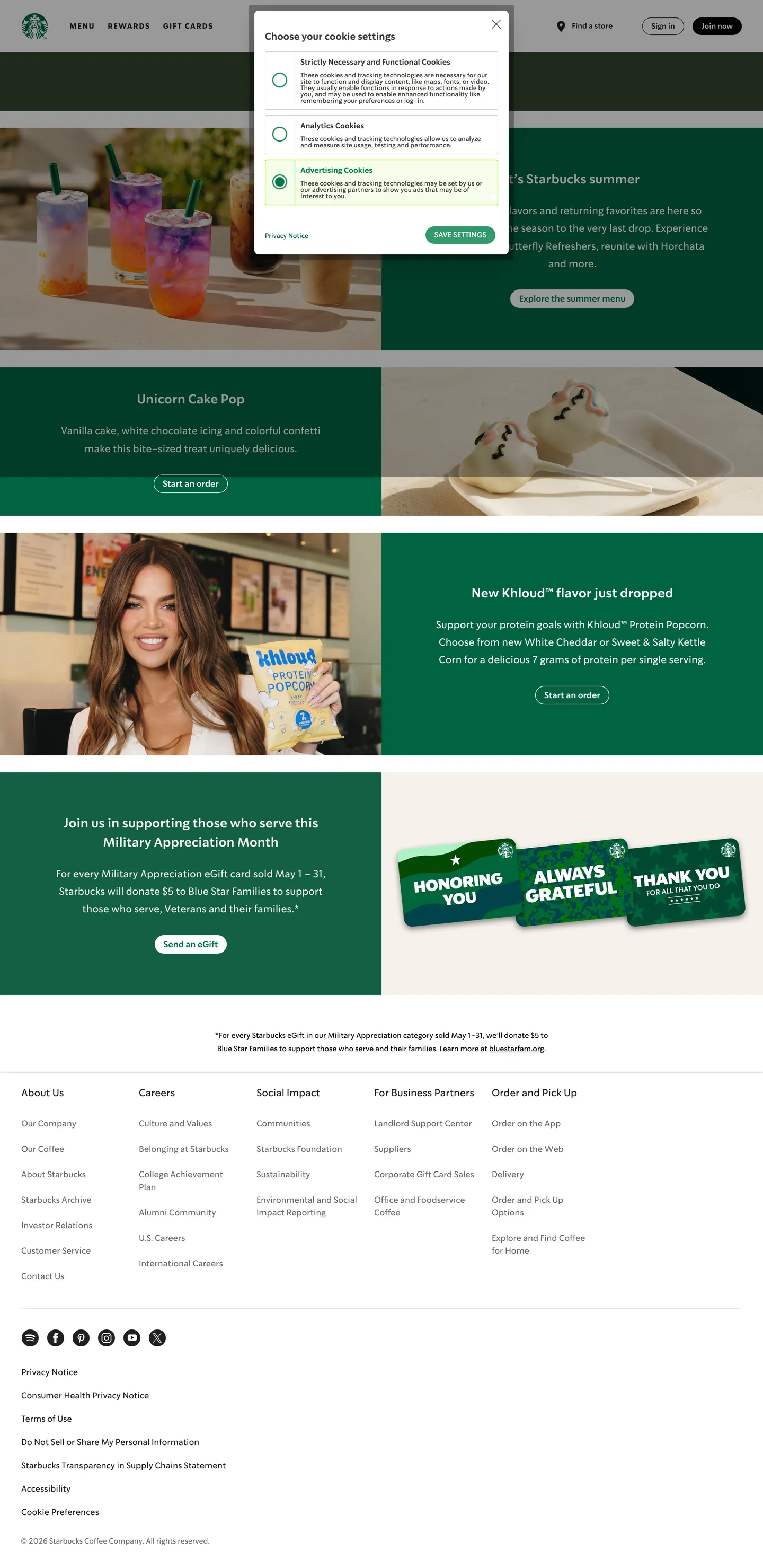
starbucks.com
Live at starbucks.com
A snapshot of the brand in production. Scroll the frame to see the whole page.
Colors
23 colors
Starbucks's system runs on #006241 as its primary voltage, used in 1 of 34 components. Type is set in SoDoSans across 12 tokens from 13px to 80px, weights 400–600. Shape language is soft — components average 29px corner radius, with no sharp interactive edges.
Text
Headlines, body, captions · 4
Borders & Hairlines
Dividers, outlines, rules · 2
Semantic
Status, errors, success, links · 1
Other
Specialty colors · 16
Typography
12 type tokens
Set in SoDoSans across 12 tokens, from 13px to 80px, weights 400–600. Shown in its own stack: where the font isn't installed, the fallback the file names stands in.
- display-1080px · weight 600 · lh 1.2 · tracking -0.16pxThe quick brown fox jumps over the lazy dog
- jumbo-958px · weight 600 · lh 1.2 · tracking -0.16pxThe quick brown fox jumps over the lazy dog
- hero-large-845px · weight 600 · lh 1.2 · tracking -0.16pxThe quick brown fox jumps over the lazy dog
- h124px · weight 600 · lh 36px · tracking -0.16pxThe quick brown fox jumps over the lazy dog
- h224px · weight 400 · lh 36px · tracking -0.16pxThe quick brown fox jumps over the lazy dog
- body-large19px · weight 400 · lh 33.25px · tracking -0.16pxThe quick brown fox jumps over the lazy dog
- body-316px · weight 400 · lh 24px · tracking -0.01emThe quick brown fox jumps over the lazy dog
- small-214px · weight 600 · lh 1.5 · tracking -0.01emThe quick brown fox jumps over the lazy dog
- micro-113px · weight 400 · lh 1.5 · tracking -0.01emThe quick brown fox jumps over the lazy dog
- button-label16px · weight 600 · lh 1.2 · tracking -0.01emThe quick brown fox jumps over the lazy dog
- rewards-serif45px · weight 400 · lh 1.2 · tracking -0.16pxThe quick brown fox jumps over the lazy dog
- careers-script24px · weight 400 · lh 1.2The quick brown fox jumps over the lazy dog
Layout
Radii and spacing
5 corner radii and 12 spacing values. Shape language: soft.
Radii
- none0px
- xs4px
- card12px
- pill50px
- full50%
Spacing
- space-14px
- space-28px
- space-316px
- space-424px
- space-532px
- space-640px
- space-748px
- space-856px
- space-964px
- outer-gutter16px
- outer-gutter-md24px
- outer-gutter-lg40px
Components
34 components
Each rendered from its tokens (color, type, radius, padding) on Starbucks's own canvas.
- Button Primary Filledbutton-primary-filledButton Primary Filled
- Button Primary Outlinedbutton-primary-outlinedButton Primary Outlined
- Button Black Filledbutton-black-filledButton Black Filled
- Button Dark Outlinedbutton-dark-outlinedButton Dark Outlined
- Button Green On Green Invertedbutton-green-on-green-invertedButton Green On Green Inverted
- Button Outlined On Darkbutton-outlined-on-darkButton Outlined On Dark
- Button Consent Agreebutton-consent-agreeButton Consent Agree
- Button Frap Floatingbutton-frap-floatingButton Frap Floating
- Button Frap Minibutton-frap-miniButton Frap Mini
- Button Feedback Tabbutton-feedback-tabButton Feedback Tab
- Card Defaultcard-defaultCard Default
- Card Giftcard-giftCard Gift
- Card Rewards Statuscard-rewards-statusCard Rewards Status
- Card Partnershipcard-partnershipCard Partnership
- Dropdown Menudropdown-menuDropdown Menu
- ModalmodalModal
- Floating Label Inputfloating-label-inputFloating Label Input
- Option Iconoption-iconOption Icon
- Global Navglobal-navGlobal Nav
- Sub Navsub-navSub Nav
- Feature Bandfeature-bandFeature Band
- Size Options Cupsize-options-cupSize Options Cup
- Add In Selectadd-in-selectAdd In Select
- Numeric Stepper Buttonnumeric-stepper-buttonNumeric Stepper Button
- Button Customizebutton-customizeButton Customize
- Button Add To Orderbutton-add-to-orderButton Add To Order
- Rewards Cost Pillrewards-cost-pillRewards Cost Pill
- Product Description Bandproduct-description-bandProduct Description Band
- Nutrition Table Rownutrition-table-rowNutrition Table Row
- Store Availability Selectorstore-availability-selectorStore Availability Selector
- Pdp Breadcrumbpdp-breadcrumbPdp Breadcrumb
- Back Chevron Linkback-chevron-linkBack Chevron Link
- Cookie Consentcookie-consentCookie Consent
- Expander Accordionexpander-accordionExpander Accordion
In use
The system, in use
Starbucks's tokens on the kind of product it builds.
Build something people actually use.
A short paragraph of marketing copy that previews how the brand's display tier and body tier read together. Two sentences is usually enough.
FAQ
Starbucks design system FAQ
Common questions about Starbucks's tokens, components, and how to use this DESIGN.md in your project.
Read next
Related reading
Specs, directories, and component libraries that pair with this design system.
Use it
Use Starbucks in your project
One machine-readable file. Drop it into Claude, Cursor, or any AI tool that reads DESIGN.md.
Download the DESIGN.md
One machine-readable file: every color, type, radius, spacing, and component token of Starbucks.
Feed it to your AI tool
Drop it into Claude, Cursor, or GitHub Copilot. The agent writes React components and Tailwind classes that match Starbucks's visual language.
Reference the tokens directly
Or paste the values into your Tailwind config, CSS variables, or component library: every color, size and radius is a quoted, ready-to-copy value.
Read the full DESIGN.md: overview, rationale, do’s and don’ts
Overview
Starbucks is a warm, confident retail flagship design system that wears the green of the storefront apron across every surface. The canvas is not pure white — it alternates between a neutral-warm cream ({colors.neutral-warm} — #f2f0eb) and a slightly darker ceramic ({colors.ceramic} — #edebe9) that references actual store materials: paper napkins, café walls, wood finishes. The signature Starbucks Green ({colors.starbucks-green} — #006241) anchors the brand moment on hero bands, CTAs, and Rewards surfaces. The greens come in four calibrated tiers (Starbucks Green, Green Accent, House Green, Green Uplift), each mapped to a distinct surface role, and gold ({colors.gold} — #cba258) appears only around Rewards-status ceremony — never as a general accent.
Typography carries most of the brand voice. The proprietary SoDoSans typeface (custom to Starbucks) sits across nearly every surface with a tight -0.16px letter-spacing — it reads confident and friendly rather than severe. Two context-specific swaps live in the system: the Rewards page switches to a warm serif ("Lander Tall", "Iowan Old Style", Georgia) for specific headline moments, subtly echoing the nostalgic feel of a coffeehouse chalkboard, and the Careers pages use a handwritten script ("Kalam", "Comic Sans MS", cursive) for personal cup-name touches. Three typefaces, three contexts — the system is disciplined about when each appears.
The surfaces breathe through rounded geometry. Every button is a 50px full-pill ({rounded.pill}). Cards take a 12px rounded-rectangle ({rounded.card}). The "Frap" floating CTA — a 56px circular order button in Green Accent ({colors.green-accent} — #00754A) — is the product's signature depth move: it floats bottom-right with a layered shadow stack and compresses via scale(0.95) on press. Elevations are otherwise restrained — card shadows stay at a whispered 0.14 / 0.24 alpha, global nav gets a quiet three-layer shadow stack. The whole system feels like clean café signage: legible, warm, and never shouting.
Key Characteristics:
- Four-tier green brand system (
{colors.starbucks-green}/{colors.green-accent}/{colors.house-green}/{colors.green-uplift}) each mapped to a distinct surface role — not a single "brand green". - Gold (
{colors.gold}— #cba258) reserved exclusively for Rewards-status ceremony; never a general-purpose accent. - Warm-neutral canvas (
{colors.neutral-warm}— #f2f0eb /{colors.ceramic}— #edebe9) instead of cold white — references café materials. - Custom proprietary typeface (SoDoSans) with tight
-0.16pxletter-spacing as the universal voice. - Context-specific type swaps: serif (Lander Tall) for Rewards, script (Kalam) for Careers cup-names.
- Full-pill buttons (
{rounded.pill}— 50px radius) universal;transform: scale(0.95)active press is the signature micro-interaction. - Floating Frap circular CTA (
{component.button-frap-floating}— 56px, Green Accent fill, layered shadow stack) — the product's signature elevation element. - Gift-card surfaces designed as photographed physical product — every card is a distinct illustrated photograph rather than a generated graphic.
- 12px card radius (
{rounded.card}) plus whisper-soft shadows keep content cards flat-plus-hint-of-lift. - Rem-based spacing scale anchored at 1.6rem / 16px (
{spacing.space-3}), stepping to 6.4rem / 64px ({spacing.space-9}). - Color-block page rhythm: cream hero → white content sections → dark-green (
{colors.house-green}— #1E3932) feature band with white text → cream utility zone → dark-green footer with gold and white text. An espresso-dark bookend around the bright body.
Colors
Primary Greens
- Starbucks Green (
{colors.starbucks-green}— #006241): The historic brand green. Used on h1 headings, primary section headers on the Rewards page, and as the main brand signal wherever a single dominant color is needed. - Green Accent (
{colors.green-accent}— #00754A): A slightly brighter, more luminous green. The primary filled-CTA color ("Explore our afternoon menu", "See the spring menu") and the fill of the floating Frap circular button. - House Green (
{colors.house-green}— #1E3932): The deep near-black brand green. Footer surface, feature-band backgrounds, Rewards-status dark surfaces, and the "Free coffee is just the beginning" hero band on Rewards. - Green Uplift (
{colors.green-uplift}— #2b5148): A secondary mid-dark green used sparingly on decorative accents and dark-gradient moments. - Green Light (
{colors.green-light}— #d4e9e2): A pale mint wash used for form-valid-state tints and light green utility surfaces. - Consent Green (
{colors.consent-green}— #008248): A specific variant green used only in the cookie-consent module's Agree button.
Gold (Rewards only)
- Gold (
{colors.gold}— #cba258): Reserved almost exclusively for Rewards-status ceremony — Gold-tier callouts, partnership badges (SkyMiles, Bonvoy), and premium-feeling accents. Never a general-purpose brand color. - Gold Light (
{colors.gold-light}— #dfc49d): Softer gold for background washes on gold-tier sections. - Gold Lightest (
{colors.gold-lightest}— #faf6ee): Cream-gold page-surface wash used under partnership sections on the Rewards page — ties the gold accent back into the warm neutral system.
Surface & Background
- White (
{colors.white}— #ffffff): Primary card and modal surface. Also card fill on gift-card tiles. - Neutral Cool (
{colors.neutral-cool}— #f9f9f9): Subtle cool-gray surface used on dropdown menus (Account dropdown), form-card wraps, and quiet utility containers. - Neutral Warm (
{colors.neutral-warm}— #f2f0eb): The warm cream primary page canvas for Rewards utility zones and hero bands. - Ceramic (
{colors.ceramic}— #edebe9): A slightly warmer/darker cream for zone separators, soft page-section washes, and the Rewards partnership band. - Black (
{colors.black}— #000000): Deep ink reserved for the dark top-of-page CTA strip ("Join now") and high-contrast top-nav sign-in buttons.
Text
- Text Black (
{colors.text-black}— rgba(0, 0, 0, 0.87)): Primary heading and body text color on light surfaces. Not pure black — an 87%-opacity black that reads warmer. - Text Black Soft (
{colors.text-black-soft}— rgba(0, 0, 0, 0.58)): Secondary / metadata text on light surfaces. - Text White (
{colors.text-white}— rgba(255, 255, 255, 1)): Primary heading / body text on dark green surfaces. - Text White Soft (
{colors.text-white-soft}— rgba(255, 255, 255, 0.70)): Secondary text on dark-green surfaces — footer link descriptions, caption text. - Rewards Green (
{colors.rewards-green}— #33433d): A dedicated muted slate-green used only on Rewards-page text blocks — slightly "dustier" than Text Black to signal "reward surface" without using full Starbucks Green.
Semantic & Borders
- Red (
{colors.red}— #c82014): Error and destructive state (form invalid, destructive actions). - Yellow (
{colors.yellow}— #fbbc05): Warning state, legacy brand touch. - Input Border (
{colors.input-border}— #d6dbde): The default 1px outline color on form inputs and PDP Add-in selectors. - Hairline (
{colors.hairline}— #e7e7e7): The 1px row divider used inside nutrition tables and long-form lists.
Typography
Font Family
The system runs SoDoSans for nearly every surface — Starbucks' proprietary corporate typeface licensed from House Industries. Fallbacks walk "Helvetica Neue", Helvetica, Arial, sans-serif. Two context-specific swaps exist: Lander Tall (with "Iowan Old Style", Georgia, serif fallback) for warm editorial moments on the Rewards page, and Kalam (with "Comic Sans MS", cursive fallback) for hand-written "cup name" touches on Careers pages.
There is no OpenType stylistic set explicitly activated at :root.
Hierarchy
| Token | Size | Weight | Line Height | Letter Spacing | Use |
|---|---|---|---|---|---|
{typography.display-10} | 80px | 600 | 1.2 | -0.16px | Largest Rewards / hero display |
{typography.jumbo-9} | 58px | 600 | 1.2 | -0.16px | Secondary hero headings |
{typography.hero-large-8} | 45px | 600 | 1.2 | -0.16px | Landing section headlines |
{typography.h1} | 24px | 600 | 36px | -0.16px | Starbucks-Green primary heading |
{typography.h2} | 24px | 400 | 36px | -0.16px | Regular-weight section title in Text Black |
{typography.body-large} | 19px | 400 | 33.25px | -0.16px | Hero intro copy, feature-band body |
{typography.body-3} | 16px | 400 | 24px | -0.01em | Default body copy |
{typography.small-2} | 14px | 600 | 1.5 | -0.01em | Button label, metadata, form labels |
{typography.micro-1} | 13px | 400 | 1.5 | -0.01em | Active float-label state, caption micro-copy |
{typography.button-label} | 16px | 600 | 1.2 | -0.01em | All pill-button labels |
{typography.rewards-serif} | 45px | 400 | 1.2 | -0.16px | Lander Tall serif on Rewards editorial headlines |
{typography.careers-script} | 24px | 400 | 1.2 | 0 | Kalam script for Careers "cup name" moments |
Principles
- Tight negative tracking (
-0.01em/-0.16px) is applied almost universally — the whole product reads slightly compressed, which gives SoDoSans its confident presence without feeling squeezed. - Weight shifts carry hierarchy, not size shifts.
{typography.h1}and{typography.h2}share the same 24px / 36px size; only weight (600 vs 400) and color (Starbucks Green vs Text Black) separate them. - Size tokens are rem-based, anchored to
1rem = 10pxon the live site via afont-size: 62.5%root trick. So 1.6rem = 16px, 2.4rem = 24px. The scale is semantic (textSize-1 through textSize-10), not arbitrary pixel values. - Context-specific typeface swaps — Lander Tall serif on Rewards, Kalam script on Careers — are deliberate and localized. Never mix them with the primary sans within the same surface.
- Body text never goes pure black. It sits at
{colors.text-black}(rgba(0, 0, 0, 0.87)) to match the warm-neutral canvas temperature.
Note on Font Substitutes
SoDoSans is proprietary to Starbucks (licensed from House Industries, not publicly available). Reasonable open-source substitutes are Inter (Google Fonts — similar humanist geometric proportions), Manrope (slightly rounder, similar confident feel), or Nunito Sans (warmer, good "café" feel). If substituting, verify the tight -0.01em / -0.16px tracking still reads well; some open-source fonts need -0.005em instead. Lander Tall is custom — substitute with Iowan Old Style, Lora, or Source Serif Pro. Kalam is available on Google Fonts directly.
Layout
Spacing System
Rem-based semantic scale anchored at 1rem = 10px:
- Tokens:
{spacing.space-1}4px ·{spacing.space-2}8px ·{spacing.space-3}16px ·{spacing.space-4}24px ·{spacing.space-5}32px ·{spacing.space-6}40px ·{spacing.space-7}48px ·{spacing.space-8}56px ·{spacing.space-9}64px. - Outer gutter:
{spacing.outer-gutter}16px on mobile,{spacing.outer-gutter-md}24px on tablet,{spacing.outer-gutter-lg}40px on desktop. - Universal rhythm constant: 16px (
{spacing.space-3}) appears across every page as the default outer gutter, card padding baseline, and text size 3 body — the system's most frequent spacing unit.
Grid & Container
- Column widths: Small 343px, Medium 500px, Large 720px, XLarge 1440px.
- Gift-card grid: 3-up to 5-up responsive grid of ~343px tiles.
- Rewards status section: 3-up dark-green panels at lg+ breakpoints, stacking to single column on mobile.
- Hero: asymmetric 40% (image) / 60% (content) split — image crate and content crate proportions.
Whitespace Philosophy
Whitespace carries the feeling of "plenty of space in the café." Section padding leans generous (40–64px). Content blocks are separated by whitespace rather than dividers. The cream canvas ({colors.neutral-warm} — #f2f0eb) is itself a visual breath between white cards and green feature bands.
Border Radius Scale
{rounded.card}(12px): Cards, modals, menu-item tiles.12px 12px 0 0: Full-width feedback tab (top-rounded only).{rounded.pill}(50px): All buttons — full-pill radius without exception.{rounded.full}(50%): Circular icons, Frap floating button, avatar thumbnails.{rounded.xs}(4px): PDP Add-in select, Store Availability Selector.
Elevation
| Level | Treatment | Use |
|---|---|---|
| Card | 0 0 0.5px rgba(0,0,0,0.14), 0 1px 1px rgba(0,0,0,0.24) | Default content cards — a whisper-soft dual-shadow |
| Global Nav | 0 1px 3px rgba(0,0,0,0.1), 0 2px 2px rgba(0,0,0,0.06), 0 0 2px rgba(0,0,0,0.07) | Triple-layer soft lift on the fixed top bar |
| Frap Base | 0 0 6px rgba(0,0,0,0.24) | Base halo around the floating circular CTA |
| Frap Ambient | 0 8px 12px rgba(0,0,0,0.14) | Stacked directional ambient — floats the Frap forward |
| Gift Card | Light drop shadow around illustrated photograph | Physical-card feel for gift tiles |
| Starbucks Card (SVC) | drop-shadow(0 4px 1px rgba(0,0,0,0.11)) drop-shadow(0 0 2px rgba(0,0,0,0.24)) | Stacked SVG drop shadows on Starbucks Card visuals |
Shadow philosophy: Whisper-soft, layered over solid — the system never reaches for a single heavy drop shadow. Instead, it stacks 2–3 low-alpha shadows with different offsets to simulate real-world ambient + direct lighting. The Frap button is the most elevated element on any page. There are no gradient fills — color-block banding carries perceived depth (dark-green bands read as "recessed feature zones" between cream / white body sections).
Components
Buttons
button-primary-filled — Green Accent ({colors.green-accent} — #00754A) fill, white text, 50px full-pill, 7px 16px padding, SoDoSans 16/600 with -0.01em letter-spacing. The most common CTA: "Explore our afternoon menu", "Sign up for free". Active state: transform: scale(0.95) with a 0.2s ease transition.
button-primary-outlined — Transparent fill, Green Accent text, 1px Green Accent border. Same pill / padding / active behavior as the filled variant. Used for "Give them a try", "Start an order".
button-black-filled — Black ({colors.black}) fill, white text, 50px pill. 14/600. Used on the top-of-page "Join now" strip and high-conversion moments.
button-dark-outlined — Transparent with Text Black border and Text Black label. 14/600. Used for "Sign in" in the top nav.
button-green-on-green-inverted — White fill with Green Accent text and white border. Used when the surface behind the button is the dark-green House Green band — white pill with green text instead of a green pill on green.
button-outlined-on-dark — Transparent fill with white text and white 1px border. Used on dark-green feature bands as the secondary action paired with a white filled CTA.
button-consent-agree — Consent Green ({colors.consent-green} — #008248) fill with white text, no border, 14/400. A slightly brighter green reserved for the cookie-consent banner's Agree action.
button-frap-floating — The product's signature elevation element. 56px circular Green Accent fill with white shopping-bag icon centered. Fixed bottom-right with a -0.8rem touch offset. Layered shadow: 0 0 6px rgba(0,0,0,0.24) base + 0 8px 12px rgba(0,0,0,0.14) ambient. Active state collapses the ambient shadow to 0 8px 12px rgba(0,0,0,0) with scale(0.95). A 40px mini variant (button-frap-mini) is used in tighter contexts.
button-feedback-tab — Full-width Green Accent tab pinned to the viewport bottom-right edge. Top-rounded only (12px 12px 0 0), 14/400 white text, 8px 16px padding.
Cards & Containers
card-default — White fill at 12px radius with the layered card shadow. Used for feature cards, menu-item tiles, and Rewards utility panels.
card-gift — A photographed illustrated card filling the entire surface (no solid background), grouped under a category label ("Spring", "Thank You", "Birthday") in SoDoSans 24/400 above the grid. Each card is a distinct hand-drawn watercolor — never a generic generated graphic.
card-rewards-status — A House Green ({colors.house-green} — #1E3932) panel with a colored gradient top stripe (Bronze / Silver / Gold tier), numbered "Level" badge, status title in SoDoSans 24/600 white, benefits list in white / translucent-white text, and a "As you earn more stars…" progression caption at the bottom.
card-partnership — Gold Lightest ({colors.gold-lightest} — #faf6ee) warm-cream surface with partner logos centered (SkyMiles, Bonvoy) and descriptive text below. Default 12px radius + card shadow.
dropdown-menu — Neutral Cool ({colors.neutral-cool} — #f9f9f9) surface with 24/400 Text Black menu items. No border — the background surface shift against the white nav carries the boundary.
modal — Default card shadow and 12px radius. 2.4rem padding with a heavier 8.8rem top padding to leave room for the close button / header. Combined vertical padding hits 11.2rem.
Forms
floating-label-input — White surface with a 1px Input Border ({colors.input-border} — #d6dbde) outline at 4px radius. Label floats above the input border when focused or filled — desktop label animates from 1.9rem → 1.4rem; mobile label animates from 1.6rem → 1.3rem. Active label translate: up to -12px with -50% Y. Validation: valid field gets a rgba(green-light, 0.33) tint, invalid field gets a rgba(red, 0.05) tint. Transition uses a springy cubic-bezier(0.32, 2.32, 0.61, 0.27) overshoot curve on checked inputs.
option-icon — Checkbox / radio with 3px inner padding, using the same springy cubic-bezier on selection.
Navigation
global-nav — Fixed top bar with progressive heights: 64px (xs) → 72px (mobile) → 83px (tablet) → 99px (desktop). Three-layer soft shadow stack. Left: Starbucks wordmark, offset 99px (md) / 131px (lg) from the left edge. Center: primary links in SoDoSans 400–600 (Menu · Rewards · Gift Cards). Right: Find a store link + Sign in (outlined) + Join now (black filled).
sub-nav — A second bar (e.g., Rewards internal). 53px height for global subnav, 48px for internal subnav. Horizontal tab group beneath the global nav.
Feature Band
feature-band — Full-width House Green ({colors.house-green} — #1E3932) section with left column carrying a white headline + Text White Soft ({colors.text-white-soft} — rgba(255,255,255,0.70)) subhead + CTA row (Green-on-Green Inverted primary + Outlined-on-Dark secondary), and right column with product photography. Split ratio ~40 / 60 or 50 / 50 depending on section. Stacks vertically below 768px.
Product Detail (PDP)
size-options-cup — A horizontal row of 4 cup-icon buttons (Tall / Grande / Venti / Trenta). Each item: cup silhouette icon on top, size name below (16/700 Starbucks Green), fluid-ounce caption (13/400 Text Black Soft). Active state wraps the cup icon in a 2px solid Green Accent circular ring. Inactive: no ring, same typography.
add-in-select — Full-width white rectangle with 1px Input Border outline, 4px radius. Floating label above top border ("Add-ins", "Milk") in 13/700 Text Black uppercase with 0.325px letter-spacing. Value centered (e.g., "Ice", "Coconut", "Strawberry Fruit Inclusions scoop") in 16/400 Text Black. Chevron-down icon on the right in Text Black Soft. Focus: border shifts to Green Accent.
numeric-stepper-button — Circular 32×32px button with 1px Input Border outline and neutral gray icon. Embedded inside an Add-in row when a quantity is required. The count number sits 16/700 Text Black between the − and + buttons.
button-customize — White fill, Green Accent text, 1.5px Green Accent border, 50px pill, 14px 40px padding (generously larger than default pills). Label: "Customize" with a gold sparkle icon inset left. Used for entering the drink-customization flow.
button-add-to-order — Green Accent fill, white text, 50px pill, 14px 32px padding. Pinned top-right of the product card. Same scale(0.95) active behavior as other primary CTAs.
rewards-cost-pill — Transparent fill, Gold ({colors.gold} — #cba258) text and 1px Gold border. 50px pill, 4px 12px padding. Content: "200★ item" where ★ is a small filled star glyph — indicates Rewards Stars required to redeem. Used only on products that are Rewards-redeemable.
product-description-band — Full-width House Green band beneath the product header. Stacks: Rewards Cost Pill (gold) if applicable → product description body copy in white 16/400/1.5 → nutritional inline summary in white 14/700 ("140 calories, 25g sugar, 2.5g fat") with info-icon tooltip → "Full nutrition & ingredients list" outlined-white-on-green pill. 32px vertical padding.
nutrition-table-row — Two-column layout inside a white card. Left: "Ingredients" header + list (or "Not available for this item" placeholder paragraph in 14/400 Text Black Soft). Right: "Nutrition" header + label / value rows separated by 1px Hairline ({colors.hairline} — #e7e7e7) below. Footnote markers in 13/400 Text Black Soft at the bottom.
store-availability-selector — Full-width rounded rectangle on the dark-green feature band above the size-options row. Transparent-white interior, white 14/400 text ("For item availability, choose a store"), chevron-down + shopping-bag SVG icon on the right. 4px radius, ~48px height.
pdp-breadcrumb — "Menu / Refreshers / Pink Energy Drink" trail above the product title in 14/400 Proxima Nova. Separator: / slash in Text Black Soft. Current page unlinked, prior pages underlined green-accent links.
back-chevron-link — "← Back" text link above section headings on the nutrition page. Green Accent 14/700 Proxima Nova with a left chevron < in the same green. An alternative to the full breadcrumb on deep sub-pages.
System Modules
cookie-consent — Dark-green modal card at the top of the page with "Agree" (Consent Green filled) and "Manage preferences" (outlined) buttons. Appears on first visit; dismissible.
expander-accordion — 300ms duration with a cubic-bezier(0.25, 0.46, 0.45, 0.94) measured ease-out curve. Used for FAQ sections on Rewards and gift pages.
Responsive Behavior
| Name | Width | Key Changes |
|---|---|---|
| xs | < 480px | Global nav 64px; hamburger menu; single-column layouts; pill buttons full-width. |
| Mobile | 480–767px | Global nav 72px; gift-card grid 2-up; card padding tightens. |
| Tablet | 768–1023px | Global nav 83px; gift-card grid 3-up; hero split begins to appear. |
| Desktop | 1024–1439px | Global nav 99px; gift-card grid 4-up; full 40 / 60 asymmetric hero. |
| XLarge | 1440px+ | Content caps at 1440px; gift-card grid 5-up; extra cream margin. |
Touch Targets
- Pill buttons at
7px 16pxpadding measure ~32px tall — below the 44px WCAG AAA minimum for touch-only surfaces. On mobile, button padding may visually expand to meet the minimum. - Frap floating circular button at 56px is well above minimum.
- Frap uses
--frapTouchOffset: calc(-1 * .8rem)to extend the tap area 8px beyond the visual edge. - Form float-label inputs grow their label font size on mobile (1.6rem base vs 1.9rem desktop) — easier to tap and read at arm's length.
Collapsing Strategy
- Global nav height scales progressively: 64 → 72 → 83 → 99px across breakpoints.
- Hero split collapses from 40 / 60 asymmetric → stacked (image top, content below) on mobile.
- Gift-card grid: 5-up → 4-up → 3-up → 2-up → 1-up across breakpoints with adjusted card widths.
- Feature bands stay full-width but text + imagery stack vertically on mobile.
- Outer gutter scales: 16px → 24px → 40px as the viewport grows.
- Rewards 3-column status panels stack to a single column on mobile.
- Frap floating button persists at bottom-right regardless of nav state.
Image Behavior
- Hero product photography crops tighter vertically on mobile; content becomes the visual anchor.
- Gift-card illustrations preserve aspect ratio; the card grid reflows.
opacity 0.3s ease-infade-in transition on image load (prevents jarring pop-in).- Rewards app-in-hand photography scales proportionally; never stretches.
Known Gaps
- SoDoSans is proprietary — not available on Google Fonts (licensed from House Industries). When implementing publicly, use Inter or Manrope as a substitute and document the swap. Lander Tall (Rewards serif) is also custom — substitute with Iowan Old Style, Lora, or Source Serif Pro.
- Specific per-component animation timings beyond the few documented (
--duration: 0.4s,--iconTransition: all ease-out 0.2s,--expanderDuration: 300ms) are not captured for every interactive surface. - Form error-state full styling (red border weight, icon placement) is visible on the tint token but not exhaustively extracted.
- Careers-page specific components (cup-name card, search radio grid) are referenced in token names but not covered by this extraction.
- Starbucks Visa Card / Starbucks-Card (SVC) detailed mockup specs are hinted at by
--svcRoundedCornersand--svcShadowFiltertokens but not fully documented. - Gradient system — none observed; the system is solid color-block throughout, so no gradient tokens are documented.
Food & Delivery
More systems like this
More DESIGN.md files in Food & Delivery.
Pricing
Build it with Pro
The DESIGN.md files are free. Pro adds 6,000+ blocks, premium templates and the MCP server, so your AI editor builds in your system for you.
4.9/5 out of 5 · 150+ reviewsfrom 150+ founders and developers.
Billing
Billed once a year in USD. Cancel anytime.
- How many people can use the license.
- Client work, SaaS products and anything you charge for.
- Production-ready React sections: hero, pricing, features, dashboards and more.
- Complete multi-page sites you can ship as they are.
- React icons from every major library, installable with one command.
- Presets that restyle every block, in light and dark.
- Lets your AI editor search, preview and install blocks for you.
- Priority requests are answered first.
Individual
For personal projects & open source
$32instead of $49/mo
$389 billed yearly
- Seats: 1 seat
- Commercial use: Personal & open source only
- Pro blocks: 6,000+ blocks
- Templates: All 14 templates
- React icons: 294k+ icons
- Themes: All 59 themes
- MCP server: Basic usage
- Support: Standard
Team
Most popularFor freelancers, agencies & startups
$66instead of $99/mo
$789 billed yearly · ≈ $13/dev/mo
- Seats: Up to 5 seats
- Commercial use: Included
- Pro blocks: 6,000+ blocks
- Templates: All 14 templates
- React icons: 294k+ icons
- Themes: All 59 themes
- MCP server: High usage
- Support: Priority
Organization
For companies with larger teams
$132instead of $199/mo
$1,589 billed yearly
- Seats: Unlimited seats
- Commercial use: Included
- Pro blocks: 6,000+ blocks
- Templates: All 14 templates
- React icons: 294k+ icons
- Themes: All 59 themes
- MCP server: Unlimited usage
- Support: Priority
Billed once a year in USD. Cancel anytime.
Individual
For personal projects & open source
$32instead of $49/mo
$389 billed yearly
- How many people can use the license.Seats: 1 seat
- Client work, SaaS products and anything you charge for.Commercial use: Personal & open source only
- Production-ready React sections: hero, pricing, features, dashboards and more.Pro blocks: 6,000+ blocks
- Complete multi-page sites you can ship as they are.Templates: All 14 templates
- React icons from every major library, installable with one command.React icons: 294k+ icons
- Presets that restyle every block, in light and dark.Themes: All 59 themes
- Lets your AI editor search, preview and install blocks for you.MCP server: Basic usage
- Priority requests are answered first.Support: Standard
Team
Most popularFor freelancers, agencies & startups
$66instead of $99/mo
$789 billed yearly · ≈ $13/dev/mo
Everything in Individual, plus
- How many people can use the license.Seats: Up to 5 seats
- Client work, SaaS products and anything you charge for.Commercial use: Included
- Lets your AI editor search, preview and install blocks for you.MCP server: High usage
- Priority requests are answered first.Support: Priority
Organization
For companies with larger teams
$132instead of $199/mo
$1,589 billed yearly
Everything in Team, plus
- How many people can use the license.Seats: Unlimited seats
- Lets your AI editor search, preview and install blocks for you.MCP server: Unlimited usage
- Secure checkout via Stripe
- Code lives in your repo
- Keep what you've shipped if you cancel
- License terms
Your system, built for you
Every block, template and icon, installed by your AI agent in your design system. The DESIGN.md files stay free.