Shake Shack Design System
Shake Shack's marketing design system as a DESIGN.md file. Forest green on black canvas, Jost typeface at 60px/700, photography-led food hero, 5 colors, 13 components. For React, Next.js, and AI tools.
Add shadcn.io to your AI agent. · Pro It installs blocks, icons and templates in your design system from a prompt, with Pro.
Set up MCP- Primary
- #418613
- Typeface
- Jost
- Shape
- Mixed
- Base radius
- 30px
- Colors
- 5
- Type tokens
- 10
- Components
- 13
- Spacing values
- 7
About
About Shake Shack DESIGN.md
Curated by Dov Azencot · Updated May 19, 2026 · Source shakeshack.com (opens in a new tab)
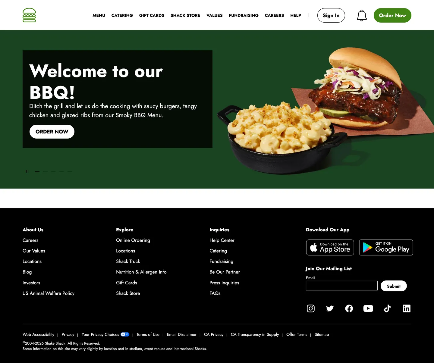
Shake Shack's marketing site makes a move most QSR brands won't: it runs a genuine color. Where McDonald's has retreated to charcoal-on-white photography stacks and Chipotle leans on a burnt-umber outline system, Shake Shack uses a saturated forest green as its entire hero surface. The above-fold experience is full-bleed food photography — a BBQ burger and a cast-iron mac and cheese — hovering on that green ground with a black text card overlapping the bottom left corner. "Welcome to our BBQ!" runs at 60px / weight 700 in white Jost; "Order Now" sits in a white pill beneath it. The only nav element rendered in color is a matching forest green "Order Now" pill in the top right corner. The system is chromatic in exactly two places — and they are the same green.
The DESIGN.md packages the system into a machine-readable spec for React tooling. Inside: 5 colors tokens drawn from the captured page — the forest green voltage (#418613), pure white (#ffffff) and pure black (#000000) as the structural pair, a medium gray (#707070) for secondary text, and a light gray (#e6e6e6) hairline tone. Ten Jost typography tokens span the 60px/700 hero headline down to 12.8px body micro-text; Roboto appears only as the form-label fallback in the email signup field and is not part of the designed typographic system. The radius scale is almost exclusively 30px pill-rounding, with 40px and 35px variants for larger and slightly smaller surfaces, and a 50% circle for icon badges. Twelve component definitions cover the hero, the green CTA pill, the white outline secondary button, the top nav, the footer, and the menu card.
Feed this file to an AI coding tool and it reproduces Shake Shack's specific choices: forest green as surface rather than accent, full-bleed food photography as the page's only chromatic moment besides the brand, Jost at modest weight discipline (no 900 or ultra), and 30px pill buttons that echo the burger shape without overpowering the photography. The system's restraint is in what it doesn't do: no gradient mesh, no texture overlay, no secondary accent, no typographic flourish. The green and the food photograph do the entire identity job.
What makes it distinct
5
- Photography-over-chrome heroa full-bleed food photograph carries every chromatic moment above the fold; the green hero canvas sits beneath, not on top
- Single forest green voltagethe green CTA pill and hero background are the same token; the system is chromatic in exactly one place and nowhere else
- Jost as the only voiceevery typographic tier from 60px display to 14px nav label shares one typeface family with no serif, mono, or display companion
- Binary surface jumpthe hero sits on forest green, the footer on pure black, with no mid-tone surface band separating the two
- Full-pill radius disciplinethe dominant border-radius is 30px (a functional pill for buttons); there is no square-corner or 4px tight-rounding tier
shakeshack.com
Live at shakeshack.com
A snapshot of the brand in production. Scroll the frame to see the whole page.
Colors
5 colors
Shake Shack's system runs on #418613 as its primary voltage, used in 2 of 13 components. Type is set in Jost across 10 tokens from 14px to 60px, weights 400–700. Shape language is mixed across 13 components, blending pills, soft rounds, and squarer corners.
Brand & Accent
Sparing, CTA-only voltage · 1
Surface
Page and card backgrounds · 1
Text
Headlines, body, captions · 2
Borders & Hairlines
Dividers, outlines, rules · 1
Typography
10 type tokens
Set in Jost across 10 tokens, from 14px to 60px, weights 400–700. Shown in its own stack: where the font isn't installed, the fallback the file names stands in.
- display-xl60px · weight 700 · lh 72pxThe quick brown fox jumps over the lazy dog
- display-md30px · weight 700 · lh 34pxThe quick brown fox jumps over the lazy dog
- heading-md20px · weight 400 · lh 30pxThe quick brown fox jumps over the lazy dog
- heading-sm16px · weight 700 · lh 24pxThe quick brown fox jumps over the lazy dog
- body-md16px · weight 400 · lh 22.4pxThe quick brown fox jumps over the lazy dog
- body-sm14px · weight 400 · lh 21pxThe quick brown fox jumps over the lazy dog
- label-md14px · weight 400 · lh 14pxThe quick brown fox jumps over the lazy dog
- label-uppercase14px · weight 700 · lh 14pxThe quick brown fox jumps over the lazy dog
- button-md17px · weight 700 · lh 24pxThe quick brown fox jumps over the lazy dog
- nav-link14px · weight 700 · lh 14pxThe quick brown fox jumps over the lazy dog
Layout
Radii and spacing
5 corner radii and 7 spacing values. Shape language: mixed.
Radii
- none0px
- sm35px
- md30px
- lg40px
- full50%
Spacing
- xs5px
- sm8px
- md20px
- base25px
- lg30px
- xl50px
- 2xl75px
Components
13 components
Each rendered from its tokens (color, type, radius, padding) on Shake Shack's own canvas.
- Button Primarybutton-primaryButton Primary
- Button Secondarybutton-secondaryButton Secondary
- Button Herobutton-heroButton Hero
- Top Navtop-navTop Nav
- Nav Linknav-linkNav Link
- Hero Sectionhero-sectionHero Section
- Hero Headinghero-headingHero Heading
- Hero Text Cardhero-text-cardHero Text Card
- Body Paragraphbody-paragraphBody Paragraph
- Body Paragraph Mutedbody-paragraph-mutedBody Paragraph Muted
- CardcardCard
- Type here…text-inputText Input
- FooterfooterFooter
In use
The system, in use
Shake Shack's tokens on the kind of product it builds.
Build something people actually use.
A short paragraph of marketing copy that previews how the brand's display tier and body tier read together. Two sentences is usually enough.
FAQ
Shake Shack design system FAQ
Common questions about Shake Shack's tokens, components, and how to use this DESIGN.md in your project.
Read next
Related reading
Specs, directories, and component libraries that pair with this design system.
- Browse all design systemsThe full directory of DESIGN.md files on shadcn.io, with live mockups for each.shadcn.io
- Shake Shack — official siteShake Shack's public marketing site — the source of truth for the live tokens captured in this file.shakeshack.com (opens in a new tab)
- The DESIGN.md specificationGoogle Labs' open spec for machine-readable design system files — the format this page is built on.github.com (opens in a new tab)
Use it
Use Shake Shack in your project
One machine-readable file. Drop it into Claude, Cursor, or any AI tool that reads DESIGN.md.
Download the DESIGN.md
One machine-readable file: every color, type, radius, spacing, and component token of Shake Shack.
Feed it to your AI tool
Drop it into Claude, Cursor, or GitHub Copilot. The agent writes React components and Tailwind classes that match Shake Shack's visual language.
Reference the tokens directly
Or paste the values into your Tailwind config, CSS variables, or component library: every color, size and radius is a quoted, ready-to-copy value.
Read the full DESIGN.md: overview, rationale, do’s and don’ts
Overview
Shake Shack's marketing site stakes out territory that most quick-service brands have abandoned. Photography-over-chrome. Where McDonald's editorial grid has retreated to charcoal text columns and Chipotle runs its burnt-umber outline system, Shake Shack gives the camera the full canvas — a high-resolution food photograph covers the hero and the brand's forest green acts as the floor it sits on, not as wallpaper. The hero BBQ burger shot bleeds edge to edge with a black card overlapping the bottom left to anchor the headline; the green is visible around the photograph like a stage surround rather than a graphic design element.
The chromatic system is built on one decision: the forest green ({colors.primary} — #418613) is the brand's only chromatic moment on the page, and it appears in exactly two high-value positions — as the hero background and as the top-nav "Order Now" pill CTA. It never dilutes itself into link accents, hover states, or decorative panels. Compared to Five Guys' crimson flooding the page as text, borders, and backgrounds, Shake Shack's green is a held breath — you notice it because it doesn't repeat.
Typography is Jost throughout — a single geometric sans that runs from the 60px/700 hero headline down to 14px nav labels without introducing a companion family. The one non-Jost text on the page (Roboto on the email form label) is a Material UI framework default, not a design intent. Display tops out at weight 700; there is no weight 900 or condensed ultra anywhere in the system.
Key Characteristics:
- Forest green voltage (
{colors.primary}— #418613) used in only two positions: hero background and nav CTA pill. Not scattered into secondary accents or link colors. - Full-bleed food photography as the hero's primary visual, with the green visible around and beneath the image like a matting border.
- Jost across every typographic tier — no display family split, no mono companion, no serif. Single-family discipline.
- 30px pill radius on all button surfaces (14 captured occurrences); no tight-rounding (4–8px) tier anywhere in the system.
- Binary surface logic: forest green above the fold, white canvas mid-section, pure black footer — no mid-tone surface band between them.
- "Order Now" CTA pill appears in two identical positions: top-right of the nav and inside the hero text card; same label, same function, different color-fill.
- Muted gray (
{colors.ink-muted}— #707070) confined to secondary text: form helper text, location captions, and supporting copy. Never used for borders.
Colors
Brand
- Primary Green (
{colors.primary}— #418613): frequency 2 as background, 1 as border. The entire chromatic identity of the marketing system — the hero canvas and the nav pill fill are the only two background uses captured. Compared to McDonald's Arches yellow (appearing once as a CTA pill) or Cloudflare's orange (filling the entire hero block), the green is similarly restrained but applied as both a surface and a button, not just one or the other.
Text
- Ink (
{colors.ink}— #000000): frequency 148 as text, 13 as background (footer), 146 as border. The structural workhorse — carries every nav label, hero card body text, and footer link. The same pure black serves as both text and the footer canvas, which removes the need for a separate footer surface token. - Ink Muted (
{colors.ink-muted}— #707070): frequency 59 as text and border. Secondary text — form helper labels, supporting body copy, and location captions. Merged from two near-identical gray tones in the extraction, converging on the single #707070 token.
Surface
- Canvas (
{colors.canvas}— #ffffff): frequency 154 as text (white text on dark surfaces), 18 as background (the mid-page white band and hero card button fill), 154 as border. The structural white — serves both as the mid-page body surface and as white text rendering on the green and black backgrounds.
Hairline
- Hairline (
{colors.hairline}— #e6e6e6): frequency 1 as text, 1 as border. A single light-gray hairline — appears on the email input underline and a subtle divider, not as card borders. The system is so border-light that this token rarely appears.
Typography
Font Family
The system runs Jost as a single-family stack across every designed tier — display, heading, body, button, and nav label. The fallback chain is Jost, Arial, serif. Roboto appears in the extraction as the form label helper text family, but this traces to a Material UI form component default rather than a deliberate Shake Shack typographic choice; it is not part of the designed system.
Hierarchy
| Token | Size | Weight | Line Height | Use |
|---|---|---|---|---|
{typography.display-xl} | 60px | 700 | 72px | Hero h1 / carousel headline ("Welcome to our BBQ!") |
{typography.display-md} | 30px | 700 | 34px | H2 section headings |
{typography.heading-md} | 20px | 400 | 30px | Sub-section lead paragraphs |
{typography.heading-sm} | 16px | 700 | 24px | Card titles and menu category headings |
{typography.body-md} | 16px | 400 | 22.4px | Default running text and nav link labels |
{typography.body-sm} | 14px | 400 | 21px | Supporting body copy and footer links |
{typography.label-md} | 14px | 400 | 14px | Form labels and inline metadata |
{typography.label-uppercase} | 14px | 700 | 14px | Uppercase nav labels (MENU, CATERING, GIFT CARDS…) |
{typography.button-md} | 17px | 700 | 24px | All CTA button labels ("Order Now", "Submit") |
{typography.nav-link} | 14px | 700 | 14px | Top-nav link labels in uppercase |
Principles
Display weight tops out at 700. The 60px / 700 hero headline is the loudest typographic moment — there is no escalation to 900 or condensed ultra. Body copy and nav labels at 400 are the supporting register; 700 is reserved exclusively for CTAs and headings. No intermediate 500 weight appears on the page. The uppercase treatment is scoped to nav links only; body copy and headings run in mixed-case Jost.
Note on Font Substitutes
Jost is a free Google Font. No substitution is needed for web use. For variable-font environments where Jost may not load correctly, DM Sans or Nunito tracks its rounded geometric feel closely at the same weight scale. For the display tier specifically (60px / 700), Nunito Bold renders a near-identical cap-height and counter shape.
Layout
Spacing System
- Base unit: 8px, appearing 37 times in the captured page — the most frequent spacing value.
- Tokens:
{spacing.xs}5px ·{spacing.sm}8px ·{spacing.md}20px ·{spacing.base}25px ·{spacing.lg}30px ·{spacing.xl}50px ·{spacing.2xl}75px. - Hero internal padding: 33×22px (top × side) inside the hero text card.
- Button padding: 10x17px for primary and secondary CTAs; 11x20px for the hero card button.
- Nav padding: ~8px vertical, 30px horizontal.
- Footer padding: 50px top/bottom, 75px horizontal.
Grid & Container
- Hero: full-bleed green canvas extending to all four edges, with the food photograph covering most of the surface and the black text card overlapping from the bottom left at roughly 50% page width.
- Mid-section: white canvas, appears to be a short transition band (visible in the screenshot as a blank white strip between the hero and the footer).
- Footer: full-bleed black canvas organized as a 4-column link grid (About Us / Explore / Inquiries / Download Our App) with a mailing-list form and social icon row at the right.
Rhythm
The page structure is stark: one full-bleed colored band (green hero), one narrow white break, and one full-bleed dark band (footer). There is no interior card grid, no scroll-reveal section stack, and no content section between the hero and footer visible in the captured screenshot. The rhythm is dictated by the carousel — the hero cycles through promotional slides, each with its own food photograph and headline.
Elevation
The system has no shadow tier. The captured extraction shows zero shadow occurrences. Depth comes entirely from surface-color contrast — the black text card sits against the green hero through color alone, with no shadow halo or border. The white-fill hero CTA button reads as elevated against the black card via the border color, not shadow. The footer hairline divider uses {colors.hairline} (#e6e6e6) as the only structural border on the page.
- Flat: 100% of surfaces — hero card, nav, footer, all buttons.
- No drop shadows, no glow, no blur layers.
Shapes
The radius scale is pill-dominant:
{rounded.none}0px — nav bar, hero section, footer, the email form input.{rounded.sm}35px — a slight variant on the standard pill, appearing once.{rounded.md}30px — the primary button radius, appearing 14 times across CTAs.{rounded.lg}40px — a single larger pill variant.{rounded.full}50% — circle treatment for icon badges or avatar surfaces.
There is no 4px, 8px, or 12px tight-rounding tier. The shape language is binary: either flat-cornered (nav, hero, footer) or a generous pill. The pill radius is generous enough that at button heights of 48px, a 30px radius produces a fully circular cap, making the buttons appear as true pills.
Components
button-primary — Forest green {colors.primary} fill, white text, {rounded.md} 30px radius, 10x17px padding, 48px height. "Order Now" is the canonical label, appearing in the top-right nav position. The green fill is the only instance of the brand voltage on the page outside the hero section background.
button-secondary — White {colors.canvas} fill, black text, white border, {rounded.md} 30px radius, 10x17px padding, 48px height. Used as the "Sign In" button in the top nav — the outline pill variant that sits alongside the green primary CTA.
button-hero — White fill, black text, 30px radius, 11x20px padding. The "ORDER NOW" pill inside the hero text card — same dimensions as the primary button but positioned over the dark hero card rather than the nav bar, with white fill to contrast against the black card background.
top-nav — White {colors.canvas} surface, 64px height, Shake Shack burger logo at left, link labels in uppercase Jost 700 at 14px center, and "Sign In" outline pill + bell icon + "Order Now" green pill at right.
nav-link — Transparent background, black text, {typography.nav-link} (14px / 700), uppercase, no padding. Rendered as MENU, CATERING, GIFT CARDS, SHACK STORE, VALUES, FUNDRAISING, CAREERS, HELP.
hero-section — Full-bleed forest green {colors.primary} canvas with food photograph covering most of the surface. No border-radius; extends to all four edges of the viewport.
hero-heading — White text at {typography.display-xl} (60px / 700), rendered inside the hero text card over the dark black surface.
hero-text-card — Pure black {colors.ink} fill, white text, no border-radius, 33×22px padding. The text-and-CTA panel overlapping the lower-left quadrant of the hero. Houses the headline, one-line sub-copy ("Ditch the grill and let us do the cooking…"), and the white CTA pill.
body-paragraph — Default ink text at {typography.body-md} — for any running text in mid-page editorial sections.
body-paragraph-muted — Muted gray {colors.ink-muted} text at {typography.body-sm} for captions, helper text, and supporting copy beneath headings.
card — White canvas, black text, no border-radius, 25px internal padding, hairline border. The generic content card for menu tiles, promotions, and editorial panels.
text-input — Transparent background, white text on dark surfaces, no border-radius, underline-style border via {colors.canvas} at the bottom edge only. Used in the footer mailing-list form; Material UI's text field pattern with a bottom-only border.
footer — Pure black {colors.ink} canvas, white text at {typography.body-sm}, 50px vertical and 75px horizontal padding. Four-column link grid, social icon row, App Store / Google Play badges, and a mailing-list email form.
Do's and Don'ts
Do use {colors.primary} (#418613) only for the two highest-value conversion positions: the top-nav CTA pill and the hero background. The system's voltage is scarce by design — adding the green to tab pills, hover states, or link accents would destroy the restraint that makes the two positions read as significant.
Do keep the hero text card on pure {colors.ink} (#000000) — not a charcoal, not a dark green, not a semi-transparent overlay. The sharp black-on-green contrast is the layout's primary depth signal; softening the card color would lose the punch.
Do run Jost at 700 for all button labels. The system uses a single weight (700) for CTAs across both the primary green pill and the secondary white outline — weight consistency across button types is part of the system's uniformity.
Do pair full-bleed food photography with the green canvas rather than brand-colored graphics or illustration. The photography is load-bearing; the system doesn't work without it, and the green canvas is designed to frame it rather than compete with it.
Don't introduce a secondary accent color. The system has exactly one chromatic moment — forest green #418613. Adding an orange, a yellow, or a secondary red for promotions would undermine the single-voltage discipline that makes the green readable as brand signature.
Don't use {colors.ink-muted} (#707070) for borders or hairlines. It appears 59 times in the extraction but exclusively as text — never as a border tone. For structural borders, use {colors.hairline} (#e6e6e6) or {colors.canvas} (white-on-dark).
Don't reduce the button radius below 30px. The pill shape reads as a deliberate brand gesture, echoing the rounded bun form of the product. A tight 4–8px radius would read as generic enterprise software and clash with the food photography context.
Don't use weight 400 for button labels or heading text. The system draws a hard line between 400 (body, nav labels, supporting copy) and 700 (CTAs, headings, uppercase labels). Blurring that boundary with a 500 or 600 weight would lose the binary contrast that makes CTAs read decisively against body text.
Known Gaps
- Mid-page content sections: the captured screenshot shows only the hero carousel and footer with a white gap between them; any menu tile grid, featured items, or promotional cards that sit between the two are not represented in this spec.
- Hover and focus states: no hover captures were taken from the extraction; the green CTA's hover state (likely a darker forest green), the "Sign In" outline hover, and nav link underlines are not documented.
- Dark mode: the system appears light-only on the marketing surface; if a dark-mode homepage exists in the app (post-authentication), its tokens are not represented here.
- App-specific patterns: the
/orderflow and the rewards dashboard carry their own component set (cart drawers, item customization, location selectors) that is outside the scope of the marketing page extraction. - Carousel states: the hero cycles through promotional slides (each with its own headline and food photograph); only the first captured slide is represented; other slide layouts, indicator dots, and transition styles are not documented.
- Form states: the email input carries only the resting state; error, success, and focus ring states from the mailing-list form are not exposed in the extraction.
- Roboto typography: Roboto appears on the form label as a Material UI default; if any other third-party component library fonts appear in the full ordering flow, they are not captured here.
Food & Delivery
More systems like this
More DESIGN.md files in Food & Delivery.
Pricing
Build it with Pro
The DESIGN.md files are free. Pro adds 6,000+ blocks, premium templates and the MCP server, so your AI editor builds in your system for you.
4.9/5 out of 5 · 150+ reviewsfrom 150+ founders and developers.
Billing
Billed once a year in USD. Cancel anytime.
- How many people can use the license.
- Client work, SaaS products and anything you charge for.
- Production-ready React sections: hero, pricing, features, dashboards and more.
- Complete multi-page sites you can ship as they are.
- React icons from every major library, installable with one command.
- Presets that restyle every block, in light and dark.
- Lets your AI editor search, preview and install blocks for you.
- Priority requests are answered first.
Individual
For personal projects & open source
$32instead of $49/mo
$389 billed yearly
- Seats: 1 seat
- Commercial use: Personal & open source only
- Pro blocks: 6,000+ blocks
- Templates: All 14 templates
- React icons: 294k+ icons
- Themes: All 59 themes
- MCP server: Basic usage
- Support: Standard
Team
Most popularFor freelancers, agencies & startups
$66instead of $99/mo
$789 billed yearly · ≈ $13/dev/mo
- Seats: Up to 5 seats
- Commercial use: Included
- Pro blocks: 6,000+ blocks
- Templates: All 14 templates
- React icons: 294k+ icons
- Themes: All 59 themes
- MCP server: High usage
- Support: Priority
Organization
For companies with larger teams
$132instead of $199/mo
$1,589 billed yearly
- Seats: Unlimited seats
- Commercial use: Included
- Pro blocks: 6,000+ blocks
- Templates: All 14 templates
- React icons: 294k+ icons
- Themes: All 59 themes
- MCP server: Unlimited usage
- Support: Priority
Billed once a year in USD. Cancel anytime.
Individual
For personal projects & open source
$32instead of $49/mo
$389 billed yearly
- How many people can use the license.Seats: 1 seat
- Client work, SaaS products and anything you charge for.Commercial use: Personal & open source only
- Production-ready React sections: hero, pricing, features, dashboards and more.Pro blocks: 6,000+ blocks
- Complete multi-page sites you can ship as they are.Templates: All 14 templates
- React icons from every major library, installable with one command.React icons: 294k+ icons
- Presets that restyle every block, in light and dark.Themes: All 59 themes
- Lets your AI editor search, preview and install blocks for you.MCP server: Basic usage
- Priority requests are answered first.Support: Standard
Team
Most popularFor freelancers, agencies & startups
$66instead of $99/mo
$789 billed yearly · ≈ $13/dev/mo
Everything in Individual, plus
- How many people can use the license.Seats: Up to 5 seats
- Client work, SaaS products and anything you charge for.Commercial use: Included
- Lets your AI editor search, preview and install blocks for you.MCP server: High usage
- Priority requests are answered first.Support: Priority
Organization
For companies with larger teams
$132instead of $199/mo
$1,589 billed yearly
Everything in Team, plus
- How many people can use the license.Seats: Unlimited seats
- Lets your AI editor search, preview and install blocks for you.MCP server: Unlimited usage
- Secure checkout via Stripe
- Code lives in your repo
- Keep what you've shipped if you cancel
- License terms
Your system, built for you
Every block, template and icon, installed by your AI agent in your design system. The DESIGN.md files stay free.