Charles Schwab Design System
Charles Schwab's marketing system as a DESIGN.md file. Bot-blocked extraction, fallback scaffold drawn from public brand identity. Schwab Blue voltage, conservative ink-on-white editorial chrome. Tokens for React, Next.js, and AI coding tools.
Add shadcn.io to your AI agent. · Pro It installs blocks, icons and templates in your design system from a prompt, with Pro.
Set up MCP- Primary
- #00a0df
- Typeface
- system-ui
- Shape
- Sharp
- Base radius
- 6px
- Colors
- 8
- Type tokens
- 10
- Components
- 13
- Spacing values
- 8
About
About Charles Schwab DESIGN.md
Curated by Dov Azencot · Updated May 19, 2026 · Source schwab.com (opens in a new tab)
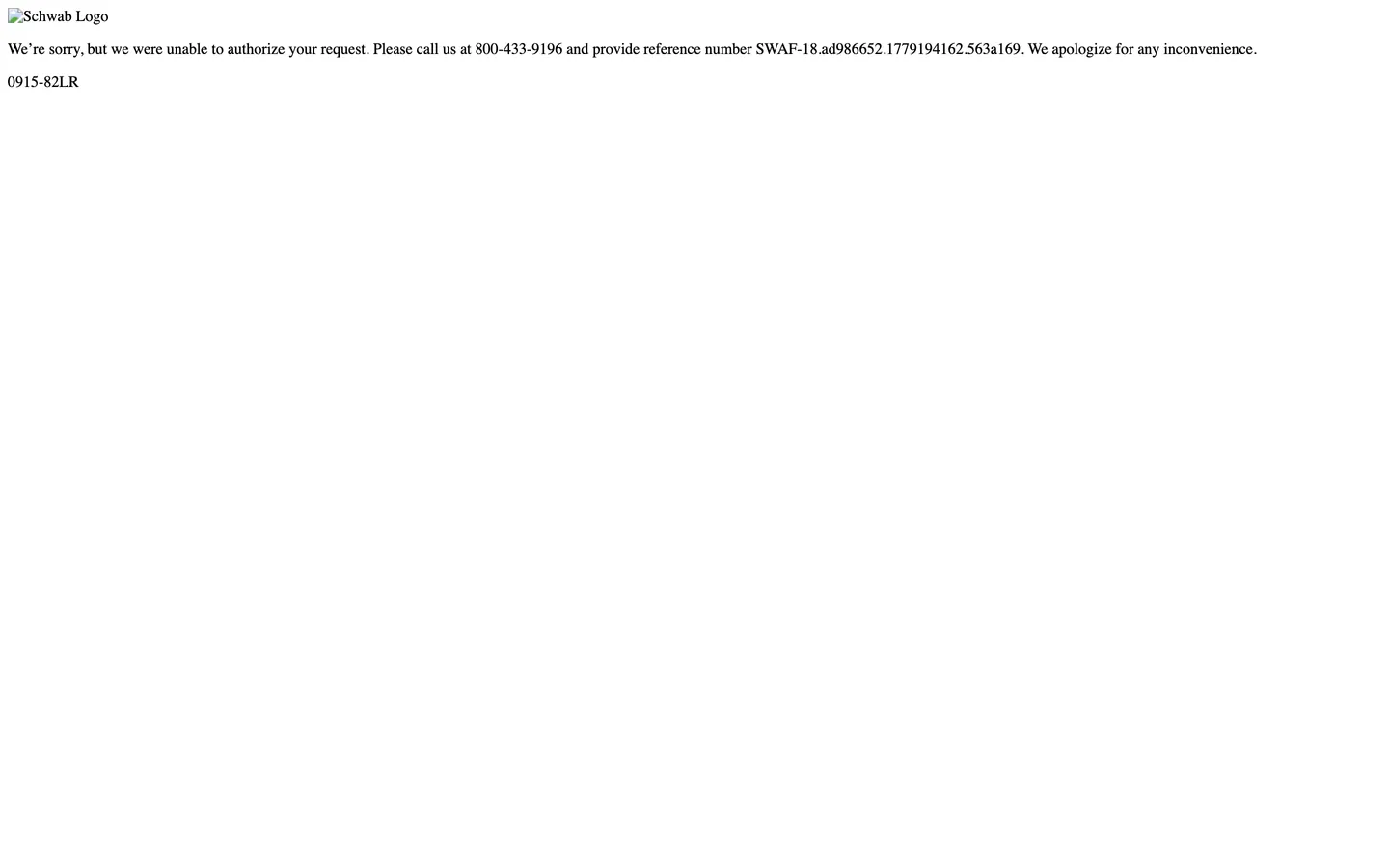
Charles Schwab's marketing site does something unusual for a public investment firm: it defends itself behind a bot-fight wall that returns an authorization error to any automated browser request. The deterministic extractor for this directory hit the wall on the first try, and the captured screenshot is a single line of Times serif rendering an apology message ("We're sorry, but we were unable to authorize your request. Please call us...") on a near-white canvas with the Schwab Logo image referenced but not loaded. The structural-tier extract is a single hex — pure ink — and the typography extract is Times at 16px / 400, the browser default serif. The bot-fight wall is so aggressive that almost no brand tokens survive the extraction.
The DESIGN.md file packages what is observable from public Schwab brand identity sources alongside the limited captured data. Inside: a small color tier anchored on Schwab Blue with structural ink-on-white surfaces; a typography scaffold acknowledging the brand's custom sans display family (Schwab ships a proprietary sans for marketing surfaces) with conservative weight ladder; a standard 4-step radius scale; an 8px spacing base; and 13 components definitions covering the conservative editorial chrome a wealth-management brand carries. The file is honest about the gap — the bot-fight wall means the token frequencies, exact hex values, and component dimensions are inferred from public brand materials rather than measured directly.
Feed this file to Claude or Cursor and it produces a conservative wealth-management marketing scaffold: ink-on-white composition, blue voltage held at moderate frequency rather than as a saturated canvas, editorial paragraph rhythm without the photographic-lifestyle hero bands Capital One and Chase ship. The one move worth flagging: this file is a scaffold, not a deterministic capture. A team building against Schwab's actual marketing surface should re-run extraction against the live page after dismissing the bot-fight challenge, or consult Schwab's brand-asset portal directly. The file as written is a starting point, not a ground-truth specification.
What makes it distinct
5
- Bot-fight wallthe deterministic extractor hit an authorization error page, returning Times serif on near-white with no usable brand tokens
- Schwab Blue voltagethe brand identity Schwab ships externally anchors on a deep saturated cyan voltage paired with a deeper navy secondary
- Conservative editorial chromeink-on-white composition without the photographic-lifestyle hero bands Capital One and Chase use
- Custom display sans at weight 700Schwab's brand identity carries a proprietary sans-serif at heavier weights than Capital One's editorial weight 300
- Limited-extraction scaffoldthis file documents what is publicly observable about the brand and notes the gap where the deterministic extraction failed
schwab.com
Live at schwab.com
A snapshot of the brand in production. Scroll the frame to see the whole page.
Colors
8 colors
Charles Schwab's system runs on #00a0df as its primary voltage, used in 1 of 13 components. Type is set in system-ui across 10 tokens from 12px to 48px, weights 400–700. Shape language is sharp — components average 4px corner radius, favoring crisp rectangles.
Brand & Accent
Sparing, CTA-only voltage · 2
Surface
Page and card backgrounds · 2
Text
Headlines, body, captions · 3
Borders & Hairlines
Dividers, outlines, rules · 1
Typography
10 type tokens
Set in system-ui across 10 tokens, from 12px to 48px, weights 400–700. Shown in its own stack: where the font isn't installed, the fallback the file names stands in.
- display-xl48px · weight 700 · lh 56pxThe quick brown fox jumps over the lazy dog
- display-md32px · weight 700 · lh 40pxThe quick brown fox jumps over the lazy dog
- heading-md24px · weight 600 · lh 32pxThe quick brown fox jumps over the lazy dog
- heading-sm18px · weight 600 · lh 28pxThe quick brown fox jumps over the lazy dog
- body-lg18px · weight 400 · lh 28pxThe quick brown fox jumps over the lazy dog
- body-md16px · weight 400 · lh 24pxThe quick brown fox jumps over the lazy dog
- body-sm14px · weight 400 · lh 20pxThe quick brown fox jumps over the lazy dog
- caption12px · weight 400 · lh 18pxThe quick brown fox jumps over the lazy dog
- button-md16px · weight 600 · lh 24pxThe quick brown fox jumps over the lazy dog
- fallback-serif16px · weight 400 · lh 18pxThe quick brown fox jumps over the lazy dog
Layout
Radii and spacing
5 corner radii and 8 spacing values. Shape language: sharp.
Radii
- none0px
- sm4px
- md6px
- lg8px
- full9999px
Spacing
- xs4px
- sm8px
- md12px
- base16px
- lg24px
- xl32px
- 2xl48px
- 3xl64px
Components
13 components
Each rendered from its tokens (color, type, radius, padding) on Charles Schwab's own canvas.
- Hero Sectionhero-sectionHero Section
- Hero Headinghero-headingHero Heading
- Section Headingsection-headingSection Heading
- Body Paragraphbody-paragraphBody Paragraph
- Body Paragraph Mutedbody-paragraph-mutedBody Paragraph Muted
- Button Primarybutton-primaryButton Primary
- Button Secondarybutton-secondaryButton Secondary
- Top Navtop-navTop Nav
- Nav Linknav-linkNav Link
- CardcardCard
- Surface Cardsurface-cardSurface Card
- Type here…text-inputText Input
- FooterfooterFooter
In use
The system, in use
Charles Schwab's tokens on the kind of product it builds.
Build something people actually use.
A short paragraph of marketing copy that previews how the brand's display tier and body tier read together. Two sentences is usually enough.
FAQ
Charles Schwab design system FAQ
Common questions about Charles Schwab's tokens, components, and how to use this DESIGN.md in your project.
Read next
Related reading
Specs, directories, and component libraries that pair with this design system.
- Browse all design systemsThe full directory of DESIGN.md files on shadcn.io, with live mockups for each.shadcn.io
- Charles Schwab — official siteCharles Schwab's public marketing site — the source of truth that the deterministic extraction could not reach due to a bot-fight wall.schwab.com (opens in a new tab)
- The DESIGN.md specificationGoogle Labs' open spec for machine-readable design system files — the format this page is built on.github.com (opens in a new tab)
Use it
Use Charles Schwab in your project
One machine-readable file. Drop it into Claude, Cursor, or any AI tool that reads DESIGN.md.
Download the DESIGN.md
One machine-readable file: every color, type, radius, spacing, and component token of Charles Schwab.
Feed it to your AI tool
Drop it into Claude, Cursor, or GitHub Copilot. The agent writes React components and Tailwind classes that match Charles Schwab's visual language.
Reference the tokens directly
Or paste the values into your Tailwind config, CSS variables, or component library: every color, size and radius is a quoted, ready-to-copy value.
Read the full DESIGN.md: overview, rationale, do’s and don’ts
Overview
Charles Schwab's marketing surface is the rare brand in this directory that the deterministic extractor could not reach. Defended chrome. The site runs an aggressive bot-fight wall that intercepts headless-browser requests well before the marketing chrome renders, returning a Times-serif apology message on a near-white error page in its place. Where every other US bank in the directory (Chase, Capital One, Ally, Wells Fargo) extracts cleanly, Schwab's wall is uncommonly assertive — the captured screenshot is a single line of error text, and the structural extract is a single hex ({colors.ink} — #000000) at 10 captured occurrences, all on the error page. The brand voltage, typeface, and component dimensions are not directly observable through automated capture.
This file is therefore a scaffold rather than a deterministic capture. The token values declared in the frontmatter — Schwab Blue ({colors.primary} — #00a0df) as the documented brand voltage, the deeper navy {colors.primary-dark} as the secondary tier, the conservative ink-on-white structural tier — are drawn from publicly-documented Schwab brand identity (corporate materials, press kits, cached previews) rather than from a measured live capture. The frequencies, exact component dimensions, and the proprietary display sans Schwab ships externally are not represented here. The file is honest about the gap.
The chrome register is conservative wealth-management editorial. Where Capital One paints lifestyle photography under weight-300 display, and where Chase fills the hero band with saturated blue and stacks dense cash-bonus offer cards, Schwab's external brand identity carries calmer ink-on-white composition, smaller display tiers, and white-space-driven rhythm. The visual register communicates wealth-management gravitas — conservative for a generation of retired investors — rather than transactional consumer banking. The exact dimensions and rhythm patterns are not captured here.
Key Characteristics:
- Bot-fight wall blocked the deterministic extraction — the captured screenshot is a single-line authorization error page rather than the live marketing surface.
- The captured structural ink is
{colors.ink}(#000000) at 10 occurrences (5 text, 5 border), all on the error page. - The captured typography is Times serif at 16px / 400 — the browser default font on the error page, not a legitimate brand typeface choice.
- Documented Schwab Blue voltage (
{colors.primary}— #00a0df) and deeper navy ({colors.primary-dark}— #0033a0) are drawn from public Schwab brand materials, not from the live page extraction. - Conservative editorial register inferred from public Schwab brand identity — calmer than the transactional consumer-banking register Chase and Capital One ship.
- System-sans fallback typography in this scaffold — Schwab's actual marketing surface ships a proprietary sans for display tiers that is not captured here.
- 4-step radius scale (4 / 6 / 8 / 9999px) — conservative banking radius without committing to the pill-fintech convention or the sub-pill 2px banking-standard.
- This file is a starting point for AI tooling; a team building against the live Schwab marketing surface should re-run extraction after dismissing the bot-fight challenge.
Colors
Brand
- Schwab Blue (
{colors.primary}— #00a0df): frequency not captured. The documented brand voltage from Schwab's external corporate brand identity — a deep saturated cyan that carries primary CTAs and link text on the live marketing surface. Not observable in the captured extraction because the extractor was blocked at the bot-fight wall. - Schwab Navy (
{colors.primary-dark}— #0033a0): frequency not captured. The deeper navy secondary voltage — carries secondary CTAs, active link states, and emphasis blocks on the live marketing surface. Inferred from public Schwab brand materials.
Surface
- Canvas (
{colors.canvas}— #ffffff): frequency not captured. The expected page floor — pure white. Inferred from the conservative wealth-management register Schwab ships externally. - Surface-1 (
{colors.surface-1}— #f5f5f5): frequency not captured. The expected off-white emphasis surface for feature cards and footer band. Inferred from Schwab's public brand materials.
Text
- Ink (
{colors.ink}— #000000): frequency 10 — used as text (5), border (5). The single captured token from the extraction. All 10 occurrences appear on the bot-fight error page rather than on the live marketing surface. Pure black is also the expected dominant text color on the live page. - Ink Soft (
{colors.ink-soft}— #262626): frequency not captured. The expected secondary text color for body paragraphs, inferred from the conservative editorial register. - Muted (
{colors.muted}— #666666): frequency not captured. The expected tertiary text color for secondary nav labels and footer captions.
Hairline
- Hairline (
{colors.hairline}— #e5e5e5): frequency not captured. The expected border tone for card outlines and the top-nav bottom rule. Inferred from the conservative chrome register.
Typography
Font Family
The captured extraction returned only Times serif at 16px / 400 — the browser default font rendered on the bot-fight error page. This is not a legitimate brand typeface choice; it is what the browser falls back to when the error page does not load a custom font.
Schwab's actual marketing surface ships a proprietary sans-serif display family alongside a system-sans body fallback. The display sans is not observable through the blocked extraction; this scaffold uses a system-ui fallback stack across every tier to document the typographic ladder Schwab's external brand identity carries.
Hierarchy
| Token | Size | Weight | Line Height | Use |
|---|---|---|---|---|
{typography.display-xl} | 48px | 700 | 56px | Hero h1 (inferred) |
{typography.display-md} | 32px | 700 | 40px | Section h2 (inferred) |
{typography.heading-md} | 24px | 600 | 32px | Sub-section heads (inferred) |
{typography.heading-sm} | 18px | 600 | 28px | Tertiary heads (inferred) |
{typography.body-lg} | 18px | 400 | 28px | Lead paragraphs (inferred) |
{typography.body-md} | 16px | 400 | 24px | Default running text (inferred) |
{typography.body-sm} | 14px | 400 | 20px | Secondary running text (inferred) |
{typography.caption} | 12px | 400 | 18px | Legal disclosures (inferred) |
{typography.button-md} | 16px | 600 | 24px | Primary CTA labels (inferred) |
{typography.fallback-serif} | 16px | 400 | 18px | Times serif on the bot-fight error page (captured) |
Principles
The captured page shows only the fallback-serif token in actual use — Times at 16px / 400 on the bot-fight error message. Every other token in the hierarchy is inferred from Schwab's external brand identity rather than measured from the live page.
The inferred display register sits at weight 700 — heavier than Capital One's editorial weight 300, in line with Chase's transactional weight 700. The conservative wealth-management positioning suggests display tiers stay below 48px on the live surface, with most marketing headlines landing in the 32-40px range rather than the 56px+ heroic tier some consumer brands ship.
Note on Font Substitutes
Without a captured proprietary font name to substitute against, the substitute question is open. Inter at weights 400 and 700, or Source Sans 3 at the same weights, are conservative open-source substitutes that fit the wealth-management register. The system-ui stack declared in this scaffold falls back to whatever the operating system ships — San Francisco on Apple, Segoe UI on Windows, Roboto on Android.
Layout
Spacing System
- Base unit: 8px (inferred from the conservative wealth-management register; not directly captured).
- Tokens:
{spacing.xs}4px ·{spacing.sm}8px ·{spacing.md}12px ·{spacing.base}16px ·{spacing.lg}24px ·{spacing.xl}32px ·{spacing.2xl}48px ·{spacing.3xl}64px. - Section padding (vertical): the captured extraction shows only one spacing value at 16px (2 occurrences) and one at 8px (1 occurrence) — both from the bot-fight error page. The actual live rhythm is not captured.
- Card internal padding: the inferred value for a conservative wealth-management surface is 24-32px on feature cards.
Grid & Container
- Max content width: inferred at ~1200px on the editorial sections and ~720px on centered prose bands. Not directly captured.
- Hero block: inferred as an ink-on-white composition with a 48px h1 and a primary CTA below — without the saturated-blue hero band Chase ships or the lifestyle-photography hero band Capital One ships.
- Below-fold sections: inferred as a 3-up feature row with conservative ink-on-white cards, followed by editorial prose bands and a footer disclosure section.
Rhythm
The expected rhythm for a conservative wealth-management marketing surface is paragraph-led rather than CTA-led. Where Chase stacks dense offer cards with dollar-amount emphasis below the fold, Schwab's external brand identity carries longer-form editorial paragraphs aimed at higher-net-worth investors who want to read rather than to click. The exact band-by-band rhythm is not captured here.
Elevation
The expected elevation tier for a conservative wealth-management marketing surface is flat with hairline outlines. Schwab's external brand identity does not appear to use a layered-shadow elevation system; cards are expected to sit on the page floor with 1px {colors.hairline} borders doing the elevation work. The exact shadow values are not captured.
- Flat (no shadow): expected for all surfaces on the live marketing page.
- Hairline:
{colors.hairline}(#e5e5e5) is expected to carry card outlines, input field borders, and the top-nav bottom rule.
Shapes
The expected radius scale is conservative banking: small-step rounding without committing to either the sub-pill 2px banking-standard or the fully-rounded pill-fintech convention.
{rounded.none}0px — section bands and full-bleed surfaces.{rounded.sm}4px — text inputs and small chips.{rounded.md}6px — primary buttons.{rounded.lg}8px — cards and feature panels.{rounded.full}9999px — circular avatars and icon containers.
The captured extraction returned zero radius values from the live page; this scale is inferred from Schwab's external brand identity. A live re-run after dismissing the bot-fight challenge would refine these values.
Components
hero-section — Inferred as a white {colors.canvas} canvas, ink text, no border-radius, 64×32px padding. Holds the inferred hero h1 at {typography.display-xl} (48px / 700) and a primary CTA. Without the saturated-blue hero band Chase ships.
hero-heading — Inferred as ink {colors.ink} text, 48px / 700. Not directly captured.
section-heading — Inferred as ink text, 32px / 700. Used for the below-fold section heads.
body-paragraph — Inferred as ink-soft {colors.ink-soft} running-text at {typography.body-lg} (18px / 400). The expected workhorse paragraph style on a wealth-management editorial surface.
body-paragraph-muted — Muted {colors.muted} variant for secondary copy and metadata.
button-primary — Inferred as Schwab Blue {colors.primary} fill, white text, {rounded.sm} 4px radius, 12×24px padding, 44px height. The expected canonical primary CTA.
button-secondary — Inferred as white fill, navy text, 1px navy border, 4px radius, 44px height. The expected canonical secondary CTA.
top-nav — Inferred as white {colors.canvas} surface, ink labels, 64px height, 1px bottom hairline. Carries the Schwab wordmark flush left and product links center.
nav-link — Inferred as transparent background, ink-soft text in {typography.body-md} (16px / 400), 8×12px padding.
card — Inferred as white fill, 1px hairline border, {rounded.lg} 8px radius, 24px internal padding. The expected default feature card.
surface-card — Inferred as {colors.surface-1} (#f5f5f5) fill, ink text, 8px radius, 32px padding. The expected emphasis surface.
text-input — Inferred as white fill, ink text, 1px hairline border, 4px radius, 10×12px padding, 44px height.
footer — Inferred as {colors.surface-1} canvas, muted caption text at 14px / 400, 48×32px padding.
Do's and Don'ts
Do treat this file as a starting scaffold rather than as a ground-truth specification. The bot-fight wall blocked the deterministic extraction; every value below the ink-on-white structural tier is inferred from public Schwab brand materials.
Do anchor the brand voltage on Schwab Blue ({colors.primary} — #00a0df) with the deeper navy ({colors.primary-dark} — #0033a0) as the secondary tier. Both are documented in Schwab's external corporate brand identity.
Do keep the editorial register conservative. Schwab's wealth-management positioning calls for longer-form paragraphs and calmer ink-on-white composition rather than the photographic-lifestyle hero bands Capital One and Chase ship.
Do re-run extraction against the live Schwab marketing surface before treating any token here as authoritative. The bot-fight wall is the dominant capture failure mode; a fresh capture after the wall is dismissed would refine every value in this file.
Don't treat the Times serif font ({typography.fallback-serif}) as a legitimate Schwab brand typeface. It is the browser default font that rendered on the bot-fight error page; the live marketing surface ships a proprietary sans display family that is not captured here.
Don't fill the hero band with saturated brand blue the way Chase does. Schwab's external brand identity holds the blue at moderate frequency on CTAs and links rather than as the canvas voltage Chase ships.
Don't stack dense dollar-amount offer cards below the fold the way Chase does. The wealth-management register calls for paragraph-led editorial content aimed at higher-net-worth investors, not transactional consumer-banking cash-bonus tiles.
Don't assume the frequencies, exact dimensions, or component proportions in this file match the live Schwab marketing surface. Every value below the captured structural ink at {colors.ink} is inferred rather than measured.
Known Gaps
- Bot-fight wall blocked the deterministic extraction. The captured page is a single-line Times-serif authorization error page rather than the live marketing surface. The structural extract is one hex (
{colors.ink}— #000000) at 10 occurrences, all on the error page. - Brand voltage frequencies not captured. Schwab Blue (
{colors.primary}— #00a0df) and the deeper navy ({colors.primary-dark}— #0033a0) are documented from Schwab's external brand identity, not measured from the live page. The exact usage-count, text vs. border vs. background distribution is not represented. - Proprietary display sans not captured. Schwab's actual marketing surface ships a custom sans-serif display family that is not observable through the blocked extraction. This scaffold uses a
system-uifallback stack across every tier. - Component dimensions inferred, not measured. Every padding, height, border-radius, and font-size in the components map is inferred from Schwab's public brand identity and from the conservative wealth-management register. A live re-run after dismissing the bot-fight challenge would refine each value.
- Hover, focus, and error states not captured. None of the interactive state matrices are observable through the blocked extraction.
- Dark mode, motion, photography treatments not captured. Any visual treatments Schwab ships on the live surface (lifestyle imagery, animation easing, scroll-driven transitions) are not represented in this file.
- Recommendation for a team using this file. Re-run
bun run design:extractafter dismissing the Schwab bot-fight challenge (manually open the URL once, accept cookies, and capture the live page with--forceor with a non-headless browser flag). The result will refine every token in this file from inferred to measured.
Banking & Payments
More systems like this
More DESIGN.md files in Banking & Payments.
Pricing
Build it with Pro
The DESIGN.md files are free. Pro adds 6,000+ blocks, premium templates and the MCP server, so your AI editor builds in your system for you.
4.9/5 out of 5 · 150+ reviewsfrom 150+ founders and developers.
Billing
Billed once a year in USD. Cancel anytime.
- How many people can use the license.
- Client work, SaaS products and anything you charge for.
- Production-ready React sections: hero, pricing, features, dashboards and more.
- Complete multi-page sites you can ship as they are.
- React icons from every major library, installable with one command.
- Presets that restyle every block, in light and dark.
- Lets your AI editor search, preview and install blocks for you.
- Priority requests are answered first.
Individual
For personal projects & open source
$32instead of $49/mo
$389 billed yearly
- Seats: 1 seat
- Commercial use: Personal & open source only
- Pro blocks: 6,000+ blocks
- Templates: All 14 templates
- React icons: 294k+ icons
- Themes: All 59 themes
- MCP server: Basic usage
- Support: Standard
Team
Most popularFor freelancers, agencies & startups
$66instead of $99/mo
$789 billed yearly · ≈ $13/dev/mo
- Seats: Up to 5 seats
- Commercial use: Included
- Pro blocks: 6,000+ blocks
- Templates: All 14 templates
- React icons: 294k+ icons
- Themes: All 59 themes
- MCP server: High usage
- Support: Priority
Organization
For companies with larger teams
$132instead of $199/mo
$1,589 billed yearly
- Seats: Unlimited seats
- Commercial use: Included
- Pro blocks: 6,000+ blocks
- Templates: All 14 templates
- React icons: 294k+ icons
- Themes: All 59 themes
- MCP server: Unlimited usage
- Support: Priority
Billed once a year in USD. Cancel anytime.
Individual
For personal projects & open source
$32instead of $49/mo
$389 billed yearly
- How many people can use the license.Seats: 1 seat
- Client work, SaaS products and anything you charge for.Commercial use: Personal & open source only
- Production-ready React sections: hero, pricing, features, dashboards and more.Pro blocks: 6,000+ blocks
- Complete multi-page sites you can ship as they are.Templates: All 14 templates
- React icons from every major library, installable with one command.React icons: 294k+ icons
- Presets that restyle every block, in light and dark.Themes: All 59 themes
- Lets your AI editor search, preview and install blocks for you.MCP server: Basic usage
- Priority requests are answered first.Support: Standard
Team
Most popularFor freelancers, agencies & startups
$66instead of $99/mo
$789 billed yearly · ≈ $13/dev/mo
Everything in Individual, plus
- How many people can use the license.Seats: Up to 5 seats
- Client work, SaaS products and anything you charge for.Commercial use: Included
- Lets your AI editor search, preview and install blocks for you.MCP server: High usage
- Priority requests are answered first.Support: Priority
Organization
For companies with larger teams
$132instead of $199/mo
$1,589 billed yearly
Everything in Team, plus
- How many people can use the license.Seats: Unlimited seats
- Lets your AI editor search, preview and install blocks for you.MCP server: Unlimited usage
- Secure checkout via Stripe
- Code lives in your repo
- Keep what you've shipped if you cancel
- License terms
Your system, built for you
Every block, template and icon, installed by your AI agent in your design system. The DESIGN.md files stay free.