Robinhood Design System
Robinhood's retail-investing design system as a DESIGN.md file. Lime #ccff00, Martina Plantijn serif, 18 colors, 19 components. For React, Next.js, and AI tools.
Add shadcn.io to your AI agent. · Pro It installs blocks, icons and templates in your design system from a prompt, with Pro.
Set up MCP- Primary
- #ccff00
- Typeface
- Phonic
- Shape
- Soft
- Base radius
- 0px
- Colors
- 18
- Type tokens
- 11
- Components
- 19
- Spacing values
- 8
About
About Robinhood DESIGN.md
Curated by Dov Azencot · Updated May 13, 2026 · Source robinhood.com (opens in a new tab)
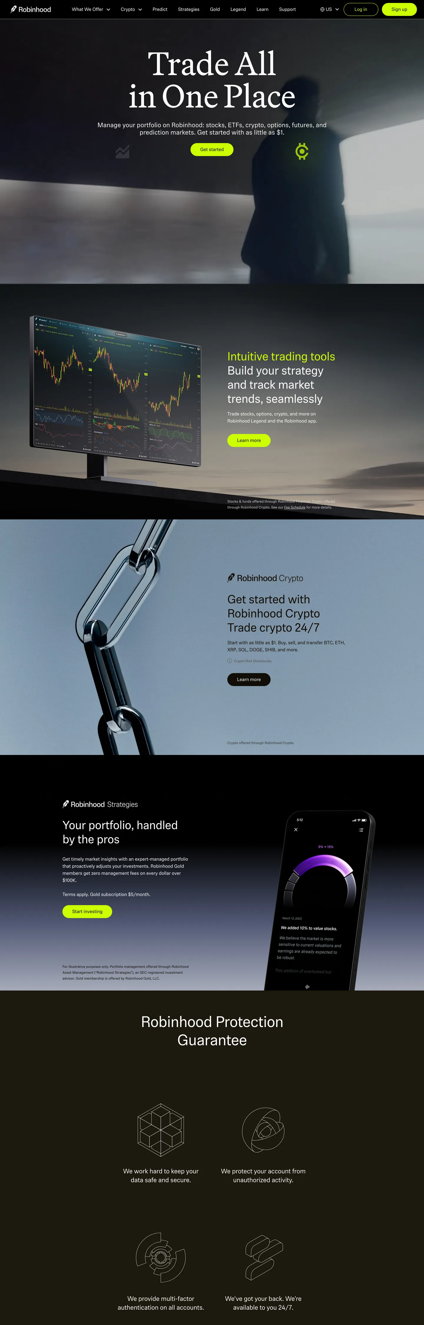
Robinhood's design language opens on warm black. The canvas sits at "#110e08" — a coffee-tinted near-black with a warmth that pure "#000000" never carries — and the hero headline lands in Martina Plantijn at 110px in regular weight. The serif choice is the brand's strongest typographic signal: where Coinbase, Stripe, and Kraken default to geometric sans display, Robinhood reaches for an editorial serif more at home in a magazine masthead than a trading dashboard. One brand voltage carries every primary action: lime-yellow "#ccff00", a high-chroma OKLCH 0.93 / 0.23 hit that fills the "Sign up" pill and nothing else. Below the hero, product mockups float as phone-frame screenshots stacked over the warm-black canvas, then a deeper warm-gray "Robinhood Protection Guarantee" band closes the page with four icon-led bullets in a 2-by-2 grid.
This page packages the spec into a single DESIGN.md file. Inside: 18 colors tokens grouped into one brand voltage, six warm-gray ink steps, and a small surface ladder; 10 typography levels spanning Martina Plantijn display, Phonic running text, and Capsule Sans Text product chrome; one pill radius at 36px; eight spacing values on an 8px base; and 19 components — the lime pill CTA, the serif hero headline, the dark product-scene card, the protection-guarantee icon tile, the warm-black nav, the phone-frame mockup, and the dark CTA band. Every hex is quoted; every Phonic and Martina weight is named so an agent can reproduce the rhythm without guessing.
Feed the file to Claude, Cursor, or GitHub Copilot. The agent will reproduce Robinhood's particular dialect — warm-black canvas, serif display headline, lime voltage scarce to a single pill per band, two-family sans split between Phonic body and Capsule Sans Text buttons — instead of a generic dark fintech theme. If Martina Plantijn is unavailable, EB Garamond or Source Serif 4 at weight 400 with -0.5px tracking is the closest open path; Phonic falls back to Inter at weight 400 with -0.25px tracking, and Capsule Sans Text maps to Geist at the button size. Pull tokens directly into a Tailwind config or shadcn registry — the pill radius and the single-voltage rule are the two non-negotiables.
What makes it distinct
5
- Single voltage CTAlime "#ccff00" carries every primary pill with frequency 24 across the page, never paired with a second filled button in the same band
- Serif display headlineMartina Plantijn at 110px / 400 weight inverts the geometric-sans convention most retail trading brands default to
- Warm-black canvas"#110e08" is a coffee-tinted near-black with frequency 636, never pure "#000000", and carries 312 of 312 border occurrences
- Phonic body / Capsule Sans buttonstwo distinct sans families split duty across reading copy and product chrome
- 36px pill geometryone corner radius (frequency 8) for every interactive surface; no intermediate steps between 0px and the pill
robinhood.com
Live at robinhood.com
A snapshot of the brand in production. Scroll the frame to see the whole page.
Colors
18 colors
Robinhood's system runs on #ccff00 as its primary voltage, used in 2 of 19 components. Type is set in Phonic across 11 tokens from 12px to 110px, weights 400–700. Shape language is soft — components average 26px corner radius, with no sharp interactive edges.
Brand & Accent
Sparing, CTA-only voltage · 1
Surface
Page and card backgrounds · 6
Text
Headlines, body, captions · 8
Borders & Hairlines
Dividers, outlines, rules · 3
Typography
11 type tokens
Set in Phonic across 11 tokens, from 12px to 110px, weights 400–700. Shown in its own stack: where the font isn't installed, the fallback the file names stands in.
- display-hero110px · weight 400 · lh 1 · tracking -0.5pxThe quick brown fox jumps over the lazy dog
- display-lg72px · weight 400 · lh 1.08 · tracking -1pxThe quick brown fox jumps over the lazy dog
- heading-xl52px · weight 400 · lh 1.19 · tracking -1.5pxThe quick brown fox jumps over the lazy dog
- heading-lg40px · weight 400 · lh 1.2 · tracking -1pxThe quick brown fox jumps over the lazy dog
- heading-md22px · weight 400 · lh 1.36 · tracking -0.5pxThe quick brown fox jumps over the lazy dog
- body-lg16px · weight 400 · lh 1.5 · tracking -0.25pxThe quick brown fox jumps over the lazy dog
- body-strong16px · weight 700 · lh 1.5 · tracking -0.25pxThe quick brown fox jumps over the lazy dog
- body-md13px · weight 400 · lh 1.4 · tracking -0.5pxThe quick brown fox jumps over the lazy dog
- button-md16px · weight 400 · lh 1 · tracking 0The quick brown fox jumps over the lazy dog
- nav-link16px · weight 400 · lh 1.4 · tracking 0The quick brown fox jumps over the lazy dog
- caption12px · weight 400 · lh 1.58 · tracking -0.1pxThe quick brown fox jumps over the lazy dog
Layout
Radii and spacing
3 corner radii and 8 spacing values. Shape language: soft.
Radii
- none0px
- pill36px
- full9999px
Spacing
- xxs2px
- xs6px
- sm8px
- md12px
- base24px
- lg30px
- xl32px
- section64px
Components
19 components
Each rendered from its tokens (color, type, radius, padding) on Robinhood's own canvas.
- Top Nav Darktop-nav-darkTop Nav Dark
- Top Nav Lighttop-nav-lightTop Nav Light
- Button Primary Pillbutton-primary-pillButton Primary Pill
- Button Secondary On Darkbutton-secondary-on-darkButton Secondary On Dark
- Button Outline On Darkbutton-outline-on-darkButton Outline On Dark
- Hero Band Darkhero-band-darkHero Band Dark
- Feature Band Warmfeature-band-warmFeature Band Warm
- Feature Band Deepfeature-band-deepFeature Band Deep
- Product Scene Cardproduct-scene-cardProduct Scene Card
- Protection Tileprotection-tileProtection Tile
- Protection Icon Plateprotection-icon-plateProtection Icon Plate
- Phone Frame Mockupphone-frame-mockupPhone Frame Mockup
- Caption On Darkcaption-on-darkCaption On Dark
- Inline Bold Emphasisinline-bold-emphasisInline Bold Emphasis
- Cta Band Darkcta-band-darkCta Band Dark
- Type here…text-input-darkText Input Dark
- Footer Darkfooter-darkFooter Dark
- Footer Linkfooter-linkFooter Link
- Legal Bandlegal-bandLegal Band
In use
The system, in use
Robinhood's tokens on the kind of product it builds.
Build something people actually use.
A short paragraph of marketing copy that previews how the brand's display tier and body tier read together. Two sentences is usually enough.
FAQ
Robinhood design system FAQ
Common questions about Robinhood's tokens, components, and how to use this DESIGN.md in your project.
Read next
Related reading
Specs, directories, and component libraries that pair with this design system.
- Browse all design systemsThe full directory of DESIGN.md files on shadcn.io, with live mockups for each.shadcn.io
- Robinhood — official siteThe retail-investing platform whose marketing surface this DESIGN.md captures.robinhood.com (opens in a new tab)
- The DESIGN.md specificationGoogle Labs' open spec for machine-readable design system files.github.com (opens in a new tab)
Use it
Use Robinhood in your project
One machine-readable file. Drop it into Claude, Cursor, or any AI tool that reads DESIGN.md.
Download the DESIGN.md
One machine-readable file: every color, type, radius, spacing, and component token of Robinhood.
Feed it to your AI tool
Drop it into Claude, Cursor, or GitHub Copilot. The agent writes React components and Tailwind classes that match Robinhood's visual language.
Reference the tokens directly
Or paste the values into your Tailwind config, CSS variables, or component library: every color, size and radius is a quoted, ready-to-copy value.
Read the full DESIGN.md: overview, rationale, do’s and don’ts
Overview
Robinhood's marketing surface opens on warm black. The page floor sits at {colors.canvas} (#110e08) — a coffee-tinted near-black with a small yellow chroma shift at OKLCH hue 85°, never pure #000000. Above that floor, the hero headline lands in Martina Plantijn at 110px in regular weight (400) — an editorial serif that reads closer to a financial-magazine masthead than a trading dashboard. One brand voltage carries every primary action: {colors.primary} (#ccff00), a high-chroma lime-yellow filling the "Sign up" pill and nothing else.
Serif-as-signature: where most retail trading brands default to a geometric sans display tier — Coinbase Display, Stripe's Sohne, Kraken's Inter — Robinhood reaches for Martina Plantijn. The serif is the brand's strongest typographic differentiator, signaling editorial gravity rather than data-density. Below the headline, Phonic (a custom sans) carries every body paragraph at 16px / 400 with -0.25px tracking, and Capsule Sans Text takes over for buttons, nav, and product chrome.
Lime-electric scarcity: the lime {colors.primary} (#ccff00) appears 24 times across the captured page — 10 as borderColor, 7 as backgroundColor, 5 as text on dark surfaces, 2 inside gradient stops. Compared to the warm-black canvas (frequency 636), the lime is rare on purpose. One filled pill per band, never two competing in the same hero. The high-chroma hit at OKLCH 0.93 / 0.23 produces the contrast the warm-black canvas swallows without it.
Key Characteristics:
- Single brand voltage: lime
{colors.primary}(#ccff00) on the "Sign up" pill — one per band, never two filled CTAs in the same hero. - Warm-black canvas:
{colors.canvas}(#110e08), not pure black; OKLCH 0.165 lightness with a small yellow chroma. - Serif display tier: Martina Plantijn at 110px / 400 weight on the hero, 72px / 400 beneath — the category-inverting choice.
- Phonic for body, Capsule Sans Text for buttons — two distinct sans families with strict role boundaries.
- One radius:
{rounded.pill}(36px) across every interactive surface; no 4px / 8px / 12px intermediates. - Three-band rhythm: warm-black hero
{colors.canvas}→ deep{colors.canvas-deep}(#1c180d) for the crypto strip → warm-gray{colors.canvas-mid}(#35322d) for the protection-guarantee close. - Phone-frame product mockups: app screenshots float over the canvas instead of dashboard composites.
Colors
Source pages: home (
/us/en/), captured 2026-05-12. The extraction surfaced 8 distinct hexes across 1145 elements scanned, weighted heavily toward warm-black ink and white text on dark.
Brand & Accent
- Lime (
{colors.primary}— #ccff00): The single brand voltage. Frequency 24 across the page: 10 borderColor, 7 backgroundColor, 5 text on dark, 2 gradient stops. Reserved for the "Sign up" CTA pill and the Protection Guarantee icon glyphs — never inline body emphasis, never a card fill.
Canvas
- Canvas (
{colors.canvas}— #110e08): Default page floor. Warm-black with OKLCH lightness 0.165 and a small yellow chroma at hue 85°. Frequency 636 — the dominant page color, used 319 as text, 312 as border, 4 as background, 1 gradient stop. - Canvas Deep (
{colors.canvas-deep}— #1c180d): Slightly elevated warm-black for the crypto band and product-scene backgrounds. Frequency 1. - Canvas Mid (
{colors.canvas-mid}— #35322d): Mid warm-gray for elevated card surfaces and the protection-guarantee tile group. Frequency 8 (6 border, 2 text). - Canvas Warm (
{colors.canvas-warm}— #4d4a46): Warmer mid-gray for hairlines on dark cards. Frequency 6.
Text
- Ink Default (
{colors.ink-default}— #ffffff): Default text on dark canvases. Frequency 197 — 99 text, 97 border, 1 background. - Ink Pure (
{colors.ink-pure}— #000000): Used on the top nav over the white logo strip. Frequency 192 — 94 text, 94 border, 4 background. Distinct from{colors.canvas}— pure black is a secondary ink role, not the page floor. - Ink Inverse (
{colors.ink-inverse}— #110e08): Text on the lime pill — same warm-black as the canvas, inverted polarity on a light surface. - Ink Subdued (
{colors.ink-subdued}— #4d4a46): Secondary text on dark surfaces. Mid warm-gray, frequency 6. - Ink Warm (
{colors.ink-warm}— #35322d): Tertiary text on dark, blends into the canvas-mid surface tone.
Surface
- Surface Light (
{colors.surface-light}— #ffffff): White surface for the top nav over the customer-logo strip and the legal footer. - Surface Dim (
{colors.surface-dim}— #d9d9d9): Hairline divider on white surfaces. Frequency 8. - On Primary (
{colors.on-primary}— #110e08): Text on the lime pill — warm-black, never pure black. - On Canvas (
{colors.on-canvas}— #ffffff): Text on every dark band. - On Canvas Subdued (
{colors.on-canvas-subdued}— #d9d9d9): Helper text and footer links on dark.
Hairlines
- Hairline Dark (
{colors.hairline-dark}— #35322d): 1px dividers on canvas-deep cards. - Hairline Light (
{colors.hairline-light}— #d9d9d9): 1px dividers on white surfaces. - Hairline Warm (
{colors.hairline-warm}— #4d4a46): 1px hairlines on dark product-scene cards.
Typography
Font Family
The system runs three families with strict role boundaries:
- Martina Plantijn — editorial serif from the Plantijn family. Carries the hero headline (110px / 400) and a 72px display variant. Fallback stack:
'EB Garamond', Georgia, serif. - Phonic — a custom sans (likely commissioned). Handles every body paragraph, h2 heading, and span at 12–52px in weights 400 and 700. Fallback stack:
Helvetica, system-ui, -apple-system, Arial, sans-serif. - Capsule Sans Text — carries pill CTA labels, nav links, and caption copy beneath product screenshots at 13–16px / 400. Fallback stack:
'Geist', 'Inter', system-ui, sans-serif.
The display/body split is functional: Martina carries serif gravity, Phonic carries running text and section heads, Capsule Sans Text carries interactive surfaces. Don't mix the three inside a single component — each family owns its register.
Hierarchy
| Token | Family | Size | Weight | Line Height | Letter Spacing | Use |
|---|---|---|---|---|---|---|
{typography.display-hero} | Martina | 110px | 400 | 1.0 | -0.5px | Homepage hero h1 ("Trade All in One Place") |
{typography.display-lg} | Martina | 72px | 400 | 1.08 | -1px | Subsidiary serif display |
{typography.heading-xl} | Phonic | 52px | 400 | 1.19 | -1.5px | Protection Guarantee h2 |
{typography.heading-lg} | Phonic | 40px | 400 | 1.2 | -1px | Section sub-heads |
{typography.heading-md} | Phonic | 22px | 400 | 1.36 | -0.5px | Card titles, h5 |
{typography.body-lg} | Phonic | 16px | 400 | 1.5 | -0.25px | Default body — appears 87 times |
{typography.body-strong} | Phonic | 16px | 700 | 1.5 | -0.25px | Inline emphasis, appears 20 times |
{typography.body-md} | Capsule | 13px | 400 | 1.4 | -0.5px | Paragraph copy beneath product screenshots |
{typography.button-md} | Capsule | 16px | 400 | 1.0 | 0 | Pill button label |
{typography.nav-link} | Capsule | 16px | 400 | 1.4 | 0 | Top-nav menu items |
{typography.caption} | Phonic | 12px | 400 | 1.58 | -0.1px | Fine print, legal disclaimers |
Principles
- Serif on hero, sans below. Martina Plantijn carries the 110px hero headline; every subsidiary heading switches to Phonic. The serif-to-sans drop is intentional — gravity on the hero, calm running below.
- Weight stays at 400 everywhere except inline bold. Display and headings render at regular weight; the only weight-700 register is
{typography.body-strong}for inline emphasis inside running text. - Negative tracking scales with size. -1.5px at 52px down to -0.1px at 12px on Phonic; -0.5px at 110px on Martina. Capsule Sans Text keeps tracking at 0 on buttons and nav.
Note on Font Substitutes
Martina Plantijn, Phonic, and Capsule Sans Text are proprietary or licensed. Open substitutes:
- Martina Plantijn → EB Garamond (Google Fonts) or Source Serif 4 at weight 400, letter-spacing -0.5px.
- Phonic → Inter at weight 400 with -0.25px tracking on body; weight 700 for emphasis.
- Capsule Sans Text → Geist or Inter at the 13–16px button range, tracking 0.
Layout
Spacing System
- Base unit: 8px. The extracted spacing array shows 8px at frequency 36, with 24px (frequency 23) and 32px (frequency 8) as the dominant rhythm steps.
- Tokens:
{spacing.xxs}2px ·{spacing.xs}6px ·{spacing.sm}8px ·{spacing.md}12px ·{spacing.base}24px ·{spacing.lg}30px ·{spacing.xl}32px ·{spacing.section}64px. - Section padding: 64px–78px on marketing bands; the captured hero uses 78px 48px on the inner band.
- Card internal padding: 30px on protection-guarantee tiles; 32px on product-scene cards.
Grid & Container
- Marketing pages center in a roughly 1200px container with the warm-black canvas extending full-bleed.
- The Protection Guarantee section runs a 2-up grid of icon tiles below the band heading.
- Product-scene cards alternate hero-image left / phone-mockup right at desktop; stack on mobile.
Whitespace Philosophy
Generous editorial pacing — closer to a magazine than a trading dashboard. Section gaps land at 64px between bands; the hero copy sits on a roughly 568px-wide column inside a much taller hero band. Density lives behind login walls, not on the marketing top of funnel.
Elevation & Depth
| Level | Treatment | Use |
|---|---|---|
| 0 | Flat warm-black canvas | Default page surface — {colors.canvas} (#110e08) |
| 1 | 1-step warm shift to {colors.canvas-deep} (#1c180d) | Crypto strip background |
| 2 | 2-step warm shift to {colors.canvas-mid} (#35322d) | Protection-guarantee tile group, product-scene cards |
| 3 | 1px hairline | {colors.hairline-warm} (#4d4a46) divider on dark cards |
| 4 | Photographic | Phone-frame product mockups float as masked photography |
Decorative Depth
The brand's depth medium is the warm-tone ladder, not box-shadows. Each band steps up by a small warmth shift — canvas → canvas-deep → canvas-mid — and the resulting graded near-black surface ladder produces the sense of elevation that lit shadows would otherwise provide. Phone-frame mockups carry photographic depth: device frames floating over the canvas, often with stock-chart imagery composited inside the screen.
Shapes
Border Radius Scale
| Token | Value | Use |
|---|---|---|
{rounded.none} | 0px | Hero band, protection tile, product-scene card, footer |
{rounded.pill} | 36px | Every CTA, every text input, every nav pill |
{rounded.full} | 9999px | Protection-icon plate, asset glyphs |
The captured CSS declares exactly one explicit corner-radius value: 36px, frequency 8 across the page. Cards and bands sit at sharp 0px; only interactive surfaces wear the pill. No intermediate 4–24px steps appear in the system. Sharp band edges plus full pill corners is the geometric contract.
Components
Top Navigation
top-nav-dark — Default top nav over the warm-black hero. Background {colors.canvas} (#110e08), text {colors.on-canvas} (#ffffff), type {typography.nav-link}, height 64px, padding 0px 32px. Layout: Robinhood wordmark left, primary horizontal menu, login / "Sign up" right.
top-nav-light — Variant over the white customer-logo strip below the hero. Background {colors.surface-light} (#ffffff), text {colors.ink-pure} (#000000). Same skeleton.
Buttons
button-primary-pill — The signature lime pill. Background {colors.primary} (#ccff00), text {colors.on-primary} (#110e08), type {typography.button-md}, padding 0px 32px, height 44px, rounded {rounded.pill} (36px). One per band — never two filled buttons in the same hero.
button-secondary-on-dark — Mid warm-gray pill for secondary actions. Background {colors.canvas-mid} (#35322d), text {colors.on-canvas}, same pill geometry, no border.
button-outline-on-dark — Transparent pill with hairline outline. Background {colors.canvas}, text {colors.on-canvas}, 1px {colors.hairline-warm} border, same pill geometry.
Hero & Bands
hero-band-dark — The warm-black hero. Background {colors.canvas} (#110e08), text {colors.on-canvas}, type {typography.display-hero} (Martina Plantijn 110px / 400 / -0.5px). Padding 78px 48px on the inner column. The Martina serif headline plus the lime pill is the brand's single-strongest visual signature.
feature-band-warm — Mid warm-gray band for the trading-tools feature row. Background {colors.canvas-mid} (#35322d), text {colors.on-canvas}, type {typography.heading-xl}.
feature-band-deep — Deep warm-black band ("Robinhood Crypto", "Robinhood Futures"). Background {colors.canvas-deep} (#1c180d), type {typography.heading-lg}.
Cards
product-scene-card — The dark-walled product scene. Background {colors.canvas-mid}, padding 32px, rounded {rounded.none} (sharp). Contains phone-frame mockup left/right, body copy beside.
protection-tile — Icon-led tile inside the Protection Guarantee 2-up grid. Background {colors.canvas}, text {colors.on-canvas}, type {typography.heading-md}, padding 30px, sharp corners, 1px {colors.hairline-warm} border. Layout: 44px circular icon plate above, headline beneath, helper text below.
protection-icon-plate — Circular plate inside each protection tile. Background {colors.canvas-deep}, lime glyph in {colors.primary}, rounded {rounded.full}, 44px diameter.
phone-frame-mockup — Phone-frame mockup floating inside product-scene cards. Background {colors.canvas-mid}, type {typography.body-md}, rounded {rounded.pill} (36px corner softens the device chrome), 1px {colors.hairline-warm} border. Carries stock-chart or order-entry screenshots inside.
Inputs & Forms
text-input-dark — Standard text input on dark surfaces (inferred from product mockups; not visible on marketing hero). Background {colors.canvas-deep}, text {colors.on-canvas}, type {typography.body-lg}, padding 10px 24px, height 44px, rounded {rounded.pill} (36px), 1px {colors.hairline-warm} border.
Typography Tokens in Use
inline-bold-emphasis — Phonic at weight 700 inside running text. Background {colors.canvas}, type {typography.body-strong}. Used inside body paragraphs for inline emphasis — the only weight-700 register on the marketing surface.
caption-on-dark — Phonic at 12px / 400. Background {colors.canvas}, text {colors.on-canvas-subdued} (#d9d9d9), type {typography.caption}. Carries disclaimers and helper text.
CTA / Footer
cta-band-dark — Pre-footer CTA band. Background {colors.canvas}, text {colors.on-canvas}, type {typography.heading-xl}, padding 64px 32px. Centered headline plus the lime pill.
footer-dark — Closing dark footer. Background {colors.canvas}, text {colors.on-canvas-subdued}, type {typography.caption}. Multi-column link list.
footer-link — Individual footer link. Background {colors.canvas}, text {colors.on-canvas-subdued}, type {typography.body-md}.
legal-band — Bottom strip beneath footer columns. Background {colors.canvas}, text {colors.on-canvas-subdued}, type {typography.caption}, padding 12px 32px.
Do's and Don'ts
Do
- Reserve
{colors.primary}(#ccff00) for the primary CTA pill — one per band, never two filled lime buttons competing in the same hero. - Set the page floor at
{colors.canvas}(#110e08), not pure black. The warm shift is measurable in OKLCH chroma 0.013 at hue 85°. - Render hero headlines in Martina Plantijn at 110px / weight 400 — the serif choice is the brand's strongest typographic differentiator.
- Use
{rounded.pill}(36px) on every interactive surface and{rounded.none}(0px) on every band and card. - Step the surface ladder via warmth, not lit shadow:
{colors.canvas}→{colors.canvas-deep}→{colors.canvas-mid}. - Pair every product-scene card with a phone-frame mockup carrying app screenshots — the brand's argument is "look at the actual app."
Don't
- Don't use
{colors.ink-pure}(#000000) as the page-floor canvas — pure black is reserved for nav text and inline emphasis on white surfaces. The hero canvas is the warm{colors.canvas}(#110e08); swapping in pure black flattens the warmth that makes the lime read editorial. - Don't substitute Inter or DM Serif Display for Martina Plantijn on the hero — those geometric and slab faces change the brand voice. EB Garamond or Source Serif 4 at weight 400 with -0.5px tracking is the closest open path.
- Don't introduce an intermediate corner radius (4 / 8 / 12 / 16 / 24px). The system runs exactly two: 0px on bands and cards, 36px on every interactive surface. A 12px corner reads as borrowed from another fintech.
- Don't apply lime
{colors.primary}(#ccff00) as a body-text color or a card background — it's a CTA fill and an icon glyph color, not a type color at body size. The lime is high-chroma enough that a paragraph in it would vibrate against the warm-black canvas. - Don't pair Martina Plantijn with a sans heading inside the same band — the serif owns the hero register, and subsidiary heads switch entirely to Phonic at 52px / 40px / 22px. Mixing inside one band breaks the gravity-to-calm drop.
- Don't bump Phonic body weight above 400 except for
{typography.body-strong}inline emphasis. Setting{typography.body-lg}to weight 500 or 600 across long-form copy collapses the editorial calm. - Don't use lit drop shadows for card elevation — the brand's depth medium is the warm-tone surface ladder. A box-shadow on
{component.product-scene-card}looks borrowed.
Responsive Behavior
Breakpoints
| Name | Width | Key Changes |
|---|---|---|
| Mobile | < 640px | Hero h1 steps 110 → 56px; protection-tile grid 1-up; product-scene cards stack vertically; nav collapses to hamburger. |
| Tablet | 640–1024px | Hero h1 80px; protection-tile grid 2-up; product-scene split simplifies. |
| Desktop | 1024–1280px | Full hero h1 110px Martina; product-scene split full-width; protection-tile 2-up. |
| Wide | > 1280px | Content caps at 1200px; bands run full-bleed. |
Touch Targets
- Primary CTA pill at 44px height — at WCAG AAA.
- Protection-icon plate at 44px diameter — also at AAA.
- Phone-frame mockup borders are non-interactive — touch goes to the underlying card.
Collapsing Strategy
- Top nav switches to hamburger below 768px; the lime "Sign up" CTA stays visible in the collapsed header.
- Hero headline steps Martina Plantijn 110 → 80 → 56 → 40px through the breakpoints.
- Protection tile grid collapses 2-up → 1-up at mobile.
- Product-scene split (image + phone mockup) stacks vertically below 768px.
Iteration Guide
- Focus on a single component at a time. Reference YAML keys directly.
- New CTAs default to
{rounded.pill}(36px); new cards default to{rounded.none}. The system runs a two-value radius scale. - State variants live as separate entries inside the
components:block; hover and pressed states aren't documented from the captured surface. - Use
{token.refs}everywhere — never inline hex inside components. - Lime stays scarce. One filled pill per band. New illustration glyphs may use the lime as a stroke or fill color, but never as a card background.
- Surface ladder steps via warmth (
{colors.canvas}→{colors.canvas-deep}→{colors.canvas-mid}), never via box-shadow.
Known Gaps
- Authenticated product UI — order entry, portfolio detail, options chains, the crypto wallet, and Robinhood Gold dashboard live behind login walls and aren't captured here. This spec covers the marketing top of funnel.
- Hover and pressed states — the lime CTA hover/active variants weren't extractable from the static capture. Only the default
{colors.primary}fill is documented. - Text input —
{component.text-input-dark}is inferred from product mockups inside phone-frame screenshots; no form input is visible on the marketing hero. - Gradient stops — atmospheric gradients behind the crypto band and futures band are treated as photography rather than tokenized gradient stops.
- Sub-brand accents — Robinhood Gold, Crypto, Futures, and Retirement carry small accent shifts not present on the captured core marketing surface.
- Motion specs — easing curves and durations for the phone-frame mockup float-in and the lime CTA hover lift are out of scope.
- Dark mode — the entire marketing surface is already dark; a light-canvas track exists only on the customer-logo strip and the legal footer.
Fintech & Crypto
More systems like this
More DESIGN.md files in Fintech & Crypto.
Pricing
Build it with Pro
The DESIGN.md files are free. Pro adds 6,000+ blocks, premium templates and the MCP server, so your AI editor builds in your system for you.
4.9/5 out of 5 · 150+ reviewsfrom 150+ founders and developers.
Billing
Billed once a year in USD. Cancel anytime.
- How many people can use the license.
- Client work, SaaS products and anything you charge for.
- Production-ready React sections: hero, pricing, features, dashboards and more.
- Complete multi-page sites you can ship as they are.
- React icons from every major library, installable with one command.
- Presets that restyle every block, in light and dark.
- Lets your AI editor search, preview and install blocks for you.
- Priority requests are answered first.
Individual
For personal projects & open source
$32instead of $49/mo
$389 billed yearly
- Seats: 1 seat
- Commercial use: Personal & open source only
- Pro blocks: 6,000+ blocks
- Templates: All 14 templates
- React icons: 294k+ icons
- Themes: All 59 themes
- MCP server: Basic usage
- Support: Standard
Team
Most popularFor freelancers, agencies & startups
$66instead of $99/mo
$789 billed yearly · ≈ $13/dev/mo
- Seats: Up to 5 seats
- Commercial use: Included
- Pro blocks: 6,000+ blocks
- Templates: All 14 templates
- React icons: 294k+ icons
- Themes: All 59 themes
- MCP server: High usage
- Support: Priority
Organization
For companies with larger teams
$132instead of $199/mo
$1,589 billed yearly
- Seats: Unlimited seats
- Commercial use: Included
- Pro blocks: 6,000+ blocks
- Templates: All 14 templates
- React icons: 294k+ icons
- Themes: All 59 themes
- MCP server: Unlimited usage
- Support: Priority
Billed once a year in USD. Cancel anytime.
Individual
For personal projects & open source
$32instead of $49/mo
$389 billed yearly
- How many people can use the license.Seats: 1 seat
- Client work, SaaS products and anything you charge for.Commercial use: Personal & open source only
- Production-ready React sections: hero, pricing, features, dashboards and more.Pro blocks: 6,000+ blocks
- Complete multi-page sites you can ship as they are.Templates: All 14 templates
- React icons from every major library, installable with one command.React icons: 294k+ icons
- Presets that restyle every block, in light and dark.Themes: All 59 themes
- Lets your AI editor search, preview and install blocks for you.MCP server: Basic usage
- Priority requests are answered first.Support: Standard
Team
Most popularFor freelancers, agencies & startups
$66instead of $99/mo
$789 billed yearly · ≈ $13/dev/mo
Everything in Individual, plus
- How many people can use the license.Seats: Up to 5 seats
- Client work, SaaS products and anything you charge for.Commercial use: Included
- Lets your AI editor search, preview and install blocks for you.MCP server: High usage
- Priority requests are answered first.Support: Priority
Organization
For companies with larger teams
$132instead of $199/mo
$1,589 billed yearly
Everything in Team, plus
- How many people can use the license.Seats: Unlimited seats
- Lets your AI editor search, preview and install blocks for you.MCP server: Unlimited usage
- Secure checkout via Stripe
- Code lives in your repo
- Keep what you've shipped if you cancel
- License terms
Your system, built for you
Every block, template and icon, installed by your AI agent in your design system. The DESIGN.md files stay free.