Revolut Design System
Revolut's design system as a DESIGN.md file. Cobalt #494fdf, Aeonik Pro at 20-136px, 35 colors, 21 components. For React, Next.js, and AI tools.
Add shadcn.io to your AI agent. · Pro It installs blocks, icons and templates in your design system from a prompt, with Pro.
Set up MCP- Primary
- #494fdf
- Typeface
- Aeonik Pro
- Shape
- Pill
- Base radius
- 12px
- Colors
- 35
- Type tokens
- 16
- Components
- 21
- Spacing values
- 11
About
About Revolut DESIGN.md
Curated by Dov Azencot · Updated May 12, 2026 · Source revolut.com (opens in a new tab)
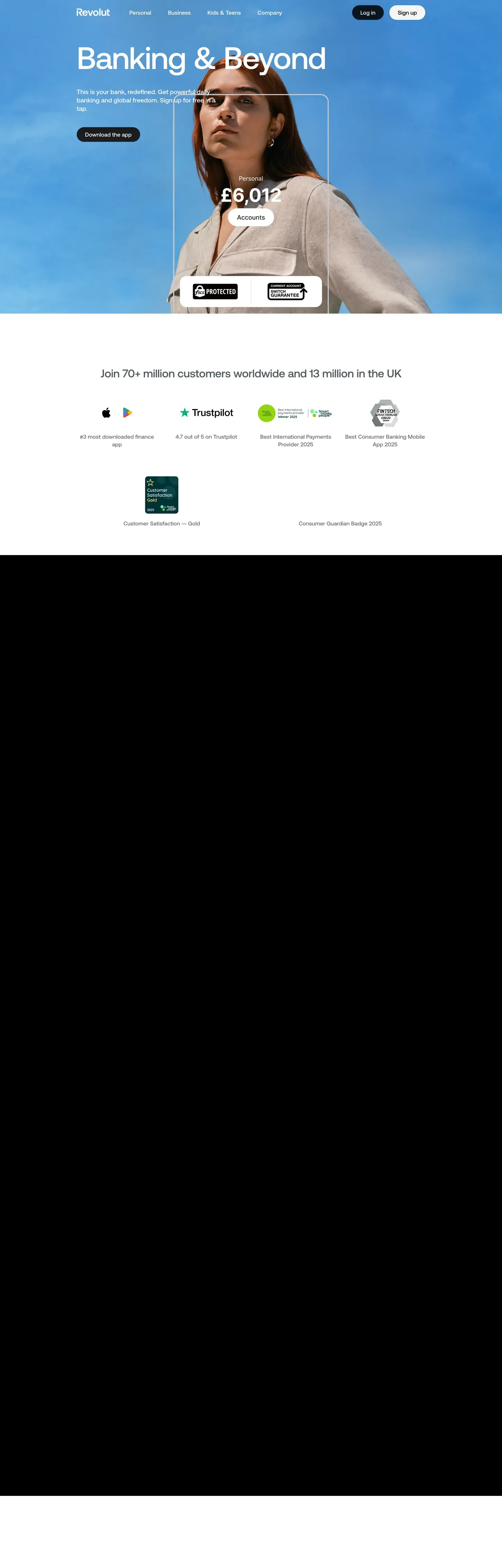
Revolut's marketing surfaces operate on a two-mode rhythm that most fintech sites avoid: full-bleed true-black storytelling bands at #000000 slam directly against pure-white #ffffff catalogue rows, with no soft transitions between them. The brand cobalt-violet #494fdf is famous, but on the marketing site it barely appears — the primary CTA on every dark hero is a white pill with black text, and the cobalt is held back for the featured plan card and the brand wordmark. The display stack is Aeonik Pro at weight 500, used at sizes from 20px up to a 136px hero ("Banking & Beyond") with tight -2.72px letter-spacing and `lineHeight: 1.0`. Body type is Inter at weight 400 with positive 0.24px tracking, which gives UI labels a subtly mechanical precision that fits the fintech context.
This page packages Revolut's marketing canvas into a single DESIGN.md file built on the Google Labs DESIGN.md specification. Inside the spec: 31 colour tokens grouped into brand, surface, text, and semantic; 17 typography tokens spanning display-xxl at 136px down to caption at 13px; 11 spacing tokens climbing from 4px to a 120px hero band; six radius tokens including a 28px corner reserved for product mockup chrome; and 21 components tokens covering buttons, plan cards, hero bands, product mockups, navigation, and the regulatory footer. Every value is quoted as an exact hex, pixel, or millisecond — no Tailwind shorthand, no approximations.
A working React or Next.js developer drops the file into Claude, Cursor, or GitHub Copilot and the agent reproduces Revolut's two-mode rhythm rather than a generic dark-theme dashboard. The tokens map cleanly onto Tailwind config or CSS variables, and component definitions reference each other by name (`{component.plan-card-featured}` resolves to `{colors.primary}` over `{colors.canvas-dark}`). The system is worth studying for one disciplined choice: a famous brand colour that almost never appears, because the white-pill-on-black CTA carries more visual voltage than the cobalt ever could.
What makes it distinct
5
- Two-mode canvastrue black #000000 storytelling bands slam against pure white #ffffff catalogue rows in full-bleed switches
- Primary CTA is a white pill on black, not the cobalt accent`#494fdf` is reserved for the featured plan card and brand glyph only
- Aeonik Pro 500 runs 20px to 136px with `lineHeight: 1.0` and -2.72px tracking on the flagship hero
- Eight saturated accent colours live inside product mockups onlynever as button surfaces or text colours
- Zero drop shadowsdepth comes from canvas switches and surface-luminance shifts between `#000000` and `#16181a`
revolut.com
Live at revolut.com
A snapshot of the brand in production. Scroll the frame to see the whole page.
Colors
35 colors
Revolut's system runs on #494fdf as its primary voltage, used in 2 of 21 components. Type is set in Aeonik Pro across 16 tokens from 13px to 136px, weights 400–700. Shape language leans on pill geometry — fully rounded surfaces dominate the component library.
Brand & Accent
Sparing, CTA-only voltage · 14
Surface
Page and card backgrounds · 6
Text
Headlines, body, captions · 6
Borders & Hairlines
Dividers, outlines, rules · 4
Other
Specialty colors · 5
Typography
16 type tokens
Set in Aeonik Pro across 16 tokens, from 13px to 136px, weights 400–700. Shown in its own stack: where the font isn't installed, the fallback the file names stands in.
- display-xxl136px · weight 500 · lh 1 · tracking -2.72pxThe quick brown fox jumps over the lazy dog
- display-xl80px · weight 500 · lh 1 · tracking -0.8pxThe quick brown fox jumps over the lazy dog
- display-lg48px · weight 500 · lh 1.21 · tracking -0.48pxThe quick brown fox jumps over the lazy dog
- display-md40px · weight 500 · lh 1.2 · tracking -0.4pxThe quick brown fox jumps over the lazy dog
- heading-lg32px · weight 500 · lh 1.19 · tracking -0.32pxThe quick brown fox jumps over the lazy dog
- heading-md24px · weight 500 · lh 1.33The quick brown fox jumps over the lazy dog
- heading-sm20px · weight 500 · lh 1.4The quick brown fox jumps over the lazy dog
- body-lg18px · weight 400 · lh 1.56 · tracking -0.09pxThe quick brown fox jumps over the lazy dog
- body-md16px · weight 400 · lh 1.5 · tracking 0.24pxThe quick brown fox jumps over the lazy dog
- body-md-bold16px · weight 600 · lh 1.5 · tracking 0.16pxThe quick brown fox jumps over the lazy dog
- body-sm14px · weight 400 · lh 1.43The quick brown fox jumps over the lazy dog
- button-lg20px · weight 500 · lh 1.4The quick brown fox jumps over the lazy dog
- button-md16px · weight 600 · lh 1.5 · tracking 0.24pxThe quick brown fox jumps over the lazy dog
- button-sm14px · weight 600 · lh 1.43The quick brown fox jumps over the lazy dog
- caption13px · weight 400 · lh 1.4The quick brown fox jumps over the lazy dog
- link-emph16px · weight 700 · lh 1.5 · tracking 0.24pxThe quick brown fox jumps over the lazy dog
Layout
Radii and spacing
6 corner radii and 11 spacing values. Shape language: pill.
Radii
- none0px
- sm8px
- md12px
- lg20px
- xl28px
- full9999px
Spacing
- xxs4px
- xs6px
- sm8px
- md14px
- lg16px
- xl24px
- xxl32px
- xxxl48px
- block80px
- section88px
- band120px
Components
21 components
Each rendered from its tokens (color, type, radius, padding) on Revolut's own canvas.
- Button Primarybutton-primaryButton Primary
- Button Primary Pressedbutton-primary-pressedButton Primary Pressed
- Button Darkbutton-darkButton Dark
- Button Softbutton-softButton Soft
- Button Outline Lightbutton-outline-lightButton Outline Light
- Button Outline Darkbutton-outline-darkButton Outline Dark
- Button Pill Smbutton-pill-smButton Pill Sm
- Type here…text-inputText Input
- Hero Band Darkhero-band-darkHero Band Dark
- Hero Band Photohero-band-photoHero Band Photo
- Feature Card Lightfeature-card-lightFeature Card Light
- Feature Card Darkfeature-card-darkFeature Card Dark
- Plan Cardplan-cardPlan Card
- Plan Card Featuredplan-card-featuredPlan Card Featured
- Product Mockupproduct-mockupProduct Mockup
- Download Tiledownload-tileDownload Tile
- Badge Tagbadge-tagBadge Tag
- Badge Featurebadge-featureBadge Feature
- Nav Barnav-barNav Bar
- Sub Nav Pillsub-nav-pillSub Nav Pill
- FooterfooterFooter
In use
The system, in use
Revolut's tokens on the kind of product it builds.
Build something people actually use.
A short paragraph of marketing copy that previews how the brand's display tier and body tier read together. Two sentences is usually enough.
FAQ
Revolut design system FAQ
Common questions about Revolut's tokens, components, and how to use this DESIGN.md in your project.
Read next
Related reading
Specs, directories, and component libraries that pair with this design system.
Use it
Use Revolut in your project
One machine-readable file. Drop it into Claude, Cursor, or any AI tool that reads DESIGN.md.
Download the DESIGN.md
One machine-readable file: every color, type, radius, spacing, and component token of Revolut.
Feed it to your AI tool
Drop it into Claude, Cursor, or GitHub Copilot. The agent writes React components and Tailwind classes that match Revolut's visual language.
Reference the tokens directly
Or paste the values into your Tailwind config, CSS variables, or component library: every color, size and radius is a quoted, ready-to-copy value.
Read the full DESIGN.md: overview, rationale, do’s and don’ts
Overview
Revolut's marketing canvas operates in a high-contrast two-mode system: a near-black storytelling canvas ({colors.canvas-dark} — #000000) that hosts hero bands, product mockups, and the planning section, alternating with white catalogue bands ({colors.canvas-light} — #ffffff) that host comparison tables, FAQ rows, and download tiles. The two modes switch in full-bleed bands rather than soft transitions; sections slam against each other to create the magazine-spread rhythm the brand is known for.
The display typography is Aeonik Pro at weight 500, used at sizes from 20px to 136px. The flagship hero ("Banking & Beyond", "Join the 70+ million using Revolut") sits at 80–136px with lineHeight: 1.0 and tight negative letter-spacing. Body type is Inter at weight 400 — open-source, no-nonsense, paired with positive tracking (0.24px) on UI labels for slightly more mechanical precision.
The brand accent is {colors.primary} (#494fdf) — a saturated cobalt violet — but it appears scarcely on marketing surfaces. The actual primary CTA on the hero is the white pill on black ("Choose your subscription"), and the cobalt violet is reserved for featured plan cards, secondary CTAs in white sections, and the brand glyph itself. A wide secondary palette of deep teal, light-blue, deep-pink, light-green, warning orange, and yellow appears inside product mockups and feature illustrations — never as button surfaces.
Key Characteristics:
- Two-mode canvas system —
{colors.canvas-dark}(true black) for storytelling,{colors.canvas-light}(white) for browsing — switched in full-bleed bands. - Display typography is Aeonik Pro 500 at sizes 20–136px with tight
lineHeight: 1.0and large negative letter-spacing on display sizes. - The actual primary CTA is
{component.button-primary}— a white pill with black text, sitting on the dark canvas as the brightest pixel. Cobalt-violet{colors.primary}is reserved for featured plan cards and secondary CTAs. - Eight saturated accent colours live inside product mockups and illustrations only, never as button surfaces — teal
#00a87e, light-blue#007bc2, deep-pink#e61e49, light-green#428619, warning orange#ec7e00, yellow#b09000, brown#936d62, danger red#e23b4a. - All buttons are pill-shaped (
{rounded.full}); content cards use{rounded.lg}(20px); inputs and small chips use{rounded.md}(12px). - Photography is product-led — phone mockups, card mockups, terminal mockups — shown full-bleed inside dark sections with no caption overlay.
Known Gaps
- Pressed/active visual states are documented for
button-primary-pressedonly; other components rely on focus-ring (browser default) for interactive feedback. - Logged-in app surfaces (transactions, transfers, account settings) are out of scope — only the public marketing canvas is documented.
- The wide accent palette (
{colors.accent-teal}#00a87ethrough{colors.accent-brown}#936d62) is captured from the extracted token set, but exact usage inside product illustrations varies per market and product line; document per-illustration rather than as system buttons. - Mobile-app screenshot art direction (phone bezels, status bars) is product-photography territory and not standardised as design tokens.
Fintech & Crypto
More systems like this
More DESIGN.md files in Fintech & Crypto.
Pricing
Build it with Pro
The DESIGN.md files are free. Pro adds 6,000+ blocks, premium templates and the MCP server, so your AI editor builds in your system for you.
4.9/5 out of 5 · 150+ reviewsfrom 150+ founders and developers.
Billing
Billed once a year in USD. Cancel anytime.
- How many people can use the license.
- Client work, SaaS products and anything you charge for.
- Production-ready React sections: hero, pricing, features, dashboards and more.
- Complete multi-page sites you can ship as they are.
- React icons from every major library, installable with one command.
- Presets that restyle every block, in light and dark.
- Lets your AI editor search, preview and install blocks for you.
- Priority requests are answered first.
Individual
For personal projects & open source
$32instead of $49/mo
$389 billed yearly
- Seats: 1 seat
- Commercial use: Personal & open source only
- Pro blocks: 6,000+ blocks
- Templates: All 14 templates
- React icons: 294k+ icons
- Themes: All 59 themes
- MCP server: Basic usage
- Support: Standard
Team
Most popularFor freelancers, agencies & startups
$66instead of $99/mo
$789 billed yearly · ≈ $13/dev/mo
- Seats: Up to 5 seats
- Commercial use: Included
- Pro blocks: 6,000+ blocks
- Templates: All 14 templates
- React icons: 294k+ icons
- Themes: All 59 themes
- MCP server: High usage
- Support: Priority
Organization
For companies with larger teams
$132instead of $199/mo
$1,589 billed yearly
- Seats: Unlimited seats
- Commercial use: Included
- Pro blocks: 6,000+ blocks
- Templates: All 14 templates
- React icons: 294k+ icons
- Themes: All 59 themes
- MCP server: Unlimited usage
- Support: Priority
Billed once a year in USD. Cancel anytime.
Individual
For personal projects & open source
$32instead of $49/mo
$389 billed yearly
- How many people can use the license.Seats: 1 seat
- Client work, SaaS products and anything you charge for.Commercial use: Personal & open source only
- Production-ready React sections: hero, pricing, features, dashboards and more.Pro blocks: 6,000+ blocks
- Complete multi-page sites you can ship as they are.Templates: All 14 templates
- React icons from every major library, installable with one command.React icons: 294k+ icons
- Presets that restyle every block, in light and dark.Themes: All 59 themes
- Lets your AI editor search, preview and install blocks for you.MCP server: Basic usage
- Priority requests are answered first.Support: Standard
Team
Most popularFor freelancers, agencies & startups
$66instead of $99/mo
$789 billed yearly · ≈ $13/dev/mo
Everything in Individual, plus
- How many people can use the license.Seats: Up to 5 seats
- Client work, SaaS products and anything you charge for.Commercial use: Included
- Lets your AI editor search, preview and install blocks for you.MCP server: High usage
- Priority requests are answered first.Support: Priority
Organization
For companies with larger teams
$132instead of $199/mo
$1,589 billed yearly
Everything in Team, plus
- How many people can use the license.Seats: Unlimited seats
- Lets your AI editor search, preview and install blocks for you.MCP server: Unlimited usage
- Secure checkout via Stripe
- Code lives in your repo
- Keep what you've shipped if you cancel
- License terms
Your system, built for you
Every block, template and icon, installed by your AI agent in your design system. The DESIGN.md files stay free.