Render Design System
Render's marketing-site design system: weight-300 Roobert display at 80px, PP Neue Montreal body, single violet accent on a paper-white canvas. Tokens for React, Next.js, and AI coding tools.
Add shadcn.io to your AI agent. · Pro It installs blocks, icons and templates in your design system from a prompt, with Pro.
Set up MCP- Primary
- #8a05ff
- Typeface
- Roobert
- Shape
- Soft
- Base radius
- 2px
- Colors
- 12
- Type tokens
- 11
- Components
- 15
- Spacing values
- 8
About
About Render DESIGN.md
Curated by Dov Azencot · Updated May 19, 2026 · Source render.com (opens in a new tab)
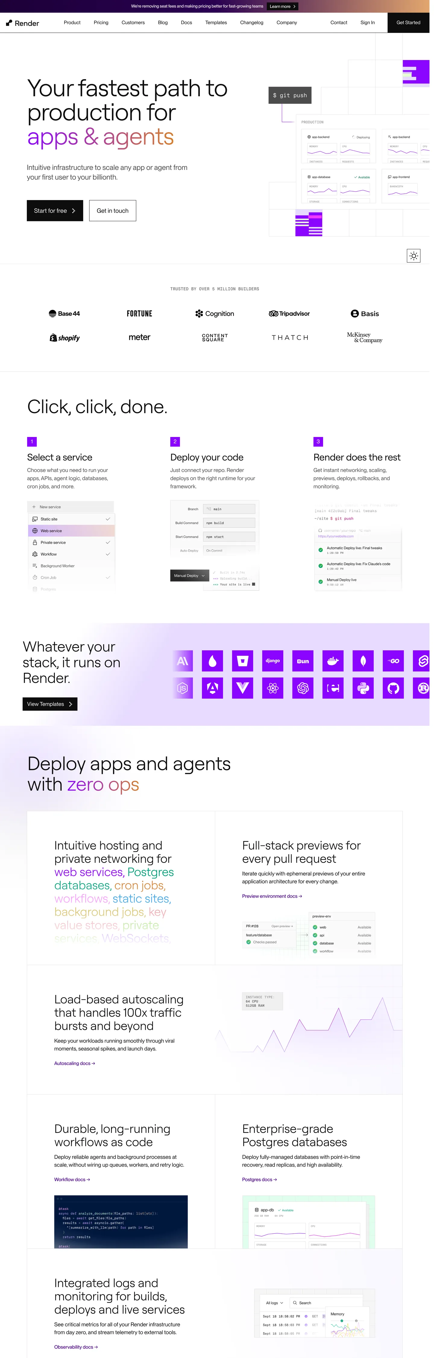
Render's marketing site announces itself through typography before color. The hero headline — "Your fastest path to production" — runs Roobert at 80px in weight 300 with -2.4px tracking, heavy on the page at maximum size but deliberately light on the weight scale. No gradient behind it, no canvas tint: just near-black type on paper white. The primary CTA below it is a sharp-cornered rectangle filled with pure ink black. In a space where competitors like Railway use purple gradients and Fly.io uses dark surfaces with colored CTAs, Render strips the brand down to two typefaces, one near-neutral canvas, and a single held-in-reserve violet for interactive moments.
The system runs a clear typographic division of labor. Roobert (a custom geometric sans with wide, open letterforms) owns every heading tier — 80px hero, 64px section header, 40px sub-section, 32px card head, 20px sub-head — all in weight 300 or 400. PP Neue Montreal owns every body, label, nav link, and caption — 18px body at weight 400, 16px for nav and UI copy, 12px uppercase labels. PP Neue Montreal Mono handles code-style tags and uppercase category chips. The result is a page where headings feel editorial and body copy feels technical without the system ever becoming dark or heavy.
The spec captures one brand-layer color with meaningful usage: the saturated violet that powers the primary interactive surface. Every other tone is structural — near-black ink, mid grays for secondary text, light gray borders, and a white canvas. Feed this file to an AI coding tool and it will reproduce Render's specific restraint: the zero-radius sharp CTA, the weight-300 display at scale, the dual-family split, and the violet kept strictly off the canvas and reserved for hover-states and badges. The disciplined move worth borrowing is the sharp CTA in a genre that has converged on pill buttons — it reads as a deliberate product statement.
What makes it distinct
5
- Weight-300 displayRoobert at 80px / weight 300 and -2.4px tracking is the loudest typographic moment in the system; no 700-weight headline exists anywhere on the page
- Zero-radius primary buttonthe ink-black 'Get Started' CTA uses a completely square 0px border radius, a deliberate counter-move against the rounded pill trend in cloud-hosting brands
- Single violet voltagethe saturated violet accent appears primarily as button fills and status chips, never as a canvas wash or hero gradient
- Dual-typeface splitRoobert carries all headings while PP Neue Montreal carries all body copy, labels, and navigation; the two families divide responsibilities cleanly without overlap
- Monospace siblingPP Neue Montreal Mono handles all code labels and uppercase category tags, sharing the same PP family umbrella as body copy
render.com
Live at render.com
A snapshot of the brand in production. Scroll the frame to see the whole page.
Colors
12 colors
Render's system runs on #8a05ff as its primary voltage, used in 2 of 15 components. Type is set in Roobert across 11 tokens from 12px to 80px, weights 300–500. Shape language is soft — components average 268px corner radius, with no sharp interactive edges.
Brand & Accent
Sparing, CTA-only voltage · 7
Surface
Page and card backgrounds · 1
Text
Headlines, body, captions · 3
Borders & Hairlines
Dividers, outlines, rules · 1
Typography
11 type tokens
Set in Roobert across 11 tokens, from 12px to 80px, weights 300–500. Shown in its own stack: where the font isn't installed, the fallback the file names stands in.
- display-xl80px · weight 300 · lh 80px · tracking -2.4pxThe quick brown fox jumps over the lazy dog
- display-lg64px · weight 300 · lh 68px · tracking -1.28pxThe quick brown fox jumps over the lazy dog
- display-md40px · weight 300 · lh 44px · tracking -0.6pxThe quick brown fox jumps over the lazy dog
- heading-md32px · weight 400 · lh 36.8px · tracking -0.8pxThe quick brown fox jumps over the lazy dog
- heading-sm20px · weight 400 · lh 24px · tracking -0.2pxThe quick brown fox jumps over the lazy dog
- body-lg18px · weight 400 · lh 26px · tracking 0.09pxThe quick brown fox jumps over the lazy dog
- body-md16px · weight 400 · lh 24px · tracking 0.16pxThe quick brown fox jumps over the lazy dog
- body-sm16px · weight 400 · lh 20px · tracking 0.16pxThe quick brown fox jumps over the lazy dog
- label-md12px · weight 500 · lh 15px · tracking 0.24pxThe quick brown fox jumps over the lazy dog
- nav-link16px · weight 400 · lh 20px · tracking 0.16pxThe quick brown fox jumps over the lazy dog
- mono-sm14px · weight 500 · lh 20px · tracking 0.28pxThe quick brown fox jumps over the lazy dog
Layout
Radii and spacing
3 corner radii and 8 spacing values. Shape language: soft.
Radii
- none0px
- sm2px
- pill937px
Spacing
- xs8px
- sm10px
- md15px
- base16px
- lg20px
- xl24px
- 2xl40px
- 3xl90px
Components
15 components
Each rendered from its tokens (color, type, radius, padding) on Render's own canvas.
- Button Primarybutton-primaryButton Primary
- Button Secondarybutton-secondaryButton Secondary
- Button Violetbutton-violetButton Violet
- Top Navtop-navTop Nav
- Nav Linknav-linkNav Link
- Hero Headinghero-headingHero Heading
- Section Headingsection-headingSection Heading
- Card Headingcard-headingCard Heading
- Body Paragraphbody-paragraphBody Paragraph
- Body Paragraph Mutedbody-paragraph-mutedBody Paragraph Muted
- CardcardCard
- Label Taglabel-tagLabel Tag
- Code Tagcode-tagCode Tag
- Type here…text-inputText Input
- Status Badgestatus-badgeStatus Badge
In use
The system, in use
Render's tokens on the kind of product it builds.
Build something people actually use.
A short paragraph of marketing copy that previews how the brand's display tier and body tier read together. Two sentences is usually enough.
FAQ
Render design system FAQ
Common questions about Render's tokens, components, and how to use this DESIGN.md in your project.
Read next
Related reading
Specs, directories, and component libraries that pair with this design system.
- Browse all design systemsThe full directory of DESIGN.md files on shadcn.io, with live mockups for each.shadcn.io
- Render — official siteRender's public marketing site — the source of truth for the live tokens captured in this file.render.com (opens in a new tab)
- The DESIGN.md specificationGoogle Labs' open spec for machine-readable design system files — the format this page is built on.github.com (opens in a new tab)
Use it
Use Render in your project
One machine-readable file. Drop it into Claude, Cursor, or any AI tool that reads DESIGN.md.
Download the DESIGN.md
One machine-readable file: every color, type, radius, spacing, and component token of Render.
Feed it to your AI tool
Drop it into Claude, Cursor, or GitHub Copilot. The agent writes React components and Tailwind classes that match Render's visual language.
Reference the tokens directly
Or paste the values into your Tailwind config, CSS variables, or component library: every color, size and radius is a quoted, ready-to-copy value.
Read the full DESIGN.md: overview, rationale, do’s and don’ts
Overview
Render's marketing site makes a typographic argument before any color lands. Weight-300 Editorial Restraint. The 80px hero headline in Roobert at weight 300 — lighter than most body copy on competing cloud-hosting sites — announces that this brand's hierarchy comes from size and tracking, not from weight or color. Where Heroku uses a bold purple hero and Railway leans on gradient overlays, Render keeps the canvas paper white and trusts letterform mass at extreme scale to carry the visual load.
The primary CTA is a sharp-cornered rectangle in pure ink black — zero corner radius in a genre that has converged on pill buttons and rounded rectangles. Combined with a single saturated violet reserved strictly for interactive fills and status indicators (never used as a canvas element or hero wash), the system reads as intentionally counter-conventional: the builder infrastructure that doesn't dress up its own marketing.
Key Characteristics:
- Paper-white canvas throughout — no colored bands, gradient sections, or dark hero surfaces anywhere in the marketing flow.
- Weight-300 Roobert display at 80px / -2.4px tracking is the heaviest typographic moment in size but the lightest in weight — a deliberate inversion of SaaS convention.
- Zero-radius (0px) primary button paired with a 937px full-pill for status badges — a binary radius system with nothing in between.
- Dual-family type split: Roobert for every heading tier, PP Neue Montreal for every body and label, PP Neue Montreal Mono for code-style category tags.
- Saturated violet (#8a05ff) appears only as background fill on interactive surfaces — 49 background uses, zero border uses, no canvas presence.
- Near-black ink (#0d0d0d, wired as --color-text-primary) instead of pure black — a 15-point lightness separation from absolute black that softens long-read contrast.
- Secondary text steps to mid-gray (#6b6b6b and #4d4d4d) for sub-labels and metadata — no bright secondary colors in the text tier.
Colors
Brand
- Violet (
{colors.primary}— #8a05ff): frequency 55. Used as background (49), text (4), gradient (2). The sole chromatic brand element; appears on the primary interactive CTA variant, status badge fills, and hover-state indicators. Wired as --color-purple-600. - Violet Dark (
{colors.primary-dark}— #48008c): frequency 5. Used as text (5). The deep-pressed state for the violet; wired as --color-purple-700.
Surface & Text
- Ink (
{colors.ink}— #0d0d0d): frequency 583. Used as text (573), bg (6), border (4). The dominant text color and primary button fill; wired as --color-text-primary, --color-gray-900, and --color-background--inverted. Near-black rather than pure black — an intentional warmth reduction. - Canvas (
{colors.canvas}— #ffffff): frequency 157. Used as text (145), bg (8), gradient (4). Page floor and primary button text on dark fills; wired as --color-background and --color-text-primary--inverted. - Ink Muted (
{colors.ink-muted}— #4d4d4d): frequency 30. Used as text (30). Secondary text for metadata and sub-labels; wired as --color-text-secondary and --color-gray-600. - Ink Secondary (
{colors.ink-secondary}— #6b6b6b): frequency 46. Used as text (46). Tertiary text for captions and supplementary copy; wired as --color-gray-500.
Hairlines & Structure
- Hairline (
{colors.hairline}— #e3e3e3): frequency 864. Used as border (861), gradient (3). The universal divider color across cards, nav separators, and input fields; wired as --color-border and --color-gray-100.
Semantic Accents
- Accent Green (
{colors.accent-green}— #006d4c): frequency 4. Used as text (4). Success state and "deployed" status labels; wired as --color-green-600. - Accent Green Light (
{colors.accent-green-light}— #dffeed): frequency 4. Used as bg (4). Success badge backgrounds; wired as --color-lime-25 / --color-green-50. - Accent Orange (
{colors.accent-orange}— #d67f2e): frequency 7. Used as text (5), gradient (2). Warning and billing-tier indicators; wired as --color-orange-400. - Accent Blue Light (
{colors.accent-blue-light}— #e0f4ff): frequency 9. Used as bg (6), gradient (3). Information state badge backgrounds; wired as --color-blue-50. - Accent Pink Light (
{colors.accent-pink-light}— #fce2fe): frequency 3. Used as bg (3). A brand-layer gradient tint; wired as --color-pink-50.
Typography
Font Families
The system runs Roobert for every heading tier — a geometric sans with wide open counters and an unusually light weight floor at 300. PP Neue Montreal carries every body, label, nav link, and UI string. PP Neue Montreal Mono handles uppercase code tags and category chips. No serif or display-serif appears anywhere on the page.
Hierarchy
| Token | Size | Weight | Line Height | Letter Spacing | Use |
|---|---|---|---|---|---|
{typography.display-xl} | 80px | 300 | 80px | -2.4px | Hero h1 |
{typography.display-lg} | 64px | 300 | 68px | -1.28px | Section h2 ("Click, click, done.") |
{typography.display-md} | 40px | 300 | 44px | -0.6px | Card feature headings |
{typography.heading-md} | 32px | 400 | 36.8px | -0.8px | Sub-section h3 |
{typography.heading-sm} | 20px | 400 | 24px | -0.2px | Card title / sub-head |
{typography.body-lg} | 18px | 400 | 26px | 0.09px | Body paragraph |
{typography.body-md} | 16px | 400 | 24px | 0.16px | Default UI text |
{typography.body-sm} | 16px | 400 | 20px | 0.16px | Compact UI / nav links |
{typography.label-md} | 12px | 500 | 15px | 0.24px | Uppercase category label |
{typography.nav-link} | 16px | 400 | 20px | 0.16px | Top-nav links |
{typography.mono-sm} | 14px | 500 | 20px | 0.28px | Code-style category tags (uppercase) |
Principles
Roobert's weight floor is 300 — the entire heading ladder sits between 300 and 400. The hero at 80px / 300 is enormous in size but feather-light in weight; the mass comes from the extreme size and negative tracking rather than stroke width. PP Neue Montreal's widest use is weight 400 for body text; weight 500 appears only for the nav-link active state and the uppercase label tier.
Note on Font Substitutes
Both Roobert and PP Neue Montreal are proprietary. DM Sans at weight 300 approximates Roobert's wide geometric letterforms at large display size. Inter or Plus Jakarta Sans at weight 400 approximates PP Neue Montreal for body copy. For the mono tier, JetBrains Mono or IBM Plex Mono at weight 500 with uppercase letter-spacing matches PP Neue Montreal Mono's code-label aesthetic.
Layout
Spacing System
- Base unit: 8px (with 16px as the dominant module).
- Tokens:
{spacing.xs}8px ·{spacing.sm}10px ·{spacing.md}15px ·{spacing.base}16px ·{spacing.lg}20px ·{spacing.xl}24px ·{spacing.2xl}40px ·{spacing.3xl}90px. - Button padding: 24px vertical × 30px horizontal — unusually tall for a 16px body font; the height reads more like a 64px touch target than a 40px web button.
- Section vertical rhythm: 90px between major page sections; 40px between sub-sections.
- Nav padding: 23px × 20px per link.
Grid & Container
- Hero: full-width white canvas with centered type stack and ink-black CTA below.
- Feature sections: full-width white bands alternating between text-left/image-right and text-center layouts.
- Card grid: 3-column at desktop for dashboard and infrastructure feature cards.
- Container width: ~1280px max content width based on nav and body layout.
Rhythm
The page is uniformly white — no visual band alternation. Section breaks read from large vertical spacing gaps and changes in heading size rather than from background-color shifts. The absence of any tinted section makes the single violet accent moments (CTA buttons, status badges) stand out more sharply against the neutral ground.
Elevation
The captured marketing surface has no shadow tier. On a pure-white canvas, traditional drop shadows would be nearly invisible and are absent from the extraction entirely. Cards use a 1px {colors.hairline} border at #e3e3e3 to define their edges — tonal hairline lift is the only elevation signal.
- Flat (no shadow): all body, hero, and section surfaces.
- Hairline-bordered cards:
{colors.hairline}(#e3e3e3) 1px border marks card and input boundaries. - No tonal surface lift: every section sits on the same white canvas — there is no
surface-1layer in the marketing palette.
Shapes
The radius scale is binary — sharp or full pill:
{rounded.none}0px — primary and secondary buttons, card containers, nav.{rounded.sm}2px — input fields only; the single entry in the gentle-rounding tier.{rounded.pill}937px — status badges and category chips; renders as a full pill on any fixed-height element.
There is no 4px, 8px, 12px, or 16px radius tier. The system is deliberately sharp at the component level, contrasting the full-pill badge shapes against zero-radius buttons for maximum visual contrast between "functional action" and "categorical label."
Components
button-primary — Ink-black fill ({colors.ink}), white text, zero-radius {rounded.none}, 24×30 padding, 66px height. The "Get Started" CTA is the canonical instance. The square edges are the most distinctive move in the system — an intentional departure from cloud-platform convention.
button-secondary — Transparent fill, ink-black text, hairline border, zero-radius, same height. Used for secondary actions beside the primary CTA.
button-violet — Violet fill ({colors.primary}), white text, zero-radius. The alternative primary for contexts where the violet accent leads rather than the ink-black button — typically inside feature cards or promotional panels.
top-nav — White canvas background, ink text in {typography.nav-link}, 66px height. Contains the Render wordmark, product nav links (Product, Solutions, Pricing, Docs, Changelog), and the right-aligned "Get Started" / Sign In cluster.
nav-link — Transparent background, ink text, {typography.nav-link} (16px / 400 / 0.16px tracking), 23×20px padding.
hero-heading — Ink text, {typography.display-xl} (80px / 300 / -2.4px). The hero reads "Your fastest path to production" across multiple lines at this size.
section-heading — Ink text, {typography.display-lg} (64px / 300 / -1.28px). Used for "Click, click, done." and comparable section leads.
card-heading — Ink text, {typography.display-md} (40px / 300 / -0.6px). The feature-card heading level used across the infrastructure marketing sections.
body-paragraph — Default ink text at {typography.body-lg} (18px / 400). The hero sub-paragraph and section leads.
body-paragraph-muted — Muted-ink text at {typography.body-md} for secondary copy and card sub-descriptions.
card — White canvas fill, hairline border at {colors.hairline}, 2px radius, 16px padding. The default content card for infrastructure feature descriptions.
label-tag — Transparent background, secondary-ink text, {typography.label-md} (12px / 500 uppercase), full-pill radius. Used for category labels above headings ("INFRASTRUCTURE", "NETWORKING").
code-tag — Ink text, {typography.mono-sm} (14px / 500 uppercase monospace), minimal padding. Inline code references and technical category labels.
text-input — White fill, ink text, {typography.body-md}, 2px radius, hairline border, 40px height. The resting state only.
status-badge — Violet fill ({colors.primary}), white text, {typography.label-md}, full-pill rounding. Used for deployment-status indicators and feature availability chips.
Do's and Don'ts
Do keep display headings at weight 300 for Roobert equivalents. The entire identity of the hero depends on extreme size carrying the weight rather than stroke mass — bumping to 400 or 600 shifts the feel from editorial builder to generic SaaS shout.
Do use zero-radius (0px) on primary and secondary buttons. The square edges read as a deliberate product positioning move; rounding to even 4px begins the slide toward the pill-heavy cloud-platform convention Render is distinguishing itself from.
Do keep the violet ({colors.primary}) off the canvas and structural surfaces. It belongs only on interactive elements — buttons, badges, hover states. Using it as a section background or hero gradient destroys the restraint that makes every violet appearance count.
Do respect the dual-family split. Roobert for headings, PP Neue Montreal for body — mixing them (a Roobert body paragraph or a PP Neue Montreal heading) blurs the typographic hierarchy that the system relies on in the absence of weight variation.
Don't add a colored background band or dark section to any marketing page. The canvas is white from header to footer; every chromatic signal comes from the type and interactive elements. A tinted light-gray section or a dark near-black hero would require rebuilding the entire color logic.
Don't introduce a radius step between 2px ({rounded.sm}) and 937px ({rounded.pill}). The binary radius system — flat-sharp for components, full-pill for chips — is the shape language. A mid-radius at 8px would look like a different system entirely.
Don't use the violet (#8a05ff) for decorative elements, icons, or text links on white. It was validated as a fill-only accent (49 bg uses, 0 border uses, 4 text uses — all in specific semantic contexts). Decorative violet on white competes with the CTA accent hierarchy.
Don't set the hero heading above weight 300. Even though Roobert goes heavier, the extracted system never uses it above 400 in any heading context. Weight 700+ at 80px would shatter the balance between type mass and canvas silence.
Known Gaps
- Hover and focus states: the extraction captures button fills at rest only; the hover transition for the ink-black CTA and the violet CTA variant are not captured.
- Dark mode: the marketing surface is light-only. Render's dashboard application uses a dark canvas but that is not represented here.
- Mobile breakpoints: spacing tokens, font sizes, and container widths at tablet and mobile viewport widths are not captured from the marketing surface.
- Form states:
{component.text-input}covers the resting state only; error, focus, and disabled treatments are not extracted. - Animation: the hero includes subtle animated infrastructure diagrams; easing curves, durations, and sequencing are not captured in this static spec.
- Product dashboard: this DESIGN.md covers the marketing site only; Render's application dashboard (deploy logs, metrics, service cards) uses a richer token system not represented here.
- Pricing page: the pricing table — which is likely where the violet button appears most frequently — was not part of the captured surface.
Web Infrastructure & Hosting
More systems like this
More DESIGN.md files in Web Infrastructure & Hosting.
Pricing
Build it with Pro
The DESIGN.md files are free. Pro adds 6,000+ blocks, premium templates and the MCP server, so your AI editor builds in your system for you.
4.9/5 out of 5 · 150+ reviewsfrom 150+ founders and developers.
Billing
Billed once a year in USD. Cancel anytime.
- How many people can use the license.
- Client work, SaaS products and anything you charge for.
- Production-ready React sections: hero, pricing, features, dashboards and more.
- Complete multi-page sites you can ship as they are.
- React icons from every major library, installable with one command.
- Presets that restyle every block, in light and dark.
- Lets your AI editor search, preview and install blocks for you.
- Priority requests are answered first.
Individual
For personal projects & open source
$32instead of $49/mo
$389 billed yearly
- Seats: 1 seat
- Commercial use: Personal & open source only
- Pro blocks: 6,000+ blocks
- Templates: All 14 templates
- React icons: 294k+ icons
- Themes: All 59 themes
- MCP server: Basic usage
- Support: Standard
Team
Most popularFor freelancers, agencies & startups
$66instead of $99/mo
$789 billed yearly · ≈ $13/dev/mo
- Seats: Up to 5 seats
- Commercial use: Included
- Pro blocks: 6,000+ blocks
- Templates: All 14 templates
- React icons: 294k+ icons
- Themes: All 59 themes
- MCP server: High usage
- Support: Priority
Organization
For companies with larger teams
$132instead of $199/mo
$1,589 billed yearly
- Seats: Unlimited seats
- Commercial use: Included
- Pro blocks: 6,000+ blocks
- Templates: All 14 templates
- React icons: 294k+ icons
- Themes: All 59 themes
- MCP server: Unlimited usage
- Support: Priority
Billed once a year in USD. Cancel anytime.
Individual
For personal projects & open source
$32instead of $49/mo
$389 billed yearly
- How many people can use the license.Seats: 1 seat
- Client work, SaaS products and anything you charge for.Commercial use: Personal & open source only
- Production-ready React sections: hero, pricing, features, dashboards and more.Pro blocks: 6,000+ blocks
- Complete multi-page sites you can ship as they are.Templates: All 14 templates
- React icons from every major library, installable with one command.React icons: 294k+ icons
- Presets that restyle every block, in light and dark.Themes: All 59 themes
- Lets your AI editor search, preview and install blocks for you.MCP server: Basic usage
- Priority requests are answered first.Support: Standard
Team
Most popularFor freelancers, agencies & startups
$66instead of $99/mo
$789 billed yearly · ≈ $13/dev/mo
Everything in Individual, plus
- How many people can use the license.Seats: Up to 5 seats
- Client work, SaaS products and anything you charge for.Commercial use: Included
- Lets your AI editor search, preview and install blocks for you.MCP server: High usage
- Priority requests are answered first.Support: Priority
Organization
For companies with larger teams
$132instead of $199/mo
$1,589 billed yearly
Everything in Team, plus
- How many people can use the license.Seats: Unlimited seats
- Lets your AI editor search, preview and install blocks for you.MCP server: Unlimited usage
- Secure checkout via Stripe
- Code lives in your repo
- Keep what you've shipped if you cancel
- License terms
Your system, built for you
Every block, template and icon, installed by your AI agent in your design system. The DESIGN.md files stay free.