Red Hat Design System
Red Hat's marketing-site design system as a DESIGN.md file. Near-black canvas, cobalt blue links, RedHatDisplay + RedHatText typefaces, PatternFly CSS variables, 11 colors, 15 components. For React, Next.js, and AI tools.
Add shadcn.io to your AI agent. · Pro It installs blocks, icons and templates in your design system from a prompt, with Pro.
Set up MCP- Primary
- #0066cc
- Typeface
- RedHatDisplay
- Shape
- Sharp
- Base radius
- 3px
- Colors
- 11
- Type tokens
- 11
- Components
- 15
- Spacing values
- 6
About
About Red Hat DESIGN.md
Curated by Dov Azencot · Updated May 18, 2026 · Source redhat.com (opens in a new tab)
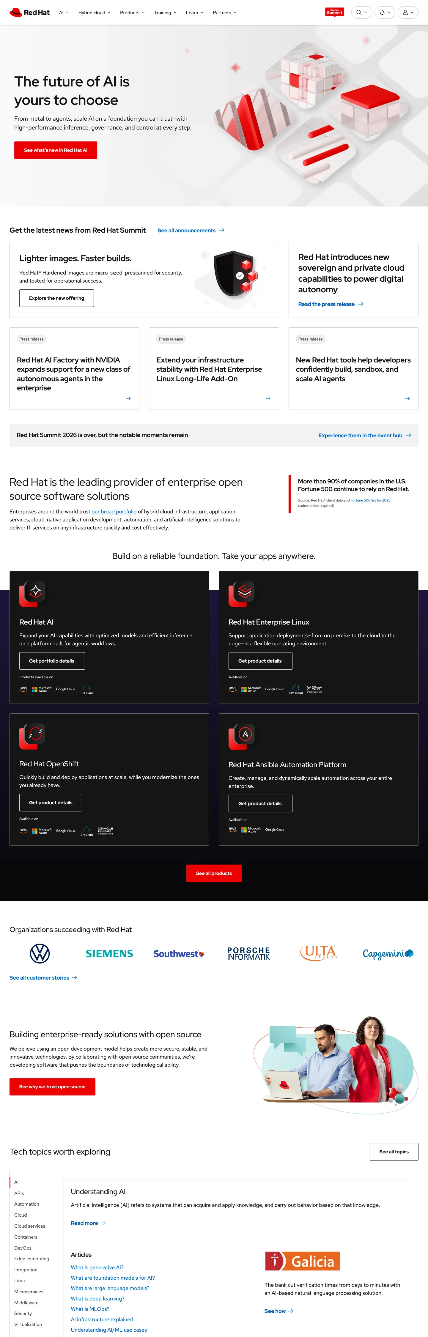
Red Hat's marketing site is built on an enterprise component library that happens to run at marketing scale. The hero is white-canvas, near-black text, with a 48px RedHatDisplay heading — "The future of AI is yours to choose" — set at weight 400, which is unexpectedly light for an h1 at that size. Where most enterprise brands push heading weight to 700 or bold to assert authority, Red Hat leaves it at 400 and trusts the editorial weight of the sentence. Cobalt blue (#0066cc) appears only on links and interactive borders, never on any background fill — the brand color is a text signal, not a canvas statement. Below the hero, alternating dark near-black bands (#151515) carry white-text editorial sections, producing the recognizable Red Hat pattern: white section, dark section, white section, dark section.
The PatternFly custom-property system beneath the surface is the system's most unusual trait. CSS variables like --pf-global--primary-color--100, --pfe-theme--color--ui-accent, and --rh-color-interactive-primary-default give the marketing layer the full semantic resolution of an enterprise design system — not just hex values but named interactive-state tokens that track hover, focus, active, and dark-mode variants. Where Cloudflare or Vercel declare a handful of branded CSS vars, Red Hat exposes more than 200 in the captured :root block. This gives AI tooling a much richer token map to work with, though the marketing surface itself only surfaces a fraction of those states.
The practical takeaway for an engineering team adopting this spec: the cobalt blue interactive signal is the only chromatic decision in the system. Everything else resolves to the near-black (#151515) / white (#ffffff) / mid-gray (#707070) triad. The 3px radius runs universally — buttons, cards, inputs, chips — with no larger-radius soft tier anywhere on the marketing surface. If you're building an enterprise-open-source product page and want the Red Hat credibility signal without porting PatternFly itself, the system reduces to three colors, two typefaces, one radius.
What makes it distinct
5
- PatternFly CSS disciplineevery interactive color state maps to a named custom property like --pf-global--primary-color--100; the system carries more semantic granularity than any pure-marketing stack
- Two proprietary Red Hat familiesRedHatDisplay for headings and navigation CTAs, RedHatText for body and captions; no fallback to Inter or system-ui in the primary render
- Cobalt blue as the single chromatic signal#0066cc appears 48 times (24 text, 24 border), exclusively on links and interactive affordances; nothing else on the page is chromatic
- 3px universal radiusone corner-radius value covers every surface in the system, from buttons to cards to form fields; no scale, no pill variant in the marketing layer
- Near-black not pure blackthe canvas floor is #151515 (not #000000), a 19% luminance value that prevents pure-black depth from reading as print-on-paper
redhat.com
Live at redhat.com
A snapshot of the brand in production. Scroll the frame to see the whole page.
Colors
11 colors
Red Hat's system runs on #0066cc as its primary voltage, used in 3 of 15 components. Type is set in RedHatDisplay across 11 tokens from 12px to 48px, weights 300–600. Shape language is sharp — components average 3px corner radius, favoring crisp rectangles.
Brand & Accent
Sparing, CTA-only voltage · 1
Surface
Page and card backgrounds · 4
Text
Headlines, body, captions · 4
Borders & Hairlines
Dividers, outlines, rules · 2
Typography
11 type tokens
Set in RedHatDisplay across 11 tokens, from 12px to 48px, weights 300–600. Shown in its own stack: where the font isn't installed, the fallback the file names stands in.
- display-xl48px · weight 400 · lh 62pxThe quick brown fox jumps over the lazy dog
- display-lg36px · weight 300 · lh 47pxThe quick brown fox jumps over the lazy dog
- heading-lg28px · weight 500 · lh 36pxThe quick brown fox jumps over the lazy dog
- heading-md24px · weight 500 · lh 31pxThe quick brown fox jumps over the lazy dog
- heading-sm20px · weight 500 · lh 26pxThe quick brown fox jumps over the lazy dog
- nav-label16px · weight 600 · lh 24pxThe quick brown fox jumps over the lazy dog
- body-lg18px · weight 400 · lh 27pxThe quick brown fox jumps over the lazy dog
- body-md16px · weight 400 · lh 24pxThe quick brown fox jumps over the lazy dog
- body-sm14px · weight 400 · lh 21pxThe quick brown fox jumps over the lazy dog
- caption12px · weight 400 · lh 18pxThe quick brown fox jumps over the lazy dog
- label-sm14px · weight 500 · lh 18pxThe quick brown fox jumps over the lazy dog
Layout
Radii and spacing
2 corner radii and 6 spacing values. Shape language: sharp.
Radii
- none0px
- sm3px
Spacing
- xs8px
- sm16px
- md24px
- lg32px
- xl64px
- 2xl96px
Components
15 components
Each rendered from its tokens (color, type, radius, padding) on Red Hat's own canvas.
- Button Primarybutton-primaryButton Primary
- Button Secondarybutton-secondaryButton Secondary
- Top Navtop-navTop Nav
- Nav Linknav-linkNav Link
- Hero Headinghero-headingHero Heading
- Section Headingsection-headingSection Heading
- Section Heading Darksection-heading-darkSection Heading Dark
- Body Paragraphbody-paragraphBody Paragraph
- Body Paragraph Darkbody-paragraph-darkBody Paragraph Dark
- CardcardCard
- Card Darkcard-darkCard Dark
- Type here…text-inputText Input
- LinklinkLink
- Section Band Darksection-band-darkSection Band Dark
- Logo Striplogo-stripLogo Strip
In use
The system, in use
Red Hat's tokens on the kind of product it builds.
Build something people actually use.
A short paragraph of marketing copy that previews how the brand's display tier and body tier read together. Two sentences is usually enough.
FAQ
Red Hat design system FAQ
Common questions about Red Hat's tokens, components, and how to use this DESIGN.md in your project.
Read next
Related reading
Specs, directories, and component libraries that pair with this design system.
- Browse all design systemsThe full directory of DESIGN.md files on shadcn.io, with live mockups for each.shadcn.io
- Red Hat — official siteRed Hat's public marketing site — the source of truth for the live tokens captured in this file.redhat.com (opens in a new tab)
- The DESIGN.md specificationGoogle Labs' open spec for machine-readable design system files — the format this page is built on.github.com (opens in a new tab)
Use it
Use Red Hat in your project
One machine-readable file. Drop it into Claude, Cursor, or any AI tool that reads DESIGN.md.
Download the DESIGN.md
One machine-readable file: every color, type, radius, spacing, and component token of Red Hat.
Feed it to your AI tool
Drop it into Claude, Cursor, or GitHub Copilot. The agent writes React components and Tailwind classes that match Red Hat's visual language.
Reference the tokens directly
Or paste the values into your Tailwind config, CSS variables, or component library: every color, size and radius is a quoted, ready-to-copy value.
Read the full DESIGN.md: overview, rationale, do’s and don’ts
Overview
Red Hat's marketing site arrives with more CSS custom-property discipline than almost any marketing surface in the directory. Enterprise Semantics at Marketing Scale. Where most brand sites declare a dozen hex values, Red Hat exposes more than 200 named PatternFly tokens — each with interactive-state variants for hover, focus, dark mode, and on-saturated contexts. This is the entire PatternFly design-system vocabulary surfaced on a marketing page, not a purpose-built marketing token set. Where Cloudflare declares --color-kumo-brand and Spline declares --color-blue, Red Hat declares --pf-global--primary-color--100, --pf-global--active-color--100, --pf-global--link--Color, and --pfe-theme--color--link — four variable names for the same cobalt blue, each scoped to a different semantic context.
The visible result is far simpler than the token depth suggests. The marketing surface is near-black and white with a single cobalt-blue interactive signal. There are no decorative gradients, no hero imagery outside small product screenshots, and no shape language beyond a universal 3px radius. The hero heading — "The future of AI is yours to choose" — sits at 48px / weight 400 in RedHatDisplay, lighter than any enterprise peer: Oracle uses 700, Cisco 600, Microsoft 600. The weight-400 display heading is a deliberate typographic choice that signals open-source editorial restraint rather than corporate authority.
Key Characteristics:
- Near-black canvas (#151515, not #000000) for dark editorial bands — 573 total occurrences in the captured page across text, background, and border.
- Cobalt blue (#0066cc) as the sole chromatic token — 48 occurrences, 24 as text and 24 as border, exclusively on links and interactive affordances.
- Two-family proprietary type stack: RedHatDisplay for headings/nav, RedHatText for body/captions — both open-source, both derived from Overpass lineage.
- Universal 3px corner radius with no soft, generous, or pill variant in the marketing layer.
- Alternating white and near-black editorial bands — the page's primary structural device.
- Light-weight display headings: 48px / 400 (hero h2), 36px / 300 (sub-section h1) — enterprise brand running below the weight level of its enterprise peers.
- PatternFly's 8px / 16px spacing cadence throughout; section padding at 32px/64px on band boundaries.
Colors
Interactive
- Cobalt Primary (
{colors.primary}— #0066cc): frequency 48. Used as text (24), border (24). The link color, active-element ring color, and interactive-border color. Wired in CSS as--pf-global--primary-color--100,--pf-global--link--Color,--pfe-theme--color--link. The single chromatic voltage on the page; appears on no background fill in the captured surface.
Surface
- Ink (
{colors.ink}— #151515): frequency 573. Used as text (285), background (6), border (282). The near-black that runs both the dark editorial bands and the standard body text on white. Wired as--pf-global--BackgroundColor--dark-100,--pf-global--Color--100,--pfe-theme--color--text. - Canvas (
{colors.canvas}— #ffffff): frequency 339. Used as text (169), border (164). The white canvas and reversed-text color in dark sections. Wired as--pf-global--BackgroundColor--light-100,--pf-global--Color--light-100. - Surface-1 (
{colors.surface-1}— #f2f2f2): frequency 3. Light background tint for subtle card elevation on white bands. Wired as--pf-global--BackgroundColor--light-300,--pfe-theme--color--surface--base. - Canvas Dark (
{colors.canvas-dark}— #1f1f1f): frequency 1. The dark-section card background, one shade lighter than the near-black ink. Wired as--pf-global--BackgroundColor--dark-300. - Surface Dark (
{colors.surface-dark}— #1f1f1f): alternate surface tone for dark band cards.
Text (secondary)
- Ink Muted (
{colors.ink-muted}— #707070): frequency 5 (border only). Disabled text, secondary UI labels, caption text. Wired as--pf-global--Color--200,--pfe-theme--color--text-muted,--pfe-theme--color--ui-disabled--text. - Ink Dark (
{colors.ink-dark}— #4d4d4d): frequency 2. Tertiary text for dense editorial copy. Wired as--pf-global--BackgroundColor--dark-400.
Hairlines
- Hairline (
{colors.hairline}— #c7c7c7): frequency 6 (border 4, text 2). Standard card and section divider border. Wired as--pfe-theme--color--ui-accent--focus--on-saturated. - Hairline Dark (
{colors.hairline-dark}— #d2d2d2): frequency 0 (declared, not directly rendered). The canonical PatternFly border tone. Wired as--pf-global--BorderColor--100,--pfe-theme--surface--border. - Ink Lightest (
{colors.ink-lightest}— #e0e0e0): frequency 1 (bg). The lightest structural surface for subtle section dividers.
Typography
Font Families
The system runs two proprietary families built on the Overpass skeleton. RedHatDisplay (wired as --rh-font-family-heading, --pfe-theme--font-family--heading) carries every heading tier and navigation label. RedHatText (wired as --rh-font-family-body-text, --pf-global--FontFamily--sans-serif) carries body paragraphs, small UI text, and captions. RedHatMono is declared in --rh-font-family-code but does not appear in the captured marketing render.
The two families are visually close — both narrow-ish, both geometric-flavored — and the split between them is primarily semantic rather than visual. The real distinction is weight range: RedHatDisplay is used at weights 300 (display light), 400 (hero h2), 500 (headings), and 600 (nav labels). RedHatText is used only at weight 400.
Hierarchy
| Token | Size | Weight | Line Height | Use |
|---|---|---|---|---|
{typography.display-xl} | 48px | 400 | 62px | Hero h2 ("The future of AI is yours to choose") |
{typography.display-lg} | 36px | 300 | 47px | Section h1 ("Red Hat is the leading provider…") |
{typography.heading-lg} | 28px | 500 | 36px | Section h3 / h2 in dark bands |
{typography.heading-md} | 24px | 500 | 31px | Sub-section h2, card headings |
{typography.heading-sm} | 20px | 500 | 26px | h3 / p in editorial strips |
{typography.nav-label} | 16px | 600 | 24px | Navigation CTAs ("Try Red Hat Enterprise Linux") |
{typography.body-lg} | 18px | 400 | 27px | Hero sub-paragraph, section leads |
{typography.body-md} | 16px | 400 | 24px | Default running text |
{typography.body-sm} | 14px | 400 | 21px | UI labels, card captions |
{typography.caption} | 12px | 400 | 18px | Footer, legal, small metadata |
{typography.label-sm} | 14px | 500 | 18px | Inline h3 labels in tight card grids |
Principles
RedHatDisplay at 400 is the defining move. Most enterprise brands treat their display typeface as a vehicle for bold authority (Oracle Bold, SAP Black). Red Hat's h2 at 48px / weight 400 reads more like an editorial magazine headline — confident because of the sentence, not because of the weight. The light variant at 36px / 300 is even more unusual: a display heading lighter than body weight, used for the sub-section lead on the hero.
Note on Font Substitutes
Both RedHatDisplay and RedHatText are open-source, available from Google Fonts (and the Red Hat brand site) under the SIL OFL license. Overpass (also available on Google Fonts) is the declared fallback in the CSS variable values and shares the same design provenance. If you need a fully system-safe substitute, Inter at the same weight values approximates the proportions at the body sizes; at the 48px display size, Geist Sans at weight 400 is closer to the cap-height behavior.
Layout
Spacing System
- Base unit: 8px.
- Tokens:
{spacing.xs}8px ·{spacing.sm}16px ·{spacing.md}24px ·{spacing.lg}32px ·{spacing.xl}64px ·{spacing.2xl}96px. - Section vertical padding: 64px between major editorial bands.
- Card internal padding: 24px (
{spacing.md}) on standard hairline cards. - Horizontal container: 16px / 32px side padding (
--pfe-theme--container-padding: 16px,--pfe-theme--container-spacer: 16px).
Grid & Container
- Max content width: ~1200px.
- Hero: centered two-column split — headline + body left, product screenshot right.
- News section: 3-column card grid (small summary cards with date + headline).
- Product cards: 2-column grid for RHEL, OpenShift, and related product blocks.
- Logo wall: 6-logo horizontal row (Volkswagen, Siemens, Southwest, Porsche, IKEA, Paymentech visible in capture).
Rhythm
The alternating-band cadence — white section / near-black section / white section — defines the page's vertical rhythm. Each band is self-contained; there is no gradient bleed between them. This creates a print-magazine pacing where the reader knows when they have entered a new topic by the surface shift.
Elevation
The system has essentially no shadow tier on the marketing surface. Elevation relies entirely on border contrast:
- Flat: hero, editorial bands, footer — all surfaces.
- Hairline cards:
{colors.hairline}(#c7c7c7) 1px border on white canvas creates the only elevation signal. - Dark-band cards: the near-black (#151515) canvas with a hairline border on a slightly lighter card background provides separation without shadow.
PatternFly's CSS variables declare box-shadow tiers (--pfe-theme--box-shadow--sm, --pfe-theme--box-shadow--md, --pfe-theme--box-shadow--lg) but these are not rendered in the captured marketing surface.
Shapes
The radius philosophy is minimal-and-universal:
{rounded.none}0px — editorial bands, hero, logo strip, section dividers.{rounded.sm}3px — every element that rounds at all: buttons, cards, inputs, chips, tags. One radius covers the entire interactive surface.
PatternFly declares a --pf-global--BorderRadius--lg: 30em pill token, but it does not appear anywhere in the captured marketing render. The 3px value comes from --pf-global--BorderRadius--sm: 3px and --pfe-theme--ui--border-radius: 3px.
Components
button-primary — Cobalt-blue {colors.primary} fill, white text, {rounded.sm} 3px radius, 8×24px padding, 40px height. "Try Red Hat AI" is the canonical hero instance.
button-secondary — Transparent fill, cobalt {colors.primary} text and 1px cobalt border, same 3px radius. Used for secondary product CTAs throughout the alternating editorial bands.
top-nav — White {colors.canvas} surface, 56px height, near-black link labels in RedHatDisplay 600. Logo flush left, main nav centered, utility links (Products, Solutions, Services, Training, Partners, About) in the middle, with a search and contact cluster flush right.
nav-link — Transparent background, near-black {colors.ink} text in {typography.nav-label} (16px / 600), 0×16px padding. RedHatDisplay 600 is heavier than typical nav links — the nav reads as assertive rather than quiet.
hero-heading — Near-black {colors.ink} text, {typography.display-xl} (48px / 400). The uncommonly light weight for an enterprise h2 at this size.
section-heading — Same near-black, {typography.heading-lg} (28px / 500). Used for product category headings in white bands.
section-heading-dark — White {colors.canvas} text in the near-black editorial bands, same {typography.heading-lg} token.
body-paragraph — Near-black text at {typography.body-lg} (18px / 400). Hero sub-copy and section leads.
body-paragraph-dark — White {colors.canvas} text for reversed body copy in dark bands.
card — White canvas, 1px {colors.hairline} border, {rounded.sm} 3px, 24px padding. Default product-summary card on light editorial bands.
card-dark — Near-black {colors.canvas-dark} fill, white text, 1px {colors.hairline} border, 3px radius. Used in the "Red Hat Solutions" product grid in dark editorial bands.
text-input — White canvas, near-black text, 1px {colors.hairline-dark} border, {rounded.sm} 3px, 8×16px padding, 36px height.
link — Cobalt {colors.primary} inline link, {typography.body-md}. The canonical link style throughout body copy.
section-band-dark — Near-black {colors.canvas-dark} (#151515) surface, white text, 64px vertical padding. The dark editorial band wrapping product sections like "Red Hat Enterprise Linux" and "Red Hat OpenShift."
logo-strip — White canvas, mid-gray monochrome logos at uniform size, 32px vertical padding. Customer logo wall (Volkswagen, Siemens, Southwest, Porsche, IKEA, Paymentech) with all marks rendered in {colors.ink-muted}.
Do's and Don'ts
Do use the cobalt blue ({colors.primary} — #0066cc) exclusively for links and interactive-element borders. In the captured page, zero background fills use the cobalt — it is a text and border signal only. Filling a button with the brand red (#ee0000) from the CSS variables would break this system entirely.
Do run RedHatDisplay at weights 300–600 for headings and navigation, and RedHatText at weight 400 for body copy. The two-family split is systematic: never use RedHatText for a heading or RedHatDisplay for running prose.
Do alternate near-black and white editorial bands as the primary page-layout device. The rhythm is the system's identity — the reader understands section breaks from the surface shift rather than from horizontal rules or decorative elements.
Do use {rounded.sm} 3px for every surface that rounds at all. There is no secondary radius in this system; adding a 12px or 16px soft-card would be a foreign import from a consumer-brand stack.
Don't render display headings at weight 700 or above. The hero h2 at 48px / 400 is the entire editorial personality of the system. Bumping to 700 turns the heading into a conventional enterprise CTA shout and loses the open-source editorial signal.
Don't use the CSS-declared accent red ({colors.emergency-red} — #ee0000 wired as --pfe-theme--color--ui-accent) on any marketing surface. It appears 0 times in the actual render; it is a product-UI token not active in marketing. Using it would create a false brand signal.
Don't introduce a second chromatic color on the marketing surface. The page runs on three neutrals plus one cobalt interactive signal. Adding a green success color, an orange highlight, or a purple accent would dissolve the restraint that defines this system.
Don't deviate from the 3px corner radius — not even for pill buttons or fully-rounded tags. The --pf-global--BorderRadius--lg: 30em pill exists in PatternFly but does not appear in marketing. A pill CTA would look out of place against the rest of the system's flat-rectangular surfaces.
Known Gaps
- Brand red (#ee0000): declared in CSS as
--pfe-theme--color--ui-accentand--rh-color-accent-brandbut appears zero times in the captured marketing render. Whether it appears in product-specific hero sections (OpenShift, Ansible) is not captured here. - Interactive states: hover, focus, active, and disabled states are fully specified in the PatternFly CSS variables but are not observable from the static render. The full state matrix is available in the PatternFly component library documentation.
- Dark mode: CSS variables declare a complete on-dark variant (--pfe-theme--color--text--on-dark, --pfe-theme--color--link--on-dark etc.) but the captured marketing surface applies the dark palette only to editorial bands, not as a toggleable mode.
- RedHatMono: declared in
--rh-font-family-codebut not rendered anywhere in the captured marketing surface. Likely active on developer documentation pages (developers.redhat.com) not captured here. - Motion and animation: PatternFly declares
--pfe-theme--animation-timing: cubic-bezier(0.465,0.183,0.153,0.946)and--pfe-theme--animation-speed: 0.2s, but these are not observable from the static capture. - Mobile breakpoints: PatternFly exposes --pf-global--breakpoint--xs through --pf-global--breakpoint--2xl (576px, 768px, 992px, 1200px, 1450px), but the marketing layout behavior at each breakpoint is not captured.
- Product-specific marketing sub-sites: Red Hat OpenShift, Ansible, and OpenStack marketing pages likely carry product-specific accent colors (OpenShift red-gradient, Ansible red-dark) not represented in the main marketing capture.
Backend, Database & DevOps
More systems like this
More DESIGN.md files in Backend, Database & DevOps.
Pricing
Build it with Pro
The DESIGN.md files are free. Pro adds 6,000+ blocks, premium templates and the MCP server, so your AI editor builds in your system for you.
4.9/5 out of 5 · 150+ reviewsfrom 150+ founders and developers.
Billing
Billed once a year in USD. Cancel anytime.
- How many people can use the license.
- Client work, SaaS products and anything you charge for.
- Production-ready React sections: hero, pricing, features, dashboards and more.
- Complete multi-page sites you can ship as they are.
- React icons from every major library, installable with one command.
- Presets that restyle every block, in light and dark.
- Lets your AI editor search, preview and install blocks for you.
- Priority requests are answered first.
Individual
For personal projects & open source
$32instead of $49/mo
$389 billed yearly
- Seats: 1 seat
- Commercial use: Personal & open source only
- Pro blocks: 6,000+ blocks
- Templates: All 14 templates
- React icons: 294k+ icons
- Themes: All 59 themes
- MCP server: Basic usage
- Support: Standard
Team
Most popularFor freelancers, agencies & startups
$66instead of $99/mo
$789 billed yearly · ≈ $13/dev/mo
- Seats: Up to 5 seats
- Commercial use: Included
- Pro blocks: 6,000+ blocks
- Templates: All 14 templates
- React icons: 294k+ icons
- Themes: All 59 themes
- MCP server: High usage
- Support: Priority
Organization
For companies with larger teams
$132instead of $199/mo
$1,589 billed yearly
- Seats: Unlimited seats
- Commercial use: Included
- Pro blocks: 6,000+ blocks
- Templates: All 14 templates
- React icons: 294k+ icons
- Themes: All 59 themes
- MCP server: Unlimited usage
- Support: Priority
Billed once a year in USD. Cancel anytime.
Individual
For personal projects & open source
$32instead of $49/mo
$389 billed yearly
- How many people can use the license.Seats: 1 seat
- Client work, SaaS products and anything you charge for.Commercial use: Personal & open source only
- Production-ready React sections: hero, pricing, features, dashboards and more.Pro blocks: 6,000+ blocks
- Complete multi-page sites you can ship as they are.Templates: All 14 templates
- React icons from every major library, installable with one command.React icons: 294k+ icons
- Presets that restyle every block, in light and dark.Themes: All 59 themes
- Lets your AI editor search, preview and install blocks for you.MCP server: Basic usage
- Priority requests are answered first.Support: Standard
Team
Most popularFor freelancers, agencies & startups
$66instead of $99/mo
$789 billed yearly · ≈ $13/dev/mo
Everything in Individual, plus
- How many people can use the license.Seats: Up to 5 seats
- Client work, SaaS products and anything you charge for.Commercial use: Included
- Lets your AI editor search, preview and install blocks for you.MCP server: High usage
- Priority requests are answered first.Support: Priority
Organization
For companies with larger teams
$132instead of $199/mo
$1,589 billed yearly
Everything in Team, plus
- How many people can use the license.Seats: Unlimited seats
- Lets your AI editor search, preview and install blocks for you.MCP server: Unlimited usage
- Secure checkout via Stripe
- Code lives in your repo
- Keep what you've shipped if you cancel
- License terms
Your system, built for you
Every block, template and icon, installed by your AI agent in your design system. The DESIGN.md files stay free.