Ramp Inspired Design System
Ramp's design system as a DESIGN.md file. Yellow CTA #ffe74c, Lausanne weight 400, 19 colors, 24 components. For React, Next.js, and AI tools.
Add shadcn.io to your AI agent. · Pro It installs blocks, icons and templates in your design system from a prompt, with Pro.
Set up MCP- Primary
- #ffe74c
- Typeface
- lausanne
- Shape
- Mixed
- Base radius
- 8px
- Colors
- 19
- Type tokens
- 9
- Components
- 24
- Spacing values
- 8
About
About Ramp Inspired DESIGN.md
Curated by Dov Azencot · Updated May 13, 2026 · Source ramp.com (opens in a new tab)
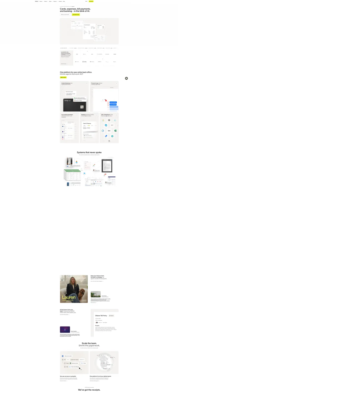
Ramp's marketing surface inverts the loudest pattern in fintech. Where Stripe paints the upper third of every page with a five-stop gradient mesh and Wise leans on a vivid lime CTA at 24px pill radius, Ramp does the opposite — a single warm sand canvas #f4f2f0, near-black Lausanne ink #212121 at one weight (400), and one tiny yellow chip #ffe74c that carries every primary call to action. The yellow is small, square-ish at 12px radius, sized below the surrounding type rather than above it. The argument is restraint as authority: a back-office platform that doesn't shout. Nothing on the marketing page asks for visual rent except the yellow chip and the product tiles beneath it.
This page packages the full system into a single DESIGN.md file. Inside: 19 colors covering the yellow CTA voltage, five named atmospheric gradients (midnight, dusk, daylight, solar, blaze) used as full-bleed product backdrops, four neutral surface tints, and the ink ladder from #212121 down to a 50% alpha helper; 9 typography tokens spanning Lausanne 14px caption through 48px hero — all at weight 400 with -0.01px tracking on display sizes only; 24 components covering buttons, the signature product-tile card, the inset email-input pill, navigation, the yellow status badge, and the dark-card composite used on the AI-agent panels. Every token name traces back to a `--lausanne-*` or `--color-*` CSS variable extracted from the live site.
Feed the file to Claude, Cursor, or GitHub Copilot. The agent will reproduce Ramp's specific quietness — one yellow chip, one type weight, sand canvas over white, 12px radius on everything that isn't a circle — rather than the generic high-contrast fintech default. Lausanne is proprietary; the canonical open-source substitute is Inter at weight 400 with -0.01px tracking on display sizes, or Geist Sans 400 for closer optical width. Avoid system-ui defaults; the brand's restraint depends on Lausanne's narrow x-height and the warm canvas pulling the type into print-like density.
What makes it distinct
5
- Single yellow CTA chip#ffe74c is the only filled brand affordance, sized smaller than competing fintech pills
- Lausanne weight 400 across every tierno thin display variant, no bold, hierarchy comes from size alone
- Warm sand canvas #f4f2f0 over pure whitethe brand reads as a printed magazine, not a SaaS console
- Product-tile mosaicevery feature band is a 2x2 grid of bordered #ffffff cards with 12px radius
- Five named atmospheresmidnight, dusk, daylight, solar, blaze each ship as full linear gradients
ramp.com
Live at ramp.com
A snapshot of the brand in production. Scroll the frame to see the whole page.
Colors
19 colors
Ramp Inspired's system runs on #ffe74c as its primary voltage, used in 4 of 24 components. Type is set in lausanne across 9 tokens from 10px to 48px, weights 400–400. Shape language is mixed across 24 components, blending pills, soft rounds, and squarer corners.
Brand & Accent
Sparing, CTA-only voltage · 1
Surface
Page and card backgrounds · 4
Text
Headlines, body, captions · 7
Borders & Hairlines
Dividers, outlines, rules · 1
Semantic
Status, errors, success, links · 1
Other
Specialty colors · 5
Typography
9 type tokens
Set in lausanne across 9 tokens, from 10px to 48px, weights 400–400. Shown in its own stack: where the font isn't installed, the fallback the file names stands in.
- display-xl48px · weight 400 · lh 50px · tracking -0.01pxThe quick brown fox jumps over the lazy dog
- display-lg40px · weight 400 · lh 42px · tracking -0.005pxThe quick brown fox jumps over the lazy dog
- display-md28px · weight 400 · lh 32px · tracking 0pxThe quick brown fox jumps over the lazy dog
- heading24px · weight 400 · lh 28px · tracking 0pxThe quick brown fox jumps over the lazy dog
- body-lg20px · weight 400 · lh 26px · tracking 0pxThe quick brown fox jumps over the lazy dog
- body-md16px · weight 400 · lh 24px · tracking 0pxThe quick brown fox jumps over the lazy dog
- body-sm14px · weight 400 · lh 20px · tracking 0pxThe quick brown fox jumps over the lazy dog
- caption13px · weight 400 · lh 19px · tracking 0pxThe quick brown fox jumps over the lazy dog
- micro-cap10px · weight 400 · lh 22px · tracking 0.18pxThe quick brown fox jumps over the lazy dog
Layout
Radii and spacing
7 corner radii and 8 spacing values. Shape language: mixed.
Radii
- xs4px
- sm6px
- md8px
- ms10px
- lg12px
- xl16px
- pill9999px
Spacing
- xs4px
- sm8px
- md12px
- lg16px
- xl20px
- xxl24px
- huge32px
- mega64px
Components
24 components
Each rendered from its tokens (color, type, radius, padding) on Ramp's own canvas.
- Button Cta Chipbutton-cta-chipButton Cta Chip
- Button Cta Chip Hoverbutton-cta-chip-hoverButton Cta Chip Hover
- Button Secondary Textbutton-secondary-textButton Secondary Text
- button-icon-circleButton Icon Circle
- Email Input Pillemail-input-pillEmail Input Pill
- Product Tileproduct-tileProduct Tile
- Product Tile Darkproduct-tile-darkProduct Tile Dark
- Card Portrait Cropcard-portrait-cropCard Portrait Crop
- Card Policy Doccard-policy-docCard Policy Doc
- Badge Status Yellowbadge-status-yellowBadge Status Yellow
- Badge Status Neutralbadge-status-neutralBadge Status Neutral
- Badge Record Pillbadge-record-pillBadge Record Pill
- Eyebrow Capeyebrow-capEyebrow Cap
- Nav Barnav-barNav Bar
- Nav Linknav-linkNav Link
- Link On Lightlink-on-lightLink On Light
- Card Corporate Photocard-corporate-photoCard Corporate Photo
- Card Globe Compositecard-globe-compositeCard Globe Composite
- Card Receipt Mosaiccard-receipt-mosaicCard Receipt Mosaic
- Table Row Numerictable-row-numericTable Row Numeric
- Cookie Bannercookie-bannerCookie Banner
- Cookie Banner Ctacookie-banner-ctaCookie Banner Cta
- Footer Lightfooter-lightFooter Light
- Highlight Name Overlayhighlight-name-overlayHighlight Name Overlay
In use
The system, in use
Ramp's tokens on the kind of product it builds.
Build something people actually use.
A short paragraph of marketing copy that previews how the brand's display tier and body tier read together. Two sentences is usually enough.
FAQ
Ramp Inspired design system FAQ
Common questions about Ramp's tokens, components, and how to use this DESIGN.md in your project.
Read next
Related reading
Specs, directories, and component libraries that pair with this design system.
Use it
Use Ramp Inspired in your project
One machine-readable file. Drop it into Claude, Cursor, or any AI tool that reads DESIGN.md.
Download the DESIGN.md
One machine-readable file: every color, type, radius, spacing, and component token of Ramp Inspired.
Feed it to your AI tool
Drop it into Claude, Cursor, or GitHub Copilot. The agent writes React components and Tailwind classes that match Ramp Inspired's visual language.
Reference the tokens directly
Or paste the values into your Tailwind config, CSS variables, or component library: every color, size and radius is a quoted, ready-to-copy value.
Read the full DESIGN.md: overview, rationale, do’s and don’ts
Overview
Ramp's marketing surface opens with a small inversion. Most finance brands in this catalogue paint the page — Stripe washes the upper third with a five-stop gradient mesh, Wise stains the canvas a pale sage and runs a vivid lime CTA at pill radius. Ramp does almost the reverse: a warm sand canvas {colors.canvas-sand} (#f4f2f0) carries the full page, near-black Lausanne ink {colors.ink} (#212121) holds every body sentence, and a single yellow CTA chip {colors.primary} (#ffe74c) at 12px radius does the entire conversion job. The chip is sized below the surrounding type, not above it. The marketing argument lands as editorial restraint — the page reads like a printed back-office magazine rather than a SaaS funnel.
The system has two structural decisions worth naming. One type weight — Lausanne renders at weight 400 across every tier from the 48px hero down to the 10px micro-cap, with negative tracking only on display sizes (-0.01px at 48px, -0.005px at 40px) and 0 tracking everywhere else. There is no thin display variant and no bold body variant. Hierarchy is driven by size alone. One depth medium — Ramp uses essentially no shadow tier; instead, every feature band renders as a 2x2 grid of bordered white tiles with 12px corners on the sand canvas, and the contrast between the tile and the canvas IS the elevation. The five named gradient atmospheres (midnight, dusk, daylight, solar, blaze) are reserved for product-tile interiors, never for buttons or page backgrounds.
Color discipline is the brand's quiet flex. Yellow {colors.primary} (#ffe74c) is the only filled brand affordance on the marketing page — one chip per band, never two competing. Ink ladders from {colors.ink} (#212121) at full opacity through {colors.ink-secondary} (#2d3748), {colors.ink-mute} (#4a5568), and {colors.ink-mute-2} (#718096) for helper text. Surfaces stack as {colors.canvas-sand} (#f4f2f0) → {colors.canvas} (#ffffff) → {colors.canvas-hover} (#edf2f7) for row hovers. The semantic palette is restricted to {colors.success} (#38a169) and {colors.danger} (#e53e3e) on the cookie banner only — the brand pushes status messaging into the in-product surface, not the marketing one.
Key Characteristics:
- Single yellow CTA chip —
{colors.primary}(#ffe74c) at 12px radius is the only filled brand affordance, sized smaller than the surrounding body text. - Warm sand canvas —
{colors.canvas-sand}(#f4f2f0) replaces pure white across every page band; the canvas itself reads as printed paper. - One Lausanne weight (400) — every type tier renders at the same weight; hierarchy comes from size alone.
- Product-tile mosaic depth — 2x2 grids of bordered
{colors.canvas}cards at 12px radius do the work that shadows would do in a Material-style system. - Five named gradient atmospheres — midnight (#000000 → #112d5b), dusk, daylight, solar
{colors.solar}(#f4d35e), and blaze{colors.blaze}(#e07a3c) fill product-tile interiors only. - Editorial portrait crops — customer photography uses a yellow name-highlighter overlay (
highlight-name-overlay) and a 12px-radius card, treated like a magazine pull-quote. - Negative tracking on display only — -0.01px at 48px and -0.005px at 40px; body and below stay at 0.
Colors
Source pages: home (
/), tile composites for cards, procure-to-pay, accounting, banking, integrations.
Brand & Accent
- Yellow (
{colors.primary}— #ffe74c): The brand's single filled CTA color. Used onbutton-cta-chip,badge-status-yellow, and as the highlighter behind portrait captions. - Solar (
{colors.solar}— #f4d35e): A saturated gold used as a product-tile gradient stop; never a button. - Blaze (
{colors.blaze}— #e07a3c): A warm orange used as a chart line color and a band-fill gradient stop.
Surface
- Canvas Sand (
{colors.canvas-sand}— #f4f2f0): Default page background — warm off-white with a faint olive tint, replaces pure white at the page level. - Canvas (
{colors.canvas}— #ffffff): Pure white reserved for product tiles, cards, and form inputs floating on the sand canvas. - Canvas Cool (
{colors.canvas-cool}— #f7fafc): Cool-tinted off-white used by the cookie banner and a handful of secondary surfaces. - Canvas Hover (
{colors.canvas-hover}— #edf2f7): Row hover and neutral background fill inside tables. - Hairline (
{colors.hairline}— #e2e8f0): 1px borders on tiles, inputs, and table rows.
Text
- Ink (
{colors.ink}— #212121): Default body text color across the brand. Near-black with a faint warmth, never pure #000000. - Ink Soft (
{colors.ink-soft}— #2b2e35): Used on the dark product-tile fill and on the cookie-banner CTA. - Ink Secondary (
{colors.ink-secondary}— #2d3748): Secondary headings, link emphasis. - Ink Mute (
{colors.ink-mute}— #4a5568): Helper text, captions, footer body. - Ink Mute 2 (
{colors.ink-mute-2}— #718096): Disabled and badge text. - Ink Mute 3 (
{colors.ink-mute-3}— #a0aec0): Tertiary placeholder text on inputs.
On-Brand Text
- On Primary (
{colors.on-primary}— #212121): Text on the yellow CTA chip — the same near-black as body ink, never white.
Atmospheric Gradients
- Midnight — linear gradient from
{colors.midnight-top}(#000000) at 0% to{colors.midnight-bottom}(#112d5b) at 100%, top to bottom. Used as the corporate-card photography backdrop. - Dusk — multi-stop sky gradient used on dashboard composites with horizon tone.
- Daylight — pale blue-to-white gradient used on policy-document composites.
Semantic
- Success (
{colors.success}— #38a169): Used on cookie-banner GPC-applied indicator. - Danger (
{colors.danger}— #e53e3e): Used on cookie-banner GPC-overridden indicator. The brand restricts semantic color to the privacy banner — product status colors live inside the authenticated surface.
Typography
Font Family
The display and UI tier is Lausanne (proprietary, licensed from Nizar Kazan via Type Department) loaded as a variable font with a fallback stack of 'Inter', system-ui, -apple-system, sans-serif. The brand runs a single weight — 400 — across every tier, which cuts hard against category convention. Most finance brands stair-step weight: thin for hero, regular for body, semibold for UI. Ramp doesn't.
When Lausanne is unavailable, fall back to Inter at weight 400 with the same negative tracking on display sizes. Geist Sans at weight 400 matches the optical width more closely if you have it loaded. Avoid system-ui defaults — they break the brand's print-like density.
Hierarchy
| Token | Size | Weight | Line Height | Letter Spacing | Use |
|---|---|---|---|---|---|
{typography.display-xl} | 48px | 400 | 50px | -0.01px | Hero headline |
{typography.display-lg} | 40px | 400 | 42px | -0.005px | Section opener |
{typography.display-md} | 28px | 400 | 32px | 0px | Sub-section heading |
{typography.heading} | 24px | 400 | 28px | 0px | Card title |
{typography.body-lg} | 20px | 400 | 26px | 0px | Lede paragraph |
{typography.body-md} | 16px | 400 | 24px | 0px | Default body |
{typography.body-sm} | 14px | 400 | 20px | 0px | UI label, button text |
{typography.caption} | 13px | 400 | 19px | 0px | Helper, table label |
{typography.micro-cap} | 10px | 400 | 22px | 0.18px | All-caps eyebrow |
Principles
- One weight for everything. Lausanne at 400, top to bottom. No thin variant, no bold variant. Hierarchy is driven by size alone.
- Negative tracking on display only. -0.01px at 48px and -0.005px at 40px. Body sizes and below stay at 0.
- Lausanne's narrow x-height does the work. The font's compressed character width creates editorial density without needing a thin weight — a Geist or Inter substitute will read slightly wider, which is acceptable.
- All-caps eyebrows at 10px with 0.18px tracking. The only place the brand uses uppercase, and the only place letter-spacing goes positive.
Note on Font Substitutes
Lausanne is proprietary. The closest open-source substitutes are Inter at weight 400 and Geist Sans at weight 400 — both pair correctly with the documented -0.01px negative tracking on display sizes. Manrope is too geometric, Outfit is too round, and system-ui will break the brand's print-like rhythm. The brand's discipline depends on the type reading as quietly editorial; substitutes that bring more personality undermine the effect.
Layout
Spacing System
- Base unit: 4px (Tailwind-standard
--spacingvariable extracted from the live site). - Tokens:
{spacing.xs}4px ·{spacing.sm}8px ·{spacing.md}12px ·{spacing.lg}16px ·{spacing.xl}20px ·{spacing.xxl}24px ·{spacing.huge}32px ·{spacing.mega}64px. - Section padding: 64–128px vertical on marketing surfaces (
--spacer-l= 128px,--spacer-m= 64px extracted from the site). - Tile internal padding: asymmetric 32px 24px 32px 32px — the canonical product-tile padding that gives the title room while pulling the right edge tight.
Grid & Container
- Marketing pages center in a ~1200px container with full-bleed sand canvas underneath.
- Product-tile bands collapse 2x2 → 1x2 → 1x1 at 992px and 768px (
--breakpoint-lg= 992px,--breakpoint-md= 768px). - The hero is constrained to roughly 480px width on desktop — narrow, magazine-like, deliberately not full-bleed.
Whitespace Philosophy
The sand canvas does the whitespace work — the page never visually opens to "negative space" because there's always a warm tint behind the type. Section gaps tend toward 96–128px, tighter than Stripe but looser than Linear.
Elevation & Depth
| Level | Treatment | Use |
|---|---|---|
| 0 | Flat on canvas-sand | Default page surface |
| 1 | 1px {colors.hairline} border on {colors.canvas} | Product tiles, cards, inputs |
| 2 | drop-shadow: 0 3px 3px rgba(0,0,0,0.12) | Modal lift, dropdown menu |
| 3 | drop-shadow: 0 9px 7px rgba(0,0,0,0.1) | Floating composite on dark surface |
Decorative Depth
Ramp's primary depth medium is the tile mosaic itself — a 2x2 grid of {colors.canvas} tiles with 1px hairline border on the warm {colors.canvas-sand} canvas. The contrast between white-on-sand reads as elevation without needing a shadow. Literal shadows are reserved for floating menus and the corporate-card composite; they stay subtle.
Shapes
Border Radius Scale
| Token | Value | Use |
|---|---|---|
{rounded.xs} | 4px | Inline tags, nav links |
{rounded.sm} | 6px | Small badges, table chrome |
{rounded.md} | 8px | Compact alerts, status pills |
{rounded.ms} | 10px | Email-input pill |
{rounded.lg} | 12px | Buttons, cards, product tiles, hero input |
{rounded.xl} | 16px | Cookie banner, large containers |
{rounded.pill} | 9999px | Circular icon buttons only |
Photography Geometry
Customer photography uses portrait crops inside {rounded.lg} 12px cards, with the customer's first name rendered in 40px Lausanne over a yellow highlight-name-overlay chip. The composite reads as a magazine pull-quote — name foregrounded, role tucked underneath, quote anchored at the bottom.
Components
Buttons
button-cta-chip — the single brand affordance.
- Background
{colors.primary}(#ffe74c), text{colors.on-primary}(#212121), type{typography.body-sm}, padding 8px 12px, rounded{rounded.lg}12px. - Sized below the surrounding body text rather than above it. The intent is editorial restraint.
button-secondary-text — link-style alternative.
- Background
{colors.canvas-sand}(#f4f2f0), text{colors.ink}(#212121), no border, no fill change on hover.
button-icon-circle — round icon button.
- Background
{colors.ink-soft}(#2b2e35), text/icon{colors.canvas}(#ffffff), padding 8px, rounded{rounded.pill}9999px. Used for chat-launcher and inline AI-agent actions.
Cards & Containers
product-tile — the dominant feature container.
- Background
{colors.canvas}(#ffffff), padding 32px 24px 32px 32px (asymmetric — the canonical tile inset), rounded{rounded.lg}12px, 1px{colors.hairline}(#e2e8f0) border. - Holds a 14px Lausanne eyebrow, a 24px title, and a composited product-UI screenshot beneath.
product-tile-dark — the inverse polarity.
- Background
{colors.ink-soft}(#2b2e35), text{colors.canvas}(#ffffff), otherwise identical toproduct-tile. Used on the AI-agent and cards-and-expenses panels.
card-portrait-crop — magazine pull-quote.
- Background
{colors.canvas}, 0 padding (the photo bleeds), 12px rounded. The customer's first name renders at 40px Lausanne over ahighlight-name-overlayyellow chip.
card-policy-doc — composited document mockup.
- Background
{colors.canvas}, padding 24px, rounded{rounded.lg}12px, 1px hairline border. Used on the AI-policy-learning band.
card-corporate-photo — corporate card photography.
- Background gradient from
{colors.midnight-top}(#000000) to{colors.midnight-bottom}(#112d5b), 0 padding, 12px rounded. Holds the photographed corporate card asset.
card-globe-composite — global-spend illustration.
- Background
{colors.canvas}, padding 24px, 12px rounded. Holds the rotating-globe illustration with arc trajectories.
Inputs & Forms
email-input-pill — the hero email-capture field.
- Background
{colors.canvas}(#ffffff), text{colors.ink}(#212121), type{typography.body-md}, padding 0px 16px 0px 24px, rounded{rounded.ms}10px, 1px{colors.ink}border. - The unusual 10px radius (not 8, not 12) is the only place in the system where this token appears.
Navigation
nav-bar — top nav on sand canvas.
- Background
{colors.canvas-sand}(#f4f2f0, often rendered transparent over the page), text{colors.ink}, padding 16px 24px. Logo wordmark on the left, primary nav center, sign-in +button-cta-chipon the right. Nav height is exactly 62px (--nav-heightextracted from the site).
nav-link — inline nav item.
- Background
{colors.canvas-sand}, text{colors.ink}, padding 0px 12px, no underline.
Pills, Badges, and Chips
badge-status-yellow — yellow status indicator.
- Background
{colors.primary}(#ffe74c), text{colors.on-primary}(#212121), type{typography.caption}, padding 4px 8px, rounded{rounded.md}8px.
badge-status-neutral — gray status indicator.
- Background
{colors.canvas-hover}(#edf2f7), text{colors.ink-secondary}(#2d3748), same geometry.
badge-record-pill — interactive record indicator on AI agent panels.
- Background
{colors.canvas}, text{colors.ink}, 1px hairline border, type{typography.body-sm}, padding 4px 8px, rounded{rounded.md}.
eyebrow-cap — uppercase section eyebrow.
- Text
{colors.ink-mute}(#4a5568), type{typography.micro-cap}(10px / 0.18px tracking), no fill.
Signature Components
Product-Tile Mosaic — a 2x2 grid of product-tile containers stacked on the sand canvas. Each tile holds an eyebrow + 24px title + composited product-UI screenshot. The mosaic is the brand's primary information-density device — five product capabilities visible per viewport.
Customer Portrait with Name-Highlighter — a 12px-radius card-portrait-crop holding a customer photograph, with the customer's first name in 40px Lausanne overlaid against a yellow highlight-name-overlay chip. Reads as a magazine pull-quote.
Five Atmospheric Gradients — midnight, dusk, daylight, solar, blaze ship as full linear-gradient tokens (--background-image-* on the live site) used as product-tile interior fills only. The gradients never fill page sections or button surfaces.
link-on-light — inline links on light surfaces.
- Text
{colors.ink-secondary}(#2d3748), no underline by default, no hover color change.
cookie-banner — Fides-driven privacy banner.
- Background
{colors.canvas-cool}(#f7fafc), text{colors.ink-mute}, padding 24px, rounded{rounded.lg}12px.
cookie-banner-cta — banner accept button.
- Background
{colors.ink-soft}(#2b2e35), text{colors.canvas}, type{typography.body-sm}, padding 8px 16px, rounded{rounded.sm}6px.
table-row-numeric — table row for transaction tables.
- Background
{colors.canvas}, text{colors.ink}, type{typography.body-sm}, padding 8px 12px. No tabular-figure feature is applied at the brand level — Lausanne renders proportional figures, which is unusual for the category.
footer-light — site-wide footer.
- Background
{colors.canvas-sand}(#f4f2f0), text{colors.ink-mute}(#4a5568), type{typography.caption}, padding 64px 24px.
Do's and Don'ts
Do
- Reserve
{colors.primary}(#ffe74c) for the single CTA chip per band, sized below the body text. - Run every type tier at weight 400. Use size to create hierarchy.
- Use
{colors.canvas-sand}(#f4f2f0) for the page background and{colors.canvas}(#ffffff) for tiles floating on it. - Build feature bands as 2x2 grids of
product-tilecontainers — the mosaic is the brand's information-density signature. - Apply -0.01px tracking at 48px and -0.005px at 40px; leave body sizes at 0.
- Use the named gradient atmospheres (midnight, dusk, daylight, solar, blaze) inside product-tile interiors only.
Don't
- Don't bump Lausanne above weight 400 — the single-weight discipline IS the brand voice.
- Don't enlarge the yellow chip to a full-width pill — it must read as smaller than the surrounding type.
- Don't replace the sand canvas with pure white at the page level — the warm tint is non-negotiable.
- Don't add a secondary brand accent. Yellow is the only voltage; the five gradients are atmospheric, not interactive.
- Don't use the named gradients as page backgrounds or button fills — they live inside product tiles.
- Don't add layered shadows for elevation — the tile mosaic carries the depth.
Responsive Behavior
Breakpoints
| Name | Width | Key Changes |
|---|---|---|
| Wide | ≥ 1440px | Full mosaic at 2x2; hero email-input inline with chip |
| Desktop | 992–1440px | Default content max-width; mosaic at 2x2 |
| Tablet | 768–991px | Mosaic collapses to 1x2; hero stacks |
| Mobile | < 768px | Mosaic 1x1; nav collapses to hamburger; display drops 48 → 32px |
Touch Targets
- The yellow CTA chip stays at 8px 12px padding on mobile, totaling roughly 36×36px hit area — under the WCAG AAA threshold; the brand accepts this for editorial register.
- Form fields stay at 30–40px height (the email pill is 30px on desktop, scales to 40px on mobile).
Collapsing Strategy
- Display tiers stair-step 48 → 40 → 32px through the breakpoints.
- The product-tile mosaic collapses 2x2 → 1x2 → 1x1, never reflowing inside the tile.
- Portrait crops scale down proportionally without re-cropping.
Image Behavior
Product-UI composites are pre-rendered raster screenshots embedded inside product-tile containers. There is no live product rendering on the marketing surface — every dashboard view is a static composite, art-directed per band.
Known Gaps
- Authenticated product surface: app.ramp.com runs a separate token set with denser table chrome and dashboard-specific status colors. The marketing-page semantic palette is restricted to the cookie banner.
- AI-agent panel state matrix: the dark
product-tile-darkpanels carry an in-product AI surface that has more states (loading, streaming, completed, error) than captured here — only the resting state is documented. - Customer-photography asset system: portrait crops use art-directed studio photography with a yellow name-highlighter overlay; the photography brief and crop ratios live outside this spec.
- Tile hover motion: product tiles lift subtly on hover with an opacity and translate animation; precise easing tokens are not extracted.
- Corporate-card rotation animation: the homepage corporate-card composite has a continuous slow Y-axis rotation; the keyframe timing isn't captured.
- Annual-report typography: the printed-magazine annual report uses a different display family with serif accents — its own brand expression, not part of this marketing spec.
Fintech & Crypto
More systems like this
More DESIGN.md files in Fintech & Crypto.
Pricing
Build it with Pro
The DESIGN.md files are free. Pro adds 6,000+ blocks, premium templates and the MCP server, so your AI editor builds in your system for you.
4.9/5 out of 5 · 150+ reviewsfrom 150+ founders and developers.
Billing
Billed once a year in USD. Cancel anytime.
- How many people can use the license.
- Client work, SaaS products and anything you charge for.
- Production-ready React sections: hero, pricing, features, dashboards and more.
- Complete multi-page sites you can ship as they are.
- React icons from every major library, installable with one command.
- Presets that restyle every block, in light and dark.
- Lets your AI editor search, preview and install blocks for you.
- Priority requests are answered first.
Individual
For personal projects & open source
$32instead of $49/mo
$389 billed yearly
- Seats: 1 seat
- Commercial use: Personal & open source only
- Pro blocks: 6,000+ blocks
- Templates: All 14 templates
- React icons: 294k+ icons
- Themes: All 59 themes
- MCP server: Basic usage
- Support: Standard
Team
Most popularFor freelancers, agencies & startups
$66instead of $99/mo
$789 billed yearly · ≈ $13/dev/mo
- Seats: Up to 5 seats
- Commercial use: Included
- Pro blocks: 6,000+ blocks
- Templates: All 14 templates
- React icons: 294k+ icons
- Themes: All 59 themes
- MCP server: High usage
- Support: Priority
Organization
For companies with larger teams
$132instead of $199/mo
$1,589 billed yearly
- Seats: Unlimited seats
- Commercial use: Included
- Pro blocks: 6,000+ blocks
- Templates: All 14 templates
- React icons: 294k+ icons
- Themes: All 59 themes
- MCP server: Unlimited usage
- Support: Priority
Billed once a year in USD. Cancel anytime.
Individual
For personal projects & open source
$32instead of $49/mo
$389 billed yearly
- How many people can use the license.Seats: 1 seat
- Client work, SaaS products and anything you charge for.Commercial use: Personal & open source only
- Production-ready React sections: hero, pricing, features, dashboards and more.Pro blocks: 6,000+ blocks
- Complete multi-page sites you can ship as they are.Templates: All 14 templates
- React icons from every major library, installable with one command.React icons: 294k+ icons
- Presets that restyle every block, in light and dark.Themes: All 59 themes
- Lets your AI editor search, preview and install blocks for you.MCP server: Basic usage
- Priority requests are answered first.Support: Standard
Team
Most popularFor freelancers, agencies & startups
$66instead of $99/mo
$789 billed yearly · ≈ $13/dev/mo
Everything in Individual, plus
- How many people can use the license.Seats: Up to 5 seats
- Client work, SaaS products and anything you charge for.Commercial use: Included
- Lets your AI editor search, preview and install blocks for you.MCP server: High usage
- Priority requests are answered first.Support: Priority
Organization
For companies with larger teams
$132instead of $199/mo
$1,589 billed yearly
Everything in Team, plus
- How many people can use the license.Seats: Unlimited seats
- Lets your AI editor search, preview and install blocks for you.MCP server: Unlimited usage
- Secure checkout via Stripe
- Code lives in your repo
- Keep what you've shipped if you cancel
- License terms
Your system, built for you
Every block, template and icon, installed by your AI agent in your design system. The DESIGN.md files stay free.