Qonto Design System
Qonto's marketing system pairs a charcoal hero with a flipped-white product band, 24px generous-radius black cards, and QontoSans at every tier. Tokens for React, Next.js, and AI tools.
Add shadcn.io to your AI agent. · Pro It installs blocks, icons and templates in your design system from a prompt, with Pro.
Set up MCP- Primary
- #050505
- Typeface
- QontoSans
- Shape
- Mixed
- Base radius
- 8px
- Colors
- 14
- Type tokens
- 11
- Components
- 17
- Spacing values
- 9
About
About Qonto DESIGN.md
Curated by Dov Azencot · Updated May 18, 2026 · Source qonto.com (opens in a new tab)
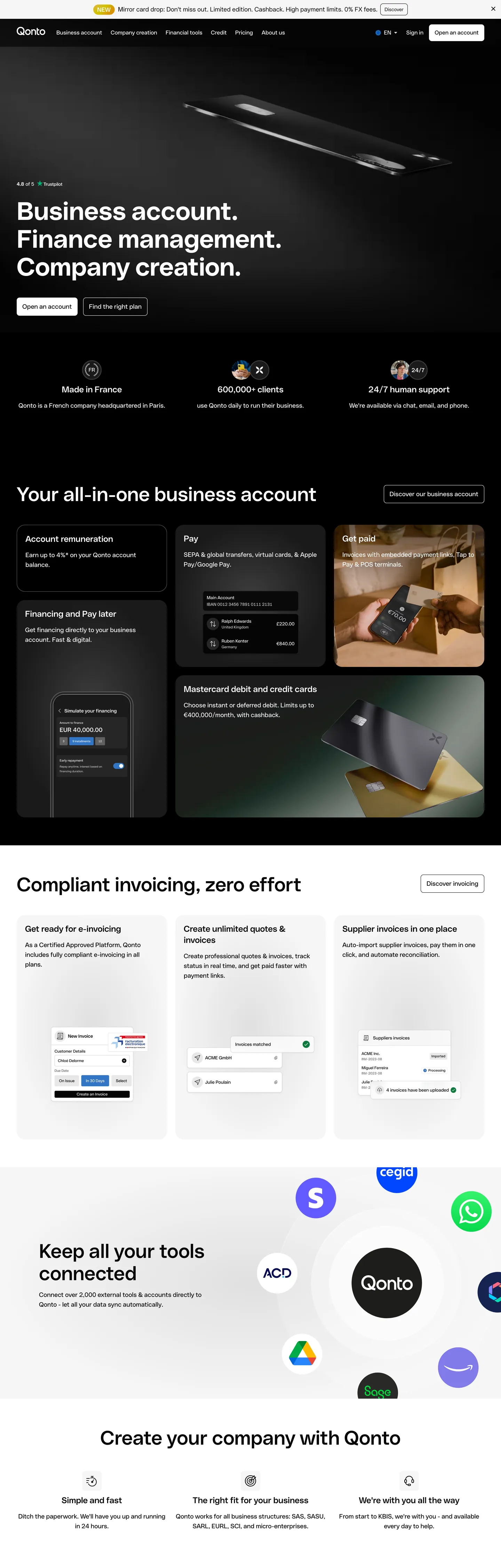
Qonto's marketing surface opens with a move almost no other European fintech makes. The above-fold is charcoal black, no gradient — pure ink-on-shadow with a 72px QontoSans display headline stacked in three short sentences ("Business account. Finance management. Company creation."), a tilted chrome debit-card render floating overhead like a piece of industrial product photography, and two pill CTAs ("Open an account" / "Find the right plan") sitting beneath in modest weight. Where Revolut and Wise paint their heroes in saturated purples and chartreuses, and where Mercury and Brex go bright white with a graphite voltage, Qonto holds the canvas at near-black and lets the only color come from the rendered metal of the card itself.
Below the fold the page flips. The canvas inverts to white, and the product band reappears as a charcoal mosaic — five black 24px-rounded cards laid out in an asymmetric grid (a tall card for "Account remuneration," a payments tile with Apple/Google Pay glyphs, a "Get paid" card showing an embedded payment link, a "Financing" card with a phone mockup, a wide "Mastercard debit and credit cards" card with two metallic chips angled in the light). The repetition of the same 24px radius across every tile, paired with the absence of any second corner-radius value, is the system's structural signature: there is no middle tier, no soft 12px or 16px option. Either a surface is a card (24px) or it is a chip / input (8px). The binary scale gives the whole page its sharp-efficient feeling without using a single sharp corner.
The DESIGN.md file packages the system into a machine-readable spec. Inside: 14 colors tokens stripped down from the 60+ CSS variables Qonto exposes in `:root` (the public marketing site only renders a charcoal-and-ink chrome with sky and mustard highlight tokens reserved for inline emphasis), 11 typography tokens running QontoSans from 12px footnote to 72px hero, a binary radius scale, an 8px-base spacing system, and 17 components definitions covering the dark hero band, the white below-fold canvas, the 24px charcoal product card, the pill CTA, and the chip-rendered top-nav. Feed it to a coding agent and the move worth reproducing is the inversion — charcoal above, white below, the same 24px card geometry repeating across both surfaces.
What makes it distinct
5
- Hero-flip compositiona charcoal-black above-fold lands on a white below-fold; the brand voltage is the surface contrast, not a chromatic accent
- Single-radius cardsevery product tile uses a 24px corner; the system runs only two radii (24px on cards, 8px on chips and inputs) with no middle tier
- QontoSans across every tier72px hero in weight 700, 56px section heads in 600, 18px lead paragraphs in 400, 12px legal in 400, no second family on the page
- Restraint by absence11 raw rendered colors total on a banking page that exposes 60+ CSS variables; the public chrome strips the palette down to charcoal, ink, hairline, white
- Industrial product photographychrome debit cards and tilted phone mockups carry the hero rather than illustration, lit like an Apple keynote frame
qonto.com
Live at qonto.com
A snapshot of the brand in production. Scroll the frame to see the whole page.
Colors
14 colors
Qonto's system runs on #050505 as its primary voltage, used in 4 of 17 components. Type is set in QontoSans across 11 tokens from 12px to 72px, weights 400–700. Shape language is mixed across 17 components, blending pills, soft rounds, and squarer corners.
Surface
Page and card backgrounds · 2
Text
Headlines, body, captions · 5
Borders & Hairlines
Dividers, outlines, rules · 3
Semantic
Status, errors, success, links · 1
Other
Specialty colors · 3
Typography
11 type tokens
Set in QontoSans across 11 tokens, from 12px to 72px, weights 400–700. Shown in its own stack: where the font isn't installed, the fallback the file names stands in.
- display-xl72px · weight 700 · lh 80pxThe quick brown fox jumps over the lazy dog
- display-lg56px · weight 600 · lh 64pxThe quick brown fox jumps over the lazy dog
- display-md40px · weight 600 · lh 48pxThe quick brown fox jumps over the lazy dog
- heading-md24px · weight 600 · lh 32pxThe quick brown fox jumps over the lazy dog
- body-lg18px · weight 400 · lh 28pxThe quick brown fox jumps over the lazy dog
- body-md16px · weight 400 · lh 24pxThe quick brown fox jumps over the lazy dog
- body-sm14px · weight 400 · lh 22pxThe quick brown fox jumps over the lazy dog
- label-emph16px · weight 700 · lh 26pxThe quick brown fox jumps over the lazy dog
- caption12px · weight 400 · lh 18pxThe quick brown fox jumps over the lazy dog
- button-md16px · weight 400 · lh 26pxThe quick brown fox jumps over the lazy dog
- nav-link16px · weight 400 · lh 26pxThe quick brown fox jumps over the lazy dog
Layout
Radii and spacing
5 corner radii and 9 spacing values. Shape language: mixed.
Radii
- none0px
- xs6px
- sm8px
- lg24px
- full9999px
Spacing
- xs4px
- sm8px
- md12px
- base16px
- lg24px
- xl32px
- 2xl48px
- 3xl56px
- 4xl80px
Components
17 components
Each rendered from its tokens (color, type, radius, padding) on Qonto's own canvas.
- Hero Sectionhero-sectionHero Section
- Hero Headinghero-headingHero Heading
- Section Headingsection-headingSection Heading
- Body Paragraphbody-paragraphBody Paragraph
- Body Paragraph Mutedbody-paragraph-mutedBody Paragraph Muted
- Legal Footnotelegal-footnoteLegal Footnote
- Button Primarybutton-primaryButton Primary
- Button Secondarybutton-secondaryButton Secondary
- Top Navtop-navTop Nav
- Nav Linknav-linkNav Link
- Card Darkcard-darkCard Dark
- Card Lightcard-lightCard Light
- Product Tileproduct-tileProduct Tile
- Trust Chiptrust-chipTrust Chip
- Logo Orblogo-orbLogo Orb
- Type here…text-inputText Input
- FooterfooterFooter
In use
The system, in use
Qonto's tokens on the kind of product it builds.
Build something people actually use.
A short paragraph of marketing copy that previews how the brand's display tier and body tier read together. Two sentences is usually enough.
- · 1 project
- · Community support
- · 10k req/mo
- · 10 projects
- · Priority support
- · 1M req/mo
- · Custom domains
- · Unlimited
- · SLA
- · Audit log
- · SSO
FAQ
Qonto design system FAQ
Common questions about Qonto's tokens, components, and how to use this DESIGN.md in your project.
Read next
Related reading
Specs, directories, and component libraries that pair with this design system.
- Browse all design systemsThe full directory of DESIGN.md files on shadcn.io, with live mockups for each.shadcn.io
- Qonto — official siteQonto's public marketing site — the source of truth for the live tokens captured in this file.qonto.com (opens in a new tab)
- The DESIGN.md specificationGoogle Labs' open spec for machine-readable design system files — the format this page is built on.github.com (opens in a new tab)
Use it
Use Qonto in your project
One machine-readable file. Drop it into Claude, Cursor, or any AI tool that reads DESIGN.md.
Download the DESIGN.md
One machine-readable file: every color, type, radius, spacing, and component token of Qonto.
Feed it to your AI tool
Drop it into Claude, Cursor, or GitHub Copilot. The agent writes React components and Tailwind classes that match Qonto's visual language.
Reference the tokens directly
Or paste the values into your Tailwind config, CSS variables, or component library: every color, size and radius is a quoted, ready-to-copy value.
Read the full DESIGN.md: overview, rationale, do’s and don’ts
Overview
Qonto's marketing surface stages two surfaces back-to-back. Canvas-flip composition. The above-fold is a near-black charcoal {colors.ink-charcoal} canvas with a 72px QontoSans display in three stacked one-word sentences and a tilted chrome debit-card render hovering overhead; immediately below the fold the canvas inverts to pure white {colors.canvas}, and the brand returns to charcoal only inside the 24px-rounded product cards laid across the band. Where Revolut and Wise saturate their heroes with purple and chartreuse, and where Mercury and Brex hold a single bright white surface top-to-bottom with a graphite accent, Qonto trusts the surface inversion itself to do the chromatic work a brand voltage would normally carry.
The chromatic restraint is unusually severe for a fintech surface. The captured page renders only 11 raw colors despite Qonto exposing 60+ CSS custom properties in :root (every color in the broader product palette — sky, mustard, sakura, peach, plum, olive, mint, taupe — sits unrendered in the marketing chrome). The four highlight tokens that do appear in CSS ({colors.highlight-blueberry}, {colors.highlight-mustard}, {colors.highlight-peach}, {colors.highlight-sakura}) are reserved for inline-emphasis treatments inside long-form content; the public marketing band shows none of them. The result reads like industrial-design product documentation rather than a typical European fintech surface.
The shape language is binary radius. Every card on the captured page uses 24px ({rounded.lg}) — the asymmetric 5-card product mosaic below the fold, the integration-logo orb container, the testimonial chips. Inputs, secondary chips, and CTA buttons use 8px ({rounded.sm}). There is no middle-tier 12 or 16px rounding anywhere; the silhouette test would identify Qonto from any single tile in isolation by the corner curvature alone.
Key Characteristics:
- Charcoal-above / white-below canvas inversion — the brand voltage is the surface contrast, not a single hex; 72px display in white-on-charcoal becomes 56px display in charcoal-on-white below the fold.
- 24px (
{rounded.lg}) on every product card and a strict 8px ({rounded.sm}) on every chip and input. No middle tier, no soft 12 or 16px option. - QontoSans carries every tier — 72px hero in weight 700, 56px section heads in 600, 18px lead in 400, 12px legal in 400. No second family on the page.
- Industrial product photography in the hero (chrome debit card tilted into a lit composition); a phone mockup, two metallic mastercards, and a payment-link tile carry the product band below.
- Top-nav floats above the charcoal hero as a flush dark band — no surface contrast with the canvas, just a 1px hairline rule at the bottom.
- The full secondary palette (sky, mustard, sakura, peach, plum, olive, mint, taupe) sits declared but unrendered on the captured page — the broader product chrome strips down for marketing.
- Two pill-ish 8px CTAs in the hero ("Open an account" cream-fill on charcoal, "Find the right plan" transparent with hairline border) — no third hierarchy.
- 80px section padding on the dark hero band; below the fold the rhythm tightens to ~56px between major sections.
Colors
Canvas
- Canvas (
{colors.canvas}— #ffffff): frequency 592 (288 text, 15 bg, 283 border). Pure white below the fold — the body floor for the product band, the integration mosaic, and the footer. Wired across 24 CSS variable names including--color-white,--color-primary-white,--color-mauve-50, and--color-scrim-light-overlay. Carries the cream pill CTA fill and every below-fold display headline. - Ink Charcoal (
{colors.ink-charcoal}— #050505): frequency 241 (72 text, 7 bg, 69 border, 93 gradient). The hero canvas tone — near-black with a hint of warmth, wired as--color-zinc-950,--color-primary-black, and--color-scrim-dark-overlay. Carries the hero background, the dark product-card fills, and the top-nav surface.
Text
- Ink (
{colors.ink}— #000000): frequency 244 (119 text, 6 bg, 119 border). Pure black — used as the canonical text color below the fold and as the running-text tone in the integration band. Wired as--color-blackand--color-transparentin CSS. - Ink Soft (
{colors.ink-soft}— #1a1a1a): frequency 6, all as background or gradient. The slightly-lifted charcoal tone for product cards and hover states. - Ink Muted (
{colors.ink-muted}— #3d3d3d): frequency 3 — used inside dark-card gradients and secondary surface fills. Wired as--color-stone-700,--color-mist-700,--color-grey-700. - Ink Secondary (
{colors.ink-secondary}— #616161): frequency 8 (0 text, 4 bg, 4 border). The footer-text and metadata tone — wired as--color-grey-600.
Hairline
- Hairline (
{colors.hairline}— #cccccc): frequency 160 (80 text, 80 border). The primary border tone — used on every white-card outline, the input field stroke, and the top-nav bottom rule. Wired as--color-neutral-300,--color-grey-300,--color-mauve-300. - Hairline Soft (
{colors.hairline-soft}— #e0e0e0): frequency 4 — softer border tone for elevated cards and dropdown menus. Wired as--color-zinc-200,--color-grey-200. - Divider (
{colors.divider}— #b8b8b8): frequency 3 — vertical-rule color between top-nav links. Wired as--color-grey-400.
Surface
- Surface 2 (
{colors.surface-2}— #eef0f5): the cool-tinted alternate surface declared as--color-bluegrey-50/--color-neutral-100. Reserved for the integrations band background and below-fold callout panels.
Highlight (declared, reserved)
- Highlight Blueberry (
{colors.highlight-blueberry}— #c6e6fb): wired as--color-highlight-blueberry,--color-sky-200,--color-blueberry-50. The sky-tinted inline-emphasis token for long-form content; not rendered in the captured marketing chrome. - Highlight Mustard (
{colors.highlight-mustard}— #faffa4): wired as--color-highlight-mustard,--color-mustard-50. A bright-pale yellow inline-emphasis token; not rendered above the fold. - Highlight Peach (
{colors.highlight-peach}— #ffc9a6): wired as--color-highlight-peach,--color-peach-50. Reserved for warm-emphasis treatments in product surfaces; absent from marketing chrome. - Highlight Sakura (
{colors.highlight-sakura}— #ffdfea): wired as--color-highlight-sakura,--color-sakura-50. Reserved for soft-emphasis treatments; absent from marketing chrome.
Typography
Font Family
The system runs QontoSans across every tier — display, heading, body, button, nav, legal — without a second family. Fallbacks walk system-ui, -apple-system, sans-serif. There is no display serif, no monospace, no condensed sans, no italic alternate visible on the captured surface. The single typeface carries every voice; the variation is weight (300 / 400 / 600 / 700) and size (12px to 72px).
QontoSans reads as a geometric grotesk with high x-height — it sits in the same neighborhood as Inter, GT America, and Inter Display, with slightly tighter apertures.
Hierarchy
| Token | Size | Weight | Line Height | Use |
|---|---|---|---|---|
{typography.display-xl} | 72px | 700 | 80px | Hero h1 ("Business account. Finance management. Company creation.") |
{typography.display-lg} | 56px | 600 | 64px | Section h2 ("Your all-in-one business account", "Compliant invoicing, zero effort") |
{typography.display-md} | 40px | 600 | 48px | Sub-section heads, large metric callouts |
{typography.heading-md} | 24px | 600 | 32px | h3 product-card titles ("Account remuneration", "Get paid", "Mastercard debit and credit cards") |
{typography.body-lg} | 18px | 400 | 28px | Hero sub-paragraph, section leads |
{typography.body-md} | 16px | 400 | 24px | Default running text |
{typography.body-sm} | 14px | 400 | 22px | Caption rows, metadata |
{typography.label-emph} | 16px | 700 | 26px | Inline emphasis inside body copy |
{typography.caption} | 12px | 400 | 18px | Legal-footnote tier (rendered on every regulatory line in the footer) |
{typography.button-md} | 16px | 400 | 26px | CTA label |
{typography.nav-link} | 16px | 400 | 26px | Top-nav link labels |
Principles
Display weight tops out at 700 only on the 72px hero h1; every other tier from 56px down sits at 600 or 400. The 56-down-to-40 step in the section-heading band is single-weight 600 — there is no semibold-or-bold ladder. The system uses size, not weight, to mark hierarchy; the largest weight contrast on the page is between display 700 and body 400.
The hero h1 splits a single thought into three one-word sentences ("Business account. Finance management. Company creation."), each terminated by a period. The compositional move is unusually directive for a banking surface — most peers run a flowing single-sentence dek; Qonto stacks three nouns and trusts the periods to do the rhythm.
Note on Font Substitutes
QontoSans is proprietary. Inter at the same weights is the closest open-source substitute; the proportions track within ~2% at 16-18px body sizes. For the 72px display tier, General Sans (Indian Type Foundry) and Geist (Vercel) both work; Geist is closer in cap-height, General Sans closer in aperture geometry.
Layout
Spacing System
- Base unit: 8px — the dominant gap and the unit underlying every padding token.
- Tokens:
{spacing.xs}4px ·{spacing.sm}8px ·{spacing.md}12px ·{spacing.base}16px ·{spacing.lg}24px ·{spacing.xl}32px ·{spacing.2xl}48px ·{spacing.3xl}56px ·{spacing.4xl}80px. - Hero padding: 80x48px (
{spacing.4xl}vertical,{spacing.2xl}horizontal) on the charcoal hero band. - Section padding: 56x0px (
{spacing.3xl}vertical) between major below-fold sections. - Card internal padding:
{spacing.lg}(24px) on every product card — the radius and padding are matched, giving each tile the same visual mass.
Grid & Container
- Max content width: ~1200px on the body band, full-bleed on the charcoal hero (the product photography extends to the edge of the canvas).
- Hero: charcoal canvas with the 72px display, two-CTA stack, and trust-rating chip pinned to the left half; the chrome debit-card render fills the right half.
- Product mosaic: asymmetric 3-column band with a tall card on the left ("Account remuneration"), a 1+1 column in the middle ("Pay" / "Financing"), and a tall + wide pair on the right ("Get paid" / "Mastercard debit").
- Below-fold sections: 3-column equal grid for the invoicing band ("Get ready for e-invoicing" / "Create unlimited quotes" / "Supplier invoices in one place"), 1-up integration mosaic with circular logo orbs around a center "Qonto" orb.
Rhythm
The page alternates between dense charcoal and generous white bands. The hero is dense (display + photography pinned together). The product mosaic that follows is dense again (5 cards packed asymmetrically). Then the invoicing band breathes (3 column-cells with whitespace between). Then the integration band collapses back to dense (~30 logo orbs floating around the center Qonto mark). The footer returns to generous. The system is not on a single tempo — it pulses between packed product moments and breathing editorial moments.
Elevation
The system has essentially no shadow tier. The captured page records a single shadow occurrence on the cream pill CTA, plus a few subtle 1px shadow halos on the integration-logo orbs. Hierarchy comes from surface-color contrast — charcoal cards lifted off the white canvas by 95+ points of lightness, or white cards on the integration band lifted off the cool-tinted {colors.surface-2} (#eef0f5) backdrop.
- Flat (no shadow): hero, top-nav, every body section, footer — 99% of surfaces.
- CTA elevation: the white pill on the charcoal hero sits with a single faint shadow — the only meaningfully-elevated element above the fold.
- Tonal lift: charcoal
{colors.ink-charcoal}cards on white{colors.canvas}carry the entire product-mosaic depth illusion via lightness contrast alone. - Hairline:
{colors.hairline}(#cccccc) carries every visible border at 1px — input outlines, top-nav bottom rule, card edges on the white band.
Shapes
The radius scale is binary: 24px on cards, 8px on everything else.
{rounded.none}0px — the hero band itself, the top-nav, the body text container.{rounded.xs}6px — the small trust-rating chip and metadata pills.{rounded.sm}8px — pill CTAs, input fields, top-nav nav-link hover states, secondary chips.{rounded.lg}24px — every product card, every integration-logo container, the asymmetric mosaic tiles.{rounded.full}9999px — the circular logo orbs in the integration band, icon buttons.
There is no 12 or 16px middle tier. The decision is structural: cards are either generous-soft (24px) or chip-tight (8px), with nothing between. The silhouette signature of the page is the 24px corner repeating across every tile in the product band.
Components
hero-section — Charcoal {colors.ink-charcoal} canvas, 80x48px padding, no border-radius. Holds the 72px hero h1 in white at {typography.display-xl}, a small Trustpilot rating chip beneath, two pill CTAs, and the right-pinned chrome debit-card render.
hero-heading — White {colors.canvas} text on the charcoal hero, QontoSans 72px / 700. Splits one thought into three stacked one-word sentences ("Business account. Finance management. Company creation."); each terminated by a period.
section-heading — Same {typography.display-lg} token rendered in ink-soft {colors.ink-soft} on the white below-fold canvas. Used on "Your all-in-one business account", "Compliant invoicing, zero effort", "Keep all your tools connected", "Create your company with Qonto".
body-paragraph — Default ink-soft running text at {typography.body-lg} (18px / 400). The hero sub-paragraph and section leads.
body-paragraph-muted — {colors.ink-secondary} (#616161) variant at {typography.body-md} for secondary copy and footer-metadata labels.
legal-footnote — Pure-black {colors.ink} at {typography.caption} (12px / 400, 18px line-height). Used for the regulatory-disclosure line in the footer ("Qonto SA is a licensed payment institution authorized by the French Autorité…"). The single tier of running text below 14px in the system.
button-primary — White {colors.canvas} fill on the charcoal hero, ink {colors.ink} text, {rounded.sm} 8px radius, 11x16 padding, 44px height. Border 0. "Open an account" is the canonical instance.
button-secondary — Transparent fill on the charcoal hero with white text and a 1px white-alpha border. Same dimensions and radius as {component.button-primary}. Used for "Find the right plan" and "Discover" / "Discover invoicing" inline CTAs throughout the page.
top-nav — Charcoal {colors.ink-charcoal} surface (same tone as the hero canvas — no surface contrast), 64px height, 16x24px padding. Houses the Qonto wordmark flush left, product-nav links (Business account / Company creation / Financial tools / Credit / Pricing / About) center, and the right-aligned EN selector / Sign in / "Open an account" cluster.
nav-link — Transparent background, white text in {typography.nav-link} (16px / 400). 8x12 padding. No hover surface visible in the captured frame.
card-dark — {colors.ink-charcoal} fill, white text, {rounded.lg} 24px radius, 24px internal padding. The default product-mosaic tile — holds card heading, copy paragraph, and an embedded product photograph or screenshot.
card-light — {colors.canvas} (white) fill, ink-soft text, {rounded.lg} 24px radius, 24px internal padding, 1px {colors.hairline-soft} border. Used in the 3-up invoicing band below the product mosaic.
product-tile — Same as {component.card-dark} but with a {typography.heading-md} (24px / 600) title and a product-photography slot beneath. The five hero-product tiles all use this component.
trust-chip — Transparent fill, white text at {typography.body-sm} (14px / 400), {rounded.xs} 6px radius, 0x6 padding, 20px height. The small Trustpilot 4.8/5 rating pinned above the hero h1.
logo-orb — White {colors.canvas} fill, fully circular {rounded.full}, 64px height. Carries every customer-integration logo (Slack, Google Drive, Apple Pay, WhatsApp, AOAD, Cegid, Sage, etc.) in the integration-mosaic band — every orb is the same size regardless of source-logo aspect.
text-input — White surface, ink-soft text, 1px hairline border, {rounded.sm} 8px radius, 11x16 padding, 44px height.
footer — White canvas, ink-secondary text, 56x24 padding. No surface contrast against the body — the footer continues the white floor with only a regulatory-disclosure line at the bottom.
Do's and Don'ts
Do treat the canvas inversion (charcoal above, white below) as the brand voltage. The system does not have a chromatic CTA accent; the contrast between the dark hero and the white product band is the load-bearing identity move. Replacing the inversion with a single full-page surface dilutes everything else.
Do repeat the 24px ({rounded.lg}) radius on every card. The silhouette signature of the page is the matched corner across the entire product mosaic. Mixing 24px cards with 16px cards in the same band would visually fracture the grid.
Do use industrial-style product photography (chrome debit cards, tilted device mockups, lit metallic surfaces) rather than flat illustration. The hero only works because the central artifact reads as a physical object; replacing it with a 2D vector flattens the page back to a generic SaaS hero.
Do keep QontoSans across every tier. The system has no second family; introducing a display serif or a monospace breaks the consistency that makes the binary-radius / single-weight composition cohere.
Don't introduce a 12 or 16px middle radius tier. The binary 8px / 24px scale is deliberate — adding a 16px option creates an in-between corner that looks neither chip nor card, and the silhouette consistency disappears.
Don't render the highlight tokens ({colors.highlight-blueberry}, {colors.highlight-mustard}, {colors.highlight-peach}, {colors.highlight-sakura}) as background fills or large surfaces. They are inline-emphasis tokens declared in CSS (--color-highlight-*) for use behind individual words in long-form content; using them as card fills imports product-surface chrome that doesn't belong on the marketing band.
Don't swap the hero canvas from {colors.ink-charcoal} (#050505) to pure {colors.ink} (#000000). The 5-point warmth difference is the difference between a banking surface that reads as industrial-photography lit and one that reads as a basic dark mode. The warmth is consistent across the page wherever charcoal appears.
Don't introduce a third button hierarchy beyond the white-pill primary and the transparent-with-hairline secondary. The hero shows exactly two CTAs ("Open an account" / "Find the right plan"); adding a third tertiary button or an outline-bordered chip dilutes the two-step decision the page is engineered for.
Known Gaps
- Hover and focus states: the captured surface exposes resting states only. Hover treatments on
{component.button-primary},{component.nav-link}, and{component.card-dark}are not visible in the static capture. - Form input error states:
{component.text-input}carries the resting state; validation / error styling lives inside the product onboarding flow and is not exposed on the marketing surface. - Dark mode below the fold: the captured marketing surface is light-mode below the fold by default. The product Dashboard exposes a richer dark theme that the marketing chrome does not reference.
- Motion: the chrome debit-card hero render rotates on scroll-into-view, and the product mosaic uses a stagger on first-paint, but the captured spec is end-state only.
- Localized surfaces: the captured page is the English-US locale (
qonto.com/en). Qonto serves France, Germany, Italy, and Spain with localized hero copy and currency formats; the chrome remains identical across markets. - Product-surface palette: the full secondary palette (sky / mustard / sakura / peach / plum / olive / mint / taupe / blueberry) sits declared as CSS variables but unrendered on the marketing surface. It carries the product Dashboard's category-coding and is not represented as primary tokens here.
- App-store badges and trust logos: the captured page references third-party trust marks (Trustpilot 4.8/5 in the hero, Mastercard / Apple Pay / Google Pay glyphs in the payments tile). These are not declared as system components.
Banking & Payments
More systems like this
More DESIGN.md files in Banking & Payments.
Pricing
Build it with Pro
The DESIGN.md files are free. Pro adds 6,000+ blocks, premium templates and the MCP server, so your AI editor builds in your system for you.
4.9/5 out of 5 · 150+ reviewsfrom 150+ founders and developers.
Billing
Billed once a year in USD. Cancel anytime.
- How many people can use the license.
- Client work, SaaS products and anything you charge for.
- Production-ready React sections: hero, pricing, features, dashboards and more.
- Complete multi-page sites you can ship as they are.
- React icons from every major library, installable with one command.
- Presets that restyle every block, in light and dark.
- Lets your AI editor search, preview and install blocks for you.
- Priority requests are answered first.
Individual
For personal projects & open source
$32instead of $49/mo
$389 billed yearly
- Seats: 1 seat
- Commercial use: Personal & open source only
- Pro blocks: 6,000+ blocks
- Templates: All 14 templates
- React icons: 294k+ icons
- Themes: All 59 themes
- MCP server: Basic usage
- Support: Standard
Team
Most popularFor freelancers, agencies & startups
$66instead of $99/mo
$789 billed yearly · ≈ $13/dev/mo
- Seats: Up to 5 seats
- Commercial use: Included
- Pro blocks: 6,000+ blocks
- Templates: All 14 templates
- React icons: 294k+ icons
- Themes: All 59 themes
- MCP server: High usage
- Support: Priority
Organization
For companies with larger teams
$132instead of $199/mo
$1,589 billed yearly
- Seats: Unlimited seats
- Commercial use: Included
- Pro blocks: 6,000+ blocks
- Templates: All 14 templates
- React icons: 294k+ icons
- Themes: All 59 themes
- MCP server: Unlimited usage
- Support: Priority
Billed once a year in USD. Cancel anytime.
Individual
For personal projects & open source
$32instead of $49/mo
$389 billed yearly
- How many people can use the license.Seats: 1 seat
- Client work, SaaS products and anything you charge for.Commercial use: Personal & open source only
- Production-ready React sections: hero, pricing, features, dashboards and more.Pro blocks: 6,000+ blocks
- Complete multi-page sites you can ship as they are.Templates: All 14 templates
- React icons from every major library, installable with one command.React icons: 294k+ icons
- Presets that restyle every block, in light and dark.Themes: All 59 themes
- Lets your AI editor search, preview and install blocks for you.MCP server: Basic usage
- Priority requests are answered first.Support: Standard
Team
Most popularFor freelancers, agencies & startups
$66instead of $99/mo
$789 billed yearly · ≈ $13/dev/mo
Everything in Individual, plus
- How many people can use the license.Seats: Up to 5 seats
- Client work, SaaS products and anything you charge for.Commercial use: Included
- Lets your AI editor search, preview and install blocks for you.MCP server: High usage
- Priority requests are answered first.Support: Priority
Organization
For companies with larger teams
$132instead of $199/mo
$1,589 billed yearly
Everything in Team, plus
- How many people can use the license.Seats: Unlimited seats
- Lets your AI editor search, preview and install blocks for you.MCP server: Unlimited usage
- Secure checkout via Stripe
- Code lives in your repo
- Keep what you've shipped if you cancel
- License terms
Your system, built for you
Every block, template and icon, installed by your AI agent in your design system. The DESIGN.md files stay free.