Progressive Design System
Progressive's marketing design system as a DESIGN.md file. Teal-blue #0077b3 brand color, 96 Sans at weight 300 display, 10 colors tokens, 14 components. For React, Next.js, and AI tools.
Add shadcn.io to your AI agent. · Pro It installs blocks, icons and templates in your design system from a prompt, with Pro.
Set up MCP- Primary
- #0077b3
- Typeface
- 96 Sans
- Shape
- Mixed
- Base radius
- 5px
- Colors
- 10
- Type tokens
- 12
- Components
- 14
- Spacing values
- 8
About
About Progressive DESIGN.md
Curated by Dov Azencot · Updated May 19, 2026 · Source progressive.com (opens in a new tab)
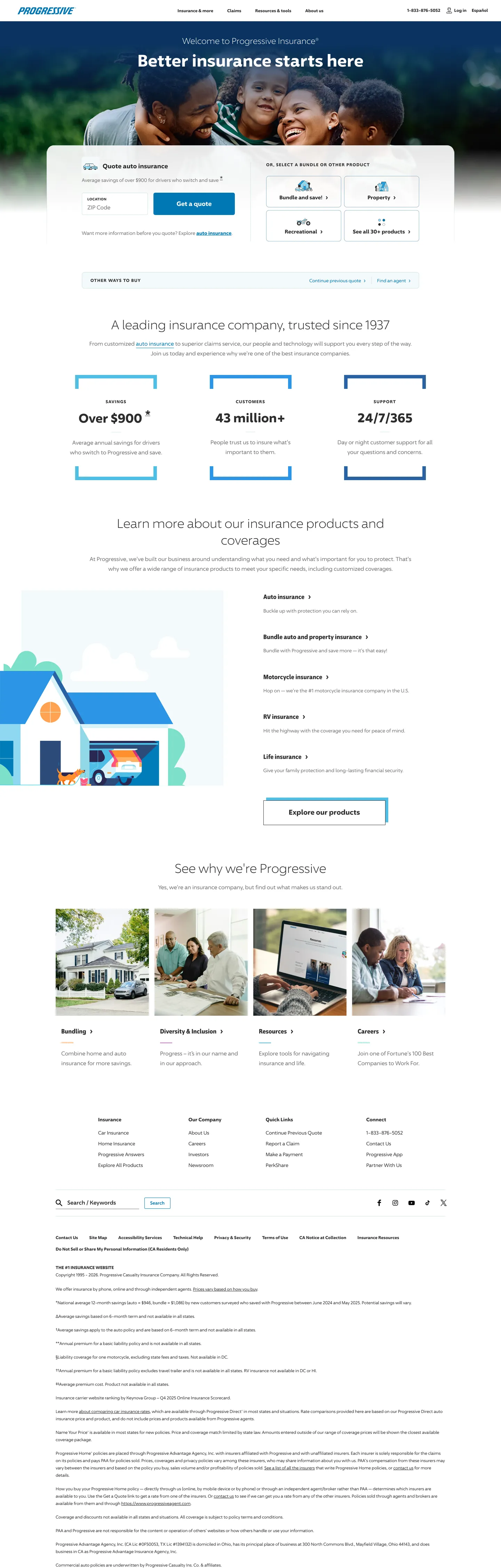
Progressive's marketing site is defined by what it does not do. There are no brand-color fills dominating the hero — the above-fold band is photography of a family, overlaid with a white headline ("Better insurance starts here") in 96 Sans at weight 300. The quote form sits directly below in a white panel; the user's first click is into a ZIP code field, not a CTA button. Where GEICO leads with a mascot and navy authority, Lemonade leads with a serif challenge, and Cloudflare gives the entire hero canvas to its brand orange, Progressive gives the hero to a photograph and a web form. The philosophy is utilitarian: the product is the CTA, and the CTA is the form.
The DESIGN.md file packages the system into 10 colors tokens anchored on a near-charcoal ink (#2d2d2d at 467 occurrences), a teal-blue brand action color (#0077b3), and a pure white canvas. Typography runs 96 Sans — a custom proprietary family — with a condensed variant for nav and label contexts. Display headlines sit at weight 300, an unusually restrained choice: 36px/300 for the main section heading, 24px/300 for the hero h1. Body text drops to weight 400 at 12–16px. Twelve component definitions cover the photography hero band, the white quote-entry panel, the section info-card grid, the stats strip, and the footer link structure.
Feed this spec to Claude or Cursor and it reproduces Progressive's specific moves: photography hero with form-forward layout, weight-300 display in a custom sans at modest sizes, teal-blue as the sole interactive accent, minimal rounding (8px maximum on most surfaces), and near-charcoal ink rather than near-black. The system is not designed to impress on a first glance — it is designed to reduce the distance between arrival and quote submission. The typography restraint at weight 300 reads as institutional confidence rather than brand exuberance, which is appropriate for a 1937-founded incumbent addressing a trust-sensitive purchase category.
What makes it distinct
5
- Weight 300 as authority signal96 Sans at weight 300 runs hero headlines and display text; the lightest display weight of any insurance brand in the directory
- Photography-first herothe above-fold band is a full-bleed dark navy photograph of a smiling family; copy and a quote form float over it in white
- Minimal CSS variable layeronly 3 CSS custom properties are declared (all are string labels for UI elements); every color is hard-coded rather than token-referenced
- Teal-blue #0077b3 as the sole chromatic CTAappears 22 times across background, text, border, and gradient; carries quote entry links and section divider accents
- 96 Sans Condensed for nav and UI labelsa narrower variant of the custom typeface handles the product-navigation tabs and condensed UI labels at 18px/700
progressive.com
Live at progressive.com
A snapshot of the brand in production. Scroll the frame to see the whole page.
Colors
10 colors
Progressive's system runs on #0077b3 as its primary voltage, used in 2 of 14 components. Type is set in 96 Sans across 12 tokens from 12px to 48px, weights 300–700. Shape language is mixed across 14 components, blending pills, soft rounds, and squarer corners.
Brand & Accent
Sparing, CTA-only voltage · 1
Surface
Page and card backgrounds · 2
Text
Headlines, body, captions · 4
Borders & Hairlines
Dividers, outlines, rules · 2
Other
Specialty colors · 1
Typography
12 type tokens
Set in 96 Sans across 12 tokens, from 12px to 48px, weights 300–700. Shown in its own stack: where the font isn't installed, the fallback the file names stands in.
- display-lg48px · weight 700 · lh 56pxThe quick brown fox jumps over the lazy dog
- display-md36px · weight 300 · lh 48pxThe quick brown fox jumps over the lazy dog
- display-sm36px · weight 700 · lh 48pxThe quick brown fox jumps over the lazy dog
- heading-lg24px · weight 300 · lh 32pxThe quick brown fox jumps over the lazy dog
- heading-md18px · weight 700 · lh 25.2pxThe quick brown fox jumps over the lazy dog
- heading-sm18px · weight 700 · lh 24pxThe quick brown fox jumps over the lazy dog
- body-lg16px · weight 400 · lh 28pxThe quick brown fox jumps over the lazy dog
- body-md14px · weight 400 · lh 21pxThe quick brown fox jumps over the lazy dog
- body-sm12px · weight 400 · lh 21pxThe quick brown fox jumps over the lazy dog
- label-upper12px · weight 700 · lh 21px · tracking 1.25pxThe quick brown fox jumps over the lazy dog
- label-md14px · weight 700 · lh 24.5pxThe quick brown fox jumps over the lazy dog
- caption13px · weight 400 · lh 16.9pxThe quick brown fox jumps over the lazy dog
Layout
Radii and spacing
6 corner radii and 8 spacing values. Shape language: mixed.
Radii
- none0px
- sm2.5px
- md5px
- lg8px
- xl20px
- full9999px
Spacing
- xs10px
- sm12px
- md14px
- base16px
- lg18px
- xl20px
- 2xl26px
- 3xl40px
Components
14 components
Each rendered from its tokens (color, type, radius, padding) on Progressive's own canvas.
- Hero Bandhero-bandHero Band
- Hero Headinghero-headingHero Heading
- Hero Subheadinghero-subheadingHero Subheading
- Quote Panelquote-panelQuote Panel
- Button Primarybutton-primaryButton Primary
- Button Secondarybutton-secondaryButton Secondary
- Top Navtop-navTop Nav
- Nav Linknav-linkNav Link
- Section Headingsection-headingSection Heading
- Body Paragraphbody-paragraphBody Paragraph
- Stat Numberstat-numberStat Number
- CardcardCard
- Type here…text-inputText Input
- FooterfooterFooter
In use
The system, in use
Progressive's tokens on the kind of product it builds.
Build something people actually use.
A short paragraph of marketing copy that previews how the brand's display tier and body tier read together. Two sentences is usually enough.
FAQ
Progressive design system FAQ
Common questions about Progressive's tokens, components, and how to use this DESIGN.md in your project.
Read next
Related reading
Specs, directories, and component libraries that pair with this design system.
- Browse all design systemsThe full directory of DESIGN.md files on shadcn.io, with live mockups for each.shadcn.io
- Progressive — official siteProgressive's public marketing site — the source of truth for the live tokens captured in this file.progressive.com (opens in a new tab)
- The DESIGN.md specificationGoogle Labs' open spec for machine-readable design system files — the format this page is built on.github.com (opens in a new tab)
Use it
Use Progressive in your project
One machine-readable file. Drop it into Claude, Cursor, or any AI tool that reads DESIGN.md.
Download the DESIGN.md
One machine-readable file: every color, type, radius, spacing, and component token of Progressive.
Feed it to your AI tool
Drop it into Claude, Cursor, or GitHub Copilot. The agent writes React components and Tailwind classes that match Progressive's visual language.
Reference the tokens directly
Or paste the values into your Tailwind config, CSS variables, or component library: every color, size and radius is a quoted, ready-to-copy value.
Read the full DESIGN.md: overview, rationale, do’s and don’ts
Overview
Progressive's marketing site does something counterintuitive for an insurance brand. Whispered authority: the hero headline — "Better insurance starts here" — is rendered in 96 Sans at weight 300 and just 24px, white text over a full-bleed photography of a smiling family. This is the system's quietest typographic moment, chosen for the most prominent position on the page. Where GEICO answers with weight 700 and a navy CTA, and Lemonade opens with a 55px serif challenge, Progressive whispers. The restraint is deliberate: an established company since 1937 does not need to earn attention through typographic force.
The page's dominant interaction surface is the quote form, not a brand CTA. The above-fold layout places a white quote-entry panel directly adjacent to the photography band, with product-type tabs (Auto, Home, Renters, Condo, Motorcycle, Life, Boat, Commercial) and a ZIP code input as the first user interface. The "Get a quote" submit action is the first primary button — not a marketing CTA but a functional entry point. Unlike most insurance or fintech marketing sites that route users through a CTA to a separate flow, Progressive embeds the form directly in the hero as its primary conversion surface.
The color system is sparse. Near-charcoal {colors.ink} (#2d2d2d, frequency 467) dominates as the text and border tone — in the same near-dark register as GEICO's ink but without the slight warm cast that GEICO's value carries. The teal-blue {colors.primary} (#0077b3) handles all interactive surfaces — links in the "learn more" blocks, the quote-form gradient band, the photo-card section CTAs. The extracted nav links render in browser-default blue (#0000ee, frequency 52), which is either an intentional accessibility choice or an artifact of the site's sparse CSS variable structure — only 3 CSS custom properties are declared, all of them string labels rather than color values.
Key Characteristics:
- 96 Sans at weight 300 runs every display and hero heading — the lightest display weight among all insurance brands in the directory.
- Photography-first hero with an embedded quote form; the brand's conversion surface is in the hero, not behind a CTA.
- Teal-blue
{colors.primary}(#0077b3, frequency 22) is the sole chromatic interactive accent; all other visible color is structural grey or near-charcoal. - Near-charcoal
{colors.ink}(#2d2d2d, frequency 467) is the dominant text color — 234 text occurrences, 233 border occurrences. - Near-zero CSS variable layer — only 3 custom properties declared; colors are hard-coded rather than token-referenced.
- 8px maximum card radius; the system does not use mid-range or pill radii for card surfaces.
- Browser-default blue (#0000ee, 52 occurrences) used for nav links — either an intentional accessibility decision or a consequence of sparse CSS styling.
Colors
Brand
- Primary Teal (
{colors.primary}— #0077b3): frequency 22. Used as text (9), background (1), border (10), gradient (2). Progressive's sole chromatic interactive color — carried by quote-section link text, the hero gradient band, and section CTAs ("Learn more about our insurance products").
Structural
- Ink (
{colors.ink}— #2d2d2d): frequency 467. Used as text (234), border (233). The dominant text and hairline tone — a near-charcoal that sits darker than GEICO's ink but without a warm cast. - Ink Dark (
{colors.ink-dark}— #000000): frequency 116. Used as text (59), border (57). Pure black appearing on headline elements and form inputs. Not a shadow; a harder text tone on specific high-contrast surfaces. - Ink Muted (
{colors.ink-muted}— #707070): frequency 46. Used as text (23), border (23). Mid-grey for secondary text labels and footnote rows. - Canvas (
{colors.canvas}— #ffffff): frequency 13. Background fills on the quote panel, below-fold sections, and the footer. The page floor for all non-photography content zones. - Link Default (
{colors.link-default}— #0000ee): frequency 52. Used as text (28), border (24). Browser-default hyperlink blue, used for nav links and in-body anchor text. Not wired to a CSS variable; this is the browser's default link color, indicating minimal link-color override in the nav.
Hairline
- Hairline (
{colors.hairline}— #d1e2e5): frequency 2 as border. Light steel-blue hairline used for card borders and form input outlines in the quote panel. - Hairline Dark (
{colors.hairline-dark}— #91b0bf): frequency 4 as border. A slightly darker steel-blue for more visible form input outlines.
Accent
- Surface Teal (
{colors.surface-teal}— #4ebee5): frequency 1 as shadow. A lighter sky-teal appearing as a shadow element on one component — likely the progress indicator or the hero gradient edge. - Shadow (
{colors.shadow}— #cccccc): frequency 1 as shadow. The only grey shadow in the system, used on a single card elevation.
Typography
Font Family
Progressive runs 96 Sans — a custom proprietary typeface — across every surface, with a narrower variant 96 Sans Condensed appearing for navigation tab labels and condensed UI contexts. Fallbacks walk to Arial, sans-serif. There is no serif tier and no mono voice. The family name "96" references Progressive's founding year combined with the design direction; it is not publicly licensed.
Hierarchy
| Token | Size | Weight | Line Height | Use |
|---|---|---|---|---|
{typography.display-lg} | 48px | 700 | 56px | Large stat numbers ("Over $900+" savings figure) |
{typography.display-md} | 36px | 300 | 48px | Section h2 ("A leading insurance company, trusted since 1937") |
{typography.display-sm} | 36px | 700 | 48px | Bold stat emphasis within the stats strip |
{typography.heading-lg} | 24px | 300 | 32px | Hero h1 ("Better insurance starts here") |
{typography.heading-md} | 18px | 700 | 25.2px | 96 Sans Condensed — nav product tabs and section sub-headers |
{typography.heading-sm} | 18px | 700 | 24px | Section sub-heads ("Why we're Progressive") |
{typography.body-lg} | 16px | 400 | 28px | Paragraph body and form field text |
{typography.body-md} | 14px | 400 | 21px | Card body copy, secondary descriptions |
{typography.body-sm} | 12px | 400 | 21px | Dominant nav and footer link size; 46 occurrences |
{typography.label-upper} | 12px | 700 | 21px | Uppercase tracked labels (1.25px tracking) — section category markers |
{typography.label-md} | 14px | 700 | 24.5px | Bold link labels, CTA text |
{typography.caption} | 13px | 400 | 16.9px | Small metadata, caption rows |
Principles
Weight 300 at 24–36px is the system's display tier — the display ladder runs from whisper (24px/300) to measured statement (36px/300), never reaching for bold. The bold tier (weight 700) is reserved for stats ("Over $900+"), nav labels, section category tabs, and UI control labels — surfaces where the user needs to scan quickly, not where the brand is making an impression. This is the inverse of GEICO's weight discipline: GEICO uses 700 for everything important; Progressive uses 300 for everything important and 700 for everything functional.
The condensed variant (96 Sans Condensed) handles 9 occurrences at 18px/700, concentrated in the product-navigation tab set at the top of the quote form and in the photo-card sub-section links below the fold.
Substitutes
96 Sans is not publicly available. Inter at weight 300 is the closest open-source substitute for display and hero headings. For the condensed variant, Barlow Condensed or Public Sans Condensed transfer the narrower proportions at 18px/700. The uppercase tracked labels (1.25px) pair with any geometric sans at weight 700.
Layout
Spacing System
- Base unit: 18px (18 occurrences) — the dominant single-value padding token.
- Tokens:
{spacing.xs}10px ·{spacing.sm}12px ·{spacing.md}14px ·{spacing.base}16px ·{spacing.lg}18px ·{spacing.xl}20px ·{spacing.2xl}26px ·{spacing.3xl}40px. - Hero vertical padding: 50px top, 20px bottom — the hero band uses more top padding than bottom to give breathing room above the headline.
- Quote panel: 20px internal padding. The form's product-type tabs sit at 0px padding (flush to the panel top).
- Nav: 18px top/bottom padding on nav links, 20px horizontal — creating tall click targets for the product tab strip.
Grid & Container
- Hero layout: two-column split — photography + headline left (60%), white quote-form panel right (40%).
- Stats strip: 3-column centered bar with teal-bordered left edge, displaying "Over $900+" / "43 million+ customers" / "24/7/365 support."
- Product information section: 5-column grid linking to Auto, Home, Renters, Condo, and Commercial, each with a photo-card, title, description, and "Learn more" teal link.
- "Why we're Progressive" section: 3-photo editorial grid with heading and sub-copy.
- Footer: dense multi-column link structure, 4–5 columns wide, with "Are you an agent?" secondary link strip below.
Rhythm
The page alternates between photography-density (hero band, product-card grid, editorial grid) and text-density (stats strip, information accordion panels, footer). Unlike Cloudflare's dramatic alternation between edge-to-edge product and constrained editorial, Progressive maintains a more even density throughout — the page never fully goes quiet, and there is no section with generous whitespace comparable to Lemonade's illustration band or GEICO's stats section.
Elevation
The system has minimal elevation. The extracted shadow colors are a single light grey (#cccccc at 1 occurrence) and a light teal (#4ebee5 at 1 occurrence, possibly a gradient edge). Card surfaces lift from the white canvas via 1px hairline borders at {colors.hairline} (#d1e2e5) rather than box shadows. The quote-entry panel floats over the hero photography via background-color contrast (white panel on dark photography) rather than a shadow layer.
- Flat: hero text, stats strip, editorial grid, footer — essentially the entire page.
- Hairline card borders:
{colors.hairline}(#d1e2e5) and{colors.hairline-dark}(#91b0bf) on the quote panel and information cards. - No tinted shadow: the system does not use tinted elevation in any captured surface.
Shapes
The radius scale is minimal and conservative:
{rounded.none}0px — hero text elements, form inputs, section headings, footer.{rounded.sm}2.5px — smallest surface element; appears once in the extracted radii.{rounded.md}5px (2 occurrences) — small secondary surfaces.{rounded.lg}8px (5 occurrences, dominant card radius) — the quote panel, information cards, the stat strip container.{rounded.xl}20px (2 occurrences) — CTA button radius; a rounded-but-not-pill treatment.{rounded.full}9999px — not explicitly captured but used for circular avatar images in the editorial grid.
Unlike Lemonade's full-pill CTAs at 50px or Cloudflare's binary small-step-plus-pill system, Progressive's primary buttons use a 20px radius — visibly rounded but not circular, signaling a functional form-like surface rather than a consumer app action.
Components
hero-band — Full-bleed dark photography, white headline text at {typography.heading-lg} (24px/300), 50×0×20px vertical padding. The photography subject matter — families, homes — is the brand statement.
hero-heading — White canvas text at {typography.display-md} (36px/300) used for the primary section headline below the hero photography band ("A leading insurance company, trusted since 1937").
hero-subheading — Same 24px/300 weight in white — used for the above-fold headline ("Better insurance starts here") floating over the photography.
quote-panel — White canvas fill, {rounded.lg} 8px radius, 20px padding, {colors.hairline} border. Houses the product-type tab strip, the ZIP code input, and the submit CTA. The page's primary conversion surface.
button-primary — Teal {colors.primary} fill, white text at {typography.label-md}, 20px radius, 12×20px padding, 44px height. "Get a quote" in the form panel; "Learn more" inline links in the product grid.
button-secondary — White canvas fill, teal {colors.primary} text and 1px teal border, 20px radius, 10×18px padding, 40px height. Secondary actions like "See all coverage" in the product section.
top-nav — White canvas, near-black text at {typography.body-sm} (12px/400), 56px height, 18×10px padding. Progressive Flo logo left, product links center, "Log in" / "1-800" right.
nav-link — Transparent fill, browser-default blue {colors.link-default} (#0000ee) text at {typography.body-sm}, 20×10px padding. The nav link color is the browser's default, not a styled token.
section-heading — Ink charcoal at {typography.display-md} (36px/300). Below-fold section headings in near-charcoal on white.
body-paragraph — Ink charcoal at {typography.body-sm} (12px/400, the dominant body size by count — 46 occurrences). The main body copy runs at 12px — smaller than GEICO (16px) or Lemonade (16px).
stat-number — Display-lg type (48px/700) in {colors.ink} on transparent background. The stats strip numbers ("Over $900+ / 43 million+ / 24/7/365").
card — White canvas, 1px {colors.hairline} border, {rounded.lg} 8px radius, 18px padding. Information section cards for the product grid.
text-input — White canvas, near-black text at {typography.body-lg}, no radius (0px — square corners), 35px height, left-padded 33.6px for icon clearance. The ZIP code field in the quote panel.
footer — White canvas, muted ink {colors.ink-muted} text at {typography.body-sm}, multi-column link grid, 26px top/bottom padding.
Do's and Don'ts
Do lead with the quote form in the hero. Progressive's above-fold layout embeds the form directly rather than routing through a CTA; this form-forward approach is the system's clearest distinction from other insurance marketing patterns.
Do keep display and hero headings at weight 300. The 36px/weight-300 section heading is the system's calibrated expression of institutional authority — bumping to weight 400 or 700 immediately reads as a different brand register and undermines the restraint signal.
Do use the {colors.primary} teal (#0077b3) exclusively for interactive surfaces — links, form submit buttons, gradient accents. The system has only this one chromatic non-structural color, and diluting it across non-interactive elements (section headings, card titles) would collapse the visual distinction between action and information.
Do run body copy at 12px/400 ({typography.body-sm}). The dominant body text size extracted from the page is 12px — 46 occurrences — not 16px. Using 16px body text would shift the information density and make the page read as more editorial than utilitarian.
Don't use browser-default blue (#0000ee) for CTA buttons or primary actions. The {colors.link-default} value appears in nav links and in-body anchors as an apparent residual of minimal link styling — it signals a hyperlink role. CTAs must use {colors.primary} (#0077b3) to distinguish brand-owned interactive surfaces from generic hyperlinks.
Don't apply the 20px button radius ({rounded.xl}) to card surfaces. The system uses 8px card radius and 20px button radius as two distinct signals: cards feel like informational containers, buttons feel like rounded actions. Applying 20px to a card would blur that distinction.
Don't replace the photography hero with a brand-color fill. Progressive's hero is a photo band precisely because the brand identity does not rely on a distinctive chromatic move (the way Cloudflare's orange or Lemonade's magenta does). Replacing the photography with a teal fill would look like a different brand entirely — and would also lose the form-forward layout, which requires the visual anchor of the photography to make the white form panel readable against it.
Don't drop the 96 Sans Condensed variant for the product-navigation tabs. The condensed variant at 18px/700 provides the visual density needed to fit 8 product types (Auto, Home, Renters, Condo, Motorcycle, Life, Boat, Commercial) in a horizontal tab strip without wrapping. Substituting non-condensed type at the same size breaks the tab layout.
Known Gaps
- Primary button extraction: the extractor did not capture a primary button element (
primaryButton: null). The button styles are reconstructed from the typography extraction and the{colors.primary}teal; the actual button component may have different padding or height values than those documented here. - Hero photography: the specific photography, subject matter, and image treatment are outside the scope of a design token spec. The brief here describes only the overlay text and form panel styles, not the photography direction.
- No CSS variable layer: Progressive exposes only 3 CSS custom properties — all string labels. Every color is hard-coded. This means there is no token variable path to resolve in production code; developers must reference hex values directly rather than using var() references.
- Hover and focus states: the extraction captures resting states only. Focus ring color, button hover tint, nav link hover background, and form input focus border are not documented.
- Mobile layout: the quote-form panel likely stacks to a full-width single column on mobile, collapsing the 60/40 hero split. This responsive behavior is not captured from the desktop extraction.
- Flo mascot and campaign assets: the Progressive Flo character and related campaign-specific illustration or photography are brand assets not captured as design tokens.
Banking & Payments
More systems like this
More DESIGN.md files in Banking & Payments.
Pricing
Build it with Pro
The DESIGN.md files are free. Pro adds 6,000+ blocks, premium templates and the MCP server, so your AI editor builds in your system for you.
4.9/5 out of 5 · 150+ reviewsfrom 150+ founders and developers.
Billing
Billed once a year in USD. Cancel anytime.
- How many people can use the license.
- Client work, SaaS products and anything you charge for.
- Production-ready React sections: hero, pricing, features, dashboards and more.
- Complete multi-page sites you can ship as they are.
- React icons from every major library, installable with one command.
- Presets that restyle every block, in light and dark.
- Lets your AI editor search, preview and install blocks for you.
- Priority requests are answered first.
Individual
For personal projects & open source
$32instead of $49/mo
$389 billed yearly
- Seats: 1 seat
- Commercial use: Personal & open source only
- Pro blocks: 6,000+ blocks
- Templates: All 14 templates
- React icons: 294k+ icons
- Themes: All 59 themes
- MCP server: Basic usage
- Support: Standard
Team
Most popularFor freelancers, agencies & startups
$66instead of $99/mo
$789 billed yearly · ≈ $13/dev/mo
- Seats: Up to 5 seats
- Commercial use: Included
- Pro blocks: 6,000+ blocks
- Templates: All 14 templates
- React icons: 294k+ icons
- Themes: All 59 themes
- MCP server: High usage
- Support: Priority
Organization
For companies with larger teams
$132instead of $199/mo
$1,589 billed yearly
- Seats: Unlimited seats
- Commercial use: Included
- Pro blocks: 6,000+ blocks
- Templates: All 14 templates
- React icons: 294k+ icons
- Themes: All 59 themes
- MCP server: Unlimited usage
- Support: Priority
Billed once a year in USD. Cancel anytime.
Individual
For personal projects & open source
$32instead of $49/mo
$389 billed yearly
- How many people can use the license.Seats: 1 seat
- Client work, SaaS products and anything you charge for.Commercial use: Personal & open source only
- Production-ready React sections: hero, pricing, features, dashboards and more.Pro blocks: 6,000+ blocks
- Complete multi-page sites you can ship as they are.Templates: All 14 templates
- React icons from every major library, installable with one command.React icons: 294k+ icons
- Presets that restyle every block, in light and dark.Themes: All 59 themes
- Lets your AI editor search, preview and install blocks for you.MCP server: Basic usage
- Priority requests are answered first.Support: Standard
Team
Most popularFor freelancers, agencies & startups
$66instead of $99/mo
$789 billed yearly · ≈ $13/dev/mo
Everything in Individual, plus
- How many people can use the license.Seats: Up to 5 seats
- Client work, SaaS products and anything you charge for.Commercial use: Included
- Lets your AI editor search, preview and install blocks for you.MCP server: High usage
- Priority requests are answered first.Support: Priority
Organization
For companies with larger teams
$132instead of $199/mo
$1,589 billed yearly
Everything in Team, plus
- How many people can use the license.Seats: Unlimited seats
- Lets your AI editor search, preview and install blocks for you.MCP server: Unlimited usage
- Secure checkout via Stripe
- Code lives in your repo
- Keep what you've shipped if you cancel
- License terms
Your system, built for you
Every block, template and icon, installed by your AI agent in your design system. The DESIGN.md files stay free.