Prisma Design System
Prisma's marketing design system as a DESIGN.md file — teal #16a394 brand voltage, Mona Sans VF at 64px display, Inter body, 6px card rounding, 20 components. Tokens for React, Next.js, and AI tools.
Add shadcn.io to your AI agent. · Pro It installs blocks, icons and templates in your design system from a prompt, with Pro.
Set up MCP- Primary
- #16a394
- Typeface
- Inter
- Shape
- Mixed
- Base radius
- 10px
- Colors
- 20
- Type tokens
- 15
- Components
- 20
- Spacing values
- 9
About
About Prisma DESIGN.md
Curated by Dov Azencot · Updated May 19, 2026 · Source prisma.io (opens in a new tab)
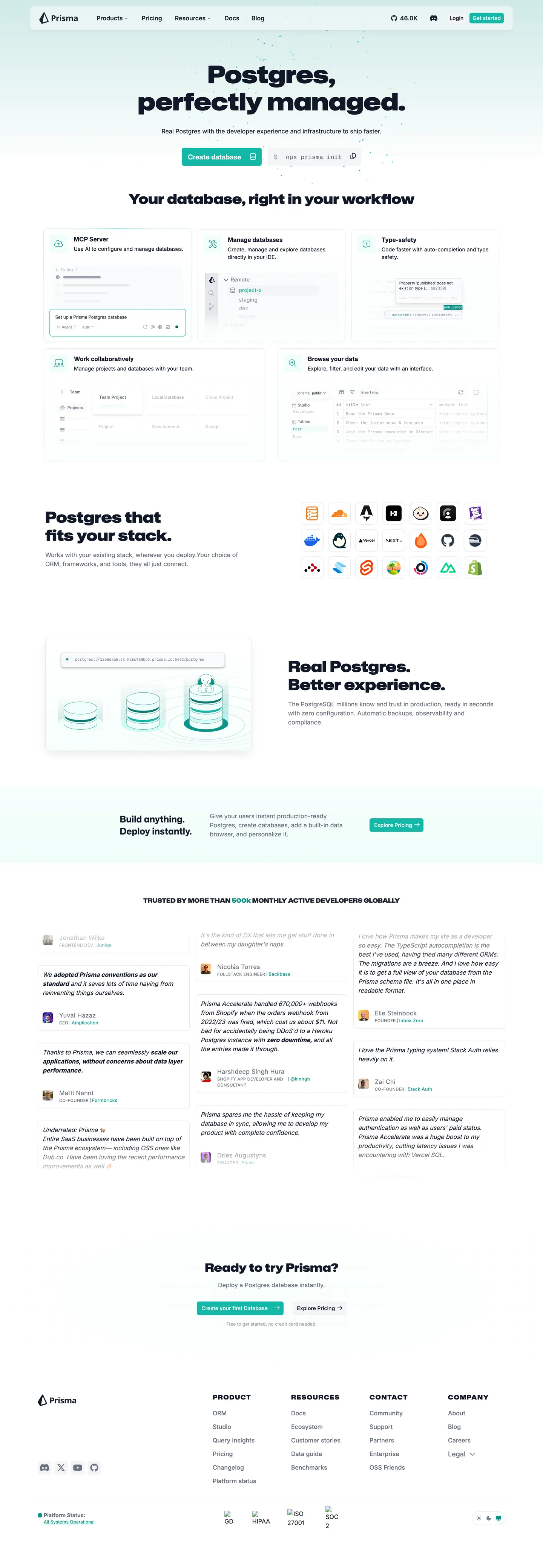
Prisma's marketing page is organized around a quiet typographic contradiction — the hero headline "Postgres, perfectly managed." runs Mona Sans VF at 64px in weight 400, the same weight as the body copy, so the display and the paragraph share the same visual mass and the teal CTA button becomes the heaviest element above the fold. Where most ORM and database brands reach for weight 700 or 800 to impose authority, Prisma withholds weight at the display tier and concentrates force in a single saturated color. The overall impression is a white-canvas editorial system that happens to sell infrastructure rather than content.
The DESIGN.md file packages this into machine-readable tokens for React and AI tools. Inside: 20 colors tokens including a teal brand voltage (#16a394) that wires simultaneously into --primary, --ring, --sidebar-primary, and --chart-1; 14 typography tokens spanning Mona Sans VF in four display roles (64px h1, 40px h2, 36px h2, 24px h3) and Inter in seven operational roles (16px body, 12px caption, 11px uppercase label); 7 radius values dominated by a 6px card default; 9 spacing values on an 8px base; and 20 components definitions covering the teal CTA button, hairline-edged feature cards, the dark sidebar, monospace code blocks, and the light nav bar.
Feed this file to Claude or Cursor and it reproduces Prisma's specific moves: white canvas with near-black ink text, teal-only brand voltage never repeated in secondary accents, Mona Sans VF for display moments with Inter handling everything at 16px and below, and a 6px card geometry that feels like product UI rather than marketing decoration. The one structural decision worth borrowing for any developer-infra brand is the two-family split — reserving Mona Sans VF exclusively for headings creates a clear register shift that Inter's system stack cannot produce alone.
What makes it distinct
5
- Weight-400 display headlineMona Sans VF at 64px in weight 400 is lighter than any comparable ORM brand, letting teal CTA voltage carry the page rather than typographic muscle
- Two-family systemMona Sans VF for all display and section headings, Inter for all nav, body, and button copy; the swap happens at precisely 18px
- Teal-as-primary#16a394 wired to --primary, --ring, --sidebar-primary, --chart-1 simultaneously; one color carries CTAs, focus states, and data visualizations
- 6px dominant radius92 occurrences at 6px, the tightest meaningful step for product-UI cards and input fields on a white canvas
- Uppercase small-caps labelsMona Sans VF at 16px / weight 700 / 1.6px letter-spacing runs the nav badge and product-tier chips, the only tracking-wide tier in the system
prisma.io
Live at prisma.io
A snapshot of the brand in production. Scroll the frame to see the whole page.
Colors
20 colors
Prisma's system runs on #16a394 as its primary voltage, used in 1 of 20 components. Type is set in Inter across 15 tokens from 11px to 64px, weights 375–900. Shape language is mixed across 20 components, blending pills, soft rounds, and squarer corners.
Brand & Accent
Sparing, CTA-only voltage · 5
Surface
Page and card backgrounds · 3
Text
Headlines, body, captions · 5
Borders & Hairlines
Dividers, outlines, rules · 2
Semantic
Status, errors, success, links · 2
Other
Specialty colors · 3
Typography
15 type tokens
Set in Inter across 15 tokens, from 11px to 64px, weights 375–900. Shown in its own stack: where the font isn't installed, the fallback the file names stands in.
- display-xl64px · weight 400 · lh 72pxThe quick brown fox jumps over the lazy dog
- display-lg40px · weight 900 · lh 48pxThe quick brown fox jumps over the lazy dog
- display-md36px · weight 900 · lh 48pxThe quick brown fox jumps over the lazy dog
- heading-md24px · weight 700 · lh 32pxThe quick brown fox jumps over the lazy dog
- heading-sm18px · weight 650 · lh 28pxThe quick brown fox jumps over the lazy dog
- badge-label16px · weight 700 · lh 24px · tracking 1.6pxThe quick brown fox jumps over the lazy dog
- body-lg16px · weight 375 · lh 24pxThe quick brown fox jumps over the lazy dog
- body-md16px · weight 400 · lh 24pxThe quick brown fox jumps over the lazy dog
- button-md16px · weight 600 · lh 24pxThe quick brown fox jumps over the lazy dog
- nav-link16px · weight 600 · lh 24pxThe quick brown fox jumps over the lazy dog
- label-md14px · weight 500 · lh 20pxThe quick brown fox jumps over the lazy dog
- body-sm14px · weight 400 · lh 20pxThe quick brown fox jumps over the lazy dog
- caption12px · weight 400 · lh 16pxThe quick brown fox jumps over the lazy dog
- caption-upper11px · weight 400 · lh 16px · tracking 0.36pxThe quick brown fox jumps over the lazy dog
- mono-md16px · weight 400 · lh 24pxThe quick brown fox jumps over the lazy dog
Layout
Radii and spacing
7 corner radii and 9 spacing values. Shape language: mixed.
Radii
- none0px
- xs3px
- sm6px
- md10px
- lg12px
- xl16px
- full9999px
Spacing
- xxs4px
- xs6px
- sm8px
- md12px
- base16px
- lg24px
- xl32px
- 2xl48px
- 3xl64px
Components
20 components
Each rendered from its tokens (color, type, radius, padding) on Prisma's own canvas.
- Button Primarybutton-primaryButton Primary
- Button Primary Hoverbutton-primary-hoverButton Primary Hover
- Button Secondarybutton-secondaryButton Secondary
- Top Navtop-navTop Nav
- Nav Linknav-linkNav Link
- Hero Headinghero-headingHero Heading
- Section Headingsection-headingSection Heading
- Body Paragraphbody-paragraphBody Paragraph
- CardcardCard
- Card Mutedcard-mutedCard Muted
- Badge Labelbadge-labelBadge Label
- Badge Tealbadge-tealBadge Teal
- Type here…text-inputText Input
- SidebarsidebarSidebar
- Sidebar Activesidebar-activeSidebar Active
- Code Blockcode-blockCode Block
- Feature Icon Cardfeature-icon-cardFeature Icon Card
- Testimonial Cardtestimonial-cardTestimonial Card
- FooterfooterFooter
- ModalmodalModal
In use
The system, in use
Prisma's tokens on the kind of product it builds.
Build something people actually use.
A short paragraph of marketing copy that previews how the brand's display tier and body tier read together. Two sentences is usually enough.
FAQ
Prisma design system FAQ
Common questions about Prisma's tokens, components, and how to use this DESIGN.md in your project.
Read next
Related reading
Specs, directories, and component libraries that pair with this design system.
- Browse all design systemsThe full directory of DESIGN.md files on shadcn.io, with live mockups for each.shadcn.io
- Prisma — official sitePrisma's public marketing site — the source of truth for the live tokens captured in this file.prisma.io (opens in a new tab)
- The DESIGN.md specificationGoogle Labs' open spec for machine-readable design system files — the format this page is built on.github.com (opens in a new tab)
Use it
Use Prisma in your project
One machine-readable file. Drop it into Claude, Cursor, or any AI tool that reads DESIGN.md.
Download the DESIGN.md
One machine-readable file: every color, type, radius, spacing, and component token of Prisma.
Feed it to your AI tool
Drop it into Claude, Cursor, or GitHub Copilot. The agent writes React components and Tailwind classes that match Prisma's visual language.
Reference the tokens directly
Or paste the values into your Tailwind config, CSS variables, or component library: every color, size and radius is a quoted, ready-to-copy value.
Read the full DESIGN.md: overview, rationale, do’s and don’ts
Overview
Prisma's marketing site withholds typographic weight at the display tier — by design. Weight restraint as brand confidence. The hero headline "Postgres, perfectly managed." runs Mona Sans VF at 64px in weight 400, the same weight Inter uses for body paragraphs on the same page. Where competitors like PlanetScale and Neon run their hero headlines at weight 700–900, Prisma holds display at weight 400 and lets the single teal CTA button (#16a394) carry all perceptual force above the fold. The button is the heaviest visual object on the page.
The two-family typographic system reinforces the register split. Mona Sans VF handles every heading and badge label — it is the brand voice. Inter handles every body paragraph, nav link, and button label — it is the operational voice. The two families never appear at the same tier; the crossover is at 18px / heading boundary. Unlike most developer-infra brands that commit to a single workhorse family (Vercel uses Geist exclusively, Linear uses Inter exclusively), Prisma explicitly signals "display = product identity, body = developer utility."
Chromatic restraint matches the typographic restraint. The teal voltage (#16a394) is the only chromatic brand moment — it goes on CTAs, sidebar highlights, focus rings, and chart series simultaneously. There is no secondary accent. The large semantic palette (success-teal #0d9488, ORM-indigo #4f46e5, purple/pink/fuchsia/sky) is wired for a docs and dashboard product surface and does not appear in the marketing chrome.
Key Characteristics:
- Mona Sans VF at 64px / weight 400 for the hero h1 — lighter than every comparable infrastructure brand.
- Single teal voltage (#16a394) wired to --primary, --ring, --sidebar-primary, --chart-1, and --color-fd-primary simultaneously.
- Two-family system: Mona Sans VF for headings/labels, Inter for body/nav/buttons. Crossover at 18px.
- 6px dominant radius (92 occurrences) — card geometry is tighter than Cloudflare (3–8px binary) but softer than Linear (4px).
- Hairline-only card elevation — #e2e8f0 borders on a white canvas, zero drop shadows on marketing surfaces.
- Uppercase tracked badge labels — Mona Sans VF at 16px / weight 700 / 1.6px tracking, used for nav product badges and feature-tier chips.
- Large semantic palette declared in CSS but invisible in marketing chrome — success, error, ORM-indigo, PPG-teal tiers all exist for product/docs surfaces.
Colors
Brand
- Primary Teal (
#16a394): frequency 0 rendered (CSS variable layer only). Wired as --primary, --sidebar-primary, --sidebar-ring, --chart-1, --ring, --color-fd-ring. The brand voltage — every CTA button, sidebar active state, and focus ring resolves through this single token. - Primary Strong (
#0d9488): frequency 66. Used as text (64), bg (1), gradient (1). The Prisma Postgres Gateway color and success semantic token — wired as --color-foreground-ppg, --color-stroke-success, --color-fd-primary. - Primary Light (
#14b8a6): frequency 4. Used as background. The pale success reverse — wired as --color-background-success-reverse and --color-foreground-ppg-weak. - Primary Dark (
#0f766e): declared as --color-foreground-ppg-strong. The darkest teal shade, used for emphasis text over pale teal backgrounds. - Accent Teal Pale (
#d9f9f6): frequency 0 rendered. Wired as --accent, --color-fd-accent, --sidebar-accent. The pale surface for active sidebar items and accent backgrounds.
Structural
- Ink (
#111827): frequency 239. Used as text — the near-black primary text color, wired as --color-foreground-neutral and --color-background-neutral-reverse-strong. - Ink Soft (
#1d242f): frequency 193. Used as text (145) and bg (48). Secondary foreground and popover text — wired as --foreground, --card-foreground, --sidebar-foreground. - Ink Muted (
#6b7280): frequency 173. Used as text — the workhorse secondary text color for body paragraphs, wired as --color-foreground-neutral-weak. - Ink Weaker (
#9ca3af): frequency 2. Tertiary text — footer metadata and placeholder labels. - Canvas (
#ffffff): frequency 198. Used as background (79) and text (105). Pure white page floor and card surfaces, also the reverse text color on teal and dark backgrounds. - Surface-1 (
#f3f4f6): frequency 7. Muted card backgrounds, sidebar hover states, and feature-icon card fills. - Surface-2 (
#f7fafc): wired as --sidebar and --color-fd-secondary. The sidebar background tone — a touch warmer than surface-1. - Hairline (
#e2e8f0): frequency 758. The dominant border — wired as --border, --color-fd-border, --sidebar-border, --input, --color-border. Card outlines, input borders, dividers. - Hairline Strong (
#d1d5db): wired as --color-stroke-neutral-strong. A slightly darker border for emphasis contexts.
Semantic
- Error (
#dc2626): wired as --color-foreground-error, --color-stroke-error. Not rendered on the marketing surface. - Warning (
#ea580c): wired as --color-foreground-warning. Not rendered on the marketing surface. - Disabled (
#4a5568): wired as --color-disabled. Form field disabled state. - ORM Ink (
#4f46e5): wired as --color-foreground-orm, --color-stroke-orm. The ORM product color — appears on the /orm sub-product docs surface. - Syntax Green (
#0ac864): wired as --color-fd-diff-add-symbol. Code diff addition indicator.
Typography
Font Families
The system runs two families. Mona Sans VF (GitHub's variable sans-serif) handles every heading, section label, and badge. Inter handles every paragraph, nav link, and button. The monospace tier runs Mona Sans Mono VF (also variable) for code blocks. Fallbacks walk the usual system-ui stack.
The variable font axes on Mona Sans VF are used actively — the hero h1 at weight 400 and the section h2s at weight 900 are the two poles of the same variable axis, not separate font files.
Hierarchy
| Token | Family | Size | Weight | Use |
|---|---|---|---|---|
{typography.display-xl} | Mona Sans VF | 64px | 400 | Hero h1 — "Postgres, perfectly managed." |
{typography.display-lg} | Mona Sans VF | 40px | 900 | Primary section h2 headings |
{typography.display-md} | Mona Sans VF | 36px | 900 | Secondary section h2 headings |
{typography.heading-md} | Mona Sans VF | 24px | 700 | h3 — feature card titles |
{typography.heading-sm} | Mona Sans VF | 18px | 650 | Subheadings and feature card labels |
{typography.badge-label} | Mona Sans VF | 16px | 700 | Uppercase nav badges, 1.6px tracking |
{typography.body-lg} | Inter | 16px | 375 | Default body copy — the variable axis at 375 |
{typography.body-md} | Inter | 16px | 400 | Standard paragraph text |
{typography.button-md} | Inter | 16px | 600 | Button labels |
{typography.nav-link} | Inter | 16px | 600 | Top-nav link labels |
{typography.label-md} | Inter | 14px | 500 | Form labels and metadata chips |
{typography.body-sm} | Inter | 14px | 400 | Caption rows and secondary paragraph text |
{typography.caption} | Inter | 12px | 400 | Footer and small labels |
{typography.caption-upper} | Inter | 11px | 400 | Uppercase nano labels, 0.36px tracking |
{typography.mono-md} | Mona Sans Mono VF | 16px | 400 | Code blocks and inline code |
Principles
The display-to-body weight flip is the defining typographic move. The h1 at weight 400 is lighter than the button labels (Inter 600) on the same screen — a deliberate inversion of the usual hierarchy. Mona Sans VF's 900-weight section headings restore authority at the sub-section level, creating a two-pulse rhythm: quiet hero → loud section → quiet body.
Note on Font Substitutes
Mona Sans VF is open-source via GitHub's repository. The closest alternative is DM Sans variable for the display tier and Inter (already in the stack) for body. The critical substitution constraint: the hero h1 must stay at weight 400, not bumped to 500 or 600 — the understatement is the point.
Layout
Spacing System
- Base unit: 8px, appearing 88 times in the extracted spacing data.
- Tokens:
{spacing.xxs}4px ·{spacing.xs}6px ·{spacing.sm}8px ·{spacing.md}12px ·{spacing.base}16px ·{spacing.lg}24px ·{spacing.xl}32px ·{spacing.2xl}48px ·{spacing.3xl}64px. - Button padding: 0 vertical, 16px horizontal at 48px height — the height constraint controls vertical rhythm rather than padding.
- Card internal padding: 16px (
{spacing.base}) on standard feature cards; 24px ({spacing.lg}) on testimonial and larger hero cards. - Section rhythm: 48px vertical between major sections, consistent with the 2xl spacing token.
Grid & Container
- Max content width: ~1080px for hero and main content columns.
- Hero layout: two-column split — headline + CTA left, product UI screenshot right. Headline column is ~60% width.
- Feature row: three-column grid of product cards (Serverless Postgres, ORM, Prisma Studio, AI Toolkit), each in a hairline-bordered card with a 10px rounded corner.
- Testimonial row: three-column grid of customer quote cards.
- Below fold: alternating single-column editorial blocks and two-column feature comparisons.
Rhythm
The page alternates between a generous white editorial zone (hero, testimonials) and a denser product-card zone (the 4-up feature grid, the stack comparison, the Prisma Postgres architecture diagram). There is no atmospheric background shift between zones — every section runs on the same white canvas, and the product-card zone announces itself through the 6px-rounded hairline card grid rather than a color or gradient change.
Elevation
The marketing surface has essentially no shadow tier. The captured page has only 8 shadow occurrences, all using pure black with low opacity (small box-shadow halos). Card elevation comes entirely from hairline borders — {colors.hairline} (#e2e8f0, 758 occurrences) outlines every feature card, modal container, and code block. There is no intermediate surface — cards sit directly on the white canvas floor.
- Flat (no shadow): hero, editorial sections, footer — ~95% of surfaces.
- Hairline-bordered: feature cards, text inputs, the code comparison panel, the Prisma Studio screenshot frame.
- Sidebar: uses
{colors.surface-2}background tone against{colors.canvas}to create the only tonal lift on the page.
Shapes
The radius scale is mid-soft with a tight default:
{rounded.none}0px — hero and section containers.{rounded.xs}3px — computed from --radius-square-low; small chip corners.{rounded.sm}6px — the dominant radius (92 occurrences): feature cards, input fields, nav dropdown items, small badges, the primary CTA button.{rounded.md}10px — 48 occurrences: the hero CTA button in the screenshot mockup, larger card containers.{rounded.lg}12px — 22 occurrences: modals and overlay panels. Matches --radius-square-high.{rounded.xl}16px — 1 occurrence: the largest card in the testimonial strip.{rounded.full}9999px — avatar circles in the testimonial row. The pill variant does not appear on buttons.
The 6px default is tighter than Cloudflare's 6–8px card rounding and matches the Tailwind rounded-md convention exactly. The system skips the 4px tier that Linear and Vercel use as their base — Prisma's smallest meaningful radius is 6px.
Components
button-primary — Teal {colors.primary} fill, white text, Inter 600, {rounded.sm} 6px radius, 0×16px padding at 48px height. "Create database" is the canonical instance. No border — the teal fill is the button's entire identity.
button-primary-hover — Background deepens to {colors.primary-strong} (#0d9488) — a one-step darker teal for the press/hover state.
button-secondary — White {colors.canvas} fill, ink-soft text, 1px {colors.hairline} border, 6×10px padding, 36px height. Used for "Read the docs" and feature secondary actions.
top-nav — White canvas, 64px height, 1px bottom hairline border. Prisma logo left, product nav (Products / Solutions / Docs / Changelog / Blog) center, "Sign in" and "Create database" cluster right.
nav-link — Transparent background, ink-soft text in {typography.nav-link} (Inter 600), 6×10px padding. Hover shows a {rounded.sm} hairline-bordered background fill.
hero-heading — Near-black ink text, Mona Sans VF 64px / weight 400. Zero padding — the headline flows at natural width.
section-heading — Near-black ink, Mona Sans VF 40px / weight 900. The contrast between the weight-400 hero and the weight-900 sections is the page's primary typographic rhythm.
body-paragraph — {colors.ink-muted} (#6b7280) at Inter 16px / 400. The muted tone keeps body copy subordinate to the headline and CTA button.
card — White canvas, 1px {colors.hairline} border, 10px radius, 16px padding. The default feature card — holds an icon, heading, and 1-2 line description.
card-muted — {colors.surface-1} fill, same radius and padding. Used for the "Build anything. Deploy Instantly." illustration band and the AI workflow card.
badge-label — Muted ink, Mona Sans VF 16px / weight 700 / 1.6px tracking / uppercase. The nav badge that labels product categories ("POSTGRES," "ORM," "STUDIO").
badge-teal — Pale teal {colors.accent-teal-pale} fill, dark teal text, 6px radius, 2×8px padding. Used for product-category chips inside feature cards.
text-input — White canvas, 1px hairline border, 6px radius, 6×10px padding, 36px height. The search and signup input fields.
sidebar — {colors.surface-2} background, hairline right border, Inter 14px / 400. The docs/product sidebar navigation surface.
sidebar-active — {colors.accent-teal-pale} fill, dark teal text, 6px radius. The active sidebar link indicator — the teal accent at its most restrained.
code-block — White canvas, 1px hairline border, 6px radius, 12px padding. Uses {typography.mono-md} with Mona Sans Mono VF.
feature-icon-card — {colors.surface-1} fill, 10px radius, 16px padding. The icon + label card units in the "Postgres that fits your stack." technology grid.
testimonial-card — White canvas, 1px hairline border, 12px radius, 24px padding. Customer quote cards beneath the feature grid.
footer — White canvas, ink-muted text, 1px top hairline border, 48px vertical padding. Four-column link grid (Summary / Announcements / Contact / Community).
Do's and Don'ts
Do keep the hero headline at weight 400 when using Mona Sans VF. The typographic identity of the system is the weight inversion — a hero lighter than the button. Adding weight to the h1 destroys the relationship that makes the teal CTA the heaviest element above the fold.
Do use {colors.hairline} (#e2e8f0) for every card border. The system is mono-hairline — 758 of the captured border occurrences use this single tone. Introducing a second border color breaks the structural unity.
Do keep Mona Sans VF exclusive to headings and badge labels. Inter handles every element below 18px. Mixing Mona Sans VF into body copy at 14–16px removes the register signal that marks "this is a heading" even before the reader parses the content.
Do use {colors.primary} (#16a394) for exactly one CTA per section. The system's teal never repeats as a secondary accent — there are no teal body links, no teal hover backgrounds, no teal icon fills. One teal moment per screen is the discipline.
Don't use {colors.primary-strong} (#0d9488) as a primary CTA color. It is the Prisma Postgres Gateway semantic color (--color-foreground-ppg), used for success states and the PPG product badge; placing it on a CTA button creates a false semantic signal.
Don't apply the {rounded.full} pill radius to buttons. The system does not use pill-shaped buttons anywhere on the marketing surface — the maximum button radius is {rounded.md} 10px. Pill buttons would import a visual convention that belongs to Cloudflare and Stripe, not Prisma.
Don't use {colors.orm-ink} (#4f46e5) or any other semantic color from the large palette as a brand accent. The ORM indigo, PPG teal, fuchsia, purple, pink, cyan, and sky tokens are all scoped to product-domain diagram nodes in the docs surface — they are not available for marketing decoration.
Don't place the section headings at weight 400. The weight-900 section h2 is a deliberate contrast with the weight-400 hero — it creates the two-pulse rhythm of "quiet hero → loud section." Using 400 throughout flattens the hierarchy to a single monotone register.
Known Gaps
- Dark mode: the captured marketing surface is light-only. The CSS exposes a full reverse palette (--color-background-neutral-reverse, --color-foreground-neutral-reverse) wired for a dark theme, likely used in the Prisma Studio product surface. Not represented here.
- Hover and focus states: only the button-primary-hover state is documented; the full matrix (input focus ring, nav hover, card hover) is not captured from the static marketing screenshot.
- Interactive product-UI screenshots: the hero right column shows a Prisma Studio and a code snippet component. The exact pixel dimensions and internal token structure of these in-product UI panels are not captured.
- Animation and motion: the marketing page includes scroll-triggered fade-in animations on the feature grid and testimonial strip. Easing curves and duration values are not captured here.
- Mona Sans VF variable axes: the spec uses weight axis values (400, 650, 700, 900) but does not capture any other variable axis (e.g., width, slant) if present. The rendering uses default values for all non-weight axes.
- The full semantic palette: 20+ semantic color tokens (error, warning, sky, cyan, fuchsia, lime, pink, violet, purple, ORM-indigo tiers) are declared in CSS but absent from the marketing render. Their full interaction with the docs and dashboard surface is not represented here.
Backend, Database & DevOps
More systems like this
More DESIGN.md files in Backend, Database & DevOps.
Pricing
Build it with Pro
The DESIGN.md files are free. Pro adds 6,000+ blocks, premium templates and the MCP server, so your AI editor builds in your system for you.
4.9/5 out of 5 · 150+ reviewsfrom 150+ founders and developers.
Billing
Billed once a year in USD. Cancel anytime.
- How many people can use the license.
- Client work, SaaS products and anything you charge for.
- Production-ready React sections: hero, pricing, features, dashboards and more.
- Complete multi-page sites you can ship as they are.
- React icons from every major library, installable with one command.
- Presets that restyle every block, in light and dark.
- Lets your AI editor search, preview and install blocks for you.
- Priority requests are answered first.
Individual
For personal projects & open source
$32instead of $49/mo
$389 billed yearly
- Seats: 1 seat
- Commercial use: Personal & open source only
- Pro blocks: 6,000+ blocks
- Templates: All 14 templates
- React icons: 294k+ icons
- Themes: All 59 themes
- MCP server: Basic usage
- Support: Standard
Team
Most popularFor freelancers, agencies & startups
$66instead of $99/mo
$789 billed yearly · ≈ $13/dev/mo
- Seats: Up to 5 seats
- Commercial use: Included
- Pro blocks: 6,000+ blocks
- Templates: All 14 templates
- React icons: 294k+ icons
- Themes: All 59 themes
- MCP server: High usage
- Support: Priority
Organization
For companies with larger teams
$132instead of $199/mo
$1,589 billed yearly
- Seats: Unlimited seats
- Commercial use: Included
- Pro blocks: 6,000+ blocks
- Templates: All 14 templates
- React icons: 294k+ icons
- Themes: All 59 themes
- MCP server: Unlimited usage
- Support: Priority
Billed once a year in USD. Cancel anytime.
Individual
For personal projects & open source
$32instead of $49/mo
$389 billed yearly
- How many people can use the license.Seats: 1 seat
- Client work, SaaS products and anything you charge for.Commercial use: Personal & open source only
- Production-ready React sections: hero, pricing, features, dashboards and more.Pro blocks: 6,000+ blocks
- Complete multi-page sites you can ship as they are.Templates: All 14 templates
- React icons from every major library, installable with one command.React icons: 294k+ icons
- Presets that restyle every block, in light and dark.Themes: All 59 themes
- Lets your AI editor search, preview and install blocks for you.MCP server: Basic usage
- Priority requests are answered first.Support: Standard
Team
Most popularFor freelancers, agencies & startups
$66instead of $99/mo
$789 billed yearly · ≈ $13/dev/mo
Everything in Individual, plus
- How many people can use the license.Seats: Up to 5 seats
- Client work, SaaS products and anything you charge for.Commercial use: Included
- Lets your AI editor search, preview and install blocks for you.MCP server: High usage
- Priority requests are answered first.Support: Priority
Organization
For companies with larger teams
$132instead of $199/mo
$1,589 billed yearly
Everything in Team, plus
- How many people can use the license.Seats: Unlimited seats
- Lets your AI editor search, preview and install blocks for you.MCP server: Unlimited usage
- Secure checkout via Stripe
- Code lives in your repo
- Keep what you've shipped if you cancel
- License terms
Your system, built for you
Every block, template and icon, installed by your AI agent in your design system. The DESIGN.md files stay free.