Polar Design System
Polar's marketing-site design system as a DESIGN.md file. Pure white canvas, ink-navy display headlines, pure black pill CTA, Catppuccin Latte accent palette held in reserve, hand-drawn line glyphs, Inter and GeistMono, 18 colors, 18 components for React and AI tools.
Add shadcn.io to your AI agent. · Pro It installs blocks, icons and templates in your design system from a prompt, with Pro.
Set up MCP- Primary
- #1e66f5
- Typeface
- Inter
- Shape
- Sharp
- Base radius
- 5.6px
- Colors
- 18
- Type tokens
- 11
- Components
- 18
- Spacing values
- 9
About
About Polar DESIGN.md
Curated by Dov Azencot · Updated May 18, 2026 · Source polar.sh (opens in a new tab)
Polar's marketing page does something almost no other payments brand attempts: it refuses to render its declared brand color. The CSS exposes a full Catppuccin Latte palette (a Stripe-blue primary at #1e66f5 wired as `--color-primary`, plus purple, green, teal, orange) — yet above the fold the page renders exactly two ink tones. The hero h1 "Turn Usage Into Revenue" sits at 128px in deep navy-ink (#4c4f69) on a pure white canvas, with the primary CTA rendered as a pure black pill rather than the Catppuccin blue. Where Stripe leans on indigo gradients and LemonSqueezy on yellow, and where every other developer-payments brand reaches for a chromatic CTA fill, Polar reaches for ink. The brand voltage is not held in reserve for accents; it is held in reserve for nothing — the page ships without it.
The DESIGN.md file packages the system into a machine-readable spec for React tooling. Inside: 18 colors tokens drawn from the Catppuccin Latte palette declared in CSS but rendering as a two-tone ink-on-canvas system above the fold; 11 typography tokens running Inter and InterDisplay across every spoken tier plus GeistMono for the 12px footnote and code voice; a binary radius scale of 0px sharp corners and 9999px pills with no middle step; an 8px-base spacing scale; and 18 components definitions covering the pure-black pill CTA, the pale-gray pillar card with its single-stroke line glyph, the "Why Polar" secondary pill, the 64px lockup wordmark, and the muted-gray outro paragraph that closes the page.
Feed this file to Claude, Cursor, or any AI tool that reads structured design tokens and the agent reproduces Polar's specific moves: pure white canvas instead of an off-white cream, ink-navy text rather than pure black for body, pure black for the single CTA pill, 128px Inter display headlines with -3.2px tracking, GeistMono for every annotation, hand-drawn one-stroke glyphs over filled icons, and the Catppuccin Latte palette wired but withheld. Token references resolve cleanly — `{colors.ink-navy}` for body, `{colors.canvas}` for surfaces, `{typography.display-hero}` for the 128px h1. Borrow the ink-as-voltage move only if your product can carry the weight without a chromatic crutch; most payments brands cannot.
What makes it distinct
5
- Ink-as-voltagethe primary CTA is a pure black #000000 pill, not the Catppuccin Latte blue #1e66f5 declared as --color-primary; the brand color stays unrendered above the fold
- 128px display headlineInter at weight 400 with -3.2px tracking compresses the hero h1 until adjacent letters almost touch, the loudest typographic moment in the system
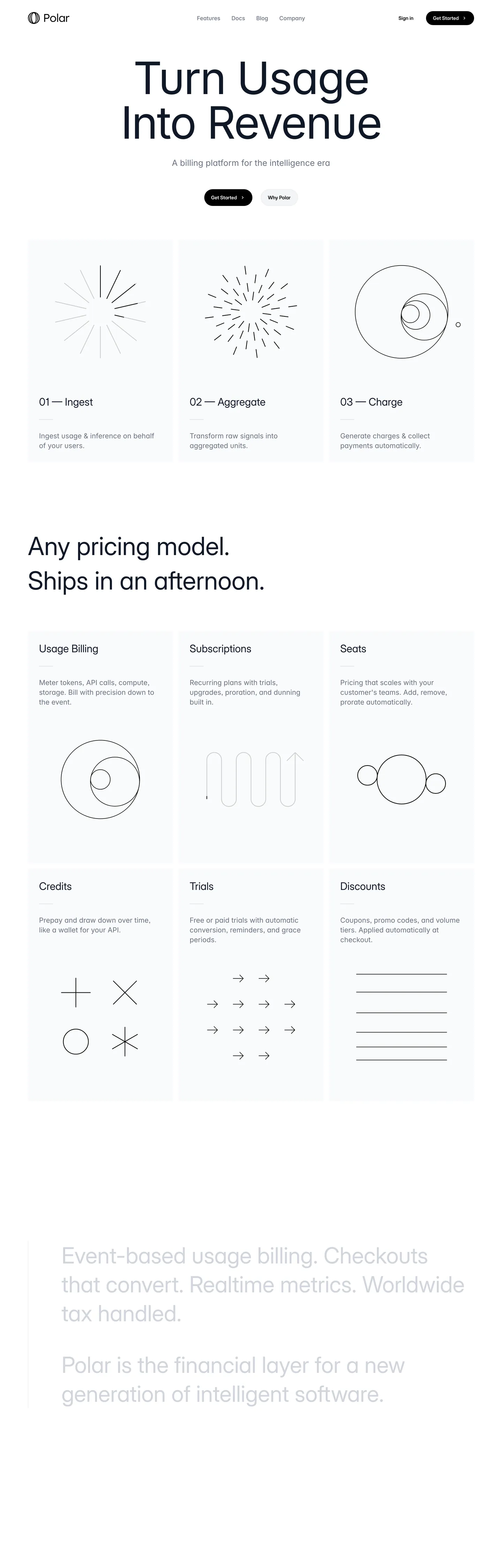
- Hand-drawn line illustrationseach of the three pillar cards carries a single-stroke black glyph (starburst, denser starburst, circles within circles) rather than a filled icon or product screenshot
- Catppuccin Latte palette wired but withheldpurple #8839ef, green #40a02b, blue #1e66f5, teal #179299, orange #fe640b live in CSS custom properties yet only the deep navy text tone renders on the captured marketing surface
- Pill-or-square binary radiusthe CTA and pillar cards use the maximum representable radius (9999px) as a pill while every other surface stays at 0px sharp corners; no middle tier exists
polar.sh
Live at polar.sh
A snapshot of the brand in production. Scroll the frame to see the whole page.
Colors
18 colors
Polar's system anchors on #1e66f5 (primary) as its primary color. Type is set in Inter across 11 tokens from 12px to 128px, weights 400–600. Shape language is sharp — components average 0px corner radius, favoring crisp rectangles.
Brand & Accent
Sparing, CTA-only voltage · 3
Surface
Page and card backgrounds · 4
Text
Headlines, body, captions · 4
Borders & Hairlines
Dividers, outlines, rules · 1
Other
Specialty colors · 6
Typography
11 type tokens
Set in Inter across 11 tokens, from 12px to 128px, weights 400–600. Shown in its own stack: where the font isn't installed, the fallback the file names stands in.
- display-hero128px · weight 400 · lh 128px · tracking -3.2pxThe quick brown fox jumps over the lazy dog
- display-h172px · weight 400 · lh 99pxThe quick brown fox jumps over the lazy dog
- display-h248px · weight 400 · lh 60pxThe quick brown fox jumps over the lazy dog
- display-md30px · weight 400 · lh 36pxThe quick brown fox jumps over the lazy dog
- body-lg20px · weight 400 · lh 27.5pxThe quick brown fox jumps over the lazy dog
- body-md16px · weight 400 · lh 24pxThe quick brown fox jumps over the lazy dog
- body-sm14px · weight 400 · lh 20pxThe quick brown fox jumps over the lazy dog
- label-md14px · weight 600 · lh 20pxThe quick brown fox jumps over the lazy dog
- button-md16px · weight 500 · lh 24pxThe quick brown fox jumps over the lazy dog
- mono-sm12px · weight 400 · lh 19.5pxThe quick brown fox jumps over the lazy dog
- mono-eyebrow12px · weight 400 · lh 16px · tracking 0.3pxThe quick brown fox jumps over the lazy dog
Layout
Radii and spacing
3 corner radii and 9 spacing values. Shape language: sharp.
Radii
- none0px
- sm5.6px
- full9999px
Spacing
- xs4px
- sm8px
- md12px
- base16px
- lg20px
- xl24px
- 2xl32px
- 3xl48px
- section96px
Components
18 components
Each rendered from its tokens (color, type, radius, padding) on Polar's own canvas.
- Hero Sectionhero-sectionHero Section
- Hero Headinghero-headingHero Heading
- Hero Subheadhero-subheadHero Subhead
- Section Headingsection-headingSection Heading
- Body Paragraphbody-paragraphBody Paragraph
- Body Paragraph Mutedbody-paragraph-mutedBody Paragraph Muted
- Outro Paragraphoutro-paragraphOutro Paragraph
- Mono Captionmono-captionMono Caption
- Button Primarybutton-primaryButton Primary
- Button Primary Hoverbutton-primary-hoverButton Primary Hover
- Button Secondarybutton-secondaryButton Secondary
- Top Navtop-navTop Nav
- Nav Linknav-linkNav Link
- Pillar Cardpillar-cardPillar Card
- Pillar Card Titlepillar-card-titlePillar Card Title
- Pillar Glyphpillar-glyphPillar Glyph
- Type here…text-inputText Input
- FooterfooterFooter
In use
The system, in use
Polar's tokens on the kind of product it builds.
Build something people actually use.
A short paragraph of marketing copy that previews how the brand's display tier and body tier read together. Two sentences is usually enough.
FAQ
Polar design system FAQ
Common questions about Polar's tokens, components, and how to use this DESIGN.md in your project.
Read next
Related reading
Specs, directories, and component libraries that pair with this design system.
- Browse all design systemsThe full directory of DESIGN.md files on shadcn.io, with live mockups for each.shadcn.io
- Polar — official sitePolar's public marketing site — the source of truth for the live tokens captured in this file.polar.sh (opens in a new tab)
- The DESIGN.md specificationGoogle Labs' open spec for machine-readable design system files — the format this page is built on.github.com (opens in a new tab)
Use it
Use Polar in your project
One machine-readable file. Drop it into Claude, Cursor, or any AI tool that reads DESIGN.md.
Download the DESIGN.md
One machine-readable file: every color, type, radius, spacing, and component token of Polar.
Feed it to your AI tool
Drop it into Claude, Cursor, or GitHub Copilot. The agent writes React components and Tailwind classes that match Polar's visual language.
Reference the tokens directly
Or paste the values into your Tailwind config, CSS variables, or component library: every color, size and radius is a quoted, ready-to-copy value.
Read the full DESIGN.md: overview, rationale, do’s and don’ts
Overview
Polar's marketing page inverts the dev-payments convention. Ink as voltage. Where Stripe leans on indigo gradients, LemonSqueezy on saturated yellow, and Paddle on a teal-blue brand block, Polar fills the canvas with pure white ({colors.canvas} — #ffffff), sets the hero h1 in deep navy-ink ({colors.ink-navy} — #4c4f69), and renders the primary CTA as a pure black pill ({colors.ink} — #000000) with white text. The CSS exposes a full Catppuccin Latte palette — a Stripe-blue primary at {colors.primary} (#1e66f5) wired as --color-primary, plus purple, green, teal, and orange — and yet above the fold the page renders zero of those chromatic moves. The brand color is not scarce; it is absent.
The typographic hero is a 128px Inter h1 with -3.2px letter-spacing ("Turn Usage Into Revenue") that compresses the line until adjacent letters almost touch. Body sits at 20px in Inter weight 400; section h2s sit at 48px in InterDisplay weight 400. The display tier holds at weight 400 throughout — there is no 600+ moment on the page. The supporting voice is GeistMono at 12px (40 captured samples), used for the small "01 — Ingest" / "02 — Aggregate" / "03 — Charge" labels above each pillar card and for inline code annotations elsewhere. The pairing — Inter display + GeistMono metadata — is the same magazine-meets-terminal split Cloudflare runs with FT Kunst Grotesk and Apercu Mono Pro, only here the display family is the open-source Inter instead of a licensed grotesk.
The decorative voice is hand-drawn line glyph: each of the three pillar cards carries a single-stroke black illustration in place of a filled icon — a sparse 12-line starburst for Ingest, a denser 24-line starburst for Aggregate, a phyllotaxis of nested circles plus a floating satellite circle for Charge. Below the fold the Subscriptions / Trials / Discounts grid carries a one-line inward spiral, a serpentine path of arrows, and a stack of horizontal rules. The glyphs feel closer to a print-magazine illustration than to a SaaS feature tile, and they replace what most payments brands would render as a product screenshot.
Key Characteristics:
- Pure white canvas (
{colors.canvas}— #ffffff), never warm cream — the page floor stays neutral and lets the line glyphs read as ink-on-paper. - Ink-as-voltage primary CTA (
{colors.ink}— #000000) pill, with the Catppuccin Latte blue ({colors.primary}— #1e66f5) declared in CSS but unrendered above the fold. - Deep navy-ink (
{colors.ink-navy}— #4c4f69) as the dominant text tone (29 captured occurrences) — not pure black, which would feel harsh against the white canvas. - 128px Inter h1 with -3.2px tracking — the loudest typographic moment in the system, executed at weight 400 rather than the 700+ that fintech and enterprise systems lean on.
- GeistMono 12px (40 captured samples) carries every small-caps label, footnote, and code annotation; no uppercase-tracked sans label tier exists.
- Binary radius scale — sharp 0px corners on every surface except the two pill elements (
{colors.ink}CTA and the rare "Why Polar" secondary pill at{rounded.full}9999px). - Hand-drawn one-stroke line glyphs replace filled icons inside the pillar and feature cards; no SVG fill, only stroke.
- Catppuccin Latte palette wired but withheld — purple
{colors.secondary}(#8839ef), green{colors.tertiary}(#40a02b), teal{colors.accent-teal}(#179299), orange{colors.accent-orange}(#fe640b) live in CSS custom properties and render either zero or near-zero times on the captured marketing surface.
Colors
Brand (declared but withheld)
- Catppuccin Blue (
{colors.primary}— #1e66f5): frequency 7 (all text). Wired in CSS as--color-primary,--color-accent,--color-blue,--color-blue-600,--sidebar-primary. Despite owning seven CSS variables, the blue never fills a CTA, never appears as a background block, never carries a section. Polar's declared brand color is rendered exclusively as inline link text on the page. - Catppuccin Purple (
{colors.secondary}— #8839ef): frequency 12 (all text). No CSS variable mapping in the captured tokens, but the hex appears in the broader Catppuccin Latte palette family. Reserved for inline accents and product chrome that the marketing page does not exercise. - Catppuccin Green (
{colors.tertiary}— #40a02b): frequency 10 (all text). The success-state green from Catppuccin Latte. Used inline on the marketing page for tags and status pills inside the dashboard preview, never as a chromatic block. - Catppuccin Teal (
{colors.accent-teal}— #179299): frequency 4 (all text). The cooler accent in the Catppuccin family. - Catppuccin Orange (
{colors.accent-orange}— #fe640b): frequency 1 (text). Wired as--color-orange-500. The single warmest accent in the palette, used at most once on the captured surface.
Text
- Ink (
{colors.ink}— #000000): frequency 35. Used as text (30), background (4), border (1). Wired as--color-blackand--color-graphic-stroke. The pure-black tone carries the primary CTA pill fill, every hand-drawn line glyph stroke, and a handful of high-contrast labels. Not the body text color — that role belongs to ink-navy. - Ink Navy (
{colors.ink-navy}— #4c4f69): frequency 29 (all text). Wired as--color-gray-600in the Catppuccin Latte palette. The dominant body and display text color across the page — never pure black, deliberately softened to a deep navy-gray with a faint blue cast. The hero h1 "Turn Usage Into Revenue" is rendered in this tone. - Ink Muted (
{colors.ink-muted}— #7c7f93): frequency 12 (all text). Wired as--color-polar-400. Secondary text and the GeistMono caption tone — sits one step lighter than ink-navy without losing legibility on white. - Ink Subtle (
{colors.ink-subtle}— #9a9ba2): declared as--color-polar-300,--color-gray-400,--color-neutral-400,--orbit-text-subtle. Reserved for tertiary metadata and disabled-state text; appears minimally on the captured marketing surface.
Surface
- Canvas (
{colors.canvas}— #ffffff): frequency 15. Used as text (10 — inside the black CTA pill), background (5). Wired as--color-background,--color-card,--color-popover,--color-white,--background, and ten other CSS variables. The page floor — pure white, not the warm cream Cloudflare and Vercel reach for. - Surface-1 (
{colors.surface-1}— #e6e6e6): wired as--orbit-bg-elevated,--color-border,--color-ring,--input. The single light-gray tone that doubles as both card background (on the pillar cards, though those render closer to#f7f7f7) and as the default border / input outline. There is no separate hairline color in the system. - Surface-2 (
{colors.surface-2}— #c7c8cc): wired as--color-polar-100,--color-graphic-dim. The dim graphic stroke tone used for the lightest line-art elements and for the muted-gray outro paragraph that closes the page. - Surface-3 (
{colors.surface-3}— #d7d8da): wired as--color-polar-50. The lightest gray in the Polar palette family — sits between Surface-1 and Surface-2 on the lightness ramp.
Hairline
- Hairline (
{colors.hairline}— #e6e6e6): same hex as Surface-1, intentionally. The system has no second hairline tone — borders, inputs, and the rare divider all resolve to the same light-gray value. Wired as--color-border,--input,--ring,--color-sidebar-border.
Graphite (dark-mode reserves)
- Graphite-700 (
{colors.graphite-700}— #171719): wired as--color-polar-700and--color-polar-800. The lifted-card tone in the dark variant of the system; absent from the captured light-mode marketing surface. - Graphite-800 (
{colors.graphite-800}— #101011): wired as--color-polar-900and--orbit-text. The deepest panel tone in dark mode. - Graphite-900 (
{colors.graphite-900}— #030712): wired as--color-polar-950,--popover-foreground,--color-popover-foreground. The dark-mode canvas color — essentially pure black with a faint blue tint, the deepest declared dark surface. - Graphite-Soft (
{colors.graphite-soft}— #27282a): wired as--color-polar-600. The mid-step dark surface that bridges Graphite-700 and the dark canvas.
Typography
Font Families
The system runs three voices: Inter for body, button, and the 128px hero h1; InterDisplay for the section h2 / h3 tier; GeistMono for the 12px footnote and code-annotation voice. Fallbacks walk to sans-serif and monospace respectively. All three families are open-source — Inter and InterDisplay from rsms.me, GeistMono from Vercel — which makes Polar's typographic system unusually portable for a payments brand.
The pairing of Inter at 128px display + GeistMono at 12px metadata is the magazine-meets-terminal split. Cloudflare runs the same pairing with FT Kunst Grotesk and Apercu Mono Pro; Polar reaches the same effect with open-source families.
Hierarchy
| Token | Size | Weight | Line Height | Letter Spacing | Use |
|---|---|---|---|---|---|
{typography.display-hero} | 128px | 400 | 128px | -3.2px | Hero h1 ("Turn Usage Into Revenue") |
{typography.display-h1} | 72px | 400 | 99px | 0 | Secondary display tier |
{typography.display-h2} | 48px | 400 | 60px | 0 | Section h2 ("Any pricing model. Ships in an afternoon.") |
{typography.display-md} | 30px | 400 | 36px | 0 | Outro paragraph display, larger labels |
{typography.body-lg} | 20px | 400 | 27.5px | 0 | Default running text, pillar-card body |
{typography.body-md} | 16px | 400 | 24px | 0 | Inline body and link text |
{typography.body-sm} | 14px | 400 | 20px | 0 | Top-nav labels, secondary metadata |
{typography.label-md} | 14px | 600 | 20px | 0 | Primary CTA pill label ("Get Started") |
{typography.button-md} | 16px | 500 | 24px | 0 | Secondary button label |
{typography.mono-sm} | 12px | 400 | 19.5px | 0 | Inline mono captions, code annotations |
{typography.mono-eyebrow} | 12px | 400 | 16px | 0.3px | Uppercase-tracked GeistMono eyebrow labels |
Principles
Display weight stays at 400. The hero h1 at 128px / 400 with -3.2px tracking is the editorial-magazine treatment executed in the inverse of the convention — confidence by extreme tracking compression rather than by weight. Stripe at weight 300 sits adjacent to this move; Polar pushes the same restraint further by holding weight 400 across every display tier and letting the -3.2px tracking carry the typographic force at the top of the ramp.
The 14px CTA label is the only place weight 600 appears on the page. Body and display sit at 400; the CTA pill bumps to 600 to compensate for its smaller size against the pure-black pill fill. There is no semibold heading tier and no italic.
The GeistMono voice does the labor a label or eyebrow tier would normally do. There are no uppercase-tracked sans labels in the system; small-caps duty falls entirely to GeistMono at 12px. The 40-occurrence frequency makes the mono the second-most-common typographic voice on the page after Inter body.
Note on Font Substitutes
All three families are open-source. Inter ships from rsms.me/inter under the SIL Open Font License; InterDisplay is the same family's display cut. GeistMono is Vercel's open-source monospace, shipped from vercel.com/font. No substitution is required — paste the families directly into Tailwind config or the font-sans / font-mono CSS custom properties.
Layout
Spacing System
- Base unit: 8px — the dominant module on the page, appearing 7 times in the captured spacing extraction.
- Tokens:
{spacing.xs}4px ·{spacing.sm}8px ·{spacing.md}12px ·{spacing.base}16px ·{spacing.lg}20px ·{spacing.xl}24px ·{spacing.2xl}32px ·{spacing.3xl}48px ·{spacing.section}96px. - Section padding (vertical): 96px between the hero and the pillar-card grid; 96px again between the pillar grid and the "Any pricing model" h2. The largest captured spacing value on the page.
- Card internal padding: 32px (
{spacing.2xl}) on the pillar cards — 20 captured occurrences of 32px, the second-most-common spacing value after the small-step gap tokens. - Top-nav padding: 16px (
{spacing.base}) vertical, 32px ({spacing.2xl}) horizontal, on a 64px nav height. - Hero padding: 96px (
{spacing.section}) vertical, 32px ({spacing.2xl}) horizontal.
Grid & Container
- Max content width: approximately 1248px on the hero (the captured h1 width), narrowing to 752px on the section h2 below the fold.
- Hero block: centered headline + 16px sub-caption ("A billing platform for the intelligence era") + the black pill CTA and a hairline-bordered "Why Polar" secondary pill, stacked vertically on the white canvas.
- Pillar-card grid: 3-column grid at desktop showing the Ingest / Aggregate / Charge pillars, each a pale-gray card with a centered line glyph above, a 14px InterDisplay weight-600 title row ("01 — Ingest"), and a 14px body paragraph beneath.
- Below-fold features grid: 6 cards in a 3 x 2 grid covering Usage Billing / Subscriptions / Seats / Credits / Trials / Discounts. Each carries a one-stroke line glyph beneath the title and body paragraph.
Rhythm
The page alternates between typographic hero and glyph-anchored card grids. The hero is the single typographic moment; everything below the fold is glyph-led. There is no atmospheric gradient between bands — every section terminates on the same pure-white canvas, and the only chromatic variation is the slight elevation contrast between the white canvas and the #f7f7f7 card fills.
Elevation
The system has essentially no shadow tier. The captured page contains zero shadow occurrences on {colors.ink} and zero on any other color. Hierarchy comes from surface-color contrast (#f7f7f7 cards lifted off the pure-white canvas) and from the binary radius scale — pills feel tappable, sharp-corner cards feel like editorial content.
- Flat (no shadow): hero, body bands, pillar cards, feature cards, top-nav, footer — every captured surface.
- Tonal lift: the pillar cards render at approximately
#f7f7f7against the pure-white canvas — a roughly 3% lightness shift that reads as elevation without any shadow being drawn. - Hairline outlines:
{colors.hairline}(#e6e6e6) marks the secondary "Why Polar" pill outline and the input field outlines. The hairline is barely visible at typical viewing distance, reinforcing the editorial restraint.
Shapes
The radius scale is binary: sharp 0px corners on every surface except the two pill elements.
{rounded.none}0px — the dominant radius. The pillar cards, the feature cards, the top-nav, the text inputs, every editorial surface terminates in a sharp 90-degree corner.{rounded.sm}5.6px — a single captured occurrence on a small chip; rare enough to treat as exceptional rather than systematic.{rounded.full}9999px — the primary CTA pill ({component.button-primary}) and the secondary "Why Polar" pill ({component.button-secondary}). Both render as fully-rounded ends.
There is no middle tier. No 4px / 6px / 8px / 12px / 16px steps exist in the system. A surface either holds a hard editorial corner or rounds to a tappable pill. The binary split is the warmest design move on the page — every other element holds sharp restraint, and the two pills carry the entire affordance signal.
Components
hero-section — Pure white {colors.canvas} floor, 96 x 32px padding, no border-radius. Holds the centered 128px Inter h1 in {colors.ink-navy}, a 16px sub-caption in {colors.ink-muted}, and the primary + secondary pill cluster beneath.
hero-heading — Ink-navy {colors.ink-navy} text on the white canvas, Inter 128px / 400, -3.2px tracking. The system's editorial moment — confidence by tracking compression, not by weight.
hero-subhead — Ink-muted {colors.ink-muted} text at {typography.body-md} — the single-line caption beneath the h1 ("A billing platform for the intelligence era").
section-heading — Ink-navy text at {typography.display-h2} (48px / 400). The "Any pricing model. Ships in an afternoon." h2 below the pillar grid.
body-paragraph — Default ink-navy running text at {typography.body-lg} (20px / 400) — the workhorse paragraph style on the page.
body-paragraph-muted — {colors.ink-muted} variant for secondary copy and metadata rows under glyphs.
outro-paragraph — Light-gray {colors.surface-2} (#c7c8cc) text at {typography.display-md} (30px / 400). The two long paragraphs that close the page ("Event-based usage billing…" and "Polar is the financial layer…") render in this barely-readable surface-2 tone — a deliberate fade-to-quiet rather than a centered footer.
mono-caption — GeistMono at {typography.mono-sm} (12px / 400), used for the "01 — Ingest" / "02 — Aggregate" / "03 — Charge" eyebrows above each pillar card and for inline code annotations.
button-primary — The signature CTA. Pure black {colors.ink} (#000000) fill, white text, fully-rounded {rounded.full} pill, 12 x 20px padding, 40px height, weight 600. No border. "Get Started" is the canonical instance.
button-primary-hover — Background flips to {colors.graphite-700} (#171719) — a slightly softer near-black for the press state.
button-secondary — White {colors.canvas} fill, ink-navy text, 1px {colors.surface-1} hairline border, fully-rounded {rounded.full} pill, same 12 x 20px padding and 40px height as the primary. "Why Polar" and "Sign in" are the canonical instances.
top-nav — White {colors.canvas} surface, 64px height, 16 x 32px padding. The Polar wordmark flush left, product links (Features / Docs / Blog / Company) center, "Sign in" + "Get Started" pill cluster flush right. No bottom hairline visible at the captured viewing distance.
nav-link — Ink-navy text in {typography.body-sm}, 8 x 12px padding. No hover background visible on the captured surface.
pillar-card — Pale #f7f7f7 fill (rendered between {colors.canvas} and {colors.surface-1}), ink-navy text, sharp {rounded.none} 0px corners, 32px internal padding. Holds the centered line glyph, the 14px mono eyebrow row, the 20px title, and the 14px body paragraph in a stacked composition.
pillar-card-title — Ink-navy text at {typography.body-lg} (20px / 400) — the "01 — Ingest" / "Subscriptions" / "Credits" title rows.
pillar-glyph — Pure black {colors.ink} stroke on transparent fill, no border-radius, no padding. The hand-drawn single-stroke line illustrations — starburst, denser starburst, nested circles, inward spiral, serpentine arrows, stack of rules. The decorative voice of the page.
text-input — White surface, ink-navy text, 1px {colors.surface-1} hairline border, sharp {rounded.none} corners, 12 x 16px padding, 40px height. The system follows the binary-radius rule even on form fields — inputs hold the editorial sharp corner, never round.
footer — White canvas continuation, muted-gray text in {typography.body-sm}, 48 x 32px padding. No surface contrast against the page floor; the footer just continues the canvas.
Do's and Don'ts
Do treat ink as the brand voltage. The single move that defines this system is the pure-black {colors.ink} CTA pill on the pure-white canvas. Reaching for the declared Catppuccin blue {colors.primary} to fill the CTA would put Polar visually adjacent to Stripe and indistinguishable from every other developer-payments brand.
Do use {colors.ink-navy} (#4c4f69) for body and display text, never pure {colors.ink} (#000000). The deep navy-gray softens the contrast against the white canvas and carries the faint Catppuccin Latte blue cast that ties the running text to the wider palette. Pure black is reserved for the CTA pill and the line glyphs.
Do render decorative iconography as one-stroke line glyphs rather than as filled icons or product screenshots. The hand-drawn starbursts, nested circles, and serpentine arrows are the editorial voice of the page; filled icons would shift the system into generic SaaS territory.
Do hold the entire display tier at weight 400. The 128px hero h1 sits at weight 400 with -3.2px tracking; the section h2 at 48px also sits at weight 400. Bumping any display tier to weight 600 or 700 collapses the magazine-treatment into a SaaS shout.
Don't render the primary CTA in {colors.primary} (#1e66f5) just because the CSS declares it as --color-primary. The blue is in the system for product surfaces; on the marketing page, the CTA must stay pure black {colors.ink} (#000000). Filling the pill in blue collapses the ink-as-voltage principle and removes the only differentiator.
Don't use {colors.hairline} (#e6e6e6) for background fills or text — it is a border-only token. For a light surface lift on the pillar cards, use #f7f7f7 (the {colors.canvas}-adjacent off-white that renders the cards) instead.
Don't introduce a middle radius tier between 0px and 9999px. The system is binary — every surface is either sharp-cornered or a full pill. Adding a 4px, 8px, or 12px step softens the contrast between editorial surfaces and the two tappable pills, and breaks the visual logic of the page.
Don't render the pillar-card glyphs as filled icons or as full-color product screenshots. The hand-drawn single-stroke geometry is the entire decorative voice of the system; filling the glyphs or swapping them for screenshots removes the print-magazine feel and pulls the page back toward generic developer-payments territory.
Known Gaps
- Hover and focus states: documented for
{component.button-primary-hover}only; the full state matrix (focus rings, active press, disabled tints, error states) is not visible on the captured marketing surface. - Form input error states:
{component.text-input}carries the resting state; error / validation styling lives inside the merchant dashboard and the checkout product surface, neither of which is represented in the captured marketing page. - Dark mode: the captured marketing surface is light-only. A dark variant exists in the merchant dashboard and is wired into CSS as
{colors.graphite-700}through{colors.graphite-900}, but those tones do not appear on the public marketing page. - Catppuccin palette in product context:
{colors.secondary}(purple),{colors.tertiary}(green),{colors.accent-teal}, and{colors.accent-orange}are declared in CSS but appear at most 12 times each on the marketing surface, all as inline text. Their full roles live in the dashboard, the checkout flow, and the API explorer — none of which are captured here. - Motion: the pillar-card glyphs may animate on scroll-into-view in the live runtime, but the spec captures end-state values only. Easing curves, stagger timing, and any micro-interaction on the CTA pill are not represented.
- Product surfaces: this DESIGN.md captures the marketing site only. The Polar dashboard (
polar.sh/dashboard), the merchant portal, the checkout flow, and the documentation site (docs.polar.sh) carry their own surface tokens, component sets, and chromatic moves that are not represented here.
Banking & Payments
More systems like this
More DESIGN.md files in Banking & Payments.
Pricing
Build it with Pro
The DESIGN.md files are free. Pro adds 6,000+ blocks, premium templates and the MCP server, so your AI editor builds in your system for you.
4.9/5 out of 5 · 150+ reviewsfrom 150+ founders and developers.
Billing
Billed once a year in USD. Cancel anytime.
- How many people can use the license.
- Client work, SaaS products and anything you charge for.
- Production-ready React sections: hero, pricing, features, dashboards and more.
- Complete multi-page sites you can ship as they are.
- React icons from every major library, installable with one command.
- Presets that restyle every block, in light and dark.
- Lets your AI editor search, preview and install blocks for you.
- Priority requests are answered first.
Individual
For personal projects & open source
$32instead of $49/mo
$389 billed yearly
- Seats: 1 seat
- Commercial use: Personal & open source only
- Pro blocks: 6,000+ blocks
- Templates: All 14 templates
- React icons: 294k+ icons
- Themes: All 59 themes
- MCP server: Basic usage
- Support: Standard
Team
Most popularFor freelancers, agencies & startups
$66instead of $99/mo
$789 billed yearly · ≈ $13/dev/mo
- Seats: Up to 5 seats
- Commercial use: Included
- Pro blocks: 6,000+ blocks
- Templates: All 14 templates
- React icons: 294k+ icons
- Themes: All 59 themes
- MCP server: High usage
- Support: Priority
Organization
For companies with larger teams
$132instead of $199/mo
$1,589 billed yearly
- Seats: Unlimited seats
- Commercial use: Included
- Pro blocks: 6,000+ blocks
- Templates: All 14 templates
- React icons: 294k+ icons
- Themes: All 59 themes
- MCP server: Unlimited usage
- Support: Priority
Billed once a year in USD. Cancel anytime.
Individual
For personal projects & open source
$32instead of $49/mo
$389 billed yearly
- How many people can use the license.Seats: 1 seat
- Client work, SaaS products and anything you charge for.Commercial use: Personal & open source only
- Production-ready React sections: hero, pricing, features, dashboards and more.Pro blocks: 6,000+ blocks
- Complete multi-page sites you can ship as they are.Templates: All 14 templates
- React icons from every major library, installable with one command.React icons: 294k+ icons
- Presets that restyle every block, in light and dark.Themes: All 59 themes
- Lets your AI editor search, preview and install blocks for you.MCP server: Basic usage
- Priority requests are answered first.Support: Standard
Team
Most popularFor freelancers, agencies & startups
$66instead of $99/mo
$789 billed yearly · ≈ $13/dev/mo
Everything in Individual, plus
- How many people can use the license.Seats: Up to 5 seats
- Client work, SaaS products and anything you charge for.Commercial use: Included
- Lets your AI editor search, preview and install blocks for you.MCP server: High usage
- Priority requests are answered first.Support: Priority
Organization
For companies with larger teams
$132instead of $199/mo
$1,589 billed yearly
Everything in Team, plus
- How many people can use the license.Seats: Unlimited seats
- Lets your AI editor search, preview and install blocks for you.MCP server: Unlimited usage
- Secure checkout via Stripe
- Code lives in your repo
- Keep what you've shipped if you cancel
- License terms
Your system, built for you
Every block, template and icon, installed by your AI agent in your design system. The DESIGN.md files stay free.