PlanetScale Design System
PlanetScale's design language as a DESIGN.md file. ui-monospace stack, graphite #414141 ink, single orange #f35815 CTA, 17 components. For React + AI tools.
Add shadcn.io to your AI agent. · Pro It installs blocks, icons and templates in your design system from a prompt, with Pro.
Set up MCP- Primary
- #f35815
- Typeface
- ui-monospace
- Shape
- Sharp
- Base radius
- 12px
- Colors
- 23
- Type tokens
- 8
- Components
- 17
- Spacing values
- 8
About
About PlanetScale DESIGN.md
Curated by Dov Azencot · Updated May 13, 2026 · Source planetscale.com (opens in a new tab)
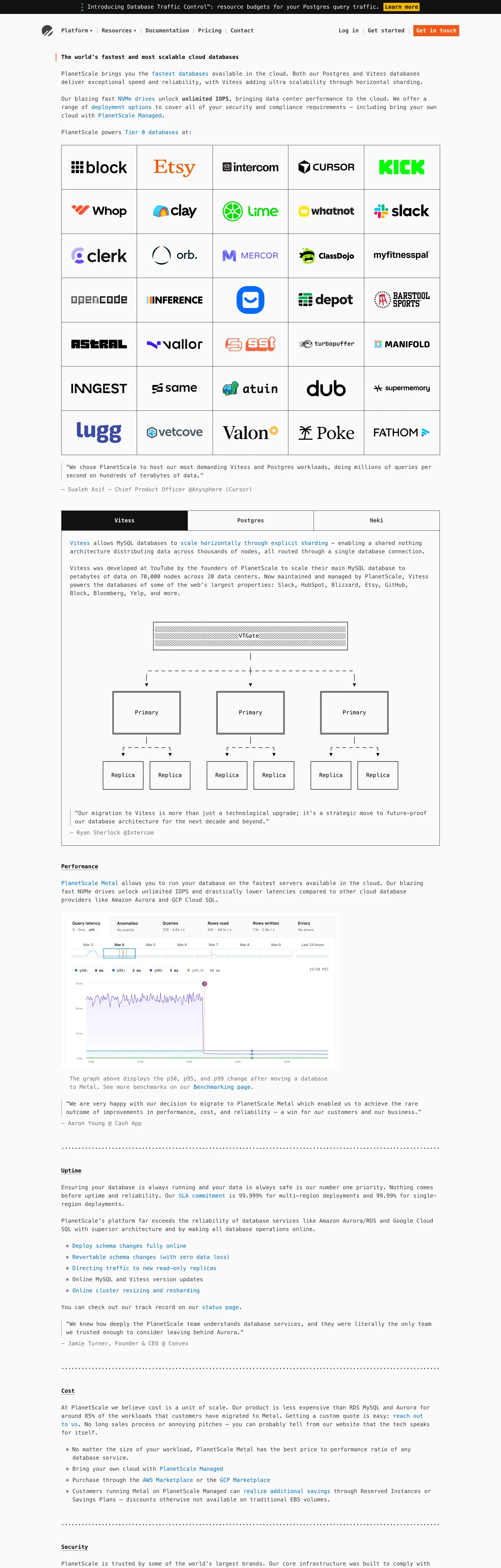
PlanetScale's landing page is a database product styled like a manpage. The hero headline, the customer-logo wall (Block, Etsy, Lume, Cash App, Notion, Verkada, Pinger, Dub), the architecture diagram for the Vitess and Postgres clusters, the benchmark tables, the latency line chart, the FAQ-style scroll, and the "Get in touch" CTA all sit in the same ui-monospace stack at the same 16px size. The hierarchy comes entirely from weight — 400 for paragraphs, 500 for one mid-tier label tier, 600 for nav links and H2 section labels, 700 for the H1 — and the canvas is a barely-warm off-white "#fafafa" with graphite text "#414141" doing 463 of the page's color occurrences. Where most database brands signal infrastructure-seriousness with a heavy sans-serif and a saturated CTA color band, PlanetScale signals it by setting the whole page in code-font and letting graphite ink do the work.
This DESIGN.md packages the system into one Google Labs spec file. Inside: 23 colors tokens covering graphite ink "#414141", off-white canvas "#fafafa", deep contrast "#111111" used as the inverted bg, pure black "#000000" reserved for the H1, the orange "#f35815" CTA voltage, the yellow "#f2b600" news-pill chip, a quiet blue link "#0b6ec5", plus the full semantic ramp PlanetScale ships as CSS vars (red "#d92038", green "#13862e", purple "#5e49af", postgres-brand "#336791") — eight typography roles all on the system monospace stack at 16px, three radii (0px / 12px / 9999px), an 8-step spacing scale anchored on a 24px section unit, and seventeen components that mirror the actual structures on the page (the orange-filled CTA, the bordered ghost nav button, the customer logo cell, the architecture-diagram tile, the benchmark row, the news-pill chip).
Feed the file to Claude Code, Cursor, or Copilot and the agent will reproduce PlanetScale's restraint — every text role at 16px in ui-monospace, graphite-on-cream chrome, one saturated orange button per page, sharp 0px corners on everything that isn't the news pill. Reference the tokens directly in Tailwind config or use the spec as an audit checklist against an existing developer-tooling page. Where most Vitess and Postgres hosting brands escalate to a serif-display headline and a navy hero band, PlanetScale stays in monospace at one size and trusts that the typographic discipline reads as engineering confidence.
What makes it distinct
5
- Single-size monospaceevery body, label, and H1 sits at 16px in the ui-monospace stack, with weight 400/600/700 doing the entire hierarchy
- Graphite-over-cream chrome#414141 ink (463 occurrences) lives on a #fafafa canvas, with zero gray section bands across the full scroll
- Lone orange CTA#f35815 fills exactly one button on the page and shows up nowhere else in the chrome
- Yellow voltage scoped to a pill#f2b600 appears once, on the news chip near the hero, with no secondary surface ever painted in it
- 9999px is the only declared radiusevery other rectangle in the system is sharp 0px, with no soft-card vocabulary anywhere
planetscale.com
Live at planetscale.com
A snapshot of the brand in production. Scroll the frame to see the whole page.
Colors
23 colors
PlanetScale's system runs on #f35815 as its primary voltage, used in 2 of 17 components. Type is set in ui-monospace across 8 tokens from 16px to 16px, weights 400–700. Shape language is sharp — components average 0px corner radius, favoring crisp rectangles.
Brand & Accent
Sparing, CTA-only voltage · 3
Surface
Page and card backgrounds · 4
Text
Headlines, body, captions · 7
Borders & Hairlines
Dividers, outlines, rules · 3
Semantic
Status, errors, success, links · 2
Other
Specialty colors · 4
Typography
8 type tokens
Set in ui-monospace across 8 tokens, from 16px to 16px, weights 400–700. Shown in its own stack: where the font isn't installed, the fallback the file names stands in.
- display-h116px · weight 700 · lh 24pxThe quick brown fox jumps over the lazy dog
- heading-h216px · weight 700 · lh 24pxThe quick brown fox jumps over the lazy dog
- nav-link16px · weight 600 · lh 24pxThe quick brown fox jumps over the lazy dog
- button-md16px · weight 600 · lh 16pxThe quick brown fox jumps over the lazy dog
- body-md16px · weight 400 · lh 24pxThe quick brown fox jumps over the lazy dog
- body-emphasis16px · weight 600 · lh 24pxThe quick brown fox jumps over the lazy dog
- label-tight16px · weight 500 · lh 24px · tracking -0.096pxThe quick brown fox jumps over the lazy dog
- code-block16px · weight 500 · lh 20pxThe quick brown fox jumps over the lazy dog
Layout
Radii and spacing
3 corner radii and 8 spacing values. Shape language: sharp.
Radii
- none0px
- md12px
- full9999px
Spacing
- xxs4px
- xs8px
- sm12px
- md16px
- base24px
- lg40px
- xl48px
- gutter9.63281px
Components
17 components
Each rendered from its tokens (color, type, radius, padding) on PlanetScale's own canvas.
- Button Primarybutton-primaryButton Primary
- Button Primary Hoverbutton-primary-hoverButton Primary Hover
- Button Secondarybutton-secondaryButton Secondary
- Primary Navprimary-navPrimary Nav
- Nav Link Inlinenav-link-inlineNav Link Inline
- News Pillnews-pillNews Pill
- Hero H1hero-h1Hero H1
- Body Paragraphbody-paragraphBody Paragraph
- Link Inlinelink-inlineLink Inline
- Customer Logo Cellcustomer-logo-cellCustomer Logo Cell
- Architecture Tilearchitecture-tileArchitecture Tile
- Benchmark Rowbenchmark-rowBenchmark Row
- Chart Containerchart-containerChart Container
- Faq Rowfaq-rowFaq Row
- Footer Sectionfooter-sectionFooter Section
- Postgres Markpostgres-markPostgres Mark
- Code Snippetcode-snippetCode Snippet
In use
The system, in use
PlanetScale's tokens on the kind of product it builds.
Build something people actually use.
A short paragraph of marketing copy that previews how the brand's display tier and body tier read together. Two sentences is usually enough.
FAQ
PlanetScale design system FAQ
Common questions about PlanetScale's tokens, components, and how to use this DESIGN.md in your project.
Read next
Related reading
Specs, directories, and component libraries that pair with this design system.
- Browse all design systemsThe full directory of DESIGN.md files on shadcn.io, with live mockups for each.shadcn.io
- PlanetScale — official siteThe world's fastest and most scalable cloud hosting for Vitess and Postgres.planetscale.com (opens in a new tab)
- The DESIGN.md specificationGoogle Labs' open spec for machine-readable design system files.github.com (opens in a new tab)
Use it
Use PlanetScale in your project
One machine-readable file. Drop it into Claude, Cursor, or any AI tool that reads DESIGN.md.
Download the DESIGN.md
One machine-readable file: every color, type, radius, spacing, and component token of PlanetScale.
Feed it to your AI tool
Drop it into Claude, Cursor, or GitHub Copilot. The agent writes React components and Tailwind classes that match PlanetScale's visual language.
Reference the tokens directly
Or paste the values into your Tailwind config, CSS variables, or component library: every color, size and radius is a quoted, ready-to-copy value.
Read the full DESIGN.md: overview, rationale, do’s and don’ts
Overview
PlanetScale's marketing page is a database product styled like a static-site README. Every text role on the page — H1, H2, body paragraph, nav link, button label, footer fine print, customer-logo caption — sits in the system monospace stack at a single 16px font-size with a 24px line-height. The hierarchy is built from weight alone: weight 400 (102 occurrences) carries body, weight 600 (16 occurrences) carries nav and section labels, weight 700 (6 occurrences) carries the H1. There is no display face, no serif, no sans, no italic, no escalation to 24px or 32px for emphasis. Single-size monospace is the entire typographic identity, and it is the rarest move in database-product marketing — most Vitess and Postgres hosting brands escalate to a heavy sans-serif at 48px+ to signal infrastructure muscle.
The chrome is graphite-on-cream. The canvas is {colors.canvas} ("#fafafa") — barely warmer than pure white, set by the --bg-primary CSS variable. The dominant ink is {colors.ink} ("#414141", graphite), bound to both --text-primary and --border-primary — it lives in 175 text occurrences and 240 border occurrences across the page, doing nearly every label, paragraph, hairline, and cell edge. Pure black {colors.ink-strong} ("#000000") is reserved for the H1 alone; deeper near-black {colors.ink-inverted} ("#111111") sits behind the --bg-inverted variable and surfaces in the footer band only. Where most developer brands ship a 5-step neutral gray ramp and use all of them, PlanetScale collapses neutrals to ink + decoration and lets weight differentiate.
The conversion voltage is {colors.primary} ("#f35815", a saturated orange), and it is the single filled-button color on the page. The "Get in touch" CTA is the only surface painted in orange; every other interactive element is a ghost button bordered in 1px graphite. The brand-identity voltage is {colors.brand-yellow} ("#f2b600", the --yellow-300 token), used exactly once — on a news pill near the hero — and never reused as a section band, chip background, or footer accent. Unlike the convention of pairing a primary CTA color with a secondary tinted hover band, PlanetScale ships the orange as a one-shot signal and trusts the rest of the page to stay monochrome. The radius vocabulary is two values: 0px on every rectangle in the system, 9999px on the one news pill. Sharp corners are the page's geometric default.
Key Characteristics:
- ui-monospace stack across every text role at a single 16px size — weight 400 / 600 / 700 do the entire hierarchy
- Graphite
{colors.ink}("#414141") does both text and border roles via the--text-primaryand--border-primaryvars - Off-white
{colors.canvas}("#fafafa") is the only body background — no section-band alternation across the scroll - Single orange
{colors.primary}("#f35815") on exactly one CTA per surface, with a 1px graphite border underneath the fill - Single yellow
{colors.brand-yellow}("#f2b600") on exactly one news pill, with no secondary surface ever painted in it - Two-value radius —
{rounded.none}("0px") on every container,{rounded.full}("9999px") on the news pill only - 24px base spacing unit (42 occurrences) anchors gap, padding, and section rhythm across the page
Colors
- Graphite ink (
#414141) — frequency 463. Used as text (175), border (240), gradient (48). The brand's load-bearing voltage, bound to both--text-primaryand--border-primary— it does paragraphs, labels, nav links, hairlines, table edges, and footer rules. Where most developer brands separate text and border into two distinct grays, PlanetScale collapses them into one graphite token. - Off-white canvas (
#fafafa) — frequency 7. Used as text (4), bg (3). The--bg-primarytoken — the only body background on the page. Not pure white, not gray — a barely-warmed neutral that registers as paper rather than sterile chrome. - Quiet blue link (
#0b6ec5) — frequency 36. Used as text (36). The--blue-600/--text-bluetoken, reserved for inline anchor text. Not used as a button fill, not used as a section band — link voltage only. - Decoration gray (
#c1c1c1) — frequency 21. Used as text (15), border (6). The--gray-300/--text-decorationtoken — secondary captions and strong dividers between sections. Sits one step above{colors.hairline}for moments that need slightly more weight. - Secondary ink (
#737373) — frequency 9. Used as text (9). The--gray-550/--text-secondarytoken — metadata, timestamps, and footer fine-print rows. Reserved for prose where graphite would feel too heavy. - H1 black (
#000000) — frequency 7. Used as text (7). Bound to the--black/--text-contrastvariable. The H1 "The world's fastest and most scalable cloud databases" is the only element painted in pure black; everything else in the prose ladder lives one notch lighter at graphite. - Orange CTA (
#f35815) — frequency 2. Used as bg (1), border (1). The--orange-500/--text-orangetoken — the single filled-button color on the page. Reserved for the "Get in touch" conversion target; appears nowhere else in the chrome. - Yellow news pill (
#f2b600) — frequency 1. Used as bg (1). The--yellow-300token, scoped to one news chip near the hero. The only pill on the page is the only place this hex lives. - Inverted near-black (
#111111) — frequency 3. Used as text (1), bg (2). The--bg-inverted/--gray-900token — the dark footer band surface. Not pure black; the brand reserves true#000000for the H1 and uses this slightly lifted near-black for the only dark surface on the page.
The wider semantic ramp (red #d92038, green #13862e, blue #1e9de7, purple #5e49af, postgres-brand #336791) ships in CSS variables but does not render on the marketing surfaces captured. Treat it as a reserve for in-product status states.
Typography
The page uses one font stack: ui-monospace, SFMono-Regular, "SF Mono", Menlo, Consolas, "Liberation Mono", monospace. Every text role on the marketing surface is set at 16px with a 24px line-height — there is no display face, no secondary serif, no sans-serif fallback, no escalation to a larger headline size. The hierarchy comes from weight alone:
- Weight 400 (102 occurrences) —
{typography.body-md}. Body paragraphs, blockquotes, captions. The dominant tier. - Weight 600 (16 occurrences) —
{typography.nav-link}/{typography.body-emphasis}. Nav links, H2 section labels, buttons, strong inline runs. - Weight 700 (6 occurrences) —
{typography.display-h1}. The H1 only, plus a handful of<strong>runs. - Weight 500 with -0.096px tracking (1 occurrence each on
spananda) — one-off label-tight roles used sparingly.
The button label specifically runs at 16px / weight 600 / 16px line-height (the only place line-height tightens to 1.0 rather than 1.5) — pack the label into a 32px-tall button without vertical drift.
If the system monospace stack isn't available, substitute JetBrains Mono, IBM Plex Mono, or Geist Mono. Preserve the 16px / 24px ratio across every role. Don't substitute a sans-serif — the single-typeface monospace decision is the entire identity.
Layout
The captured screenshot is 1440×4500 — every section sits centered in a roughly 1100px-wide content column on the {colors.canvas} background, with {spacing.lg} (40px) horizontal page padding. Section rhythm is built around {spacing.base} (24px), which appears 42 times in the extracted spacing array as the universal gap value; {spacing.xl} (48px) shows up 3 times as the larger between-section break. Customer-logo cells sit in a 6-column responsive grid with 1px {colors.hairline} ("#e1e1e1") dividers between them. The architecture diagram is a column of bordered rectangles connected by thin vertical lines. Benchmark tables sit as bordered rows with consistent 24px horizontal padding. There is no decorative divider — only thin hairlines and column gaps separate content blocks.
Elevation & Depth
PlanetScale ships zero shadow tokens. The extraction's shadow count is 0 across every color in the palette, and the --tw-shadow variable resolves to a fully transparent value. Depth is communicated entirely via 1px borders: cards are hairline-bordered rectangles flat on the canvas, the architecture diagram is a stack of bordered tiles, the benchmark tables use 1px graphite-tinted row separators. Hairline-as-elevation is the entire vocabulary — no card drops, no glow accents, no soft-shadow ladder. Where most database brands ship a 3-tier shadow ramp for hover / focus / elevation states, PlanetScale ships 1px borders and lets the typography stay flat.
Shapes
The page declares exactly one border-radius value across all 486 scanned elements: 9999px, used on the news pill near the hero. Everything else — buttons, cards, tables, charts, code blocks, footer columns — renders at 0px. The two-value radius vocabulary is the brand's geometric signature: sharp containers + one pill exception. Treat {rounded.md} ("12px") as a fallback for derived UI that genuinely needs a soft-card surface, but don't introduce it on the canonical structures captured here.
Components
{components.button-primary}— the orange "Get in touch" CTA. 32px tall, 0–8px horizontal padding, 16px button label at weight 600, 1px graphite border underneath the{colors.primary}fill. Reserved for the single conversion target on each surface.{components.button-primary-hover}— deepens to{colors.primary-deep}("#b83a05"). Same 1px graphite border, same geometry.{components.button-secondary}— ghost button. Transparent fill, 1px graphite border, graphite ink label at weight 600. Used for "Documentation" and other neutral nav-adjacent links.{components.primary-nav}— top bar. 56px tall, 40px horizontal padding, sits flat on the{colors.canvas}background with no bottom border drawn.{components.nav-link-inline}— inline nav anchor. Transparent fill, no padding, 16px / weight 600 graphite label.{components.news-pill}— the only pill on the page.{colors.brand-yellow}fill, pure-black ink, 16px label, 9999px radius, 24px tall.{components.hero-h1}— the single headline element. Pure-black ink ({colors.ink-strong}), 16px / weight 700 — same size as everything else on the page, signaled only by weight. Sits with 16px of left padding from the column edge.{components.body-paragraph}— the workhorse prose row. Graphite ink, 16px / weight 400, no padding, no border.{components.link-inline}— anchor color{colors.link}("#0b6ec5"). Used as inline anchor text; never as a button fill.{components.customer-logo-cell}— bordered cell on the customer wall. 1px{colors.hairline}divider, 24px padding, monochrome customer mark.{components.architecture-tile}— diagram block on the Vitess + Postgres architecture chart. 1px{colors.hairline-strong}border, 16px padding, sharp 0px corners.{components.benchmark-row}— table row on the benchmark comparison surfaces. 1px hairline border, 8px / 24px padding.{components.chart-container}— wrapper for the latency line chart. Hairline border, 16px padding, flat-on-canvas.{components.faq-row}— bordered FAQ row near the footer. 16px vertical padding, no border, sits flat on the canvas with the next row separated by typography rhythm rather than a rule.{components.footer-section}— footer band. Graphite ink on{colors.canvas}, 48px vertical padding, no decorative band.{components.postgres-mark}— the one place the--text-postgrescolor ("#336791") renders, on the Postgres wordmark in the architecture diagram.{components.code-snippet}— code block with{colors.canvas-secondary}("#ddf2ff") background and weight-500 monospace ink. The only surface on the page tinted with the blue family.
Do's and Don'ts
- Do keep every text role on the same 16px monospace stack — escalating any headline to 24px or 32px breaks the single-size discipline that is the brand's whole identity.
- Do use
{colors.ink}("#414141") for both text and 1px borders — the brand binds them to one token (--text-primaryand--border-primary) and you should too. - Do reserve
{colors.primary}("#f35815") for exactly one filled button per page surface. Pair it with a{colors.border-primary}1px outline underneath the fill — the page renders both. - Do keep
{colors.brand-yellow}("#f2b600") on a single 9999px pill near the hero. The yellow is brand-identity voltage, not a usable palette token. - Don't introduce a 4px or 8px corner radius on cards — the page's geometric vocabulary is exactly two values (0px and 9999px), and a soft-card 8px corner breaks the README rhythm. If you genuinely need a softer surface,
{rounded.md}("12px") exists as a fallback but doesn't render on any captured component. - Don't paint a second surface in
{colors.primary}("#f35815"). The orange is a one-shot conversion signal — a second orange button on the same page halves its voltage. Use{components.button-secondary}(ghost-bordered, transparent fill) for any non-primary action. - Don't add shadow ladders. The extraction shows 0 shadow uses across all 72 color tokens; the
--tw-shadowtoken resolves fully transparent. Depth is communicated by 1px hairlines, not blurred drops. - Don't substitute
{colors.ink}("#414141") with a generic mid-neutral gray — the specific graphite tone is bound to the brand's CSS variables and harmonizes with the orange CTA. A cooler gray reads as enterprise dashboard; a warmer gray reads as terminal noise. - Don't use the
{colors.brand-yellow}("#f2b600") as a section band or footer accent. The yellow is scoped to one pill — repeating it on a band miniaturizes the brand's "news today" signal into chrome. - Don't substitute the monospace stack with a sans-serif for body. The system's restraint is "16px monospace everywhere", and replacing body with Inter or Geist turns it into a generic dev-tools landing immediately.
Known Gaps
- Mobile screenshots not captured — responsive behavior is inferred from desktop evidence; mobile breakpoint padding, hamburger drawer, and benchmark-table reflow are not documented in this spec.
- Hover and focus states are not captured per system policy.
{components.button-primary-hover}is derived from the--orange-600token rather than from a live state extraction. - In-product PlanetScale dashboard is not documented — the wider semantic ramp (red, green, purple, blue) ships in CSS variables but doesn't render on the marketing surfaces, so dashboard chrome (status pills, alert banners, badge variants) is out of scope.
- Form-input components — the captured page has no text input on the home surface;
{colors.canvas-secondary}("#ddf2ff") is documented as the code-snippet tint but notext-inputcomponent is included. - Vitess and Postgres comparison page — the benchmark surfaces likely share the same chrome but introduce dataset-specific row styles not extracted here.
Backend, Database & DevOps
More systems like this
More DESIGN.md files in Backend, Database & DevOps.
Pricing
Build it with Pro
The DESIGN.md files are free. Pro adds 6,000+ blocks, premium templates and the MCP server, so your AI editor builds in your system for you.
4.9/5 out of 5 · 150+ reviewsfrom 150+ founders and developers.
Billing
Billed once a year in USD. Cancel anytime.
- How many people can use the license.
- Client work, SaaS products and anything you charge for.
- Production-ready React sections: hero, pricing, features, dashboards and more.
- Complete multi-page sites you can ship as they are.
- React icons from every major library, installable with one command.
- Presets that restyle every block, in light and dark.
- Lets your AI editor search, preview and install blocks for you.
- Priority requests are answered first.
Individual
For personal projects & open source
$32instead of $49/mo
$389 billed yearly
- Seats: 1 seat
- Commercial use: Personal & open source only
- Pro blocks: 6,000+ blocks
- Templates: All 14 templates
- React icons: 294k+ icons
- Themes: All 59 themes
- MCP server: Basic usage
- Support: Standard
Team
Most popularFor freelancers, agencies & startups
$66instead of $99/mo
$789 billed yearly · ≈ $13/dev/mo
- Seats: Up to 5 seats
- Commercial use: Included
- Pro blocks: 6,000+ blocks
- Templates: All 14 templates
- React icons: 294k+ icons
- Themes: All 59 themes
- MCP server: High usage
- Support: Priority
Organization
For companies with larger teams
$132instead of $199/mo
$1,589 billed yearly
- Seats: Unlimited seats
- Commercial use: Included
- Pro blocks: 6,000+ blocks
- Templates: All 14 templates
- React icons: 294k+ icons
- Themes: All 59 themes
- MCP server: Unlimited usage
- Support: Priority
Billed once a year in USD. Cancel anytime.
Individual
For personal projects & open source
$32instead of $49/mo
$389 billed yearly
- How many people can use the license.Seats: 1 seat
- Client work, SaaS products and anything you charge for.Commercial use: Personal & open source only
- Production-ready React sections: hero, pricing, features, dashboards and more.Pro blocks: 6,000+ blocks
- Complete multi-page sites you can ship as they are.Templates: All 14 templates
- React icons from every major library, installable with one command.React icons: 294k+ icons
- Presets that restyle every block, in light and dark.Themes: All 59 themes
- Lets your AI editor search, preview and install blocks for you.MCP server: Basic usage
- Priority requests are answered first.Support: Standard
Team
Most popularFor freelancers, agencies & startups
$66instead of $99/mo
$789 billed yearly · ≈ $13/dev/mo
Everything in Individual, plus
- How many people can use the license.Seats: Up to 5 seats
- Client work, SaaS products and anything you charge for.Commercial use: Included
- Lets your AI editor search, preview and install blocks for you.MCP server: High usage
- Priority requests are answered first.Support: Priority
Organization
For companies with larger teams
$132instead of $199/mo
$1,589 billed yearly
Everything in Team, plus
- How many people can use the license.Seats: Unlimited seats
- Lets your AI editor search, preview and install blocks for you.MCP server: Unlimited usage
- Secure checkout via Stripe
- Code lives in your repo
- Keep what you've shipped if you cancel
- License terms
Your system, built for you
Every block, template and icon, installed by your AI agent in your design system. The DESIGN.md files stay free.