Plaid Design System
Plaid's fintech-infrastructure design system as a DESIGN.md file. Black #111111, Plaid Sans 500, 23 colors, 18 components. For React, Next.js, and AI tools.
Add shadcn.io to your AI agent. · Pro It installs blocks, icons and templates in your design system from a prompt, with Pro.
Set up MCP- Primary
- #02294b
- Typeface
- Plaid Sans
- Shape
- Soft
- Base radius
- 20px
- Colors
- 23
- Type tokens
- 12
- Components
- 18
- Spacing values
- 8
About
About Plaid DESIGN.md
Curated by Dov Azencot · Updated May 13, 2026 · Source plaid.com (opens in a new tab)
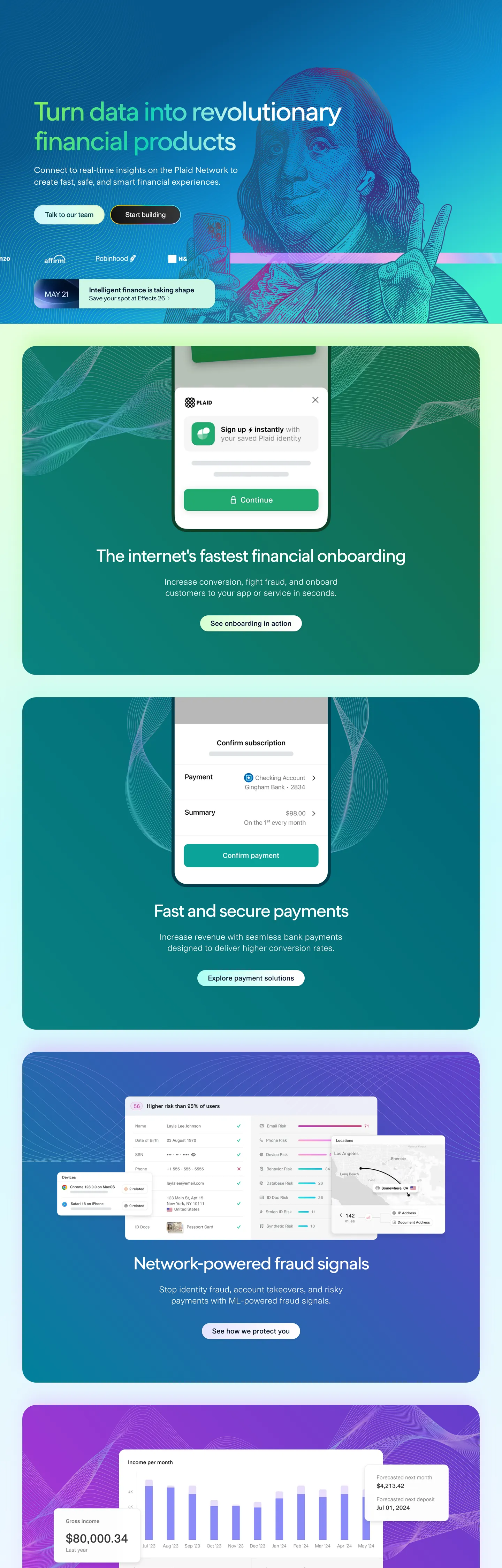
Plaid's design language is the chromatic-band marketing page taken to a categorical extreme. The hero opens on a deep teal-green wash, the next section flips to white with a centered iPhone mockup, the next to mint-green, the next to violet-blue with a fraud-signal chart, the next to deep magenta with a dashboard composite. Each band is a single saturated color — never a subtle gradient, never a wash of pastels. Where most fintech-infrastructure brands stretch one indigo across the entire scroll, Plaid assigns one chromatic story per product capability and lets the band do the section break. Body text and borders share absolute black "#111111" — the system's highest-frequency token at 1184 occurrences across text and 1px hairline borders — and the reading canvas inside each card returns to pure "#ffffff" with no off-white softening.
This page packages the full system into a single DESIGN.md file. Inside: 23 colors tokens spanning the brand chromatic bands and the structural ink/canvas register, 11 typography levels across Plaid Sans, Cern, and Inconsolata, 5 corner radii on a split pill/card scale, 8 spacing values, and 18 components — pill buttons, the floating product card, the dashboard composite with monospace code, the chromatic band itself as a layout token, and the dark footer panel. Every hex is quoted; every Plaid Sans weight (400, 500, 600) is reproducible. The format is the Google Labs DESIGN.md spec — plain text, machine-readable, AI-toolable.
Feed the file to Claude, Cursor, or GitHub Copilot. The AI writes React components and Tailwind classes that match Plaid's particular dialect — chromatic-band sectioning, Plaid Sans display at weight 500 with aggressive negative tracking, the 100px pill on a 20px card surface, and the Inconsolata monospace code blocks composited inside dashboard mockups — rather than a generic indigo-and-white fintech theme. Inter Variable at weight 500 with "-3.4px" tracking on hero display sizes approximates Plaid Sans; the proprietary family is not licensed for redistribution. Use the chromatic bands as your section-break grammar; never compress two bands into a single panel.
What makes it distinct
5
- Chromatic band canvaseach section is a full-bleed saturated gradient (teal #088181, magenta #b14edb, indigo #0a54c4, violet #6748d8), one story per color
- Absolute black inktext and borders share #111111 at frequency 1184, the highest single-token density in the system
- Plaid Sans 500 with -3.4px trackingthe hero h1 lands at 76px with negative letter-spacing larger than the brand's body type size
- 100px pill on 20px cardbuttons round to 100px (frequency 40) while cards round to 20px (frequency 34); the radius gap is the brand's geometric signature
- Inconsolata code registera single monospace register at 27px appears inside dashboard mockups, the only non-Plaid-Sans display type on the page
plaid.com
Live at plaid.com
A snapshot of the brand in production. Scroll the frame to see the whole page.
Colors
23 colors
Plaid's system runs on #02294b as its primary voltage, used in 1 of 18 components. Type is set in Plaid Sans across 12 tokens from 13px to 76px, weights 400–700. Shape language is soft — components average 41px corner radius, with no sharp interactive edges.
Brand & Accent
Sparing, CTA-only voltage · 2
Surface
Page and card backgrounds · 2
Text
Headlines, body, captions · 6
Borders & Hairlines
Dividers, outlines, rules · 2
Semantic
Status, errors, success, links · 2
Other
Specialty colors · 9
Typography
12 type tokens
Set in Plaid Sans across 12 tokens, from 13px to 76px, weights 400–700. Shown in its own stack: where the font isn't installed, the fallback the file names stands in.
- display-hero76px · weight 500 · lh 1.12 · tracking -3.4pxThe quick brown fox jumps over the lazy dog
- display-xl70px · weight 500 · lh 1.2 · tracking -2.8pxThe quick brown fox jumps over the lazy dog
- display-lg50px · weight 500 · lh 1.1 · tracking -2pxThe quick brown fox jumps over the lazy dog
- display-md30px · weight 500 · lh 1.2 · tracking -0.9pxThe quick brown fox jumps over the lazy dog
- display-sm24px · weight 400 · lh 1.4 · tracking 0The quick brown fox jumps over the lazy dog
- heading-md20px · weight 600 · lh 1.3 · tracking -0.75pxThe quick brown fox jumps over the lazy dog
- heading-sm20px · weight 600 · lh 1.1 · tracking -0.4pxThe quick brown fox jumps over the lazy dog
- body-lg24px · weight 400 · lh 1.4 · tracking 0The quick brown fox jumps over the lazy dog
- body-md16px · weight 400 · lh 1.5 · tracking 0The quick brown fox jumps over the lazy dog
- body-strong16px · weight 700 · lh 1.33 · tracking 0The quick brown fox jumps over the lazy dog
- caption13px · weight 400 · lh 1.5 · tracking 0The quick brown fox jumps over the lazy dog
- code-md27px · weight 400 · lh 1.5 · tracking 0The quick brown fox jumps over the lazy dog
Layout
Radii and spacing
5 corner radii and 8 spacing values. Shape language: soft.
Radii
- sm8px
- md20px
- lg40px
- pill100px
- none2px
Spacing
- xxs1px
- xs8px
- sm12px
- md16px
- lg24px
- xl30px
- xxl40px
- huge64px
Components
18 components
Each rendered from its tokens (color, type, radius, padding) on Plaid's own canvas.
- Button Primarybutton-primaryButton Primary
- Button Primary Hoverbutton-primary-hoverButton Primary Hover
- Button Secondarybutton-secondaryButton Secondary
- Button On Bandbutton-on-bandButton On Band
- Pill Tagpill-tagPill Tag
- Type here…text-inputText Input
- Type here…text-input-focusedText Input Focused
- Chromatic Bandchromatic-bandChromatic Band
- Card Floatingcard-floatingCard Floating
- Card Dashboard Compositecard-dashboard-compositeCard Dashboard Composite
- Card Mobile Mockupcard-mobile-mockupCard Mobile Mockup
- Card Statcard-statCard Stat
- Top Navtop-navTop Nav
- Nav Linknav-linkNav Link
- Link Inlinelink-inlineLink Inline
- Code Blockcode-blockCode Block
- Footer Panelfooter-panelFooter Panel
- Badge Statusbadge-statusBadge Status
In use
The system, in use
Plaid's tokens on the kind of product it builds.
Build something people actually use.
A short paragraph of marketing copy that previews how the brand's display tier and body tier read together. Two sentences is usually enough.
FAQ
Plaid design system FAQ
Common questions about Plaid's tokens, components, and how to use this DESIGN.md in your project.
Read next
Related reading
Specs, directories, and component libraries that pair with this design system.
- Browse all design systemsThe full directory of DESIGN.md files on shadcn.io, with live mockups for each.shadcn.io
- Plaid — official siteThe financial-data infrastructure platform whose marketing surface this DESIGN.md captures.plaid.com (opens in a new tab)
- The DESIGN.md specificationGoogle Labs' open spec for machine-readable design system files.github.com (opens in a new tab)
Use it
Use Plaid in your project
One machine-readable file. Drop it into Claude, Cursor, or any AI tool that reads DESIGN.md.
Download the DESIGN.md
One machine-readable file: every color, type, radius, spacing, and component token of Plaid.
Feed it to your AI tool
Drop it into Claude, Cursor, or GitHub Copilot. The agent writes React components and Tailwind classes that match Plaid's visual language.
Reference the tokens directly
Or paste the values into your Tailwind config, CSS variables, or component library: every color, size and radius is a quoted, ready-to-copy value.
Read the full DESIGN.md: overview, rationale, do’s and don’ts
Overview
Plaid's marketing surface is the chromatic-band layout taken to a categorical extreme. The page opens on deep teal "#088181" with a giant Plaid Sans h1 set in weight 500 at 76px with "-3.4px" letter-spacing — a compression value larger than the brand's body type size. Each subsequent scroll section flips to a new saturated band: mint "#42f0cd" for onboarding, indigo "#0a54c4" for the fraud-signal network, magenta "#b14edb" and violet "#6748d8" for analytics, near-black violet "#0d0d3f" for the footer. Inside each band, a centered "#ffffff" card or product mockup floats above the canvas with absolute black "#111111" text. The card itself rounds to "20px"; the buttons inside it round to "100px". The geometric gap between those two radii is the brand's signature shape decision.
Chromatic band canvas: where most fintech-infrastructure brands stretch a single indigo across the entire scroll and use color only for accents, Plaid assigns one full-bleed saturated band per product capability and lets the canvas itself do the section break. The band is not decoration; it is the layout grammar. Pill-on-card geometry: the "100px" full pill (frequency 40) is the only button shape in the system, and the "20px" card (frequency 34) is the only surface shape — the absence of an intermediate "12px" or "16px" radius is what makes the geometry read as deliberate rather than scaled.
Black "#111111" carries both text (592 occurrences) and 1px hairline borders (590) — a near-perfect parity that means every dark border in the system shares a CSS variable with every dark text token. White "#ffffff" carries the inside of every floating card. The chromatic bands themselves contain no body text in dark ink; on a colored band, body type inverts to white at 24px / weight 400.
Key Characteristics:
- Chromatic-band sectioning — deep teal "#088181", mint "#42f0cd", indigo "#0a54c4", magenta "#b14edb", violet "#6748d8", footer-violet "#0d0d3f" — one band per scroll story.
- Plaid Sans weight 500 hero display at 76px with "-3.4px" letter-spacing — compression-as-signature.
- Absolute black ink "#111111" for both text and 1px hairlines — frequency 1184, the single highest-density token in the system.
- "100px" pill CTAs on "20px" cards — the radius gap with no intermediate value is the brand's geometric tell.
- Inconsolata monospace at 26.9px inside dashboard composites — the only non-Plaid-Sans display register on the page.
- 315 CSS custom properties on
:root, organized as raw / aliased / component-state token layers. - Cern body register at 16px / weight 400 / line-height 24px — every paragraph, label, and nav link lives here.
Colors
Source pages: home (
/).
Ink & Canvas
- Ink (
{colors.ink}— "#111111") — frequency 1184. Used as text (592), border (590), gradient (2). The universal text and hairline color; every dark stroke in the system resolves to this hex. Carries--t5-black-1000,--button-primary-fill-default,--color-fill-default. - Canvas (
{colors.canvas}— "#ffffff") — frequency 396. Used as text (189) on dark bands, background (12), border (189). The inside of every floating card and the on-band text color. - Ink Secondary (
{colors.ink-secondary}— "#02294b") — frequency 94. Used as text (44), border (50). Deep navy reserved for form-input borders and inline link emphasis on white surfaces — not black, not gray, a dark blue that adds depth to chrome. - Ink Deep (
{colors.ink-deep}— "#00172e") — frequency 25. Used as text (12), border (12), bg (1). Reserved for the H2 register on white surfaces. - Ink Muted (
{colors.ink-muted}— "#555555") — frequency 18. Used as text (9), border (9). Helper text and table labels. - Ink Soft (
{colors.ink-soft}— "#7d7d7d") — frequency 28. Used as text (2), border (2), shadow (24). The shadow-bearing gray — most of its weight goes to elevation, not type.
Hairlines
- Hairline (
{colors.hairline}— "#dcdcdc") — frequency 0 raw, but resolves through--color-border-default-contrastand--t5-textinput-border-resting. The 1px card-border default on white. - Hairline Soft (
{colors.hairline-soft}— "#c5c5c5") — frequency 22. Used as text (11), border (11). The monospace code-block text color and faded chrome. - Surface Disabled (
{colors.surface-disabled}— "#e5effe") — frequency 4. Used as gradient (4). A near-white blue used for disabled inputs and modal-progress fills.
Chromatic Bands
- Band Teal Deep (
{colors.band-teal-deep}— "#088181") — frequency 2. Used as gradient (2). The hero band canvas. - Band Teal (
{colors.band-teal}— "#10d0b7") — frequency 2. Used as gradient (2). The mid-band onboarding fill. - Band Mint (
{colors.band-mint}— "#42f0cd") — frequency 3. Used as gradient (3). Carries--green600and the secure-payments accent. - Band Indigo (
{colors.band-indigo}— "#0a54c4") — frequency 6. Used as text (4), border (2). The fraud-signal network band. - Band Blue (
{colors.band-blue}— "#156ef5") — frequency 2. Used as gradient (2). Network-graph highlight stops. - Band Sky (
{colors.band-sky}— "#37b0f4") — frequency 4. Used as text (2), border (2). Carries--blue700. - Band Violet (
{colors.band-violet}— "#6748d8") — frequency 8. Used as gradient (8). The analytics-band base. - Band Magenta (
{colors.band-magenta}— "#b14edb") — frequency 5. Used as gradient (5). The top brand-layer hex by CSS-variable layer classification — appears in the analytics band and as a section accent. - Band Pink (
{colors.band-pink}— "#bb33d7") — frequency 2. Used as gradient (2). Secondary magenta stop. - Band Footer (
{colors.band-footer}— "#0d0d3f") — frequency 1. Used as bg (1). The near-black violet that fills the final scroll panel. - Accent Purple (
{colors.accent-purple}— "#8358ef") — frequency 2. Used as gradient (2). A brighter violet inside analytics chart fills. - Accent Mist (
{colors.accent-mist}— "#fbe5ff") — frequency 4. Used as gradient (4). A pale pink stop inside multi-stop band washes.
Status
- Status Error (
{colors.status-error}— "#ce4553") — frequency 1. Used as gradient (1). Resolves--color-border-status-errorand--t5-red-600— form-validation only. - Status Warning (
{colors.status-warning}— "#f2d211") — frequency 6. Used as text (3), border (3). Carries--yellow800— reserved for status pills inside the dashboard composite, never on marketing CTAs.
Typography
Font Families
The display and hero register is Plaid Sans (proprietary) at weights 400, 500, and 600 — the entire above-the-fold reading layer lives here. The UI body register is Cern, a workhorse sans that handles every 16px paragraph, nav link, form label, and caption. The monospace register is Inconsolata (open-source via Google Fonts), reserved for the dashboard-composite code block at 26.9px / weight 400.
When Plaid Sans is unavailable, fall back to Inter Variable at weight 500 with matching negative tracking (-3.4px at 76px, scaling proportionally to -0.4px at 20px). Avoid Helvetica or Roboto — both render too geometric for the brand's slightly humanist Plaid Sans silhouette. The Cern fallback chain in the extracted CSS goes Cern → Helvetica Neue → Helvetica → Nimbus Sans → system-ui — keep that ladder intact when porting.
Hierarchy
| Token | Size | Weight | Line Height | Letter Spacing | Use |
|---|---|---|---|---|---|
{typography.display-hero} | 76px | 500 | 1.12 | -3.4px | Hero h1 (one per page) |
{typography.display-xl} | 70px | 500 | 1.2 | -2.8px | Secondary hero h2 |
{typography.display-lg} | 50px | 500 | 1.1 | -2px | Band-opener heading |
{typography.display-md} | 30px | 500 | 1.2 | -0.9px | Section sub-heading |
{typography.display-sm} | 24px | 400 | 1.4 | 0 | Card title on dark band |
{typography.heading-md} | 20px | 600 | 1.3 | -0.75px | Button label, link emphasis |
{typography.heading-sm} | 20px | 600 | 1.1 | -0.4px | Compact in-card heading |
{typography.body-lg} | 24px | 400 | 1.4 | 0 | Marketing body lead on bands |
{typography.body-md} | 16px | 400 | 1.5 | 0 | Default Cern UI body |
{typography.body-strong} | 16px | 700 | 1.33 | 0 | H2 inline emphasis |
{typography.caption} | 13px | 400 | 1.5 | 0 | Helper, footer, fine print |
{typography.code-md} | 27px | 400 | 1.5 | 0 | Inconsolata code-block inside dashboard composites |
Principles
- Weight 500 on display. Plaid Sans never drops to weight 400 on display sizes ≥ 30px. Bumping to weight 600+ makes the brand register as enterprise-CRM; dropping to 400 makes it disappear under the chromatic band.
- Negative tracking is the brand. Display tiers carry
-3.4pxat 76px down to-0.4pxat 20px. The tracking value at hero size exceeds the body type's own pixel size — the brand's typographic compression signature. - Two-family discipline. Plaid Sans handles display, Cern handles UI. Never set body type in Plaid Sans below 24px; never set hero display in Cern.
- Monospace at one register only. Inconsolata appears at 27px inside the dashboard composite code block. There is no 14px or 12px monospace caption — that register does not exist in the marketing system.
Note on Font Substitutes
Plaid Sans is proprietary. Inter Variable (open-source via Google Fonts) at weight 500 with negative tracking is the closest substitute for display sizes. For the Cern body register, Inter at weight 400 or Source Sans 3 at weight 400 approximates the rhythm. For the monospace register, Inconsolata is itself open-source via Google Fonts — no substitute needed.
Layout
Spacing System
- Base unit: 8px (with a 1px hairline sub-token and a 30px wide-button padding token specific to the brand).
- Tokens:
{spacing.xxs}1px ·{spacing.xs}8px ·{spacing.sm}12px ·{spacing.md}16px ·{spacing.lg}24px ·{spacing.xl}30px ·{spacing.xxl}40px ·{spacing.huge}64px. - Section padding: 125px vertical on chromatic bands — the brand pads bands generously so the centered card has breathing room above and below.
- Card internal padding: 40px on the floating product card; 24px on dashboard composites.
- Button padding:
8px 30px— the wide horizontal padding is the brand's tell for "this is a primary action."
Grid & Container
- Marketing chromatic bands extend edge-to-edge; the centered card stays within a ~907px content max-width (the hero heading width).
- The mobile mockup card sits at 253px wide internally — the brand's standard input field width inside that composite.
- Dashboard composites use their own internal multi-column grids rendered as static composites.
Whitespace Philosophy
The chromatic band IS the whitespace system. Where other brands separate sections with 96px of empty canvas, Plaid separates sections with a hue swap. The card-internal whitespace is tight (40px) because the band-external whitespace is the saturated color itself.
Elevation & Depth
| Level | Treatment | Use |
|---|---|---|
| 0 | Flat | Default canvas |
| 1 | 1px {colors.hairline} (#dcdcdc) border | Card default on white |
| 2 | box-shadow: rgba(125,125,125,0.16) 0 8px 24px | Floating mockup card above chromatic band |
| 3 | Chromatic band | The brand's primary depth medium — saturated full-bleed color as visual lift |
Decorative Depth
The chromatic band IS the depth system. The shadow color resolves through {colors.ink-soft} (#7d7d7d) at low alpha — never pure black, never indigo-blue like Stripe's rgba(0,55,112,0.08). The brand's gray-bearing shadow is intentionally chromatically neutral, so the saturated band underneath does the visual work.
Shapes
Border Radius Scale
| Token | Value | Use |
|---|---|---|
{rounded.none} | 2px | Hairline tags, table chrome corners |
{rounded.sm} | 8px | Form inputs only |
{rounded.md} | 20px | Cards, mockup containers, code blocks |
{rounded.lg} | 40px | Rounder mobile-mockup card variant |
{rounded.pill} | 100px | Every button, every status badge, every CTA |
Photography Geometry
The brand uses product UI mockups more than photography. The hero band includes a single decorative photographic swash (a script-typography overlay) but otherwise the visual storytelling is composited mockups: an iPhone onboarding screen, a fraud-signal network chart, an analytics dashboard with monospace code. All mockups sit inside {rounded.md} 20px containers with a subtle Level 2 shadow.
Components
Buttons
button-primary — the dominant CTA system-wide.
- Background
{colors.ink}(#111111), text{colors.canvas}(#ffffff), type{typography.heading-md}, padding8px 30px, rounded{rounded.pill}100px, height 48px. - Hover state
button-primary-hovershifts opacity to "0.84" (resolves through--t5-black-1000-84).
button-secondary — outline-style alternative on white.
- Background
{colors.canvas}, text{colors.ink}, 1px{colors.ink}border, same pill geometry.
button-on-band — the white pill used on a chromatic band.
- Background
{colors.canvas}(#ffffff), text{colors.ink}(#111111), same pill geometry. This is the inversion ofbutton-primaryfor use directly on a saturated band canvas.
Cards & Containers
card-floating — the centered product card on a chromatic band.
- Background
{colors.canvas}, padding 40px, rounded{rounded.md}20px, Level 2 shadow.
card-dashboard-composite — analytics / fraud-signal composite.
- Background
{colors.canvas}, type{typography.code-md}for Inconsolata monospace inside, padding 24px, rounded{rounded.md}.
card-mobile-mockup — the rounder iPhone-frame card.
- Background
{colors.canvas}, padding 32px, rounded{rounded.lg}40px.
card-stat — small metric card inside dashboard composites.
- Background
{colors.canvas}, type{typography.display-md}for the big number, padding 24px, 1px{colors.hairline}border, rounded{rounded.md}20px.
Inputs & Forms
text-input — standard form field.
- Background
{colors.canvas}, text{colors.ink-muted}(#555555), type{typography.body-md}, padding8px 8px 8px 16px, rounded{rounded.sm}8px, 1px{colors.ink-secondary}(#02294b) border, height 48px. - Focus state
text-input-focusedswaps border to{colors.ink}(#111111) and text to{colors.ink}.
Navigation
top-nav — top nav floating over the teal hero band.
- Background
{colors.band-teal-deep}(#088181) — transparent over the band, text{colors.canvas}, padding16px 40px. Logo wordmark on the left, primary nav center, abutton-on-bandfilled pill on the right.
nav-link — individual nav link.
- Text
{colors.canvas}(#ffffff) on band, type{typography.body-md}(16px / 400 Cern). No underline, no decoration.
Pills, Tags, and Chips
pill-tag — small status pill.
- Background
{colors.canvas}, text{colors.ink}, type{typography.caption}, padding0px 6px 0px 0px, rounded{rounded.pill}100px.
badge-status — bordered status badge.
- Background
{colors.canvas}, text{colors.ink}, 1px{colors.ink}border, padding8px 16px, rounded{rounded.pill}.
Signature Components
chromatic-band — the full-bleed saturated section canvas.
- Background
{colors.band-teal-deep}(or any band token), text{colors.canvas}, padding125px 40px, rounded{rounded.none}. Each scroll section is its own band; never compress two bands into a single panel.
code-block — Inconsolata code preview inside dashboard composites.
- Background
{colors.ink}(#111111), text{colors.hairline-soft}(#c5c5c5), type{typography.code-md}(Inconsolata 27px), padding 24px, rounded{rounded.md}20px.
link-inline — inline link on white surfaces.
- Text
{colors.ink-secondary}(#02294b), type{typography.body-md}, no underline by default. The deep-navy hex (not the chromatic-band hues) carries link semantics on white.
footer-panel — the final scroll panel.
- Background
{colors.band-footer}(#0d0d3f), text{colors.canvas}, type{typography.caption}, padding64px 40px. Holds 4–6 columns of link groups and a small legal row.
Do's and Don'ts
Do
- Assign one saturated chromatic band per product capability section — teal for onboarding, indigo for fraud, magenta/violet for analytics.
- Render hero display at Plaid Sans weight 500 with
-3.4pxletter-spacing; the negative tracking is the brand's typographic signature. - Use
{colors.ink}(#111111) for both body text AND 1px hairline borders — the parity is the brand's chromatic discipline. - Set every button to
{rounded.pill}100px regardless of size — there is no rectangular button in the system. - Use
{rounded.md}20px for every card surface;{rounded.sm}8px is form-input-only. - Reserve Inconsolata for the dashboard-composite code block at 27px.
Don't
- Don't use a "12px" or "16px" radius on cards — neither value exists in Plaid's radius scale. The system collapses to 8px (inputs) / 20px (cards) / 100px (pills); inserting a 12px breaks the geometric discipline. Use
{rounded.md}20px instead. - Don't run two adjacent chromatic bands in the same hue family (teal then mint, magenta then violet). Each band must contrast with its neighbor; the contrast is what makes the scroll-as-section grammar work. Insert a white-card-on-band break if you need two related-hue bands.
- Don't use
{colors.ink-secondary}(#02294b) as a body-text color — it is form-input-border-and-inline-link only (frequency 94, evenly split between text and border on white). For body text, use{colors.ink}(#111111). - Don't drop Plaid Sans display below weight 500 on sizes ≥ 30px — at weight 400 the brand register collapses to a generic Helvetica feel. Bumping above 600 reads as enterprise CRM.
- Don't use the magenta
{colors.band-magenta}(#b14edb) or violet{colors.band-violet}(#6748d8) as a CTA fill — they are band canvases, not button colors. The primary button is always{colors.ink}(#111111) or{colors.canvas}(#ffffff). - Don't compress button padding below
8px 30px— the wide 30px horizontal padding is the brand's tell. Tightening to8px 16px(the Stripe / Mercury default) reads as a different system entirely. - Don't pair the pill button with a non-pill chip in the same composition. Status badges, tags, and buttons all share the 100px pill — a rounded-rect chip next to a pill button breaks the geometric grammar.
Known Gaps
- Dashboard product chrome: the authenticated Plaid Dashboard application has its own semantic palette (loading states, transaction-status pills, balance-change deltas) that lives behind auth and is not part of this marketing-surface spec.
- Motion specs: the swash typography animation, the inter-band scroll transitions, and the card-hover lift are not captured here — only the static visual tokens.
- Sub-brand palettes: Plaid Identity, Income, and Investments each layer a small accent over the core chromatic bands; only the core marketing surface is captured.
- Multi-stop gradient blobs: the hero band contains a multi-color gradient blob behind the typography swash; treated here as a single
{colors.band-teal-deep}token rather than its constituent stops. - Hover state coverage: only
button-primary-hover(opacity 0.84) is documented from the extracted--t5-button-bg-solid-hoveredchain; hover specs for cards, links, and nav items were not reliably extractable. - Contrast audit: the white-on-magenta and white-on-violet body type passes WCAG AA at large sizes but may not pass AAA at body sizes — a full a11y audit is not part of this spec.
Banking & Payments
More systems like this
More DESIGN.md files in Banking & Payments.
Pricing
Build it with Pro
The DESIGN.md files are free. Pro adds 6,000+ blocks, premium templates and the MCP server, so your AI editor builds in your system for you.
4.9/5 out of 5 · 150+ reviewsfrom 150+ founders and developers.
Billing
Billed once a year in USD. Cancel anytime.
- How many people can use the license.
- Client work, SaaS products and anything you charge for.
- Production-ready React sections: hero, pricing, features, dashboards and more.
- Complete multi-page sites you can ship as they are.
- React icons from every major library, installable with one command.
- Presets that restyle every block, in light and dark.
- Lets your AI editor search, preview and install blocks for you.
- Priority requests are answered first.
Individual
For personal projects & open source
$32instead of $49/mo
$389 billed yearly
- Seats: 1 seat
- Commercial use: Personal & open source only
- Pro blocks: 6,000+ blocks
- Templates: All 14 templates
- React icons: 294k+ icons
- Themes: All 59 themes
- MCP server: Basic usage
- Support: Standard
Team
Most popularFor freelancers, agencies & startups
$66instead of $99/mo
$789 billed yearly · ≈ $13/dev/mo
- Seats: Up to 5 seats
- Commercial use: Included
- Pro blocks: 6,000+ blocks
- Templates: All 14 templates
- React icons: 294k+ icons
- Themes: All 59 themes
- MCP server: High usage
- Support: Priority
Organization
For companies with larger teams
$132instead of $199/mo
$1,589 billed yearly
- Seats: Unlimited seats
- Commercial use: Included
- Pro blocks: 6,000+ blocks
- Templates: All 14 templates
- React icons: 294k+ icons
- Themes: All 59 themes
- MCP server: Unlimited usage
- Support: Priority
Billed once a year in USD. Cancel anytime.
Individual
For personal projects & open source
$32instead of $49/mo
$389 billed yearly
- How many people can use the license.Seats: 1 seat
- Client work, SaaS products and anything you charge for.Commercial use: Personal & open source only
- Production-ready React sections: hero, pricing, features, dashboards and more.Pro blocks: 6,000+ blocks
- Complete multi-page sites you can ship as they are.Templates: All 14 templates
- React icons from every major library, installable with one command.React icons: 294k+ icons
- Presets that restyle every block, in light and dark.Themes: All 59 themes
- Lets your AI editor search, preview and install blocks for you.MCP server: Basic usage
- Priority requests are answered first.Support: Standard
Team
Most popularFor freelancers, agencies & startups
$66instead of $99/mo
$789 billed yearly · ≈ $13/dev/mo
Everything in Individual, plus
- How many people can use the license.Seats: Up to 5 seats
- Client work, SaaS products and anything you charge for.Commercial use: Included
- Lets your AI editor search, preview and install blocks for you.MCP server: High usage
- Priority requests are answered first.Support: Priority
Organization
For companies with larger teams
$132instead of $199/mo
$1,589 billed yearly
Everything in Team, plus
- How many people can use the license.Seats: Unlimited seats
- Lets your AI editor search, preview and install blocks for you.MCP server: Unlimited usage
- Secure checkout via Stripe
- Code lives in your repo
- Keep what you've shipped if you cancel
- License terms
Your system, built for you
Every block, template and icon, installed by your AI agent in your design system. The DESIGN.md files stay free.