Pinecone Design System
Pinecone's design system as a DESIGN.md file. Electric blue #002bff, GT Planar, 23 colors tokens, 19 components. For React, Next.js, and AI tools.
Add shadcn.io to your AI agent. · Pro It installs blocks, icons and templates in your design system from a prompt, with Pro.
Set up MCP- Primary
- #002bff
- Typeface
- GT Planar
- Shape
- Sharp
- Base radius
- 6px
- Colors
- 23
- Type tokens
- 11
- Components
- 19
- Spacing values
- 8
About
About Pinecone DESIGN.md
Curated by Dov Azencot · Updated May 13, 2026 · Source pinecone.io (opens in a new tab)
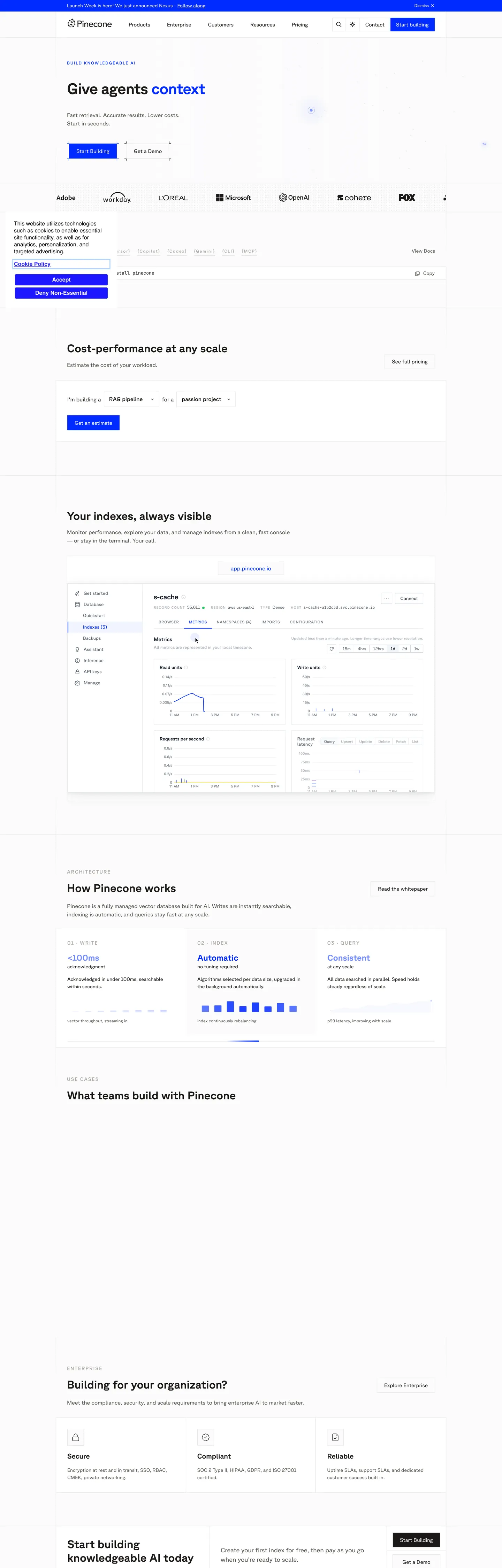
Pinecone's page is the vector database rendered as a technical brochure. The canvas commits to pure white (#ffffff), text lands in a warm near-black (#1c1917) rather than the cool #000000 the page's CSS exposes, and the one chromatic event on the hero is the electric blue primary at #002bff — used inside the inline "context" word of the headline, the filled Start Building button, and the secondary nav CTA. Where most developer-infra brands soften the corner radius to 6px or 8px, Pinecone holds every button at 0px. The square edge is the signature. Sub-brand violet (#3d11a0) and frost-blue (#b3d5ff) sit declared in CSS variables but stay almost entirely off-page on the home surface — reserved for product UI accents and chart strokes.
This page packages the system into a single DESIGN.md file following the Google Labs open spec. Inside: 23 colors tokens (one primary, one primary-dark navy, three sub-brand accents, a five-step warm grey ladder from #e7e5e4 hairline to #1c1917 ink, plus four semantic info / success / warning / error roles), 11 typography styles running GT Planar at weights 400 / 500 / 600 / 700 with a JetBrains Mono companion at 12px and an Apple II Pro terminal accent for the integration bracket row, 4 radius tokens topping at 50% for avatar circles, an 8-step spacing scale anchored at 16px, and 19 components recipes — the square Start Building primary, the outlined Get a Demo, the app-pinecone.io URL pill at the top of the dashboard mockup, the install-pinecone code block, and the architecture three-column card row.
Feed the file to Claude, Cursor, or GitHub Copilot when you want a React surface that reads as Pinecone rather than another shadcn theme. The agent reproduces the specific moves: 0px buttons in #002bff with white text, 44px bold display at -0.88px tracking, warm #1c1917 ink rather than pure black, and a single electric blue voltage that refuses to share the page with a secondary accent. Reference the tokens inside Tailwind config or treat the spec as an audit checklist — every hex is quoted so it pastes cleanly into theme files. The system is worth studying because of what it refuses: no rounded buttons, no atmospheric gradient, no display weight below 700.
What makes it distinct
5
- Square 0px button radiusthe Start Building CTA at #002bff never rounds, where every other developer SaaS pills its buttons
- Single electric voltage#002bff appears 41 times (21 text, 12 bg, 7 border) and is the only chromatic event above the fold
- Bold-700 display tier44px hero at weight 700 with -0.88px tracking, where Stripe and Vercel hold display at 300 / 600
- Apple II Pro terminal font appears oncethe bracketed [Cursor] [Copilot] [Codex] [Gemini] [CLI] [MCP] row signals the agent-integration story typographically
- 509-occurrence #e7e5e4 hairlinethe warmest near-white border in the palette carries every card divider and section split
pinecone.io
Live at pinecone.io
A snapshot of the brand in production. Scroll the frame to see the whole page.
Colors
23 colors
Pinecone's system runs on #002bff as its primary voltage, used in 5 of 19 components. Type is set in GT Planar across 11 tokens from 11px to 44px, weights 400–700. Shape language is sharp — components average 0px corner radius, favoring crisp rectangles.
Brand & Accent
Sparing, CTA-only voltage · 6
Surface
Page and card backgrounds · 2
Text
Headlines, body, captions · 7
Borders & Hairlines
Dividers, outlines, rules · 2
Semantic
Status, errors, success, links · 4
Other
Specialty colors · 2
Typography
11 type tokens
Set in GT Planar across 11 tokens, from 11px to 44px, weights 400–700. Shown in its own stack: where the font isn't installed, the fallback the file names stands in.
- display-hero44px · weight 700 · lh 1.1 · tracking -0.88pxThe quick brown fox jumps over the lazy dog
- display-h232px · weight 700 · lh 1.2 · tracking 0pxThe quick brown fox jumps over the lazy dog
- heading-md20px · weight 600 · lh 1.3 · tracking 0pxThe quick brown fox jumps over the lazy dog
- body-lg16px · weight 400 · lh 1.5 · tracking 0pxThe quick brown fox jumps over the lazy dog
- body-md15px · weight 400 · lh 1.4 · tracking 0pxThe quick brown fox jumps over the lazy dog
- body-sm14px · weight 400 · lh 1.43 · tracking 0pxThe quick brown fox jumps over the lazy dog
- label-eyebrow11px · weight 500 · lh 1.4 · tracking 0.6pxThe quick brown fox jumps over the lazy dog
- label-caps12px · weight 500 · lh 1.5 · tracking 1.8pxThe quick brown fox jumps over the lazy dog
- caption12px · weight 400 · lh 1.4 · tracking 0pxThe quick brown fox jumps over the lazy dog
- code-md12px · weight 400 · lh 1.5 · tracking 0pxThe quick brown fox jumps over the lazy dog
- terminal-bracket13px · weight 400 · lh 1.4 · tracking 0pxThe quick brown fox jumps over the lazy dog
Layout
Radii and spacing
5 corner radii and 8 spacing values. Shape language: sharp.
Radii
- none0px
- sm4px
- md6px
- full9999px
- circle50%
Spacing
- xxs2px
- xs4px
- sm6px
- md8px
- base10px
- lg16px
- xl32px
- xxl64px
Components
19 components
Each rendered from its tokens (color, type, radius, padding) on Pinecone's own canvas.
- Button Primarybutton-primaryButton Primary
- Button Primary Hoverbutton-primary-hoverButton Primary Hover
- Button Secondarybutton-secondaryButton Secondary
- Nav Ctanav-ctaNav Cta
- Top Navtop-navTop Nav
- Nav Linknav-linkNav Link
- Announcement Barannouncement-barAnnouncement Bar
- Eyebrow Labeleyebrow-labelEyebrow Label
- Hero Headinghero-headingHero Heading
- Body Paragraphbody-paragraphBody Paragraph
- Card Sectioncard-sectionCard Section
- Card Architecturecard-architectureCard Architecture
- Url Pillurl-pillUrl Pill
- Type here…text-inputText Input
- Estimator Chipestimator-chipEstimator Chip
- Code Blockcode-blockCode Block
- Integration Bracketintegration-bracketIntegration Bracket
- Logo Orbitlogo-orbitLogo Orbit
- Footer Ctafooter-ctaFooter Cta
In use
The system, in use
Pinecone's tokens on the kind of product it builds.
Build something people actually use.
A short paragraph of marketing copy that previews how the brand's display tier and body tier read together. Two sentences is usually enough.
FAQ
Pinecone design system FAQ
Common questions about Pinecone's tokens, components, and how to use this DESIGN.md in your project.
Read next
Related reading
Specs, directories, and component libraries that pair with this design system.
- Browse all design systemsThe full directory of DESIGN.md files on shadcn.io, with live mockups for each.shadcn.io
- Pinecone — official siteThe managed vector database the system is extracted from.pinecone.io (opens in a new tab)
- The DESIGN.md specificationGoogle Labs' open spec for machine-readable design system files.github.com (opens in a new tab)
Use it
Use Pinecone in your project
One machine-readable file. Drop it into Claude, Cursor, or any AI tool that reads DESIGN.md.
Download the DESIGN.md
One machine-readable file: every color, type, radius, spacing, and component token of Pinecone.
Feed it to your AI tool
Drop it into Claude, Cursor, or GitHub Copilot. The agent writes React components and Tailwind classes that match Pinecone's visual language.
Reference the tokens directly
Or paste the values into your Tailwind config, CSS variables, or component library: every color, size and radius is a quoted, ready-to-copy value.
Read the full DESIGN.md: overview, rationale, do’s and don’ts
Overview
Pinecone's page is the managed vector database rendered as a technical brochure. The canvas commits to {colors.canvas} (pure white #ffffff), text lands in {colors.ink} (#1c1917 — a warm near-black, not the #000000 the CSS also exposes), and the only consistent chromatic event above the fold is the electric blue voltage at {colors.primary} (#002bff) — used inside the inline context word of the headline, the filled Start Building button, the secondary top-nav CTA, and the link color across every CTA-adjacent surface.
Square-edged authority: Where most developer-infra brands soften the corner radius to 6px or 8px (Supabase 6px, Linear 8px, Vercel's nav 6px), Pinecone holds every button at 0px. The Start Building primary, the Get a Demo outlined secondary, the Connect button on the dashboard mockup, the announcement bar at the top of the page — every CTA-shaped surface ships a literal right angle. The square edge is the brand's argument that this is load-bearing infrastructure rather than a friendly product, and it carries through to every card and section split.
Typography runs GT Planar at weight 700 for display and 400 for body, with a JetBrains Mono companion at 12px inside the install snippet and a one-off Apple II Pro bitmap face reserved for the bracketed [Cursor] [Copilot] [Codex] [Gemini] [CLI] [MCP] integration row below the install command. The hero hits 44px / 700 / -0.88px tracking — heavier than Stripe's weight-300 fintech track, heavier than Vercel's weight-600 ceiling, and contrary to the category default of restraining display weight below body. Pinecone leans the opposite way: display is the loudest typographic surface on the page.
The hairline ladder is the structural workhorse. A warm {colors.hairline} (#e7e5e4) appears 509 times across the page — every card divider, section split, table outline, and dashboard chrome edge resolves to this single border token. Cooler #cbd5e1 and #6b7280 exist inside CSS variables but barely surface on the marketing track. Unlike the convention of one cool grey for borders and one warm grey for text, Pinecone aligns warmth across both — the warm-near-black ink at #1c1917 and the warm-near-white hairline at #e7e5e4 share the same temperature.
Colors
- Electric blue (
#002bff) — frequency 41. Used as text (21), background (12), border (7). The single load-bearing voltage on the home surface — Start Building CTA, hero inline "context" word, top-nav CTA, link color. The only chromatic event above the fold. - Hairline warm (
#e7e5e4) — frequency 509, all as border. The dominant structural token in the system; every card, table, and section split renders against this single value. Resolves from--border/--color-border. - Ink warm (
#1c1917) — frequency 74. Used as text (73), background (1). The headline and primary body ink —--color-text-primary/--text-primary. Warm, not cool — the brand picksoklch(0.216 0.006 56.04)over pure black. - Ink cool (
#111827) — frequency 131, all as text. The secondary text grade resolved from Tailwind'sgray-900/slate-900/zinc-900. Used in product UI body copy, table rows, dashboard chrome. - Pure black (
#000000) — frequency 193. Used as text (191), shadow (2). High raw count but mostly inherited from gradient stops and Osano consent-widget defaults; rarely surfaces on the marketing canvas. The brand prefers#1c1917for ink. - Canvas white (
#ffffff) — frequency 96. Used as background (79), text (12), border (4), gradient (1). The dominant surface fill across every section. Resolves from--paper/--color-background/--white. - Ink secondary (
#57534e) — frequency 31, all as text. The secondary body-copy grade. Resolves from--text-secondary/--color-text-secondary. Used for the "Fast retrieval. Accurate results. Lower costs." hero subtitle and section dek copy. - Ink mute (
#4b5563) — frequency 58, all as text. The tertiary body grade —--color-secondary/--color-neutral-600. Used inside dashboard mockup labels and table column headers. - Ink tertiary (
#a8a29e) — frequency 49. Used as text (43), border (6). The faint-text grade for axis labels, watermark logo strokes, and the "01 · WRITE" / "02 · INDEX" / "03 · QUERY" section step markers. - Hairline cool (
#cbd5e1) — frequency 9, all as border. The cooler divider grade —--color-divider/--color-zinc-300— surfaces inside the cost estimator widget and certain product UI chrome but stays scoped, not page-wide. - Surface (
#f1f5f9) — frequency 2, all as background. The faint band fill for alternating section backgrounds. Resolves from--surface/--color-surface. Reserved for section-band differentiation; never used for cards. - Primary dark (
#222160) — declared in--color-primary-dark/--primary-dark. The deep navy companion to the electric blue; sits inside CSS but stays off the home page surface. Reserved for product UI accent. - Brand violet (
#3d11a0) — declared in--color-brand-violet/--brand-violet. The sub-brand voltage — does not appear on the home canvas but exists for chart strokes and product-feature illustrations. - Brand frost-blue (
#b3d5ff) — declared in--brand-frost-blue/--color-brand-frost-blue. The pale companion for chart fills and ambient background tints inside product UI. - Brand cyan (
#8bf6ff) — frequency 2, all as background. A pale cyan accent —--color-cyan-200/--color-alpha6. Appears as a faint chart fill and decorative dot inside the dashboard mockup. - Navy (
#1a194c) — declared in--color-navy/--color-navy2. A near-indigo deep tone reserved for overlay scrims and inverted-band backgrounds; not present on the home surface. - Overlay (
#2b3244) — declared in--overlay/--color-overlay. The modal-and-drawer scrim tone — desaturated dark slate, used at low opacity. - Success (
#15b077) — declared in--color-success/--success. The semantic positive — index-ready states, healthy uptime indicators inside product UI. - Warning (
#dd815d) — declared in--color-warning/--warning. The semantic caution — burnt-orange, never bright amber. Reserved for usage thresholds inside dashboards. - Error (
#e31957) — declared in--color-error/--error. The semantic negative — magenta-red rather than pure red, picks up the brand's preference for off-axis hues. - Accent yellow (
#f4e04d) — frequency 1, as background. A single decorative yellow chip inside the dashboard mockup's chart legend; absent from every other surface.
Typography
The system runs GT Planar (a Grilli Type geometric sans) across every text surface, declared in --default-font-family. Weights observed on the page: 400 (body, nav, paragraph), 500 (eyebrow labels, ALL-CAPS section markers), 600 (subhead emphasis), 700 (hero, h2, h3). Display tier hits 44px / 700 / -0.88px tracking — the brand picks weight rather than size to carry voice. There is no italic on the page, and no display weight below 600.
JetBrains Mono at 12px is the technical companion, declared in --font-mono / --font-jetbrains-mono. It appears once on the home surface — inside the npm install pinecone code block — and again across product UI chrome for IDs, region strings, and namespace labels.
Apple II Pro is the one-off bitmap accent, declared in --font-apple-ii-pro / --font-apple-ii. It appears exactly once on the home page: the bracketed [Cursor] [Copilot] [Codex] [Gemini] [CLI] [MCP] row below the install snippet. The font signals the agent-integration story typographically — pinecone is a database you call from your editor's chat panel, and the bitmap face carries that argument without an illustration.
Eyebrow labels above section headlines (BUILD KNOWLEDGEABLE AI, ARCHITECTURE, USE CASES, ENTERPRISE) ship at 11px / 500 / 0.6px tracking, ALL-CAPS, set in the electric blue {colors.primary}. They are the most idiosyncratic typographic move on the page — single-line, mid-tracking, blue ink, no icon — and they thread the system together visually.
Layout
The page operates on a 1280px max-width container with 32px horizontal padding (the dominant 0px 32px spacing value). Section rhythm is anchored at 64px vertical gaps between major bands; card grids sit at 16px internal spacing. The top nav holds at 73px tall, content sections sit at 64px–100px vertical padding. The cost-estimator widget runs a single horizontal row of dropdown chips at 4px / 6px internal padding — the most compressed UI density on the entire page.
The hero composition follows a left-aligned column rather than centered — eyebrow + h1 + paragraph + CTA pair all stacked against the left edge, with a faint decorative arc floating in the right margin. Below the hero, a logo orbit row (Adobe, Workday, L'Oréal, Microsoft, OpenAI, Cohere, Fox) sits at 50% radius circle frames. The architecture three-card row (01 · WRITE, 02 · INDEX, 03 · QUERY) is the single horizontal triplet pattern; everything else is 1-column or 2-column.
Elevation & Depth
Pinecone refuses traditional shadows. The system documents --shadow-2xs through --shadow-2xl inside CSS variables but the home surface barely uses them — the dashboard mockup, the cost estimator widget, and the architecture cards all sit on a 1px hairline ring at {colors.hairline} (#e7e5e4) rather than a drop shadow. Hairline-as-elevation: depth is signaled by a single warm border, not by atmospheric blur.
The one exception is the dashboard mockup's URL pill at the top (app.pinecone.io) — it ships with a hint of soft surface lift via --shadow-xs (0 1px 2px 0 over black at 5% alpha), barely perceptible but enough to detach the pill from the chrome below it.
Shapes
The radius story is binary: 0px or circular. Every button, card, code block, section panel, and input ships at 0px. The avatars in the logo orbit, the chart legend dots, and the decorative arcs in the hero ship at 50% (circle). The system declares --radius-md at .375rem (6px) and --radius-lg at .5rem (8px) inside CSS variables, but the home page does not use them — they exist for product UI chrome (table cell rounding, certain dropdown chips). The cost estimator widget's "RAG pipeline" / "passion project" select chips hold a 4px radius, the only mid-radius surface on the home page.
Components
button-primary—{colors.primary}background, white ink,0pxradius,8px 16pxpadding, height39px. The Start Building CTA.button-primary-hover— shifts to#302bff, a slightly desaturated electric blue from the Osano consent contrast tokens.button-secondary— white canvas, ink text,0pxradius,{colors.hairline}border. The Get a Demo button.nav-cta— top-right Start Building button in the nav bar, smaller36pxheight.top-nav—73pxtall, white canvas,0px 32pxhorizontal padding, ink-cool text.nav-link— text-only nav items (Products, Enterprise, Customers, Resources, Pricing).announcement-bar— full-width electric blue band at the top of the page carrying the launch broadcast.eyebrow-label—11px / 500 / 0.6pxALL-CAPS in electric blue above every section heading.hero-heading—44px / 700 / -0.88px, warm ink. Inlinecontextword rendered in{colors.primary}.body-paragraph—16px / 400 / 24pxline-height, secondary ink.card-section— square white panel with hairline border, used for the cost estimator and the dashboard frame.card-architecture— the three-up01 · WRITE/02 · INDEX/03 · QUERYpanels.url-pill— theapp.pinecone.iochip at the top of the dashboard mockup; the one pill-radius surface on the page.text-input—46pxtall,10px 16pxpadding, faint#fbfbfcfill, hairline border.estimator-chip— theRAG pipeline/passion projectdropdowns inside the cost widget; the only4pxradius on the home page.code-block— thenpm install pineconesnippet, JetBrains Mono on white with a hairline border, copy button right-aligned.integration-bracket— the[Cursor]/[Copilot]/[Codex]/[Gemini]/[CLI]/[MCP]row in Apple II Pro.logo-orbit— the customer-logo carousel below the hero, circular frames at50%radius.footer-cta— inverted ink-on-white footer "Start Building" CTA at the bottom of the page.
Do's and Don'ts
Do keep every CTA at 0px radius — including small in-row buttons. The brand's authority comes from the right angle, and softening even one button to 6px breaks the system.
Do use {colors.hairline} (#e7e5e4) for every divider, card border, and section split. Cooler #cbd5e1 exists in the CSS but the marketing track aligns warmth across both ink and hairlines.
Do reserve Apple II Pro for the integration bracket row only — one occurrence per page. The bitmap font is a signal, not a body face.
Don't use #000000 for text — the page declares it but resolves headline ink to #1c1917 (warm near-black). Pure black appears 193 times in the CSS but the marketing canvas leans warm. For copy, alias --color-text-primary to #1c1917.
Don't pill the primary button. Every other developer-infra brand softens to 6–8px; Pinecone's 0px is the differentiator. A pilled Start Building looks like a competitor's button instantly.
Don't introduce a secondary chromatic accent on the home surface. The CSS declares brand-violet #3d11a0 and brand-frost-blue #b3d5ff but they stay off the marketing canvas — using either alongside the electric #002bff would dilute the single-voltage principle.
Don't drop a heavy shadow under cards — the system signals elevation via the #e7e5e4 hairline ring, not via blur. A shadow-md on the architecture cards reads as foreign material.
Don't lower display weight below 600. The brand's voice is carried by weight-700 at 44px against thin 400 body — flattening display to 500 (the Supabase / Linear convention) collapses the contrast that makes the page feel engineered.
Known Gaps
- Dark-mode marketing variant — the page declares
data-theme="light"and--theme: "light"; no dark marketing surfaces were captured. The product app may default differently. - Focus rings — the system documents
--osano-focus-outline-color: Highlight(browser default) but no custom focus ring on form inputs or buttons surfaces in the captured CSS. - Hover state colors beyond
#302bff— pressed and hover lifts on cards, nav links, and the architecture panels were not consistently observable. - Empty / loading / skeleton screens — the captured dashboard mockup is fully populated; loading states are not represented.
- Toast and inline-alert system — semantic info / success / warning / error tokens exist (
#15b077,#dd815d,#e31957) but no alert or toast component is rendered on the marketing track. - In-product dashboard chrome — table header densities, namespace selector chips, the SQL-style query editor — these live inside the product app and weren't captured on the public marketing surface beyond the floating screenshot.
- Motion — the page runs
marqueeandmarquee-reversekeyframes at 60s linear infinite for the logo orbit, but easing for hover transitions on buttons and cards is not documented in the captured CSS.
Backend, Database & DevOps
More systems like this
More DESIGN.md files in Backend, Database & DevOps.
Pricing
Build it with Pro
The DESIGN.md files are free. Pro adds 6,000+ blocks, premium templates and the MCP server, so your AI editor builds in your system for you.
4.9/5 out of 5 · 150+ reviewsfrom 150+ founders and developers.
Billing
Billed once a year in USD. Cancel anytime.
- How many people can use the license.
- Client work, SaaS products and anything you charge for.
- Production-ready React sections: hero, pricing, features, dashboards and more.
- Complete multi-page sites you can ship as they are.
- React icons from every major library, installable with one command.
- Presets that restyle every block, in light and dark.
- Lets your AI editor search, preview and install blocks for you.
- Priority requests are answered first.
Individual
For personal projects & open source
$32instead of $49/mo
$389 billed yearly
- Seats: 1 seat
- Commercial use: Personal & open source only
- Pro blocks: 6,000+ blocks
- Templates: All 14 templates
- React icons: 294k+ icons
- Themes: All 59 themes
- MCP server: Basic usage
- Support: Standard
Team
Most popularFor freelancers, agencies & startups
$66instead of $99/mo
$789 billed yearly · ≈ $13/dev/mo
- Seats: Up to 5 seats
- Commercial use: Included
- Pro blocks: 6,000+ blocks
- Templates: All 14 templates
- React icons: 294k+ icons
- Themes: All 59 themes
- MCP server: High usage
- Support: Priority
Organization
For companies with larger teams
$132instead of $199/mo
$1,589 billed yearly
- Seats: Unlimited seats
- Commercial use: Included
- Pro blocks: 6,000+ blocks
- Templates: All 14 templates
- React icons: 294k+ icons
- Themes: All 59 themes
- MCP server: Unlimited usage
- Support: Priority
Billed once a year in USD. Cancel anytime.
Individual
For personal projects & open source
$32instead of $49/mo
$389 billed yearly
- How many people can use the license.Seats: 1 seat
- Client work, SaaS products and anything you charge for.Commercial use: Personal & open source only
- Production-ready React sections: hero, pricing, features, dashboards and more.Pro blocks: 6,000+ blocks
- Complete multi-page sites you can ship as they are.Templates: All 14 templates
- React icons from every major library, installable with one command.React icons: 294k+ icons
- Presets that restyle every block, in light and dark.Themes: All 59 themes
- Lets your AI editor search, preview and install blocks for you.MCP server: Basic usage
- Priority requests are answered first.Support: Standard
Team
Most popularFor freelancers, agencies & startups
$66instead of $99/mo
$789 billed yearly · ≈ $13/dev/mo
Everything in Individual, plus
- How many people can use the license.Seats: Up to 5 seats
- Client work, SaaS products and anything you charge for.Commercial use: Included
- Lets your AI editor search, preview and install blocks for you.MCP server: High usage
- Priority requests are answered first.Support: Priority
Organization
For companies with larger teams
$132instead of $199/mo
$1,589 billed yearly
Everything in Team, plus
- How many people can use the license.Seats: Unlimited seats
- Lets your AI editor search, preview and install blocks for you.MCP server: Unlimited usage
- Secure checkout via Stripe
- Code lives in your repo
- Keep what you've shipped if you cancel
- License terms
Your system, built for you
Every block, template and icon, installed by your AI agent in your design system. The DESIGN.md files stay free.