Phantom Design System
Phantom's marketing system pairs a near-black abstract-ribbon hero with a lavender-white below-fold surface. Single proprietary Phantom Sans typeface, periwinkle CTA pill, 11 colors, 14 components for React and Next.js.
Add shadcn.io to your AI agent. · Pro It installs blocks, icons and templates in your design system from a prompt, with Pro.
Set up MCP- Primary
- #ab9ff2
- Typeface
- Phantom
- Shape
- Soft
- Base radius
- 24px
- Colors
- 11
- Type tokens
- 10
- Components
- 14
- Spacing values
- 8
About
About Phantom DESIGN.md
Curated by Dov Azencot · Updated May 19, 2026 · Source phantom.app (opens in a new tab)
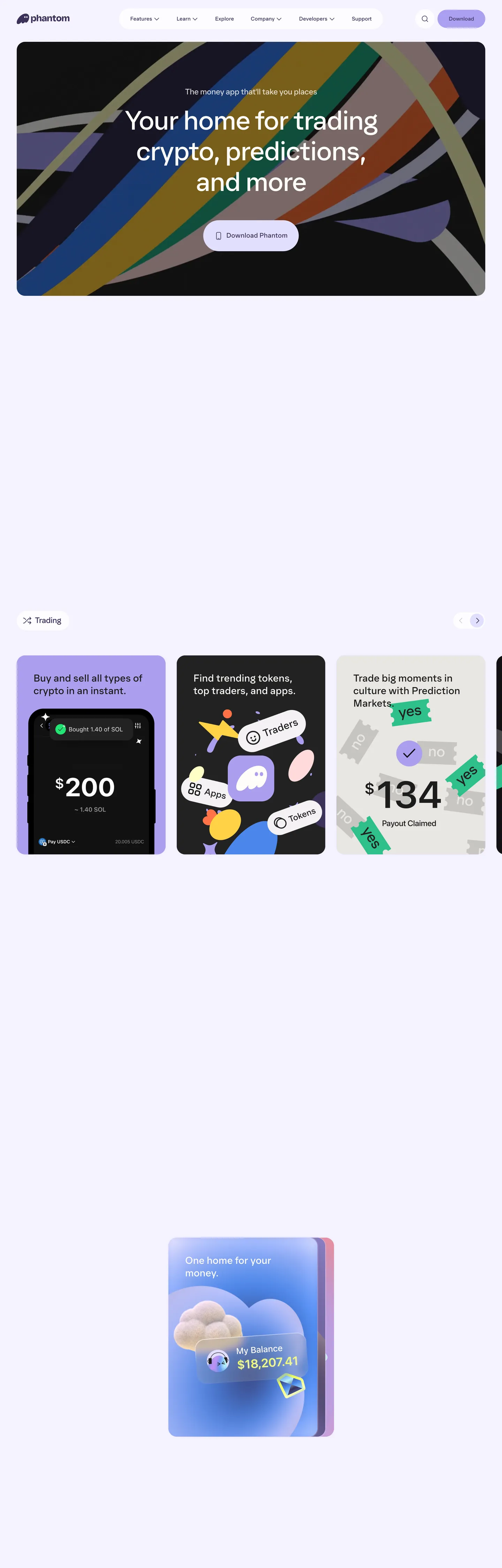
Phantom's homepage opens with something most crypto wallets avoid: genuine visual risk. A full-bleed near-black canvas carries diagonal abstract ribbons — warm gold, deep teal, burnt rust, muted violet — sweeping across the frame at competing angles. The effect reads less like a marketing section and more like a canvas dropped from a generative art tool. The wordmark sits in the top-left in white; the nav links in deep violet; and the only CTA on the canvas is a softly-rounded pill in periwinkle lavender with matching ink. Then, on scroll, the page lands on a near-white lavender surface — tinted just enough to feel distinct from the plain white that most wallets default to. Where Coinbase commits to plain blue-on-white and MetaMask leans on orange-on-dark, Phantom chooses a tertiary hue and applies it to the canvas itself.
The DESIGN.md file packages the system for React and AI tools. Inside: 11 colors tokens, the dominant one being a dark violet-purple used 530 times across text and borders; a soft periwinkle lavender for the CTA pill and card shadow; a warm near-white for body surfaces; and a near-black for the hero. Typography is a single proprietary family — Phantom — running at weight 400 across every tier from 96px display down to 15px label, with no weight variation. The radius scale is generous-soft starting at 24px for cards, reaching 100px for pill buttons, with full-circle avatars at 50%. Spacing centers on a 16px base with section pads at 48px.
Feed this spec to an AI tool and it reproduces Phantom's two signature moves: the abstract ribbon hero (achieved through diagonal gradient or SVG strips in the brand palette, not photography) and the lavender-washed below-fold canvas. The one thing worth borrowing selectively is the single-weight type discipline — Phantom Sans at 400 creates a calm, approachable register that contrasts sharply with the aggressive DeFi aesthetic competitors favor. Most apps need at least one weight bump; Phantom proves it can work without one.
What makes it distinct
5
- Abstract ribbon herodiagonal strokes in gold, teal, rust, and violet over a near-black canvas replace any traditional photography or illustration
- Lavender canvas washthe below-fold surface is a warm periwinkle near-white, not standard off-white; every card and section sits on this tinted floor
- Single-weight typographyPhantom Sans runs at weight 400 through display (96px) down to label (15px); there is no bold or heavy tier
- Inverted CTA pillthe primary button fills with soft periwinkle lavender and renders ink text in deep violet, reversing the light-text-on-dark convention
- Generous-rounded cards24px and 32px radius dominate; the scale skips any sub-16px tier
phantom.app
Live at phantom.app
A snapshot of the brand in production. Scroll the frame to see the whole page.
Colors
11 colors
Phantom's system runs on #ab9ff2 as its primary voltage, used in 2 of 14 components. Type is set in Phantom across 10 tokens from 15px to 96px, weights 350–400. Shape language is soft — components average 39px corner radius, with no sharp interactive edges.
Brand & Accent
Sparing, CTA-only voltage · 4
Surface
Page and card backgrounds · 3
Text
Headlines, body, captions · 2
Borders & Hairlines
Dividers, outlines, rules · 1
Other
Specialty colors · 1
Typography
10 type tokens
Set in Phantom across 10 tokens, from 15px to 96px, weights 350–400. Shown in its own stack: where the font isn't installed, the fallback the file names stands in.
- display-xl96px · weight 400 · lh 105.6px · tracking -2.4pxThe quick brown fox jumps over the lazy dog
- display-lg80px · weight 400 · lh 88px · tracking -2pxThe quick brown fox jumps over the lazy dog
- heading-md30px · weight 400 · lh 36pxThe quick brown fox jumps over the lazy dog
- heading-sm24px · weight 400 · lh 32.4px · tracking -0.6pxThe quick brown fox jumps over the lazy dog
- body-lg20px · weight 350 · lh 28pxThe quick brown fox jumps over the lazy dog
- body-md16px · weight 400 · lh 20pxThe quick brown fox jumps over the lazy dog
- body-sm15px · weight 400 · lh 18.15pxThe quick brown fox jumps over the lazy dog
- button-md16px · weight 400 · lh 20pxThe quick brown fox jumps over the lazy dog
- nav-link16px · weight 400 · lh 20pxThe quick brown fox jumps over the lazy dog
- label-sm15px · weight 400 · lh 18.15pxThe quick brown fox jumps over the lazy dog
Layout
Radii and spacing
7 corner radii and 8 spacing values. Shape language: soft.
Radii
- none0px
- sm16px
- md24px
- lg32px
- xl96px
- pill100px
- full50%
Spacing
- xs4px
- sm8px
- md12px
- base16px
- lg24px
- xl32px
- 2xl48px
- section96px
Components
14 components
Each rendered from its tokens (color, type, radius, padding) on Phantom's own canvas.
- Button Primarybutton-primaryButton Primary
- Button Secondarybutton-secondaryButton Secondary
- Top Navtop-navTop Nav
- Nav Linknav-linkNav Link
- Hero Sectionhero-sectionHero Section
- Hero Headinghero-headingHero Heading
- Section Headingsection-headingSection Heading
- Body Paragraphbody-paragraphBody Paragraph
- Body Paragraph Mutedbody-paragraph-mutedBody Paragraph Muted
- CardcardCard
- Card Darkcard-darkCard Dark
- Card Lavendercard-lavenderCard Lavender
- Type here…text-inputText Input
- FooterfooterFooter
In use
The system, in use
Phantom's tokens on the kind of product it builds.
Build something people actually use.
A short paragraph of marketing copy that previews how the brand's display tier and body tier read together. Two sentences is usually enough.
FAQ
Phantom design system FAQ
Common questions about Phantom's tokens, components, and how to use this DESIGN.md in your project.
Read next
Related reading
Specs, directories, and component libraries that pair with this design system.
- Browse all design systemsThe full directory of DESIGN.md files on shadcn.io, with live mockups for each.shadcn.io
- Phantom — official sitePhantom's public marketing site — the source of truth for the live tokens captured in this file.phantom.app (opens in a new tab)
- The DESIGN.md specificationGoogle Labs' open spec for machine-readable design system files — the format this page is built on.github.com (opens in a new tab)
Use it
Use Phantom in your project
One machine-readable file. Drop it into Claude, Cursor, or any AI tool that reads DESIGN.md.
Download the DESIGN.md
One machine-readable file: every color, type, radius, spacing, and component token of Phantom.
Feed it to your AI tool
Drop it into Claude, Cursor, or GitHub Copilot. The agent writes React components and Tailwind classes that match Phantom's visual language.
Reference the tokens directly
Or paste the values into your Tailwind config, CSS variables, or component library: every color, size and radius is a quoted, ready-to-copy value.
Read the full DESIGN.md: overview, rationale, do’s and don’ts
Overview
Phantom's marketing site makes a move almost no other crypto wallet attempts. Abstract Art as Brand Identity. The above-fold hero is a near-black canvas overlaid with diagonal abstract ribbons — warm gold, teal, rust, violet, and gray-lavender strips colliding at competing angles — a visual that reads more like generative art than a financial product. Where Coinbase commits to an orderly cobalt-on-white grid and MetaMask leans on orange-on-dark with product screenshots, Phantom puts illustrative abstraction at the center and keeps the product (a phone mockup) below the fold.
The below-fold surface drops to a lavender-washed near-white — tinted with the same violet family as the deep ink color, creating a tonal bridge between the dark hero and the body sections. The primary CTA is a periwinkle lavender pill with deep-violet text, inverting the typical convention of a dark button with light text. This inversion is consistent: across the marketing surface, lightness is the accent, darkness is the ink.
Typography is a single proprietary family — Phantom — running at weight 400 across every tier from 96px display to 15px label. The radius scale starts at 24px for cards; there is no tight sub-16px tier. The ghost mascot appears in the app product UI shown in feature cards, not as a hero decoration — the brand character is kept inside the product surface.
Key Characteristics:
- Near-black hero canvas with diagonal abstract ribbon illustration; no photography, no device mockup above the fold.
- Lavender-washed body surface (#fffdf8 — a near-white with violet undertone) rather than plain white for every below-fold section.
- Single brand voltage: periwinkle lavender (#ab9ff2) used as the CTA fill and card highlight shadow — 19 total occurrences in the extraction.
- Deep violet-purple ink (#3c315b) — frequency 530 — carries text and borders across the entire system.
- Phantom Sans at weight 400 across all tiers; the only variation is a single 350-weight for a sub-label tier. No bold or heavy.
- Generous radius scale: 24px on cards, 32px on feature tiles, 100px on pill CTAs, full circles on avatars.
- Feature cards below the fold use lavender, dark, and neutral fills — three visual registers within a consistent palette.
- Ghost mascot appears only inside product UI screenshots, never as a decorative hero element.
Colors
Brand
- Primary Lavender (
{colors.primary}— #ab9ff2): frequency 2. Used as background — the primary CTA button fill and a card accent highlight. The single chromatic brand moment in the system; a soft periwinkle lavender that reads warm and approachable rather than electric. - Shadow Lavender (
{colors.shadow-lavender}— #e2dffe): frequency 19. Used as background (7) and shadow (12). The card shadow tint and secondary highlight fill — a paler version of the primary lavender that reads almost white in most contexts. Wired as --eofi4sg and --eofi4sa.
Canvas & Surfaces
- Canvas (
{colors.canvas}— #1c1c1c): frequency 63. Used as text (30), background (3), border (30). The hero floor and dark-card surface — a near-black with no blue undertone, closer to charcoal than the true black Spline uses. - Surface-1 (
{colors.surface-1}— #fffdf8): frequency 90. Used as text (40), background (10), border (40). The below-fold canvas — a warm near-white with a faint violet undertone. The entire body of the page rests on this tinted floor. - Surface-2 (
{colors.surface-2}— #f4f2f4): frequency 3. Used as background only. A slightly cooler near-white for secondary surface contexts (e.g., input fields, chip backgrounds).
Text
- Ink (
{colors.ink}— #3c315b): frequency 530. Used as text (264) and border (264). The dominant text and border color across the entire system — a deep violet-purple rather than pure black, wired across ten CSS variables. Gives white-surface content a violet warmth. - Ink Muted (
{colors.ink-muted}— #86848d): frequency 8. Used as text (4) and border (4). Secondary and tertiary labels — a medium violet-gray.
Hairline
- Hairline (
{colors.hairline}— #e9e8ea): frequency 2. A light gray-violet for dividers and card borders on light surfaces.
Accent (illustrative palette)
- Accent Blue (
{colors.accent-blue}— #6ca0fb): frequency 1. Appears in the abstract ribbon illustration on the hero canvas — not a brand chrome color. - Accent Yellow (
{colors.accent-yellow}— #ffffc4): frequency 1. Ribbon illustration element — warm yellow strip on the hero. - Accent Pink (
{colors.accent-pink}— #ffdadc): frequency 1. Ribbon illustration element — blush-pink strip on the hero.
Typography
Font Family
The system runs Phantom — a proprietary custom sans-serif — across every tier. There is no second family, no mono voice, no serif counterpoint. Fallbacks walk to system-ui, -apple-system, sans-serif. The defining characteristic is weight uniformity: every tier from 96px display to 15px label runs at weight 400, with a single 350-weight exception for a 20px sub-label tier.
Hierarchy
| Token | Size | Weight | Line Height | Letter Spacing | Use |
|---|---|---|---|---|---|
{typography.display-xl} | 96px | 400 | 105.6px | -2.4px | Hero h2 ("Trading tools for everyone") |
{typography.display-lg} | 80px | 400 | 88px | -2px | Large number displays in feature cards |
{typography.heading-md} | 30px | 400 | 36px | 0 | Section paragraph leads |
{typography.heading-sm} | 24px | 400 | 32.4px | -0.6px | Section h2/h3 headings |
{typography.body-lg} | 20px | 350 | 28px | 0 | Sub-heading / lead body |
{typography.body-md} | 16px | 400 | 20px | 0 | Default body text |
{typography.body-sm} | 15px | 400 | 18.15px | 0 | Labels, captions, small UI text |
{typography.button-md} | 16px | 400 | 20px | 0 | CTA button label |
{typography.nav-link} | 16px | 400 | 20px | 0 | Top-nav link labels |
{typography.label-sm} | 15px | 400 | 18.15px | 0 | Chip labels, tag text |
Principles
Weight 400 through the entire scale is the discipline. The 96px display h2 at weight 400 with -2.4px tracking delivers authority through size and tracking, not through bold weight. This is the opposite of the typical fintech approach (Stripe, Revolut) that leans on weight 600–700 for hierarchy. The single 350-weight concession at 20px reads as the system's "medium" emphasis — barely perceptible but present.
Note on Font Substitutes
Phantom is proprietary. Plus Jakarta Sans at weight 400 is the closest open-source substitute for display sizes — it shares the rounded terminals and warm proportions of Phantom. Inter at weight 400 transfers cleanly for body sizes. Preserve the single-weight discipline: introducing weight 600 or 700 breaks the calm register the system depends on.
Layout
Spacing System
- Base unit: 4px (8px as the dominant padding module).
- Tokens:
{spacing.xs}4px ·{spacing.sm}8px ·{spacing.md}12px ·{spacing.base}16px ·{spacing.lg}24px ·{spacing.xl}32px ·{spacing.2xl}48px ·{spacing.section}96px. - Hero padding: 48px top and sides; the abstract ribbon fills edge-to-edge.
- Card internal padding:
{spacing.lg}(24px) on all feature cards. - Section padding (vertical): 96px at the top of major sections, 48px at the bottom.
Grid & Container
- Max content width: ~1080px on text-heavy sections; the hero ribbon fills full browser width.
- Hero: full-bleed near-black canvas with the ribbon illustration behind the centered headline + CTA stack.
- Feature section: 3-column horizontal card carousel below the fold — lavender, dark, and neutral fills per card.
- App mockup section: centered single phone/card mockup at ~400px wide on the lavender surface.
Rhythm
The page alternates between the full-bleed dark hero and light lavender editorial sections. Below the fold each section rests on the same warm near-white surface — no alternating backgrounds, no color band changes. Depth comes from the card fills (lavender, dark, neutral) rather than from section-background shifts.
Elevation
The system uses shadow-lavender tinting rather than neutral-gray drop shadows.
- Flat (no shadow): hero, nav, footer, editorial text sections.
- Tinted card shadow:
{colors.shadow-lavender}(#e2dffe) appears 12 times as shadow ink — the card lift effect uses a lavender-tinted shadow rather than black-alpha, which keeps the shadow within the brand palette. - Surface contrast: dark cards (#1c1c1c) on the lavender surface read as elevated by color contrast alone; no shadow needed.
Shapes
The radius scale is generous-soft, starting at 16px and skipping any tight tier:
{rounded.none}0px — used for the hero section wrapper and text blocks.{rounded.sm}16px — a single captured instance; used for minor UI elements.{rounded.md}24px (14 instances) — the default card radius; the dominant rounded shape on the page.{rounded.lg}32px (12 instances) — larger feature tiles and the hero section card wrapper.{rounded.xl}96px (2 instances) — the largest card radius on the hero-section inner container.{rounded.pill}100px (7 instances) — pill buttons (CTA "Download" and secondary actions).{rounded.full}50% (6 instances) — avatar circles, icon chips, the ghost mascot badge.
There is no 4px or 8px tier. The system is deliberately soft — even the smallest UI surfaces start at 24px.
Components
button-primary — The signature CTA. Soft periwinkle lavender {colors.primary} fill, deep-violet {colors.ink} text, 100px pill radius, 16×32 padding, 52px height. "Download" is the canonical hero instance — the only chromatic accent on the dark canvas.
button-secondary — Transparent fill, {colors.ink} text, 1px border in ink, pill radius. Used for secondary actions like "Explore" in the nav.
top-nav — Warm near-white {colors.surface-1} surface, deep-violet {colors.ink} text, 56px height, no bottom border. Phantom wordmark flush left in the deep violet; nav links (Features, Learn, Explore, Company, Developers, Support) centered; Download CTA pill right-aligned.
nav-link — Transparent background, {colors.ink} text at {typography.nav-link} (16px / 400), 12×24 padding with dropdown indicator.
hero-section — Near-black {colors.canvas} fill, 48px padding, {rounded.md} 24px radius on the inner container. The abstract ribbon illustration fills edge-to-edge behind the centered headline + sub-label + CTA stack.
hero-heading — White {colors.surface-1} text, Phantom 96px / 400, -2.4px tracking. The hero h2 centers over the ribbon art.
section-heading — Deep-violet {colors.ink} text at {typography.heading-md} (30px / 400) on the lavender surface.
body-paragraph — Default {colors.ink} text at {typography.body-md} (16px / 400).
body-paragraph-muted — Muted {colors.ink-muted} text at {typography.body-sm} for secondary captions.
card — Warm near-white {colors.surface-1} fill, {colors.ink} text, {rounded.md} 24px radius, 24px padding, lavender shadow tint via {colors.shadow-lavender}.
card-dark — Near-black {colors.canvas} fill, white text, {rounded.md} 24px radius, 24px padding. Used in the feature carousel for the dark-tone card variant.
card-lavender — Periwinkle {colors.primary} fill, {colors.ink} text, {rounded.md} 24px radius. Used in the feature carousel for the lavender-tone card variant.
text-input — {colors.surface-2} fill, {colors.ink} text, {rounded.sm} 16px radius, 12×20 padding, 44px height. No visible border in the resting state.
footer — Warm near-white {colors.surface-1} surface, muted {colors.ink-muted} text at {typography.body-sm}, 48×24 padding. Continues the lavender-washed body floor.
Do's and Don'ts
Do treat the abstract ribbon hero as an illustration layer, not a CSS gradient. The ribbons cross at competing angles and have textured edges — they are rendered art, not geometric shapes. Approximate with SVG paths or an image asset; a CSS linear-gradient will look flat by comparison.
Do use {colors.surface-1} (#fffdf8) — not pure white — for the below-fold canvas. The violet undertone links the body to the deep-violet ink color and to the hero's lavender accent. Pure white severs that connection.
Do keep Phantom Sans (or its substitute) at weight 400 across all tiers. The calm authority of a 96px headline at weight 400 depends on the entire scale holding the same weight — introducing a 700-weight h1 collapses the system's defining register.
Do apply the {colors.shadow-lavender} (#e2dffe) shadow tint to card hover states. The lavender shadow keeps elevation within the brand palette instead of defaulting to neutral black-alpha.
Don't use {colors.primary} (#ab9ff2) for text or background fills outside the CTA button and card highlight contexts. It appears only 2 times on the marketing surface; multiplying it into section fills destroys the single-voltage discipline.
Don't introduce any radius below 16px. The system's softness starts at {rounded.sm} (16px) — the minimum. Bringing in 4px or 8px rounding reads like a different product's design language.
Don't use the illustrative ribbon palette (accent blue, accent yellow, accent pink) outside the hero illustration context. Those hues belong to the abstract art layer, not to the brand chrome.
Don't place the ghost mascot as a decorative header element. Phantom keeps the mascot inside product UI screenshots — it is a product character, not a brand wallpaper. Using it as a hero illustration over-explains the brand.
Known Gaps
- Hover and active states: no hover or press variants captured from the marketing surface; only the resting
{component.button-primary}state is documented. - Dark-mode body: the system has a near-black hero canvas, but the body sections are light-only. Whether a dark-mode body variant exists on other pages is not represented here.
- Motion: the hero ribbon appears to be an animated or parallax illustration in the live page; the spec captures static end-state values only. Easing curves and animation timing are not represented.
- Ghost mascot specifications: the mascot appears in product screenshots but its construction (SVG, illustration style, proportions) is outside the scope of the marketing surface extraction.
- Mobile breakpoints: the captured surface is desktop-width. The feature card carousel likely collapses to a single-column scroll on mobile; no responsive tokens are captured.
- Form states:
{component.text-input}carries the resting state only; focus ring, error, and disabled states are not documented from the marketing surface. - Subscription or tier accents: the extraction shows accent blue (#6ca0fb) and accent colors appearing once each — their role (illustrative? tier-specific?) is unclear from the marketing-only capture.
Fintech & Crypto
More systems like this
More DESIGN.md files in Fintech & Crypto.
Pricing
Build it with Pro
The DESIGN.md files are free. Pro adds 6,000+ blocks, premium templates and the MCP server, so your AI editor builds in your system for you.
4.9/5 out of 5 · 150+ reviewsfrom 150+ founders and developers.
Billing
Billed once a year in USD. Cancel anytime.
- How many people can use the license.
- Client work, SaaS products and anything you charge for.
- Production-ready React sections: hero, pricing, features, dashboards and more.
- Complete multi-page sites you can ship as they are.
- React icons from every major library, installable with one command.
- Presets that restyle every block, in light and dark.
- Lets your AI editor search, preview and install blocks for you.
- Priority requests are answered first.
Individual
For personal projects & open source
$32instead of $49/mo
$389 billed yearly
- Seats: 1 seat
- Commercial use: Personal & open source only
- Pro blocks: 6,000+ blocks
- Templates: All 14 templates
- React icons: 294k+ icons
- Themes: All 59 themes
- MCP server: Basic usage
- Support: Standard
Team
Most popularFor freelancers, agencies & startups
$66instead of $99/mo
$789 billed yearly · ≈ $13/dev/mo
- Seats: Up to 5 seats
- Commercial use: Included
- Pro blocks: 6,000+ blocks
- Templates: All 14 templates
- React icons: 294k+ icons
- Themes: All 59 themes
- MCP server: High usage
- Support: Priority
Organization
For companies with larger teams
$132instead of $199/mo
$1,589 billed yearly
- Seats: Unlimited seats
- Commercial use: Included
- Pro blocks: 6,000+ blocks
- Templates: All 14 templates
- React icons: 294k+ icons
- Themes: All 59 themes
- MCP server: Unlimited usage
- Support: Priority
Billed once a year in USD. Cancel anytime.
Individual
For personal projects & open source
$32instead of $49/mo
$389 billed yearly
- How many people can use the license.Seats: 1 seat
- Client work, SaaS products and anything you charge for.Commercial use: Personal & open source only
- Production-ready React sections: hero, pricing, features, dashboards and more.Pro blocks: 6,000+ blocks
- Complete multi-page sites you can ship as they are.Templates: All 14 templates
- React icons from every major library, installable with one command.React icons: 294k+ icons
- Presets that restyle every block, in light and dark.Themes: All 59 themes
- Lets your AI editor search, preview and install blocks for you.MCP server: Basic usage
- Priority requests are answered first.Support: Standard
Team
Most popularFor freelancers, agencies & startups
$66instead of $99/mo
$789 billed yearly · ≈ $13/dev/mo
Everything in Individual, plus
- How many people can use the license.Seats: Up to 5 seats
- Client work, SaaS products and anything you charge for.Commercial use: Included
- Lets your AI editor search, preview and install blocks for you.MCP server: High usage
- Priority requests are answered first.Support: Priority
Organization
For companies with larger teams
$132instead of $199/mo
$1,589 billed yearly
Everything in Team, plus
- How many people can use the license.Seats: Unlimited seats
- Lets your AI editor search, preview and install blocks for you.MCP server: Unlimited usage
- Secure checkout via Stripe
- Code lives in your repo
- Keep what you've shipped if you cancel
- License terms
Your system, built for you
Every block, template and icon, installed by your AI agent in your design system. The DESIGN.md files stay free.