PayPal Design System
PayPal's marketing system runs on a two-blue brand voltage — midnight navy plus cyan — with PayPalOpen display, Helvetica Neue body, and 25px pill CTAs. Tokens for React, Next.js, and AI coding tools.
Add shadcn.io to your AI agent. · Pro It installs blocks, icons and templates in your design system from a prompt, with Pro.
Set up MCP- Primary
- #0070ba
- Typeface
- Helvetica Neue
- Shape
- Soft
- Base radius
- 14px
- Colors
- 16
- Type tokens
- 11
- Components
- 17
- Spacing values
- 10
About
About PayPal DESIGN.md
Curated by Dov Azencot · Updated May 19, 2026 · Source paypal.com (opens in a new tab)
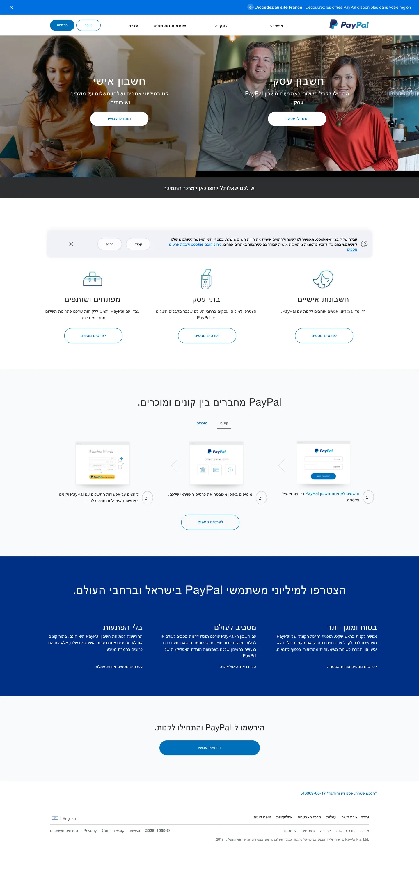
PayPal's marketing chrome does something most payments brands have walked away from: it commits to a duotone. The "PP" monogram in the top right pairs midnight navy with a lighter cyan blue, and both colors are wired into the system as load-bearing tokens — navy for nav labels, footer fill, and primary brand text; cyan for the hero CTA pill, the secondary mark, and icon strokes. Where Stripe collapsed its identity into a single indigo and Adyen leans on green-on-near-black, PayPal keeps both blues live and lets them divide labor by surface. Below the photographic hero, a sand-cream band carries three hairline-edged feature chips, each titled in PayPalOpen Medium at modest 14-20px sizes; further down, a flat navy block ("Join millions using PayPal in Israel and worldwide") inverts the figure-ground and re-asserts the brand voltage as a full-bleed surface.
The DESIGN.md file packages the system into a machine-readable spec for React tooling. Inside: 16 colors tokens drawn from the captured Hebrew locale plus the declared `--glnv-*` CSS-variable family (which exposes navy, cyan, and the sand-cream surface tones globally regardless of which locale renders); 11 typography tokens running PayPalOpen across display + CTAs and Helvetica Neue across body, with a dedicated PayPalSansSmall uppercase-tracked tier for nav-segment labels; 5 corner-radius tokens centered on a 25px pill default; 10 spacing values; and 17 components definitions covering the cyan pill CTA, the navy outlined secondary, the sand-cream feature card, the navy footer band, and the photographic hero cell.
Feed this file to an AI coding tool and it reproduces PayPal's specific moves: two-blue voltage instead of a single accent, sand-cream off-canvas rather than pure white, 25px pill CTAs at compact 38px heights, and the PayPalOpen-over-Helvetica split that lets a Latin headline pair cleanly with Hebrew or any RTL body locale. One caveat worth flagging: the captured screenshot is the Israel locale (Hebrew, RTL), so the body sizes skew a hair smaller than the US site's 16px default and a few component widths are mirror-flipped — the tokens themselves are locale-agnostic, but verify direction-sensitive padding against your own surface before shipping.
What makes it distinct
5
- Two-blue voltagemidnight navy and cyan blue both carry brand weight, the duotone signature of the 2014 PP monogram rather than a single accent held in reserve
- PayPalOpen + Helvetica Neue splitthe proprietary sans handles headlines and CTAs, the system fallback Helvetica Neue carries 14-15px body across every locale
- 25px pill CTAs at 38px heightthe corner-radius scale is binary: 25px pill or 0, no middle rounded-card tier
- Sand-cream secondary canvasfeature bands sit on warm cream #faf8f5, not pure white, an off-white move that softens the navy footer
- Uppercase tracked monospace navsecondary nav links render in PayPalSansSmall at weight 700 with +1px tracking and uppercase casing, distinct from any other text on the page
paypal.com
Live at paypal.com
A snapshot of the brand in production. Scroll the frame to see the whole page.
Colors
16 colors
PayPal's system runs on #0070ba as its primary voltage, used in 1 of 17 components. Type is set in Helvetica Neue across 11 tokens from 12px to 40px, weights 400–700. Shape language is soft — components average 13px corner radius, with no sharp interactive edges.
Brand & Accent
Sparing, CTA-only voltage · 5
Surface
Page and card backgrounds · 3
Text
Headlines, body, captions · 5
Borders & Hairlines
Dividers, outlines, rules · 3
Typography
11 type tokens
Set in Helvetica Neue across 11 tokens, from 12px to 40px, weights 400–700. Shown in its own stack: where the font isn't installed, the fallback the file names stands in.
- display-xl40px · weight 400 · lh 50px · tracking 0.8pxThe quick brown fox jumps over the lazy dog
- display-md35px · weight 400 · lh 44px · tracking 0.7pxThe quick brown fox jumps over the lazy dog
- heading-md28px · weight 400 · lh 35px · tracking 0.28pxThe quick brown fox jumps over the lazy dog
- heading-sm20px · weight 500 · lh 30pxThe quick brown fox jumps over the lazy dog
- body-lg20px · weight 400 · lh 30pxThe quick brown fox jumps over the lazy dog
- body-md15px · weight 400 · lh 22.5pxThe quick brown fox jumps over the lazy dog
- body-sm14px · weight 400 · lh 22.4pxThe quick brown fox jumps over the lazy dog
- label-md14px · weight 500 · lh 17.5px · tracking -0.14pxThe quick brown fox jumps over the lazy dog
- nav-segment14px · weight 700 · lh 14px · tracking 1pxThe quick brown fox jumps over the lazy dog
- button-md12px · weight 400 · lh 12pxThe quick brown fox jumps over the lazy dog
- caption12px · weight 400 · lh 12pxThe quick brown fox jumps over the lazy dog
Layout
Radii and spacing
5 corner radii and 10 spacing values. Shape language: soft.
Radii
- none0px
- md14px
- pill25px
- full1000px
- circle9999px
Spacing
- xs4px
- sm10px
- base15px
- md18px
- lg25px
- xl35px
- 2xl48px
- 3xl72px
- 4xl90px
- 5xl130px
Components
17 components
Each rendered from its tokens (color, type, radius, padding) on PayPal's own canvas.
- Button Primarybutton-primaryButton Primary
- Button Primary Hoverbutton-primary-hoverButton Primary Hover
- Button Secondarybutton-secondaryButton Secondary
- Button Ghostbutton-ghostButton Ghost
- Top Navtop-navTop Nav
- Nav Linknav-linkNav Link
- Hero Headinghero-headingHero Heading
- Section Headingsection-headingSection Heading
- Body Paragraphbody-paragraphBody Paragraph
- Body Paragraph Mutedbody-paragraph-mutedBody Paragraph Muted
- Hero Photo Bandhero-photo-bandHero Photo Band
- Feature Cardfeature-cardFeature Card
- Feature Bandfeature-bandFeature Band
- Promo Bandpromo-bandPromo Band
- Segment Pillsegment-pillSegment Pill
- Icon Circleicon-circleIcon Circle
- FooterfooterFooter
In use
The system, in use
PayPal's tokens on the kind of product it builds.
Build something people actually use.
A short paragraph of marketing copy that previews how the brand's display tier and body tier read together. Two sentences is usually enough.
FAQ
PayPal design system FAQ
Common questions about PayPal's tokens, components, and how to use this DESIGN.md in your project.
Read next
Related reading
Specs, directories, and component libraries that pair with this design system.
- Browse all design systemsThe full directory of DESIGN.md files on shadcn.io, with live mockups for each.shadcn.io
- PayPal — official sitePayPal's public marketing site — the source of truth for the live tokens captured in this file.paypal.com (opens in a new tab)
- The DESIGN.md specificationGoogle Labs' open spec for machine-readable design system files — the format this page is built on.github.com (opens in a new tab)
Use it
Use PayPal in your project
One machine-readable file. Drop it into Claude, Cursor, or any AI tool that reads DESIGN.md.
Download the DESIGN.md
One machine-readable file: every color, type, radius, spacing, and component token of PayPal.
Feed it to your AI tool
Drop it into Claude, Cursor, or GitHub Copilot. The agent writes React components and Tailwind classes that match PayPal's visual language.
Reference the tokens directly
Or paste the values into your Tailwind config, CSS variables, or component library: every color, size and radius is a quoted, ready-to-copy value.
Read the full DESIGN.md: overview, rationale, do’s and don’ts
Overview
PayPal's marketing chrome commits to a duotone where most payments brands have collapsed to one. Two-blue voltage: the deep midnight navy ({colors.brand-navy-deep} — #001c64) and the lighter cyan blue ({colors.brand-cyan} — #009cde) both carry brand weight, the duotone "PP" monogram in the top right resolving into actual system tokens rather than just a logo. Navy carries nav labels, primary text, the secondary-button outline, and the full-bleed promo band; cyan carries icon strokes, the hover state of every link, and the hero-CTA pill ({colors.primary} — #0070ba, a closely-related hyperlink blue). Where Stripe collapsed its identity into a single indigo voltage and Adyen leans on a mint-green accent against near-black, PayPal explicitly keeps both blues live and divides their work by surface.
The hero is a wide photographic band — a customer holding a phone — with the headline floating in pure white over the image and the cyan pill CTA carrying the primary action. Below the fold the page returns to a sand-cream secondary canvas ({colors.surface-cream} — #faf8f5, not pure white) where three hairline-edged feature chips sit on a 14px-rounded card geometry. Further down a flat {colors.brand-navy-deep} block ("Join millions using PayPal in Israel and worldwide") inverts the figure-ground and re-asserts the brand voltage as a full-bleed surface.
Typography splits cleanly. The proprietary PayPalOpen sans handles display (40px / 400 with a generous +0.8px tracking — confidence through tracking, not weight) and the PayPalOpen-Medium variant handles 14-20px CTA labels and feature titles. Helvetica Neue carries 14-15px running body across every locale. PayPalSansSmall at weight 700, +1px tracking, uppercase casing handles the segment-nav links — the loudest typographic tier on the page despite sitting at 14px, because the brand reserves uppercase + mono-style tracking for navigation only.
Key Characteristics:
- Two-blue brand voltage —
{colors.brand-navy-deep}(#001c64) plus{colors.brand-cyan}(#009cde), both load-bearing rather than one held as accent — the 2014 PP monogram structure preserved as tokens. - Sand-cream secondary canvas (
{colors.surface-cream}— #faf8f5) holds the feature band below the photographic hero; pure white{colors.canvas}carries the body floor. - PayPalOpen display + Helvetica Neue body — proprietary sans on the loud surfaces, system fallback on the quiet ones.
- PayPalSansSmall uppercase-tracked nav at 14px / 700 with +1px tracking — the single loudest typographic moment on the page.
- 25px pill CTAs at 38px button height — every primary, secondary, and ghost affordance reads as a fully-rounded pill at that aspect ratio.
- Binary radius scale: 25px pill (
{rounded.pill}) and full circle ({rounded.circle}) carry every clickable affordance; 14px feature card ({rounded.md}) is the single rounded-container tier; everything else terminates at 0. - Hairline-only cards:
{colors.hairline}(#e6e0d9, warm sand-tone) and{colors.hairline-cool}(#d4d9dc) carry every border in the system — there are no shadow-lifted cards. - Photographic hero band (
{component.hero-photo-band}) — a wide image of a person holding a phone, with headline + CTA pinned in pure white over the image at center.
Colors
Brand
- Hyperlink Blue (
{colors.primary}— #0070ba): frequency 24. Used as text (11), border (11), background (2). The CTA-pill fill in the captured hero — a cyan-leaning blue that sits between the navy and the brand cyan, used wherever a link or primary action needs to read as a clickable affordance. - Primary Hover (
{colors.primary-hover}— #0070e0): frequency 3. Wired as--glnv-style-button-primary-hover-bg,--glnv-style-general-hyperlink-main-hover, and--glnv-style-icon-main. The hover variant of the hyperlink blue plus the icon stroke color, one half-step brighter than{colors.primary}. - Brand Navy Deep (
{colors.brand-navy-deep}— #001c64): wired as--glnv-style-general-text-main,--glnv-style-nav-item-page-active, and the footer link colors. The dominant navy half of the PP monogram, used as the full-bleed promo-band background and the primary text tone across the entire system. - Brand Navy (
{colors.brand-navy}— #003087): wired as--glnv-style-button-primary-bg,--glnv-style-button-secondary, and--glnv-style-button-secondary-border. A slightly warmer navy used on the global secondary-button outline (not the locale-specific cyan pill captured in the Israel hero). - Brand Cyan (
{colors.brand-cyan}— #009cde): frequency 2 (1 bg, 1 gradient). The lighter half of the PP monogram. Wired into the brand system but used sparingly on the marketing surface itself — its main role is the wordmark color and icon-stroke accent.
Surface
- Canvas (
{colors.canvas}— #ffffff): frequency 83. The body floor, feature-card fills, and the white space beneath the photographic hero. Wired as--glnv-style-backgroundand--glnv-style-button-primary-active. - Surface Cream (
{colors.surface-cream}— #faf8f5): wired as--glnv-header-accordion-bg-color. The sand-cream secondary canvas — feature bands and the global-header accordion sit on this off-white tone rather than pure white. Warmer than{colors.canvas}and intentional. - Surface Light (
{colors.surface-light}— #f0f2f9): frequency 1. A cool blue-tinted off-white used as the carousel slide background ("PayPal connects buyers and sellers") below the feature chips.
Text
- Ink (
{colors.ink}— #001c64): the brand navy deep, doubling as the primary text token across headings and lead paragraphs. The convergence is deliberate — PayPal uses its brand navy as the text floor rather than maintaining a separate neutral ink tone. - Ink Soft (
{colors.ink-soft}— #2c2e2f): frequency 56 — used as text (29), border (26), background (1). The nav-link inactive tone and a secondary body color. A true dark gray, distinct from the brand navy. - Ink Muted (
{colors.ink-muted}— #545d68): wired as--glnv-style-general-text-muted-main. The body-paragraph muted tone for sub-labels and feature-card descriptions. - Ink Tertiary (
{colors.ink-tertiary}— #666666): frequency 40 — text (21), border (19). Tertiary captions and footer labels. - Ink Quaternary (
{colors.ink-quaternary}— #767676): frequency 164 — text (82), border (82). The dominant captured text tone in the Hebrew-locale page — used on the small body, footnote, and form-label tier where the brand navy would feel too heavy.
Hairline
- Hairline (
{colors.hairline}— #e6e0d9): wired as--glnv-style-structure-borderand--glnv-header-border-bottom. The warm sand-tone border used on feature cards and the global header bottom-rule — the warmth ties to{colors.surface-cream}and signals the brand's preference against cool-blue grays for chrome. - Hairline Cool (
{colors.hairline-cool}— #d4d9dc): frequency 4 (all borders). A cool blue-tinted gray used on segment-pill borders below the hero. - Divider (
{colors.divider}— #c0c0c0): frequency 3. Wired as--glnv-footer-separator-color. The footer separator line — distinctly heavier than the structural hairline.
Typography
Font Families
The system runs three families: PayPalOpen (proprietary humanist sans) for display headlines and CTA labels; PayPalSansSmall (also proprietary, wider/tracked variant) for uppercase nav-segment labels; Helvetica Neue (system stack) for every 14-15px body paragraph and caption. Fallbacks walk to "Helvetica Neue", Helvetica, Arial, sans-serif across the board.
The split is the distinguishing typographic move. Most fintechs use one proprietary family across every tier (Stripe with Sohne-var, Wise with Inter); PayPal explicitly hands the body to Helvetica Neue, which keeps the page reading as familiar / system across global locales while the proprietary PayPalOpen handles the loud display + CTA surfaces.
Hierarchy
| Token | Size | Weight | Line Height | Letter Spacing | Use |
|---|---|---|---|---|---|
{typography.display-xl} | 40px | 400 | 50px | 0.8px | Hero h1 / h2 ("חשבון אישי") |
{typography.display-md} | 35px | 400 | 44px | 0.7px | Section h2 below the photographic hero |
{typography.heading-md} | 28px | 400 | 35px | 0.28px | Sub-section titles, large feature titles |
{typography.heading-sm} | 20px | 500 | 30px | 0 | h3 / h4 — feature-card titles |
{typography.body-lg} | 20px | 400 | 30px | 0 | Hero sub-paragraph |
{typography.body-md} | 15px | 400 | 22.5px | 0 | Default running text, link rows |
{typography.body-sm} | 14px | 400 | 22.4px | 0 | Caption rows, secondary copy |
{typography.label-md} | 14px | 500 | 17.5px | -0.14px | Feature-chip titles, anchor labels |
{typography.nav-segment} | 14px | 700 | 14px | 1px | Uppercase segment-nav links |
{typography.button-md} | 12px | 400 | 12px | 0 | Primary CTA labels |
{typography.caption} | 12px | 400 | 12px | 0 | Footnote, small-print captions |
Principles
Display weight stays at 400. The hero at 40px / 400 with generous +0.8px tracking is the editorial treatment — confidence through tracking and color contrast against the photographic hero, not through weight. The captured h2 at 39.998px appears 4 times across the page. There is no 700-weight display tier; weight 700 is reserved for the PayPalSansSmall uppercase nav-segment tier only.
The CTA-button text is the quietest typographic moment on the page — 12px at weight 400 in Helvetica Neue, with no letter-spacing. The button itself does the visual work through its 25px pill geometry and cyan fill; the label sits inside as functional text rather than declaration.
Note on Font Substitutes
PayPalOpen and PayPalSansSmall are proprietary. Inter at the same sizes is the closest open-source substitute for PayPalOpen — adjust display tracking to +0.02em on the 40px tier to match. For PayPalSansSmall, use Inter at weight 700 with text-transform: uppercase and letter-spacing: 1px; the result reads close to the original. The Helvetica Neue body tier is already a system stack — keep it as-is or substitute the more legible Inter if you want a single family across body too.
Layout
Spacing System
- Base unit: approximately 5px increments, with 10/15/25/35px as the dominant module steps — not a strict 4 or 8px grid.
- Tokens:
{spacing.xs}4px ·{spacing.sm}10px ·{spacing.base}15px ·{spacing.md}18px ·{spacing.lg}25px ·{spacing.xl}35px ·{spacing.2xl}48px ·{spacing.3xl}72px ·{spacing.4xl}90px ·{spacing.5xl}130px. - Section padding (vertical): 90px on the hero band, 72px on the feature band, 130px on the navy promo band — increasing as the page progresses downward.
- Card internal padding: 25/25/23px on feature cards (an asymmetric "top + sides equal, bottom -2px" pattern that appears on multiple surfaces).
- Nav padding: 25/25/23px vertical, 48px horizontal — the same asymmetric padding the feature cards use, anchoring the rhythm.
Grid & Container
- Max content width: approximately 1080px on the hero band, ~1280px on the feature row.
- Hero band: full-bleed photographic image, with the headline + CTA centered at ~720px max-width over the image.
- Feature band: 3-column hairline-card grid on
{colors.surface-cream}, collapsing to 1-column on narrow viewports. - Carousel band: 3-up rounded-card carousel on
{colors.surface-light}with cyan-stroked chevron icon-buttons in{rounded.circle}containers. - Promo band: full-bleed
{colors.brand-navy-deep}block, 130px vertical padding, centered headline + 3-up support columns + a single cyan-pill CTA.
Rhythm
The page alternates band colors more aggressively than most marketing surfaces: photographic hero → white body → cream feature band → light-blue carousel band → navy promo block → white CTA band → light footer. Each band carries a distinct surface color, and the brand voltage rotates between background fill (navy promo) and contrast accent (cyan CTA on white). The rhythm is the structural device — color shifts mark section boundaries rather than spacing alone.
Elevation
The system has essentially no shadow tier rendered on the captured marketing surface. The brand carries elevation through hairline borders and full-bleed color blocks instead.
- Flat (no shadow): body, feature cards, segment pills, promo band, footer — 99% of surfaces.
- Hairline outlines:
{colors.hairline}(#e6e0d9) on feature cards;{colors.hairline-cool}(#d4d9dc) on segment pills. - Photographic hero: the only "elevated" surface is the photographic image itself, which sits as a full-bleed band rather than a card.
- Modal scrim: not exposed on the captured surface; the global header accordion uses
{colors.surface-cream}as a flat backdrop rather than a darkened scrim.
Shapes
The radius scale is binary: pill or flat. There is essentially no middle rounded-card tier on the captured surfaces.
{rounded.none}0px — every full-bleed band (hero, feature, promo, footer), every text block.{rounded.md}14px — frequency 1. The single rounded-card tier, used on the carousel slide ("PayPal connects buyers and sellers").{rounded.pill}25px — frequency 9. The dominant button radius — primary CTA, secondary outline, ghost button, segment pill. At a 38px button height, 25px reads as fully rounded.{rounded.full}1000px — frequency 2. Used on long-pill containers where 25px would not reach the full half-height.{rounded.circle}50% — frequency 5. Icon-button circles for the carousel chevrons and the round-icon affordances inside cards.
There is no 4px / 8px / 12px tier — small surfaces start at 14px and most affordances jump directly to the 25px pill. The contrast between flat blocks and pill affordances is the entire shape language.
Components
button-primary — The signature CTA. Cyan-blue {colors.primary} fill, white text, {rounded.pill} 25px radius, 12×18px padding, 38px height. The captured hero CTA sits at 84px width — a compact pill that reads as the primary action without dominating the photographic hero.
button-primary-hover — Flips to {colors.primary-hover} (#0070e0) — one half-step lighter / brighter cyan. The hover state of every link in the system uses the same blue, tying the CTA to the link palette.
button-secondary — White fill, {colors.brand-navy} text, 1px navy outline, same 25px pill geometry. Used on the "Login" affordance and secondary CTAs throughout — the navy outline signals a less-loud action than the cyan fill.
button-ghost — Transparent fill, ink text, 25px pill radius. The "Learn more" tertiary action that appears in feature cards.
top-nav — White surface, 65px height, 1px {colors.hairline} bottom rule. PayPal "PP" monogram flush left (in the captured Israel locale, flush right due to RTL), product-segment links centered in {typography.nav-segment} (uppercase + tracked), "Login" + "Get Started" cluster at the opposite edge.
nav-link — Ink-soft {colors.ink-soft} text in {typography.nav-segment} (PayPalSansSmall 14px / 700, +1px tracking, uppercase casing). 25/25/23px asymmetric padding. The loudest typographic tier on the page despite being only 14px — the uppercase + tracked treatment is the brand's nav signature.
hero-heading — White text on the photographic hero band, {typography.display-xl} (40px / 400, +0.8px tracking). The captured h2 "חשבון אישי" is the canonical instance; the corresponding English would read "Personal Account."
section-heading — Ink {colors.ink} text on white or cream surfaces at {typography.heading-md} (28px / 400). Used for sub-section titles below the hero.
body-paragraph — {colors.ink-muted} (#545d68) running text at {typography.body-md} (Helvetica Neue 15px / 400). The default reading tier across the page.
body-paragraph-muted — {colors.ink-quaternary} (#767676) at {typography.body-sm} (14px / 400). The captured-page dominant text tone for small body and form-label tier — appears 82 times as text in the Hebrew locale.
hero-photo-band — Full-bleed white container holding the photographic hero image. 90px vertical padding, edge-to-edge horizontal. The headline + CTA pin to the image center; the image extends behind them.
feature-card — White surface, {colors.hairline} (#e6e0d9) warm-sand border, {rounded.md} 14px radius, 25/25/23px padding. The three feature chips below the hero ("Smart shopping," "Business accounts," "Personal accounts") use this surface.
feature-band — Cream {colors.surface-cream} (#faf8f5) full-bleed band holding the feature cards. 72px top padding, edge-to-edge horizontal — the cream signals a soft transition from the photographic hero.
promo-band — Full-bleed {colors.brand-navy-deep} (#001c64) block, white text, 130px top padding. The single in-body application of the brand voltage as full surface fill — re-asserting the navy identity below the cream feature band.
segment-pill — White surface, {colors.ink} text, 1px {colors.hairline-cool} outline, 25px pill, 11×18px padding, 38px height. Used for the category-segment switcher above the carousel.
icon-circle — White surface, cyan {colors.brand-cyan} stroke, {rounded.circle} full-circle radius, 40px height. Carousel chevrons and round icon affordances.
footer — White surface, {colors.ink-tertiary} text, 1px {colors.divider} (#c0c0c0) top rule. 35×10px padding, language selector + small-print links + copyright row.
Do's and Don'ts
Do treat the brand voltage as a duotone, not a single accent. Navy and cyan are both load-bearing — navy carries text and full-bleed surfaces, cyan carries CTAs and link-hover states. Collapsing to a single blue would discard the PP-monogram structure that defines the identity.
Do use {colors.surface-cream} (#faf8f5) — never pure #ffffff — for the secondary canvas behind feature cards. The warmth difference is intentional and ties to the warm {colors.hairline} (#e6e0d9) sand-tone border; mixing pure white with the warm border tone breaks the cohesion.
Do let {typography.nav-segment} (PayPalSansSmall 14px / 700, +1px tracking, uppercase) carry every product-segment label. The system has no other uppercase or tracked tier — reaching for one breaks the brand's nav-only convention.
Do keep CTA buttons at 38px height with 25px pill radius. The half-height pill ratio is the brand's most recognizable shape; bumping the height to 44/48px or dropping the radius to 8/12px erases the signature.
Don't use {colors.brand-navy} (#003087) for body text — it is wired as a button-bg / button-outline token only. For ink, use {colors.ink} (#001c64) or {colors.ink-muted} (#545d68). Mixing the two navies in adjacent text and surface creates a visible blue-mismatch.
Don't introduce a shadow tier on feature cards. The captured marketing surface has zero shadow elevation — depth is hairline + full-bleed color contrast. Adding a 4-8px shadow turns the brand's flat-on-hairline language into a generic SaaS card system.
Don't drop the +1px letter-spacing on {typography.nav-segment}. The tracking is the brand's nav signature; without it the 14px PayPalSansSmall reads like an ordinary small label rather than the loudest typographic moment on the page.
Don't use {colors.brand-cyan} (#009cde) for primary CTAs — it is wired into the monogram and icon strokes, not the action layer. The primary CTA uses {colors.primary} (#0070ba), a hyperlink-blue that sits between navy and cyan; substituting cyan there reads as a wordmark color leak.
Known Gaps
- Locale capture: the screenshot is the Israel (
/il/home) Hebrew RTL page. The tokens are locale-agnostic, but verify direction-sensitive padding (the asymmetric 25/25/23px pattern) on your own LTR / RTL surface before shipping. - Hover and focus states: documented for
{component.button-primary-hover}only. The full state matrix (focus rings, active press, disabled tints) is wired into CSS variables (--glnv-header-link-box-shadow-color,--glnv-style-structure-focus) but not directly rendered on the captured surface. - Form input states: the captured page does not expose a form input. PayPal's actual checkout flow uses a separate component system not represented here.
- Dark mode: the captured surface is light-only. The CSS variables include some dark / overlay tokens (
--overlay-medium) but no full dark-mode palette is exposed on the marketing chrome. - Motion: the page uses a band-by-band scroll-in animation; the spec captures end-state values only. Easing curves and stagger timing live in the live JavaScript.
- Product surfaces: this DESIGN.md captures the global homepage marketing chrome. The PayPal Dashboard, Checkout, and PayPal Business surfaces (
paypal.com/business,developer.paypal.com) carry their own token systems not represented here. - Logo wall: the customer/partner trust band typically present on the global homepage is not captured here — the Israel locale page does not surface a logo wall above the fold.
Banking & Payments
More systems like this
More DESIGN.md files in Banking & Payments.
Pricing
Build it with Pro
The DESIGN.md files are free. Pro adds 6,000+ blocks, premium templates and the MCP server, so your AI editor builds in your system for you.
4.9/5 out of 5 · 150+ reviewsfrom 150+ founders and developers.
Billing
Billed once a year in USD. Cancel anytime.
- How many people can use the license.
- Client work, SaaS products and anything you charge for.
- Production-ready React sections: hero, pricing, features, dashboards and more.
- Complete multi-page sites you can ship as they are.
- React icons from every major library, installable with one command.
- Presets that restyle every block, in light and dark.
- Lets your AI editor search, preview and install blocks for you.
- Priority requests are answered first.
Individual
For personal projects & open source
$32instead of $49/mo
$389 billed yearly
- Seats: 1 seat
- Commercial use: Personal & open source only
- Pro blocks: 6,000+ blocks
- Templates: All 14 templates
- React icons: 294k+ icons
- Themes: All 59 themes
- MCP server: Basic usage
- Support: Standard
Team
Most popularFor freelancers, agencies & startups
$66instead of $99/mo
$789 billed yearly · ≈ $13/dev/mo
- Seats: Up to 5 seats
- Commercial use: Included
- Pro blocks: 6,000+ blocks
- Templates: All 14 templates
- React icons: 294k+ icons
- Themes: All 59 themes
- MCP server: High usage
- Support: Priority
Organization
For companies with larger teams
$132instead of $199/mo
$1,589 billed yearly
- Seats: Unlimited seats
- Commercial use: Included
- Pro blocks: 6,000+ blocks
- Templates: All 14 templates
- React icons: 294k+ icons
- Themes: All 59 themes
- MCP server: Unlimited usage
- Support: Priority
Billed once a year in USD. Cancel anytime.
Individual
For personal projects & open source
$32instead of $49/mo
$389 billed yearly
- How many people can use the license.Seats: 1 seat
- Client work, SaaS products and anything you charge for.Commercial use: Personal & open source only
- Production-ready React sections: hero, pricing, features, dashboards and more.Pro blocks: 6,000+ blocks
- Complete multi-page sites you can ship as they are.Templates: All 14 templates
- React icons from every major library, installable with one command.React icons: 294k+ icons
- Presets that restyle every block, in light and dark.Themes: All 59 themes
- Lets your AI editor search, preview and install blocks for you.MCP server: Basic usage
- Priority requests are answered first.Support: Standard
Team
Most popularFor freelancers, agencies & startups
$66instead of $99/mo
$789 billed yearly · ≈ $13/dev/mo
Everything in Individual, plus
- How many people can use the license.Seats: Up to 5 seats
- Client work, SaaS products and anything you charge for.Commercial use: Included
- Lets your AI editor search, preview and install blocks for you.MCP server: High usage
- Priority requests are answered first.Support: Priority
Organization
For companies with larger teams
$132instead of $199/mo
$1,589 billed yearly
Everything in Team, plus
- How many people can use the license.Seats: Unlimited seats
- Lets your AI editor search, preview and install blocks for you.MCP server: Unlimited usage
- Secure checkout via Stripe
- Code lives in your repo
- Keep what you've shipped if you cancel
- License terms
Your system, built for you
Every block, template and icon, installed by your AI agent in your design system. The DESIGN.md files stay free.