Payoneer Design System
Payoneer's marketing-site design system as DESIGN.md. Near-black body text, AvenirNextWorld Demi headings, gradient decorations, 15 colors tokens, 16 components. For React, Next.js, and AI coding tools.
Add shadcn.io to your AI agent. · Pro It installs blocks, icons and templates in your design system from a prompt, with Pro.
Set up MCP- Primary
- #efefef
- Typeface
- AvenirNextWorld-Demi
- Shape
- Soft
- Base radius
- 12px
- Colors
- 15
- Type tokens
- 13
- Components
- 16
- Spacing values
- 6
About
About Payoneer DESIGN.md
Curated by Dov Azencot · Updated May 19, 2026 · Source payoneer.com (opens in a new tab)
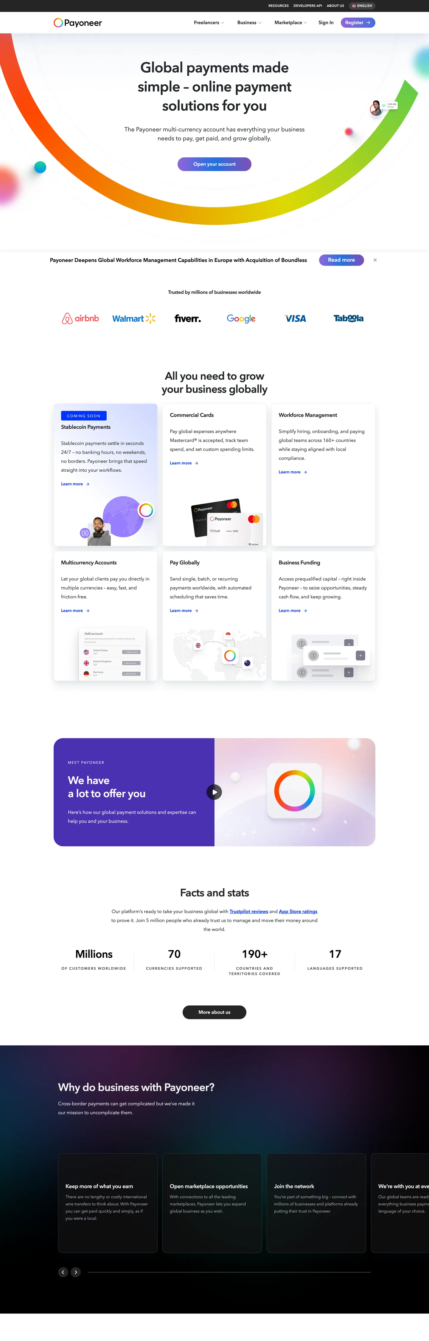
Payoneer's marketing page has an unusual relationship with its own color system. The CSS registers five named gradient presets — purple-green-blue, blue-green-yellow, orange-purple-blue, green-yellow-orange, and yellow-orange-purple — along with individual brand-color tokens for orange (#ff4800), purple (#DA54D8), blue (#0092F4), green (#20DC86), and yellow (#dfd902). But the above-fold page chrome is aggressively achromatic: a white canvas, near-black body text (#212529), and a standard-blue link color that the CTA buttons inherit from Bootstrap's `--bs-primary`. The gradient appears as the large decorative arc that opens the above-fold hero — a swooping multi-color stroke in the upper-left corner — and as the 3D-rendered wheel in the "facts and stats" section mid-page. The chrome says restraint; the decoration says spectrum.
The DESIGN.md file packages the system into a machine-readable spec for React and AI coding tools. Inside: 15 colors tokens anchored around the near-black Bootstrap body color (#212529), the gradient-stop colors (blue, purple, green — declared as Payoneer brand tokens), and a clean white canvas. Thirteen typography tokens run AvenirNextWorld in two cuts: Regular for body copy (14-20px, weight 400) and Demi for headings, navigation, and buttons (18-48px, weight treated as 400 by the renderer but visually rendered as demibold/semibold). Six radius tokens run from 4px for small chips to 500px pill for flag/avatar circles. Sixteen components cover the gradient-arc hero, trust-brand logo strip, feature-card grid, stats counter section, and the near-black footer with gradient-wheel decoration.
Feed this file to Claude or Cursor and it will reproduce Payoneer's specific moves: white body canvas with near-black text, gradient decoration as hero identity rather than flat brand-color fill, AvenirNextWorld-Demi for all heading and button weight, 12px card radius as the dominant UI surface rounding, and the dark footer transition that reframes the gradient palette. The system is worth studying as an example of a gradient-led identity where the gradient itself — not any single hex from it — is the brand signal.
What makes it distinct
5
- Gradient-as-identityPayoneer's tri-color gradient (blue to purple to green) is wired as five named CSS gradient presets and appears as the primary visual decoration, not a single brand hex
- Two-cut type systemAvenirNextWorld-Regular for body and AvenirNextWorld-Demi for headings, buttons, and nav; Demi carries the brand's semibold register without declaring a separate 700 weight
- Dark footer sectionthe page transitions from a white body to a near-black footer section (#131314) where the gradient arc decoration and partner logos live
- No orange in the chromedespite the CSS declaring --wp--preset--color--payoneer-orange (#ff4800) as a named brand color, it appears only inside gradient stops and never as a flat fill in the captured page
- 12px card radiusthe dominant interactive radius is 12px across cards, inputs, and most UI elements, with 16px on slightly larger panels
payoneer.com
Live at payoneer.com
A snapshot of the brand in production. Scroll the frame to see the whole page.
Colors
15 colors
Payoneer's system runs on #efefef as its primary voltage, used in 1 of 16 components. Type is set in AvenirNextWorld-Demi across 13 tokens from 11px to 48px, weights 400–500. Shape language is soft — components average 52px corner radius, with no sharp interactive edges.
Brand & Accent
Sparing, CTA-only voltage · 4
Surface
Page and card backgrounds · 3
Text
Headlines, body, captions · 6
Borders & Hairlines
Dividers, outlines, rules · 2
Typography
13 type tokens
Set in AvenirNextWorld-Demi across 13 tokens, from 11px to 48px, weights 400–500. Shown in its own stack: where the font isn't installed, the fallback the file names stands in.
- display-lg48px · weight 400 · lh 64px · tracking -0.96pxThe quick brown fox jumps over the lazy dog
- display-md48px · weight 500 · lh 64px · tracking -0.96pxThe quick brown fox jumps over the lazy dog
- heading-lg36px · weight 400 · lh 44px · tracking -0.72pxThe quick brown fox jumps over the lazy dog
- heading-md18px · weight 400 · lh 30px · tracking -0.36pxThe quick brown fox jumps over the lazy dog
- heading-sm16px · weight 400 · lh 24pxThe quick brown fox jumps over the lazy dog
- body-lg20px · weight 400 · lh 30pxThe quick brown fox jumps over the lazy dog
- body-md16px · weight 400 · lh 30pxThe quick brown fox jumps over the lazy dog
- body-sm14px · weight 400 · lh 24pxThe quick brown fox jumps over the lazy dog
- label-sm14px · weight 400 · lh 19.6pxThe quick brown fox jumps over the lazy dog
- button-md18px · weight 400 · lh 25.7pxThe quick brown fox jumps over the lazy dog
- caption12px · weight 400 · lh 18pxThe quick brown fox jumps over the lazy dog
- nav-link11px · weight 400 · lh 24px · tracking 0.385pxThe quick brown fox jumps over the lazy dog
- eyebrow12px · weight 400 · lh 18px · tracking 2.04pxThe quick brown fox jumps over the lazy dog
Layout
Radii and spacing
7 corner radii and 6 spacing values. Shape language: soft.
Radii
- none0px
- sm4px
- md12px
- lg16px
- xl20px
- pill500px
- full50%
Spacing
- xs8px
- sm16px
- md24px
- base48px
- lg88px
- xl96px
Components
16 components
Each rendered from its tokens (color, type, radius, padding) on Payoneer's own canvas.
- Button Primarybutton-primaryButton Primary
- Button Secondarybutton-secondaryButton Secondary
- Top Navtop-navTop Nav
- Nav Linknav-linkNav Link
- Hero Sectionhero-sectionHero Section
- Hero Headinghero-headingHero Heading
- Section Headingsection-headingSection Heading
- Body Paragraphbody-paragraphBody Paragraph
- Body Paragraph Mutedbody-paragraph-mutedBody Paragraph Muted
- CardcardCard
- Trust Logo Striptrust-logo-stripTrust Logo Strip
- Feature Gridfeature-gridFeature Grid
- Stats Bandstats-bandStats Band
- Footer Darkfooter-darkFooter Dark
- Type here…text-inputText Input
- Partner Logo Chippartner-logo-chipPartner Logo Chip
In use
The system, in use
Payoneer's tokens on the kind of product it builds.
Build something people actually use.
A short paragraph of marketing copy that previews how the brand's display tier and body tier read together. Two sentences is usually enough.
FAQ
Payoneer design system FAQ
Common questions about Payoneer's tokens, components, and how to use this DESIGN.md in your project.
Read next
Related reading
Specs, directories, and component libraries that pair with this design system.
- Browse all design systemsThe full directory of DESIGN.md files on shadcn.io, with live mockups for each.shadcn.io
- Payoneer — official sitePayoneer's public marketing site — the source of truth for the live tokens captured in this file.payoneer.com (opens in a new tab)
- The DESIGN.md specificationGoogle Labs' open spec for machine-readable design system files — the format this page is built on.github.com (opens in a new tab)
Use it
Use Payoneer in your project
One machine-readable file. Drop it into Claude, Cursor, or any AI tool that reads DESIGN.md.
Download the DESIGN.md
One machine-readable file: every color, type, radius, spacing, and component token of Payoneer.
Feed it to your AI tool
Drop it into Claude, Cursor, or GitHub Copilot. The agent writes React components and Tailwind classes that match Payoneer's visual language.
Reference the tokens directly
Or paste the values into your Tailwind config, CSS variables, or component library: every color, size and radius is a quoted, ready-to-copy value.
Read the full DESIGN.md: overview, rationale, do’s and don’ts
Overview
Payoneer's marketing site runs on a principle that is unusual in the payments category. Gradient-as-brand-signature: the system does not hold a single hex as the voltage — it holds a gradient sequence. The CSS registers five named presets mixing blue, purple, green, orange, and yellow in different orders. The above-fold chrome is a white canvas with near-black body text and a swooping tri-color arc in the upper-left corner. That arc — not a button color, not a logo fill, not a section background — is the brand's most immediate visual statement. Where PayPal anchors on a flat dark navy, and where Wise anchors on a single lime-green, Payoneer positions itself through spectral breadth: a payment platform that touches every currency, every direction, every economic participant.
AvenirNextWorld runs in two cuts. Regular handles all body copy; Demi handles headings, navigation, and button labels. There is no separate bold tier for display text — the Demi cut is the system's maximum weight for everything above 14px. This keeps the page from developing typographic muscle that would push it toward enterprise-banking gravity; instead the weight register sits at a comfortable semibold throughout, appropriate for a platform built for working freelancers and small businesses rather than corporate finance teams.
The page's dark moment is the footer. The "Why do business with Payoneer?" section and the closing CTA sit on a near-pure-black surface (#131314). The gradient arc and the partner logo strip (Walmart, Google, Rappi, VISA, Netflix, Booking.com) appear in this dark section in white-reversed treatment. This is not a dark-mode toggle — it is a deliberate terminal punctuation, ending the page with authority before the footer fine print.
Key Characteristics:
- Tri-color gradient (blue-to-purple-to-green and variants) is the brand identity, not a single hex.
- AvenirNextWorld-Demi as the single weight register for all headings, buttons, and nav — no bold display tier.
- White canvas (#ffffff) body with near-black ink (#212529) — 1040 total occurrences for the dark ink.
- Near-black terminal footer (#131314 — 6 background occurrences) providing a dark-section transition.
- 12px as the dominant card radius (24 occurrences), 16px on larger panels, 20px on selected CTA elements.
- Bootstrap CSS custom property naming (
--bs-*variables) throughout the structural tier — the site runs on WordPress with Bootstrap 5. - Trust-brand logo strip (allianz, Walmart, Rappi, Google, VISA, Booking.com) immediately below the hero fold.
Colors
Brand Gradient Stops
- Brand Blue (
{colors.brand-blue}— #0092f4): frequency 27, all gradient. The sky-blue stop in the tri-color gradient. Wired as--wp--preset--color--payoneer-blueand--wp--preset--color--vivid-cyan-blue. - Brand Purple (
{colors.brand-purple}— #d054ce): frequency 26, all gradient. The magenta-purple stop. Wired as--wp--preset--color--payoneer-purple. Clustered from #d054ce and #da54d8. - Brand Green (
{colors.brand-green}— #20dc86): frequency 25, all gradient. The mint-green stop. Wired as--wp--preset--color--payoneer-green. - Primary Blue (
{colors.primary-blue}— #0033ff): frequency 19. Text (9), background (1), border (9). The deepest blue in the system — used on CTA button fills and link text in the section headings. Wired as--wp--preset--color--primary-blue. - Link Blue (
{colors.link-blue}— #0d6efd): frequency 58. Text (29), border (29). Bootstrap's--bs-primaryand--bs-link-color— the body link color and the derived form-element accent.
Surface
- Canvas (
{colors.canvas}— #ffffff): frequency 204. Text (95), background (12), border (94), gradient (3). The page floor for the body. - Canvas Light (
{colors.canvas-light}— #efefef): frequency 409. Text (204), background (13), border (192). The light-grey band used in the "facts and stats" section and as a hairline-light surface. Clustered from four near-identical light-grey values. - Canvas Dark (
{colors.canvas-dark}— #131314): frequency 6, all background. The near-black footer section.
Text
- Ink (
{colors.ink}— #212529): frequency 1040. Text (513), background (20), border (507). The dominant body text color. Bootstrap's--bs-darkand--bs-body-color. Clustered from near-identical near-black values. - Ink Soft (
{colors.ink-soft}— #4a4a4a): frequency 18, text (9) and border (9). Secondary body text and icon fills. Wired as--bs-gray-700and--wp--preset--color--payoneer-middle-grey. - Ink Muted (
{colors.ink-muted}— #878787): frequency 3. Tertiary labels and disabled text. Wired as--wp--preset--color--payoneer-hard-grey.
Structural
- Hairline (
{colors.hairline}— #d9d9d9): frequency 1, border only. The card outline color. Wired as--bs-gray-400and--bs-border-color. - Hairline Soft (
{colors.hairline-soft}— #efefef): the soft divider color, part of the canvas-light cluster. - Shadow Ink (
{colors.shadow-ink}— #083452): frequency 48, shadow only. The tinted navy shadow used on card and button elevation. A deep-ocean blue that adds cool undertone to shadows. - Nav Text (
{colors.nav-text}— #ffffff): the white text used in the dark-background top navigation bar.
Typography
Font Families
The system runs AvenirNextWorld in two named cuts:
- AvenirNextWorld-Regular — body paragraphs, hero sub-text, caption text (14-20px).
- AvenirNextWorld-Demi — headings, button labels, nav links, eyebrow labels (11-48px). The Demi cut reports font-weight: 400 to the CSS renderer because the weight sits in the font file name, but visually it renders as a demibold/600.
There is also a legacy Payoneer-Level-One family declared in CSS (--wp--preset--font-family--payoneer-level-one), but it does not appear in the extracted typography samples — it likely applies to a graphic-display treatment in video or print contexts not captured here.
Hierarchy
| Token | Size | Weight | Line Height | Letter Spacing | Use |
|---|---|---|---|---|---|
{typography.display-lg} | 48px | Demi | 64px | -0.96px | Hero h1 — "Global payments made easy" |
{typography.display-md} | 48px | Regular/500 | 64px | -0.96px | Hero h1 variant in Regular cut |
{typography.heading-lg} | 36px | Demi | 44px | -0.72px | Section h2 ("All you need to grow your business globally") |
{typography.heading-md} | 18px | Demi | 30px | -0.36px | Feature-card headings and sub-section titles |
{typography.heading-sm} | 16px | Demi | 24px | 0 | Small card titles and inline labels |
{typography.body-lg} | 20px | Regular | 30px | 0 | Hero sub-paragraph |
{typography.body-md} | 16px | Regular | 30px | 0 | Default running text |
{typography.body-sm} | 14px | Regular | 24px | 0 | Caption rows and secondary body |
{typography.label-sm} | 14px | Regular | 19.6px | 0 | Inline link labels |
{typography.button-md} | 18px | Demi | 25.7px | 0 | CTA button labels |
{typography.caption} | 12px | Demi | 18px | 0 | Legal fine print |
{typography.nav-link} | 11px | Demi | 24px | 0.385px | Top-nav links (uppercase small) |
{typography.eyebrow} | 12px | Demi | 18px | 2.04px | UPPERCASE section category labels |
Principles
The system runs Demi for every context requiring weight emphasis — buttons, headings, nav — but never declares a heavier weight for the display tier. The hero h1 at 48px uses the same Demi cut as a button label at 18px. This means the hierarchy is established entirely by size and letter-spacing, not by progressing through font weights. The nav links run at 11px with 0.385px tracking and an implicit uppercase treatment — visible in the captured screenshot as small caps over the dark nav bar.
Note on Font Substitutes
AvenirNextWorld is a licensed font. The closest open-source substitute for the Demi cut is Nunito SemiBold (600). For the Regular cut, Source Sans 3 Regular transfers cleanly at all body sizes. If you need a single-family substitute for both cuts, Plus Jakarta Sans at 400 and 600 weights is the most structurally similar free option.
Layout
Spacing System
- Base unit: 8px (33 occurrences).
- Tokens:
{spacing.xs}8px ·{spacing.sm}16px ·{spacing.md}24px ·{spacing.base}48px ·{spacing.lg}88px ·{spacing.xl}96px. - Hero top padding: 88px (the nav-height spacer).
- Section padding (vertical): 48px between major sections.
- Card internal padding: 24px on feature cards; 16px on compact grid items.
Grid & Container
- Max content width: declared as
--wp--style--global--content-size: 800pxfor editorial content,--wp--style--global--wide-size: 1080pxfor wide layout. - Hero: white full-width canvas, content at 800px wide. Gradient arc decorates the upper-left corner.
- Feature grid: 3-column grid of feature cards ("Account Management," "Collections," "Payment Management," "Pricing," "Tax," "Investments"), each with a small purple/blue icon, a Demi 18px heading, and 2-3 body lines.
- Trust-brand strip: a horizontal logo row featuring Walmart, Rappi, Google, VISA, allianz, Booking.com at natural-size white or greyscale marks.
- Stats strip: three large figures ("Millions of customers," "70 currencies," "190+ countries," "17 years of experience") in Demi display type on the light-grey band.
Rhythm
The page runs a consistent 48px vertical gap between sections, creating a stable scroll rhythm. The only interruption is the dark footer section — which the rhythm arrives at after 5-6 white-canvas sections, so the contrast lands with deliberate weight. Inside sections, the hero uses generous padding (88px top) while below-fold sections are more compact.
Elevation
Payoneer uses a tinted navy shadow (#083452) for card elevation — the same move as Trezor but with a different navy source. The shadow appears 48 times in the extraction, all as shadow fills.
- Flat: hero section, logo strip, stats band, footer — no shadow.
- Card elevation: feature cards use the tinted navy shadow at low opacity for a 1-2px lift. The 12px card radius softens the shadow corner geometry.
- Gradient wheel: the 3D-rendered gradient wheel in the facts section does not use a CSS shadow — it is a self-lit render.
Shapes
The radius scale is medium-generous with a circular-avatar exception:
{rounded.sm}4px — small chip and fine-rule accents (13 occurrences).{rounded.md}12px — the dominant card radius (24 occurrences). Cards, inputs, most UI elements.{rounded.lg}16px — larger panels and CTA cards (15 occurrences).{rounded.xl}20px — CTA button radius and section-feature tiles (12 occurrences).{rounded.pill}500px — pill-style navigation items and country/region badges (13 occurrences, declared as 500px in CSS).{rounded.full}50% — avatar circles, flag thumbnails, and the gradient-wheel crop (41 occurrences, the most frequent radius).
The 50% (full-circle) radius is by far the most-used value in the extraction because the page includes multiple circular avatar and flag elements in the partner and regional sections.
Components
button-primary — Primary blue fill (#0033ff), white text, AvenirNextWorld-Demi 18px, 20px radius, 9×53px padding, 44px height. "Get Payoneer" is the canonical instance in the hero.
button-secondary — Transparent fill, near-black text, 1px hairline border, 20px radius, same dimensions. Used for secondary CTA variants.
top-nav — Near-black (#131314) surface, white text, 60px height. The dark nav sits on a page that is otherwise entirely white-canvas, creating a strong header anchoring.
nav-link — White text, AvenirNextWorld-Demi 11px / 0.385px tracking, on the dark nav surface. Uppercase treatment gives the nav a small-caps feel.
hero-section — White canvas, 88×15px padding, gradient-arc decoration in upper-left. Headline in Demi 48px / -0.96px tracking, sub-copy in Regular 20px/400.
hero-heading — Near-black ink, AvenirNextWorld-Demi 48px / -0.96px tracking, -0.96px letter-spacing. Two-line display.
section-heading — Near-black ink, Demi 36px / -0.72px. Section h2 appearing above 6 major content blocks.
body-paragraph — Near-black ink, Regular 16px/400, 30px line-height. Default running text.
body-paragraph-muted — Ink-muted (#878787) text, Regular 14px/400. Tertiary labels and metadata.
card — White fill, 1px hairline border, 12px radius, 24px padding. The default feature card with icon, Demi 18px heading, and 2-3 body lines.
trust-logo-strip — White surface, greyscale partner logos at uniform height, no border or background tint. Rendered as a horizontal flex row immediately below the hero.
feature-grid — White card fill with a light-grey (#efefef) section background behind the grid. 12px radius, 24×16px padding. 3-column layout for the 6 feature categories.
stats-band — Light-grey (#efefef) band, near-black stats labels, Demi 36px / -0.72px for the numbers. Three-column layout for the four stats ("Millions," "70," "190+," "17").
footer-dark — Near-black (#131314) fill, white text, 48×24px padding. The gradient arc decoration re-appears here as a partial color wheel element.
text-input — White fill, near-black text, 1px hairline border, 12px radius. Standard form field.
partner-logo-chip — Transparent background, circular crop (50% radius), 24px height. Used for flag/avatar rows in the regional coverage section.
Do's and Don'ts
Do use the gradient as the primary brand decoration. The tri-color gradient (blue-to-purple-to-green) is Payoneer's identity mark. It should appear as a decorative arc, a gradient wheel, or a gradient stroke — not as a flat fill on buttons or section backgrounds.
Do use AvenirNextWorld-Demi for every heading, button, and nav element. The system's weight discipline is a single cut for all non-body contexts. Introducing a separate 700 weight would create a typographic hierarchy the system isn't designed to support.
Do end the page with the dark (#131314) section. The near-black footer provides terminal authority after 5-6 white-canvas sections. Dropping this dark transition makes the page feel like it trails off rather than concludes.
Do keep the canvas pure white (#ffffff) for the body sections. The light-grey (#efefef) band is reserved for the stats section — the only below-fold section with a non-white background. Mixing additional tinted backgrounds would dilute both signals.
Don't use the brand gradient colors (blue #0092f4, purple #d054ce, green #20dc86) as flat button fills. They appear only inside gradient stop declarations in the captured page. Using them as flat fills introduces a "de-saturated gradient" aesthetic that conflicts with the arc-and-wheel decoration strategy.
Don't set hero headings heavier than the Demi cut. The 48px hero headline in Demi is the typographic ceiling; using Bold or Black weight at that scale tips the platform identity toward aggressive fintech, away from the accessible-payments positioning Payoneer holds for freelancers.
Don't use the shadow color (#083452) for border fills. The 48 occurrences are all shadow-role only — the navy appears only behind elements as a tinted elevation shadow, never as a visible border or background.
Don't apply the pill radius (500px) to content cards. The 500px pill is reserved for navigation badges and region chips. Content cards use 12px; applying pill radius to the feature grid would make the page feel product-UI rather than marketing.
Known Gaps
- Orange brand color: the CSS declares
--wp--preset--color--payoneer-orange: #ff4800but it appears only in gradient stop lists in the captured page. It may appear on sub-pages, campaign materials, or the mobile app. - Yellow brand color: similarly,
--wp--preset--color--payoneer-yellow: #dfd902is declared but not rendered on the captured homepage. - Mobile nav: the above-fold capture shows the desktop dark nav bar; the mobile hamburger state (the page uses the mm-menu plugin, declared via
--mm-*variables) is not captured. - Hover states: the button hover color (Bootstrap's
--bs-link-hover-color, a darkened mid-blue) is declared but not captured in the rendered states. No hover state for cards or nav items is represented. - Product app surfaces: Payoneer's dashboard (app.payoneer.com) has a separate token system with more saturated brand-color usage that is not represented here.
- Gradient arc geometry: the decorative gradient arc's SVG path, stroke width, and precise color-stop positions are not captured as token values. The color stops are available in this spec; the geometric path requires visual reconstruction.
- WordPress theme layer: the site runs on a WordPress theme (payo) with Bootstrap 5 and mm-menu. Many structural values are Bootstrap defaults (
--bs-*) rather than bespoke brand tokens.
Banking & Payments
More systems like this
More DESIGN.md files in Banking & Payments.
Pricing
Build it with Pro
The DESIGN.md files are free. Pro adds 6,000+ blocks, premium templates and the MCP server, so your AI editor builds in your system for you.
4.9/5 out of 5 · 150+ reviewsfrom 150+ founders and developers.
Billing
Billed once a year in USD. Cancel anytime.
- How many people can use the license.
- Client work, SaaS products and anything you charge for.
- Production-ready React sections: hero, pricing, features, dashboards and more.
- Complete multi-page sites you can ship as they are.
- React icons from every major library, installable with one command.
- Presets that restyle every block, in light and dark.
- Lets your AI editor search, preview and install blocks for you.
- Priority requests are answered first.
Individual
For personal projects & open source
$32instead of $49/mo
$389 billed yearly
- Seats: 1 seat
- Commercial use: Personal & open source only
- Pro blocks: 6,000+ blocks
- Templates: All 14 templates
- React icons: 294k+ icons
- Themes: All 59 themes
- MCP server: Basic usage
- Support: Standard
Team
Most popularFor freelancers, agencies & startups
$66instead of $99/mo
$789 billed yearly · ≈ $13/dev/mo
- Seats: Up to 5 seats
- Commercial use: Included
- Pro blocks: 6,000+ blocks
- Templates: All 14 templates
- React icons: 294k+ icons
- Themes: All 59 themes
- MCP server: High usage
- Support: Priority
Organization
For companies with larger teams
$132instead of $199/mo
$1,589 billed yearly
- Seats: Unlimited seats
- Commercial use: Included
- Pro blocks: 6,000+ blocks
- Templates: All 14 templates
- React icons: 294k+ icons
- Themes: All 59 themes
- MCP server: Unlimited usage
- Support: Priority
Billed once a year in USD. Cancel anytime.
Individual
For personal projects & open source
$32instead of $49/mo
$389 billed yearly
- How many people can use the license.Seats: 1 seat
- Client work, SaaS products and anything you charge for.Commercial use: Personal & open source only
- Production-ready React sections: hero, pricing, features, dashboards and more.Pro blocks: 6,000+ blocks
- Complete multi-page sites you can ship as they are.Templates: All 14 templates
- React icons from every major library, installable with one command.React icons: 294k+ icons
- Presets that restyle every block, in light and dark.Themes: All 59 themes
- Lets your AI editor search, preview and install blocks for you.MCP server: Basic usage
- Priority requests are answered first.Support: Standard
Team
Most popularFor freelancers, agencies & startups
$66instead of $99/mo
$789 billed yearly · ≈ $13/dev/mo
Everything in Individual, plus
- How many people can use the license.Seats: Up to 5 seats
- Client work, SaaS products and anything you charge for.Commercial use: Included
- Lets your AI editor search, preview and install blocks for you.MCP server: High usage
- Priority requests are answered first.Support: Priority
Organization
For companies with larger teams
$132instead of $199/mo
$1,589 billed yearly
Everything in Team, plus
- How many people can use the license.Seats: Unlimited seats
- Lets your AI editor search, preview and install blocks for you.MCP server: Unlimited usage
- Secure checkout via Stripe
- Code lives in your repo
- Keep what you've shipped if you cancel
- License terms
Your system, built for you
Every block, template and icon, installed by your AI agent in your design system. The DESIGN.md files stay free.