Panera Design System
Panera's marketing design system as a DESIGN.md file. Forest green on midnight, Champion display type at 66px, Sequel Sans body, pill CTAs, 12 colors, 12 typography tokens, 16 components. For React and AI tools.
Add shadcn.io to your AI agent. · Pro It installs blocks, icons and templates in your design system from a prompt, with Pro.
Set up MCP- Primary
- #576c1d
- Typeface
- sequel-sans
- Shape
- Soft
- Base radius
- 8px
- Colors
- 12
- Type tokens
- 12
- Components
- 16
- Spacing values
- 7
About
About Panera DESIGN.md
Curated by Dov Azencot · Updated May 19, 2026 · Source panerabread.com (opens in a new tab)
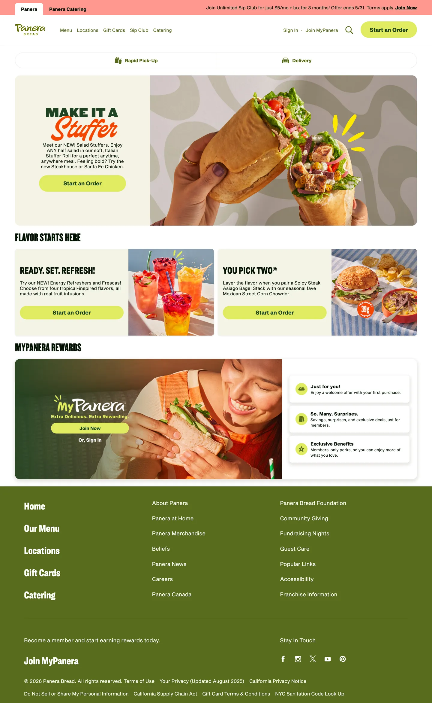
Panera's marketing site runs an unusual typographic double act: Champion — a thick, uppercase condensed display face borrowed from editorial posters — carries the hero banners, while Sequel Sans, a contemporary humanist sans, handles every other reading surface from nav links to loyalty copy to the footer copyright line. Where most fast-casual brands (Chipotle, Chick-fil-A, Shake Shack) anchor on a single workhorse sans or a slab serif that does both jobs, Panera separates "shout" from "speak" into two entirely different font families. The hero headline "MAKE IT A STUFFER" reads like a sandwich-board announcement; the body reads like a thoughtful café menu card. The contrast is the brand's typographic signature.
The DESIGN.md file packages the system into a machine-readable spec for React and AI tools. Inside: 12 colors tokens drawn from a midnight near-black canvas, four gradient steps of forest green (hearty-green through panera-green through a lighter green to chartreuse), warm parchment off-whites, and a single watermelon-pink as an accent present in the CSS but absent from the marketing chrome. Twelve typography tokens span Champion and Sequel Sans across hero, heading, subhead, body, and label tiers. Four radius tokens run from 8px standard to a 1000px pill. Sixteen components cover the pill-shaped CTA button, the green-on-parchment hero banner, the loyalty card module, the nav strip, and the footer column layout.
Feed this file to Claude or Cursor and it will reproduce Panera's specific moves: forest-green CTAs on warm-parchment backgrounds rather than on white, Champion uppercase-condensed for any promotional banner headline, Sequel Sans at 15px for body and interactive copy, and pill geometry for every button. The system is worth studying for its botanical naming layer — the CSS custom properties use names like `--pnra-color-midnight`, `--pnra-color-mother-bread`, and `--pnra-color-soft-white` that tell a story about sourcing and warmth rather than simply encoding visual values.
What makes it distinct
5
- Two-typeface display splitChampion for hero banners (uppercase condensed) and Sequel Sans for all body, nav, and CTA copy; the combination reads café chalkboard meets contemporary sans
- Botanical token namesforest greens encoded as hearty-green, panera-green, and mother-bread in CSS custom properties; the naming layer signals brand intention, not just visual choice
- Pill-only CTA geometryevery primary button on the page is 29px–1000px radius; no rounded-rectangle CTAs exist in the captured surface
- Midnight near-black as inktext runs on a forest-green-tinted black (#011400) rather than neutral charcoal; the tint connects every body element to the produce-fresh positioning
- Warm parchment canvassoft-white (#f4f3e6) appears as the primary off-white background, a cream tone 15 points warmer than pure white
panerabread.com
Live at panerabread.com
A snapshot of the brand in production. Scroll the frame to see the whole page.
Colors
12 colors
Panera's system runs on #576c1d as its primary voltage, used in 2 of 16 components. Type is set in sequel-sans across 12 tokens from 10px to 66px, weights 400–700. Shape language is soft — components average 16px corner radius, with no sharp interactive edges.
Brand & Accent
Sparing, CTA-only voltage · 3
Surface
Page and card backgrounds · 3
Text
Headlines, body, captions · 3
Borders & Hairlines
Dividers, outlines, rules · 1
Other
Specialty colors · 2
Typography
12 type tokens
Set in sequel-sans across 12 tokens, from 10px to 66px, weights 400–700. Shown in its own stack: where the font isn't installed, the fallback the file names stands in.
- display-xl66px · weight 400 · lh 66pxThe quick brown fox jumps over the lazy dog
- display-lg38px · weight 400 · lh 40pxThe quick brown fox jumps over the lazy dog
- display-md32px · weight 400 · lh 34px · tracking -0.1pxThe quick brown fox jumps over the lazy dog
- heading-lg34px · weight 400 · lh 39pxThe quick brown fox jumps over the lazy dog
- heading-md32px · weight 400 · lh 32px · tracking -0.2pxThe quick brown fox jumps over the lazy dog
- subhead-lg22px · weight 500 · lh 26px · tracking -0.2pxThe quick brown fox jumps over the lazy dog
- subhead-md18px · weight 700 · lh 18px · tracking -0.2pxThe quick brown fox jumps over the lazy dog
- body-lg18px · weight 400 · lh 22px · tracking 0.11pxThe quick brown fox jumps over the lazy dog
- body-md15px · weight 400 · lh 22px · tracking 0.11pxThe quick brown fox jumps over the lazy dog
- body-sm13px · weight 400 · lh 18px · tracking 0.11pxThe quick brown fox jumps over the lazy dog
- label-md15px · weight 700 · lh 22pxThe quick brown fox jumps over the lazy dog
- caption10px · weight 400 · lh 12pxThe quick brown fox jumps over the lazy dog
Layout
Radii and spacing
5 corner radii and 7 spacing values. Shape language: soft.
Radii
- none0px
- md8px
- lg16px
- pill29px
- full1000px
Spacing
- xs10px
- sm15px
- md16px
- base20px
- lg24px
- xl40px
- 2xl50px
Components
16 components
Each rendered from its tokens (color, type, radius, padding) on Panera's own canvas.
- Button Primarybutton-primaryButton Primary
- Button Primary Hoverbutton-primary-hoverButton Primary Hover
- Button Secondarybutton-secondaryButton Secondary
- Top Navtop-navTop Nav
- Nav Linknav-linkNav Link
- Hero Headinghero-headingHero Heading
- Section Headingsection-headingSection Heading
- Body Paragraphbody-paragraphBody Paragraph
- Body Paragraph Mutedbody-paragraph-mutedBody Paragraph Muted
- CardcardCard
- Hero Bannerhero-bannerHero Banner
- Menu Cardmenu-cardMenu Card
- Loyalty Cardloyalty-cardLoyalty Card
- Type here…text-inputText Input
- Eyebrow Labeleyebrow-labelEyebrow Label
- FooterfooterFooter
In use
The system, in use
Panera's tokens on the kind of product it builds.
Build something people actually use.
A short paragraph of marketing copy that previews how the brand's display tier and body tier read together. Two sentences is usually enough.
FAQ
Panera design system FAQ
Common questions about Panera's tokens, components, and how to use this DESIGN.md in your project.
Read next
Related reading
Specs, directories, and component libraries that pair with this design system.
- Browse all design systemsThe full directory of DESIGN.md files on shadcn.io, with live mockups for each.shadcn.io
- Panera — official sitePanera's public marketing site — the source of truth for the live tokens captured in this file.panerabread.com (opens in a new tab)
- The DESIGN.md specificationGoogle Labs' open spec for machine-readable design system files — the format this page is built on.github.com (opens in a new tab)
Use it
Use Panera in your project
One machine-readable file. Drop it into Claude, Cursor, or any AI tool that reads DESIGN.md.
Download the DESIGN.md
One machine-readable file: every color, type, radius, spacing, and component token of Panera.
Feed it to your AI tool
Drop it into Claude, Cursor, or GitHub Copilot. The agent writes React components and Tailwind classes that match Panera's visual language.
Reference the tokens directly
Or paste the values into your Tailwind config, CSS variables, or component library: every color, size and radius is a quoted, ready-to-copy value.
Read the full DESIGN.md: overview, rationale, do’s and don’ts
Overview
Panera's marketing site is built on a two-voice typographic model that most restaurant brands avoid. Announce and inform. Champion — a thick, uppercase condensed display face — handles every banner headline; Sequel Sans, a contemporary humanist, handles navigation, body copy, CTAs, and loyalty program text. The two families never swap roles. Where Chipotle and Sweetgreen run a single workhorse typeface across every scale, and where most QSR brands reach for a custom slab to do both jobs, Panera splits the work across two distinct identities: the loud declaration and the calm explanation are visually different languages.
The palette is anchored in four steps of forest green — {colors.primary-dark} through {colors.primary} through {colors.primary-mid} — plus a midnight near-black ink ({colors.ink}) with a green undertone baked in via the CSS variable --pnra-color-midnight (#011400). Below the green tier, the surface is warm parchment rather than pure white: soft-white (#f4f3e6) and extra-light-clay (#eae9e6) carry the canvas and card surfaces. The CSS custom properties use botanical names — hearty-green, mother-bread, soft-white, sun-dapple, panera-green — that signal sourcing intent at the token level.
Key Characteristics:
- Champion uppercase-condensed at 32–66px for every promotional headline — hero banners, promotional chips, and menu section titles.
- Sequel Sans at 15px / 400 for body and interactive copy; 15px / 700 for button labels; 22px / 500 for subheads — all on the same family with weight doing the differentiation.
- Forest green CTAs (
{colors.primary}— #576c1d) on warm parchment ({colors.surface-1}— #f4f3e6) rather than on white. - Pill-only button geometry — 29px radius on captured buttons, 1000px declared as the pill token. No rounded-rectangle CTAs anywhere in the marketing surface.
- Midnight ink with a green tint (
{colors.ink}— #011400) carries all body text and borders, connecting every text element to the botanical palette. - Loyalty program module runs the darkest hearty-green (#1d4321) as a full-bleed card, inverting to white text — the only dark-surface moment in the system.
- Botanical token naming layer in CSS custom properties creates a legible story at the code level before any visual rendering.
Colors
Brand
- Panera Green (
{colors.primary}— #576c1d): frequency 19. Used as text (9), border (9), background (1). The mid-tone forest green — fills primary CTA buttons and nav accents across the page. Wired in CSS as--pnra-color-panera-green. - Hearty Green (
{colors.primary-dark}— #1d4321): frequency 6. Used as text (3), border (3). The deep forest tone — carries loyalty card backgrounds and active state fills. Named--pnra-color-hearty-greenin the CSS. - Mid Green (
{colors.primary-mid}— #4c753f): frequency 18. Used as text (9), border (9). An intermediate green step between hearty-green and panera-green; appears on secondary interactive elements without a declared CSS variable name. - Chartreuse (
{colors.chartreuse}— #e0eb60): frequency 2. A bright yellow-green declared as--pnra-color-chartreuse; appears in promotional accent contexts but is rare in the captured surface.
Surface
- Soft White (
{colors.surface-1}— #f4f3e6): frequency 3, all as background fills. The primary parchment canvas — named--pnra-color-soft-white. 15 perceptual points warmer than pure white; carries the hero banner and card backgrounds. - Extra Light Clay (
{colors.surface-2}— #eae9e6): frequency 5 (4 as shadow, 1 as border). A slightly grayer parchment used for shadow stops and hairline borders. Named--pnra-color-extra-light-clay. - Canvas (
{colors.canvas}— #ffffff): pure white, used on the top-nav background and where parchment would contrast too heavily against photography.
Text
- Ink (
{colors.ink}— #011400): frequency 58. Used as text (29), border (29). The midnight near-black with a green undertone — carries every body element and border line across the page. Named--pnra-color-midnight. - Ink Neutral (
{colors.ink-neutral}— #000000): frequency 240, used as text (120) and border (118). The dominant structural dark — shadow and the heaviest text instances. Named--pnra-color-black. - Ink Muted (
{colors.ink-muted}— #6f6f75): frequency 2. A cool-neutral mid-gray for secondary labels; appears only twice in the captured surface.
Accent
- Watermelon (
{colors.watermelon}— #ff978f): frequency 1, background only. A warm salmon-pink declared as--pnra-color-light-watermelon; appears on a single promotional accent in the captured surface. The only chromatic departure from the green-and-earth palette.
Typography
Font Families
The system runs three typefaces: Champion for all uppercase display and hero banners, Sequel Sans for all body, navigation, button, and subhead copy, and Ringside for intermediate heading tiers (34–32px). Champion and Ringside are licensed typefaces; Sequel Sans is also proprietary. Fallbacks for all three walk to "Helvetica Neue", Helvetica, Arial, sans-serif.
The Champion / Sequel Sans split is the defining typographic move. The two families have radically different personalities — Champion is poster-weight condensed, Sequel Sans is open and humanist — and Panera uses both without cross-contamination.
Hierarchy
| Token | Size | Weight | Line Height | Use |
|---|---|---|---|---|
{typography.display-xl} | 66px | 400 | 66px | Hero banner h1 — "MAKE IT A STUFFER" (Champion, uppercase condensed) |
{typography.display-lg} | 38px | 400 | 40px | Section headline — "FLAVOR STARTS HERE" (Champion) |
{typography.display-md} | 32px | 400 | 34px | Medium promotional headlines (Champion) |
{typography.heading-lg} | 34px | 400 | 39px | Editorial heading tier (Ringside) |
{typography.heading-md} | 32px | 400 | 32px | Sub-section headings (Ringside) |
{typography.subhead-lg} | 22px | 500 | 26px | Menu category subheads (Sequel Sans) |
{typography.subhead-md} | 18px | 700 | 18px | Product name labels (Sequel Sans) |
{typography.body-lg} | 18px | 400 | 22px | Lead paragraph text (Sequel Sans) |
{typography.body-md} | 15px | 400 | 22px | Default body and nav link text (Sequel Sans) |
{typography.body-sm} | 13px | 400 | 18px | Secondary labels and small captions (Sequel Sans) |
{typography.label-md} | 15px | 700 | 22px | Button labels and emphasis (Sequel Sans) |
{typography.caption} | 10px | 400 | 12px | Fine print, icon labels (Sequel Sans) |
Principles
Champion tops out at 66px in the hero — the loudest moment — and descends to 32px for secondary banners. It always renders uppercase; there is no mixed-case instance in the captured surface. Sequel Sans handles everything else, with weight (400 for body, 700 for buttons and labels) doing the differentiation within the family rather than size. The {typography.display-xl} token at 66px / weight 400 is unusual: the face is inherently heavy by its design, so the weight property is 400 even though the visual weight reads as bold.
Note on Font Substitutes
Champion and Ringside are licensed. Bebas Neue or Anton replicate the uppercase-condensed personality of Champion at open-source cost. Sequel Sans is proprietary; Inter or DM Sans transfer cleanly at the same 15–18px body sizes. Maintain the two-family split — attempting to replace both with a single face that covers both registers loses the brand's announce/inform distinction.
Layout
Spacing System
- Base unit: 15px — the dominant structural padding value, appearing 12 times in the extracted surface (used as vertical section rhythm).
- Tokens:
{spacing.xs}10px ·{spacing.sm}15px ·{spacing.md}16px ·{spacing.base}20px ·{spacing.lg}24px ·{spacing.xl}40px ·{spacing.2xl}50px. - Hero section padding: 40px top, 50px horizontal on the banner cards.
- Card internal padding: 16px standard; 24px on the loyalty full-bleed card.
- Nav item padding: 15px vertical, 0px horizontal gap between nav items, with CTA button at 40px horizontal padding.
Grid & Container
- Max content width: ~1280px at desktop.
- Hero banner: full-width parchment card with the hero image spanning edge-to-edge behind the overlaid headline and CTA stack.
- Below-fold: 2-column editorial grid (two promotional panels side-by-side), collapsing to a single column for the loyalty module.
- Footer: multi-column link directory — 5 columns of navigation links on ink-black background.
Rhythm
The page alternates between a full-bleed hero banner and constrained editorial bands. The loyalty module breaks the pattern by introducing the darkest surface (hearty-green, #1d4321) as a full-bleed departure before returning to parchment. Vertical spacing is generous — 15px is the base rhythm unit with sections sitting at 40–50px of breathing room.
Elevation
The system has a hairline-and-clay elevation model. There are no traditional drop shadows in the captured surface — depth comes from {colors.surface-2} (#eae9e6, used 4 times as shadow) to define card boundaries against the parchment canvas. The extra-light-clay tone provides just enough contrast to lift cards without introducing shadow blur.
- Flat (no shadow): hero, nav, footer, promotional banner panels.
- Clay lift: card surfaces use the
{colors.surface-2}as a soft 1px shadow or border to separate from the parchment canvas. - Surface inversion: the loyalty card (
{component.loyalty-card}) uses hearty-green fill — the single dark-surface elevation in the system.
Shapes
The radius language is pill-first with an 8px standard for card containers:
{rounded.none}0px — the footer and full-bleed hero panels.{rounded.md}8px — menu cards, text inputs, and interior card elements.{rounded.lg}16px — larger promotional cards and the loyalty module container.{rounded.pill}29px — all CTA buttons on the captured page.{rounded.full}1000px — the declared maximum-pill token for badge and tag variants.
There is no 4px tier. Even small inputs default to 8px. The pill-only CTA commitment is absolute — no rounded-rectangle button appears anywhere in the marketing surface.
Components
button-primary — Forest-green {colors.primary} fill, white text, Sequel Sans bold label, 29px pill radius, 15×24px padding. "Start an Order" is the canonical instance, appearing three times on the page in identical treatment.
button-primary-hover — Deepens to hearty-green {colors.primary-dark} (#1d4321) on hover. The single darker step in the green scale.
button-secondary — Transparent fill, forest-green text and border, pill radius. Used for tertiary actions.
top-nav — White {colors.canvas} surface, 56px height. The Panera wordmark-logotype sits flush left; Locations, Menu, Gift Cards, and Catering links center; Sign In / Join MyPanera and "Start an Order" CTA pill flush right.
nav-link — Transparent background, midnight ink text in {typography.body-md}, 10×16px padding.
hero-heading — Transparent background, midnight ink text in {typography.display-xl} (Champion, 66px / 400). The promotional banner headline.
hero-banner — Parchment {colors.surface-1} background, 16px radius on the card container, 40×50px padding. The hero photography fills the right two-thirds; the headline and CTA stack left.
section-heading — Transparent background, midnight text in {typography.display-lg} (Champion). Used for "FLAVOR STARTS HERE" and "MYPANERA REWARDS."
body-paragraph — Default midnight running-text at {typography.body-md}.
body-paragraph-muted — Cool-neutral {colors.ink-muted} for secondary copy.
card — Parchment surface, midnight text, 8px radius, 16px padding. The standard content card for promotional panels.
menu-card — White surface with extra-light-clay border, midnight text in {typography.subhead-md} (Sequel Sans 18px / 700). Menu item thumbnail cards.
loyalty-card — Hearty-green {colors.primary-dark} fill, white text, 16px radius, 24px padding. The MyPanera loyalty module — the single dark-canvas surface in the marketing system.
text-input — White surface, midnight text, extra-light-clay border, 8px radius, 10×16px padding, 44px height.
eyebrow-label — Transparent background, small Sequel Sans 13px / 400 for above-heading context labels.
footer — Ink-black {colors.ink} surface, white text in {typography.body-md}, 45×50px padding. Five-column link directory with social icons.
Do's and Don'ts
Do use Champion only for uppercase promotional banners and headline moments. The face has no lowercase character in this brand context; mixing it with sentence-case copy breaks the announce/inform split.
Do fill all CTAs with forest green ({colors.primary} — #576c1d) on parchment backgrounds ({colors.surface-1} — #f4f3e6). The green-on-parchment pairing is the system's most distinctive visual moment; swapping to white backgrounds flattens it to generic QSR styling.
Do maintain pill geometry on every button. The 29px radius is not a rounded rectangle — it is a true pill, and mixing in 4–8px radius buttons disrupts the organic warmth signal.
Do use {colors.ink} (#011400) for all text and border elements rather than {colors.ink-neutral} (#000000). The green-tinted midnight reads warmer and connects every text element to the botanical palette.
Don't use the chartreuse (#e0eb60) as a CTA fill or text color. It appears twice in the captured surface in promotional accent contexts only; at full-weight fills it clashes with the earthy-green range. Use {colors.primary} instead.
Don't render body copy in Champion. Sequel Sans carries all informational text — body, labels, nav links, sub-heads. Champion at body sizes (15px) would be unreadable and off-brand.
Don't introduce dark-surface sections beyond the loyalty module pattern. The hearty-green {colors.primary-dark} full-bleed card works because it appears once, late in the page. Multiple dark sections erode its impact.
Don't mix the watermelon pink ({colors.watermelon} — #ff978f) with the forest-green range as co-equal accents. The watermelon is a promotional accent for seasonal campaigns — placing it beside forest green reads as a competing brand signal.
Known Gaps
- Hover and focus states: documented for
{component.button-primary-hover}only; focus rings, active press states, and disabled tints are not captured from the marketing surface. - Mobile layout: the captured surface is desktop-width (1280px). Nav collapses to a hamburger and the hero banner reflows to a stacked single-column; neither is represented in the component tokens.
- Dark mode: the captured marketing surface is light-only. No dark variant is declared in the CSS custom properties.
- Menu product surface: the full /menu pages run a denser card grid with pricing, allergen badges, and calorie counts — a richer surface with more component types than the homepage exposes.
- Loyalty program states: the MyPanera module on the homepage shows only the unauthenticated join state. Authenticated member states with tier badges, points counters, and reward cards are not represented.
- Animation: the hero banner cycles through promotional content on a timer; easing curves and transition timing are not captured in this spec.
Food & Delivery
More systems like this
More DESIGN.md files in Food & Delivery.
Pricing
Build it with Pro
The DESIGN.md files are free. Pro adds 6,000+ blocks, premium templates and the MCP server, so your AI editor builds in your system for you.
4.9/5 out of 5 · 150+ reviewsfrom 150+ founders and developers.
Billing
Billed once a year in USD. Cancel anytime.
- How many people can use the license.
- Client work, SaaS products and anything you charge for.
- Production-ready React sections: hero, pricing, features, dashboards and more.
- Complete multi-page sites you can ship as they are.
- React icons from every major library, installable with one command.
- Presets that restyle every block, in light and dark.
- Lets your AI editor search, preview and install blocks for you.
- Priority requests are answered first.
Individual
For personal projects & open source
$32instead of $49/mo
$389 billed yearly
- Seats: 1 seat
- Commercial use: Personal & open source only
- Pro blocks: 6,000+ blocks
- Templates: All 14 templates
- React icons: 294k+ icons
- Themes: All 59 themes
- MCP server: Basic usage
- Support: Standard
Team
Most popularFor freelancers, agencies & startups
$66instead of $99/mo
$789 billed yearly · ≈ $13/dev/mo
- Seats: Up to 5 seats
- Commercial use: Included
- Pro blocks: 6,000+ blocks
- Templates: All 14 templates
- React icons: 294k+ icons
- Themes: All 59 themes
- MCP server: High usage
- Support: Priority
Organization
For companies with larger teams
$132instead of $199/mo
$1,589 billed yearly
- Seats: Unlimited seats
- Commercial use: Included
- Pro blocks: 6,000+ blocks
- Templates: All 14 templates
- React icons: 294k+ icons
- Themes: All 59 themes
- MCP server: Unlimited usage
- Support: Priority
Billed once a year in USD. Cancel anytime.
Individual
For personal projects & open source
$32instead of $49/mo
$389 billed yearly
- How many people can use the license.Seats: 1 seat
- Client work, SaaS products and anything you charge for.Commercial use: Personal & open source only
- Production-ready React sections: hero, pricing, features, dashboards and more.Pro blocks: 6,000+ blocks
- Complete multi-page sites you can ship as they are.Templates: All 14 templates
- React icons from every major library, installable with one command.React icons: 294k+ icons
- Presets that restyle every block, in light and dark.Themes: All 59 themes
- Lets your AI editor search, preview and install blocks for you.MCP server: Basic usage
- Priority requests are answered first.Support: Standard
Team
Most popularFor freelancers, agencies & startups
$66instead of $99/mo
$789 billed yearly · ≈ $13/dev/mo
Everything in Individual, plus
- How many people can use the license.Seats: Up to 5 seats
- Client work, SaaS products and anything you charge for.Commercial use: Included
- Lets your AI editor search, preview and install blocks for you.MCP server: High usage
- Priority requests are answered first.Support: Priority
Organization
For companies with larger teams
$132instead of $199/mo
$1,589 billed yearly
Everything in Team, plus
- How many people can use the license.Seats: Unlimited seats
- Lets your AI editor search, preview and install blocks for you.MCP server: Unlimited usage
- Secure checkout via Stripe
- Code lives in your repo
- Keep what you've shipped if you cancel
- License terms
Your system, built for you
Every block, template and icon, installed by your AI agent in your design system. The DESIGN.md files stay free.