OpenTofu Design System
OpenTofu's design system as DESIGN.md. Deep navy #0c192b canvas, DM Sans at 60px bold, single lemon-yellow brand accent, system monospace for code panels, 15 colors tokens, 15 components. For React, Next.js, and AI coding tools.
Add shadcn.io to your AI agent. · Pro It installs blocks, icons and templates in your design system from a prompt, with Pro.
Set up MCP- Primary
- #ffda18
- Typeface
- DM Sans
- Shape
- Mixed
- Base radius
- 8px
- Colors
- 15
- Type tokens
- 11
- Components
- 15
- Spacing values
- 9
About
About OpenTofu DESIGN.md
Curated by Dov Azencot · Updated May 19, 2026 · Source opentofu.org (opens in a new tab)
OpenTofu's marketing site is, by design, a documentation site first. The brand runs Docusaurus in dark mode, which means every design decision — the navy canvas, the gray-blue hairline, the card surface, the heading weight — starts from the Infima design framework's opinionated dark defaults. Into that framework OpenTofu inserts one and only one chromatic brand signal: lemon-yellow #ffda18, wired into 16 CSS custom properties including `--ifm-link-color`, `--ifm-menu-color-active`, `--ifm-tabs-color-active-border`, `--docusaurus-progress-bar-color`, and `--docsearch-primary-color`. Every interactive affordance on the page — active nav links, active tabs, breadcrumb highlights, search accents — glows in this single yellow. The rest of the palette is cool, dark, and structural: midnight navy, slate-gray text, blue hairlines, near-black code surfaces.
The DESIGN.md file packages the system into a machine-readable spec for React tooling. Inside: "15 colors tokens anchored on the #0c192b background with the lemon-yellow primary;" 11 typography tokens running DM Sans at 60px / 700 for the hero h1 (with an unusual 3px letter-spacing) through 14px body; and the system monospace stack across all 173 captured code-surface samples. The radius ladder runs 6.4px (the IFM 0.4rem global default) for most surfaces, 12px for content cards, and 9999px for the pill CTA. 15 components definitions cover the hero, the yellow CTA, the dark code panel, the Docusaurus feature card, the sidebar-nav link, and the footer.
Feed this file to Claude or Cursor and it reproduces OpenTofu's positioning: a dark documentation aesthetic with a single warm accent that marks every "active" state. The system is worth studying for the discipline of the single-color activation pattern: when every interactive state — link, tab, breadcrumb, progress bar, search highlight — uses one hue, the page teaches its own interaction model without needing icons or labels.
What makes it distinct
5
- Single lemon-yellow voltage#ffda18 wires into 16 CSS custom properties as the primary link, active-tab, breadcrumb, and search accent; the only warm color on an otherwise cool-dark canvas
- Documentation-site architecturethe design system is Docusaurus dark mode, not a custom marketing surface; card radius at 6.4px and heading weight at 700 follow the IFM framework's defaults
- DM Sans with wide letter-spacing at displaythe 60px hero h1 renders at 3px letter-spacing, an atypically loose display treatment for the infrastructure category
- System mono for all codeno branded mono typeface; the default SFMono-Regular / Menlo / Monaco / Consolas stack carries all 173 extracted code-surface samples
- Cloud Native Computing Foundation badge prominencethe Linux Foundation affiliation appears above the fold as a trust signal, a positioning move against commercial competitors
opentofu.org
Live at opentofu.org
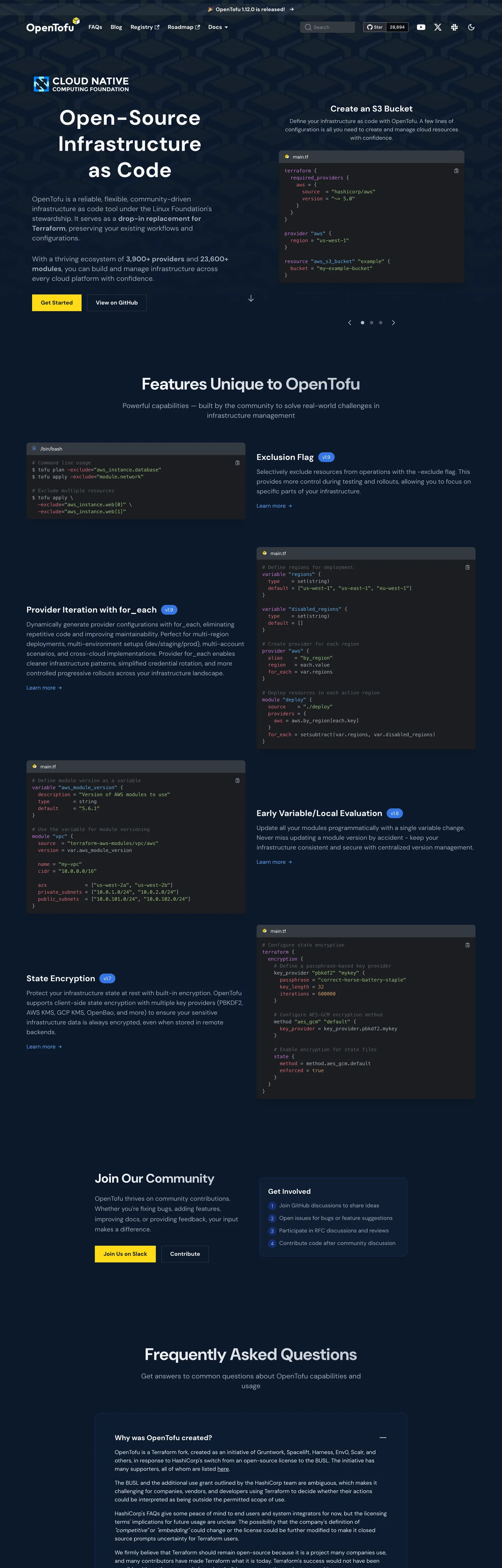
A snapshot of the brand in production. Scroll the frame to see the whole page.
Colors
15 colors
OpenTofu's system runs on #ffda18 as its primary voltage, used in 2 of 15 components. Type is set in DM Sans across 11 tokens from 14px to 60px, weights 400–700. Shape language is mixed across 15 components, blending pills, soft rounds, and squarer corners.
Brand & Accent
Sparing, CTA-only voltage · 3
Surface
Page and card backgrounds · 5
Text
Headlines, body, captions · 5
Borders & Hairlines
Dividers, outlines, rules · 1
Other
Specialty colors · 1
Typography
11 type tokens
Set in DM Sans across 11 tokens, from 14px to 60px, weights 400–700. Shown in its own stack: where the font isn't installed, the fallback the file names stands in.
- display-xl60px · weight 700 · lh 75px · tracking 3pxThe quick brown fox jumps over the lazy dog
- display-lg48px · weight 700 · lh 48pxThe quick brown fox jumps over the lazy dog
- heading-lg36px · weight 700 · lh 40pxThe quick brown fox jumps over the lazy dog
- heading-md24px · weight 700 · lh 32pxThe quick brown fox jumps over the lazy dog
- heading-sm20px · weight 700 · lh 28pxThe quick brown fox jumps over the lazy dog
- body-lg18px · weight 400 · lh 28pxThe quick brown fox jumps over the lazy dog
- body-md16px · weight 400 · lh 24pxThe quick brown fox jumps over the lazy dog
- body-sm14px · weight 400 · lh 20pxThe quick brown fox jumps over the lazy dog
- label-md16px · weight 700 · lh 24pxThe quick brown fox jumps over the lazy dog
- button-md16px · weight 700 · lh 24pxThe quick brown fox jumps over the lazy dog
- code-sm14px · weight 400 · lh 20pxThe quick brown fox jumps over the lazy dog
Layout
Radii and spacing
7 corner radii and 9 spacing values. Shape language: mixed.
Radii
- none0px
- xs4px
- sm6.4px
- md8px
- lg12px
- xl16px
- full9999px
Spacing
- xs6px
- sm8px
- base12px
- md16px
- lg24px
- xl32px
- 2xl48px
- 3xl64px
- 4xl80px
Components
15 components
Each rendered from its tokens (color, type, radius, padding) on OpenTofu's own canvas.
- Button Primarybutton-primaryButton Primary
- Button Primary Hoverbutton-primary-hoverButton Primary Hover
- Button Secondarybutton-secondaryButton Secondary
- Top Navtop-navTop Nav
- Nav Linknav-linkNav Link
- Nav Link Activenav-link-activeNav Link Active
- Hero Headinghero-headingHero Heading
- Section Headingsection-headingSection Heading
- Body Paragraphbody-paragraphBody Paragraph
- CardcardCard
- Code Blockcode-blockCode Block
- Feature Cardfeature-cardFeature Card
- Type here…text-inputText Input
- Faq Itemfaq-itemFaq Item
- FooterfooterFooter
In use
The system, in use
OpenTofu's tokens on the kind of product it builds.
Build something people actually use.
A short paragraph of marketing copy that previews how the brand's display tier and body tier read together. Two sentences is usually enough.
import { build } from "./build"

export async function main() {
  const result = await build()
  console.log("done", result)
}
FAQ
OpenTofu design system FAQ
Common questions about OpenTofu's tokens, components, and how to use this DESIGN.md in your project.
Read next
Related reading
Specs, directories, and component libraries that pair with this design system.
- Browse all design systemsThe full directory of DESIGN.md files on shadcn.io, with live mockups for each.shadcn.io
- OpenTofu — official siteOpenTofu's public marketing site — the source of truth for the live tokens captured in this file.opentofu.org (opens in a new tab)
- The DESIGN.md specificationGoogle Labs' open spec for machine-readable design system files — the format this page is built on.github.com (opens in a new tab)
Use it
Use OpenTofu in your project
One machine-readable file. Drop it into Claude, Cursor, or any AI tool that reads DESIGN.md.
Download the DESIGN.md
One machine-readable file: every color, type, radius, spacing, and component token of OpenTofu.
Feed it to your AI tool
Drop it into Claude, Cursor, or GitHub Copilot. The agent writes React components and Tailwind classes that match OpenTofu's visual language.
Reference the tokens directly
Or paste the values into your Tailwind config, CSS variables, or component library: every color, size and radius is a quoted, ready-to-copy value.
Read the full DESIGN.md: overview, rationale, do’s and don’ts
Overview
OpenTofu's marketing site is honest about what it is: a documentation platform that has been given a brand identity. Single-accent activation: the Docusaurus dark-mode framework provides every structural token — the navy canvas, the gray hairlines, the card surfaces, the heading hierarchy — while OpenTofu overrides exactly two things. First, the heading typeface (DM Sans replaces the system default via --ifm-heading-font-family). Second, the primary color family (lemon-yellow #ffda18 replaces Docusaurus's default blue, wiring into 16 custom properties including every active nav state, every tab highlight, every search accent, and the progress bar). The result is a design system where one color does every interactive job on the page.
Community trust over conversion infrastructure: the above-fold hero leads with the Cloud Native Computing Foundation badge, not a customer logo wall. The primary CTA says "Download" — not "Start free trial" or "Get started for free." The hero body copy names HashiCorp's BSL license change explicitly as the reason OpenTofu exists. This is not a marketing site trying to hide its origins; it is a community brand making its open-source lineage the first-above-fold argument. Where commercial infra brands like HashiCorp and Pulumi lead with enterprise use cases, OpenTofu leads with the license.
Typography adds one distinctive move: the 60px DM Sans hero h1 renders at 3px positive letter-spacing — the widest display tracking in the extracted dev-tools directory. Where Cloudflare tightens at -1.4px and Linear at -1px, OpenTofu opens up at +3px, making the headline read as open and community-oriented rather than precision-engineered.
Key Characteristics:
- Lemon-yellow
{colors.primary}(#ffda18) wired into 16 CSS custom properties — the single chromatic signal in an otherwise cool-dark palette. Every active interactive state uses this color. - Deep navy canvas
{colors.canvas}(#0c192b) from Docusaurus dark mode; near-black code surfaces at{colors.canvas-surface}(#1b1d20). - DM Sans at 60px / 700 / +3px letter-spacing for the hero — the widest display tracking in this category.
- System monospace stack for all code surfaces — no custom mono typeface.
- IFM 0.4rem (6.4px) global radius for most surfaces; 12px for content cards; 9999px pill for the primary CTA.
- CNCF / Linux Foundation trust badge above the hero fold — open-source affiliation as the primary credential.
Colors
Brand
- Primary Yellow (
{colors.primary}— #ffda18): frequency 4. Used as background (2) and border (2). Wired into 16 CSS custom properties as the universal active-state signal. The page's single warm color; absent from all structural surfaces. - Primary Light (
{colors.primary-light}— #60a5fa): frequency 4, all as background. Wired as--ifm-color-primary-lighter. A sky-blue hover/lighter variant in the primary color family. - Primary Lighter (
{colors.primary-lighter}— #93c5fd): frequency 4, all as text. Wired as--ifm-color-primary-lightest. A pale-blue for the lightest primary-color applications.
Surface
- Canvas (
{colors.canvas}— #0c192b): frequency 2. The deep navy page floor, wired as--ifm-background-color. Hero background and gradient base. - Canvas Surface (
{colors.canvas-surface}— #1b1d20): frequency 9. Near-black code block background, footer surface, and the darkest card tier. Wired as--ifm-pre-background,--ifm-footer-background-color,--ifm-color-gray-900. - Surface-1 (
{colors.surface-1}— #14253d): frequency 11, all as background fills. The primary content-card surface — slightly lighter than the canvas. Wired as--ifm-color-primary-contrast-background,--docsearch-footer-background. - Surface-2 (
{colors.surface-2}— #353a41): frequency 15. Mid-dark surface for dividers, inactive card tones. Wired as a structural tone. - Surface Card (
{colors.surface-card}— #242526): frequency 1. The Docusaurus card/dropdown background, wired as--ifm-background-surface-color,--ifm-card-background-color,--ifm-dropdown-background-color.
Text
- Ink (
{colors.ink}— #f9f9f9): frequency 246 — the dominant page text. Near-white at near-full opacity; wired as--ifm-font-color-base,--ifm-navbar-link-color. Carries headlines, body copy, nav labels, and button labels. - Ink Muted (
{colors.ink-muted}— #e7e9ec): frequency 19. Secondary text, blockquotes, hero body copy. Wired as--ifm-color-secondary,--ifm-hero-text-color. - Ink Secondary (
{colors.ink-secondary}— #9da6b5): frequency 28. Tertiary text, muted metadata, footer link labels. - Ink Tertiary (
{colors.ink-tertiary}— #b6bcc7): frequency 10. The dimmest text tier — caption labels, footnote metadata.
Hairlines
- Hairline (
{colors.hairline}— #ced3da): frequency 914 — the dominant border token. 913 border occurrences. Every table row, card edge, divider, and feature grid line uses this single cool-gray. Wired as--ifm-color-gray-400,--ifm-color-secondary-darker.
Syntax
- Syntax Text (
{colors.syntax-text}— #abb2bf): frequency 479, all as text. The default code-surface text color — the One Dark Pro gray that renders all non-highlighted code tokens. Carries the page's 173 extracted code samples. - Syntax Keyword (
{colors.syntax-keyword}— #c678dd): frequency 22, all as text. The One Dark Pro purple for language keywords, type identifiers, and special tokens in the embedded HCL/Go code examples.
Typography
Font Families
The system runs DM Sans for all editorial surfaces — headings, body, nav, buttons, labels — and the system monospace stack (SFMono-Regular → Menlo → Monaco → Consolas → Liberation Mono → Courier New) for all code surfaces. There is no branded mono typeface; the system stack is both intentional and consistent with the open-source documentation aesthetic.
DM Sans is wired into Docusaurus via --ifm-heading-font-family: 'DM Sans', system-ui. Body text inherits the Docusaurus system-UI stack unless overridden per element — the extracted samples confirm DM Sans is applied across the rendered body paragraphs.
Hierarchy
| Token | Size | Weight | Line Height | Letter Spacing | Use |
|---|---|---|---|---|---|
{typography.display-xl} | 60px | 700 | 75px | 3px | Hero h1 ("Open-Source Infrastructure as Code") |
{typography.display-lg} | 48px | 700 | 48px | 0 | Section h2 ("Features Unique to OpenTofu") |
{typography.heading-lg} | 36px | 700 | 40px | 0 | Sub-section h2 |
{typography.heading-md} | 24px | 700 | 32px | 0 | Feature card h3 |
{typography.heading-sm} | 20px | 700 | 28px | 0 | FAQ titles, small section heads |
{typography.body-lg} | 18px | 400 | 28px | 0 | Hero sub-paragraph, lead body |
{typography.body-md} | 16px | 400 | 24px | 0 | Default running text |
{typography.body-sm} | 14px | 400 | 20px | 0 | Captions, metadata |
{typography.label-md} | 16px | 700 | 24px | 0 | Active nav labels, CTA labels |
{typography.button-md} | 16px | 700 | 24px | 0 | Button labels |
{typography.code-sm} | 14px | 400 | 20px | 0 | All code surfaces |
Principles
Display weight is 700, body is 400. There is no 300, 500, or 600 weight in the system — DM Sans is binary in its weight usage. The distinguishing typographic move is the +3px letter-spacing on the 60px hero h1; every other tier tracks at 0. The loose display tracking is the brand's community-openness signal, the inverse of the tight -1px to -2px tracking that enterprise dev-tools use.
Note on Font Substitutes
DM Sans is open-source and freely available from Google Fonts. Plus Jakarta Sans is a close cousin with similar geometric-humanist proportions. For the monospace tier, the system stack is already what Docusaurus ships; no substitution is necessary.
Layout
Spacing System
- Base unit: 8px.
- Tokens:
{spacing.xs}6px ·{spacing.sm}8px ·{spacing.base}12px ·{spacing.md}16px ·{spacing.lg}24px ·{spacing.xl}32px ·{spacing.2xl}48px ·{spacing.3xl}64px ·{spacing.4xl}80px. - Section padding (vertical): 64–80px between major sections.
- Card internal padding:
{spacing.lg}(24px) on all feature and FAQ cards. - Container max-width: 1140px (
--ifm-container-width) standard, 1320px (--ifm-container-width-xl) wider.
Grid & Container
- Hero: left-aligned text column (~60%) with a right-aligned code-panel mockup (~40%). The CNCF / Linux Foundation badge floats above the headline.
- Feature grid: 2-column layout of code-panel mockups + description text, alternating left/right.
- Community section: 2-column grid of "Join Our Community" / "Get Involved" CTAs.
- FAQ section: single-column accordion of collapsible question-answer pairs.
Rhythm
The page alternates between hero + code-panel sections and text-only sections. Code panels appear prominently above the fold and in each feature section; text-only sections (FAQ, community) sit below. The code-panel sections use the dark {colors.canvas-surface} code surface against the {colors.canvas} page floor; the contrast is the page's primary visual rhythm.
Elevation
The system uses tonal surface contrast for all elevation, with no drawn shadows. Dark cards ({colors.surface-card} #242526) and code blocks ({colors.canvas-surface} #1b1d20) lift off the canvas ({colors.canvas} #0c192b) through lightness steps alone. The 42 shadow occurrences in the extraction are all pure black used for the IFM global shadow declaration on dropdowns and modals, not card elevation. The hairline border {colors.hairline} (#ced3da) defines card edges where tonal contrast alone is insufficient.
Shapes
The radius scale runs on the IFM global-radius of 0.4rem (6.4px):
{rounded.none}0px — section dividers and full-bleed bands only.{rounded.xs}4px — the smallest chip surfaces.{rounded.sm}6.4px — the IFM default radius applied to inputs, dropdowns, nav links, badges, and code blocks.{rounded.md}8px — medium card surfaces.{rounded.lg}12px — content cards and FAQ panels.{rounded.xl}16px — the largest feature card surfaces.{rounded.full}9999px — the primary "Download" CTA pill.
The ladder centers on 6.4px, the Docusaurus/IFM default, with cards at 12px providing the main visual softness.
Components
button-primary — Lemon-yellow {colors.primary} fill, dark text {colors.canvas}, DM Sans {typography.button-md}, full pill {rounded.full}, 8×16px padding, 40px height. "Download" is the canonical instance — the single yellow element above the fold.
button-primary-hover — Background shifts to sky-blue {colors.primary-light} for the hover state. This hover color (a blue) against the yellow resting state is atypical — the IFM framework's hover variant is a lighter step in the primary color family.
button-secondary — Transparent fill, near-white text, 1px {colors.hairline} border, {rounded.sm} 6.4px, same dimensions. Used for "More details" and "Learn more" secondary CTAs.
top-nav — Transparent over the hero (the navbar shadow is disabled via --ifm-navbar-shadow: none), 64px height, 12×24px padding. Houses the OpenTofu wordmark, product links (Docs, Showcase, Resources, Blog, Search), and the yellow "Download" pill CTA.
nav-link — Transparent, near-white text, {typography.body-md}, no radius, 4×12px padding.
nav-link-active — Near-white becomes yellow {colors.primary}, weight shifts to {typography.label-md}. The active state is the color's only visible job — switching one token turns the nav item from structural to branded.
hero-heading — Near-white text at {typography.display-xl} (60px / 700 / +3px tracking). "Open-Source Infrastructure as Code."
section-heading — {typography.display-lg} (48px / 700). Feature section heads like "Features Unique to OpenTofu."
body-paragraph — {colors.ink-muted} text at {typography.body-lg} (18px / 400). The hero sub-paragraph and feature descriptions.
card — {colors.surface-card} fill, near-white text, {rounded.lg} 12px, 24px padding. General content card.
code-block — Near-black {colors.canvas-surface} fill, {colors.syntax-text} default token color, {rounded.sm} 6.4px, 16×24px padding. The HCL and Go code panels with One Dark Pro syntax highlighting (purple keywords {colors.syntax-keyword}, coral strings, mint constants).
feature-card — Same dimensions as {component.card} but with a {colors.surface-2} border for additional structure. Used in the features grid.
text-input — {colors.surface-card} fill, near-white text, {rounded.sm} 6.4px, 8×16px padding, 48px height, 1px {colors.hairline} border. The search input and newsletter field.
faq-item — {colors.surface-card} fill, near-white heading at {typography.heading-sm}, {rounded.lg} 12px, 24px padding. The collapsible FAQ accordion items in the "Frequently Asked Questions" section.
footer — {colors.canvas-surface} fill, {colors.ink-secondary} text, {typography.body-sm}, 48×24px padding. Continues the near-black surface below the page.
Do's and Don'ts
Do use {colors.primary} (#ffda18) only for interactive active states — active nav links, active tabs, the primary CTA background, search accents. This single-color activation pattern teaches the interaction model by repetition; diluting it to section fills or decorative accents breaks the system.
Do hold DM Sans display weight at 700. The heading weight in this system is a binary choice — 400 for body, 700 for heading — inherited from Docusaurus's --ifm-heading-font-weight: 700. Introducing 500 or 600 would require overriding IFM defaults and creates inconsistency with the underlying framework.
Do let {colors.hairline} (#ced3da) carry all border work. At 913 of 914 border occurrences, this is the most dominant structural hairline in the extracted directory; there is no second hairline tone. Using any other color for borders breaks the grid's visual unity.
Do preserve the +3px letter-spacing on the 60px display h1. The loose tracking is the single typographic move that distinguishes this brand from the tight-display conventions of commercial infra brands; removing it makes the hero read like Terraform's.
Don't use {colors.primary-light} (#60a5fa) or {colors.primary-lighter} (#93c5fd) for the primary CTA or active-state fills. These are the IFM primary-color hover/lightest variants — they appear as background fills (4 occurrences each) in framework hover states and should not be promoted to prominent interactive surfaces that compete with the yellow primary.
Don't introduce a custom mono typeface. The system monospace stack is intentional — it uses the developer's own IDE monospace, which removes brand distance. Adding JetBrains Mono or Fira Code would add a brand voice the system explicitly does not have.
Don't use {colors.syntax-keyword} (#c678dd) or {colors.syntax-text} (#abb2bf) outside code blocks. These are One Dark Pro syntax-highlighting palette values, not brand accents; applying them to card fills or headings would make the page look like a syntax-highlighting error.
Don't add a second accent color alongside the yellow. The entire system's interaction model is built on one color doing every active-state job. A second accent color (e.g. blue for "Pro" features) would require re-teaching the user which color means "active" — the yellow's meaning depends on its uniqueness.
Known Gaps
- Docusaurus framework coupling: the token system is built on the IFM framework — changing
--ifm-global-radiusor--ifm-color-primarypropagates across all 16+ custom properties simultaneously. This DESIGN.md captures the rendered values, not the IFM variable hierarchy. - Light mode: OpenTofu's site renders in dark mode only; the
--ifm-color-scheme: darkflag is set globally. A light-mode variant is not exposed and would require significant IFM overrides. - Mobile breakpoint: the feature grid and hero layout collapse on narrow viewports; the captured tokens reflect the 1440px desktop layout only.
- Hover and focus states: the full IFM interaction matrix (focus rings, disabled states, pressed states) is not captured. The yellow primary wires into hover states through the IFM cascade rather than explicit component overrides.
- Sidebar navigation: the Docusaurus sidebar (collapsible doc tree, active-link yellow highlighting) is a distinct surface from the marketing page; its spacing, typography, and depth hierarchy are not represented in this spec.
- Announcement bar: OpenTofu sometimes shows a Docusaurus announcement bar at the top of the page. Its height is declared via
--docusaurus-announcement-bar-height: 30pxbut its content and styling are not captured in the current extraction.
Backend, Database & DevOps
More systems like this
More DESIGN.md files in Backend, Database & DevOps.
Pricing
Build it with Pro
The DESIGN.md files are free. Pro adds 6,000+ blocks, premium templates and the MCP server, so your AI editor builds in your system for you.
4.9/5 out of 5 · 150+ reviewsfrom 150+ founders and developers.
Billing
Billed once a year in USD. Cancel anytime.
- How many people can use the license.
- Client work, SaaS products and anything you charge for.
- Production-ready React sections: hero, pricing, features, dashboards and more.
- Complete multi-page sites you can ship as they are.
- React icons from every major library, installable with one command.
- Presets that restyle every block, in light and dark.
- Lets your AI editor search, preview and install blocks for you.
- Priority requests are answered first.
Individual
For personal projects & open source
$32instead of $49/mo
$389 billed yearly
- Seats: 1 seat
- Commercial use: Personal & open source only
- Pro blocks: 6,000+ blocks
- Templates: All 14 templates
- React icons: 294k+ icons
- Themes: All 59 themes
- MCP server: Basic usage
- Support: Standard
Team
Most popularFor freelancers, agencies & startups
$66instead of $99/mo
$789 billed yearly · ≈ $13/dev/mo
- Seats: Up to 5 seats
- Commercial use: Included
- Pro blocks: 6,000+ blocks
- Templates: All 14 templates
- React icons: 294k+ icons
- Themes: All 59 themes
- MCP server: High usage
- Support: Priority
Organization
For companies with larger teams
$132instead of $199/mo
$1,589 billed yearly
- Seats: Unlimited seats
- Commercial use: Included
- Pro blocks: 6,000+ blocks
- Templates: All 14 templates
- React icons: 294k+ icons
- Themes: All 59 themes
- MCP server: Unlimited usage
- Support: Priority
Billed once a year in USD. Cancel anytime.
Individual
For personal projects & open source
$32instead of $49/mo
$389 billed yearly
- How many people can use the license.Seats: 1 seat
- Client work, SaaS products and anything you charge for.Commercial use: Personal & open source only
- Production-ready React sections: hero, pricing, features, dashboards and more.Pro blocks: 6,000+ blocks
- Complete multi-page sites you can ship as they are.Templates: All 14 templates
- React icons from every major library, installable with one command.React icons: 294k+ icons
- Presets that restyle every block, in light and dark.Themes: All 59 themes
- Lets your AI editor search, preview and install blocks for you.MCP server: Basic usage
- Priority requests are answered first.Support: Standard
Team
Most popularFor freelancers, agencies & startups
$66instead of $99/mo
$789 billed yearly · ≈ $13/dev/mo
Everything in Individual, plus
- How many people can use the license.Seats: Up to 5 seats
- Client work, SaaS products and anything you charge for.Commercial use: Included
- Lets your AI editor search, preview and install blocks for you.MCP server: High usage
- Priority requests are answered first.Support: Priority
Organization
For companies with larger teams
$132instead of $199/mo
$1,589 billed yearly
Everything in Team, plus
- How many people can use the license.Seats: Unlimited seats
- Lets your AI editor search, preview and install blocks for you.MCP server: Unlimited usage
- Secure checkout via Stripe
- Code lives in your repo
- Keep what you've shipped if you cancel
- License terms
Your system, built for you
Every block, template and icon, installed by your AI agent in your design system. The DESIGN.md files stay free.