Nubank Design System
Nubank's marketing system as a DESIGN.md file. Deep violet brand voltage held in reserve for CTAs, Graphik display at weight 500, full-bleed customer photography, and a 999px pill geometry across every action. Tokens for React, Next.js, and AI coding tools.
Add shadcn.io to your AI agent. · Pro It installs blocks, icons and templates in your design system from a prompt, with Pro.
Set up MCP- Primary
- #820ad1
- Typeface
- graphikMedium
- Shape
- Soft
- Base radius
- 24px
- Colors
- 14
- Type tokens
- 11
- Components
- 18
- Spacing values
- 10
About
About Nubank DESIGN.md
Curated by Dov Azencot · Updated May 18, 2026 · Source nubank.com.br (opens in a new tab)
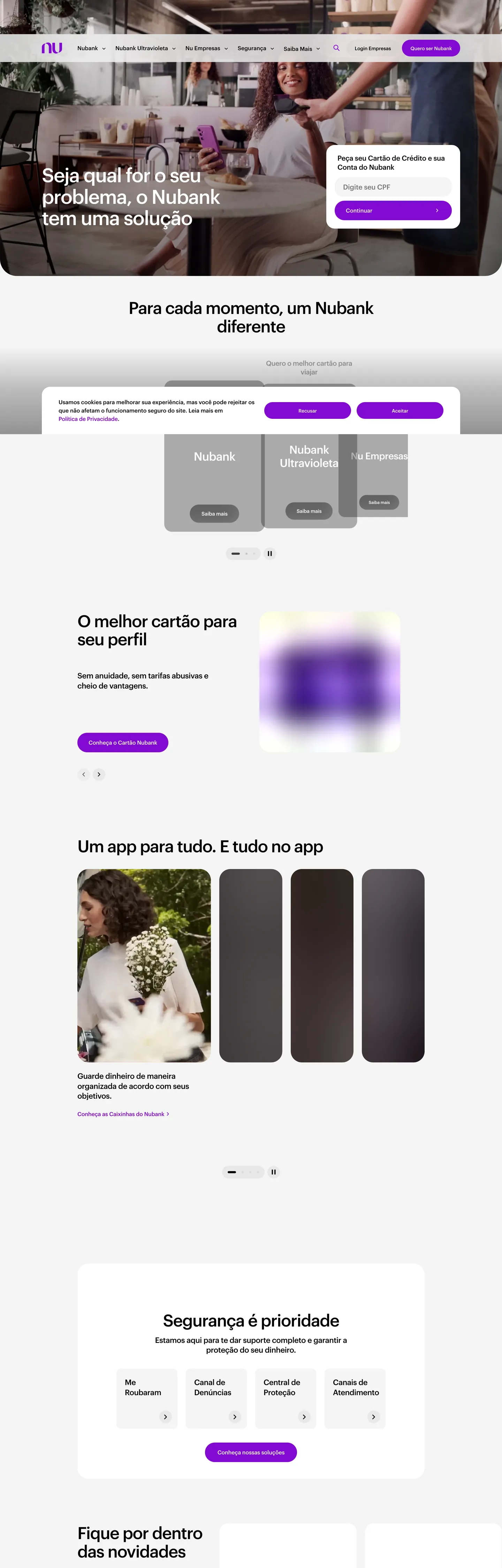
Nubank's marketing site does something almost no other LATAM neobank does: it gives the brand voltage almost no real estate above the fold. The hero is a full-bleed lifestyle photograph — a barista standing at the counter of an espresso bar — with the headline "Seja qual for o seu problema, o Nubank tem uma solução" in 56px graphikMedium white type floating over the image, and a deep violet pill CTA tucked into the lower-left corner. Where Revolut paints its hero in flat brand black and Monzo runs Hot Coral as a wallpaper colour, Nubank treats its violet as a scarce signal — held back for the CTA, the link, the brand logo, and very little else. The photograph carries the warmth; the violet carries the action.
The DESIGN.md file packages the system into a machine-readable spec for React tooling. Inside: 14 colors tokens drawn from the brand-core violet ramp (10/20/30 lavenders up through 80/90 plums) plus the structural ink-and-offWhite tier, organized around the single voltage at violet 60; 11 typography tokens running Graphik in two weights (regular 400 / medium 500) across display, heading, body, button, and label tiers; 4 radius tokens with a 999px pill at the top of the scale; an 8 px base spacing scale that snaps to 24 px for card padding and 64 px for desktop card margins; and 18 components definitions covering the violet CTA pill, the photo-overlay hero, the rounded card grids, the segmented control, and the dark testimonial card.
Feed this file to Claude or Cursor and it reproduces Nubank's specific moves: photography-on-canvas instead of a colored hero, a single violet reserved for CTA pills and links, pure black ink for type rather than the slightly-blue near-black that Wise and Mercury use, Graphik at modest 400-500 weights, and 999px pill geometry across every action. The one move worth borrowing only if you have warm customer photography to lean on: the willingness to let the brand color completely recede above the fold. Most fintech brands need the voltage doing the structural work; Nubank trusts the photograph to do it instead.
What makes it distinct
5
- Voltage held in reservedeep violet #820ad1 appears just 67 times in the captured page, almost entirely on CTA pills and link text, never as a background wash
- Photography-first herothe above-fold is a full-bleed lifestyle photograph of a barista, with white display type floating over it rather than a colored canvas
- Graphik at modest weightsdisplay sits at 48-56px in weight 500, body at 16-18px in weight 400, no 700+ tier anywhere on the marketing surface
- 999px pill geometryevery CTA, every chip, every category tab carries the maximum-radius pill; the 24px and 32px card radii sit beneath it as the only other rounding values
- Black ink, not charcoalbody and headline text use pure #000000 on the offWhite canvas, the maximum-contrast move that lets photography carry color while type stays monochrome
nubank.com.br
Live at nubank.com.br
A snapshot of the brand in production. Scroll the frame to see the whole page.
Colors
14 colors
Nubank's system runs on #820ad1 as its primary voltage, used in 3 of 18 components. Type is set in graphikMedium across 11 tokens from 12px to 56px, weights 400–500. Shape language is soft — components average 411px corner radius, with no sharp interactive edges.
Brand & Accent
Sparing, CTA-only voltage · 6
Surface
Page and card backgrounds · 2
Text
Headlines, body, captions · 3
Borders & Hairlines
Dividers, outlines, rules · 2
Other
Specialty colors · 1
Typography
11 type tokens
Set in graphikMedium across 11 tokens, from 12px to 56px, weights 400–500. Shown in its own stack: where the font isn't installed, the fallback the file names stands in.
- display-xl56px · weight 500 · lh 61.6px · tracking -1.68pxThe quick brown fox jumps over the lazy dog
- display-lg48px · weight 500 · lh 52.8px · tracking -1.44pxThe quick brown fox jumps over the lazy dog
- display-md36px · weight 500 · lh 43.2px · tracking -0.72pxThe quick brown fox jumps over the lazy dog
- heading-md22px · weight 500 · lh 28.6px · tracking -0.44pxThe quick brown fox jumps over the lazy dog
- heading-sm18px · weight 500 · lh 39.96pxThe quick brown fox jumps over the lazy dog
- body-lg18px · weight 400 · lh 25.92pxThe quick brown fox jumps over the lazy dog
- body-md16px · weight 400 · lh 24pxThe quick brown fox jumps over the lazy dog
- label-md16px · weight 500 · lh 24px · tracking -0.16pxThe quick brown fox jumps over the lazy dog
- button-md14px · weight 500 · lh 21px · tracking -0.14pxThe quick brown fox jumps over the lazy dog
- nav-link16px · weight 500 · lh 16pxThe quick brown fox jumps over the lazy dog
- caption12px · weight 400 · lh 19.92pxThe quick brown fox jumps over the lazy dog
Layout
Radii and spacing
6 corner radii and 10 spacing values. Shape language: soft.
Radii
- none0px
- sm12px
- md24px
- lg32px
- xl48px
- full999px
Spacing
- xs4px
- sm8px
- md12px
- base16px
- lg24px
- xl32px
- 2xl48px
- 3xl64px
- 4xl80px
- 5xl120px
Components
18 components
Each rendered from its tokens (color, type, radius, padding) on Nubank's own canvas.
- Hero Sectionhero-sectionHero Section
- Hero Headinghero-headingHero Heading
- Section Headingsection-headingSection Heading
- Sub Headingsub-headingSub Heading
- Body Paragraphbody-paragraphBody Paragraph
- Body Paragraph Mutedbody-paragraph-mutedBody Paragraph Muted
- Button Primarybutton-primaryButton Primary
- Button Primary Hoverbutton-primary-hoverButton Primary Hover
- Button Secondarybutton-secondaryButton Secondary
- Top Navtop-navTop Nav
- Nav Linknav-linkNav Link
- Segmented Togglesegmented-toggleSegmented Toggle
- CardcardCard
- Card Photocard-photoCard Photo
- Testimonial Card Darktestimonial-card-darkTestimonial Card Dark
- Link Textlink-textLink Text
- Type here…text-inputText Input
- FooterfooterFooter
In use
The system, in use
Nubank's tokens on the kind of product it builds.
Build something people actually use.
A short paragraph of marketing copy that previews how the brand's display tier and body tier read together. Two sentences is usually enough.
FAQ
Nubank design system FAQ
Common questions about Nubank's tokens, components, and how to use this DESIGN.md in your project.
Read next
Related reading
Specs, directories, and component libraries that pair with this design system.
- Browse all design systemsThe full directory of DESIGN.md files on shadcn.io, with live mockups for each.shadcn.io
- Nubank — official siteNubank's public marketing site — the source of truth for the live tokens captured in this file.nubank.com.br (opens in a new tab)
- The DESIGN.md specificationGoogle Labs' open spec for machine-readable design system files — the format this page is built on.github.com (opens in a new tab)
Use it
Use Nubank in your project
One machine-readable file. Drop it into Claude, Cursor, or any AI tool that reads DESIGN.md.
Download the DESIGN.md
One machine-readable file: every color, type, radius, spacing, and component token of Nubank.
Feed it to your AI tool
Drop it into Claude, Cursor, or GitHub Copilot. The agent writes React components and Tailwind classes that match Nubank's visual language.
Reference the tokens directly
Or paste the values into your Tailwind config, CSS variables, or component library: every color, size and radius is a quoted, ready-to-copy value.
Read the full DESIGN.md: overview, rationale, do’s and don’ts
Overview
Nubank's marketing site inverts the neobank convention. Voltage in reserve. Where Monzo wraps its hero in Hot Coral and Revolut paints flat brand black across the fold, Nubank gives the above-fold canvas entirely to a customer photograph — a barista at a coffee bar in the captured page — and reserves its deep violet ({colors.primary} — #820ad1) for the small pill CTA tucked into the lower-left corner. The brand voltage appears 67 times across the whole captured page, but on the hero itself it shows up only twice: the CTA fill and the brand logo. The photograph does every job a colored canvas would normally do.
Below the fold the page drops onto a soft offWhite floor ({colors.surface-1} — #f4f4f4, wired as --colors-backgroundColors-subtle), and the rhythm becomes editorial. Section headlines sit at 48px graphikMedium weight 500 with -1.44px tracking; body text at 16-18px in regular 400; everything else flows in cards rounded to 24px ({rounded.md}) or 32px ({rounded.lg}) with no shadow. The category strip uses {rounded.full} 999px pills for the Pessoa Física / Pessoa Jurídica / Para Empresas toggle and again for every action button. The shape language is pill or card — the system has no rounded-but-not-pill middle tier for tappable elements.
Typography runs Graphik across every tier — wired in CSS as --font-nusans-display and --font-nusans-text, with graphikMedium and graphikRegular as the rendered families. Two weights only: 400 (regular) and 500 (medium). The 56px hero h1 in medium is the loudest typographic moment in the system; there is no 700+ weight anywhere on the marketing surface. Where Wise leans on display-bold and Mercury walks up to weight 600, Nubank holds at 500 across the board — the same restraint Airbnb uses on Cereal, only applied to a neobank brand whose voltage is twenty times more saturated.
Key Characteristics:
- Single deep-violet voltage (
{colors.primary}— #820ad1) reserved for CTA pills and link text — 67 occurrences across the captured page, 30 as text, 30 as border, 7 as background. - Photography-first hero with full-bleed lifestyle imagery, white 56px display type floating over it; the brand color is given no real estate above the fold beyond the small CTA and logo.
- Black ink (
{colors.ink}— #000000) for body and headlines, not a slightly-blue near-black; the offWhite canvas takes any softness the system needs. - Graphik at weight 400-500 only — no 700+ tier; display tops out at 56px in medium with -1.68px tracking.
- 999px pill geometry on every CTA, every category tab, every filter chip — the pill is the universal action shape.
- Two non-pill card radii: 24px (
{rounded.md}) for default cards, 32px ({rounded.lg}) for larger photo-led tiles; a 48px ({rounded.xl}) tier exists for the dark testimonial blocks. - Dark testimonial cards (
{component.testimonial-card-dark}) flip to black surface with white text — the system's only inversion, used once per page to break the cream-and-photography rhythm. - 8px base spacing unit. Card internal padding
{spacing.lg}(24px); section vertical rhythm{spacing.4xl}(80px) between major bands.
Colors
Brand
- Violet Core (
{colors.primary}— #820ad1): frequency 67. Used as text (30), border (30), background (7). The single brand voltage — fills primary CTAs, marks link text, fills the brand logo in the top-nav. Wired in CSS as--colors-brand-core-60,--colors-content-link,--colors-surfaces-states-enabled,--colors-surfaces-headerLogo. The discipline is to hold this color for actions only. - Violet Hover (
{colors.primary-hover}— #490b75): the deeper plum used on link-hover and CTA-hover states. Wired as--colors-content-linkHover,--colors-brand-core-80,--colors-content-states-hovered. - Violet Pressed (
{colors.primary-pressed}— #290b4d): the darkest violet, reserved for the pressed/active state on primary buttons. Wired as--colors-content-states-pressedActive,--colors-brand-ultravioleta-90. - Violet Soft (
{colors.primary-soft}— #aa68ff): the lighter brand-core-40 tone used for subtle interactive surfaces in the product editor. Declared but not rendered on the marketing surface. - Violet Tint (
{colors.primary-tint}— #d2a5ff): brand-core-30, used as a focus-ring color (--colors-bordersColors-accentFocus) and as a subtle hover-surface tint. - Violet Surface (
{colors.primary-surface}— #eadbf1): the palest violet wash, wired as--colors-backgroundColors-highand--colors-content-states-lowest. Used as a low-emphasis surface tint on subtle hover states.
Text
- Ink (
{colors.ink}— #000000): frequency 846 — the dominant tone on the page. Used as text (421), border (406), and a handful of structural backgrounds. Wired as--colors-content-primary,--colors-content-icon,--colors-content-base,--colors-neutrals-100. The contrast is uncompromising: pure black on offWhite, never a softened charcoal. - Ink Muted (
{colors.ink-muted}— #777777): frequency 2 as text — secondary copy under headlines and footnote rows. Wired as--colors-content-secondary,--colors-neutrals-55. - Ink Secondary (
{colors.ink-secondary}— #414140): frequency 6 as background — a deep neutral used on the dark-card overlay tones. Wired as--colors-neutrals-80.
Surface
- Canvas (
{colors.canvas}— #ffffff): frequency 201 — the default surface inside cards, the top-nav background, and most card fills. Wired as--colors-neutrals-0,--colors-backgroundColors-default,--colors-surfaces-default. - Surface-1 (
{colors.surface-1}— #f4f4f4): frequency 15 — the page floor below the fold, wired as--colors-backgroundColors-subtle,--colors-neutrals-5, and--colors-surfaces-subtle. The offWhite carries the warmth that body text refuses to give up.
Hairline
- Hairline (
{colors.hairline}— #e4e4e4): the default border tone — input outlines, card edges, footer rules. Wired as--colors-bordersColors-default,--colors-neutrals-15,--colors-backgroundColors-strong. - Hairline Strong (
{colors.hairline-strong}— #a2a2a2): frequency 184 — used as a secondary border tone on inputs and as a disabled-state surface. Wired as--colors-neutrals-45,--colors-content-states-disabled,--colors-surfaces-strong.
Feedback
- Feedback Critical (
{colors.feedback-critical}— #d01d1c): the system's error tone, wired as--colors-feedback-red-50and--colors-content-feedback-critical. Not rendered on the captured marketing page but declared for form validation in the product surfaces.
Typography
Font Family
The system runs Graphik for every spoken surface — declared in CSS as --font-nusans-display (graphikMedium) for headings, buttons, and emphasis labels, and --font-nusans-text (graphikRegular) for body and caption. Two weights only: 400 (regular) and 500 (medium). Fallbacks walk arial, helvetica. There is no separate display serif, no italic tier, no condensed variant. One family, two weights, every job. A third family (nubankIcons) carries the icon glyphs and never appears as text.
Hierarchy
| Token | Size | Weight | Line Height | Letter Spacing | Use |
|---|---|---|---|---|---|
{typography.display-xl} | 56px | 500 | 61.6px | -1.68px | Hero h1 ("Seja qual for o seu problema, o Nubank tem uma solução") |
{typography.display-lg} | 48px | 500 | 52.8px | -1.44px | Section h2 ("Para cada momento, um Nubank diferente") |
{typography.display-md} | 36px | 500 | 43.2px | -0.72px | Sub-section h3, product-card titles |
{typography.heading-md} | 22px | 500 | 28.6px | -0.44px | Card titles, mid-density spans |
{typography.heading-sm} | 18px | 500 | 39.96px | 0 | h3 with extended leading for stacked rows |
{typography.body-lg} | 18px | 400 | 25.92px | 0 | Default running paragraph text |
{typography.body-md} | 16px | 400 | 24px | 0 | Secondary body and caption rows |
{typography.label-md} | 16px | 500 | 24px | -0.16px | Inline links, emphasis spans |
{typography.button-md} | 14px | 500 | 21px | -0.14px | Primary and secondary CTA labels |
{typography.nav-link} | 16px | 500 | 16px | 0 | Top-nav link labels |
{typography.caption} | 12px | 400 | 19.92px | 0 | Footnote text, legal copy |
Principles
Display weight tops out at 500, never 700. The 56px hero h1 with -1.68px tracking is the loudest typographic moment in the system — confidence by negative letter-spacing, not by weight. Most LATAM neobanks (Inter, Banco Pan, Picpay) run display at weight 700+; Nubank's restraint at 500 is the single typographic move that separates it from its category peers. Body and caption share weight 400; medium 500 is the system's only emphasis treatment.
The 56px → 48px → 36px → 22px display ladder is steep and tight — there is no 64px tier above the hero and no 28-30px tier between the section h2 and the card title. The typographic system uses size jumps rather than weight jumps to mark hierarchy.
Note on Font Substitutes
Graphik is licensed. Inter at the same weights is the closest open-source substitute; the proportions transfer cleanly and Inter's slightly looser counters read close to Graphik at the 16-18px body sizes. For the tight tracking on display sizes, apply letter-spacing: -0.03em on Inter to match Graphik's tighter cap-height optical density. General Sans is closer in feel but not free.
Layout
Spacing System
- Base unit: 8px (with 4px as the finest module — wired as
--space-x1). - Tokens:
{spacing.xs}4px ·{spacing.sm}8px ·{spacing.md}12px ·{spacing.base}16px ·{spacing.lg}24px ·{spacing.xl}32px ·{spacing.2xl}48px ·{spacing.3xl}64px ·{spacing.4xl}80px ·{spacing.5xl}120px. - Section padding (vertical):
{spacing.4xl}(80px) between major bands;{spacing.5xl}(120px) on the hero block (wired as--space-heroDesktop). - Card internal padding:
{spacing.lg}(24px) default; the photo-led tiles run to{spacing.xl}(32px) on the inside. - Card desktop margin: 64px (wired as
--space-cardMarginDesktop) — the gap between the photo-led tile grid and the page edge on desktop.
Grid & Container
- Max content width: ~1200px (
--breakpoints-xl1200px) on most sections; ~1080px on display headlines for measure-control. - Hero: full-bleed lifestyle photograph with the centered display headline and CTA stacked in the lower-left safe zone.
- Photo-led tile grid: 3-column grid of
{rounded.lg}32px-rounded cards each carrying a customer photograph at the top and an editorial caption beneath. - Product-card row: segmented carousel showing the four Nubank cards (Nubank, Nubank Ultravioleta, Nubank Mais, Nubank PJ) — each card sits in a 24px-rounded tile.
- Tabbed security band: a four-tab segmented control near the bottom (Não Falaremos / Antifraude / Proteção / Canais de Atendimento) that swaps its content panel in place.
Rhythm
The page alternates between photography bands and editorial bands. The hero is photographic; the first card row is editorial (white tiles with violet links); the next band returns to photography (the 3-up customer-stories grid); the dark testimonial block flips contrast; the tabbed security panel returns to white. There is no atmospheric gradient between bands — every section terminates flush on either canvas or surface-1, and depth comes from card elevation rather than from background shifts.
Elevation
The system has essentially no shadow tier. The captured page renders zero shadow occurrences across all 1,256 scanned elements — the violet, the ink, the offWhite, and the white never lift off each other with a shadow. Instead, hierarchy comes from {colors.canvas} cards sitting on the {colors.surface-1} offWhite floor, or from the offWhite cards sitting on a photograph.
- Flat (no shadow): 100% of body surfaces — hero, card rows, dark testimonial, footer.
- Surface contrast: white cards on offWhite floor; offWhite cards on white floor inside the segmented panels.
- Photographic lift: the dark testimonial card (
{component.testimonial-card-dark}) is the only structurally-elevated element on the page — it's elevated by color inversion, not by shadow.
Shapes
The radius scale is pill or card — no middle tier for tappable elements:
{rounded.none}0px — only on the hero photograph and section dividers.{rounded.sm}12px — wired as--radii-smalland--radii-sm, used on form inputs and small subtle surfaces.{rounded.md}24px — wired as--radii-mediumand--radii-md, the default card radius across most product rows.{rounded.lg}32px — wired as--radii-largeand--radii-lg, used on larger photo-led tiles.{rounded.xl}48px — wired as--radii-extraLargeand--radii-xl, used on the dark testimonial cards.{rounded.full}999px — wired as--radii-full, the universal tappable-action shape: every CTA, every category tab, every filter chip.
There is no 8px or 16px tier. The smallest meaningful card surface starts at 12px (inputs only); every interactive element jumps directly to the 999px pill. The pill is the warmest, most-tappable shape in the system and Nubank uses it as a universal action signal.
Components
hero-section — Full-bleed photographic canvas, 120×24 padding (wired as --space-heroDesktop). The lifestyle photograph carries the band; the headline and CTA float over it in the lower-left safe zone.
hero-heading — White text on the photographic hero, graphikMedium 56px / 500 with -1.68px tracking. The display tier — confidence by color contrast and tracking, never by weight.
section-heading — Black text at {typography.display-lg} (48px / 500) — the section h2s below the fold ("Para cada momento, um Nubank diferente", "O melhor cartão para seu perfil", "Um app para tudo. E tudo no app").
sub-heading — Black text at {typography.display-md} (36px / 500) for sub-section titles on card rows.
body-paragraph — Default black text at {typography.body-lg} (18px / 400) — the workhorse paragraph style.
body-paragraph-muted — Muted {colors.ink-muted} variant at {typography.body-md} for secondary captions and footnote rows.
button-primary — The signature CTA. Violet {colors.primary} fill, white text, {rounded.full} 999px pill, 0×24 padding, 48px height, graphikMedium 14px / 500. "Quero ser Nubank" is the canonical instance — width snaps to ~167px.
button-primary-hover — Background flips to {colors.primary-hover} (#490b75) — the deeper plum for the hover state. Pressed state goes to {colors.primary-pressed} (#290b4d).
button-secondary — Transparent fill with violet text and a 1px violet border. {rounded.full} 999px pill, same 48px height. Used for "Saiba mais" / "Conhecer" secondary actions on card rows.
top-nav — White {colors.canvas} surface, 64px height, 12×24 padding, 1px {colors.hairline} bottom rule. Wordmark in violet {colors.primary} flush left, product-nav links (Você / Empresas / Para Você Investir / Vagas) center, "Pessoa Física / Pessoa Jurídica" segmented toggle flush right.
nav-link — Black {colors.ink} text in {typography.nav-link} (16px / 500), 8×12 padding. No hover background visible in the captured surface; the hover treatment is text-color shift to violet.
segmented-toggle — OffWhite {colors.surface-1} track, fully-rounded {rounded.full} pill, 32px height, 4×8 padding. The Pessoa Física / Pessoa Jurídica toggle in the top-nav and the segmented filters in the card grids.
card — White {colors.canvas} surface, {rounded.md} 24px radius, 24px internal padding, 1px {colors.hairline} border. The default content card — holds card feature blocks and benefit explanations.
card-photo — OffWhite {colors.surface-1} surface, {rounded.lg} 32px radius, 0 padding (the photograph fills the tile edge-to-edge). Used in the 3-up customer-stories grid below the fold.
testimonial-card-dark — Black {colors.ink} fill, white text, {rounded.xl} 48px radius, 32px padding. The single inversion in the system — used once per page to break the cream-and-photography rhythm.
link-text — Inline text styled in violet {colors.primary} at {typography.label-md} (16px / 500). The only place violet appears in body copy; hover shifts to {colors.primary-hover}.
text-input — White {colors.canvas} fill, black text, 1px {colors.hairline-strong} border, {rounded.sm} 12px radius, 12×16 padding, 48px height. Focus ring uses {colors.primary-tint} (#d2a5ff).
footer — OffWhite {colors.surface-1} background, black text, 80×24 padding. No surface contrast against the page floor — the footer continues the offWhite canvas.
Do's and Don'ts
Do treat violet {colors.primary} as the action color only. The system holds it for CTA pills, link text, the brand logo, and a focus-state tint — and nothing else. Filling card surfaces with #820ad1 dilutes the only chromatic brand signal in the system.
Do use customer photography as the hero canvas. The page is designed around the assumption that the above-fold is a human moment, not a colored block. Without warm photography, the hero collapses into a white wall with a single violet pill and the entire chromatic restraint stops paying off.
Do keep display weight at 500 max. The 56px hero h1 at weight 500 with -1.68px tracking is the loudest typographic moment in the system. Bumping to 700 makes Nubank read like Inter or Banco Pan and erases the editorial restraint that's the brand's typographic signature.
Do use {rounded.full} 999px pills for every tappable action. The system has no rounded-but-not-pill option for buttons; introducing an 8px-rounded CTA breaks the universal-pill discipline that marks actions across the entire page.
Don't use {colors.ink} (#000000) for surfaces. Body and headline ink is pure black, but card surfaces are {colors.canvas} (#ffffff) or {colors.surface-1} (#f4f4f4) — only the testimonial card ({component.testimonial-card-dark}) flips to a black fill. Black backgrounds elsewhere read as a system fault.
Don't introduce a slightly-blue near-black like a graphite gunmetal or muted slate. The system commits to pure {colors.ink} for text contrast on the offWhite canvas; softening it to a near-black erases the deliberate maximum-contrast move that lets photography carry the page's warmth.
Don't add a middle radius tier between 12px and the 999px pill. The system jumps from 12px inputs to 24px cards to a 999px pill with no 8px or 16px stop in between. A 16px-rounded button looks borrowed from a different system (Stripe, Linear) and weakens the pill-as-action signal.
Don't render the brand wordmark or product names in body text inline. The Nubank wordmark only appears in violet, full size, in the top-nav and footer. Inlining it as <span style="color:#820ad1">Nubank</span> inside paragraphs is a CMS anti-pattern that breaks the scarce-voltage rule.
Known Gaps
- Hover and focus states: documented for
{component.button-primary-hover}and the link-hover variant only. The full state matrix (focus rings, disabled buttons, active press) is partially captured but not fully exposed in the marketing surface. - Form input states:
{component.text-input}carries the resting state; error / validation styling lives in the product editor (Nubank app) and is not rendered on the marketing site. - Dark mode: the captured marketing surface is light-only. A dark variant exists in the Nubank product app but is not represented here. The
--colors-brand-ultravioletaramp (with very dark plum values at depth 100) is wired but not used in the captured marketing chrome. - Sub-brand palettes: the CSS exposes
--colors-brand-pj-*(Pessoa Jurídica) and--colors-brand-ultravioleta-*(the Ultravioleta high-tier card) as separate violet ramps. These map to different surface tones inside their respective product areas; the marketing site uses only the brand-core ramp. - Motion: the card-row carousels animate on tap but the spec captures end-state values only. Easing curves, swipe distance, and momentum live in the Chakra runtime that powers the Nubank marketing surface.
- Product surfaces: this DESIGN.md captures the marketing site only. The Nubank app itself and the Pessoa Jurídica dashboard carry richer token systems — segmented modals, gizmo palettes, feedback tones — that are not represented here.
- iconography: the system uses a custom
nubankIconsicon font, wired as--font-nubank-icons. The icon glyphs are not exposed as SVGs in the captured marketing surface and the spec does not include them.
Banking & Payments
More systems like this
More DESIGN.md files in Banking & Payments.
Pricing
Build it with Pro
The DESIGN.md files are free. Pro adds 6,000+ blocks, premium templates and the MCP server, so your AI editor builds in your system for you.
4.9/5 out of 5 · 150+ reviewsfrom 150+ founders and developers.
Billing
Billed once a year in USD. Cancel anytime.
- How many people can use the license.
- Client work, SaaS products and anything you charge for.
- Production-ready React sections: hero, pricing, features, dashboards and more.
- Complete multi-page sites you can ship as they are.
- React icons from every major library, installable with one command.
- Presets that restyle every block, in light and dark.
- Lets your AI editor search, preview and install blocks for you.
- Priority requests are answered first.
Individual
For personal projects & open source
$32instead of $49/mo
$389 billed yearly
- Seats: 1 seat
- Commercial use: Personal & open source only
- Pro blocks: 6,000+ blocks
- Templates: All 14 templates
- React icons: 294k+ icons
- Themes: All 59 themes
- MCP server: Basic usage
- Support: Standard
Team
Most popularFor freelancers, agencies & startups
$66instead of $99/mo
$789 billed yearly · ≈ $13/dev/mo
- Seats: Up to 5 seats
- Commercial use: Included
- Pro blocks: 6,000+ blocks
- Templates: All 14 templates
- React icons: 294k+ icons
- Themes: All 59 themes
- MCP server: High usage
- Support: Priority
Organization
For companies with larger teams
$132instead of $199/mo
$1,589 billed yearly
- Seats: Unlimited seats
- Commercial use: Included
- Pro blocks: 6,000+ blocks
- Templates: All 14 templates
- React icons: 294k+ icons
- Themes: All 59 themes
- MCP server: Unlimited usage
- Support: Priority
Billed once a year in USD. Cancel anytime.
Individual
For personal projects & open source
$32instead of $49/mo
$389 billed yearly
- How many people can use the license.Seats: 1 seat
- Client work, SaaS products and anything you charge for.Commercial use: Personal & open source only
- Production-ready React sections: hero, pricing, features, dashboards and more.Pro blocks: 6,000+ blocks
- Complete multi-page sites you can ship as they are.Templates: All 14 templates
- React icons from every major library, installable with one command.React icons: 294k+ icons
- Presets that restyle every block, in light and dark.Themes: All 59 themes
- Lets your AI editor search, preview and install blocks for you.MCP server: Basic usage
- Priority requests are answered first.Support: Standard
Team
Most popularFor freelancers, agencies & startups
$66instead of $99/mo
$789 billed yearly · ≈ $13/dev/mo
Everything in Individual, plus
- How many people can use the license.Seats: Up to 5 seats
- Client work, SaaS products and anything you charge for.Commercial use: Included
- Lets your AI editor search, preview and install blocks for you.MCP server: High usage
- Priority requests are answered first.Support: Priority
Organization
For companies with larger teams
$132instead of $199/mo
$1,589 billed yearly
Everything in Team, plus
- How many people can use the license.Seats: Unlimited seats
- Lets your AI editor search, preview and install blocks for you.MCP server: Unlimited usage
- Secure checkout via Stripe
- Code lives in your repo
- Keep what you've shipped if you cancel
- License terms
Your system, built for you
Every block, template and icon, installed by your AI agent in your design system. The DESIGN.md files stay free.