Netlify Design System
Netlify's marketing system as a DESIGN.md file. Saturated teal-cyan CTA against a near-black hero, then a warm white body below the fold. Three-voice typography — Figtree, Instrument Sans, Martian Mono — and 16 components for React and AI tools.
Add shadcn.io to your AI agent. · Pro It installs blocks, icons and templates in your design system from a prompt, with Pro.
Set up MCP- Primary
- #32e6e2
- Typeface
- Figtree
- Shape
- Soft
- Base radius
- 6px
- Colors
- 18
- Type tokens
- 12
- Components
- 16
- Spacing values
- 9
About
About Netlify DESIGN.md
Curated by Dov Azencot · Updated May 19, 2026 · Source netlify.com (opens in a new tab)
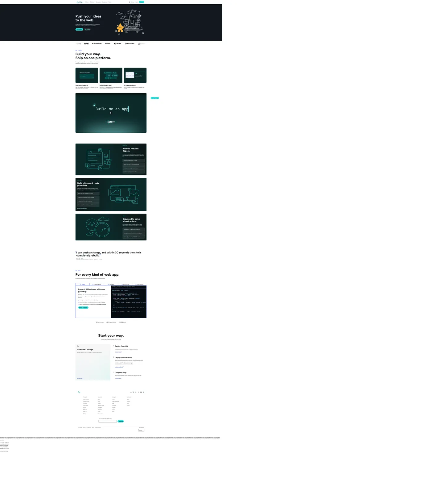
Netlify's marketing site opens with a move you do not see on Vercel, Cloudflare, or Render: the page is split into two surface eras. The above-fold band is near-black ink with a chunky 64px Figtree headline ("Push your ideas to the web") in white, a hand-drawn illustration of a shopping cart full of cloud icons floating to the right, and a single saturated teal-cyan pill CTA centered beneath. The instant you scroll past the fold the surface flips — warm white canvas, near-black ink type, a 64px section h2 ("Build your way. Ship on one platform.") in Figtree weight 800 again, and dark editorial cards in a deep teal-charcoal returning the brand voltage as in-card decoration. The two halves are stitched together by a single object: the cyan pill. It is the only chromatic surface that appears in both the dark hero and the light body, and it carries the brand voltage end-to-end.
The DESIGN.md file packages the system into a machine-readable spec. Inside: 18 colors tokens drawn from a 200-plus CSS custom-property root, organized into a brand-voltage tier (teal-cyan primary, paler teal hover, deep teal-charcoal as the secondary surface), an ink tier (near-black headline / muted-grey body / off-white text inverse), a hairline tier (a faintly-blue #e4f0fb that doubles as soft surface fill), and a small status set. Ten typography tokens span three typefaces: Figtree (the workhorse display sans, weights 600-800), Instrument Sans (the body sans, weight 400-500), and Martian Mono (the uppercase eyebrow voice, weight 400). Sixteen components cover the cyan pill primary CTA, the dark hero panel, the white body card, the mono-uppercase eyebrow row, the input field, and the editorial dark cards used below the fold.
Feed this file to Claude or Cursor and it reproduces Netlify's specific moves: the dark-to-light page split rather than a single canvas, the cyan pill as the only chromatic anchor, three typefaces with sharply different jobs, and the 64px / weight 800 display step that distinguishes the system from quieter peers like Vercel (60px / weight 500) and Render (48px / weight 600). The one move worth borrowing only if your product story has two distinct narrative halves is the split-canvas opener; for most SaaS the surface should pick a side.
What makes it distinct
5
- Teal-cyan voltagethe brand color is a single saturated cyan that owns the hero CTA pill and every link accent, against an almost-black canvas
- Three-voice typographyFigtree at weight 800 for display, Instrument Sans for body, Martian Mono uppercase for eyebrows and code
- Two-era pagea near-black hero band drops to a warm white body, with the teal pill stitching the two halves together
- Heavy 800-weight displaythe 64px hero h1 sits at weight 800 (not the 500-600 most dev-infra peers use); a deliberate dial against the dark canvas
- Mono uppercase eyebrowsMartian Mono at 16px appears 44 times as section labels in all-caps; the system's quiet technical voice
netlify.com
Live at netlify.com
A snapshot of the brand in production. Scroll the frame to see the whole page.
Colors
18 colors
Netlify's system runs on #32e6e2 as its primary voltage, used in 2 of 16 components. Type is set in Figtree across 12 tokens from 12px to 64px, weights 400–800. Shape language is soft — components average 135px corner radius, with no sharp interactive edges.
Brand & Accent
Sparing, CTA-only voltage · 3
Surface
Page and card backgrounds · 4
Text
Headlines, body, captions · 5
Borders & Hairlines
Dividers, outlines, rules · 1
Other
Specialty colors · 5
Typography
12 type tokens
Set in Figtree across 12 tokens, from 12px to 64px, weights 400–800. Shown in its own stack: where the font isn't installed, the fallback the file names stands in.
- display-xl64px · weight 800 · lh 70.4pxThe quick brown fox jumps over the lazy dog
- display-md48px · weight 700 · lh 52.8pxThe quick brown fox jumps over the lazy dog
- heading-lg36.8px · weight 800 · lh 40.48pxThe quick brown fox jumps over the lazy dog
- heading-md32px · weight 700 · lh 35.2pxThe quick brown fox jumps over the lazy dog
- heading-sm24px · weight 700 · lh 26.4pxThe quick brown fox jumps over the lazy dog
- body-lg18px · weight 400 · lh 27pxThe quick brown fox jumps over the lazy dog
- body-md16px · weight 400 · lh 24pxThe quick brown fox jumps over the lazy dog
- body-sm14px · weight 400 · lh 21pxThe quick brown fox jumps over the lazy dog
- button-md18px · weight 600 · lh 19.8pxThe quick brown fox jumps over the lazy dog
- nav-link16px · weight 400 · lh 24pxThe quick brown fox jumps over the lazy dog
- eyebrow-mono16px · weight 400 · lh 24pxThe quick brown fox jumps over the lazy dog
- code-mono12px · weight 400 · lh 18pxThe quick brown fox jumps over the lazy dog
Layout
Radii and spacing
8 corner radii and 9 spacing values. Shape language: soft.
Radii
- none0px
- xs2px
- sm4px
- md6px
- lg8px
- xl12px
- 2xl16px
- pill360px
Spacing
- xs4px
- sm8px
- base12px
- md16px
- lg24px
- xl32px
- 2xl48px
- 3xl64px
- 4xl96px
Components
16 components
Each rendered from its tokens (color, type, radius, padding) on Netlify's own canvas.
- Button Primarybutton-primaryButton Primary
- Button Primary Hoverbutton-primary-hoverButton Primary Hover
- Button Secondarybutton-secondaryButton Secondary
- Button Dark Secondarybutton-dark-secondaryButton Dark Secondary
- Top Navtop-navTop Nav
- Nav Linknav-linkNav Link
- Hero Sectionhero-sectionHero Section
- Hero Headinghero-headingHero Heading
- Section Headingsection-headingSection Heading
- Body Paragraphbody-paragraphBody Paragraph
- Eyebrow Labeleyebrow-labelEyebrow Label
- Card Darkcard-darkCard Dark
- Card Lightcard-lightCard Light
- Type here…text-inputText Input
- Code Blockcode-blockCode Block
- FooterfooterFooter
In use
The system, in use
Netlify's tokens on the kind of product it builds.
Build something people actually use.
A short paragraph of marketing copy that previews how the brand's display tier and body tier read together. Two sentences is usually enough.
FAQ
Netlify design system FAQ
Common questions about Netlify's tokens, components, and how to use this DESIGN.md in your project.
Read next
Related reading
Specs, directories, and component libraries that pair with this design system.
- Browse all design systemsThe full directory of DESIGN.md files on shadcn.io, with live mockups for each.shadcn.io
- Netlify — official siteNetlify's public marketing site — the source of truth for the live tokens captured in this file.netlify.com (opens in a new tab)
- The DESIGN.md specificationGoogle Labs' open spec for machine-readable design system files — the format this page is built on.github.com (opens in a new tab)
Use it
Use Netlify in your project
One machine-readable file. Drop it into Claude, Cursor, or any AI tool that reads DESIGN.md.
Download the DESIGN.md
One machine-readable file: every color, type, radius, spacing, and component token of Netlify.
Feed it to your AI tool
Drop it into Claude, Cursor, or GitHub Copilot. The agent writes React components and Tailwind classes that match Netlify's visual language.
Reference the tokens directly
Or paste the values into your Tailwind config, CSS variables, or component library: every color, size and radius is a quoted, ready-to-copy value.
Read the full DESIGN.md: overview, rationale, do’s and don’ts
Overview
Netlify's marketing site is the only major dev-infrastructure brand that runs two surface eras on the same page. Split-canvas voltage. The hero band sits on near-black ink ({colors.canvas-dark} — #181a1c) with white display type and a hand-drawn cloud-shopping-cart illustration on the right; the moment you scroll past the fold, the surface flips to warm white ({colors.canvas} — #ffffff) with near-black type and dark editorial cards returning the brand voltage as in-card decoration. Where Vercel commits to matte black, Cloudflare to a saturated orange canvas, and Render to a near-white editorial floor, Netlify runs both halves on the same scroll. The single object that stitches the two together is the teal-cyan CTA pill — it is the only chromatic surface that appears in both eras, and it carries the brand voltage end-to-end.
The brand color is a single saturated teal-cyan ({colors.primary} — #32e6e2), wired into CSS as --color-brand-2, --color-brand-core-2, and --button-primary-bg-color. On hover it brightens to {colors.primary-hover} (#8efbf7), a paler teal step. A secondary brand cobalt {colors.link} (#2e51ed) carries the link tone and the highlighted-tab accent. The deep teal-charcoal {colors.secondary} (#0c2a2a) is the dark editorial surface that appears in cards below the fold — close enough to the hero's near-black that it reads as a return of the hero band, far enough that it sits as a distinct elevated surface on the white canvas.
Typography is the system's most distinctive move: three typefaces, three jobs. Figtree at weight 800 carries every display moment — the 64px hero h1, the 64px section h2 below the fold, and the smaller 32-48px headings inside cards. Instrument Sans handles body copy at 16-18px weight 400 and nav-link labels at 14-16px. Martian Mono at 16px in uppercase carries every eyebrow label, section tag, and feature chip — it appears 44 times in the captured page, more than any other typographic variant. The three voices divide labor cleanly: Figtree speaks, Instrument Sans explains, Martian Mono labels.
Key Characteristics:
- Single brand voltage
{colors.primary}(#32e6e2) — a saturated teal-cyan that owns the primary CTA pill and the search-submit button, paired with a paler teal hover step{colors.primary-hover}(#8efbf7). - Two-era page surface — near-black hero
{colors.canvas-dark}(#181a1c) above the fold, warm white{colors.canvas}(#ffffff) below the fold, stitched by the cyan pill that appears in both eras. - Three-voice typography — Figtree for display (weight 700-800), Instrument Sans for body (weight 400), Martian Mono uppercase for eyebrows (weight 400, 44 occurrences).
- Heavy 800-weight display tier — the 64px hero h1 and 64px section h2 both run at weight 800, not the 500-600 most peers use; a deliberate dial against the dark canvas.
- Deep teal-charcoal
{colors.secondary}(#0c2a2a) — the in-body dark editorial card surface that returns the brand voltage in the white-canvas half of the page. - Pill CTAs at
{rounded.pill}(360px declared, rendered as fully-rounded) for both primary and secondary buttons across both surface eras. - Hand-drawn outline illustrations in the cyan voltage color — the cloud-shopping-cart, the agent-ready primitives diagram, the speedometer-and-globe — render as line art in the teal accent on the dark canvas.
- Cobalt
{colors.link}(#2e51ed) is the link tone and the eyebrow color, not a secondary brand voltage; it appears 0 times as background and 0 times as border in the captured page.
Colors
Brand
- Teal Primary (
{colors.primary}— #32e6e2): frequency 0 as text and border (the brand voltage is reserved for fills) — used as background only on the primary CTA pill, the search-submit button, and the in-card border for dark editorial cards. Wired in CSS as--color-brand-2,--color-brand-core-2,--button-primary-bg-color,--search-submit-btn-bg-color,--teal-200. The single chromatic brand moment. - Teal Hover (
{colors.primary-hover}— #8efbf7): the paler teal hover variant for the primary CTA. Wired as--color-brand-2-hover,--ntl-button-primary-bg-color-hover,--teal-100,--color-highlight. - Teal Deep (
{colors.primary-deep}— #05bdba): the Netlify logo "spark" color, wired as--color-brand-logo-sparkand--teal-400. Appears in the wordmark and in dark-on-light surfaces where the primary cyan would burn out. - Cobalt Link (
{colors.link}— #2e51ed): the link tone and the eyebrow-text color, wired as--color-brand-primary,--color-brand-1,--color-link,--ntl-eyebrow-text-color. A secondary brand voltage that carries link decoration and small accent rules. - Teal Secondary (
{colors.secondary}— #0c2a2a): the dark editorial-card surface in the white-canvas half of the page. Wired as--button-secondary-bg-color,--code-bg-color,--teal-900,--active-switcher-tab-bg-color. Frequency 3 as gradient stop — used in dark surface fills. - Teal Secondary Deep (
{colors.secondary-deep}— #014847): the wordmark text color and the secondary-button hover state. Wired as--color-brand-logo-text,--color-brand-secondary-hover,--teal-800.
Surface
- Canvas Dark (
{colors.canvas-dark}— #181a1c): frequency 0 as background fill, 38 as text — the near-black hero canvas above the fold and the page's primary heading color below the fold. Wired as--ntl-neutral-800,--button-primary-text-color,--heading-text-color. Both a surface tone and an ink tone, depending on which canvas era it sits on. - Canvas (
{colors.canvas}— #ffffff): frequency 67 — 33 as text (white type on the dark hero), 4 as background (the body floor below the fold), 30 as border. Pure white; no warm cream variant. - Surface 1 (
{colors.surface-1}— #e4f0fb): frequency 85 — 37 as text, 11 as background, 37 as border. The faintly-blue hairline color that doubles as soft card-fill on the white-canvas half. Wired as--ntl-color-bg-3,--ntl-neutral-200,--color-blog-cta-card-bg. The single hardest-working surface token — borders cards, fills disabled states, and tints the blog-card surface. - Surface 2 (
{colors.surface-2}— #d0fffe): frequency 3 as border — a very-pale cyan tint used as the search-highlight and code-on-light surface fill. Wired as--ntl-search-user-message-color,--color-guide-toc-bg,--teal-000.
Text
- Ink (
{colors.ink}— #181a1c): frequency 38 as text — the primary heading and button-label color below the fold. Same hex as{colors.canvas-dark}; the system uses one near-black for both surface and ink roles depending on context. - Ink Soft (
{colors.ink-soft}— #353a3e): the secondary running-text tone, wired as--ntl-color-text,--neutral-700. Used for body paragraphs that sit beside the heading ink without competing with it. - Ink Muted (
{colors.ink-muted}— #545a61): frequency 215 — 108 as text, 107 as border. The dominant body-paragraph color across the page and the secondary border tone. Wired as--ntl-title-text-color,--ntl-neutral-600,--color-text-2,--input-color-placeholder. - Ink Weak (
{colors.ink-weak}— #778089): the form-input border color and the testimonial-logo hover tone. Wired as--input-border-color,--ntl-color-text-weak,--color-text-3. The lightest readable ink in the system.
Syntax & Accent
- Syntax Cyan (
{colors.syntax-cyan}— #89ddff): frequency 48 — 24 as text, 24 as border. The code-snippet keyword color in the embedded code blocks ("Launch AI features with one gateway" panel). Borrowed from a Night Owl-style syntax theme rather than from the brand chrome. - Syntax Purple (
{colors.syntax-purple}— #c792ea): frequency 16 — 8 as text, 8 as border. The code-snippet function-name color. Also from the syntax theme.
Hairline & Status
- Hairline (
{colors.hairline}— #d1d5da): a cool grey border tone used on inverse surfaces and badges. Wired as--ntl-color-border-strong,--ntl-badge-border-color,--card-border-color-hover. Distinct from the soft{colors.surface-1}hairline which carries most of the card-border work. - Warn (
{colors.warn}— #f98e21): a saturated gold/orange wired as--gold-400,--color-brand-create-2. Carries the "Create" product-domain identity but appears 0 times in the captured render — declared in the CSS root only.
Typography
Font Families
The system runs three typefaces with cleanly divided jobs. Figtree is the display sans, used at weight 800 for the 64px hero h1 and the 64px below-fold section h2, plus weight 700 at 32-48px for smaller heading tiers. Instrument Sans is the body sans, used at weight 400 for paragraph copy at 14-18px and for nav-link labels at 14-16px. Martian Mono is the uppercase voice, used at weight 400 in all-caps for eyebrow labels above sections — 44 occurrences in the captured page, the single most-frequent type variant.
The three-voice split is the system's distinctive typographic move. Most dev-infra peers run two voices (display + body, or display + mono) — Vercel runs Geist + Geist Mono, Cloudflare runs FT Kunst Grotesk + Apercu Mono Pro, Render runs Inter + JetBrains Mono. Netlify is the only major brand in the category that runs three sans-and-mono voices, with Martian Mono as a separate uppercase-only role rather than a code-only role.
Hierarchy
| Token | Size | Weight | Line Height | Family | Use |
|---|---|---|---|---|---|
{typography.display-xl} | 64px | 800 | 70.4px | Figtree | Hero h1, section h2 |
{typography.display-md} | 48px | 700 | 52.8px | Figtree | Pull-quote blockquotes |
{typography.heading-lg} | 36.8px | 800 | 40.48px | Figtree | h3 inside dark editorial cards |
{typography.heading-md} | 32px | 700 | 35.2px | Figtree | Sub-section number callouts |
{typography.heading-sm} | 24px | 700 | 26.4px | Figtree | Card h3 |
{typography.body-lg} | 18px | 400 | 27px | Instrument Sans | Hero sub-paragraph |
{typography.body-md} | 16px | 400 | 24px | Instrument Sans | Default running text |
{typography.body-sm} | 14px | 400 | 21px | Instrument Sans | Nav-link labels, button labels |
{typography.button-md} | 18px | 600 | 19.8px | Figtree | CTA pill labels |
{typography.nav-link} | 16px | 400 | 24px | Instrument Sans | Top-nav link labels |
{typography.eyebrow-mono} | 16px | 400 | 24px | Martian Mono | Section eyebrow labels (uppercase) |
{typography.code-mono} | 12px | 400 | 18px | Martian Mono | Inline code annotations |
Principles
Display weight tops out at 800 — substantially heavier than the dev-infra norm (Vercel 500, Stripe 300, Cloudflare 500, Render 600). The 64px hero h1 at weight 800 reads as the loudest typographic moment in the system, and the same step repeats on the below-fold section h2 to anchor the page on a single display tier rather than a tiered ladder. The decision to dial display up to 800 instead of leaning on letter-spacing tightening (the Stripe / Cloudflare move) is what gives the Netlify hero its chunky-confident feel.
Martian Mono carries the entire eyebrow-label tier. There are no uppercase-tracked sans labels in the system — every "WAY IT WORKS", "USE CASES", "PLATFORM" small-caps section tag is set in Martian Mono. The mono voice reads quietly technical without ever shouting; the same role Apercu Mono Pro plays on Cloudflare's surface.
Note on Font Substitutes
All three families are open source. Figtree ships on Google Fonts and Bunny Fonts. Instrument Sans is distributed free by Instrument design studio. Martian Mono is open-sourced by Evil Martians on GitHub. No substitution needed — the system already runs free fonts. If you must substitute, Inter at weight 800 is the closest Figtree alternative; Space Mono uppercase carries the Martian Mono role at slightly tighter spacing.
Layout
Spacing System
- Base unit: 4px (with 12px as the dominant gap value — 37 occurrences).
- Tokens:
{spacing.xs}4px ·{spacing.sm}8px ·{spacing.base}12px ·{spacing.md}16px ·{spacing.lg}24px ·{spacing.xl}32px ·{spacing.2xl}48px ·{spacing.3xl}64px ·{spacing.4xl}96px. - Section padding (vertical): 96px on the hero band, 64px between major sections below the fold (captured 6 times as
96px 0pxand 3 times as 64px on section margins). - Card internal padding: 24px on the dark editorial cards below the fold; 16px on the smaller hairline-bordered feature cards.
- Button padding: 10x17px on the primary pill CTA (captured 6 times); 8x12px on secondary nav-link hovers.
Grid & Container
- Max content width: ~1080px on the hero, ~1280px on the dark editorial cards section.
- Hero block: full-bleed dark canvas at 96px top/bottom, content centered at ~720px on the left with the illustration occupying the right half.
- Below-fold sections: centered displays at ~1080px, with feature cards splitting into 3-up at desktop and stacking to 1-up on mobile.
- Dark editorial cards: sit on the white body canvas as elevated
{colors.secondary}panels — the surface contrast between near-black card and white canvas does the elevation work.
Rhythm
The page's structural device is the dark-light alternation. Hero (dark) → logo wall (light) → "Build your way" editorial (light) → dark prompt-preview card (dark) → "For every kind of web app" editorial (light) → "Start your way" footer-adjacent (light). The dark editorial cards inside the light body act as in-body returns of the hero canvas — a visual reminder that the platform identity sits on the dark side, while the marketing copy lives on the light side.
Elevation
The system has two shadow tiers and one tonal-lift tier. Most cards on the white canvas use the soft {colors.surface-1} border at #e4f0fb to read as elevated without a shadow draw; the dark editorial cards lift off the white canvas by surface-contrast alone (the ~95% lightness gap between {colors.canvas} and {colors.secondary} makes any shadow redundant).
- Flat (no shadow): hero, body bands, feature cells, logo wall — 95% of surfaces.
- Hairline elevation: white cards on white canvas with a 1px
{colors.surface-1}border carry the soft-tinted hairline that reads as elevation. - Tonal lift:
{colors.secondary}dark editorial cards lift off the white canvas by surface-color contrast — no shadow drawn.
Shapes
The radius scale is small-step plus pill.
- Small-step:
{rounded.xs}2px (2 occurrences),{rounded.sm}4px (23 — the dominant card and input radius),{rounded.md}6px (8 — icon buttons),{rounded.lg}8px (1 — outlier),{rounded.xl}12px (3 — larger feature cards),{rounded.2xl}16px (1 — outlier on the largest card). - Pill:
{rounded.pill}360px (6 — the primary CTA, secondary nav buttons, all the "rounded" interactive surfaces) and 50% (4 — circular avatar chips). The 360px value renders as a fully-rounded pill on any element shorter than 720px tall. - No middle tier in heavy use: the scale concentrates at 4px and at the full pill; 8 / 12 / 16px appear only as outliers.
The pill treatment carries the brand voltage. The primary CTA pill at {rounded.pill} is filled with {colors.primary} cyan; secondary pills sit as transparent surfaces with a 1px ink border in {colors.canvas-dark} on the dark hero and {colors.ink} on the white body.
Components
button-primary — The signature CTA. Teal-cyan {colors.primary} fill, near-black {colors.ink} text, fully-rounded pill at {rounded.pill}, 10x17px padding, 40px height, Figtree weight 600 at 18px. "Get started" is the canonical instance, sitting at the center of the hero stack.
button-primary-hover — Flips to the brighter {colors.primary-hover} (#8efbf7) on hover, with the same ink text. The single hover state in the captured system.
button-secondary — Transparent fill with ink text and a 1px ink border, same pill radius and dimensions as primary. Used as the "View account" secondary CTA on the dark hero.
button-dark-secondary — Deep teal-charcoal {colors.secondary} fill, white text, same pill geometry. Used as the in-card CTA on the dark editorial cards below the fold.
top-nav — Dark {colors.canvas-dark} surface that matches the hero canvas — the nav merges visually into the hero band rather than sitting as a separate strip. 12x16px padding, 56px height.
nav-link — Transparent fill, white text in {typography.nav-link}, 8x12px padding, {rounded.md} 6px hover-surface pill.
hero-section — Full-bleed {colors.canvas-dark} band, 96x0 padding, no border-radius. Holds the hero h1 in white at {typography.display-xl}, a single-line sub-paragraph in {typography.body-lg}, the cyan CTA pill stack, and the hand-drawn cart illustration on the right.
hero-heading — White {colors.canvas} text on the dark hero, Figtree 64px / 800, 0 letter-spacing. The display tier — confidence by weight, not by tracking.
section-heading — Same {typography.display-xl} token but rendered in ink {colors.ink} on the white canvas below the fold. "Build your way. Ship on one platform." and "For every kind of web app." are the canonical instances.
body-paragraph — {colors.ink-muted} running-text at {typography.body-md} — the workhorse paragraph style. Notable that the body color is the muted #545a61 rather than the heading #181a1c — a deliberate softness in the running text.
eyebrow-label — Cobalt-link {colors.link} color, Martian Mono uppercase at 16px / 400, 0 letter-spacing. The single most-distinctive small-caps treatment in the system. "WAY IT WORKS", "USE CASES", "PLATFORM" are the canonical instances.
card-dark — Deep teal-charcoal {colors.secondary} fill, white text, {rounded.xl} 12px radius, 24px internal padding, optional 1px {colors.primary} cyan border on the most-emphasized cards. The in-body return of the hero canvas; holds prompt-preview demos, agent-primitive diagrams, and the speedometer-globe panels.
card-light — White {colors.canvas} fill, ink text, {rounded.xl} 12px radius, 24px padding, 1px {colors.surface-1} border. The hairline-bordered feature card on the white canvas.
text-input — White surface, ink text, 1px {colors.ink-weak} border, {rounded.sm} 4px radius, 8px padding, 38px height. Used in the email-signup row of the footer.
code-block — Deep teal-charcoal {colors.secondary} fill, white text in {typography.code-mono} (Martian Mono 12px / 400), {rounded.md} 6px radius, 16px padding. Syntax colors are {colors.syntax-cyan} and {colors.syntax-purple} borrowed from a Night Owl-style theme.
footer — White {colors.canvas} surface, muted-grey text, 48x24px padding. Sits on the same canvas as the body — no surface contrast against the page floor.
Do's and Don'ts
Do stitch the dark hero and the light body with the cyan pill. The single object that runs across both surface eras is the {colors.primary} CTA — removing the pill from one half breaks the visual through-line and turns the page into two unrelated landing strips.
Do run all three typefaces. Figtree for display, Instrument Sans for body, Martian Mono for uppercase eyebrows — each has a different job and each appears with distinctive frequency in the captured page. Replacing Martian Mono with an uppercase-tracked Figtree turns the page into a generic SaaS marketing surface.
Do dial the display tier to weight 800. The 64px hero h1 sits at weight 800, not the 500-600 most peers run; bumping down to 600 makes the chunky-confident feel collapse into Stripe-style restraint, which is the wrong identity for this product.
Do use {colors.secondary} (#0c2a2a) for in-body dark editorial cards — not pure black, not a generic charcoal. The deep teal-charcoal is part of the brand voltage system; substituting a flat grey or pure black removes the teal undertone that ties the dark surface back to the cyan primary.
Don't render the brand cyan as text or border. {colors.primary} (#32e6e2) appears 0 times as text and 0 times as border in the captured page — it is reserved exclusively for CTA pill fills and one in-card emphasis border. Using cyan as a link color or a body accent dilutes the single chromatic anchor.
Don't use the syntax colors ({colors.syntax-cyan} #89ddff, {colors.syntax-purple} #c792ea) anywhere outside code blocks. They are borrowed Night Owl theme values for the embedded code snippets, not part of the brand palette.
Don't introduce a 8px or 16px middle radius tier on cards. The system concentrates radii at 4px (small-step cards / inputs) and at the full pill — adding a middle value softens the binary contrast between body chrome and the warm pill surfaces.
Don't swap Martian Mono for a sans uppercase. The mono uppercase eyebrow is the system's quiet technical voice — replacing it with a tracked sans turns "WAY IT WORKS" into a generic marketing tag rather than a developer-flagged section label.
Known Gaps
- Dark mode: the page already runs both a dark hero and a light body, so a full dark-mode variant would need a parallel light-hero / dark-body inversion that the captured site does not expose. Product surfaces (the Dashboard at
app.netlify.com) carry a separate dark token set not represented here. - Hover and focus states: documented for
{component.button-primary-hover}only; the full state matrix (focus rings, active press, disabled tints, error fills) is not visible on the captured marketing surface. - Form input states:
{component.text-input}carries the resting state at the footer email-signup field; error / validation styling lives inside the dashboard and is not exposed here. - Product domain colors: the CSS root declares
--color-brand-create-1,--color-brand-create-2(which resolves to{colors.warn}),--color-brand-connect-1, and--color-brand-connect-2(which resolves to{colors.link}) as product-domain identifiers ("Create" and "Connect" product surfaces) but they appear 0 times in the captured render outside the CSS root. - Motion: the hero illustration and the prompt-preview animation are interactive but the spec captures end-state values only. Easing curves and duration live in the live JavaScript.
- Product surfaces: this DESIGN.md captures the marketing site only. The Netlify Dashboard, the Build Logs surface, and the Functions / Edge Functions panels carry their own token systems not represented here.
- Customer testimonial typography: the page's blockquote tier (the "I can push a change…" pull-quote) runs at Figtree 48px / 700 — captured but not as a primary typography token because it appears only once.
Web Infrastructure & Hosting
More systems like this
More DESIGN.md files in Web Infrastructure & Hosting.
Pricing
Build it with Pro
The DESIGN.md files are free. Pro adds 6,000+ blocks, premium templates and the MCP server, so your AI editor builds in your system for you.
4.9/5 out of 5 · 150+ reviewsfrom 150+ founders and developers.
Billing
Billed once a year in USD. Cancel anytime.
- How many people can use the license.
- Client work, SaaS products and anything you charge for.
- Production-ready React sections: hero, pricing, features, dashboards and more.
- Complete multi-page sites you can ship as they are.
- React icons from every major library, installable with one command.
- Presets that restyle every block, in light and dark.
- Lets your AI editor search, preview and install blocks for you.
- Priority requests are answered first.
Individual
For personal projects & open source
$32instead of $49/mo
$389 billed yearly
- Seats: 1 seat
- Commercial use: Personal & open source only
- Pro blocks: 6,000+ blocks
- Templates: All 14 templates
- React icons: 294k+ icons
- Themes: All 59 themes
- MCP server: Basic usage
- Support: Standard
Team
Most popularFor freelancers, agencies & startups
$66instead of $99/mo
$789 billed yearly · ≈ $13/dev/mo
- Seats: Up to 5 seats
- Commercial use: Included
- Pro blocks: 6,000+ blocks
- Templates: All 14 templates
- React icons: 294k+ icons
- Themes: All 59 themes
- MCP server: High usage
- Support: Priority
Organization
For companies with larger teams
$132instead of $199/mo
$1,589 billed yearly
- Seats: Unlimited seats
- Commercial use: Included
- Pro blocks: 6,000+ blocks
- Templates: All 14 templates
- React icons: 294k+ icons
- Themes: All 59 themes
- MCP server: Unlimited usage
- Support: Priority
Billed once a year in USD. Cancel anytime.
Individual
For personal projects & open source
$32instead of $49/mo
$389 billed yearly
- How many people can use the license.Seats: 1 seat
- Client work, SaaS products and anything you charge for.Commercial use: Personal & open source only
- Production-ready React sections: hero, pricing, features, dashboards and more.Pro blocks: 6,000+ blocks
- Complete multi-page sites you can ship as they are.Templates: All 14 templates
- React icons from every major library, installable with one command.React icons: 294k+ icons
- Presets that restyle every block, in light and dark.Themes: All 59 themes
- Lets your AI editor search, preview and install blocks for you.MCP server: Basic usage
- Priority requests are answered first.Support: Standard
Team
Most popularFor freelancers, agencies & startups
$66instead of $99/mo
$789 billed yearly · ≈ $13/dev/mo
Everything in Individual, plus
- How many people can use the license.Seats: Up to 5 seats
- Client work, SaaS products and anything you charge for.Commercial use: Included
- Lets your AI editor search, preview and install blocks for you.MCP server: High usage
- Priority requests are answered first.Support: Priority
Organization
For companies with larger teams
$132instead of $199/mo
$1,589 billed yearly
Everything in Team, plus
- How many people can use the license.Seats: Unlimited seats
- Lets your AI editor search, preview and install blocks for you.MCP server: Unlimited usage
- Secure checkout via Stripe
- Code lives in your repo
- Keep what you've shipped if you cancel
- License terms
Your system, built for you
Every block, template and icon, installed by your AI agent in your design system. The DESIGN.md files stay free.