Neon Design System
Neon's serverless Postgres design language as a DESIGN.md file. Black canvas, emerald #34d59a, Inter at 80px / -3.2px, GeistMono code, 18 components.
Add shadcn.io to your AI agent. · Pro It installs blocks, icons and templates in your design system from a prompt, with Pro.
Set up MCP- Primary
- #34d59a
- Typeface
- Inter
- Shape
- Sharp
- Base radius
- 4px
- Colors
- 25
- Type tokens
- 11
- Components
- 18
- Spacing values
- 9
About
About Neon DESIGN.md
Curated by Dov Azencot · Updated May 13, 2026 · Source neon.com (opens in a new tab)
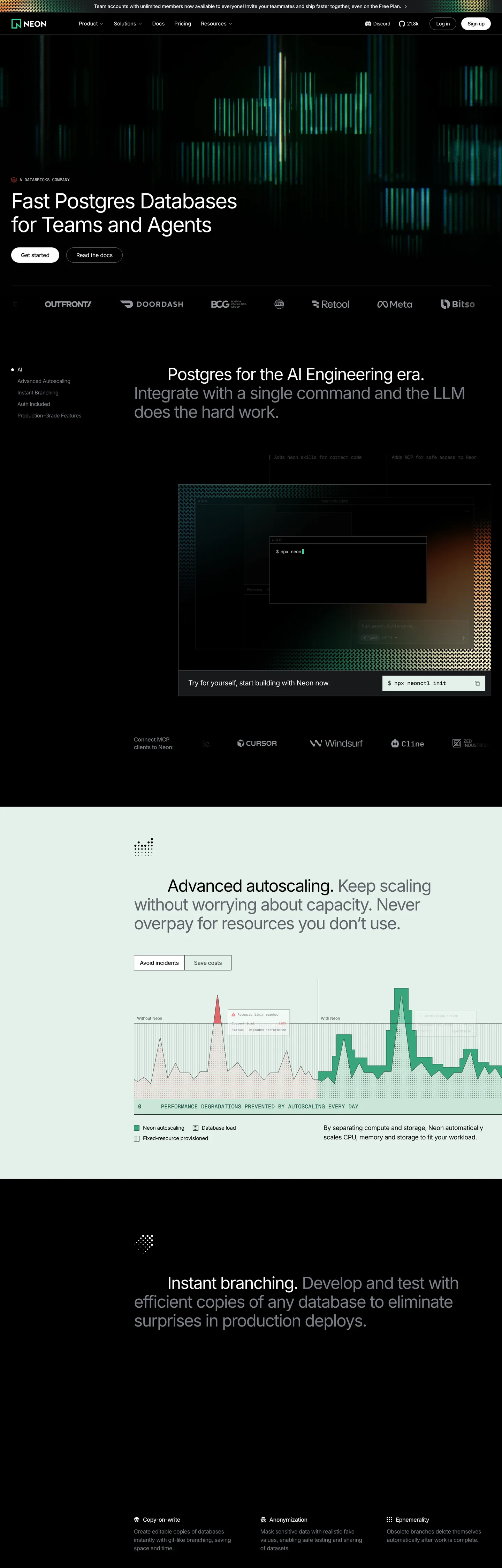
Neon's marketing surface is the inverse of the developer-database category. Where Supabase commits to a white canvas with a green accent and Postgres-the-marketing-site usually leans editorial-light, Neon defaults to true black (#000000) and lets a single emerald (#34d59a) carry every link underline, every code-keyword highlight, and the lit autoscaling-graph spikes that visualize the product. Type runs Inter at weight 400 across the entire display tier — the 80px hero pulls -3.2px tracking out of the geometric letterforms to compensate for the absent weight. There's no second accent color, no gradient mesh, no brand-blue link. The greens, the black, and the gray ladder from #94979e to #18191b are the entire palette.
This page packages that system into a single DESIGN.md file in the Google Labs open spec. Inside: 25 colors tokens (2 emerald variants, 8 grays, 4 surface fills, dark and light ink pairs, and the 4 Shiki syntax-highlight hues the brand reuses from its code blocks), 11 typography styles split between Inter and GeistMono, 4 radius tokens anchored at 4px, an 8-step spacing scale rooted on the brand's 4px grid, and 18 components recipes spanning the dark primary CTA, the inverted light-band autoscaling card, the GeistMono code block at #000000, and the underline-only nav link pattern that does most of the chrome work.
Feed the file to Claude, Cursor, or GitHub Copilot and the agent reproduces Neon's specific discipline — black-first marketing, weight-400 displays with aggressive negative tracking, emerald reserved for code and graphs, square 4px corners instead of pills. Reference the tokens directly inside a Tailwind config, or audit an existing React app against them. The system is worth studying because it proves a Postgres brand can ship a serious marketing track without a white canvas and without a single bold weight — the graph spikes do the work that bold type usually does.
What makes it distinct
5
- Black canvas as default#000000 carries hero, footer, and feature bands; the white sections are interruptions, not the baseline
- Inter at weight 400 / 80px / -3.2pxthe display tier refuses bold weights and earns presence by tracking compression instead
- Two greens, two jobs#34d59a (CSS --shiki-token-keyword) for code and links; #00e599 reserved for autoscaling-graph spikes
- Square 4px radii everywhere63 of 73 captured radius events resolve to 4px; pills exist only on a handful of badge chips
- GeistMono at 12px / 16px for technical labels and code blocksthe brand's developer DNA is visible in every snippet
neon.com
Live at neon.com
A snapshot of the brand in production. Scroll the frame to see the whole page.
Colors
25 colors
Neon's system runs on #34d59a as its primary voltage, used in 1 of 18 components. Type is set in Inter across 11 tokens from 12px to 80px, weights 400–500. Shape language is sharp — components average 2px corner radius, favoring crisp rectangles.
Brand & Accent
Sparing, CTA-only voltage · 4
Surface
Page and card backgrounds · 7
Text
Headlines, body, captions · 8
Borders & Hairlines
Dividers, outlines, rules · 4
Other
Specialty colors · 2
Typography
11 type tokens
Set in Inter across 11 tokens, from 12px to 80px, weights 400–500. Shown in its own stack: where the font isn't installed, the fallback the file names stands in.
- display-xl80px · weight 400 · lh 1 · tracking -3.2pxThe quick brown fox jumps over the lazy dog
- display-lg48px · weight 400 · lh 1.125 · tracking -1.92pxThe quick brown fox jumps over the lazy dog
- display-md28px · weight 400 · lh 1.375 · tracking -0.56pxThe quick brown fox jumps over the lazy dog
- display-sm24px · weight 500 · lh 1 · tracking -0.96pxThe quick brown fox jumps over the lazy dog
- body-lg18px · weight 400 · lh 1.5 · tracking -0.36pxThe quick brown fox jumps over the lazy dog
- body-md16px · weight 400 · lh 1.5 · tracking -0.4pxThe quick brown fox jumps over the lazy dog
- body-sm15px · weight 400 · lh 1.5 · tracking -0.3pxThe quick brown fox jumps over the lazy dog
- button-md15px · weight 400 · lh 1.5 · tracking -0.15pxThe quick brown fox jumps over the lazy dog
- caption13px · weight 400 · lh 1.25 · tracking -0.26pxThe quick brown fox jumps over the lazy dog
- eyebrow-mono12px · weight 500 · lh 1 · tracking 0.1emThe quick brown fox jumps over the lazy dog
- code16px · weight 400 · lh 1.5 · tracking -0.32pxThe quick brown fox jumps over the lazy dog
Layout
Radii and spacing
4 corner radii and 9 spacing values. Shape language: sharp.
Radii
- none0px
- sm4px
- xl16px
- full9999px
Spacing
- xxs2px
- xs4px
- sm8px
- md12px
- base16px
- lg20px
- xl24px
- 2xl32px
- 3xl80px
Components
18 components
Each rendered from its tokens (color, type, radius, padding) on Neon's own canvas.
- Button Primarybutton-primaryButton Primary
- Button Primary Hoverbutton-primary-hoverButton Primary Hover
- Button Secondarybutton-secondaryButton Secondary
- Button Ghost Darkbutton-ghost-darkButton Ghost Dark
- Nav Linknav-linkNav Link
- Link Emeraldlink-emeraldLink Emerald
- Top Navtop-navTop Nav
- Hero Headlinehero-headlineHero Headline
- Section Heading Darksection-heading-darkSection Heading Dark
- Card Feature Darkcard-feature-darkCard Feature Dark
- Card Autoscale Lightcard-autoscale-lightCard Autoscale Light
- Badge Pillbadge-pillBadge Pill
- Code Blockcode-blockCode Block
- Code Keywordcode-keywordCode Keyword
- Type here…text-inputText Input
- Caption Mutecaption-muteCaption Mute
- Divider Hairline Darkdivider-hairline-darkDivider Hairline Dark
- Graph Spikegraph-spikeGraph Spike
In use
The system, in use
Neon's tokens on the kind of product it builds.
Build something people actually use.
A short paragraph of marketing copy that previews how the brand's display tier and body tier read together. Two sentences is usually enough.
FAQ
Neon design system FAQ
Common questions about Neon's tokens, components, and how to use this DESIGN.md in your project.
Read next
Related reading
Specs, directories, and component libraries that pair with this design system.
- Browse all design systemsThe full directory of DESIGN.md files on shadcn.io, with live mockups for each.shadcn.io
- Neon — official siteThe serverless Postgres platform built for teams and AI agents — branching, autoscaling, and instant provisioning.neon.com (opens in a new tab)
- The DESIGN.md specificationGoogle Labs' open spec for machine-readable design system files.github.com (opens in a new tab)
Use it
Use Neon in your project
One machine-readable file. Drop it into Claude, Cursor, or any AI tool that reads DESIGN.md.
Download the DESIGN.md
One machine-readable file: every color, type, radius, spacing, and component token of Neon.
Feed it to your AI tool
Drop it into Claude, Cursor, or GitHub Copilot. The agent writes React components and Tailwind classes that match Neon's visual language.
Reference the tokens directly
Or paste the values into your Tailwind config, CSS variables, or component library: every color, size and radius is a quoted, ready-to-copy value.
Read the full DESIGN.md: overview, rationale, do’s and don’ts
Overview
Neon's marketing surface is the inverse of the developer-database category. Where most Postgres brands operate on a white canvas with a colored accent, Neon defaults to true {colors.canvas} (#000000) and treats white as the interruption — used only when a chart or product visualization needs a light backdrop to make the green graph spikes legible. The brand reads as phosphor-on-CRT: dark fields broken by emerald data lines, GeistMono captions, and Inter type compressed to editorial density.
Black-as-baseline: across the captured page, #000000 appears as a background in 8 contexts (hero, footer, code blocks, dark feature bands) and as a border or text color in 326 more. The system inverts the conventional polarity — the page IS dark, and any white surface is a deliberate spotlight on a graph or product mock.
Weight as restraint: Where most developer brands push 80px headlines to weight 600 or 700, Neon holds the hero {typography.display-xl} at weight 400 and earns presence through -3.2px tracking compression instead. The display tier never exceeds weight 500. This is not a brand that argues with bold type; it argues with letter-spacing math.
The single chromatic event is the emerald pair: {colors.primary} (#34d59a, declared in CSS as --shiki-token-keyword and --shiki-token-link) for code keywords and link underlines, and {colors.primary-bright} (#00e599) for the autoscaling-graph spikes. The two greens never overlap roles — one is for type, the other is for data viz. There is no second accent and no atmospheric gradient.
Key Characteristics:
- Black canvas as default (
{colors.canvas}#000000) — white surfaces appear only as interruptions for chart visualizations and the autoscaling band. - Single emerald voltage (
{colors.primary}#34d59a) for code keywords and link text;{colors.primary-bright}(#00e599) reserved for graph spikes. - Display tier at Inter weight 400 with
-3.2pxtracking at 80px — no bold display anywhere on the page. - Flat 4px / 16px / pill radius scale — 63 of 73 captured radius events resolve to 4px.
- GeistMono captions and code blocks running 12-16px against
#000000, with Shiki syntax tokens (#ff990aparameter,#ffed9cstring) reused as the only secondary chromatics. - A near-pure gray ladder from
{colors.ink-faint}(#afb1b6) through{colors.ink-mute}(#94979e) down to{colors.hairline-darker}(#242628) and{colors.canvas-night}(#18191b) — eight steps, all neutral blue-cool, no warm grays. - Light-band interruptions for charts use a tinted mint surface (
{colors.surface-mint}#e4f1eb) rather than pure white — the brand never quite leaves the green family.
Colors
- Neon Emerald (
#34d59a) — frequency 4. Used as text (1), bg (2), border (1). The brand voltage: declared in CSS as--shiki-token-keywordand--shiki-token-link. Reserved for code keywords and link underlines — never a CTA fill. - Spike Green (
#00e599) — frequency 12. Used as text (6), border (6). A cooler, brighter emerald that carries the autoscaling-chart graph lines and a handful of stroke accents. Where#34d59ais for type, this one is for data viz. - Deep Emerald (
#39a57d) — frequency 1, as gradient. The darker pair for hover and pressed states; never appears as a flat fill on the captured marketing track. - Mint Surface (
#e4f1eb) — frequency 4. Background-only. The tinted off-white panel under the autoscaling chart — proves the brand never lands on pure white even when going light. - Pure White (
#ffffff) — frequency 814. Used as text (413), bg (6), border (395). The dominant ink color, almost entirely as type on black canvas. Backgrounds are rare. - Pure Black (
#000000) — frequency 339. Used as text (165), bg (8), border (163). The canvas voltage. Carries hero, footer, code blocks, and feature bands. - Mute Gray (
#94979e) — frequency 159. Used as text (79), border (79). The workhorse mute color: secondary type on dark, hairlines on dark cards. - Deep Mute (
#797d86) — frequency 118. Used as text (57), border (61). Carries the "Postgres for the AI Engineering era" section heading — proves the brand uses muted grays for headlines, not pure white. - Soft Gray (
#c9cbcf) — frequency 44. Text and border ladder; appears in light-band interruptions. - Faint Gray (
#afb1b6) — frequency 11. Background-leaning gray for input fills and inactive states. - Hairline Dark (
#242628) — frequency 74. The 1px border color on every dark card — the visible scaffolding. - Canvas Night (
#18191b) — frequency 18. Used as text (6), bg (3), border (9). The near-black surface for elevated cards on top of the pure-black canvas.
Typography
The system runs Inter for every text role and GeistMono for code, eyebrow chips, and technical labels. There is no third typeface and no display-only face. The variation across the 11 tokens is weight (300 / 400 / 500) and size (10-80px), not family.
Display sizes stair-step display-xl 80px → display-lg 48px → display-md 28px → display-sm 24px, with letter-spacing compressed from -3.2px at the top to -0.56px at the bottom. Every display tier sits at weight 400 except the 24px tier at 500. Weight as restraint: the 80px hero refuses the conventional bold display weight — the brand earns presence through tracking math instead of stroke thickness.
Body runs 15-18px at weight 400 with -0.3px to -0.4px tracking. The eyebrow chips use GeistMono at 12px / weight 500 / 0.1em tracking — wide, uppercase, technical. Code blocks render GeistMono at 16px against the black canvas, with Shiki syntax tokens ({colors.primary} for keywords, {colors.code-parameter} #ff990a for parameters, {colors.code-string} #ffed9c for strings).
Layout
The page operates on a --spacing token of 0.25rem (4px), which makes the entire grid divisible by 4. Captured spacing values cluster at 12px (32 occurrences), 8px (14), 20px (11), 24px (9), and a recurring 80px section gap (8 occurrences). The container scale tops out at --container-7xl (80rem) but most hero content sits inside the 6xl (72rem) container with 0px 32px horizontal padding (12 captured events).
Hero composition is single-column centered: the 80px headline sits in a ~832px measure, the subhead below in a ~960px measure. Feature bands alternate orientation — chart cards run 2-up at hero width, while text-led bands stack centered with the same 80px section gap separating them.
Elevation & Depth
Neon's elevation system is hairline-led, not shadow-led. Every elevated card on the dark canvas uses a single 1px border in {colors.hairline-dark} (#242628) or {colors.hairline-darker} (#303236) against a {colors.canvas-night} (#18191b) fill — the slightly lifted near-black on pure black gives ~2 perceptual levels of elevation without a single shadow declaration. The extracted CSS confirms it: the default --tw-shadow resolves to transparent zero across nearly every elevated surface.
The result is a card system that reads as flat-but-distinct — exactly the right register for a database product. Heavy shadows would feel material and consumer; the hairline ladder reads as technical and CRT-like.
Shapes
Neon's radius scale is the flattest in the directory. Of 73 captured radius events, 63 resolve to 4px ({rounded.sm}), 9 to the pill scale ({rounded.full} 9999px, used only for tiny status chips), and 1 to 100% (avatars). There is no 8px, no 12px, no 16px-card-radius intermediate. The CSS variables expose a --radius-xl at 12px and --radius-2xl at 16px from the Tailwind config, but the page itself almost never reaches for them.
The 4px square-ish corners read as engineered rather than friendly — the right register for a database product. Where Supabase lands at 6px and Vercel pushes marketing CTAs to fully-pilled 100px, Neon stays at 4px on buttons, cards, inputs, and code blocks alike. The flatness is the voice.
Components
Eighteen recipes mapped from the captured ground truth, anchored to the dark canvas:
button-primary: black-on-black with a{colors.hairline-darker}hairline border, 12px / 24px padding, Inter body-md type. The CTA reads as a lit panel inside the canvas, not as a colored chip.button-secondary: white fill with{colors.hairline}border, dark ink — the inverted variant for light-band interruptions.nav-link: ghost button with0px 14pxpadding, 4px radius, sitting on the black top nav. No underline at rest; emerald appears on hover.link-emerald: inline link in{colors.primary-link}(#47d18c) against black body text, no padding, no radius — pure text decoration.hero-headline: 80px Inter at weight 400 with-3.2pxtracking, white on black.card-feature-dark:{colors.canvas-night}fill,{colors.hairline-dark}1px border, 4px radius, 32px padding — the standard elevated surface.card-autoscale-light:{colors.surface-mint}fill with{colors.surface-mint-soft}border, dark ink — the tinted mint panel under the chart band.badge-pill: GeistMono eyebrow chip in a pill radius, near-black fill with hairline-dark border.code-block: black fill with{colors.hairline-dark}border, GeistMono at 16px, syntax tokens in{colors.primary}/{colors.code-parameter}/{colors.code-string}.text-input:{colors.canvas-night}fill with{colors.hairline-darker}border, Inter body-md.graph-spike: the autoscaling-chart line itself —{colors.primary-bright}(#00e599) stroke against{colors.surface-mint}panel.
Do's and Don'ts
Do:
- Default to
{colors.canvas}(#000000) for marketing surfaces — the brand inverts the developer-database convention by treating black as baseline. - Hold display weights at 400 (or 500 at most) and compress letter-spacing to
-3.2pxat 80px — the typographic restraint is the voice. - Reserve
{colors.primary}(#34d59a) for code keywords and inline link text; reserve{colors.primary-bright}(#00e599) for chart strokes. The two greens are not interchangeable. - Use
{colors.hairline-dark}(#242628) 1px borders for card elevation instead of box-shadows — the captured CSS confirms the default--tw-shadowresolves to transparent zero. - Set GeistMono eyebrow chips at
0.1emletter-spacing in uppercase — the only place wide tracking appears.
Don't:
- Don't fill the primary CTA with green — emerald is for type and chart lines, not buttons. The brand CTA is black-on-black with a hairline border; a green button would push the voice toward Slack or Linear rather than Neon.
- Don't reach for an 8px or 12px radius on cards — 63 of 73 captured radii are 4px. Adding a
rounded-lg(8px) softens the engineered voice the system depends on. - Don't pair
#34d59awith white backgrounds — the green is calibrated for black canvas. On white it reads as a Slack/Notion-default green and loses the phosphor quality. Use{colors.primary-deep}(#39a57d) on light surfaces instead. - Don't use
{colors.ink-mute-deep}(#797d86) for body text — it's a heading color that carries the muted "Postgres for the AI Engineering era" section title. For body, use{colors.ink}(#ffffff) on dark or{colors.ink-on-light}(#000000) on light. - Don't introduce a third typeface — the brand runs Inter and GeistMono only. Adding a serif or a second sans collapses the technical voice.
Known Gaps
- In-product console chrome: the database explorer, SQL editor, branch view, and query-history densities live inside the product app and weren't captured on the public marketing surfaces.
- Focus rings: no text input was visible on the captured landing page; the focus-ring color, width, and offset on
:focus-visiblearen't documented. - Hover and pressed states: beyond the implied
{colors.primary-deep}(#39a57d) gradient color, hover-state lifts on buttons and cards weren't consistently observable on the static capture. - Empty / loading / skeleton screens: not visible on the captured marketing pages.
- Toast and inline-alert system: semantic info / success / warning / error treatments aren't represented in the marketing track.
- Secondary Shiki tokens: the operator (
#ba8c5e), string-expression (#af93ea), and function (#f7b983) syntax colors appear in code blocks but weren't classified as brand layers — they exist in the spec but aren't exposed as top-level color tokens here.
Backend, Database & DevOps
More systems like this
More DESIGN.md files in Backend, Database & DevOps.
Pricing
Build it with Pro
The DESIGN.md files are free. Pro adds 6,000+ blocks, premium templates and the MCP server, so your AI editor builds in your system for you.
4.9/5 out of 5 · 150+ reviewsfrom 150+ founders and developers.
Billing
Billed once a year in USD. Cancel anytime.
- How many people can use the license.
- Client work, SaaS products and anything you charge for.
- Production-ready React sections: hero, pricing, features, dashboards and more.
- Complete multi-page sites you can ship as they are.
- React icons from every major library, installable with one command.
- Presets that restyle every block, in light and dark.
- Lets your AI editor search, preview and install blocks for you.
- Priority requests are answered first.
Individual
For personal projects & open source
$32instead of $49/mo
$389 billed yearly
- Seats: 1 seat
- Commercial use: Personal & open source only
- Pro blocks: 6,000+ blocks
- Templates: All 14 templates
- React icons: 294k+ icons
- Themes: All 59 themes
- MCP server: Basic usage
- Support: Standard
Team
Most popularFor freelancers, agencies & startups
$66instead of $99/mo
$789 billed yearly · ≈ $13/dev/mo
- Seats: Up to 5 seats
- Commercial use: Included
- Pro blocks: 6,000+ blocks
- Templates: All 14 templates
- React icons: 294k+ icons
- Themes: All 59 themes
- MCP server: High usage
- Support: Priority
Organization
For companies with larger teams
$132instead of $199/mo
$1,589 billed yearly
- Seats: Unlimited seats
- Commercial use: Included
- Pro blocks: 6,000+ blocks
- Templates: All 14 templates
- React icons: 294k+ icons
- Themes: All 59 themes
- MCP server: Unlimited usage
- Support: Priority
Billed once a year in USD. Cancel anytime.
Individual
For personal projects & open source
$32instead of $49/mo
$389 billed yearly
- How many people can use the license.Seats: 1 seat
- Client work, SaaS products and anything you charge for.Commercial use: Personal & open source only
- Production-ready React sections: hero, pricing, features, dashboards and more.Pro blocks: 6,000+ blocks
- Complete multi-page sites you can ship as they are.Templates: All 14 templates
- React icons from every major library, installable with one command.React icons: 294k+ icons
- Presets that restyle every block, in light and dark.Themes: All 59 themes
- Lets your AI editor search, preview and install blocks for you.MCP server: Basic usage
- Priority requests are answered first.Support: Standard
Team
Most popularFor freelancers, agencies & startups
$66instead of $99/mo
$789 billed yearly · ≈ $13/dev/mo
Everything in Individual, plus
- How many people can use the license.Seats: Up to 5 seats
- Client work, SaaS products and anything you charge for.Commercial use: Included
- Lets your AI editor search, preview and install blocks for you.MCP server: High usage
- Priority requests are answered first.Support: Priority
Organization
For companies with larger teams
$132instead of $199/mo
$1,589 billed yearly
Everything in Team, plus
- How many people can use the license.Seats: Unlimited seats
- Lets your AI editor search, preview and install blocks for you.MCP server: Unlimited usage
- Secure checkout via Stripe
- Code lives in your repo
- Keep what you've shipped if you cancel
- License terms
Your system, built for you
Every block, template and icon, installed by your AI agent in your design system. The DESIGN.md files stay free.