N26 Design System
N26's neobank design system as a DESIGN.md file. Teal #088177, N26-Extended at 14-80px, 27 colors, 18 components. For React, Next.js, and AI tools.
Add shadcn.io to your AI agent. · Pro It installs blocks, icons and templates in your design system from a prompt, with Pro.
Set up MCP- Primary
- #088177
- Typeface
- N26-Extended
- Shape
- Mixed
- Base radius
- 8px
- Colors
- 27
- Type tokens
- 11
- Components
- 18
- Spacing values
- 10
About
About N26 DESIGN.md
Curated by Dov Azencot · Updated May 13, 2026 · Source n26.com (opens in a new tab)
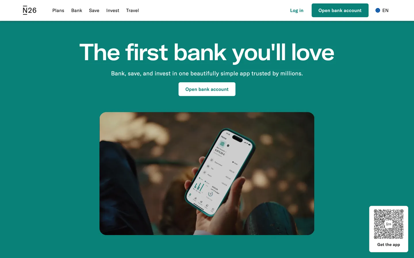
N26's marketing canvas is the Berlin neobank's argument for a fully-mobile retail bank built around a single saturated teal. The hex `#088177` is the brand: it fills the hero band edge-to-edge, it fills the primary "Open bank account" pill, and it carries link emphasis through the nav. Display type is N26-Extended at weight 400 — every heading from a 14px section eyebrow up to the 80px hero ("The first bank you'll love") renders at the one weight. There is no bold display tier. Body type is N26 (the house grotesk) at weights 400 (prose) and 500 (labels, nav links, button text) with positive `0.3px` letter-spacing on every reading size — wider than zero, against the convention of negative-tracked sans serifs in fintech. The button radius is the literal value `6px`, not the customary 9999 or 500; N26 commits to a small-corner geometry across a `2px / 4px / 6px / 8px / 24px` radii scale and renders no pills.
This page packages the N26 marketing canvas into a single DESIGN.md file built on the Google Labs DESIGN.md specification. Inside the spec: 27 colors tokens grouped into brand-teal, rhubarb, gold, slate-blue, ink, and surface roles drawn from the brand's `--color-nemo*` CSS variable namespace; 11 typography tokens spanning an 80px hero down to a 14px caption with the full N26-Extended 400 display stack and N26 400/500 body stack; six radius tokens including the load-bearing `6px` button corner and `24px` card corner; nine spacing tokens climbing from a 2px micro-gap up to a 132px section band; and 18 components tokens covering buttons, the QR-download card, the cream product card, the teal hero band, the white catalogue band, the top nav, and the legal-link footer. Every value is quoted as an exact hex, pixel, or weight number.
A working React or Next.js developer drops the file into Claude, Cursor, or GitHub Copilot and the agent reproduces N26's saturated-teal mobile-bank rhythm rather than a generic neobank dashboard. Tokens map onto Tailwind config or CSS variables; the four-family chromatic stack maps onto the brand's `nemo*` prefix in the source CSS. The system is worth studying for one disciplined choice that distinguishes it from Monzo's white-on-cream restraint and Mercury's dark-canvas inversion: N26 collapses canvas and CTA onto the same teal hex `#088177`. Where most fintech brands separate the surface voltage from the action voltage, N26 fuses them — the hero band is the button is the brand.
What makes it distinct
5
- Teal as both canvas and CTA`#088177` fills the hero band and the primary button, the rare brand that uses one hex for surface and action
- Display weight 400 across every headingN26-Extended never appears above weight 400, the inverse of Monzo's single-weight-800 commitment
- Four-family chromatic stackteal, rhubarb `#b55b64`, gold `#a67931`, and slate-blue `#205b6b` coexist as named `--color-nemo*` CSS variables
- Tight `6px` button radius on a small-radii scale2px / 4px / 6px / 8px / 24px, with no pill geometry anywhere in the system
- Positive `0.3px` letter-spacing on bodyevery N26 body token tracks wider than zero, against the Sohne / Inter negative-tracking default
n26.com
Live at n26.com
A snapshot of the brand in production. Scroll the frame to see the whole page.
Colors
27 colors
N26's system runs on #088177 as its primary voltage, used in 4 of 18 components. Type is set in N26-Extended across 11 tokens from 14px to 80px, weights 400–500. Shape language is mixed across 18 components, blending pills, soft rounds, and squarer corners.
Brand & Accent
Sparing, CTA-only voltage · 5
Surface
Page and card backgrounds · 4
Text
Headlines, body, captions · 4
Borders & Hairlines
Dividers, outlines, rules · 1
Other
Specialty colors · 13
Typography
11 type tokens
Set in N26-Extended across 11 tokens, from 14px to 80px, weights 400–500. Shown in its own stack: where the font isn't installed, the fallback the file names stands in.
- display-xxl80px · weight 400 · lh 88pxThe quick brown fox jumps over the lazy dog
- display-xl58px · weight 400 · lh 64pxThe quick brown fox jumps over the lazy dog
- display-lg44px · weight 400 · lh 52.8pxThe quick brown fox jumps over the lazy dog
- display-md32px · weight 400 · lh 40pxThe quick brown fox jumps over the lazy dog
- heading-lg24px · weight 400 · lh 32pxThe quick brown fox jumps over the lazy dog
- heading-md18px · weight 500 · lh 27pxThe quick brown fox jumps over the lazy dog
- body-lg20px · weight 400 · lh 32px · tracking 0.16pxThe quick brown fox jumps over the lazy dog
- body-md16px · weight 400 · lh 25.6px · tracking 0.16pxThe quick brown fox jumps over the lazy dog
- body-md-label16px · weight 500 · lh 24px · tracking 0.3pxThe quick brown fox jumps over the lazy dog
- body-sm14px · weight 400 · lh 20px · tracking 0.2625pxThe quick brown fox jumps over the lazy dog
- button-md16px · weight 500 · lh 24px · tracking 0.3pxThe quick brown fox jumps over the lazy dog
Layout
Radii and spacing
6 corner radii and 10 spacing values. Shape language: mixed.
Radii
- none0px
- xxs2px
- xs4px
- sm6px
- md8px
- lg24px
Spacing
- xxs2px
- xs4px
- sm8px
- md12px
- base16px
- lg24px
- xl40px
- xxl56px
- section80px
- band132px
Components
18 components
Each rendered from its tokens (color, type, radius, padding) on N26's own canvas.
- Button Primarybutton-primaryButton Primary
- Button Primary Hoverbutton-primary-hoverButton Primary Hover
- Button Primary On Tealbutton-primary-on-tealButton Primary On Teal
- Button Secondarybutton-secondaryButton Secondary
- Button Outlinebutton-outlineButton Outline
- Link Teallink-tealLink Teal
- Pill Tagpill-tagPill Tag
- Top Navtop-navTop Nav
- Nav Linknav-linkNav Link
- Hero Band Tealhero-band-tealHero Band Teal
- Hero Band Lighthero-band-lightHero Band Light
- Card Creamcard-creamCard Cream
- Card Productcard-productCard Product
- Card Rhubarb Artcard-rhubarb-artCard Rhubarb Art
- Card Gold Artcard-gold-artCard Gold Art
- Qr Download Tileqr-download-tileQr Download Tile
- Faq Rowfaq-rowFaq Row
- Footer Lightfooter-lightFooter Light
In use
The system, in use
N26's tokens on the kind of product it builds.
Build something people actually use.
A short paragraph of marketing copy that previews how the brand's display tier and body tier read together. Two sentences is usually enough.
FAQ
N26 design system FAQ
Common questions about N26's tokens, components, and how to use this DESIGN.md in your project.
Read next
Related reading
Specs, directories, and component libraries that pair with this design system.
- Browse all design systemsThe full directory of DESIGN.md files on shadcn.io, with live mockups for each.shadcn.io
- N26 — official siteThe Berlin neobank's marketing canvas — source of every hex, font, and radius in this spec.n26.com (opens in a new tab)
- The DESIGN.md specificationGoogle Labs' open spec for machine-readable design system files — the format this page is built on.github.com (opens in a new tab)
Use it
Use N26 in your project
One machine-readable file. Drop it into Claude, Cursor, or any AI tool that reads DESIGN.md.
Download the DESIGN.md
One machine-readable file: every color, type, radius, spacing, and component token of N26.
Feed it to your AI tool
Drop it into Claude, Cursor, or GitHub Copilot. The agent writes React components and Tailwind classes that match N26's visual language.
Reference the tokens directly
Or paste the values into your Tailwind config, CSS variables, or component library: every color, size and radius is a quoted, ready-to-copy value.
Read the full DESIGN.md: overview, rationale, do’s and don’ts
Overview
N26's marketing canvas is one structural color — teal #088177 — carrying both the hero band and the primary CTA on a page that otherwise runs on white #ffffff, cream #faf8f5, and the brand's house grotesk N26 at modest weights 400 and 500. The hero opens with a fully saturated teal band edge-to-edge; inside it sits the 80px hero "The first bank you'll love" rendered in N26-Extended at weight 400 over a phone-mockup illustration. The primary CTA is a teal pill — same teal as the band — with white text at radius 6px. Below the fold the page switches to cream-on-white product bands, with rhubarb #b55b64, gold #a67931, and slate-blue #205b6b scoped to illustrated product tiles rather than CTA chrome. Every button across the page uses the same 6px corner and the same 12px 24px padding.
Brand-as-canvas: N26 collapses the surface voltage and the action voltage onto the same teal #088177. The hero band is the button is the brand. Where Monzo paints the object the click buys and Mercury paints exactly one indigo pill per band, N26 paints the entire band the color of the action. The decision survives every product surface — the QR-card download band, the savings-feature band, the investments band — all carry teal as both the page top and the in-page CTA.
Display type is N26-Extended at the single weight 400 across every heading tier from 14px section eyebrow up to the 80px hero. There is no bold display alternative; the brand commits to a one-weight stack on the inverse end of Monzo's single-weight-800 stack. Body type is N26 (the house grotesk) at weight 400 for prose and weight 500 for labels, nav links, and button text. Every body token tracks at positive letter-spacing — 0.3px on the 16px default, 0.2625px on the 14px caption, 0.16px on the 20px lead — wider than zero, against the negative-tracked default that Stripe and Linear use.
Key Characteristics:
- One-color rhythm —
{colors.brand-teal}(#088177) fills the hero band and the primary CTA pill, the rare brand that uses one hex for surface and action. - Display is N26-Extended at weight 400 exclusively — 14px to 80px, with
lineHeightmapped to the brand's--text-nemo*token family. - Four-family chromatic stack —
{colors.brand-teal},{colors.rhubarb}(#b55b64),{colors.gold}(#a67931), and{colors.slate-blue}(#205b6b) coexist as named--color-nemo*CSS variables; only teal fills buttons. - The button radius is the literal value
6pxrather than9999pxor500px— N26 ships a small-corner geometry across2px / 4px / 6px / 8px / 24px, with no pill anywhere in the system. - Positive
0.3pxletter-spacing on body — every N26 body token tracks wider than zero. Display tokens useletterSpacing: normal(zero), so the tracking signature lives on the reading sizes. - Cards use two corner sizes:
8pxon the densecard-productgrid and24pxon illustrated cream-fill cards. Inline tags use2px.
Colors
Source pages: home (
/en-eu).
Brand — Teal
- Brand Teal (
{colors.brand-teal}—#088177): frequency 30. Used as text (13), border (13), bg (4). The single load-bearing voltage — fills the hero band, fills thebutton-primarypill, carries link emphasis on the white nav. CSS variable--color-nemoTealand--color-teal-500. - Brand Teal Deep (
{colors.brand-teal-deep}—#005451): the hover and pressed step forbutton-primaryand the deepest text accent on cream surfaces. CSS variable--color-nemoTealDeep. - Brand Teal Strong (
{colors.brand-teal-strong}—#06736a): the mid-step between brand and deep — used inside icon glyphs and chart fills. CSS variable--color-nemoTealStrong. - Brand Teal Soft (
{colors.brand-teal-soft}—#a8ded8): a desaturated pale teal — fills mid-feature tiles and pill-tag backgrounds. CSS variable--color-nemoTeal200. - Brand Teal Bright (
{colors.brand-teal-bright}—#d8edeb): a near-cream tinted teal — fills the lightest feature surface, the soft step above white. CSS variable--color-nemoTealBright.
Rhubarb (illustration accent)
- Rhubarb (
{colors.rhubarb}—#b55b64): a muted dusty-red coral — fills illustrated product art and the "Rhubarb" account tier. CSS variable--color-nemoRhubarb. - Rhubarb Strong / Deep / Soft / Bright (
#99424b/#7d3940/#edcccf/#f5e1e3): the 4-step rhubarb scale used in card art chrome, never on CTAs.
Gold (illustration accent)
- Gold (
{colors.gold}—#a67931): a warm honey — fills illustrated product art on the savings tier and certain mid-card chrome. - Gold Mid / Soft / Bright (
#c89d58/#d6b17d/#ebddcc): the 3-step gold scale, scoped to illustration and decorative tile chrome.
Slate-Blue (illustration accent)
- Slate Blue (
{colors.slate-blue}—#205b6b): a deep desaturated blue-green — fills the rare data-mockup chart line and footer accent ranges. - Slate Blue Mid / Soft (
#2b697a/#4f8392): mid-tone slate steps used in line-graph illustration and footer chrome.
Ink
- Ink (
{colors.ink}—#1b1b1b): frequency 730. Used as text (385), border (344), shadow (1). The brand's default body-text color on white and cream. Not pure black — a near-black that reads softer at body sizes. CSS variable--color-nemoBlackand--color-black. - Ink Muted (
{colors.ink-muted}—#6d6d6d): a mid-gray for secondary text and label rows on white. CSS variable--color-nemoGrayStrong. - Ink Deep (
{colors.ink-deep}—#121212): an even darker near-black — appears in shadow tinting and the rare ultra-dense type block.
On Brand & Surface
- On Brand (
{colors.on-brand}—#ffffff): white text and iconography on teal surfaces. - Canvas Light (
{colors.canvas-light}—#ffffff): frequency 83. Used as text (30), border (30), bg (23). Default page background outside the hero band; carries product-catalogue bands and the nav. CSS variable--color-nemoWhite. - Canvas Cream (
{colors.canvas-cream}—#faf8f5): the brand's pale cream — fills the secondary product-card surface and footer band. CSS variable--color-nemoCream. - Canvas Cream Strong (
{colors.canvas-cream-strong}—#f2f2f2): a slightly grayer cream step — fills dense feature cards. CSS variable--color-nemoCreamStrong.
Hairline
- Surface Gray (
{colors.surface-gray}—#e9e9e9): frequency 41. Used as border (39), bg (2). The default 1px hairline color between FAQ rows and card divisions. CSS variable--color-nemoGrayBrightand--color-gray-100. - Hairline (
{colors.hairline}—#d9d9d9): a slightly darker gray — borders on QR-download tiles and input chrome. CSS variable--color-nemoGrayand--color-gray-500. - Scrim (
{colors.scrim}—#000000): frequency 6. Used as text (3), border (3). Pure black appears via browser-default rendering on a handful of unstyled elements and gradient stops. The brand's actual body ink is{colors.ink}(#1b1b1b), not pure black — the small#000000count reflects user-agent defaults, not the brand's chosen text color.
Semantic
The marketing canvas does not declare a separate semantic palette (success / warning / danger / info). Error states live inside the authenticated app product and are out of scope here.
Typography
Font Family
Two proprietary families:
- N26-Extended at the single weight
400— every heading tier from{typography.heading-md}(18px) up to{typography.display-xxl}(80px) renders in this one weight. There is no thin or bold display alternative in the marketing system. CSS variable--font-extended. - N26 (the house grotesk) at weights
400(body prose) and500(labels, nav links, button text). Body sizes are 14px (caption), 16px (default), 17px (lead variant), and 20px (large). CSS variable--font-standard.
Both families are proprietary, served from n26.com under the CSS variables --font-extended and --font-standard with internal fallbacks (N26-Extended-Fallback and N26-Fallback). When N26 cannot be licensed, Inter Variable at weight 400 with positive 0.3px tracking on body sizes is the closest open-source path; alternatively General Sans or DM Sans render the same rounded-grotesk silhouette. Keep N26-Extended at weight 400 across every display tier — heavier weights collapse the brand's editorial signature.
Hierarchy
| Token | Size | Weight | Line Height | Use |
|---|---|---|---|---|
{typography.display-xxl} | 80px | 400 | 88px | Hero ("The first bank you'll love") |
{typography.display-xl} | 58px | 400 | 64px | Section opener on white bands |
{typography.display-lg} | 44px | 400 | 52.8px | Sub-section opener on cream bands |
{typography.display-md} | 32px | 400 | 40px | Card title on dense product grid |
{typography.heading-lg} | 24px | 400 | 32px | Tile heading on illustrated product cards |
{typography.heading-md} | 18px | 500 | 27px | Nav link, FAQ row label, mini-card title |
{typography.body-lg} | 20px | 400 | 32px | Hero supporting text on teal band |
{typography.body-md} | 16px | 400 | 25.6px | Default prose body |
{typography.body-md-label} | 16px | 500 | 24px | Label rows, button text, nav inline |
{typography.body-sm} | 14px | 400 | 20px | Caption, footer legal text, app-store sub-label |
{typography.button-md} | 16px | 500 | 24px | Pill button label (matches body-md-label) |
Principles
- Single display weight is the brand. N26-Extended never appears above weight 400 in the marketing system. The inverse end of Monzo's single-weight-800 commitment.
- Tracking is positive on body, zero on display. Body tokens sit at
0.3px(16px),0.2625px(14px),0.16px(20px). Display tokens sit atletterSpacing: normal. The brand's typographic signature is body-tracking, not display-tracking. - Labels are weight 500. Nav, button text, and label rows use N26 at weight 500 — one step heavier than the body 400 so labels read as actionable.
- Line-height climbs with size. The 80px hero uses 88px line-height (1.1); body 16px uses 25.6px (1.6). The brand widens leading on body for readability and tightens on display for editorial density.
Note on Font Substitutes
N26 and N26-Extended are proprietary. Inter Variable at weight 400 (display) plus 400/500 (body) with positive 0.3px tracking on body sizes is the closest open-source substitute. Avoid weight ≥ 500 on display tokens — the brand's single-weight-400 commitment collapses at heavier weights into generic neobank type.
Layout
Spacing System
- Base unit: 8px (with 2 / 4 / 12 / 16 sub-tokens).
- Tokens:
{spacing.xxs}2px ·{spacing.xs}4px ·{spacing.sm}8px ·{spacing.md}12px ·{spacing.base}16px ·{spacing.lg}24px ·{spacing.xl}40px ·{spacing.xxl}56px ·{spacing.section}80px ·{spacing.band}132px. - Section padding: 80px on marketing band tops, 132px on the largest feature bands.
- Card internal padding:
40px 24pxon cream feature cards,32pxon illustrated product tiles,16pxon QR-download tiles. - Button padding:
12px 24pxon every variant — the same value across primary, secondary, outline, and inverse.
Grid & Container
The page centers in a 1328px navigation-header column (CSS variable --navigation-header-width) with content rows clamping to a 1464px --container-nemoContainer. The hero band extends edge-to-edge with the headline and CTA centered. Product-tile grids run 4-up at desktop, collapse to 2-up at 1024px (CSS variable --breakpoint-nemolg), and 1-up below.
Whitespace Philosophy
Bands have generous vertical breathing room: 80px section padding climbs to 132px on the largest feature bands. Inside cards the rhythm tightens: 16px between body rows, 8px on adjacent label-and-value pairs. The brand chooses readable density over edge-to-edge maximalism — content holds at a 1464px column even on wide screens.
Elevation & Depth
| Level | Treatment | Use |
|---|---|---|
| 0 | Flat | Default surface — most cards have no shadow at all |
| 1 | drop-shadow: 0 1px 1px rgba(0,0,0,0.05) | The smallest lift on QR-download tile chrome |
| 2 | drop-shadow: 0 9px 7px rgba(0,0,0,0.1) | Floating illustrated product tiles on cream |
| 3 | Band switch — teal #088177 slams against white | The brand's primary depth medium |
Decorative Depth
N26's depth system is structural: the alternation between {colors.brand-teal} (the hero band) and {colors.canvas-light} (the product bands) is the visual lift, not a shadow ladder. Drop shadows are reserved for the small QR-download tile (drop-shadow-xs) and floating illustrated product cards (drop-shadow-xl). No card carries a multi-step shadow stack; depth comes from the band switch and the 1px hairline borders between rows.
Shapes
Border Radius Scale
| Token | Value | Use |
|---|---|---|
{rounded.none} | 0px | Hero bands, footer, nav, full-bleed surfaces |
{rounded.xxs} | 2px | Inline chips, tags, the smallest pill-tag corner |
{rounded.xs} | 4px | Inline labels, badge geometry |
{rounded.sm} | 6px | Every button — primary, secondary, outline, inverse |
{rounded.md} | 8px | Product cards, QR-download tiles, dense feature grids |
{rounded.lg} | 24px | Illustrated cream-fill cards, the largest feature surfaces |
Small-Corner Geometry
The 6px button radius is the literal value N26 ships — not 9999px or 500px. The radii scale climbs in small steps from 2px to 24px with no pill geometry anywhere in the system. The brand chooses small corners over maximal-pill commitment, which positions the brand visually closer to a software-utility surface than a chat-bubble marketing canvas. Every button across primary, secondary, outline, and inverse variants uses the same 6px radius, the same 12px 24px padding, and 48px height.
Components
Buttons
button-primary — the dominant CTA system-wide.
- Background
{colors.brand-teal}(#088177), text{colors.on-brand}(#ffffff), type{typography.button-md}, padding12px 24px, rounded{rounded.sm}6px, height 48px. - Used on every marketing band as the single filled CTA. Teal fills both the band and the button.
button-primary-hover — the hover and pressed step.
- Background
{colors.brand-teal-deep}(#005451), same text, same geometry. Tonal step within the teal family rather than a luminance shift.
button-primary-on-teal — the inverse for the teal hero band.
- Background
{colors.canvas-light}(#ffffff), text{colors.brand-teal}(#088177), same6pxcorner and12px 24pxpadding. - Appears inside the teal hero band when a white pill needs to read as the brightest pixel against the saturated band.
button-secondary — soft cream fill.
- Background
{colors.canvas-cream-strong}(#f2f2f2), text{colors.ink}, same6pxgeometry.
button-outline — 1px ink border on white.
- Background
{colors.canvas-light}, text{colors.ink}(#1b1b1b),1px solid {colors.ink}border, same6pxgeometry, height 48px.
Links & Tags
link-teal — the inline teal link.
- Background
{colors.canvas-light}, text{colors.brand-teal}(#088177), type{typography.body-md-label}. The only place teal renders as text color rather than surface or button fill. Appears in nav and inline body links.
pill-tag — pale-teal chip.
- Background
{colors.brand-teal-bright}(#d8edeb), text{colors.brand-teal-deep}(#005451), type{typography.body-sm}, padding4px 8px, rounded{rounded.xxs}2px.
Navigation
top-nav — the page header.
- Background
{colors.canvas-light}, text{colors.ink}, height 63px (CSS variable--header-height), padding12px 24px. Logo "N26" wordmark on the left, primary nav center, "Log in" link and filledbutton-primaryon the right.
nav-link — inline nav anchor.
- Background
{colors.canvas-light}, text{colors.ink}via{typography.heading-md}weight 500. No underline default; no hover color shift documented.
Hero & Bands
hero-band-teal — the saturated teal hero.
- Background
{colors.brand-teal}(#088177), text{colors.on-brand}, type{typography.display-xxl}(80px / 400 / 88px), padding80px 24px. Carries the "The first bank you'll love" headline above the phone-mockup illustration and the white-pill CTA.
hero-band-light — white catalogue hero.
- Background
{colors.canvas-light}, text{colors.ink}, type{typography.display-xl}(58px / 400 / 64px), padding80px 24px. Carries section openers on white bands below the fold.
Cards
card-cream — the cream feature card.
- Background
{colors.canvas-cream}(#faf8f5), text{colors.ink}, padding40px 24px, rounded{rounded.lg}24px. The largest illustrated feature surface.
card-product — dense product tile.
- Background
{colors.canvas-cream-strong}(#f2f2f2), text{colors.ink}, type{typography.heading-lg}, padding32px, rounded{rounded.md}8px. Hosts the product-tier illustration grid.
card-rhubarb-art — soft rhubarb illustration card.
- Background
{colors.rhubarb-soft}(#edcccf), text{colors.rhubarb-deep}(#7d3940), type{typography.heading-lg}, padding32px, rounded{rounded.lg}24px. Used on the savings or rhubarb-tier marketing band.
card-gold-art — soft gold illustration card.
- Background
{colors.gold-bright}(#ebddcc), text{colors.ink}, type{typography.heading-lg}, padding32px, rounded{rounded.lg}24px. Used on the investments or gold-tier marketing band.
Tiles & Rows
qr-download-tile — the floating QR-code app download tile.
- Background
{colors.canvas-light}, text{colors.ink}via{typography.body-sm}, padding16px, rounded{rounded.md}8px, 1px{colors.hairline}border. Sits floating bottom-right on desktop with the brand'sdrop-shadow-xl.
faq-row — the FAQ accordion row.
- Background
{colors.canvas-light}, text{colors.ink}via{typography.heading-md}, padding16px 0px, 1px{colors.surface-gray}border between rows. No rounded corners; full-bleed of the column.
Footer
footer-light — the regulatory footer.
- Background
{colors.canvas-cream}(#faf8f5), text{colors.ink-muted}(#6d6d6d), type{typography.body-sm}, padding80px 24px. Holds 4 columns of link groups, the country selector, and the BaFin / FSCS regulatory legal row.
Do's and Don'ts
Do
- Use
{colors.brand-teal}(#088177) for both the hero band and the primary CTA — N26 fuses surface voltage and action voltage onto the same hex. Splitting them into separate surface and action colors breaks the brand's one-hex rhythm. - Render every heading in N26-Extended at weight 400. Drop to N26 at weight 500 only on
heading-mdwhere the label voice is closer to body. - Track body type at positive letter-spacing —
0.3pxon the 16px default. Display tracks at zero. The brand's typographic signature is body-tracking, not display-tracking. - Use literal
6pxfor button radius — not9999pxor500px. The brand ships a small-corner geometry across2px / 4px / 6px / 8px / 24pxwith no pill anywhere. - Scope rhubarb, gold, and slate-blue to illustration and product-card art. Only teal fills CTAs.
Don't
- Don't bump N26-Extended above weight 400 — the single-weight-400 commitment is the brand's editorial signature. Heavier display weights collapse into generic neobank type, the inverse of the Monzo error (which is dropping below weight 800).
- Don't fill a CTA with rhubarb
#b55b64, gold#a67931, or slate-blue#205b6b— the four-family chromatic stack reserves these for illustration and product-card art. A rhubarb-filled CTA breaks the discipline that gives the brand its editorial range. - Don't apply negative letter-spacing to body tokens — every N26 body token sits at positive tracking (
0.3pxon 16px,0.2625pxon 14px). Negative tracking is the Sohne / Inter / Söhne convention, not this one. - Don't substitute
9999pxor500pxfor{rounded.sm}(6px) on buttons. The brand's small-corner geometry is a category-positioning signal — pill geometry collapses N26 into the messaging-app archetype Monzo occupies. - Don't use
#000000for body text — the brand's actual ink is{colors.ink}(#1b1b1b), a deep near-black. Pure black appears only via user-agent defaults on unstyled elements. - Don't soft-fade between
{colors.brand-teal}and{colors.canvas-light}band boundaries — the hard slam between saturated teal and white is the brand's structural depth medium; a gradient transition removes the magazine-spread rhythm.
Known Gaps
- Hover and pressed states are documented for
button-primary(#005451) but not forbutton-secondary,button-outline, or the link variants. Focus rings are not captured. - Logged-in app surfaces (transactions, spaces, investments, account settings) are out of scope. Only the public marketing canvas at n26.com is in this spec.
- Localized variants (en-eu vs en-de vs fr-fr) may run different hero headlines, illustration art, and copy density but share the token system.
- Rhubarb, gold, and slate-blue illustration art is enumerated as color tokens but the specific component-level placement inside illustrated phone-tile mockups appears as raster art rather than CSS-rendered surfaces and is not assigned to component tokens.
- Motion specs for the brand's named animations (
slideUp,slideUpLayered,accordionSlideDown,heroMediaExpand) are declared in CSS variables on:rootbut their per-component application is not documented. - Semantic palette (success, warning, danger, info) is not declared in the marketing system — error states live inside the authenticated app product.
Banking & Payments
More systems like this
More DESIGN.md files in Banking & Payments.
Pricing
Build it with Pro
The DESIGN.md files are free. Pro adds 6,000+ blocks, premium templates and the MCP server, so your AI editor builds in your system for you.
4.9/5 out of 5 · 150+ reviewsfrom 150+ founders and developers.
Billing
Billed once a year in USD. Cancel anytime.
- How many people can use the license.
- Client work, SaaS products and anything you charge for.
- Production-ready React sections: hero, pricing, features, dashboards and more.
- Complete multi-page sites you can ship as they are.
- React icons from every major library, installable with one command.
- Presets that restyle every block, in light and dark.
- Lets your AI editor search, preview and install blocks for you.
- Priority requests are answered first.
Individual
For personal projects & open source
$32instead of $49/mo
$389 billed yearly
- Seats: 1 seat
- Commercial use: Personal & open source only
- Pro blocks: 6,000+ blocks
- Templates: All 14 templates
- React icons: 294k+ icons
- Themes: All 59 themes
- MCP server: Basic usage
- Support: Standard
Team
Most popularFor freelancers, agencies & startups
$66instead of $99/mo
$789 billed yearly · ≈ $13/dev/mo
- Seats: Up to 5 seats
- Commercial use: Included
- Pro blocks: 6,000+ blocks
- Templates: All 14 templates
- React icons: 294k+ icons
- Themes: All 59 themes
- MCP server: High usage
- Support: Priority
Organization
For companies with larger teams
$132instead of $199/mo
$1,589 billed yearly
- Seats: Unlimited seats
- Commercial use: Included
- Pro blocks: 6,000+ blocks
- Templates: All 14 templates
- React icons: 294k+ icons
- Themes: All 59 themes
- MCP server: Unlimited usage
- Support: Priority
Billed once a year in USD. Cancel anytime.
Individual
For personal projects & open source
$32instead of $49/mo
$389 billed yearly
- How many people can use the license.Seats: 1 seat
- Client work, SaaS products and anything you charge for.Commercial use: Personal & open source only
- Production-ready React sections: hero, pricing, features, dashboards and more.Pro blocks: 6,000+ blocks
- Complete multi-page sites you can ship as they are.Templates: All 14 templates
- React icons from every major library, installable with one command.React icons: 294k+ icons
- Presets that restyle every block, in light and dark.Themes: All 59 themes
- Lets your AI editor search, preview and install blocks for you.MCP server: Basic usage
- Priority requests are answered first.Support: Standard
Team
Most popularFor freelancers, agencies & startups
$66instead of $99/mo
$789 billed yearly · ≈ $13/dev/mo
Everything in Individual, plus
- How many people can use the license.Seats: Up to 5 seats
- Client work, SaaS products and anything you charge for.Commercial use: Included
- Lets your AI editor search, preview and install blocks for you.MCP server: High usage
- Priority requests are answered first.Support: Priority
Organization
For companies with larger teams
$132instead of $199/mo
$1,589 billed yearly
Everything in Team, plus
- How many people can use the license.Seats: Unlimited seats
- Lets your AI editor search, preview and install blocks for you.MCP server: Unlimited usage
- Secure checkout via Stripe
- Code lives in your repo
- Keep what you've shipped if you cancel
- License terms
Your system, built for you
Every block, template and icon, installed by your AI agent in your design system. The DESIGN.md files stay free.