Mux Design System
Mux's video-platform design language as a DESIGN.md file. Amber #ffb200, Rotonto display, Aeonik body, JetBrainsMono eyebrows, 18+ components. For React and AI tools.
Add shadcn.io to your AI agent. · Pro It installs blocks, icons and templates in your design system from a prompt, with Pro.
Set up MCP- Primary
- #ffb200
- Typeface
- Aeonik
- Shape
- Soft
- Base radius
- 14px
- Colors
- 19
- Type tokens
- 14
- Components
- 18
- Spacing values
- 9
About
About Mux DESIGN.md
Curated by Dov Azencot · Updated May 13, 2026 · Source mux.com (opens in a new tab)
Mux's marketing surface is the dashboard of a video-API developer platform, written for engineers who already build players and care what a 99th-percentile rebuffer rate looks like. The brand sits on a warm cream canvas (`#e2e4dd`) rather than the developer-genre default of pure-white-on-near-black — and breaks that calm with an amber Get-started pill (`#ffb200`) where most infra brands would default to a blue, an ink-black, or a saturated indigo. A secondary brand green (`#1be349`) handles dashboard accents and the footer Talk-to-sales CTA. Everywhere else — code panels, dark transcript surfaces, the customer-love testimonial band — the page drops to a near-black `#242628` ink layer. The decoration is the contrast: warm canvas, dark technical card, amber pill.
This DESIGN.md packages the system into a single machine-readable file. Inside: 19 colors tokens (cream canvas, amber primary, green secondary, near-black surface, four-step gray ladder), 14 typography styles across Rotonto display, Aeonik body, and JetBrainsMono mono, 7 corner radii (with the `28px` card radius doing most of the lifting and `9999px` reserved for pills), 9 spacing values built on a `14px / 28px / 56px` rhythm, and 18 components from `nav-bar` to `hero-band` to the polarity-flipped `dark-feature-card`. The format follows the Google Labs DESIGN.md spec — colors, typography, rounded, spacing, components, all token-referenced.
Feed the file to Claude, Cursor, or Copilot when you need a React component that reads as a video-developer brand rather than as a generic shadcn theme. The agent picks up the moves — amber single-voltage CTAs, cream canvas, 28px card chrome, JetBrainsMono uppercase eyebrows above Rotonto display, Aeonik body with a tracked `0.32px` letter-spacing. Reference the tokens directly in Tailwind config, or audit existing UI against them. The system rewards study because of what it refuses: there is no blue primary, no second display weight beyond Rotonto's working `400`, and no card radius between `28px` and `9999px` — the brand commits to a wide-corner geometry and never blinks.
What makes it distinct
5
- Amber as primary voltage`#ffb200` paints the only Get started pill, never softened to a blue or a black
- Two ultra-large radii28px for every card and 9999px for every CTA pill, with nothing between them
- Three-typeface contractRotonto for display, Aeonik for body, JetBrainsMono uppercase for eyebrows
- Cream canvas over white`#e2e4dd` is the warm body tone, white is reserved for cards and the nav
- Green as the second voice`#1be349` carries dashboard accents, demo affordances, and the footer Talk-to-sales pill
mux.com
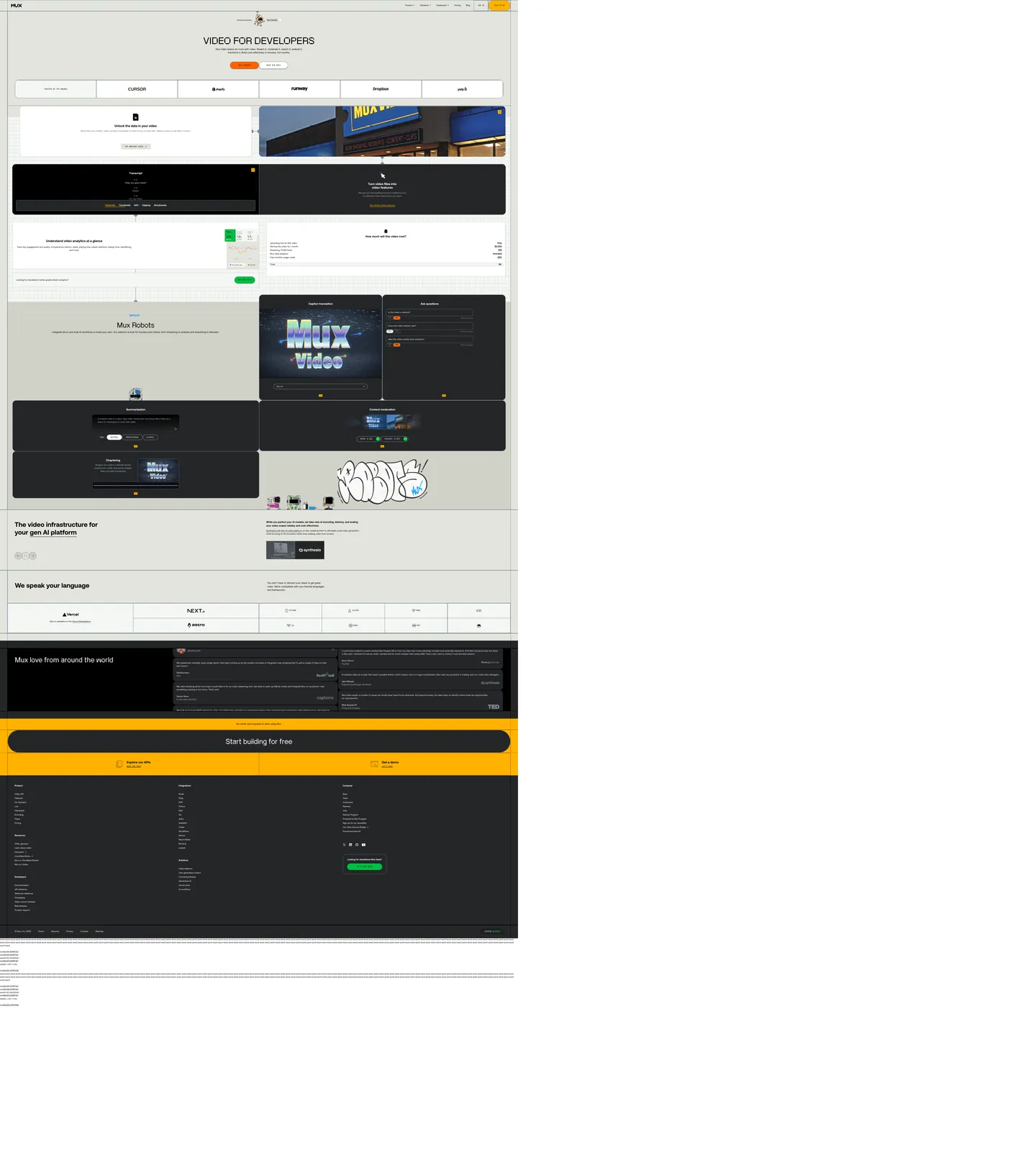
Live at mux.com
A snapshot of the brand in production. Scroll the frame to see the whole page.
Colors
19 colors
Mux's system runs on #ffb200 as its primary voltage, used in 1 of 18 components. Type is set in Aeonik across 14 tokens from 13px to 66px, weights 400–700. Shape language is soft — components average 28px corner radius, with no sharp interactive edges.
Brand & Accent
Sparing, CTA-only voltage · 7
Surface
Page and card backgrounds · 5
Text
Headlines, body, captions · 3
Borders & Hairlines
Dividers, outlines, rules · 3
Other
Specialty colors · 1
Typography
14 type tokens
Set in Aeonik across 14 tokens, from 13px to 66px, weights 400–700. Shown in its own stack: where the font isn't installed, the fallback the file names stands in.
- display-xl66px · weight 400 · lh 75.9px · tracking 1.32pxThe quick brown fox jumps over the lazy dog
- display-lg50px · weight 400 · lh 60px · tracking 1pxThe quick brown fox jumps over the lazy dog
- heading-md24px · weight 700 · lh 27.6px · tracking 0pxThe quick brown fox jumps over the lazy dog
- heading-sm21px · weight 700 · lh 24.15px · tracking 0pxThe quick brown fox jumps over the lazy dog
- lead18px · weight 400 · lh 27px · tracking 0.36pxThe quick brown fox jumps over the lazy dog
- body-md16px · weight 400 · lh 24px · tracking 0.32pxThe quick brown fox jumps over the lazy dog
- body-md-strong16px · weight 700 · lh 24px · tracking 0.32pxThe quick brown fox jumps over the lazy dog
- body-sm14px · weight 400 · lh 21px · tracking 0.28pxThe quick brown fox jumps over the lazy dog
- link-nav16px · weight 400 · lh 32px · tracking 0pxThe quick brown fox jumps over the lazy dog
- button-md16px · weight 700 · lh 24px · tracking 0.32pxThe quick brown fox jumps over the lazy dog
- eyebrow-mono14px · weight 400 · lh 16.8px · tracking 0pxThe quick brown fox jumps over the lazy dog
- code-md14px · weight 400 · lh 22.4px · tracking 0pxThe quick brown fox jumps over the lazy dog
- label-mono14px · weight 400 · lh 21px · tracking 0pxThe quick brown fox jumps over the lazy dog
- caption-mono13px · weight 400 · lh 19.5px · tracking 0pxThe quick brown fox jumps over the lazy dog
Layout
Radii and spacing
7 corner radii and 9 spacing values. Shape language: soft.
Radii
- none0px
- xs2px
- sm7px
- md14px
- card28px
- hero112px
- full9999px
Spacing
- xxs3.5px
- xs7px
- sm14px
- md28px
- lg32px
- xl42px
- 2xl56px
- 3xl64px
- hero112px
Components
18 components
Each rendered from its tokens (color, type, radius, padding) on Mux's own canvas.
- Nav Barnav-barNav Bar
- Nav Linknav-linkNav Link
- Button Primarybutton-primaryButton Primary
- Button Primary Hoverbutton-primary-hoverButton Primary Hover
- Button Secondarybutton-secondaryButton Secondary
- Button Greenbutton-greenButton Green
- Chip Monochip-monoChip Mono
- Type here…text-inputText Input
- Hero Bandhero-bandHero Band
- Feature Cardfeature-cardFeature Card
- Dark Feature Carddark-feature-cardDark Feature Card
- Code Panelcode-panelCode Panel
- Pricing Cardpricing-cardPricing Card
- Logo Striplogo-stripLogo Strip
- Eyebrow Labeleyebrow-labelEyebrow Label
- Cta Bandcta-bandCta Band
- FooterfooterFooter
- Testimonial Bandtestimonial-bandTestimonial Band
In use
The system, in use
Mux's tokens on the kind of product it builds.
Build something people actually use.
A short paragraph of marketing copy that previews how the brand's display tier and body tier read together. Two sentences is usually enough.
FAQ
Mux design system FAQ
Common questions about Mux's tokens, components, and how to use this DESIGN.md in your project.
Read next
Related reading
Specs, directories, and component libraries that pair with this design system.
- Browse all design systemsThe full directory of DESIGN.md files on shadcn.io, with live mockups for each.shadcn.io
- Mux — official siteVideo API for developers — streaming, analytics, captions, and AI-ready video infrastructure.mux.com (opens in a new tab)
- The DESIGN.md specificationGoogle Labs' open spec for machine-readable design system files.github.com (opens in a new tab)
Use it
Use Mux in your project
One machine-readable file. Drop it into Claude, Cursor, or any AI tool that reads DESIGN.md.
Download the DESIGN.md
One machine-readable file: every color, type, radius, spacing, and component token of Mux.
Feed it to your AI tool
Drop it into Claude, Cursor, or GitHub Copilot. The agent writes React components and Tailwind classes that match Mux's visual language.
Reference the tokens directly
Or paste the values into your Tailwind config, CSS variables, or component library: every color, size and radius is a quoted, ready-to-copy value.
Read the full DESIGN.md: overview, rationale, do’s and don’ts
Overview
Mux's marketing surface is the dashboard of a video-API developer platform, written for engineers who measure success in rebuffer-rate percentiles. It earns that posture without using the developer-genre's default chrome: instead of pure white on near-black with a blue primary, the page sits on a warm cream {colors.canvas} (#e2e4dd), floats white {colors.surface} (#ffffff) cards on top, drops to a near-black {colors.surface-dark} (#242628) for code panels and the testimonial band, and breaks the calm with an amber Get-started pill {colors.primary} (#ffb200). The brand-secondary is a saturated green {colors.accent-green} (#1be349) that carries dashboard markers and the footer Talk-to-sales CTA. Black {colors.ink} (#000000) carries every paragraph and headline.
Amber-as-voltage: where most developer infrastructure brands fall back on a saturated blue or an ink-black primary, Mux paints its single conversion CTA in {colors.primary} (#ffb200) — the same hue you'd find on a cassette label or a Sony Walkman power LED. The amber appears in only ~12 background fills on a 2647-element page; scarcity is the design move. Unlike the convention of using brand color as the dominant text and surface tone, Mux holds amber for the moment the reader is meant to click, and only that moment.
Type is a three-way contract. Rotonto carries display at weight 400 with positive 1.32px tracking — a wide-mouth grotesque that gives the hero "Video for developers" headline its retro-broadcast feel. Aeonik carries body, navigation, buttons, and links at weight 400 with a deliberately positive 0.32px letter-spacing (every paragraph runs slightly looser than CSS default — the brand's voice). JetBrainsMono uppercase carries every eyebrow, every chip label, every code snippet. The three faces never blend roles: you do not set body in Rotonto, you do not set a heading in mono, you do not set a button in Rotonto.
Two-pole radius geometry: the page commits to a {rounded.card} 28px card radius (40 occurrences in extracted CSS) and a {rounded.full} 9999px pill for every button, chip, and nav-bar container (17 occurrences) — and refuses everything between. There is no 8px button, no 12px card. The chrome itself is the brand, and the brand picks wide corners on cards and full corners on pills.
Key Characteristics:
- A single amber primary CTA
{colors.primary}(#ffb200) carries every conversion target, paired with a white-outlinebutton-secondaryfor the watch-the-demo action. The brand uses a9999pxpill shape across every button context — marketing, nav, in-card. - A green secondary voltage
{colors.accent-green}(#1be349) carries the footer "Looking for standalone Mux Data?" CTA, analytics-card accents, and dashboard markers. Reserved — never a primary fill. - A cream
{colors.canvas}(#e2e4dd) body canvas instead of pure white. White{colors.surface}(#ffffff) is reserved for cards floating on the cream. - Every section eyebrow ("DEPLOY", "TRUSTED BY TOP BRANDS", "EXPLORE OUR APIs") sets in JetBrainsMono
{typography.eyebrow-mono}uppercase — a small technical signature above the wide-mouth Rotonto display. - Flat-only elevation. There are no captured drop shadows; cards earn lift through the cream → white → dark
#242628polarity ladder, not through blur.
Colors
Brand & Accent
- Amber (
{colors.primary}—#ffb200) — frequency 152. Used as text (70), border (70), background (12). The single conversion voltage —Get startedpill,Start building for freepill, theTry Mux Datachip. Reserved for primary CTAs. - Burnt Orange (
{colors.primary-deep}—#ff6100) — frequency 106. Used as text (51), border (51), background (4). The pressed / hover state of the amber pill, and a few inline link emphases. - Brand Green (
{colors.accent-green}—#1be349) — frequency 4. Used as text (1), bg (2), border (1). The secondary voltage —Talk to salesfooter pill and analytics-chart accent dots. Layered asbrandin the extraction. - Deep Green (
{colors.accent-green-deep}—#00be43) — frequency 2. Background-only. The pressed state of the green pill. - Pink (
{colors.accent-pink}—#fa50b5) — frequency 4. Used as text (2), border (2). Rare diagnostic color — appears in code-highlight tokens only. - Blue Link (
{colors.accent-blue}—#0091ff) — frequency 8. Used as text (4), border (4). Inline-link blue, scoped to body copy.
Surface
- Cream Canvas (
{colors.canvas}—#e2e4dd) — frequency 20. Used as bg (18), text (1), border (1). The warm page body — every marketing band sits on this tone. - Warm Stone (
{colors.canvas-warm}—#d0d2c8) — frequency 14. Used as bg (5), border (8), text (1). A slightly bluer-cream used for inset bands inside the cream canvas and as light-mode card chrome. - Pure White (
{colors.surface}—#ffffff) — frequency 1149. Used as text (593), border (528), bg (28). The card / dialog / input surface. White is the card tone, not the page tone. - Dark Surface (
{colors.surface-dark}—#242628) — frequency 50. Used as bg (46), gradient (4). The polarity-flipped technical surface — code panels, the Mux Robots demo card, the testimonial band, the conversion CTA band. - Deepest (
{colors.surface-deep}—#14141e) — frequency 1. Background-only. The ultra-dark variant for the very-final footer.
Text
- Ink (
{colors.ink}—#000000) — frequency 712. Used as text (364), border (319), bg (14). Every body paragraph and headline on light surfaces, and the footer background fill. Not gray-tinted — pure#000000. - Ink Muted (
{colors.ink-muted}—#565e67) — frequency 30. Used as border (19), bg (6), text (5). The mid-tone for secondary captions and divider strokes inside cards. - Ink Soft (
{colors.ink-soft}—#828c97) — frequency 93. Used as border (77), text (12), bg (4). The default nav-link separator color and the lowest-priority caption tone.
Hairlines
- Hairline (
{colors.hairline}—#adb9c6) — frequency 264. Used as text (133), border (131). The default 1px divider across nav, cards, inputs, logo strip. Carries border duty more than fill duty. - Hairline Soft (
{colors.hairline-soft}—#d5dbe2) — frequency 2. Border-only. A softer variant used inside dropdown menus.
Semantic
- Focus Ring (
{colors.focus-ring}—#0482ff) — frequency 2. Layered asbrandvia--tw-ring-color. The Tailwind ring color — every focused input picks this up. - Amber Border (
{colors.amber-border}—#bd8209) — frequency 15. Border-only. The pressed-state border on the amber pill — a darker pull from the same hue family.
Typography
Font Family
Three faces carry the entire system, with no overlap of role:
- Rotonto — display, used at weight
400only. The wide-mouth grotesque headline face. Renders the hero "Video for developers" at66px / 75.9px / 1.32px trackingand section headlines at50px / 60px / 1px tracking. Positive tracking is part of the voice — every display line is set looser than CSS default. - Aeonik — body, navigation, button labels, link text. Weight
400for body and700for emphasis only. Body sets at16px / 24pxwith a deliberate positive0.32pxletter-spacing. - JetBrainsMono — every eyebrow label, every code snippet, every chip caption. Weight
400only. Uppercase for eyebrows and chip labels at14px; mixed-case for body code at14px / 22.4px.
Hierarchy
| Token | Size | Weight | Line Height | Letter Spacing | Use |
|---|---|---|---|---|---|
{typography.display-xl} | 66px | 400 | 75.9px | 1.32px | Hero headline ("Video for developers"). Rotonto. |
{typography.display-lg} | 50px | 400 | 60px | 1px | Section headlines ("The video infrastructure for…"). Rotonto. |
{typography.heading-md} | 24px | 700 | 27.6px | 0px | Card-cluster headlines ("Mux Robots", "We speak your language"). Aeonik. |
{typography.heading-sm} | 21px | 700 | 24.15px | 0px | Sub-card headings inside feature clusters. Aeonik. |
{typography.lead} | 18px | 400 | 27px | 0.36px | Lead paragraphs under section headlines. Aeonik. |
{typography.body-md} | 16px | 400 | 24px | 0.32px | Default body paragraph. Aeonik. |
{typography.body-md-strong} | 16px | 700 | 24px | 0.32px | Bolded inline body and button labels. Aeonik. |
{typography.body-sm} | 14px | 400 | 21px | 0.28px | Secondary captions and footer body. Aeonik. |
{typography.link-nav} | 16px | 400 | 32px | 0px | Nav-link text and tabbed-row link rows. Aeonik. |
{typography.button-md} | 16px | 700 | 24px | 0.32px | Pill-button labels (Get started, Talk to sales). Aeonik. |
{typography.eyebrow-mono} | 14px | 400 | 16.8px | 0px (uppercase) | Section eyebrows and chip labels. JetBrainsMono. |
{typography.code-md} | 14px | 400 | 22.4px | 0px | Inline code and code-panel body. JetBrainsMono. |
{typography.label-mono} | 14px | 400 | 21px | 0px (uppercase) | Chip labels inside the dark Mux Robots demo. JetBrainsMono. |
{typography.caption-mono} | 13px | 400 | 19.5px | 0px | Smallest mono caption — code-block footers and metadata pills. |
Principles
- Positive tracking is the voice. Body sets at
+0.32px, lead at+0.36px, hero display at+1.32px. The brand never tracks negative. Stripping the positive letter-spacing breaks the brand. - Three faces, three roles, no blending. Rotonto never appears in body. Aeonik never appears in code. JetBrainsMono never appears in display.
- Uppercase is exclusively for mono. Every uppercase block on the page sets in JetBrainsMono — Aeonik never uppercases, Rotonto never uppercases. Where most brands let display uppercase for impact, Mux holds uppercase as a technical-label signal.
- Display weight ceiling is 400. Rotonto never appears at 600 or 700 on the page. The wide-mouth letterforms carry the impact on their own.
Note on Font Substitutes
The two display + body faces are proprietary. Open-source substitutes:
- Wide-mouth grotesque (Rotonto) —
Editorial Newat weight400is the closest in spirit;Söhne Breitworks if licensed;Cabinet Groteskat weight400is a passable second. - Geometric sans (Aeonik) —
Interat weight400/700withfont-feature-settings: 'ss01'andletter-spacing: 0.02em.General Sansis the next-best option. - Monospace —
JetBrains Monoopen-source is the exact face.IBM Plex Monoworks as a second.
Layout
Spacing System
- Base unit:
14px. The brand's rhythm is14 / 28 / 56 / 112— every captured spacing value is a multiple of14(it is not a4pxor8pxsystem). The hero band uses112pxvertical padding. - Tokens:
{spacing.xxs}3.5px·{spacing.xs}7px·{spacing.sm}14px·{spacing.md}28px·{spacing.lg}32px·{spacing.xl}42px·{spacing.2xl}56px·{spacing.3xl}64px·{spacing.hero}112px. - Section padding: marketing bands use
{spacing.2xl}56pxtop/bottom inside cards (56px 28px 28pxis the most common card-padding signature, 7 occurrences). Hero band stretches to{spacing.hero}112px. - Card interior padding:
{spacing.md}28pxis the dominant horizontal padding (94 occurrences);{spacing.sm}14pxis the inline gap (69 occurrences). - Inline gap: button rows and chip rows sit at
{spacing.sm}14pxbetween siblings.
Grid & Container
- Max width: ~1408px (
1440pxviewport minus the cream gutter). Content centers with{spacing.md}28pxhorizontal gutters on desktop. - Column patterns:
- Two-column feature row:
feature-cardleft + darkdark-feature-cardright ("Unlock the data" + "Mux Video" cluster). - Logo strip: 6-cell row of monochrome customer logos inside a single
{rounded.card}28pxwhite pill. - Code-cluster row: dark Mux Robots demo card (left, narrow) + dark "Caption translation / Ask questions" cards (right, paired).
- Footer: 4-column nav with column eyebrow labels in
{typography.eyebrow-mono}.
- Two-column feature row:
Whitespace Philosophy
The cream canvas itself supplies decoration; whitespace separates the cards. Section spacing is generous — {spacing.2xl} 56px between bands lets the cream breathe between white cards. Inside a card, headline / body stack is tight ({spacing.xs} 7px gap), then a wider gap before the CTA pill. The page reads as engineered — large gaps between cards + tight interior, never the reverse.
Elevation & Depth
| Level | Treatment | Use |
|---|---|---|
| Level 0 — Flat | No shadow, no border. | The cream canvas itself, the hero band, and the footer. |
| Level 1 — Polarity Contrast | No shadow — uses surface step from {colors.canvas} #e2e4dd to {colors.surface} #ffffff. | The default card chrome (feature-card, pricing-card, logo-strip). |
| Level 2 — Dark Inset | No shadow — uses surface step from {colors.canvas} #e2e4dd to {colors.surface-dark} #242628. | The technical-band chrome (dark-feature-card, code-panel, cta-band). |
| Level 3 — Footer Sink | No shadow — uses surface step from {colors.canvas} #e2e4dd to {colors.ink} #000000. | The final-footer band and testimonial-band. |
Shadow-as-absence: there are no box-shadow declarations captured on Mux's marketing surface. Cards earn elevation purely through the cream → white → dark #242628 → black polarity ladder. Where most developer-infra brands stack 2–3 small offsets to fake material depth, Mux refuses the technique entirely. The 28px radius and the surface contrast carry the lift. This is a deliberate constraint — adopting Mux's chrome means committing to flat surfaces.
Shapes
Border Radius Scale
| Token | Value | Use |
|---|---|---|
{rounded.none} | 0px | Full-bleed bands (hero, footer). |
{rounded.xs} | 2px | Tightest radius — applied to inline mono chips inside code snippets. |
{rounded.sm} | 7px | A single one-off — the Mux Robots demo's progress-rail container. |
{rounded.md} | 14px | Mid-scale chrome — inner code-block frames and chart containers inside feature-card. |
{rounded.card} | 28px | The dominant card radius — every white card, every dark surface, every logo-strip wrapper (40 occurrences). |
{rounded.hero} | 112px | Reserved for the hero-band corner softening (17 occurrences) — the cream block's giant rounded corners. |
{rounded.full} | 9999px | Every pill button, every chip, every social-icon container, the top-nav wrapper, the conversion-CTA pill (17 occurrences). |
Photography Geometry
- Hero illustration: cream-on-cream small astronaut graphic, no frame, set above the headline.
- Customer logos: monochrome
{colors.ink}SVGs at consistent height inside a single white{rounded.card}28pxpill (thelogo-stripcomponent). - Dashboard mockups: cropped UI screenshots inside
{rounded.card}28pxframes, paired with a dark{colors.surface-dark}#242628polarity-flipped neighbor. - Mux Robots demo card: dark
#242628card with a pixel-artMux Videographic, paired controls in{rounded.full}pills.
Components
Buttons & Chips
button-primary — the canonical amber pill.
- Background
{colors.primary}(#ffb200), text{colors.primary-fg}(#000000), label set in{typography.button-md}, padding{spacing.sm} {spacing.md}(14px 28px), shape{rounded.full}, height44px. The single conversion target on every band.
button-primary-hover — the pressed state.
- Background
{colors.primary-deep}(#ff6100), text{colors.primary-fg}(#000000), otherwise identical tobutton-primary.
button-secondary — the watch-the-demo white pill.
- Background
{colors.surface}(#ffffff), text{colors.ink}(#000000), 1px border{colors.hairline}(#adb9c6), label{typography.button-md}, shape{rounded.full}.
button-green — the footer Talk to sales and Mux Data CTA.
- Background
{colors.accent-green}(#1be349), text{colors.primary-fg}(#000000), label{typography.button-md}, shape{rounded.full}. The brand-secondary voltage — reserved for sales / data-product surfaces.
chip-mono — the small uppercase eyebrow chip.
- Background
{colors.surface}(#ffffff), text{colors.ink}(#000000), border{colors.hairline}(#adb9c6), body set in{typography.eyebrow-mono}(JetBrainsMono uppercase), padding{spacing.xs} {spacing.sm}, shape{rounded.full}. Labels demo states ("INPUT", "OUTPUT", "DEPLOY").
Inputs
text-input — the canonical text input.
- Background
{colors.surface}(#ffffff), text{colors.ink}(#000000), border{colors.hairline}(#adb9c6), body in{typography.body-md}, padding{spacing.xs} {spacing.md}(7px 28px), shape{rounded.full}, height44px. Focus ring uses{colors.focus-ring}(#0482ff).
Navigation
nav-bar — the sticky top nav.
- Background
{colors.surface}(#ffffff), text{colors.ink}(#000000),{typography.link-nav}, padding{spacing.sm} {spacing.md}, height64px. The entire nav row sits inside a{rounded.full}9999pxpill — the nav itself is a giant pill.
nav-link — the centered link row inside the nav-bar pill.
- Text
{colors.ink}(#000000), border{colors.ink-soft}(#828c97),{typography.body-md}, padding{spacing.md}(28px), height43px. No hover background — links stay flat against the white nav fill.
Cards & Surfaces
feature-card — the canonical white card.
- Background
{colors.surface}(#ffffff), text{colors.ink}(#000000), padding{spacing.2xl} {spacing.md} {spacing.md}(56px 28px 28px— the dominant card-padding signature), shape{rounded.card}28px. Hosts the "Unlock the data in your video" / "Understand video analytics" cards.
dark-feature-card — the polarity-flipped technical card.
- Background
{colors.surface-dark}(#242628), text{colors.surface}(#ffffff), padding{spacing.2xl} {spacing.md} {spacing.md}, shape{rounded.card}28px. Hosts the Mux-Robots demo, the Transcript block, the Caption Translation card.
code-panel — the dark code-preview surface.
- Background
{colors.surface-dark}(#242628), text{colors.surface}(#ffffff), body in{typography.code-md}(JetBrainsMono14px), padding{spacing.md}, shape{rounded.card}28px.
pricing-card — the pricing-tier card on the standalone pricing band.
- Background
{colors.surface}(#ffffff), text{colors.ink}(#000000), padding{spacing.xl} {spacing.md}, shape{rounded.card}28px. Inside: amount in{typography.heading-md}, included list in{typography.body-md}rows.
logo-strip — the customer-logo row inside a single white pill.
- Background
{colors.surface}(#ffffff), text{colors.ink}(#000000),{typography.eyebrow-mono}for the "TRUSTED BY TOP BRANDS" eyebrow, padding{spacing.md}, shape{rounded.card}28px.
Signature Bands
hero-band — the cream hero.
- Background
{colors.canvas}(#e2e4dd), text{colors.ink}(#000000), padding{spacing.hero} {spacing.md}(112px 28px). Inside: small mono eyebrow chip above, hero display headline{typography.display-xl}("Video for developers"), then the lead paragraph in{typography.lead}, then thebutton-primary+button-secondaryrow.
cta-band — the dark conversion band near the footer.
- Background
{colors.surface-dark}(#242628), text{colors.surface}(#ffffff), display set in{typography.display-lg}("Start building for free"), padding{spacing.md} {spacing.2xl}, shape{rounded.card}28px. Contains a centered amberbutton-primarypill.
testimonial-band — the black "Mux love from around the world" band.
- Background
{colors.ink}(#000000), text{colors.surface}(#ffffff), padding{spacing.xl} {spacing.md}, shape{rounded.card}28px. Hosts ~4 testimonial quote cards in a flex row.
footer — the bottom 4-column nav.
- Background
{colors.ink}(#000000), text{colors.surface}(#ffffff), padding{spacing.3xl} {spacing.md}(64px 28px). Column eyebrows in{typography.eyebrow-mono}(uppercase mono); link rows in{typography.body-sm}.
eyebrow-label — the inline uppercase mono label above headlines.
- Text
{colors.ink}(#000000),{typography.eyebrow-mono}. Renders "DEPLOY", "INTEGRATIONS", "EXPLORE OUR APIs" above each section'sdisplay-lgheadline.
Do's and Don'ts
Do
- Hold amber for the click moment. Use
{colors.primary}(#ffb200) only on the single primary CTA per band — never as a fill on a card surface, never as a text color in body copy. Frequency 12 background fills across the entire page is the discipline. - Set the canvas in cream, not white. Page-body bands sit on
{colors.canvas}(#e2e4dd); white{colors.surface}(#ffffff) is reserved for cards that float on the cream. - Commit to two radii. Cards at
{rounded.card}28px, pills at{rounded.full}9999px. Nothing between unless you're matching a single Mux-Robots progress-rail one-off at{rounded.sm}7px. - Set every eyebrow in JetBrainsMono uppercase. Section headers prepend a
{typography.eyebrow-mono}label — "DEPLOY", "INTEGRATIONS", "TRUSTED BY TOP BRANDS". Aeonik never uppercases. - Track Aeonik positive. Body at
+0.32px, lead at+0.36px. Stripping the positive letter-spacing is the single fastest way to lose the brand voice.
Don't
- Don't use
{colors.primary}(#ffb200) on a card background. Amber is the CTA voltage; using it as a fill makes the card read as a banner ad. Use{colors.surface}(#ffffff) for cards on the cream canvas, or{colors.surface-dark}(#242628) for polarity-flipped panels. - Don't pick a card radius between
14pxand28px. The dominant radius is{rounded.card}28px(40 occurrences). A16pxor20pxcard breaks the chrome — the brand commits to wide corners and never compromises. - Don't stack drop shadows. The page has zero captured
box-shadowdeclarations. Adding a 2px-blur drop at 10% black opacity to a card breaks the flat-surface contract — Mux relies on the cream / white / dark polarity ladder for lift. - Don't blend typefaces across roles. Rotonto never sets a body paragraph; Aeonik never sets an eyebrow; JetBrainsMono never sets a display headline. The three-face contract is the loudest part of the system.
- Don't paint the green
{colors.accent-green}(#1be349) as a primary CTA fill. Green is reserved for the Mux-Data and Talk-to-sales surfaces (frequency 4 across the page). Promoting it to a marketing primary breaks the amber's single-voltage discipline. - Don't track Rotonto negative. Display tracks
+1.32pxat the hero. Negative tracking on a wide-mouth grotesque collapses the letterforms into each other.
Known Gaps
- Hover states: the amber
button-primarydarkens to{colors.primary-deep}(#ff6100) on press, but the exact transition timing and easing are not captured. The captured page renders only the static state. - Focus rings: form inputs pick up
{colors.focus-ring}(#0482ff) via Tailwind's--tw-ring-color, but ring width and offset are not directly captured. - Dark-mode tokens: Mux serves a single light-mode marketing surface — no
prefers-color-scheme: darkpalette is captured. The{colors.surface-dark}(#242628) panels are not the dark-mode page; they are inset technical surfaces inside the light page. - Dashboard / in-product chrome: this DESIGN.md covers the public marketing page. The Mux dashboard's denser inner surfaces — analytics tables, asset lists, live-stream monitors — likely use the same
{colors.surface-dark}(#242628) vocabulary but with tighter spacing values not captured here. - Motion: the Mux Robots demo and Caption Translation cards loop a short video on hover; motion tokens (duration, easing curves) are not captured.
Web Infrastructure & Hosting
More systems like this
More DESIGN.md files in Web Infrastructure & Hosting.
Pricing
Build it with Pro
The DESIGN.md files are free. Pro adds 6,000+ blocks, premium templates and the MCP server, so your AI editor builds in your system for you.
4.9/5 out of 5 · 150+ reviewsfrom 150+ founders and developers.
Billing
Billed once a year in USD. Cancel anytime.
- How many people can use the license.
- Client work, SaaS products and anything you charge for.
- Production-ready React sections: hero, pricing, features, dashboards and more.
- Complete multi-page sites you can ship as they are.
- React icons from every major library, installable with one command.
- Presets that restyle every block, in light and dark.
- Lets your AI editor search, preview and install blocks for you.
- Priority requests are answered first.
Individual
For personal projects & open source
$32instead of $49/mo
$389 billed yearly
- Seats: 1 seat
- Commercial use: Personal & open source only
- Pro blocks: 6,000+ blocks
- Templates: All 14 templates
- React icons: 294k+ icons
- Themes: All 59 themes
- MCP server: Basic usage
- Support: Standard
Team
Most popularFor freelancers, agencies & startups
$66instead of $99/mo
$789 billed yearly · ≈ $13/dev/mo
- Seats: Up to 5 seats
- Commercial use: Included
- Pro blocks: 6,000+ blocks
- Templates: All 14 templates
- React icons: 294k+ icons
- Themes: All 59 themes
- MCP server: High usage
- Support: Priority
Organization
For companies with larger teams
$132instead of $199/mo
$1,589 billed yearly
- Seats: Unlimited seats
- Commercial use: Included
- Pro blocks: 6,000+ blocks
- Templates: All 14 templates
- React icons: 294k+ icons
- Themes: All 59 themes
- MCP server: Unlimited usage
- Support: Priority
Billed once a year in USD. Cancel anytime.
Individual
For personal projects & open source
$32instead of $49/mo
$389 billed yearly
- How many people can use the license.Seats: 1 seat
- Client work, SaaS products and anything you charge for.Commercial use: Personal & open source only
- Production-ready React sections: hero, pricing, features, dashboards and more.Pro blocks: 6,000+ blocks
- Complete multi-page sites you can ship as they are.Templates: All 14 templates
- React icons from every major library, installable with one command.React icons: 294k+ icons
- Presets that restyle every block, in light and dark.Themes: All 59 themes
- Lets your AI editor search, preview and install blocks for you.MCP server: Basic usage
- Priority requests are answered first.Support: Standard
Team
Most popularFor freelancers, agencies & startups
$66instead of $99/mo
$789 billed yearly · ≈ $13/dev/mo
Everything in Individual, plus
- How many people can use the license.Seats: Up to 5 seats
- Client work, SaaS products and anything you charge for.Commercial use: Included
- Lets your AI editor search, preview and install blocks for you.MCP server: High usage
- Priority requests are answered first.Support: Priority
Organization
For companies with larger teams
$132instead of $199/mo
$1,589 billed yearly
Everything in Team, plus
- How many people can use the license.Seats: Unlimited seats
- Lets your AI editor search, preview and install blocks for you.MCP server: Unlimited usage
- Secure checkout via Stripe
- Code lives in your repo
- Keep what you've shipped if you cancel
- License terms
Your system, built for you
Every block, template and icon, installed by your AI agent in your design system. The DESIGN.md files stay free.