Skip to content

Morgan Stanley Design System

Morgan Stanley's marketing-site design system as DESIGN.md. Near-monochrome palette, MS Gloriola II Std display, Karla uppercase CTA labels, 0px border-radius, 16 components. For React, Next.js, and AI tools.

Add shadcn.io to your AI agent. · Pro It installs blocks, icons and templates in your design system from a prompt, with Pro.

Set up MCP
Primary
#187aba
Typeface
karlaregular
Shape
Sharp
Base radius
0px
Colors
10
Type tokens
12
Components
16
Spacing values
8

About

About Morgan Stanley DESIGN.md

Curated by Dov Azencot · Updated May 19, 2026 · Source morganstanley.com (opens in a new tab)

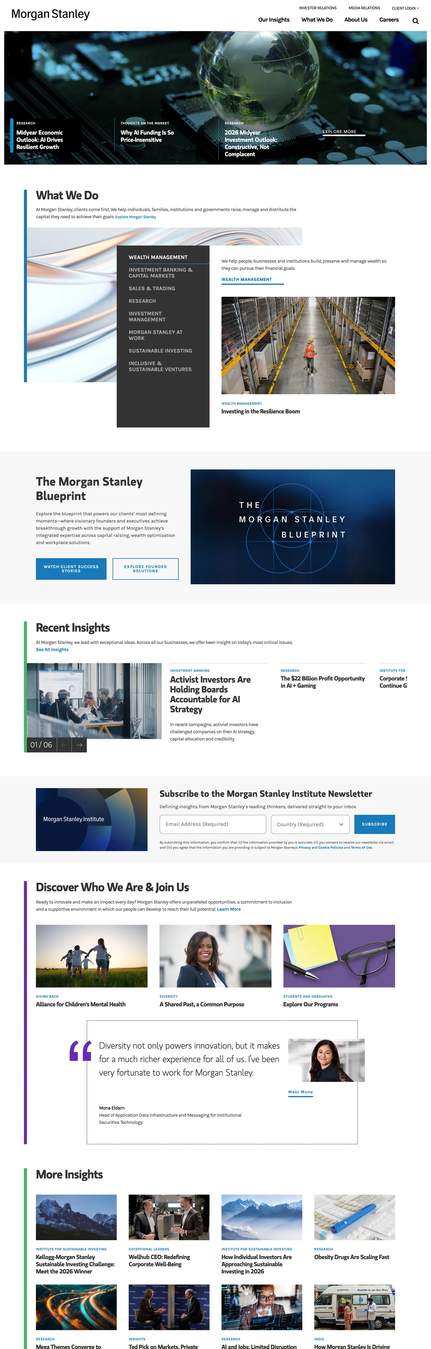
Morgan Stanley's marketing site announces authority through absence. No gradient hero, no photography overlay with a glowing CTA pill — the above-fold is a full-bleed documentary image (a globe rendered in blue light) with the wordmark set in white Karla Bold at 12px uppercase in the top-left corner, nothing else. The only color decision is the background: black. Below the fold, a white canvas opens and the system's two typefaces take over: MS Gloriola II Std in weight 500 at 40px with tight -1.45px tracking for section headings, and Karla Regular at 16px with no tracking for body copy. Where Goldman Sachs leans on a bold weight-700 sans and JPMorgan Chase uses a conventional blue primary, Morgan Stanley keeps its headings in a semi-serif display family that reads closer to a financial-publication editorial voice than a typical investment-bank marketing system.

The DESIGN.md file captures the system in machine-readable form. Inside: 10 colors tokens organized around a pure-ink dominant (503 occurrences), a single steel-blue interactive layer (#187aba, 210 occurrences split equally between text and border roles), and structural mid-grays at #4c4c4c and #333333. Twelve typography tokens span MS Gloriola II Std across three heading sizes and Karla across body, label, nav, and CTA roles — including the uppercase-tracked 12px Karla Bold used on every navigation link and CTA. One radius value (10px on the newsletter input), an 8-step spacing scale, and 16 components definitions cover the hero image band, the sectional display headings, the uppercase-link CTAs, the zero-radius navigation, and the newsletter subscription form.

Feed this file to Claude or Cursor and it reproduces Morgan Stanley's specific discipline: two proprietary typefaces in strict division, near-monochrome palette with a single blue link layer, flat 0px surfaces everywhere except the newsletter email input, and no decorative background fills outside the hero photography band. The system is worth studying not for its visual warmth — it has none — but for how far a brand can lean into typographic voice and ink-to-paper contrast as its sole differentiator. The display font is doing the work that color and gradient do in every competitor's system.

What makes it distinct

5

  1. Two-typeface splitMS Gloriola II Std owns every heading tier; Karla handles every label, nav item, and CTA in uppercase-tracked sans
  2. Near-monochrome palettepure black (#000000) dominates at 503 occurrences; the only chromatic note is steel blue (#187aba) for links and borders
  3. Zero roundingevery surface including the newsletter input sits at 0px border-radius; the only detected radius is a single 10px on the email field
  4. Uppercase CTA labels at 1.1px trackingKarla Bold at 14px / weight 700 in all-caps is the system's only typographic warmth signal
  5. No shadows, no background fillsdepth comes from a 1px black border and column-level ink contrast alone

morganstanley.com

Live at morganstanley.com

A snapshot of the brand in production. Scroll the frame to see the whole page.

Morgan Stanley's website at morganstanley.com

Colors

10 colors

Morgan Stanley's system runs on #187aba as its primary voltage, used in 1 of 16 components. Type is set in karlaregular across 12 tokens from 12px to 54px, weights 400–700. Shape language is sharp — components average 2px corner radius, favoring crisp rectangles.

Brand & Accent

Sparing, CTA-only voltage · 2

Surface

Page and card backgrounds · 2

Text

Headlines, body, captions · 5

Borders & Hairlines

Dividers, outlines, rules · 1

Typography

12 type tokens

Set in karlaregular across 12 tokens, from 12px to 54px, weights 400–700. Shown in its own stack: where the font isn't installed, the fallback the file names stands in.

  • display-xl54px · weight 500 · lh 68px · tracking -1.45pxThe quick brown fox jumps over the lazy dog
  • display-lg40px · weight 500 · lh 48px · tracking -1.45pxThe quick brown fox jumps over the lazy dog
  • heading-md20px · weight 500 · lh 24px · tracking -0.73pxThe quick brown fox jumps over the lazy dog
  • heading-sm14px · weight 400 · lh 14px · tracking 1pxThe quick brown fox jumps over the lazy dog
  • body-lg18px · weight 400 · lh 20pxThe quick brown fox jumps over the lazy dog
  • body-md16px · weight 400 · lh 24px · tracking -0.67pxThe quick brown fox jumps over the lazy dog
  • body-sm14px · weight 400 · lh 20pxThe quick brown fox jumps over the lazy dog
  • label-md14px · weight 700 · lh 14px · tracking 1.1pxThe quick brown fox jumps over the lazy dog
  • label-sm12px · weight 700 · lh 12px · tracking 0.24pxThe quick brown fox jumps over the lazy dog
  • button-md14px · weight 700 · lh 14px · tracking 1.1pxThe quick brown fox jumps over the lazy dog
  • nav-link14px · weight 400 · lh 14px · tracking -0.5pxThe quick brown fox jumps over the lazy dog
  • caption12px · weight 400 · lh 16px · tracking -0.2pxThe quick brown fox jumps over the lazy dog

Layout

Radii and spacing

2 corner radii and 8 spacing values. Shape language: sharp.

Radii

  • none0px
  • input10px

Spacing

  • xxs3px
  • xs5px
  • sm10px
  • md14px
  • base20px
  • lg30px
  • xl40px
  • 2xl80px

Components

16 components

Each rendered from its tokens (color, type, radius, padding) on Morgan Stanley's own canvas.

  • Button Primary
    button-primaryButton Primary
  • Button Secondary
    button-secondaryButton Secondary
  • Cta Link
    cta-linkCta Link
  • Top Nav
    top-navTop Nav
  • Nav Link
    nav-linkNav Link
  • Hero Section
    hero-sectionHero Section
  • Hero Heading
    hero-headingHero Heading
  • Section Heading
    section-headingSection Heading
  • Card Heading
    card-headingCard Heading
  • Body Paragraph
    body-paragraphBody Paragraph
  • Body Paragraph Muted
    body-paragraph-mutedBody Paragraph Muted
  • Card
    cardCard
  • Link Text
    link-textLink Text
  • Category Label
    category-labelCategory Label
  • Type here…
    text-inputText Input
  • Footer
    footerFooter

In use

The system, in use

Morgan Stanley's tokens on the kind of product it builds.

Build something people actually use.

A short paragraph of marketing copy that previews how the brand's display tier and body tier read together. Two sentences is usually enough.

Get startedLearn more
Marketing heroHeadline, sub-copy, primary CTA — the universal homepage opener.
Reporting · 14 min read

The quiet collapse of an old idea

For decades the consensus held that the system would correct itself. Then it didn't. This is the inside story of what changed, told by the people who watched it unravel.

"Nobody noticed because the failure was indistinguishable from progress."

By Sam Reporter · Updated 2 hours ago

Editorial articleMagazine-style longform with display headline.

FAQ

Morgan Stanley design system FAQ

Common questions about Morgan Stanley's tokens, components, and how to use this DESIGN.md in your project.

Read next

Specs, directories, and component libraries that pair with this design system.

Use it

Use Morgan Stanley in your project

One machine-readable file. Drop it into Claude, Cursor, or any AI tool that reads DESIGN.md.

Download DESIGN.md
  1. Download the DESIGN.md

    One machine-readable file: every color, type, radius, spacing, and component token of Morgan Stanley.

  2. Feed it to your AI tool

    Drop it into Claude, Cursor, or GitHub Copilot. The agent writes React components and Tailwind classes that match Morgan Stanley's visual language.

  3. Reference the tokens directly

    Or paste the values into your Tailwind config, CSS variables, or component library: every color, size and radius is a quoted, ready-to-copy value.

Read the full DESIGN.md: overview, rationale, do’s and don’ts

Overview

Morgan Stanley's marketing site is built on a single organizing principle. Ink authority: the page is a near-monochrome system — pure black ink on white canvas, structured by two proprietary typefaces in strict division of labor — that refuses every decorative shortcut competitors reach for. Where Goldman Sachs deploys a heavy-weight italic sans for headline punch and JPMorgan Chase leans on a conventional corporate blue as its primary voltage, Morgan Stanley holds the heading tier to MS Gloriola II Std, a semi-serif that reads closer to the Financial Times than to any investment-bank peer, at weight 500 — never 700 — with tight negative tracking.

The chromatic restraint is absolute. 503 of the most-used color occurrences are pure black (#000000); the only non-neutral color is steel blue (#187aba) at 210 occurrences, used almost entirely as text (103) and border (105), never as a background fill. This is not a "conservative blue" brand in the convention of retail banking — it is a system that refuses hue as a design instrument and instead competes on typographic weight and negative space.

Navigation and CTAs speak in a second voice: Karla Bold at 12px, uppercase, with 1.1px letter-spacing — a technical, tracking-heavy label register that stands in deliberate contrast to the semi-serif display above. The split maps precisely to content vs. wayfinding.

Key Characteristics:

  • Near-monochrome palette with pure black (#000000) as the dominant token — 503 occurrences covering text, borders, and the hero background equally.
  • Single chromatic layer: steel blue (#187aba) reserved for link text, interactive borders, and focus rings — never as a fill color.
  • MS Gloriola II Std at weight 500 in three heading sizes — a semi-serif display that no major bank competitor uses at this tier.
  • Karla Bold at 12-14px uppercase with 1.1px tracking for every label, navigation item, and CTA — the system's typographic counterweight.
  • Zero border-radius on all surfaces except the newsletter email input (10px) — sharp geometry as institutional signal.
  • 0px radius buttons filled with charcoal (#333333), not blue — the CTA has no brand voltage.
  • Flat system with no shadow tier; depth comes from 1px black borders and column-level contrast.
  • Full-bleed dark photography hero with white label text over black — the only moment of visual luxury.

Colors

Ink

  • Ink ({colors.ink} — #000000): frequency 503. Used as text (251), border (251), background (1). The page's load-bearing structural token — every nav item, section divider, body paragraph, and button border runs in pure black. Wired with no CSS variable name on the captured surfaces.
  • Ink Soft ({colors.ink-soft} — #333333): frequency 92. Used as text (43), border (37), background (12). The primary button fill and secondary heading color below the fold. Softer than pure black but still achromatic.
  • Ink Mid ({colors.ink-mid} — #4c4c4c): frequency 91. Used as text (47), border (44). The workhorse body-paragraph color — slightly lighter than ink-soft, used for running copy and the newsletter form label.
  • Ink Muted ({colors.ink-muted} — #757575): frequency 46. Used as text (23), border (23). Secondary and tertiary labels, caption rows, footer sub-text.
  • Ink Dark ({colors.ink-dark} — #222222): frequency 2. Used as text and border in selected card contexts. A near-black that merges visually with pure ink but registers as a separate value in the CSS.

Canvas

  • Canvas ({colors.canvas} — #ffffff): frequency 118. Used as text (57), background (7), border (54). Below-fold body surface, button text over dark fills, and the white text in the hero band.
  • Surface-1 ({colors.surface-1} — #f2f2f2): frequency 2. Background fill on alternating section rows — the only surface color that breaks the white canvas.

Interactive

  • Primary ({colors.primary} — #187aba): frequency 210. Used as text (103), border (105), background (2). The system's only chromatic token — steel blue reserved for link underlines, hover-state borders, and inline hyperlinks. Never used as a button fill.
  • Primary Text ({colors.primary-text} — #0000ee): frequency 46. Used as text (23), border (23). The browser default hyperlink blue — appears on unvisited anchor elements that have not been restyled. A residual rendering artifact rather than a brand decision; avoid introducing this deliberately.

Hairline

  • Hairline ({colors.hairline} — #bdbdbd): frequency 2, as border only. Used exclusively on the newsletter email input field to mark the resting border state.

Typography

Font Families

The system runs MS Gloriola II Std for headings across three weight variants (ms_gloriola_ii_stdlight, ms_gloriola_ii_stdregular, ms_gloriola_ii_std_semibold) and Karla for everything else (karlabold, karlaregular). Both are proprietary or brand-customized — MS Gloriola II Std is not publicly licensed; Karla is available on Google Fonts in standard weight variants. The two-family split is absolute: there is no heading size that uses Karla, and no body size that uses MS Gloriola II Std.

Hierarchy

TokenSizeWeightLine HeightLetter SpacingUse
{typography.display-xl}54px50068px-1.45pxHero / primary page h1
{typography.display-lg}40px50048px-1.45pxSection h2 ("What We Do")
{typography.heading-md}20px50024px-0.73pxCard headlines, article sub-heads
{typography.heading-sm}14px40014px1pxSmall-caps section labels (MS Gloriola regular)
{typography.body-lg}18px40020px0Navigation area links (Karla Regular)
{typography.body-md}16px40024px-0.67pxDefault body paragraph (Karla Regular)
{typography.body-sm}14px40020px0Body anchor text, inline links
{typography.label-md}14px70014px1.1pxPrimary CTA labels, uppercase link buttons
{typography.label-sm}12px70012px0.24pxSecondary navigation labels, small uppercase links
{typography.button-md}14px70014px1.1pxCTA button text in uppercase
{typography.nav-link}14px40014px-0.5pxTop-nav link labels in Karla Regular uppercase
{typography.caption}12px40016px-0.2pxFooter, disclaimer text, metadata

Principles

The semi-serif display at weight 500 is the distinctive move. The heading never reaches 700 — the authority comes from the typeface's letterform character, not from weight. Karla labels at uppercase with positive tracking are the sharpest typographic contrast in the system: where the headings are quiet and editorial, the CTAs announce themselves through capitalization and spacing.

Note on Font Substitutes

MS Gloriola II Std is proprietary and unavailable for download. Playfair Display at weight 400-500 is the closest public alternative for the semi-serif display role — it shares the mixed-serif character. For Karla, the original is on Google Fonts; Inter Bold in uppercase with 0.08em tracking is an acceptable substitute if Karla is unavailable.

Layout

Spacing System

  • Base unit: 10px — the dominant padding value (24 occurrences), present on button verticals, card internals, and nav items.
  • Tokens: {spacing.xxs} 3px · {spacing.xs} 5px · {spacing.sm} 10px · {spacing.md} 14px · {spacing.base} 20px · {spacing.lg} 30px · {spacing.xl} 40px · {spacing.2xl} 80px.
  • Section padding (vertical): 80px on the full-bleed hero photography band; below-fold sections have no declared background padding — they rely on heading margin and column rhythm.
  • Card internal padding: 20px for dark overlay cards; 0px on left-edge for editorial columns.
  • Navigation: 7px horizontal padding per nav link label (0px vertical on the link element itself, with padding applied to the parent nav container).

Grid & Container

  • Max content width: approximately 1200px for the "What We Do" section heading and article columns.
  • Hero: full-bleed dark photography, with small uppercase Karla wordmark at the top-left. No centered CTA stack — the image IS the hero.
  • Below-fold sections: 3-column layouts with ink hairline dividers, article card grids with dark overlay panels, and an editorial full-bleed "Morgan Stanley Blueprint" section with reversed text on a navy panel.
  • Newsletter section: centered 2-column form (label + input + submit button in a row) on white canvas, 357px input width.

Rhythm

The page alternates between dark-surface editorial moments (the hero photography, the dark card overlays, the Blueprint panel) and white-canvas structured content (the "What We Do" grid, the "Recent Insights" card row, the "Discover Who We Are" section). Neither band dominates — the rhythm is counter-alternating, which prevents the page from feeling either consistently light or consistently dark.

Elevation

The system has no shadow tier. The page renders no detected shadow values in the extracted color data. Depth is communicated entirely through two mechanisms: surface-color contrast (dark photography or dark card overlays against the white canvas) and 1px black borders ({colors.ink}) that define the edges of cards, form inputs, and navigation items. The newsletter input uses a {colors.hairline} (#bdbdbd) border in resting state — the only non-ink border in the system.

There is no elevation ladder of any kind — no raised cards, no ambient shadow, no floating nav bar. The system is categorically flat.

Shapes

The radius scale is zero-first. The only detected non-zero value in the extracted data is 10px on the newsletter email subscription input — every other surface (buttons, navigation items, card containers, dropdowns) renders at 0px. This makes Morgan Stanley the most geometrically strict system in the banking category captured in this directory.

  • {rounded.none} 0px — all buttons, nav elements, card containers, dropdown panels.
  • {rounded.input} 10px — newsletter email input field only.

The square geometry reads as institutional authority; the single rounded input is the one concession to conventional form-field usability.

Components

button-primary — Charcoal {colors.ink-soft} fill, white text, Karla Bold 14px uppercase at 1.1px tracking, 0px radius, 10×20px padding, 62px height. "Investment Banking & Capital Markets" is the canonical instance — a category selector, not a conventional CTA.

button-secondary — White canvas fill, ink text, same Karla Bold uppercase label. No border on the captured instances; 0px radius.

cta-link — Transparent background, ink text, Karla Bold uppercase at 1.1px tracking. The navigation arrow-link pattern ("View All Insights →") used throughout section footers.

top-nav — White canvas surface, 48px height. Wordmark flush left, primary nav links (About Us / Wealth Management / Investment Management / Institutional / Research / Ideas) in Karla Regular uppercase 14px, utility links (Careers / Locations / What We Do / About Us) at Karla Bold 12px uppercase.

nav-link — Transparent, ink text, Karla Regular 14px uppercase at -0.5px tracking, 7px horizontal padding. No hover fill — only an ink border appears on active states.

hero-section — Full-bleed dark photography, 80px top/bottom padding. The wordmark label in white Karla Bold 12px uppercase sits at the top-left; no centered CTA.

hero-heading — Not a true h1 above the fold; the first true display heading "What We Do" sits below the photography band, rendered in MS Gloriola II Std 40px / weight 500 / -1.45px tracking in charcoal ink-soft.

section-heading — Same as hero-heading: MS Gloriola II Std 40px / 500 on white canvas in ink-soft. Used for "The Morgan Stanley Blueprint," "Recent Insights," "Discover Who We Are & Join Us."

card-heading — MS Gloriola II Std 20px / 500 in white on dark overlay cards; 0px left padding on the body, 20px left padding on the headline block that spans the dark panel.

body-paragraph — Karla Regular 16px / 400 in ink-mid (#4c4c4c), 24px line height, -0.67px tracking. The default running-text style.

body-paragraph-muted — Karla Regular 12px / 400 in ink-muted (#757575) for legal disclaimers, form consent text, and caption rows.

card — Charcoal ink-soft fill, white headline in MS Gloriola II Std 20px, 20px padding, 0px radius. Used for the dark overlay article cards in the "Recent Insights" row.

link-text — Transparent background, steel blue (#187aba) text in Karla Regular 14px. The inline hyperlink style — the only moment of chromatic brand voltage in body copy.

category-label — Ink text, Karla Bold 12px uppercase at 0.24px tracking. The small-caps category markers above article cards.

text-input — White canvas fill, ink-mid text, Karla Regular 18px, 10px rounded corners, 0×20px padding, 64px height, {colors.hairline} border. The newsletter email field — the system's only interaction surface.

footer — White canvas, ink body text, Karla Regular 14px. No surface contrast from the page floor; the footer continues the canvas.

Do's and Don'ts

Do use MS Gloriola II Std exclusively for headings. The two-typeface split between the semi-serif display family and Karla is the system's load-bearing typographic identity — using Karla for a heading or MS Gloriola II Std for a nav label breaks the division the entire system is built on.

Do hold steel blue ({colors.primary} — #187aba) to link text and borders only. Its 210 occurrences are split 103 text / 105 border — there are only 2 background-fill uses in the entire captured page, both incidental. Blue fills on buttons would contradict the system's flat-ink authority.

Do use 0px border-radius on all interactive surfaces. The square geometry is not a default oversight — it is the institution's architectural decision. A pill button or rounded card would read as a completely different brand.

Do let the heading weight stay at 500. MS Gloriola II Std at 40px / 500 with -1.45px tracking makes the editorial statement — bumping to 700 would change the heading from a publication dek to a retail-banking shout.

Don't use #187aba as a background fill for buttons or cards. It appears twice as a background in 210 extracted occurrences; the system's CTA fill is charcoal #333333 on white text. Rendering a blue-fill primary button imports the visual grammar of Chase or Bank of America, not Morgan Stanley.

Don't introduce shadows. The page has zero shadow-color entries in its extraction; every elevation signal comes from surface-color contrast. A drop shadow on a card would be the single most foreign element in the system.

Don't set heading letter-spacing to 0 or positive values. MS Gloriola II Std at 40px needs -1.45px tracking; at 20px it takes -0.73px. Without negative tracking, the semi-serif letterforms open up and lose the compact editorial reading.

Don't mix uppercase Karla with mixed-case at the same typographic tier. The system is binary: display-tier text is in MS Gloriola II Std in mixed case; CTA and nav text is in Karla Bold uppercase. Any mixed-case Karla label at the CTA tier reads as a styling accident.

Known Gaps

  • Color system depth: the captured page exposes no CSS custom properties for color — Morgan Stanley does not appear to use CSS variables for theming. The token set reflects direct hex values only; any internal design-token system is not publicly surfaced.
  • The actual homepage: the above-fold captured content is a photography band with no text content visible at scrape time; the effective "hero" heading is the "What We Do" section below. A full homepage capture with the rotating hero copy would reveal more typographic instances.
  • Dark-surface component states: the dark overlay cards and the Blueprint panel carry white text on dark backgrounds, but hover and focus states on these surfaces are not captured.
  • Navigation mega-menu: Morgan Stanley runs a dropdown mega-menu on hover for each primary nav item; its internal layout, card structure, and color decisions are not captured in the marketing-surface extraction.
  • Mobile and responsive tokens: the CSS variable system exposes zh-hans and JP font families (source-han-sans-cn-variable, source-han-sans-jp-variable, source-han-sans-hk-variable) for international markets, but no responsive breakpoint tokens are exposed in the captured variables.
  • Motion: the hero photography transitions between images in a slow crossfade; timing and easing values are not captured.
  • Form error states: the newsletter input resting state is captured; validation error (red border, error message) and success state are not.

Banking & Payments

More systems like this

More DESIGN.md files in Banking & Payments.

Pricing

Build it with Pro

The DESIGN.md files are free. Pro adds 6,000+ blocks, premium templates and the MCP server, so your AI editor builds in your system for you.

4.9/5 out of 5 · 150+ reviewsfrom 150+ founders and developers.

Billed once a year in USD. Cancel anytime.

Individual

For personal projects & open source

$32instead of $49/mo

$389 billed yearly

  • How many people can use the license.Seats: 1 seat
  • Client work, SaaS products and anything you charge for.Commercial use: Personal & open source only
  • Production-ready React sections: hero, pricing, features, dashboards and more.Pro blocks: 6,000+ blocks
  • Complete multi-page sites you can ship as they are.Templates: All 14 templates
  • React icons from every major library, installable with one command.React icons: 294k+ icons
  • Presets that restyle every block, in light and dark.Themes: All 59 themes
  • Lets your AI editor search, preview and install blocks for you.MCP server: Basic usage
  • Priority requests are answered first.Support: Standard

Team

Most popular

For freelancers, agencies & startups

$66instead of $99/mo

$789 billed yearly · ≈ $13/dev/mo

Everything in Individual, plus

  • How many people can use the license.Seats: Up to 5 seats
  • Client work, SaaS products and anything you charge for.Commercial use: Included
  • Lets your AI editor search, preview and install blocks for you.MCP server: High usage
  • Priority requests are answered first.Support: Priority

Organization

For companies with larger teams

$132instead of $199/mo

$1,589 billed yearly

Everything in Team, plus

  • How many people can use the license.Seats: Unlimited seats
  • Lets your AI editor search, preview and install blocks for you.MCP server: Unlimited usage
  • Secure checkout via Stripe
  • Code lives in your repo
  • Keep what you've shipped if you cancel
  • License terms

Your system, built for you

Every block, template and icon, installed by your AI agent in your design system. The DESIGN.md files stay free.

Get Pro