Monzo Design System
Monzo's design system as a DESIGN.md file. Hot Coral #ff4f40, MonzoSansDisplay at 16-61px, 19 colors, 19 components. For React, Next.js, and AI tools.
Add shadcn.io to your AI agent. · Pro It installs blocks, icons and templates in your design system from a prompt, with Pro.
Set up MCP- Primary
- #ff4f40
- Typeface
- MonzoSansDisplay
- Shape
- Soft
- Base radius
- 24px
- Colors
- 19
- Type tokens
- 14
- Components
- 19
- Spacing values
- 9
About
About Monzo DESIGN.md
Curated by Dov Azencot · Updated May 13, 2026 · Source monzo.com (opens in a new tab)
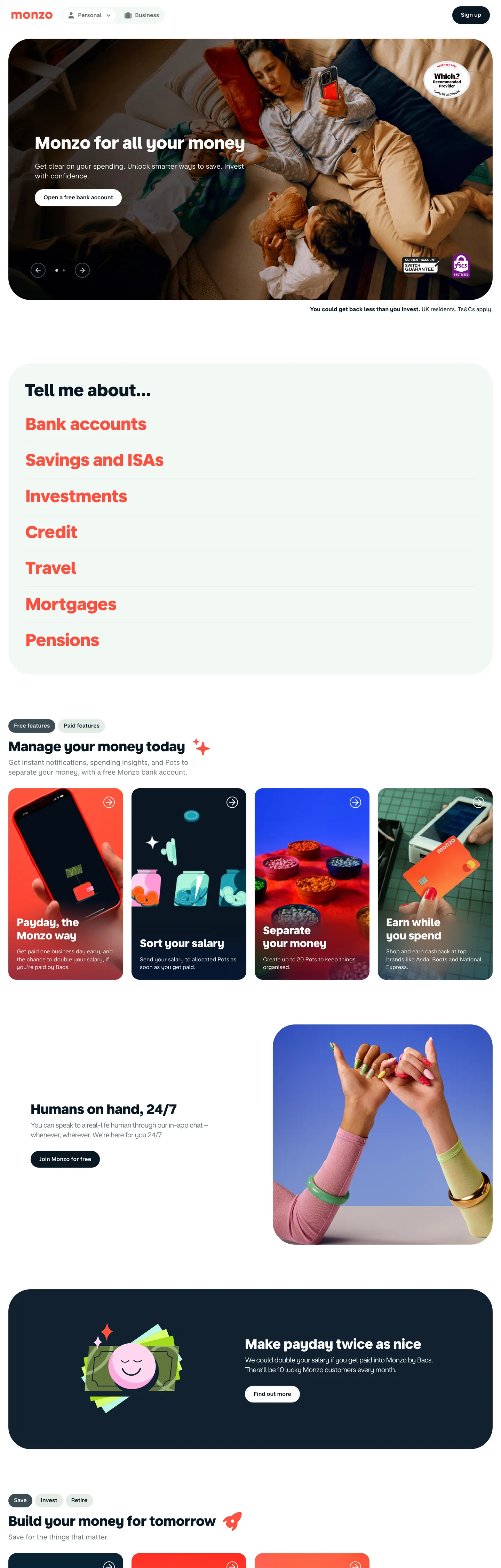
Monzo's marketing canvas is the visual argument for a UK challenger bank built around its physical card. The Hot Coral hex `#ff4f40` is famous, but on the site itself it is held back: the card mockup is Hot Coral, the illustrated phone tiles in the "Manage your money today" grid are Hot Coral, and almost nothing else. The primary CTA on every band is a dark-navy pill at `#091723` with white text and a `500px` radius — pill geometry so committed the radius value rounds up to half-a-thousand pixels rather than the customary 9999. Display type is MonzoSansDisplay at the single weight `800`, scaling from a 16px section eyebrow up to a 61px hero ("It all starts with a Hot Coral card") with `lineHeight: 1.0`. Body type is MonzoSansText at weights 400 and 600. Two structural background colours — white `#ffffff` and deep navy `#091723` — split the page into payday-storytelling bands and white product-catalogue bands.
This page packages the Monzo marketing canvas into a single DESIGN.md file built on the Google Labs DESIGN.md specification. Inside the spec: 19 colour tokens grouped into brand, surface, ink, and link roles; 12 typography tokens spanning a 61px hero down to a 13px caption with the full MonzoSansDisplay 800 and MonzoSansText 400/600/700 weight stack; six radius tokens including the load-bearing `500px` pill and a `4px` micro-tag corner; nine spacing tokens climbing from 4px to a 64px section band; and 19 components tokens covering buttons, payday cards, illustrated product tiles, the top nav, the dark "Humans on hand" support card, FAQ rows, and the legal-link footer. Every value is quoted as an exact hex, pixel, or weight number.
A working React or Next.js developer drops the file into Claude, Cursor, or GitHub Copilot and the agent reproduces Monzo's friendly-bank rhythm rather than a generic neobank dashboard. Tokens map onto Tailwind config or CSS variables, and components reference each other by name. The system is worth studying for one disciplined choice that mirrors Airbnb's restraint with Rausch: a famous brand colour treated as a material — the colour of the card, the colour of the illustration — rather than the colour of the button. Where most fintech brands try to brand the click, Monzo brands the object the click buys.
What makes it distinct
5
- Hot Coral as object color`#ff4f40` fills the physical card and illustrated phone tiles, never a CTA button
- Primary CTA is a dark-navy pill`#091723` background, white text, 500px radius, 12px-24px padding
- MonzoSansDisplay 800 across every heading16px h3 to 61px hero, no thin display tier exists
- Pill `500px` and tight `4px` are the two dominant radii`500px` for buttons and rounded chips, `4px` for inline tags
- Two-mode rhythmwhite #ffffff product bands slam against deep #091723 payday bands with no gradient transitions
monzo.com
Live at monzo.com
A snapshot of the brand in production. Scroll the frame to see the whole page.
Colors
19 colors
Monzo's system runs on #ff4f40 as its primary voltage, used in 3 of 19 components. Type is set in MonzoSansDisplay across 14 tokens from 13px to 61px, weights 400–800. Shape language is soft — components average 140px corner radius, with no sharp interactive edges.
Brand & Accent
Sparing, CTA-only voltage · 2
Surface
Page and card backgrounds · 5
Text
Headlines, body, captions · 8
Borders & Hairlines
Dividers, outlines, rules · 3
Other
Specialty colors · 1
Typography
14 type tokens
Set in MonzoSansDisplay across 14 tokens, from 13px to 61px, weights 400–800. Shown in its own stack: where the font isn't installed, the fallback the file names stands in.
- display-xxl61px · weight 800 · lh 1The quick brown fox jumps over the lazy dog
- display-xl49px · weight 800 · lh 1.2The quick brown fox jumps over the lazy dog
- display-lg44px · weight 800 · lh 1.2The quick brown fox jumps over the lazy dog
- display-md39px · weight 800 · lh 1.2The quick brown fox jumps over the lazy dog
- display-sm31px · weight 800 · lh 1.2The quick brown fox jumps over the lazy dog
- heading-lg25px · weight 700 · lh 1.2The quick brown fox jumps over the lazy dog
- heading-md20px · weight 600 · lh 1.2The quick brown fox jumps over the lazy dog
- heading-sm16px · weight 600 · lh 1.2The quick brown fox jumps over the lazy dog
- body-lg20px · weight 400 · lh 1.4The quick brown fox jumps over the lazy dog
- body-md16px · weight 400 · lh 1.4The quick brown fox jumps over the lazy dog
- body-md-label16px · weight 600 · lh 1.4The quick brown fox jumps over the lazy dog
- body-md-strong16px · weight 700 · lh 1.375The quick brown fox jumps over the lazy dog
- body-sm13px · weight 400 · lh 1.4The quick brown fox jumps over the lazy dog
- button-md16px · weight 600 · lh 1.4The quick brown fox jumps over the lazy dog
Layout
Radii and spacing
7 corner radii and 9 spacing values. Shape language: soft.
Radii
- none0px
- xs4px
- md24px
- lg32px
- xl64px
- full500px
- circle100%
Spacing
- xxs4px
- xs8px
- sm10px
- md16px
- lg20px
- xl24px
- xxl32px
- section48px
- band64px
Components
19 components
Each rendered from its tokens (color, type, radius, padding) on Monzo's own canvas.
- Button Primarybutton-primaryButton Primary
- Button Primary On Darkbutton-primary-on-darkButton Primary On Dark
- Button Secondarybutton-secondaryButton Secondary
- Button Outline Lightbutton-outline-lightButton Outline Light
- Pill Tagpill-tagPill Tag
- Badge Coralbadge-coralBadge Coral
- Top Navtop-navTop Nav
- Nav Linknav-linkNav Link
- Hero Band Lighthero-band-lightHero Band Light
- Hero Band Darkhero-band-darkHero Band Dark
- Card Payday Darkcard-payday-darkCard Payday Dark
- Card Product Tilecard-product-tileCard Product Tile
- Card Feature Mintcard-feature-mintCard Feature Mint
- Card Support Lightcard-support-lightCard Support Light
- Faq Rowfaq-rowFaq Row
- Link List Rowlink-list-rowLink List Row
- Inline Linkinline-linkInline Link
- Download Tiledownload-tileDownload Tile
- Footer Darkfooter-darkFooter Dark
In use
The system, in use
Monzo's tokens on the kind of product it builds.
Build something people actually use.
A short paragraph of marketing copy that previews how the brand's display tier and body tier read together. Two sentences is usually enough.
FAQ
Monzo design system FAQ
Common questions about Monzo's tokens, components, and how to use this DESIGN.md in your project.
Read next
Related reading
Specs, directories, and component libraries that pair with this design system.
- Browse all design systemsThe full directory of DESIGN.md files on shadcn.io, with live mockups for each.shadcn.io
- Monzo — official siteThe UK challenger bank's marketing canvas — source of every hex, font, and radius in this spec.monzo.com (opens in a new tab)
- The DESIGN.md specificationGoogle Labs' open spec for machine-readable design system files — the format this page is built on.github.com (opens in a new tab)
Use it
Use Monzo in your project
One machine-readable file. Drop it into Claude, Cursor, or any AI tool that reads DESIGN.md.
Download the DESIGN.md
One machine-readable file: every color, type, radius, spacing, and component token of Monzo.
Feed it to your AI tool
Drop it into Claude, Cursor, or GitHub Copilot. The agent writes React components and Tailwind classes that match Monzo's visual language.
Reference the tokens directly
Or paste the values into your Tailwind config, CSS variables, or component library: every color, size and radius is a quoted, ready-to-copy value.
Read the full DESIGN.md: overview, rationale, do’s and don’ts
Overview
Monzo's marketing canvas is two structural surfaces — white #ffffff and deep navy #091723 — alternating in full-bleed bands, with Hot Coral #ff4f40 reserved for the object the bank sells. The hero opens on white with "Monzo for all your money" sitting in MonzoSansDisplay at 39px / weight 800; below it the link list ("Bank accounts", "Savings and ISAs", "Investments") renders in Hot Coral as inline link text rather than buttons. The payday band ("Make payday twice as nice") slams in at #091723 with a #112231 card inset, the same load-bearing dark-on-dark step the spec captures in {colors.surface-payday} over {colors.canvas-dark}. Every primary CTA across both modes is a navy pill #091723 with white text at radius 500px — Hot Coral never fills a button.
Hot Coral as object color: Monzo treats {colors.primary} (#ff4f40) the way Airbnb treats Rausch — as a material, not a CTA. The card mockup in the hero is Hot Coral. The illustrated phone tiles in the "Manage your money today" grid are Hot Coral. The Monzo "M" mark is Hot Coral. The button is navy. Where most fintech brands paint the click, Monzo paints the thing the click buys.
Display type is MonzoSansDisplay at the single weight 800 across every heading tier from 16px section eyebrow up to a 61px hero with lineHeight: 1.0. There is no thin display alternative. Body type is MonzoSansText at weight 400 for prose, weight 600 for labels and button text, weight 700 for <strong> emphasis. Letter-spacing stays at normal (zero) on every token — Monzo does not lean on negative tracking. The brand's editorial signal is the single-weight 800 stack, not the tracking adjustments other display systems rely on.
Key Characteristics:
- Two-mode band rhythm —
{colors.canvas-light}(white) for product-catalogue bands,{colors.canvas-dark}(#091723) for payday storytelling bands, switched in full-bleed with no soft transitions. - Hot Coral
{colors.primary}(#ff4f40) is the colour of the card, the colour of illustrated phone tiles, and the colour of inline link emphasis on the link-list rows — never the colour of a CTA button. - The primary CTA is
{components.button-primary}— a navy pill{colors.ink}(#091723) with white text,{rounded.full}(500px) radius,{spacing.md} {spacing.xl}(12px 24px) padding, 51px tall. - Display is MonzoSansDisplay at weight 800 exclusively — 16px to 61px, with
lineHeight: 1.0on the hero and1.2everywhere else. - The pill radius is the literal value
500pxrather than the customary9999px— a deliberate maximal-pill commitment that survives in production CSS. - Cards use two corner sizes:
64pxon the large dark payday card and24pxon illustrated product tiles and mint-fill feature cards. Inline tags use4px.
Colors
Source pages: home (
/).
Brand
- Hot Coral (
{colors.primary}—#ff4f40): frequency 20. Used as text (9), border (9), bg (2). The brand's signature colour — saturated coral-orange that fills the physical card mockup, illustrated phone tiles, and the Monzo wordmark glyph. Rare on the marketing canvas (under 5% of total chromatic load); reserved as an object colour. - Hot Coral Bright (
{colors.primary-bright}—#f64d3f): a slightly redder variant captured by the extractor — clusters with Hot Coral. Used insidecard-product-tileshadow gradients and in some illustration accents. - On Primary (
{colors.on-primary}—#ffffff): white text and iconography on Hot Coral surfaces.
Ink
- Ink (
{colors.ink}—#091723): frequency 300. Used as text (137), border (137), bg (26). The brand's load-bearing dark — used as the primary CTA fill, default body-text colour on white, border on outline buttons. Not pure black — a deep blue-leaning navy that adds warmth at body sizes. - Ink Canvas (
{colors.ink-canvas}—#112231): frequency 5. Used as bg (5). ThethemeColordeclared in the brand's manifest and the slightly lighter elevated dark surface — fillscard-payday-darkover the#091723band canvas. - Ink Deep (
{colors.ink-deep}—#012433): a very dark navy captured by the extractor — clusters with ink-canvas. Reserved for hairlines inside dark cards. - Ink Mute (
{colors.ink-mute}—#3b4c54): frequency 2. Used as bg (2). A desaturated gray-blue used for muted secondary text on white and for tertiary chrome.
Link
- Link (
{colors.link}—#0000ee): frequency 52. Used as text (26), border (26). The browser-default link blue — Monzo lets unstyled<a>elements render at #0000ee in footer legal links and a handful of content rows. Not the brand's "primary link" colour; the actual link list above the fold renders in Hot Coral.
Surface
- Canvas Light (
{colors.canvas-light}—#ffffff): frequency 346. Used as text (178), border (129), bg (39). Default page background; carries product-catalogue bands and the hero. - Canvas Dark (
{colors.canvas-dark}—#091723): same hex as{colors.ink}, doubling as a structural surface — the payday band, the support card section, the footer. - Surface Payday (
{colors.surface-payday}—#112231): the elevated dark step overcanvas-dark— fillscard-payday-dark. - Surface Mint (
{colors.surface-mint}—#e3ebe4): frequency 3. Used as bg (3). A very pale mint with a green-tinted hue — fillscard-feature-mintandpill-tagbackgrounds. - Surface Cream (
{colors.surface-cream}—#f2f8f3): a paler tinted near-white captured in the white cluster — used as a soft second light surface step on FAQ accordion expanded states.
Hairline & Scrim
- Hairline Light (
{colors.hairline-light}—rgba(9,23,35,0.12)): 12%-alpha ink — 1px borders between FAQ rows and link-list dividers on white. - Hairline Dark (
{colors.hairline-dark}—rgba(255,255,255,0.12)): 12%-alpha white — 1px borders inside dark payday bands. - Divider Soft (
{colors.divider-soft}—rgba(9,23,35,0.06)): 6%-alpha ink — micro-dividers on dense lists. - Scrim (
{colors.scrim}—#000000): frequency 539. Used as text (270), border (264), shadow (5). Pure black appears via browser-default rendering on a handful of unstyled elements and the fallback shadow. Monzo's actual body ink is{colors.ink}(#091723), not pure black — the high#000000count reflects user-agent defaults, not the brand's chosen text colour.
Semantic
The marketing canvas does not declare a separate semantic palette (success / warning / danger / info). Error states live inside the authenticated app product and are out of scope here.
Typography
Font Family
Two proprietary families:
- MonzoSansDisplay at the single weight
800— every heading tier from{typography.heading-sm}(16px) up to{typography.display-xxl}(61px) renders in this one weight. There is no thin display alternative in the marketing system. - MonzoSansText at weights
400(body prose),600(labels, button text),700(<strong>emphasis). Body sizes are 13px (caption), 16px (default), and 20px (lead).
Both families are proprietary, served from monzo.com under the CSS variables --font-stack-title (MonzoSansDisplay) and --font-stack-body (MonzoSansText). When MonzoSans cannot be licensed, Inter at the same weight stack is the closest open-source path; alternatively General Sans, DM Sans, or Söhne render the same blocky-friendly silhouette. Clamp display line-height to 1.0 on the hero and 1.2 elsewhere; keep letter-spacing at normal.
Hierarchy
| Token | Size | Weight | Line Height | Use |
|---|---|---|---|---|
{typography.display-xxl} | 61px | 800 | 1.0 | Hero ("It all starts with a Hot Coral card") |
{typography.display-xl} | 49px | 800 | 1.2 | Section opener on white bands |
{typography.display-lg} | 44px | 800 | 1.2 | Section opener on dark payday bands |
{typography.display-md} | 39px | 800 | 1.2 | "Monzo for all your money" hero variant |
{typography.display-sm} | 31px | 800 | 1.2 | Card title ("Make payday twice as nice") |
{typography.heading-lg} | 25px | 700 | 1.2 | Tile heading on product grid |
{typography.heading-md} | 20px | 600 | 1.2 | Sub-section heading, FAQ row label |
{typography.heading-sm} | 16px | 600 | 1.2 | Smallest display tier — eyebrow, mini-card title |
{typography.body-lg} | 20px | 400 | 1.4 | Hero supporting text on dark bands |
{typography.body-md} | 16px | 400 | 1.4 | Default prose body |
{typography.body-md-label} | 16px | 600 | 1.4 | Nav links, button text, label rows |
{typography.body-md-strong} | 16px | 700 | 1.375 | <strong> inline emphasis inside paragraphs |
{typography.body-sm} | 13px | 400 | 1.4 | Caption, footer legal text, app-store sub-label |
{typography.button-md} | 16px | 600 | 1.4 | Pill button label (matches body-md-label) |
Principles
- Single display weight is the brand. MonzoSansDisplay never appears below weight 800 in the marketing system. Drop to weight 600 only when the type token is MonzoSansText (
heading-md,heading-sm). - Tracking is zero. Every display and body token sits at
letterSpacing: normal. Negative tracking is not the brand's typographic signature. - Line-height collapses on the hero.
display-xxlat 61px useslineHeight: 1.0. Every other token uses1.2on display or1.4on body. - Body labels are weight 600. Nav, button text, and label rows use MonzoSansText 600 — heavier than the body 400 by one step, so labels read as actionable without becoming display.
Note on Font Substitutes
MonzoSans is proprietary. Inter at weight 800 (display) plus 400/600/700 (body) is the closest open-source substitute. Avoid weight ≤ 500 on display tokens — the brand's single-weight-800 commitment collapses at lighter weights.
Layout
Spacing System
- Base unit: 8px (with 4 / 10 / 16 sub-tokens).
- Tokens:
{spacing.xxs}4px ·{spacing.xs}8px ·{spacing.sm}10px ·{spacing.md}16px ·{spacing.lg}20px ·{spacing.xl}24px ·{spacing.xxl}32px ·{spacing.section}48px ·{spacing.band}64px. - Section padding: 48–64px on marketing surfaces; 24px on mobile.
- Card internal padding: 48px on the large dark payday card, 24px on illustrated product tiles, 32px on the light support card.
- Button padding: 12px 24px on every pill variant — the same value across primary, secondary, outline, and on-dark.
Grid & Container
The page centers in a ~1100px column on desktop; the dark payday band extends edge-to-edge with the card inset clamped to the column. The product-tile grid is a 4-up that collapses to 2-up at 768px and 1-up at 480px. Section gaps tend toward 64px with content rows tightening to 16px inside FAQ accordions and link lists.
Whitespace Philosophy
Bands have generous vertical breathing room (64px section padding) and the column width holds at ~1100px even on wide screens — the brand chooses readability over edge-to-edge density. Inside cards the rhythm tightens: 16px between body rows, 8px on adjacent label-and-value pairs.
Elevation & Depth
| Level | Treatment | Use |
|---|---|---|
| 0 | Flat | Default surface — most cards have no shadow at all |
| 1 | Tonal step #112231 over #091723 | The payday card lifts off the dark band via luminance, not shadow |
| 2 | box-shadow: rgba(0,0,0,0.08) 0 4px 16px | Floating illustrated product tiles on white |
| 3 | Band switch — white slams against #091723 | The brand's primary depth medium |
Decorative Depth
Monzo's depth system is structural: the alternation between {colors.canvas-light} and {colors.canvas-dark} is the visual lift, not a shadow ladder. Drop shadows appear only on illustrated product tiles where the Hot Coral card mockup needs to feel physical against the white canvas. The dark payday card uses tonal luminance (#112231 over #091723) to register as elevated without a shadow.
Shapes
Border Radius Scale
| Token | Value | Use |
|---|---|---|
{rounded.none} | 0px | Hero bands, footer, nav, FAQ row borders |
{rounded.xs} | 4px | Inline tags, small badges, the only sharp-cornered-but-rounded chip |
{rounded.md} | 24px | Illustrated product tiles, mint feature cards, download tiles |
{rounded.lg} | 32px | Mid-size feature cards |
{rounded.xl} | 64px | The large dark payday card |
{rounded.full} | 500px | All pill buttons and pill-shaped tags |
{rounded.circle} | 100% | Profile photos, avatar circles |
Pill Geometry
The 500px value is the actual radius Monzo ships — not the customary 9999px infinity-radius shortcut. The literal 500px reads in the stylesheet as a maximal-pill commitment rather than a "round it off to whatever" convention. Every button across primary, secondary, outline, and dark variants uses this same radius, with {spacing.md} {spacing.xl} (12px 24px) padding and 51px height.
Components
Buttons
button-primary — the dominant CTA system-wide.
- Background
{colors.ink}(#091723), text{colors.on-dark}(#ffffff), type{typography.button-md}, padding12px 24px, rounded{rounded.full}500px, height 51px. - Used on every marketing band as the single filled pill. Hot Coral never fills this button.
button-primary-on-dark — the inverse for dark bands.
- Background
{colors.canvas-light}(#ffffff), text{colors.ink}(#091723), same pill geometry. - Appears inside the dark payday band when a white pill needs to read as the brightest pixel.
button-secondary — soft mint fill.
- Background
{colors.surface-mint}(#e3ebe4), text{colors.ink}, same pill geometry.
button-outline-light — 1px ink border on white.
- Background
{colors.canvas-light}, text{colors.ink},1px solid {colors.ink}border, same pill geometry, height 51px.
Tags & Badges
pill-tag — mint pill chip.
- Background
{colors.surface-mint}(#e3ebe4), text{colors.ink}, type{typography.body-sm}, padding8px 16px, rounded{rounded.full}.
badge-coral — small Hot Coral tag.
- Background
{colors.primary}(#ff4f40), text{colors.on-primary}(#ffffff), type{typography.body-sm}, padding4px 8px, rounded{rounded.xs}4px. The single Hot-Coral-as-background exception in the chip set.
Navigation
top-nav — the page header.
- Background
{colors.canvas-light}, text{colors.ink}, height 64px, padding16px 24px. Logo wordmark on the left, primary nav center, sign-in + filledbutton-primaryon the right.
nav-link — inline nav anchor.
- Background
{colors.canvas-light}, text{colors.ink}weight 600 via{typography.body-md-label}. No underline default; no hover colour shift documented.
Hero & Bands
hero-band-light — white catalogue hero.
- Background
{colors.canvas-light}, text{colors.ink}, type{typography.display-xxl}(61px / 800 / 1.0), padding48px 24px 24px. Carries the "It all starts with a Hot Coral card" headline above the link list.
hero-band-dark — dark storytelling band.
- Background
{colors.canvas-dark}(#091723), text{colors.on-dark}, type{typography.display-md}, padding{spacing.band} {spacing.xl}(64px 24px). Carries "Monzo for all your money" and the payday section openers.
Cards
card-payday-dark — the load-bearing dark feature card.
- Background
{colors.surface-payday}(#112231) over{colors.canvas-dark}(#091723), text{colors.on-dark}, padding 48px, rounded{rounded.xl}64px. Tonal lift via luminance, no shadow.
card-product-tile — Hot Coral illustrated tile.
- Background
{colors.primary}(#ff4f40), text{colors.on-primary}, type{typography.heading-md}, padding{spacing.xl}(24px), rounded{rounded.md}24px. Hosts the phone-mockup illustration grid.
card-feature-mint — soft mint interlude.
- Background
{colors.surface-mint}(#e3ebe4), text{colors.ink}, padding 24px, rounded{rounded.md}24px.
card-support-light — the "Humans on hand, 24/7" support card.
- Background
{colors.canvas-light}, text{colors.ink}, padding 32px, rounded{rounded.md}24px. 1px hairline-light border.
Rows & Lists
faq-row — the FAQ accordion row.
- Background
{colors.canvas-light}, text{colors.ink}via{typography.heading-md}, padding16px 0px, 1px{colors.hairline-light}border between rows. No rounded corners; full-bleed of the column.
link-list-row — the Hot Coral inline link list.
- Background
{colors.canvas-light}, text{colors.primary}(#ff4f40), type{typography.heading-md}weight 600. Padding16px 0px. This is the one place Hot Coral appears as text colour rather than object colour.
inline-link — body-prose inline link.
- Text
{colors.link}(#0000ee), no background, no padding. Browser-default link blue rendered without override on legal-footer rows.
Tiles & Footer
download-tile — app-store download pill.
- Background
{colors.canvas-light}, text{colors.ink}via{typography.body-md-label}, padding12px 24px, rounded{rounded.md}24px, 1px ink border, height 51px.
footer-dark — the regulatory footer.
- Background
{colors.canvas-dark}(#091723), text{colors.on-dark-mute}(rgba(255,255,255,0.72)), type{typography.body-sm}, padding64px 24px. Holds 4 columns of link groups, social icons, and the FCA / FSCS legal row.
Do's and Don'ts
Do
- Reserve
{colors.primary}(#ff4f40) for object surfaces — the card mockup, illustrated phone tiles, the Monzo glyph. Hot Coral fillscard-product-tileandbadge-coraland no other component. - Use
{colors.ink}(#091723) as the primary CTA fill across every band — the navy pill is the brand's CTA voltage, not Hot Coral. - Render every heading in MonzoSansDisplay at weight 800. Drop to MonzoSansText only on
heading-mdandheading-smwhere the label voice is closer to body. - Use literal
500pxfor pill radius — not9999px. The brand ships the explicit value. - Switch background colour in full-bleed bands, never with gradient transitions — the slam is the depth system.
Don't
- Don't fill a CTA with Hot Coral
#ff4f40— the brand assigns Hot Coral to materials (card, illustration, glyph), not to actions. A Hot-Coral filled button breaks the disciplined-scarcity rule that gives the colour its voltage. - Don't bump MonzoSansDisplay below weight 800 — the single-weight-800 commitment is the brand's editorial signature. Lighter display weights collapse into generic neobank type.
- Don't apply negative letter-spacing to display tokens — every Monzo display token sits at
letterSpacing: normal. Tracking adjustments belong to other systems, not this one. - Don't substitute
9999pxfor{rounded.full}(500px) on buttons. The visual result clips identically, but the literal500pxcarries the brand's stylesheet voice. - Don't use
#000000for body text — the brand's actual ink is{colors.ink}(#091723), a deep blue-leaning navy. Pure black appears only via user-agent defaults on unstyled elements. - Don't soft-fade between
{colors.canvas-light}and{colors.canvas-dark}band boundaries — the hard slam is the brand's structural depth medium; a gradient transition removes the magazine-spread rhythm.
Known Gaps
- Hover and pressed states are not captured across button variants — only the base CTA token is documented. The brand likely applies a subtle luminance lift on
button-primaryhover, but no precise value is extractable. - Focus rings rely on browser-default outline behaviour; no token captures the focus colour or stroke width.
- Logged-in app surfaces (transactions, pots, payments, account settings) are out of scope. Only the public marketing canvas at monzo.com is in this spec.
- Illustration palette inside Hot Coral phone-tile mockups (the oranges, peaches, light blues, mint art layered inside
card-product-tile) appears as raster art rather than CSS-rendered colour and is not enumerated as design tokens. - Motion specs for the scroll-bound
--scroll-scaleCSS variable (declared at:root) are not documented — the brand uses light scroll-tied scaling on hero illustrations. - Semantic palette (success, warning, danger, info) is not declared in the marketing system — error states live inside the authenticated app product.
Fintech & Crypto
More systems like this
More DESIGN.md files in Fintech & Crypto.
Pricing
Build it with Pro
The DESIGN.md files are free. Pro adds 6,000+ blocks, premium templates and the MCP server, so your AI editor builds in your system for you.
4.9/5 out of 5 · 150+ reviewsfrom 150+ founders and developers.
Billing
Billed once a year in USD. Cancel anytime.
- How many people can use the license.
- Client work, SaaS products and anything you charge for.
- Production-ready React sections: hero, pricing, features, dashboards and more.
- Complete multi-page sites you can ship as they are.
- React icons from every major library, installable with one command.
- Presets that restyle every block, in light and dark.
- Lets your AI editor search, preview and install blocks for you.
- Priority requests are answered first.
Individual
For personal projects & open source
$32instead of $49/mo
$389 billed yearly
- Seats: 1 seat
- Commercial use: Personal & open source only
- Pro blocks: 6,000+ blocks
- Templates: All 14 templates
- React icons: 294k+ icons
- Themes: All 59 themes
- MCP server: Basic usage
- Support: Standard
Team
Most popularFor freelancers, agencies & startups
$66instead of $99/mo
$789 billed yearly · ≈ $13/dev/mo
- Seats: Up to 5 seats
- Commercial use: Included
- Pro blocks: 6,000+ blocks
- Templates: All 14 templates
- React icons: 294k+ icons
- Themes: All 59 themes
- MCP server: High usage
- Support: Priority
Organization
For companies with larger teams
$132instead of $199/mo
$1,589 billed yearly
- Seats: Unlimited seats
- Commercial use: Included
- Pro blocks: 6,000+ blocks
- Templates: All 14 templates
- React icons: 294k+ icons
- Themes: All 59 themes
- MCP server: Unlimited usage
- Support: Priority
Billed once a year in USD. Cancel anytime.
Individual
For personal projects & open source
$32instead of $49/mo
$389 billed yearly
- How many people can use the license.Seats: 1 seat
- Client work, SaaS products and anything you charge for.Commercial use: Personal & open source only
- Production-ready React sections: hero, pricing, features, dashboards and more.Pro blocks: 6,000+ blocks
- Complete multi-page sites you can ship as they are.Templates: All 14 templates
- React icons from every major library, installable with one command.React icons: 294k+ icons
- Presets that restyle every block, in light and dark.Themes: All 59 themes
- Lets your AI editor search, preview and install blocks for you.MCP server: Basic usage
- Priority requests are answered first.Support: Standard
Team
Most popularFor freelancers, agencies & startups
$66instead of $99/mo
$789 billed yearly · ≈ $13/dev/mo
Everything in Individual, plus
- How many people can use the license.Seats: Up to 5 seats
- Client work, SaaS products and anything you charge for.Commercial use: Included
- Lets your AI editor search, preview and install blocks for you.MCP server: High usage
- Priority requests are answered first.Support: Priority
Organization
For companies with larger teams
$132instead of $199/mo
$1,589 billed yearly
Everything in Team, plus
- How many people can use the license.Seats: Unlimited seats
- Lets your AI editor search, preview and install blocks for you.MCP server: Unlimited usage
- Secure checkout via Stripe
- Code lives in your repo
- Keep what you've shipped if you cancel
- License terms
Your system, built for you
Every block, template and icon, installed by your AI agent in your design system. The DESIGN.md files stay free.