Mintlify Design System
Mintlify's design system as a DESIGN.md file. Mint #00d4a4, Inter + Geist Mono, 51 components. For React, Next.js, and AI tools like Claude.
Add shadcn.io to your AI agent. · Pro It installs blocks, icons and templates in your design system from a prompt, with Pro.
Set up MCP- Primary
- #0a0a0a
- Typeface
- Inter
- Shape
- Mixed
- Base radius
- 8px
- Colors
- 32
- Type tokens
- 20
- Components
- 51
- Spacing values
- 12
About
About Mintlify DESIGN.md
Curated by Dov Azencot · Updated May 12, 2026 · Source mintlify.com (opens in a new tab)
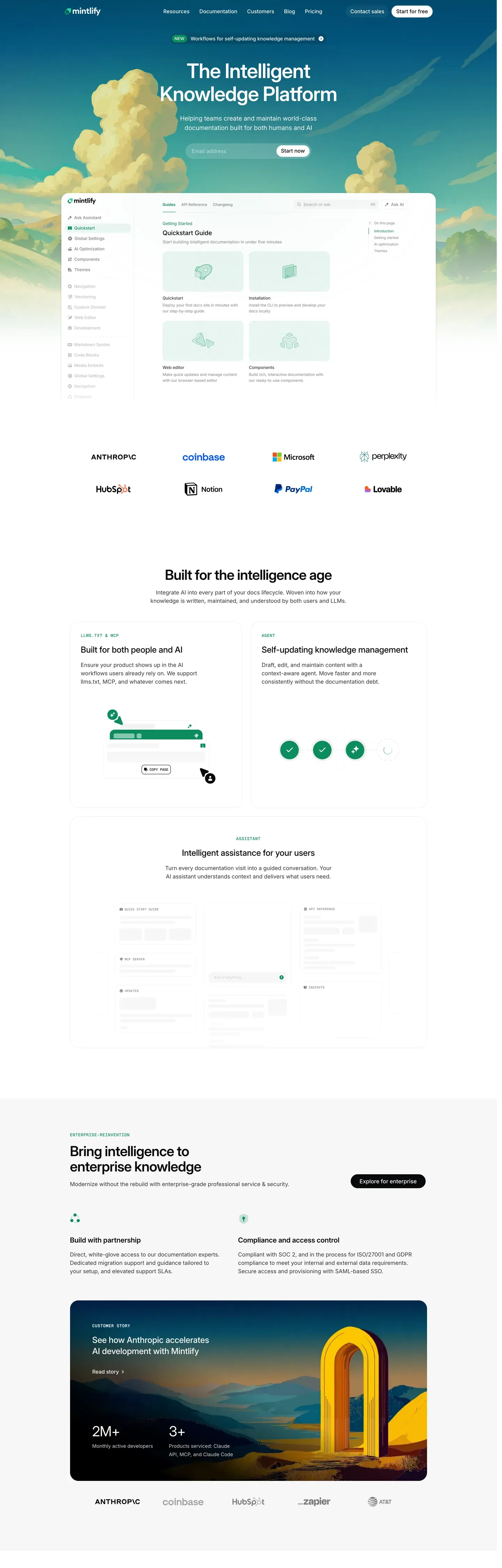
Mintlify sits at the seam between polished SaaS marketing and developer-grade documentation density. The homepage opens with a cinematic sky-gradient hero (a cloud illustration backdrop washing from "#87a8c8" sky-blue to "#f5e9d8" cream) and the startups page swaps in a dark teal-to-mint band with a rocket-launch illustration cutting across "#1a3d4a" to "#2d5a4f". Then the deeper surfaces collapse into a strict 3-column documentation grid — left sidebar nav at 240px, center prose capped at 720px, right table of contents at 200px. Inter carries every UI surface and Geist Mono shows up only for code blocks, inline references, and type signatures. The signature mint "#00d4a4" appears sparingly: hero "Get started" pill, green checkmarks on features, the 2px featured-pricing border, sidebar active indicators.
This page packages the full Mintlify spec as a single DESIGN.md file using the Google Labs DESIGN.md format. Inside: 32 colors tokens (brand mint plus deep "#00b48a" and soft "#7cebcb" variants, plus testimonial coral "#f55a3c", documentation tag blue "#3772cf", and the hero atmospheric gradient stops), 22 typography tokens spanning a 72px hero display down to 11px uppercase micro labels, an 8px-base spacing scale running through 12 tokens up to 120px hero padding, a 7-step border-radius scale, and 51 components covering buttons, cards, inputs, badges, code surfaces, sidebar and TOC navigation, hero bands, and the FAQ accordion.
Feed the file to Claude, Cursor, or GitHub Copilot when building documentation portals, developer landing pages, or API reference surfaces. The agent reads token references directly — `{colors.brand-green}`, `{rounded.full}`, `{typography.code-md}` — and writes React components and Tailwind classes that match Mintlify's voice instead of a generic shadcn theme. Or use the file as a reference audit: drop it next to your own design tokens and run a diff against discipline that already works. The system is worth studying because it solves the rare problem of presenting marketing atmosphere and developer density in the same brand language without either surface feeling diluted.
What makes it distinct
5
- Dual-mode aestheticatmospheric sky-gradient marketing heroes paired with dense 3-column developer documentation surfaces
- Signature mint #00d4a4 reserved for accent CTAs, active states, and feature checkmarksnever on body text
- Inter + Geist Mono pairingInter carries all UI prose, Geist Mono surgically marks code blocks, type signatures, and inline references
- Black-pill primary buttons with rounded.full (9999px) corners dominate marketing; white pills invert on dark hero bands
- Tight 14px body type with 1.50 line-height anchors documentation reading; hero displays push to 72px / weight 600
mintlify.com
Live at mintlify.com
A snapshot of the brand in production. Scroll the frame to see the whole page.
Colors
32 colors
Mintlify's system runs on #0a0a0a as its primary voltage, used in 5 of 51 components. Type is set in Inter across 20 tokens from 11px to 72px, weights 400–600. Shape language is mixed across 51 components, blending pills, soft rounds, and squarer corners.
Brand & Accent
Sparing, CTA-only voltage · 9
Surface
Page and card backgrounds · 5
Text
Headlines, body, captions · 5
Borders & Hairlines
Dividers, outlines, rules · 3
Other
Specialty colors · 10
Typography
20 type tokens
Set in Inter across 20 tokens, from 11px to 72px, weights 400–600. Shown in its own stack: where the font isn't installed, the fallback the file names stands in.
- hero-display72px · weight 600 · lh 1.05 · tracking -2pxThe quick brown fox jumps over the lazy dog
- display-lg56px · weight 600 · lh 1.1 · tracking -1.5pxThe quick brown fox jumps over the lazy dog
- heading-148px · weight 600 · lh 1.1 · tracking -1pxThe quick brown fox jumps over the lazy dog
- heading-236px · weight 600 · lh 1.2 · tracking -0.5pxThe quick brown fox jumps over the lazy dog
- heading-328px · weight 600 · lh 1.25The quick brown fox jumps over the lazy dog
- heading-422px · weight 600 · lh 1.3The quick brown fox jumps over the lazy dog
- heading-518px · weight 600 · lh 1.4The quick brown fox jumps over the lazy dog
- subtitle18px · weight 400 · lh 1.5The quick brown fox jumps over the lazy dog
- body-md16px · weight 400 · lh 1.5The quick brown fox jumps over the lazy dog
- body-md-medium16px · weight 500 · lh 1.5The quick brown fox jumps over the lazy dog
- body-sm14px · weight 400 · lh 1.5The quick brown fox jumps over the lazy dog
- body-sm-medium14px · weight 500 · lh 1.5The quick brown fox jumps over the lazy dog
- caption13px · weight 400 · lh 1.4The quick brown fox jumps over the lazy dog
- caption-bold13px · weight 600 · lh 1.4The quick brown fox jumps over the lazy dog
- micro12px · weight 500 · lh 1.4The quick brown fox jumps over the lazy dog
- micro-uppercase11px · weight 600 · lh 1.4 · tracking 0.5pxThe quick brown fox jumps over the lazy dog
- button-md14px · weight 500 · lh 1.3The quick brown fox jumps over the lazy dog
- code-md14px · weight 400 · lh 1.5The quick brown fox jumps over the lazy dog
- code-sm13px · weight 400 · lh 1.4The quick brown fox jumps over the lazy dog
- code-inline13px · weight 500 · lh 1.3The quick brown fox jumps over the lazy dog
Layout
Radii and spacing
7 corner radii and 12 spacing values. Shape language: mixed.
Radii
- xs4px
- sm6px
- md8px
- lg12px
- xl16px
- xxl24px
- full9999px
Spacing
- xxs4px
- xs8px
- sm12px
- md16px
- lg20px
- xl24px
- xxl32px
- xxxl40px
- section-sm48px
- section64px
- section-lg96px
- hero120px
Components
51 components
Each rendered from its tokens (color, type, radius, padding) on Mintlify's own canvas.
- Button Primarybutton-primaryButton Primary
- Button Primary Pressedbutton-primary-pressedButton Primary Pressed
- Button Primary Disabledbutton-primary-disabledButton Primary Disabled
- Button Accent Greenbutton-accent-greenButton Accent Green
- Button On Darkbutton-on-darkButton On Dark
- Button Secondarybutton-secondaryButton Secondary
- Button Ghostbutton-ghostButton Ghost
- Button Linkbutton-linkButton Link
- button-icon-circularButton Icon Circular
- Card Basecard-baseCard Base
- Card Featurecard-featureCard Feature
- Card Helpcard-helpCard Help
- Card Startup Perkcard-startup-perkCard Startup Perk
- Pricing Cardpricing-cardPricing Card
- Pricing Card Featuredpricing-card-featuredPricing Card Featured
- Testimonial Card Featuretestimonial-card-featureTestimonial Card Feature
- Testimonial Card Quotetestimonial-card-quoteTestimonial Card Quote
- Type here…text-inputText Input
- Type here…text-input-focusedText Input Focused
- Search Pillsearch-pillSearch Pill
- Segmented Tabsegmented-tabSegmented Tab
- Segmented Tab Activesegmented-tab-activeSegmented Tab Active
- Pill Tabpill-tabPill Tab
- Pill Tab Activepill-tab-activePill Tab Active
- Toggle Monthly Yearlytoggle-monthly-yearlyToggle Monthly Yearly
- Badge Discountbadge-discountBadge Discount
- Badge Requiredbadge-requiredBadge Required
- Badge Typebadge-typeBadge Type
- Badge Tagbadge-tagBadge Tag
- Promo Bannerpromo-bannerPromo Banner
- Code Blockcode-blockCode Block
- Code Block Headercode-block-headerCode Block Header
- Code Inlinecode-inlineCode Inline
- Property Rowproperty-rowProperty Row
- Feature Comparison Tablefeature-comparison-tableFeature Comparison Table
- Feature Comparison Rowfeature-comparison-rowFeature Comparison Row
- Sidebar Nav Itemsidebar-nav-itemSidebar Nav Item
- Sidebar Nav Item Activesidebar-nav-item-activeSidebar Nav Item Active
- Sidebar Section Headersidebar-section-headerSidebar Section Header
- Doc Toc Itemdoc-toc-itemDoc Toc Item
- Doc Toc Item Activedoc-toc-item-activeDoc Toc Item Active
- Copy Code Buttoncopy-code-buttonCopy Code Button
- Hero Band Skyhero-band-skyHero Band Sky
- Hero Band Darkhero-band-darkHero Band Dark
- Hero Product Mockuphero-product-mockupHero Product Mockup
- Logo Wall Itemlogo-wall-itemLogo Wall Item
- Faq Accordion Itemfaq-accordion-itemFaq Accordion Item
- Footer Regionfooter-regionFooter Region
- Footer Linkfooter-linkFooter Link
- Startup Program Cardstartup-program-cardStartup Program Card
- Founder Quote Cardfounder-quote-cardFounder Quote Card
In use
The system, in use
Mintlify's tokens on the kind of product it builds.
Build something people actually use.
A short paragraph of marketing copy that previews how the brand's display tier and body tier read together. Two sentences is usually enough.
FAQ
Mintlify design system FAQ
Common questions about Mintlify's tokens, components, and how to use this DESIGN.md in your project.
Read next
Related reading
Specs, directories, and component libraries that pair with this design system.
- Browse all design systemsThe full directory of DESIGN.md files on shadcn.io, with live mockups for each.shadcn.io
- Mintlify product siteThe live homepage, startups program, pricing, and documentation surfaces this spec was extracted from.mintlify.com (opens in a new tab)
- The DESIGN.md specificationGoogle Labs' open spec for machine-readable design system files — the format this page is built on.github.com (opens in a new tab)
Use it
Use Mintlify in your project
One machine-readable file. Drop it into Claude, Cursor, or any AI tool that reads DESIGN.md.
Download the DESIGN.md
One machine-readable file: every color, type, radius, spacing, and component token of Mintlify.
Feed it to your AI tool
Drop it into Claude, Cursor, or GitHub Copilot. The agent writes React components and Tailwind classes that match Mintlify's visual language.
Reference the tokens directly
Or paste the values into your Tailwind config, CSS variables, or component library: every color, size and radius is a quoted, ready-to-copy value.
Read the full DESIGN.md: overview, rationale, do’s and don’ts
Overview
Mintlify positions itself at the intersection of polished marketing presentation and developer-grade documentation density. The home and startups pages open with cinematic atmospheric heroes — soft sky-gradient backdrops with cloud illustrations on the homepage, dark teal-to-mint gradients with a rocket launch on the startups page — that feel more like a SaaS landing aesthetic than a developer tool. Then the deeper surfaces (pricing comparison, live documentation pages) collapse into dense, high-information layouts where Inter body type carries 14–16px copy across long-form prose, syntax-highlighted code blocks, and 3-column documentation grids.
The brand's signature mint green ({colors.brand-green}) appears sparingly but decisively — on the hero "Get started" pill button, the green checkmark icons inside feature lists, the "Featured" pricing tier border, and active state indicators inside docs UI. Black-pill primary buttons dominate the marketing flow; white-on-dark inversions appear on dark hero bands. The signature pairing of Inter (body, headings) with Geist Mono (code blocks, inline references, type signatures) reinforces the developer-tool DNA without requiring a third typeface.
Key Characteristics:
- Atmospheric gradient hero bands (sky-blue to cream on homepage; teal-to-mint on startups) provide cinematic marketing presentation
- Signature Mintlify mint green ({colors.brand-green}) reserved for accent CTAs, active states, and feature confirmations
- Black-pill primary buttons ({colors.primary} +
{rounded.full}) for marketing CTAs - Inter for all UI prose; Geist Mono for code blocks, inline code, and type/property signatures
- 3-column documentation layout (sidebar / prose / TOC) with dense 14px body type for long-form developer reading
- Tightly-controlled radius scale: marketing uses
{rounded.lg}(12px), pill buttons use{rounded.full}— no in-between corner softening - Vibrant testimonial card (
{colors.testimonial-orange}) breaks color rhythm intentionally for emotional impact
Known Gaps
- Specific dark-mode token values for canvas, surface, ink, and hairline are not surfaced on these pages; the brand has not yet shipped a published dark-mode palette
- Animation/transition timings are not extracted; recommend 150–200ms ease for hover/focus state transitions
- Form validation success state is not explicitly captured beyond defaults — implement following standard green-border + success badge patterns
- Code syntax highlighting palette inside docs is not formalized; documentation samples carry their own twoslash-style annotation system tokens (e.g.
{colors.brand-tag},{colors.brand-annotate},{colors.brand-warn}) but the full highlight scheme is not enumerated
Documentation & Knowledge
More systems like this
More DESIGN.md files in Documentation & Knowledge.
Pricing
Build it with Pro
The DESIGN.md files are free. Pro adds 6,000+ blocks, premium templates and the MCP server, so your AI editor builds in your system for you.
4.9/5 out of 5 · 150+ reviewsfrom 150+ founders and developers.
Billing
Billed once a year in USD. Cancel anytime.
- How many people can use the license.
- Client work, SaaS products and anything you charge for.
- Production-ready React sections: hero, pricing, features, dashboards and more.
- Complete multi-page sites you can ship as they are.
- React icons from every major library, installable with one command.
- Presets that restyle every block, in light and dark.
- Lets your AI editor search, preview and install blocks for you.
- Priority requests are answered first.
Individual
For personal projects & open source
$32instead of $49/mo
$389 billed yearly
- Seats: 1 seat
- Commercial use: Personal & open source only
- Pro blocks: 6,000+ blocks
- Templates: All 14 templates
- React icons: 294k+ icons
- Themes: All 59 themes
- MCP server: Basic usage
- Support: Standard
Team
Most popularFor freelancers, agencies & startups
$66instead of $99/mo
$789 billed yearly · ≈ $13/dev/mo
- Seats: Up to 5 seats
- Commercial use: Included
- Pro blocks: 6,000+ blocks
- Templates: All 14 templates
- React icons: 294k+ icons
- Themes: All 59 themes
- MCP server: High usage
- Support: Priority
Organization
For companies with larger teams
$132instead of $199/mo
$1,589 billed yearly
- Seats: Unlimited seats
- Commercial use: Included
- Pro blocks: 6,000+ blocks
- Templates: All 14 templates
- React icons: 294k+ icons
- Themes: All 59 themes
- MCP server: Unlimited usage
- Support: Priority
Billed once a year in USD. Cancel anytime.
Individual
For personal projects & open source
$32instead of $49/mo
$389 billed yearly
- How many people can use the license.Seats: 1 seat
- Client work, SaaS products and anything you charge for.Commercial use: Personal & open source only
- Production-ready React sections: hero, pricing, features, dashboards and more.Pro blocks: 6,000+ blocks
- Complete multi-page sites you can ship as they are.Templates: All 14 templates
- React icons from every major library, installable with one command.React icons: 294k+ icons
- Presets that restyle every block, in light and dark.Themes: All 59 themes
- Lets your AI editor search, preview and install blocks for you.MCP server: Basic usage
- Priority requests are answered first.Support: Standard
Team
Most popularFor freelancers, agencies & startups
$66instead of $99/mo
$789 billed yearly · ≈ $13/dev/mo
Everything in Individual, plus
- How many people can use the license.Seats: Up to 5 seats
- Client work, SaaS products and anything you charge for.Commercial use: Included
- Lets your AI editor search, preview and install blocks for you.MCP server: High usage
- Priority requests are answered first.Support: Priority
Organization
For companies with larger teams
$132instead of $199/mo
$1,589 billed yearly
Everything in Team, plus
- How many people can use the license.Seats: Unlimited seats
- Lets your AI editor search, preview and install blocks for you.MCP server: Unlimited usage
- Secure checkout via Stripe
- Code lives in your repo
- Keep what you've shipped if you cancel
- License terms
Your system, built for you
Every block, template and icon, installed by your AI agent in your design system. The DESIGN.md files stay free.