Logseq Design System
Logseq's marketing system runs a deep teal-black canvas with light gray and teal text on top, system-sans type at modest weights, and no custom font. For React, Next.js, and AI coding tools.
Add shadcn.io to your AI agent. · Pro It installs blocks, icons and templates in your design system from a prompt, with Pro.
Set up MCP- Primary
- #9ca3af
- Typeface
- ui-sans-serif
- Shape
- Mixed
- Base radius
- 8px
- Colors
- 12
- Type tokens
- 11
- Components
- 15
- Spacing values
- 8
About
About Logseq DESIGN.md
Curated by Dov Azencot · Updated May 19, 2026 · Source logseq.com (opens in a new tab)
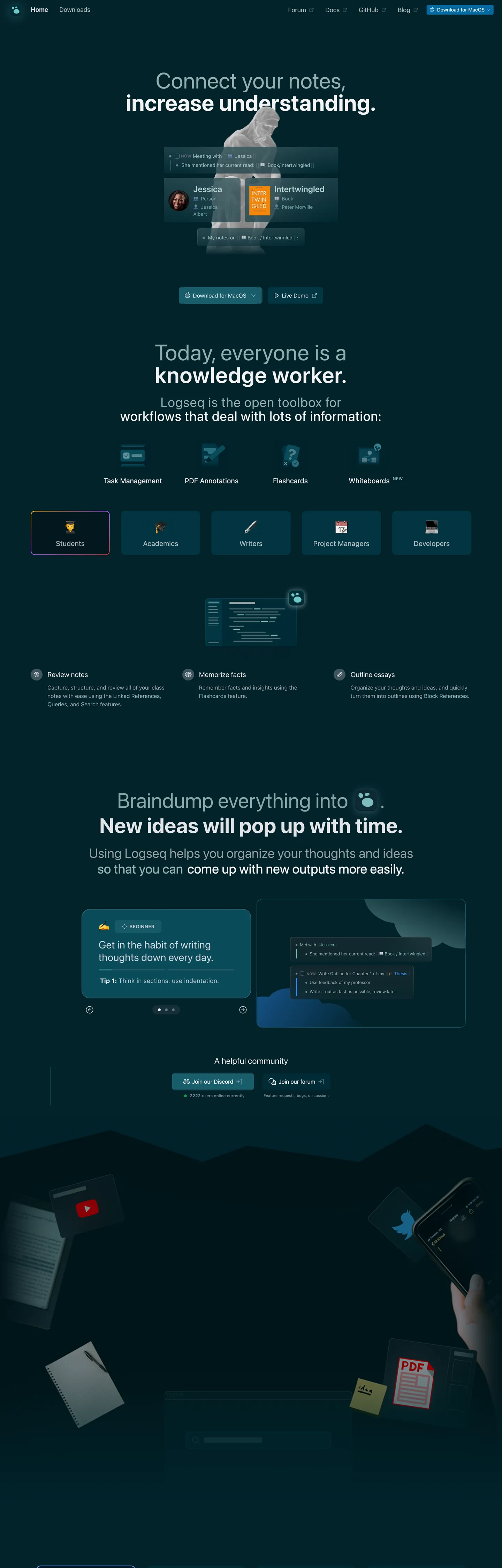
Logseq's marketing page at logseq.com is the most app-like marketing surface in the knowledge-management category. The nav sits on a deep teal-black background, the hero runs light text on that same dark surface, and by the time the page reaches its feature sections the look is indistinguishable from the Logseq desktop client running in dark mode. Where Obsidian uses a slightly purple-tinted near-black and Roam Research uses a light-cream canvas, Logseq renders a specific family of dark teal hues — from the deep near-black of the page floor to a slightly elevated teal panel color — that signals "this is a technical tool for serious knowledge workers."
The hero headline is a two-part stacked construction: "Today, everyone is a" in a light mist gray at 64px / weight 400, with "knowledge worker." below it in pure near-white at 64px / weight 600. No display typeface — the entire page runs the system-sans stack, which renders as the OS default on each platform. The sub-headline below offers "Logseq is the open toolbox for workflows that deal with lots of information," then transitions directly into a 4-icon feature grid (Task Management, PDF Annotations, Flashcards, Whiteboards). Below that is the persona tab strip — Students, Academics, Writers, Project Managers, Developers — the page's most interactive element and the one surface that uses an accent color (an amber-on-teal active chip).
Feed this file to an AI coding tool and it will reproduce Logseq's dark-canvas moves: the deep teal-black floor, light mist text instead of pure white for the primary display tier, system-sans at weight 400-600, the 8px dominant radius, and the high-frequency cool-gray hairline system that defines every panel. The persona tab strip and the community-call-to-action section are the two components most worth borrowing for knowledge-tool marketing.
What makes it distinct
5
- Dark teal-black canvasthe page runs on a deep teal navy rather than a neutral black or charcoal; the specific hue family (dark teal through near-black) is the single most distinctive surface choice
- App-shell marketingthe page looks and feels like the Logseq app running in dark mode; the nav, content cards, and sidebar elements all mirror the product's own UI
- System-sans throughoutno custom typeface; the ui-sans-serif stack renders the entire hierarchy from 64px hero to 12px caption
- High-frequency light bordera cool light gray at 456 border occurrences dominates the structural layer; hairlines define every panel boundary
- Multi-persona tab stripa role-based tab row (Students, Academics, Writers, Project Managers, Developers) with an amber-on-dark active state is the primary interactive surface on the page
logseq.com
Live at logseq.com
A snapshot of the brand in production. Scroll the frame to see the whole page.
Colors
12 colors
Logseq's system runs on #9ca3af as its primary voltage, used in 3 of 15 components. Type is set in ui-sans-serif across 11 tokens from 12px to 64px, weights 400–700. Shape language is mixed across 15 components, blending pills, soft rounds, and squarer corners.
Surface
Page and card backgrounds · 5
Text
Headlines, body, captions · 4
Borders & Hairlines
Dividers, outlines, rules · 2
Other
Specialty colors · 1
Typography
11 type tokens
Set in ui-sans-serif across 11 tokens, from 12px to 64px, weights 400–700. Shown in its own stack: where the font isn't installed, the fallback the file names stands in.
- display-xl64px · weight 600 · lh 60.8px · tracking 1pxThe quick brown fox jumps over the lazy dog
- display-xl-light64px · weight 400 · lh 60.8px · tracking 1pxThe quick brown fox jumps over the lazy dog
- display-md38px · weight 400 · lh 45.6px · tracking 0.95pxThe quick brown fox jumps over the lazy dog
- heading-lg30px · weight 400 · lh 36pxThe quick brown fox jumps over the lazy dog
- heading-md26px · weight 400 · lh 35pxThe quick brown fox jumps over the lazy dog
- body-lg20px · weight 400 · lh 30px · tracking 0.5pxThe quick brown fox jumps over the lazy dog
- body-md16px · weight 400 · lh 24pxThe quick brown fox jumps over the lazy dog
- body-sm14px · weight 400 · lh 20pxThe quick brown fox jumps over the lazy dog
- label-md14px · weight 600 · lh 20pxThe quick brown fox jumps over the lazy dog
- label-upper14px · weight 700 · lh 20pxThe quick brown fox jumps over the lazy dog
- caption12px · weight 400 · lh 16pxThe quick brown fox jumps over the lazy dog
Layout
Radii and spacing
8 corner radii and 8 spacing values. Shape language: mixed.
Radii
- none0px
- xs4px
- sm6px
- md8px
- lg12px
- xl16px
- 2xl24px
- full9999px
Spacing
- xs2px
- sm4px
- base8px
- md12px
- lg16px
- xl24px
- 2xl32px
- 3xl48px
Components
15 components
Each rendered from its tokens (color, type, radius, padding) on Logseq's own canvas.
- Button Primarybutton-primaryButton Primary
- Button Secondarybutton-secondaryButton Secondary
- Top Navtop-navTop Nav
- Nav Linknav-linkNav Link
- Hero Headinghero-headingHero Heading
- Hero Heading Mutedhero-heading-mutedHero Heading Muted
- Section Headingsection-headingSection Heading
- Body Paragraphbody-paragraphBody Paragraph
- Body Paragraph Mutedbody-paragraph-mutedBody Paragraph Muted
- CardcardCard
- Feature Icon Cellfeature-icon-cellFeature Icon Cell
- Persona Tabpersona-tabPersona Tab
- Community Cardcommunity-cardCommunity Card
- Testimonial Cardtestimonial-cardTestimonial Card
- FooterfooterFooter
In use
The system, in use
Logseq's tokens on the kind of product it builds.
Build something people actually use.
A short paragraph of marketing copy that previews how the brand's display tier and body tier read together. Two sentences is usually enough.
FAQ
Logseq design system FAQ
Common questions about Logseq's tokens, components, and how to use this DESIGN.md in your project.
Read next
Related reading
Specs, directories, and component libraries that pair with this design system.
- Browse all design systemsThe full directory of DESIGN.md files on shadcn.io, with live mockups for each.shadcn.io
- Logseq — official siteLogseq's public marketing site — the source of truth for the live tokens captured in this file.logseq.com (opens in a new tab)
- The DESIGN.md specificationGoogle Labs' open spec for machine-readable design system files — the format this page is built on.github.com (opens in a new tab)
Use it
Use Logseq in your project
One machine-readable file. Drop it into Claude, Cursor, or any AI tool that reads DESIGN.md.
Download the DESIGN.md
One machine-readable file: every color, type, radius, spacing, and component token of Logseq.
Feed it to your AI tool
Drop it into Claude, Cursor, or GitHub Copilot. The agent writes React components and Tailwind classes that match Logseq's visual language.
Reference the tokens directly
Or paste the values into your Tailwind config, CSS variables, or component library: every color, size and radius is a quoted, ready-to-copy value.
Read the full DESIGN.md: overview, rationale, do’s and don’ts
Overview
Logseq's marketing page extends the app itself into the browser. App-shell marketing. Where Notion uses a white canvas with black type and occasional gray tones, Obsidian uses a near-black with purple tints, and Roam Research uses a light cream, Logseq renders a dark teal-black surface system that is indistinguishable from the Logseq desktop client running in dark mode. The marketing site IS the product's visual environment; the product screenshots in the mid-page sections feel native rather than inserted.
The hero typographic move is a two-weight stacked construction: "Today, everyone is a" in a light teal-mist at 64px / weight 400, and "knowledge worker." in near-white at 64px / weight 600. No display typeface — the entire page runs system-sans. The contrast comes from color and weight together: muted teal text as setup, bright white text as punchline. Below the hero, a 4-icon feature grid (Task Management, PDF Annotations, Flashcards, Whiteboards) and then a persona tab strip (Students, Academics, Writers, Project Managers, Developers) act as the page's primary navigation. The active tab uses the only warm tone in the system — an amber chip — against the cool dark surface.
The color system is unusual in the directory: the "brand layer" colors are all dark surfaces rather than chromatic accents. There is no cobalt blue, no orange, no coral — the brand identity is encoded in the specific dark teal family. Compare to Bear (which uses coral red) and Things (which uses cobalt): Logseq's chromatic identity is its canvas, not its accent.
Key Characteristics:
- Deep teal-black canvas family (
{colors.canvas}through{colors.surface-2}) — four related dark teal-navy values from near-black to a panel mid-teal, all sharing a 215-220° hue. - Two-weight hero stacked headline: muted teal-mist at weight 400 as setup + white at weight 600 as punchline — both at 64px, only color and weight differentiate them.
- System-sans only — ui-sans-serif / system-ui renders as the OS default; no custom typeface.
- High-frequency cool-gray hairline (
{colors.hairline}— 456 border occurrences) defines every panel boundary in the dark system. - Persona tab strip (Students / Academics / Writers / Project Managers / Developers) with amber-on-dark active state — the only warm accent in the system.
- 8px dominant radius (
{rounded.md}) on cards and interactive surfaces — a tight-but-not-sharp developer-tool aesthetic. - Community section (Discord + forum CTAs with live-user count) as a distinct content band — positions the open-source community as product infrastructure.
- The open-source download is the primary action ("Download for MacOS"); there is no Stripe-gated paywall CTA.
Colors
Brand (dark canvas family)
- Canvas (
{colors.canvas}— #01222a): frequency 13 as background. The outer page floor — a deep teal-black used for the nav background and section transitions. The darkest tone in the canvas family. - Surface-1 (
{colors.surface-1}— #023643): frequency 14 as background. The primary feature card and content band surface — slightly elevated from the canvas. The highest-frequency background fill. - Surface-2 (
{colors.surface-2}— #195d6c): frequency 8 (6 background, 2 border). The mid-teal surface used on persona chips, feature cards in the highlighted state, and section panel backgrounds. - Surface-3 (
{colors.surface-3}— #094b5a): frequency 5 (3 background, 2 border). A dark mid-teal between surface-1 and surface-2 — used for community action cards. - Surface Deep (
{colors.surface-deep}— #01171d): frequency 5 (1 background, 4 gradient). The deepest near-black teal, appearing as gradient stops and the darkest background anchor.
Text
- Ink (
{colors.ink}— #f3f4f6): frequency 364 as text. The dominant text color — a very light cool gray, not pure white. Reads as near-white on the dark canvas. Wired as the body text color across the system. - Ink Muted (
{colors.ink-muted}— #b7d5d5): frequency 24 as text. A cool light teal used for the muted setup line in the hero ("Today, everyone is a"), feature icon sub-labels, and secondary annotation text. - Ink Secondary (
{colors.ink-secondary}— #d1d5db): frequency 15 as text. A mid-light gray used for secondary body copy and caption text. - Ink Dim (
{colors.ink-dim}— #9ca3af): frequency 8. A dimmer mid-gray for tertiary content — feature icon captions, footnote text, and footer.
Hairlines
- Hairline (
{colors.hairline}— #e5e7eb): frequency 456 (438 border). The dominant structural border tone — used on every panel boundary, card outline, and grid separator. The high frequency explains the app-shell grid feel. - Hairline Mid (
{colors.hairline-mid}— #6b7280): frequency 4 (2 border). A medium gray used for interactive element outlines (community CTA chips, button secondary borders).
Shadow
- Shadow (
{colors.shadow}— #000000): frequency 4, used in gradient stops. No traditional drop shadow system.
Typography
Font Family
The system runs a single long system-sans stack: ui-sans-serif, system-ui, -apple-system, "system-ui", "Segoe UI", Roboto, "Helvetica Neue", Arial, "Noto Sans", sans-serif plus emoji fallbacks. There is no custom font, no display family, no second voice. The entire hierarchy — from the 64px hero to the 12px caption — uses this one stack at varying weights (400, 600, 700) and sizes.
Hierarchy
| Token | Size | Weight | Line Height | Letter Spacing | Use |
|---|---|---|---|---|---|
{typography.display-xl} | 64px | 600 | 60.8px | 1px | Hero h2 second line ("knowledge worker.") |
{typography.display-xl-light} | 64px | 400 | 60.8px | 1px | Hero h1 first line ("Today, everyone is a") |
{typography.display-md} | 38px | 400 | 45.6px | 0.95px | Section display headings ("Braindump everything into…") |
{typography.heading-lg} | 30px | 400 | 36px | 0 | Mid-section h3 headings |
{typography.heading-md} | 26px | 400 | 35px | 0 | Testimonial quote body |
{typography.body-lg} | 20px | 400 | 30px | 0.5px | Feature sub-deks and lead paragraphs |
{typography.body-md} | 16px | 400 | 24px | 0 | Default body text and nav links |
{typography.body-sm} | 14px | 400 | 20px | 0 | Feature caption rows |
{typography.label-md} | 14px | 600 | 20px | 0 | Persona tab labels, card title labels |
{typography.label-upper} | 14px | 700 | 20px | 0 | Uppercase section identifiers |
{typography.caption} | 12px | 400 | 16px | 0 | Metadata, icon sub-labels |
Principles
The two-weight hero construction is the system's signature typographic move: same size (64px), same tracking (1px), different weight (400 vs. 600) and different color (muted teal vs. near-white). The effect is a setup-punchline rhythm that reads clearly on the dark canvas. Display weight tops at 600 — there is no 700 or 800 at display size. The system's heaviest moments are 700 weight uppercase labels at 14px.
Letter-spacing is applied at display sizes (0.95-1px) to improve legibility on the dark canvas. Body text at 14-16px runs zero tracking. This is the inverse of Cloudflare (which applies tight negative tracking at display) — Logseq opens tracking to pull letters apart on the dark surface.
Note on Font Substitutes
No substitution is needed — the system-sans stack is already cross-platform. On macOS it renders San Francisco, on Windows Segoe UI, on Android Roboto. Inter or Geist at the same weights will produce a stable non-system result if you need consistent rendering across platforms.
Layout
Spacing System
- Base unit: 4px, with 8px as the dominant working module.
- Tokens:
{spacing.xs}2px ·{spacing.sm}4px ·{spacing.base}8px ·{spacing.md}12px ·{spacing.lg}16px ·{spacing.xl}24px ·{spacing.2xl}32px ·{spacing.3xl}48px. - Section vertical padding: 48px between major content bands.
- Card internal padding:
{spacing.lg}(16px) for feature cards,{spacing.xl}(24px) for testimonial and community cards. - Nav padding:
{spacing.base}(8px) vertical,{spacing.lg}(16px) horizontal.
Grid & Container
- Max content width: ~720px for the hero text column; feature grids expand to ~960px.
- Hero: centered, full dark-canvas band. Two-line stacked headline + sub-copy + two CTA chips (Download for MacOS, Live Demo).
- Feature icon grid: 4-column equal-width grid — icon + label for Task Management, PDF Annotations, Flashcards, Whiteboards.
- Persona tab strip: 5-tab horizontal pill row (Students, Academics, Writers, Project Managers, Developers) — changes the screenshot section below on activation.
- Feature benefit grid: 3-column equal-width cards (Review notes / Memorize facts / Outline essays) with icon + heading + body paragraph per cell.
- Community section: 2-column centered CTA row (Join our Discord / Join our forum) with live-user count below.
Rhythm
The page runs entirely on the dark teal canvas without surface-color section transitions. Depth between sections comes from the hairline border system and tonal elevation ({colors.surface-2} cards slightly above {colors.surface-1} panels). The consistent dark floor makes the page read as one continuous app surface, with content bands distinguished by card rounding and border treatment rather than alternating background color.
Elevation
The dark canvas system has no shadow tier. Elevation is expressed entirely through surface toning — cards at {colors.surface-1} sit above the {colors.canvas} floor by roughly 15-20 lightness points; {colors.surface-2} panels sit above {colors.surface-1} by another 10 points. The hairline border ({colors.hairline} at 456 occurrences) outlines every container boundary.
- Flat (no shadow): the entire nav, hero, footer, and editorial bands.
- Tonal lift (surface-1 on canvas): feature cards, the persona screenshot zone, community cards — uses
{colors.surface-1}(14 background occurrences) against the canvas floor. - Higher lift (surface-2): the active persona chip and highlighted feature cards use
{colors.surface-2}as the most-elevated surface. - No blur or glow: the system avoids glassmorphism and colored glows, even though the dark canvas would support them.
Shapes
The radius scale is tight-to-medium, anchored at 8px:
{rounded.none}0px — hero display text and structural dividers.{rounded.xs}4px — the primary download button and small interactive chips.{rounded.sm}6px — secondary interactive elements.{rounded.md}8px — the dominant card radius (19 occurrences); feature cards, persona chips.{rounded.lg}12px — larger feature cards and testimonial containers (11 occurrences).{rounded.xl}16px — prominent section cards and the community CTA area (10 occurrences).{rounded.2xl}24px — the largest card surfaces, used sparingly (2 occurrences).{rounded.full}9999px — fully circular avatar and icon chips (3 occurrences).
The 8px anchor distinguishes Logseq from Mac-native tools like Bear (40px) and Things (18px). The tight rounding reads as developer-tool precision — similar to Linear and Vercel — rather than consumer-app softness.
Components
button-primary — The download CTA. Mid-teal {colors.surface-2} fill, light ink text at {typography.body-sm}, {rounded.xs} 4px radius, 4×8px padding, 28px height. "Download for MacOS" is the canonical instance.
button-secondary — Transparent fill, ink text, mid-gray {colors.hairline-mid} border, {rounded.md} 8px radius, 8×16px padding, 36px height. "Live Demo" is the canonical instance.
top-nav — Deep canvas {colors.canvas} fill, 48px height. Left: Logseq wordmark + Home / Downloads links. Right: Forum, Docs, GitHub, Blog dropdowns + "Download for MacOS" CTA chip.
nav-link — Transparent background, ink text at {typography.body-md}, 8×12px padding.
hero-heading — Transparent background, near-white ink at {typography.display-xl} (64px / 600 / 1px tracking). Second line of the stacked hero — "knowledge worker."
hero-heading-muted — Transparent background, teal-mist {colors.ink-muted} text at {typography.display-xl-light} (64px / 400). First line of the hero — "Today, everyone is a" — the setup.
section-heading — Near-white ink at {typography.display-md} (38px / 400 / 0.95px tracking). Section display headings — "Braindump everything into . New ideas will pop up with time."
body-paragraph — Near-white ink at {typography.body-lg} (20px / 400 / 0.5px tracking). The lead sub-copy below the hero and section headings.
body-paragraph-muted — Dim {colors.ink-dim} text at {typography.body-md}. Secondary captions and feature icon sub-labels.
card — {colors.surface-1} fill, near-white ink, 1px {colors.hairline} border, {rounded.lg} 12px radius, 16px padding. The default feature content card.
feature-icon-cell — Transparent background, dim ink text at {typography.body-sm}, no border. The 4-column feature-icon grid items (Task Management, PDF Annotations, Flashcards, Whiteboards).
persona-tab — {colors.surface-2} fill, ink text at {typography.label-md}, 1px {colors.hairline} border, {rounded.md} 8px radius, 8×16px padding, 40px height. The 5-persona tab strip — Students, Academics, Writers, Project Managers, Developers.
community-card — {colors.surface-1} fill, ink text at {typography.body-md}, {colors.hairline-mid} border, {rounded.lg} 12px radius, 12×16px padding. The Discord and forum join chips with live-user count.
testimonial-card — {colors.surface-1} fill, ink text at {typography.heading-md} (26px / 400), {rounded.xl} 16px radius, 24px padding. The user testimonial blocks in the mid-page social proof section.
footer — Canvas continuation, dim ink text at {typography.body-sm}, 32×16px padding.
Do's and Don'ts
Do use the two-weight stacked display construction for the hero. The setup line in muted teal-mist at weight 400 and the punchline in near-white at weight 600 — both at 64px — is the page's most distinctive typographic moment and worth replicating in any knowledge-tool marketing context.
Do use {colors.hairline} borders on every card and panel boundary. The 456-occurrence high-frequency border system is what makes the page read as an app shell rather than a generic marketing surface. Removing borders and relying on color contrast alone would make the cards disappear into the canvas.
Do treat the persona tab strip as the primary navigation mechanism, not a filter. Each tab revealing a distinct product screenshot makes the feature architecture legible to different audiences without requiring additional pages.
Do keep the active persona chip as the only warm-hued element. The amber active state reads strongly because everything else in the system is cool — introducing a second warm accent anywhere on the page would diminish the persona-strip's navigational clarity.
Don't introduce a custom display typeface. Logseq's brand identity lives in the canvas palette, not the type. A custom display font would signal "consumer app" rather than "open-source knowledge tool" — the opposite of the positioning.
Don't use a light-mode canvas. The dark teal-black system is the entire visual identity; switching to white or cream would require a different component approach and would lose the "marketing page IS the app" coherence.
Don't add a third surface elevation level above {colors.surface-2}. The three-step tonal ladder (canvas → surface-1 → surface-2) is already at the limit of what reads as meaningful elevation on a dark canvas. A fourth step would compress the range and make the elevation system indecipherable.
Don't use weight 700 at display sizes. The system caps display weight at 600. Weight 700 at 38-64px would read as aggressive on the dark surface — the current 600 cap is the maximum contrast that still reads as a knowledge tool rather than a SaaS landing page.
Known Gaps
- Primary brand accent: the system does not expose a single chromatic accent like a green or teal used for CTA buttons; the download button uses a dark surface fill rather than a brand voltage. A true accent is hinted at in the active persona chip (amber) but appears only once.
- Light mode: Logseq ships a light editor theme but the marketing page is dark-only. No light-mode token equivalents are captured.
- Hover and focus states: only resting states are documented. The dropdown nav menus (Forum, Docs, GitHub, Blog) carry hover surfaces that are not captured.
- Gradient construction: the hero uses gradient stops spanning the dark teal family (navy through near-black), but the full gradient CSS values are not independently documented — only the stop colors are extracted.
- Persona tab screenshot content: the five persona tab states each surface different app screenshots, but the screenshot content and the tabbed image-swap interaction are not tokenized.
- App download flow: the "Download for MacOS" action leads to a download-picker page with platform variants (Windows, Linux, Android, iOS); the secondary platform surfaces are not captured.
Documentation & Knowledge
More systems like this
More DESIGN.md files in Documentation & Knowledge.
Pricing
Build it with Pro
The DESIGN.md files are free. Pro adds 6,000+ blocks, premium templates and the MCP server, so your AI editor builds in your system for you.
4.9/5 out of 5 · 150+ reviewsfrom 150+ founders and developers.
Billing
Billed once a year in USD. Cancel anytime.
- How many people can use the license.
- Client work, SaaS products and anything you charge for.
- Production-ready React sections: hero, pricing, features, dashboards and more.
- Complete multi-page sites you can ship as they are.
- React icons from every major library, installable with one command.
- Presets that restyle every block, in light and dark.
- Lets your AI editor search, preview and install blocks for you.
- Priority requests are answered first.
Individual
For personal projects & open source
$32instead of $49/mo
$389 billed yearly
- Seats: 1 seat
- Commercial use: Personal & open source only
- Pro blocks: 6,000+ blocks
- Templates: All 14 templates
- React icons: 294k+ icons
- Themes: All 59 themes
- MCP server: Basic usage
- Support: Standard
Team
Most popularFor freelancers, agencies & startups
$66instead of $99/mo
$789 billed yearly · ≈ $13/dev/mo
- Seats: Up to 5 seats
- Commercial use: Included
- Pro blocks: 6,000+ blocks
- Templates: All 14 templates
- React icons: 294k+ icons
- Themes: All 59 themes
- MCP server: High usage
- Support: Priority
Organization
For companies with larger teams
$132instead of $199/mo
$1,589 billed yearly
- Seats: Unlimited seats
- Commercial use: Included
- Pro blocks: 6,000+ blocks
- Templates: All 14 templates
- React icons: 294k+ icons
- Themes: All 59 themes
- MCP server: Unlimited usage
- Support: Priority
Billed once a year in USD. Cancel anytime.
Individual
For personal projects & open source
$32instead of $49/mo
$389 billed yearly
- How many people can use the license.Seats: 1 seat
- Client work, SaaS products and anything you charge for.Commercial use: Personal & open source only
- Production-ready React sections: hero, pricing, features, dashboards and more.Pro blocks: 6,000+ blocks
- Complete multi-page sites you can ship as they are.Templates: All 14 templates
- React icons from every major library, installable with one command.React icons: 294k+ icons
- Presets that restyle every block, in light and dark.Themes: All 59 themes
- Lets your AI editor search, preview and install blocks for you.MCP server: Basic usage
- Priority requests are answered first.Support: Standard
Team
Most popularFor freelancers, agencies & startups
$66instead of $99/mo
$789 billed yearly · ≈ $13/dev/mo
Everything in Individual, plus
- How many people can use the license.Seats: Up to 5 seats
- Client work, SaaS products and anything you charge for.Commercial use: Included
- Lets your AI editor search, preview and install blocks for you.MCP server: High usage
- Priority requests are answered first.Support: Priority
Organization
For companies with larger teams
$132instead of $199/mo
$1,589 billed yearly
Everything in Team, plus
- How many people can use the license.Seats: Unlimited seats
- Lets your AI editor search, preview and install blocks for you.MCP server: Unlimited usage
- Secure checkout via Stripe
- Code lives in your repo
- Keep what you've shipped if you cancel
- License terms
Your system, built for you
Every block, template and icon, installed by your AI agent in your design system. The DESIGN.md files stay free.