Cohere Design System
Cohere's enterprise AI design system as a DESIGN.md file. #003c33 deep green, CohereText + Unica77, 23 colors, 14 components. For React, Next.js, and AI tools.
Add shadcn.io to your AI agent. · Pro It installs blocks, icons and templates in your design system from a prompt, with Pro.
Set up MCP- Primary
- #17171c
- Typeface
- Unica77 Cohere Web
- Shape
- Soft
- Base radius
- 16px
- Colors
- 23
- Type tokens
- 12
- Components
- 14
- Spacing values
- 8
About
About Cohere DESIGN.md
Curated by Dov Azencot · Updated May 12, 2026 · Source cohere.com (opens in a new tab)
Cohere's design system reads like a research lab annual report rather than a typical AI marketing site. The base canvas is pure white with near-black ink, broken only by deep green and dark navy product bands and the occasional coral or blue editorial accent. Three typefaces share the work — CohereText carves the oversized hero declarations, Unica77 Cohere Web carries every UI surface, and CohereMono marks the technical labels with measured letter spacing.
This page packages the full spec into a single DESIGN.md file. Inside: 23 colors, 13 type styles, 7 corner radii, an 8px-base spacing scale, and 14 components covering announcement bars, pill CTAs, agent-console mockups, capability cards, dark product bands, research tables, blog filter chips, contact forms, and the dark newsletter footer.
Feed the file to Claude, Cursor, or GitHub Copilot and the agent will write React and Tailwind that match Cohere's enterprise restraint — flat surfaces, 22px media-card radii, pill CTAs in #17171c, and the deep #003c33 green for product feature bands. Or read it as a reference when planning your own measured, editorial AI interface.
What makes it distinct
5
- Dual-typeface display splitCohereText carves the 96px hero declaration while Unica77 Cohere Web carries every UI surface beneath it
- Deep enterprise green band#003c33 full-width sections invert the white canvas into product-mockup environments without losing editorial restraint
- 32px pill CTAs in near-black#17171c primary buttons paired with underlined text links replace the conventional outlined secondary pattern
- Coral taxonomy at hero scale#ff7759 blog filter chips render at 32px card-heading weight, treating category as a primary nav control
- Mono labels with 0.28px trackingCohereMono at 14px handles uppercase system markers across research and product surfaces
cohere.com
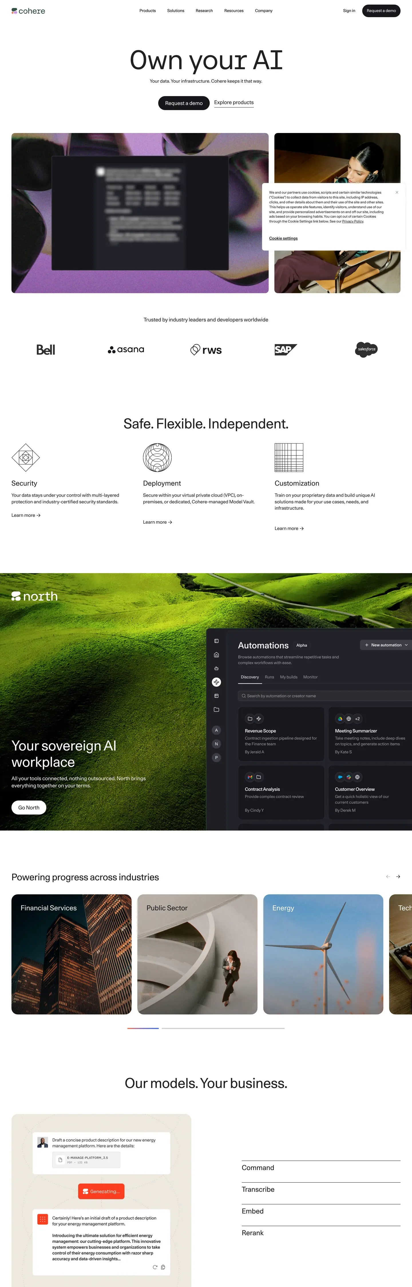
Live at cohere.com
A snapshot of the brand in production. Scroll the frame to see the whole page.
Colors
23 colors
Cohere's system runs on #17171c as its primary voltage, used in 4 of 14 components. Type is set in Unica77 Cohere Web across 12 tokens from 12px to 96px, weights 400–500. Shape language is soft — components average 16px corner radius, with no sharp interactive edges.
Brand & Accent
Sparing, CTA-only voltage · 1
Surface
Page and card backgrounds · 1
Text
Headlines, body, captions · 6
Borders & Hairlines
Dividers, outlines, rules · 3
Semantic
Status, errors, success, links · 1
Other
Specialty colors · 11
Typography
12 type tokens
Set in Unica77 Cohere Web across 12 tokens, from 12px to 96px, weights 400–500. Shown in its own stack: where the font isn't installed, the fallback the file names stands in.
- hero-display96px · weight 400 · lh 1 · tracking -1.92pxThe quick brown fox jumps over the lazy dog
- product-display72px · weight 400 · lh 1 · tracking -1.44pxThe quick brown fox jumps over the lazy dog
- section-display60px · weight 400 · lh 1 · tracking -1.2pxThe quick brown fox jumps over the lazy dog
- section-heading48px · weight 400 · lh 1.2 · tracking -0.48pxThe quick brown fox jumps over the lazy dog
- card-heading32px · weight 400 · lh 1.2 · tracking -0.32pxThe quick brown fox jumps over the lazy dog
- feature-heading24px · weight 400 · lh 1.3The quick brown fox jumps over the lazy dog
- body-large18px · weight 400 · lh 1.4The quick brown fox jumps over the lazy dog
- body16px · weight 400 · lh 1.5The quick brown fox jumps over the lazy dog
- button14px · weight 500 · lh 1.71The quick brown fox jumps over the lazy dog
- caption14px · weight 400 · lh 1.4The quick brown fox jumps over the lazy dog
- mono-label14px · weight 400 · lh 1.4 · tracking 0.28pxThe quick brown fox jumps over the lazy dog
- micro12px · weight 400 · lh 1.4The quick brown fox jumps over the lazy dog
Layout
Radii and spacing
7 corner radii and 8 spacing values. Shape language: soft.
Radii
- xs4px
- sm8px
- md16px
- lg22px
- xl30px
- pill32px
- full9999px
Spacing
- xxs2px
- xs6px
- sm8px
- md12px
- lg16px
- xl24px
- xxl32px
- section80px
Components
14 components
Each rendered from its tokens (color, type, radius, padding) on Cohere's own canvas.
- Button Primarybutton-primaryButton Primary
- Button Secondarybutton-secondaryButton Secondary
- Button Pill Outlinebutton-pill-outlineButton Pill Outline
- Announcement Barannouncement-barAnnouncement Bar
- Hero Photo Cardhero-photo-cardHero Photo Card
- Agent Console Cardagent-console-cardAgent Console Card
- Trust Logo Striptrust-logo-stripTrust Logo Strip
- Capability Cardcapability-cardCapability Card
- Dark Feature Banddark-feature-bandDark Feature Band
- Product Cardproduct-cardProduct Card
- Blog Filter Chipblog-filter-chipBlog Filter Chip
- Research Tableresearch-tableResearch Table
- Contact Form Cardcontact-form-cardContact Form Card
- Footer Newsletterfooter-newsletterFooter Newsletter
In use
The system, in use
Cohere's tokens on the kind of product it builds.
Build something people actually use.
A short paragraph of marketing copy that previews how the brand's display tier and body tier read together. Two sentences is usually enough.
FAQ
Cohere design system FAQ
Common questions about Cohere's tokens, components, and how to use this DESIGN.md in your project.
Read next
Related reading
Specs, directories, and component libraries that pair with this design system.
Use it
Use Cohere in your project
One machine-readable file. Drop it into Claude, Cursor, or any AI tool that reads DESIGN.md.
Download the DESIGN.md
One machine-readable file: every color, type, radius, spacing, and component token of Cohere.
Feed it to your AI tool
Drop it into Claude, Cursor, or GitHub Copilot. The agent writes React components and Tailwind classes that match Cohere's visual language.
Reference the tokens directly
Or paste the values into your Tailwind config, CSS variables, or component library: every color, size and radius is a quoted, ready-to-copy value.
Read the full DESIGN.md: overview, rationale, do’s and don’ts
Overview
Cohere's current web presence feels like a sober enterprise AI command center with editorial restraint. The home page opens on a huge typographic declaration over a white canvas, then uses photography, dark product mockups, trust logos, and generous empty space to make AI infrastructure feel controlled rather than speculative. Product pages invert the tone into deep green-black or dark navy bands, while blog and research pages move toward publishing-system clarity: large filters, thin rules, dense lists, and pale technical backgrounds.
What makes the system distinctive is the mix of austere black-and-white UI with bursts of tactile brand imagery. The site avoids decorative chrome in the normal interface; color arrives through photography, abstract 3D media, coral blog taxonomy chips, blue research links, and dark product environments. Cards are rounded but not cute. Type is large, tight, and almost monospaced in spirit, creating a research-lab cadence across marketing, product, and editorial surfaces.
Key Characteristics:
- Monumental display headlines with very tight line height and negative tracking.
- White editorial canvases interrupted by deep green, dark navy, and image-led CTA bands.
- Rounded media cards and product cards, usually 8px to 22px.
- Pill CTAs in near-black or white, with most secondary actions rendered as underlined text links.
- Trust-logo strips with monochrome partner marks and very wide vertical spacing.
- Agent-console mockups using dark panels, small status chips, and product integration badges.
- Blog and research surfaces with prominent taxonomy chips, long rule-separated lists, and search fields.
Colors
Brand & Accent
- Cohere Black (
#000000): Announcement bar, highest-contrast text, and the global brand anchor. - Near-Black Primary (
#17171c): Primary CTA buttons, dark footer, and deep UI cards. - Deep Enterprise Green (
#003c33): Product hero bands for North and Command-style dark sections. - Dark Navy (
#071829): Financial-services and security-oriented solution bands. - Action Blue (
#1863dc): Editorial links, pagination, and secondary action emphasis. - Coral (
#ff7759): Blog category chips, taxonomy outlines, and warm product markers. - Soft Coral (
#ffad9b): Pale chip borders and segmented article-label details.
Surface & Background
- Canvas White (
#ffffff): Dominant page background and form/card surface. - Soft Stone (
#eeece7): Product cards, testimonial placeholders, and warm neutral surface blocks. - Pale Green Wash (
#edfce9): North page section backdrop behind stacked dark capability panels. - Pale Blue Wash (
#f1f5ff): Blog CTA surface behind abstract 3D imagery. - Card Border (
#f2f2f2): Softest card containment line.
Text & Rules
- Ink (
#212121): Default body text and most link text on light backgrounds. - Muted Slate (
#93939f): Footer links, dates, metadata, and de-emphasized labels. - Slate (
#75758a): Research separators and tertiary text. - Hairline (
#d9d9dd): Standard list rules and section dividers. - Border Light (
#e5e7eb): Secondary divider and utility rule.
Semantic
- Focus Blue (
#4c6ee6): Keyboard focus and ring color. - Form Focus Violet (
#9b60aa): Focus border for text inputs. - Error Red (
#b30000): Extracted ring/shadow color associated with validation-like states.
Gradient System
Cohere does not use gradients as a generic UI fill. Gradients and color fields are media-led: abstract 3D hero imagery, deep blue open-science particle fields, red-orange product video posters, and dark green-to-black product environments. Keep UI surfaces flat; reserve gradient richness for large media panels and CTA image bands.
Typography
Font Family
- Display:
CohereText, falling back toSpace Grotesk,Inter,ui-sans-serif, andsystem-ui. - Body/UI:
Unica77 Cohere Web, falling back toInter,Arial,ui-sans-serif, andsystem-ui. - Technical labels:
CohereMono, falling back toArial,ui-sans-serif, andsystem-ui. - Icons: Cohere uses custom icon fonts and thin-line geometric illustrations.
Hierarchy
| Role | Font | Size | Weight | Line Height | Letter Spacing | Notes |
|---|---|---|---|---|---|---|
| Hero Display | CohereText | 96px | 400 | 1.00 | -1.92px | Home page declaration scale. |
| Product Display | CohereText | 72px | 400 | 1.00 | -1.44px | Product and research hero headlines. |
| Section Display | Unica77 | 60px | 400 | 1.00 | -1.2px | Large product-page headings. |
| Section Heading | Unica77 | 48px | 400 | 1.20 | -0.48px | Split hero and CTA headings. |
| Card Heading | Unica77 | 32px | 400 | 1.20 | -0.32px | Feature card and list section titles. |
| Feature Heading | Unica77 | 24px | 400 | 1.30 | 0 | Cards, filters, and article titles. |
| Body Large | Unica77 | 18px | 400 | 1.40 | 0 | Lead text and larger paragraphs. |
| Body | Unica77 | 16px | 400 | 1.50 | 0 | Default copy and link text. |
| Button | Unica77 | 14px | 500 | 1.71 | 0 | Compact CTA labels. |
| Caption | Unica77 | 14px | 400 | 1.40 | 0 | Metadata and small explanatory text. |
| Mono Label | CohereMono | 14px | 400 | 1.40 | 0.28px | Uppercase technical labels. |
| Micro | Unica77 | 12px | 400 | 1.40 | 0 | Footer, nav microcopy, and small links. |
Principles
- Use massive type sparingly; Cohere pages often have one oversized headline and then settle into restrained 16px-24px UI copy.
- Keep display type tight. Hero copy should feel compact and carved, not airy.
- Avoid heavy bold weights. Size, spacing, and surface contrast do most of the hierarchy work.
- Use uppercase mono labels for category and system markers, especially on product and research pages.
- Editorial pages can use coral chips and blue links, but the base typography remains black and measured.
Layout
Spacing System
The system uses an 8px base with many one-off alignment values: 2px, 6px, 8px, 10px, 12px, 16px, 20px, 22px, 24px, 28px, 32px, 36px, 40px, 56px, 60px, 64px, and 80px.
Large sections rely on dramatic vertical breathing room. The home page places a trust-logo strip far below the hero media. Product pages often hold dark panels inside fields of empty white space, then transition to dense forms or footers only near the end.
Grid & Container
- Global nav uses a three-zone layout: logo left, menu centered, sign-in/CTA right.
- Home hero is centered text above a two-card media composition: a wide product mockup card beside a narrower photography card.
- Feature sections commonly use 3-column cards on desktop.
- Product pages alternate centered hero blocks, trust-logo strips, large single-feature bands, and 2- or 3-column card grids.
- Research pages use full-width lists with date and chip columns instead of decorative cards.
- Forms use two-column input rows inside a rounded white card on dark or stone section backgrounds.
Whitespace Philosophy
Cohere uses whitespace as a trust signal. Large empty intervals separate the brand claim, customer proof, product proof, and CTA. Dense content appears only where it serves the information architecture: research paper rows, blog card grids, and contact form fields.
Elevation & Depth
Cohere is mostly flat. Depth comes from surface alternation, media contrast, rounded corners, and thin borders rather than drop shadows.
| Level | Treatment | Use |
|---|---|---|
| Flat | No shadow, white or dark field | Hero copy, research lists, editorial surfaces |
| Bordered | 1px #d9d9dd, #e5e7eb, or dark translucent rules | Research rows, forms, pale cards, footer inputs |
| Media Lift | Rounded image or video over contrasting section color | Hero photo cards, product videos, CTA imagery |
| Dark Product Field | Deep green or navy full-width band | Command, North, financial services, security sections |
Shapes
Radius Scale
| Token | Value | Role |
|---|---|---|
xs | 4px | Small images, search fields, article thumbnails, utility elements |
sm | 8px | Blog chips, cards, small media, dialogs |
md | 16px | Medium product cards and grouped blocks |
lg | 22px | Signature media-card and soft placeholder radius |
xl | 30px | Research/topic filter pills |
pill | 32px | Primary CTA buttons |
full | 9999px | Round status elements and fully pill-shaped controls |
Image Treatment
Images are not decorative backdrops for text except in CTA bands. Most imagery sits as rounded cards with visible corners: product videos, enterprise photography, article thumbnails, and abstract 3D renders. The dominant radii are 8px and 22px.
Components
button-primary
Near-black or white pill CTA, depending on surface contrast. Uses 14px-16px Unica77, 12px 24px padding, and a 32px pill radius. This is the primary action style for "Request a demo", "Submit", and hero CTAs.
button-secondary
Text-only action link, usually underlined or rule-aligned, with no filled background. Used for "Explore products", "Try the Playground", newsletter signup, and secondary hero actions.
button-pill-outline
Outlined pill control with transparent fill, 1px dark border, and 30px radius. Used for research filters, topic tags, and lightweight taxonomy controls.
announcement-bar
Full-width black strip above the nav, 36px tall, centered microcopy with an underlined "Learn more" link and a close control at the far right.
hero-photo-card
Rounded media card used in the home hero and solution pages. It combines photography or abstract imagery with an overlaid dark agent-console module. Radius is usually 22px on large cards and 8px on smaller thumbnails.
agent-console-card
Dark product mockup panel showing agent names, status chips, integration badges, prompt fields, and generated response cards. Background is near-black, text is white or muted, and small accent chips use product colors.
trust-logo-strip
Centered copy above a row of monochrome customer logos. It is intentionally quiet: no cards, no borders, just large horizontal spacing and black or white logos depending on the background.
capability-card
Content block with thin-line geometric illustration, 24px heading, body copy, and a text link. On light backgrounds, cards often have only a top rule or a subtle image/card relationship rather than full boxing.
dark-feature-band
Deep green or navy full-width section used for product capabilities, security claims, and feature breakdowns. Text turns white; cards use darker translucent surfaces, pale borders, and abstract line illustrations.
product-card
Warm stone card used for product/model summaries. Typically 3-column on desktop, with 8px radius, generous padding, a small pill button, a divider line, and checkmark bullet rows.
blog-filter-chip
Large coral taxonomy chip used on the blog index. Active chips invert to coral fill with dark text; inactive chips use coral outline and pale fill. Typography is oversized relative to typical filters, making the taxonomy a hero-level control.
research-table
Rule-separated publication list with title left, topic pills centered, and date right. Rows are tall, white, and border-driven; filters above use many compact outlined pills.
contact-form-card
Rounded white form panel set against dark green or warm stone sections. Inputs are rectangular with thin gray borders, 12px-16px padding, and compact labels/placeholders. Submit uses the same near-black pill style as primary CTAs.
footer-newsletter
Dark footer subscription block with coral "AI moves fast" label, white headline, muted legal microcopy, a single-line email field, and arrow submit marker. Footer columns use white section labels and muted links.
Do's and Don'ts
Do
- Use white canvas as the default surface; introduce dark green or navy as full-width product bands.
- Keep primary CTAs pill-shaped and near-black on light surfaces.
- Use 22px radius on major media cards and placeholders.
- Use coral for editorial taxonomy and small warm accents, not as the main CTA system.
- Use monochrome trust logos with wide spacing.
- Use thin-line geometric illustrations for research and capability icons.
- Let photography and product mockups carry color, while the UI shell stays restrained.
Don't
- Do not turn coral or blue into broad decorative surface colors.
- Do not add heavy drop shadows to cards.
- Do not make every section card-based; Cohere often uses unframed rows, rules, and open space.
- Do not use rounded cards below 8px for major media.
- Do not replace the display/body type split with one generic sans-serif voice.
- Do not render undocumented interaction variants in documentation or previews.
- Do not use saturated gradients as normal UI backgrounds; keep gradients media-led.
Responsive Behavior
Breakpoints
| Name | Width | Key Changes |
|---|---|---|
| Small Mobile | <425px | Single-column cards, compact nav, reduced hero headline scale |
| Mobile | 425-640px | Hero media stacks, card grids become one column, form rows stack |
| Large Mobile | 640-768px | Wider one-column layouts with larger media cards |
| Tablet | 768-1024px | Two-column cards begin, nav spacing tightens |
| Desktop | 1024-1440px | Full nav, 3-column card grids, split hero compositions |
| Large Desktop | 1440-2560px | Wide containers and large empty vertical intervals |
Touch Targets
Primary CTAs and pills meet comfortable touch sizing through 12px-24px padding and pill radii. Research filter chips and blog category chips are larger than standard tags, making dense taxonomy surfaces usable on touch devices.
Collapsing Strategy
- Nav collapses from full horizontal links to a compact mobile menu.
- Hero media moves from split cards to stacked cards.
- Product and capability grids collapse from 3 columns to 2 and then 1.
- Form fields collapse from paired rows to a single column.
- Research rows preserve their rule-separated structure but stack metadata below titles on smaller widths.
Iteration Guide
- Start from a white canvas or a full-width dark green/navy band; avoid mid-tone page backgrounds unless the screenshot shows a specific CTA/form section.
- Use
button-primaryfor the single highest-priority action andbutton-secondaryfor the companion action. - Use
hero-photo-cardoragent-console-cardwhen a page needs visual energy; avoid invented dashboard data. - For editorial pages, combine
blog-filter-chip,button-pill-outline, andresearch-tableinstead of generic marketing cards. - Keep component examples structurally honest: placeholder product frames are better than invented product content.
Known Gaps
- Exact proprietary font files are not bundled; use the documented fallbacks when implementing externally.
- Mobile screenshots were not regenerated in this public update, so mobile behavior is documented from the desktop system and existing responsive patterns.
- Some live pages lazy-load content blocks late; blank testimonial placeholders are documented as placeholder skeleton surfaces rather than filled testimonial cards.
AI & LLM Platforms
More systems like this
More DESIGN.md files in AI & LLM Platforms.
Pricing
Build it with Pro
The DESIGN.md files are free. Pro adds 6,000+ blocks, premium templates and the MCP server, so your AI editor builds in your system for you.
4.9/5 out of 5 · 150+ reviewsfrom 150+ founders and developers.
Billing
Billed once a year in USD. Cancel anytime.
- How many people can use the license.
- Client work, SaaS products and anything you charge for.
- Production-ready React sections: hero, pricing, features, dashboards and more.
- Complete multi-page sites you can ship as they are.
- React icons from every major library, installable with one command.
- Presets that restyle every block, in light and dark.
- Lets your AI editor search, preview and install blocks for you.
- Priority requests are answered first.
Individual
For personal projects & open source
$32instead of $49/mo
$389 billed yearly
- Seats: 1 seat
- Commercial use: Personal & open source only
- Pro blocks: 6,000+ blocks
- Templates: All 14 templates
- React icons: 294k+ icons
- Themes: All 59 themes
- MCP server: Basic usage
- Support: Standard
Team
Most popularFor freelancers, agencies & startups
$66instead of $99/mo
$789 billed yearly · ≈ $13/dev/mo
- Seats: Up to 5 seats
- Commercial use: Included
- Pro blocks: 6,000+ blocks
- Templates: All 14 templates
- React icons: 294k+ icons
- Themes: All 59 themes
- MCP server: High usage
- Support: Priority
Organization
For companies with larger teams
$132instead of $199/mo
$1,589 billed yearly
- Seats: Unlimited seats
- Commercial use: Included
- Pro blocks: 6,000+ blocks
- Templates: All 14 templates
- React icons: 294k+ icons
- Themes: All 59 themes
- MCP server: Unlimited usage
- Support: Priority
Billed once a year in USD. Cancel anytime.
Individual
For personal projects & open source
$32instead of $49/mo
$389 billed yearly
- How many people can use the license.Seats: 1 seat
- Client work, SaaS products and anything you charge for.Commercial use: Personal & open source only
- Production-ready React sections: hero, pricing, features, dashboards and more.Pro blocks: 6,000+ blocks
- Complete multi-page sites you can ship as they are.Templates: All 14 templates
- React icons from every major library, installable with one command.React icons: 294k+ icons
- Presets that restyle every block, in light and dark.Themes: All 59 themes
- Lets your AI editor search, preview and install blocks for you.MCP server: Basic usage
- Priority requests are answered first.Support: Standard
Team
Most popularFor freelancers, agencies & startups
$66instead of $99/mo
$789 billed yearly · ≈ $13/dev/mo
Everything in Individual, plus
- How many people can use the license.Seats: Up to 5 seats
- Client work, SaaS products and anything you charge for.Commercial use: Included
- Lets your AI editor search, preview and install blocks for you.MCP server: High usage
- Priority requests are answered first.Support: Priority
Organization
For companies with larger teams
$132instead of $199/mo
$1,589 billed yearly
Everything in Team, plus
- How many people can use the license.Seats: Unlimited seats
- Lets your AI editor search, preview and install blocks for you.MCP server: Unlimited usage
- Secure checkout via Stripe
- Code lives in your repo
- Keep what you've shipped if you cancel
- License terms
Your system, built for you
Every block, template and icon, installed by your AI agent in your design system. The DESIGN.md files stay free.