Sanity Design System
Sanity's design system as a DESIGN.md file. Near-black #0b0b0b canvas, waldenburgNormal, 29 colors, 28 components. For React, Next.js, and AI tools.
Add shadcn.io to your AI agent. · Pro It installs blocks, icons and templates in your design system from a prompt, with Pro.
Set up MCP- Primary
- #0b0b0b
- Typeface
- waldenburgNormal
- Shape
- Mixed
- Base radius
- 6px
- Colors
- 29
- Type tokens
- 16
- Components
- 28
- Spacing values
- 12
About
About Sanity DESIGN.md
Curated by Dov Azencot · Updated May 12, 2026 · Source sanity.io (opens in a new tab)
Sanity's website behaves like a control room for structured content. The canvas is #0b0b0b — near-black, achromatic, with no warm or cool tint — and it stays that way across every surface. There is no light mode in mainline marketing, and the dark canvas is treated as the natural identity rather than a toggle. Type runs waldenburgNormal, a custom geometric sans with aggressive negative letter-spacing at display sizes (-2.88px at 72px, -4.48px at 112px), paired with IBM Plex Mono for code and uppercase technical labels. The dual-register voice — editorial display next to system-readout mono — signals the audience: developers and content engineers who expect precision.
This page packages the spec into a single DESIGN.md file built on the Google Labs format. Inside: 29 colors tokens grouped into brand, accent, surface, neutral, semantic, and border roles; 16 type styles spanning a 112px hero down to 10px code micro-labels; 9 spacing tokens on an 8px base unit; a 5-step radius scale that jumps from 12px straight to a 99999px pill; and 28 components covering buttons, cards, inputs, navigation, and badges. Every color is quoted as a hex, every font size is a number, every component has a typography and radius token attached.
Drop the file into Claude, Cursor, or GitHub Copilot and the agent will reproduce Sanity's discipline rather than a generic dark-mode shadcn theme — pure achromatic grays, the coral-red #f36458 CTA, the universal #0052ef hover, and the pill-or-3px-radius binary. The system is worth studying because it commits: no shadows, no warm grays, no second accent, no dark-mode opt-in. That commitment is the design.
What makes it distinct
5
- Near-black canvas#0b0b0b is the primary identity, not a dark-mode toggle, with no warm or cool undertone
- Extreme negative trackingdisplay headings at 72px+ run -2.88px to -4.48px letter-spacing for a precision-engineered voice
- Universal blue hoverevery interactive element shifts to electric blue #0052ef on hover, a single activation signal
- Colorimetric depthelevation through surface color shifts (#0b0b0b → #212121 → #353535), never offset shadows
- Radius cliffcorners jump from 12px (large card) directly to 99999px (pill); nothing in between
sanity.io
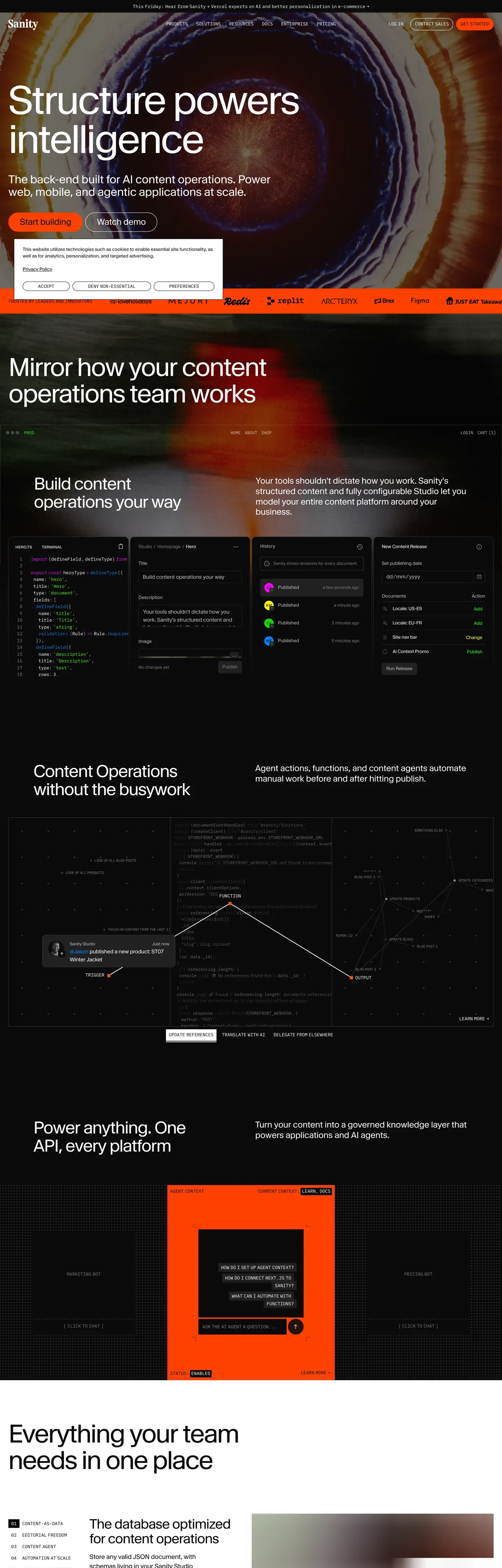
Live at sanity.io
A snapshot of the brand in production. Scroll the frame to see the whole page.
Colors
29 colors
Sanity's system runs on #0b0b0b as its primary voltage, used in 9 of 28 components. Type is set in waldenburgNormal across 16 tokens from 11px to 112px, weights 400–600. Shape language is mixed across 28 components, blending pills, soft rounds, and squarer corners.
Brand & Accent
Sparing, CTA-only voltage · 1
Surface
Page and card backgrounds · 5
Text
Headlines, body, captions · 7
Borders & Hairlines
Dividers, outlines, rules · 5
Semantic
Status, errors, success, links · 1
Other
Specialty colors · 10
Typography
16 type tokens
Set in waldenburgNormal across 16 tokens, from 11px to 112px, weights 400–600. Shown in its own stack: where the font isn't installed, the fallback the file names stands in.
- display-xl112px · weight 400 · lh 1 · tracking -4.48pxThe quick brown fox jumps over the lazy dog
- hero-secondary72px · weight 400 · lh 1.05 · tracking -2.88pxThe quick brown fox jumps over the lazy dog
- section-heading48px · weight 400 · lh 1.08 · tracking -1.68pxThe quick brown fox jumps over the lazy dog
- heading-lg38px · weight 400 · lh 1.1 · tracking -1.14pxThe quick brown fox jumps over the lazy dog
- heading-md32px · weight 425 · lh 1.24 · tracking -0.32pxThe quick brown fox jumps over the lazy dog
- heading-sm24px · weight 425 · lh 1.24 · tracking -0.24pxThe quick brown fox jumps over the lazy dog
- subheading20px · weight 425 · lh 1.13 · tracking -0.2pxThe quick brown fox jumps over the lazy dog
- body-lg18px · weight 400 · lh 1.5 · tracking -0.18pxThe quick brown fox jumps over the lazy dog
- body-md16px · weight 400 · lh 1.5The quick brown fox jumps over the lazy dog
- body-sm15px · weight 400 · lh 1.5 · tracking -0.15pxThe quick brown fox jumps over the lazy dog
- caption13px · weight 400 · lh 1.3 · tracking -0.13pxThe quick brown fox jumps over the lazy dog
- caption-sm12px · weight 400 · lh 1.5 · tracking -0.12pxThe quick brown fox jumps over the lazy dog
- micro-label11px · weight 600 · lh 1The quick brown fox jumps over the lazy dog
- code-body15px · weight 400 · lh 1.5The quick brown fox jumps over the lazy dog
- code-caption13px · weight 400 · lh 1.3The quick brown fox jumps over the lazy dog
- code-micro11px · weight 400 · lh 1.3The quick brown fox jumps over the lazy dog
Layout
Radii and spacing
6 corner radii and 12 spacing values. Shape language: mixed.
Radii
- none0px
- xs3px
- sm5px
- md6px
- lg12px
- pill99999px
Spacing
- px1px
- xxs2px
- xs4px
- sm6px
- base8px
- md12px
- lg16px
- xl24px
- xxl32px
- section48px
- section-lg64px
- section-xl96px
Components
28 components
Each rendered from its tokens (color, type, radius, padding) on Sanity's own canvas.
- Button Primarybutton-primaryButton Primary
- Button Primary Hoverbutton-primary-hoverButton Primary Hover
- Button Secondarybutton-secondaryButton Secondary
- Button Outlinedbutton-outlinedButton Outlined
- Button Ghostbutton-ghostButton Ghost
- Button Uppercase Labelbutton-uppercase-labelButton Uppercase Label
- Card Darkcard-darkCard Dark
- Card Featurecard-featureCard Feature
- Type here…text-inputText Input
- Type here…text-input-focusText Input Focus
- TextareatextareaTextarea
- Search Inputsearch-inputSearch Input
- Top Navtop-navTop Nav
- Nav Linknav-linkNav Link
- Nav Link Hovernav-link-hoverNav Link Hover
- Nav Ctanav-ctaNav Cta
- FooterfooterFooter
- Footer Linkfooter-linkFooter Link
- Footer Section Headerfooter-section-headerFooter Section Header
- Badge Neutral Subtlebadge-neutral-subtleBadge Neutral Subtle
- Badge Neutral Filledbadge-neutral-filledBadge Neutral Filled
- Tag Code Uppercasetag-code-uppercaseTag Code Uppercase
- Focus Ringfocus-ringFocus Ring
- Divider Hairlinedivider-hairlineDivider Hairline
- Divider Mediumdivider-mediumDivider Medium
- Modal Scrimmodal-scrimModal Scrim
- Dropdown Overlaydropdown-overlayDropdown Overlay
- Code Blockcode-blockCode Block
In use
The system, in use
Sanity's tokens on the kind of product it builds.
Build something people actually use.
A short paragraph of marketing copy that previews how the brand's display tier and body tier read together. Two sentences is usually enough.
FAQ
Sanity design system FAQ
Common questions about Sanity's tokens, components, and how to use this DESIGN.md in your project.
Read next
Related reading
Specs, directories, and component libraries that pair with this design system.
Use it
Use Sanity in your project
One machine-readable file. Drop it into Claude, Cursor, or any AI tool that reads DESIGN.md.
Download the DESIGN.md
One machine-readable file: every color, type, radius, spacing, and component token of Sanity.
Feed it to your AI tool
Drop it into Claude, Cursor, or GitHub Copilot. The agent writes React components and Tailwind classes that match Sanity's visual language.
Reference the tokens directly
Or paste the values into your Tailwind config, CSS variables, or component library: every color, size and radius is a quoted, ready-to-copy value.
Read the full DESIGN.md: overview, rationale, do’s and don’ts
Overview
Sanity's website is the canonical example of a dark-first developer-content platform that treats #0b0b0b as identity rather than mode. The base canvas is near-black ({colors.sanity-black} — #0b0b0b) with pure white ({colors.text-primary} — #ffffff) for primary text and silver ({colors.text-secondary} — #b9b9b9) for body copy. There is no light-mode equivalent in mainline marketing — the system commits to dark as the natural state. A single accent Sanity Red ({colors.sanity-red} — #f36458) carries every primary CTA, and a universal Electric Blue ({colors.electric-blue} — #0052ef) handles every hover state across buttons, links, and focus rings.
Type runs waldenburgNormal, a custom geometric sans Sanity licenses, with IBM Plex Mono as the technical counterweight. Display headings use aggressive negative letter-spacing — -4.48px at 112px hero scale, -2.88px at 72px, -1.68px at 48px — creating a precision-engineered, almost machined typographic voice. The weight range is intentionally narrow (400–425 for most styles, 500–600 only for 11px uppercase labels), keeping the voice consistent across editorial and UI registers.
The shape language is binary. Primary CTAs are full pills ({rounded.pill} — 99999px), inputs and textareas are 3px ({rounded.xs}), secondary buttons are 5px ({rounded.sm}), standard cards are 6px ({rounded.md}), and large feature cards are 12px ({rounded.lg}). There is nothing between 12px and the pill — the system jumps the gap. Depth is colorimetric: elevation reads through surface color shifts (#0b0b0b → #212121 → #353535) rather than offset shadows, native to dark interfaces where drop shadows would be invisible.
Key Characteristics:
- Single canvas:
{colors.sanity-black}(#0b0b0b — "Sanity Black") is the default surface for every public page. Not pure black, but close enough to feel absolute. No light mode in mainline marketing. - Single CTA color:
{colors.sanity-red}(#f36458 — coral-red) carries primary actions and brand accent moments. The only warm color in an otherwise cool, achromatic system. - Universal hover:
{colors.electric-blue}(#0052ef) is the activation signal across every interactive element — buttons, links, focus rings. One color, one signal. - Custom variable type:
waldenburgNormalfor display and UI, IBM Plex Mono for code and uppercase technical labels. Display tracking runs -0.32px to -4.48px depending on size. - Pure achromatic neutrals: the gray ramp (#0b0b0b → #212121 → #353535 → #797979 → #b9b9b9 → #ededed → #ffffff) carries no warm or cool bias — pure neutral discipline.
- Colorimetric depth: elevation through surface color steps (#0b0b0b ground → #212121 elevated → #353535 prominent → #ffffff inverted). No offset shadows; only 1px ring shadows and backdrop blur.
- Radius cliff: 3px / 5px / 6px / 12px / 99999px. The system skips the soft 16–20px range entirely — corners are either crisp or fully round.
- 8px base spacing system, with major section breaks at
{spacing.section-lg}(64px) and hero vertical padding climbing to 96–120px to create slide-like rhythm on the dark canvas.
Colors
Brand & Accent
- Sanity Black (
{colors.sanity-black}— #0b0b0b): The primary canvas. Used as the default page floor and the dominant surface color across every public page. Not pure black — close enough to feel absolute, but with a hair of softness. - Sanity Red (
{colors.sanity-red}— #f36458): The primary CTA and brand accent. A warm coral-red — the only warm color in an otherwise cool, achromatic system. Used on "Get Started" buttons and primary conversion points. - Electric Blue (
{colors.electric-blue}— #0052ef): The universal hover/active state. Every button, link, and interactive element shifts to this blue on hover. Also serves as the focus-ring color across inputs. - Light Blue (
{colors.light-blue}— #55beff) and Light Blue Soft ({colors.light-blue-soft}— #afe3ff): Secondary blue variants for accent backgrounds, badges, and dimmed blue surfaces. - Neon Green (
{colors.neon-green}— #19d600 sRGB fallback): A vivid wide-gamut green used for success states and premium feature highlights. The display-p3 source value iscolor(display-p3 .270588 1 0). - Accent Magenta (
{colors.accent-magenta}— #f600ff sRGB fallback): A vivid wide-gamut magenta for specialized accent moments. The display-p3 source value iscolor(display-p3 .960784 0 1).
Surface
- Surface Base (
{colors.surface-base}— #0b0b0b): Default page floor. - Surface Elevated (
{colors.surface-elevated}— #212121): Cards, secondary containers, input backgrounds, subtle layering above the base canvas. - Surface Prominent (
{colors.surface-prominent}— #353535): Tertiary surface and border color for creating depth between dark layers. - Surface Light (
{colors.surface-light}— #ededed) and Surface Inverted ({colors.surface-inverted}— #ffffff): Used inside inverted sections — full-bleed light bands embedded in the otherwise dark page. - Focus Cyan (
{colors.focus-cyan}— #072227): The background tint that text inputs shift to when focused. A deep cyan that pairs with the 2px blue focus ring.
Text
- Text Primary (
{colors.text-primary}— #ffffff): The dominant text color on dark surfaces. Pure white for maximum legibility. - Text Secondary (
{colors.text-secondary}— #b9b9b9 — "Silver"): Body copy on dark surfaces, muted descriptions, placeholder text. - Text Tertiary (
{colors.text-tertiary}— #797979 — "Medium Gray"): Tertiary text, metadata, timestamps, de-emphasized content. - Text on Light (
{colors.text-on-light}— #212121 — "Charcoal"): Text on light/inverted surfaces. - Text on Button Light (
{colors.text-on-button-light}— #0b0b0b): Primary text on white/light button surfaces.
Semantic
- Error Red (
{colors.error-red}— #dd0000): Destructive actions, validation errors, critical warnings. A pure, high-saturation red — distinct from the coral CTA. - GPC Green (
{colors.gpc-green}— #37cd84): Privacy/compliance indicator green. - Focus Ring Blue (
{colors.focus-ring-blue}— #0052ef): The focus-ring color, matching the universal interactive blue.
Border
- Border Dark (
{colors.border-dark}— #0b0b0b): Primary border on dark containers — barely visible, minimal containment. - Border Subtle (
{colors.border-subtle}— #212121): Standard border for inputs, textareas, and card edges. - Border Medium (
{colors.border-medium}— #353535): More visible borders for emphasized containment and dividers. - Border Light (
{colors.border-light}— #ffffff): Border on inverted/light elements or buttons needing contrast separation. - Border Orange (
{colors.border-orange}— #ff5500 sRGB fallback): Special accent border for highlighted/featured elements. The display-p3 source value iscolor(display-p3 1 0.3333 0).
Scrim
- Scrim (
{colors.scrim}— #000000): The global modal backdrop tone. Stored as the base hex; opacity is applied at render time. Pairs with a backdrop-filter blur on navigation overlays and modals.
Typography
Font Family
The system runs waldenburgNormal for display, body, navigation, and captions, with IBM Plex Mono as the technical counterweight for code blocks, inline code, and uppercase labels. Fallback stack: waldenburgNormal Fallback, ui-sans-serif, system-ui for the sans; ibmPlexMono Fallback, ui-monospace for the mono. CJK falls back to Helvetica, Arial, Hiragino Sans GB, STXihei, Microsoft YaHei, WenQuanYi Micro Hei.
The dual-register voice — editorial display next to system-readout mono — is deliberate. The sans handles authority and structure; the mono signals technical metadata and code.
Hierarchy
| Token | Size | Weight | Line Height | Letter Spacing | Use |
|---|---|---|---|---|---|
{typography.display-xl} | 112px (7rem) | 400 | 1.00 | -4.48px | Maximum-impact hero |
{typography.hero-secondary} | 72px (4.5rem) | 400 | 1.05 | -2.88px | Large section headers |
{typography.section-heading} | 48px (3rem) | 400 | 1.08 | -1.68px | Primary section anchors |
{typography.heading-lg} | 38px (2.38rem) | 400 | 1.10 | -1.14px | Feature section titles |
{typography.heading-md} | 32px (2rem) | 425 | 1.24 | -0.32px | Card titles, subsection headers |
{typography.heading-sm} | 24px (1.5rem) | 425 | 1.24 | -0.24px | Smaller feature headings |
{typography.subheading} | 20px (1.25rem) | 425 | 1.13 | -0.2px | Sub-section markers |
{typography.body-lg} | 18px (1.13rem) | 400 | 1.50 | -0.18px | Intro paragraphs |
{typography.body-md} | 16px (1rem) | 400 | 1.50 | 0 | Default body text |
{typography.body-sm} | 15px (0.94rem) | 400 | 1.50 | -0.15px | Compact body text |
{typography.caption} | 13px (0.81rem) | 400 | 1.30 | -0.13px | Metadata, tags |
{typography.caption-sm} | 12px (0.75rem) | 400 | 1.50 | -0.12px | Footnotes, timestamps |
{typography.micro-label} | 11px (0.69rem) | 600 | 1.00 | 0 (uppercase) | Tiny badges, filter labels |
{typography.code-body} | 15px | 400 | 1.50 | 0 | Code blocks |
{typography.code-caption} | 13px | 400 | 1.30 | 0 | Inline code, small technical labels |
{typography.code-micro} | 11px | 400 | 1.30 | 0 (uppercase) | Tiny code labels |
Principles
Display weights stay between 400 and 425. The system maxes out at 600, and only for 11px uppercase labels — heavy 700+ weights never appear. The narrow weight range keeps the voice consistent across editorial display and functional UI text.
Headings use tight line-heights (1.00–1.24) while body breathes at 1.50. The contrast creates clear visual hierarchy without resorting to weight changes. OpenType feature controls ("cv01", "cv11", "cv12", "cv13", "ss07" on display, "calt" 0 on body) fine-tune character alternates for different contexts.
The single typographically loud moment in the system is the 112px / -4.48px hero display — almost machined, like precision-cut steel letterforms. Everything else scales down from there with proportional tracking adjustments.
Note on Font Substitutes
If waldenburgNormal is unavailable, Inter or Space Grotesk are the closest open-source substitutes — both have the geometric, slightly condensed feel. IBM Plex Mono is on Google Fonts and transfers cleanly.
Layout
Spacing System
- Base unit: 8px (with 1px hairline and 2px micro-step).
- Tokens:
{spacing.px}1px ·{spacing.xxs}2px ·{spacing.xs}4px ·{spacing.sm}6px ·{spacing.base}8px ·{spacing.md}12px ·{spacing.lg}16px ·{spacing.xl}24px ·{spacing.xxl}32px ·{spacing.section}48px ·{spacing.section-lg}64px ·{spacing.section-xl}96px. - Section padding (vertical):
{spacing.section-lg}to{spacing.section-xl}(64–120px) for major bands — generous breathing room on the dark canvas. - Card internal padding:
{spacing.xl}(24px) for{component.card-dark}; 32–48px for{component.card-feature}. - Component padding:
{spacing.base}(8px) for buttons, inputs, badges;{spacing.md}(12px) for secondary button horizontal padding.
Grid & Container
- Max content width: ~1440px (inferred from breakpoints). Full-bleed dark sections with centered, max-width content.
- Page gutter: 32px on desktop, 16px on mobile.
- Multi-column layouts: 2–3 columns on desktop, single column on mobile.
- Card grids: CSS Grid with consistent 16–24px gaps.
Whitespace Philosophy
Sanity uses aggressive vertical spacing between sections (64–120px) to create breathing room on the dark canvas. Within sections, spacing is tighter (16–32px), creating dense information clusters separated by generous voids. The rhythm gives the page a "slides" quality — each section feels like its own focused frame.
Elevation
The system has essentially no shadow tier in the traditional sense.
- Level 0 (Flat): Default state for most elements. Dark surfaces create depth through color alone.
- Level 1 (Subtle):
0px 0px 0px 1px #212121— a border-like ring shadow for minimal containment without visible borders. - Level 2 (Focus):
0 0 0 2px var(--color-blue-500)— the 2px blue focus ring for inputs and interactive elements. - Level 3 (Overlay): Backdrop-filter blur + semi-transparent dark — navigation overlay, modal backgrounds.
Sanity's depth system is almost entirely colorimetric. Elevation is communicated through surface color shifts: {colors.surface-base} (ground) → {colors.surface-elevated} (elevated) → {colors.surface-prominent} (prominent) → {colors.surface-inverted} (inverted/highest). The few shadows that exist are ring-based (0px 0px 0px Npx) or blur-based (backdrop-filter) rather than offset shadows, maintaining the flat, precision-engineered aesthetic.
Border-based containment (1px solid {colors.border-subtle} or {colors.border-medium}) serves as the primary spatial separator. The system avoids floating-card aesthetics — everything feels mounted to the surface rather than hovering above it.
Components
Buttons
button-primary — {colors.sanity-red} (#f36458) fill, white text, full pill ({rounded.pill} — 99999px) radius, 8×16px padding, 16px label weight 400. The single primary CTA across the system: "Get Started", "Sign Up", account-flow primaries.
button-primary-hover — On hover, background flips to {colors.electric-blue} (#0052ef), text stays white. No transform, no shadow change.
button-secondary — {colors.sanity-black} (#0b0b0b) fill with {colors.text-secondary} (#b9b9b9) text, full pill, 8×12px padding. Same hover treatment — shifts to electric blue.
button-outlined — White ({colors.surface-inverted}) fill with near-black text and a 1px {colors.border-dark} outline. Full pill, 8px padding. Used on inverted/light sections.
button-ghost — {colors.surface-elevated} (#212121) fill with silver text, 5px ({rounded.sm}) radius, 0×12px padding, 1px subtle border. The only non-pill primary CTA style.
button-uppercase-label — Transparent or {colors.surface-elevated} fill, silver text in {typography.micro-label} (11px / 600 / uppercase). Used for tab-like navigation and filter controls.
Cards
card-dark — {colors.surface-elevated} (#212121) background, 1px {colors.border-medium} border, {rounded.md} (6px) radius, 24px padding. Titles in white, body in silver. Hover: subtle border color shift.
card-feature — {colors.sanity-black} (#0b0b0b) or full-bleed image background, no border or 1px subtle, {rounded.lg} (12px) radius, 32–48px padding. Contains large imagery with overlaid text — the maximum container radius in the system before jumping to the pill.
Inputs
text-input — {colors.sanity-black} (#0b0b0b) background, silver text, 1px {colors.border-subtle} border, {rounded.xs} (3px) radius, 8×12px padding.
text-input-focus — On focus, the background shifts to {colors.focus-cyan} (#072227) — a deep cyan tint — and the border becomes a 2px solid {colors.electric-blue} ring.
textarea — Same treatment as {component.text-input} with vertical resize.
search-input — {colors.sanity-black} background, silver text, no visible border, 0×12px padding, {rounded.xs} (3px) radius. Placeholder in {colors.text-tertiary} (medium gray).
Navigation
top-nav — {colors.sanity-black} background with backdrop-filter blur, compact padding, 1px {colors.border-subtle} bottom border. Logo flush-left (Sanity wordmark), nav links centered, primary CTA right-aligned.
nav-link — {typography.body-md} (16px) in silver. Hover: flips to {colors.electric-blue}.
nav-cta — {component.button-primary} styling — coral pill button anchored right.
Footer
footer — {colors.sanity-black} background, multi-column link layout.
footer-section-header — White text in {typography.code-caption} (13px IBM Plex Mono, uppercase) — a system-readout aesthetic.
footer-link — Silver, hover to blue, in {typography.body-md}.
Badges
badge-neutral-subtle — White ({colors.surface-inverted}) fill with near-black text, 13px label, full pill, 8px padding. The light variant for use on dark surfaces.
badge-neutral-filled — {colors.sanity-black} fill with white text, 13px label, full pill, 8px padding. The dark variant.
tag-code-uppercase — Transparent background, {colors.text-tertiary} (medium gray) text in {typography.code-caption} uppercase. Used as section markers and category tags.
Code & Misc
code-block — {colors.surface-elevated} (#212121) background, silver text in {typography.code-body} (15px IBM Plex Mono), {rounded.md} (6px) radius, 16px padding, 1px {colors.border-medium} border.
focus-ring — 2px solid {colors.electric-blue} ring on all focusable elements.
modal-scrim — {colors.scrim} (#000000) at 50% opacity with backdrop-filter blur.
dropdown-overlay — {colors.sanity-black} background, 1px subtle border, {rounded.md} radius. Anchored to nav and account menus.
Responsive Behavior
| Name | Width | Key Changes |
|---|---|---|
| Mobile Small | ≥ 376px | Minimum supported width. Hero typography drops to 38–48px. Single-column stacked layout. |
| Mobile | ≥ 480px | Single-column, full-bleed sections extend edge-to-edge with 16px gutters. Touch targets minimum 44px. |
| Mobile Large | ≥ 720px | Near-tablet layout, some 2-column elements begin appearing. |
| Tablet | ≥ 768px | Transition zone — 2-column layouts begin. Navigation links remain horizontal. |
| Tablet Landscape | ≥ 960px | 2-column layouts begin collapsing to 1-column variants below this. |
| Laptop | ≥ 1100px | Reduced column widths. Hero typography at 72px. |
| Desktop Compact | ≥ 1200px | Slightly condensed desktop layout. |
| Desktop | ≥ 1440px | Standard desktop. Hero typography at 112px with full -4.48px tracking. |
| Desktop XL | ≥ 1640px | Full layout, maximum content width. |
Touch Targets
- Primary CTAs: minimum 44×44px for all interactive elements on mobile.
- Heading letter-spacing relaxes slightly at mobile sizes (less aggressive negative tracking).
Collapsing Strategy
- Navigation: Horizontal links collapse to hamburger menu below 768px.
- Hero typography: Scales 112px → 72px → 48px → 38px across breakpoints, maintaining tight letter-spacing ratios.
- Grid layouts: 3-column → 2-column at ~960px, single-column below 768px.
- Card grids: Horizontal scrolling on mobile instead of wrapping (preserving card aspect ratios).
- Section spacing: Vertical padding reduces by ~40% on mobile (120px → 64px → 48px).
- Code blocks: Horizontal scroll with preserved monospace formatting.
- Image containers: Switch from fixed aspect ratios to full-width with auto height.
Known Gaps
- Custom typeface license:
waldenburgNormalis licensed only to Sanity. The spec documents the metrics, weight range, and OpenType feature usage, but the typeface file itself is not redistributable — substitute with Inter or Space Grotesk. - Wide-gamut color fallbacks:
{colors.neon-green}and{colors.accent-magenta}usecolor(display-p3 …)source values; the sRGB fallback hexes (#19d600 and #f600ff) are documented, but the cross-browser display-p3 strategy is not exhaustively captured. - Loading skeletons and motion timing: Skeleton screens, page-transition motion, and micro-interaction easing curves are not visible on the captured surfaces.
- Sanity Studio chrome: The embedded editor product uses a related but distinct token set (denser spacing, additional surface colors for inline editing). Not captured here — this spec covers public marketing and documentation only.
- Form input error states: The destructive
{colors.error-red}(#dd0000) is documented, but the full input outline + helper-text combination on validation failure was not visible in the captured surfaces.
Developer Tools & IDEs
More systems like this
More DESIGN.md files in Developer Tools & IDEs.
Pricing
Build it with Pro
The DESIGN.md files are free. Pro adds 6,000+ blocks, premium templates and the MCP server, so your AI editor builds in your system for you.
4.9/5 out of 5 · 150+ reviewsfrom 150+ founders and developers.
Billing
Billed once a year in USD. Cancel anytime.
- How many people can use the license.
- Client work, SaaS products and anything you charge for.
- Production-ready React sections: hero, pricing, features, dashboards and more.
- Complete multi-page sites you can ship as they are.
- React icons from every major library, installable with one command.
- Presets that restyle every block, in light and dark.
- Lets your AI editor search, preview and install blocks for you.
- Priority requests are answered first.
Individual
For personal projects & open source
$32instead of $49/mo
$389 billed yearly
- Seats: 1 seat
- Commercial use: Personal & open source only
- Pro blocks: 6,000+ blocks
- Templates: All 14 templates
- React icons: 294k+ icons
- Themes: All 59 themes
- MCP server: Basic usage
- Support: Standard
Team
Most popularFor freelancers, agencies & startups
$66instead of $99/mo
$789 billed yearly · ≈ $13/dev/mo
- Seats: Up to 5 seats
- Commercial use: Included
- Pro blocks: 6,000+ blocks
- Templates: All 14 templates
- React icons: 294k+ icons
- Themes: All 59 themes
- MCP server: High usage
- Support: Priority
Organization
For companies with larger teams
$132instead of $199/mo
$1,589 billed yearly
- Seats: Unlimited seats
- Commercial use: Included
- Pro blocks: 6,000+ blocks
- Templates: All 14 templates
- React icons: 294k+ icons
- Themes: All 59 themes
- MCP server: Unlimited usage
- Support: Priority
Billed once a year in USD. Cancel anytime.
Individual
For personal projects & open source
$32instead of $49/mo
$389 billed yearly
- How many people can use the license.Seats: 1 seat
- Client work, SaaS products and anything you charge for.Commercial use: Personal & open source only
- Production-ready React sections: hero, pricing, features, dashboards and more.Pro blocks: 6,000+ blocks
- Complete multi-page sites you can ship as they are.Templates: All 14 templates
- React icons from every major library, installable with one command.React icons: 294k+ icons
- Presets that restyle every block, in light and dark.Themes: All 59 themes
- Lets your AI editor search, preview and install blocks for you.MCP server: Basic usage
- Priority requests are answered first.Support: Standard
Team
Most popularFor freelancers, agencies & startups
$66instead of $99/mo
$789 billed yearly · ≈ $13/dev/mo
Everything in Individual, plus
- How many people can use the license.Seats: Up to 5 seats
- Client work, SaaS products and anything you charge for.Commercial use: Included
- Lets your AI editor search, preview and install blocks for you.MCP server: High usage
- Priority requests are answered first.Support: Priority
Organization
For companies with larger teams
$132instead of $199/mo
$1,589 billed yearly
Everything in Team, plus
- How many people can use the license.Seats: Unlimited seats
- Lets your AI editor search, preview and install blocks for you.MCP server: Unlimited usage
- Secure checkout via Stripe
- Code lives in your repo
- Keep what you've shipped if you cancel
- License terms
Your system, built for you
Every block, template and icon, installed by your AI agent in your design system. The DESIGN.md files stay free.