MetaMask Design System
MetaMask's marketing system runs three custom typefaces against a warm blush-peach canvas, with a 160px ultra-heavy display hero in deep plum-purple and domain-scoped CSS color tokens for consumer, developer, and institution use cases. Tokens for React, Next.js, and AI tools.
Add shadcn.io to your AI agent. · Pro It installs blocks, icons and templates in your design system from a prompt, with Pro.
Set up MCP- Primary
- #3d065f
- Typeface
- MMEuclidCircularB
- Shape
- Soft
- Base radius
- 8px
- Colors
- 18
- Type tokens
- 11
- Components
- 14
- Spacing values
- 8
About
About MetaMask DESIGN.md
Curated by Dov Azencot · Updated May 19, 2026 · Source metamask.io (opens in a new tab)
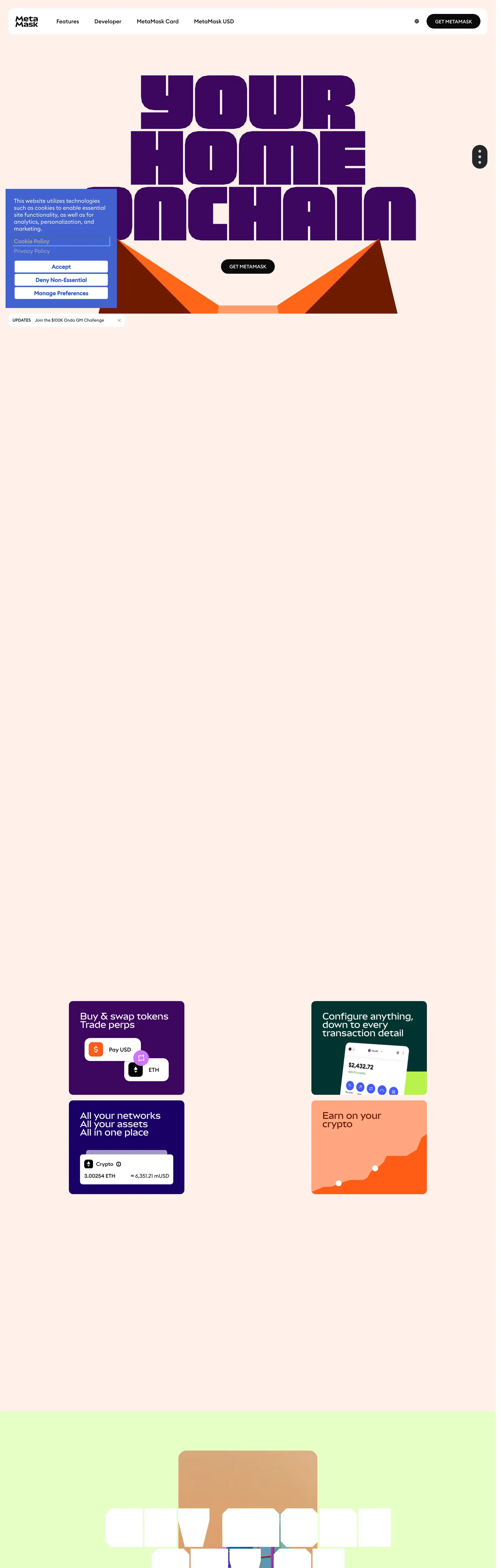
MetaMask's hero breaks two conventions simultaneously. Most crypto brands — Coinbase, Phantom, Rainbow — use a dark canvas with electric accent colors to signal technological authority. MetaMask uses a warm blush-peach background (#fff1eb, named --home-light-pink in the CSS) and renders the headline "YOUR HOME ONCHAIN" in deep plum-purple (#3d065f) at 160px using a proprietary variable font named MMPolyVariable. The effect reads as poster art rather than software marketing: massive, colored letterforms on a warm neutral ground, flanked by stylized fox-orange and crimson triangular shapes that suggest the MetaMask fox-mascot without literalism. The brand is the mascot's colors, not the crypto-dark convention.
The DESIGN.md file packages three custom font families: MMPolyVariable (the display voice, used at 160px, 128px, and 32px), MMEuclidCircularB (the interface voice, appearing 26 times at 16px/500 and across all UI chrome), and MMSansMono (the code/metadata voice). All three are MetaMask proprietary. The color system exposes unusual architectural transparency: CSS variable names follow a domain-audience pattern — `--consumer-orange`, `--developer-purple`, `--institution-blue`, `--consumer-perps-green` — revealing that MetaMask has three distinct product audiences (consumer wallet, developer tools, institutional clients) each with their own domain color. The deep plum-purple (#3d065f) is the convergence tone that all three audiences share.
The feature card system below the fold is where the domain colors activate. Product tiles use saturated indigo (#190066) for one cluster, chartreuse-green (#baf24a) for another, and deep teal (#013330) for a third. Each tile uses 70px border radius — producing a superellipse shape that reads distinctly at the ~200px tile scale. The overall effect is that the brand page functions as both a consumer-facing marketing site and a signal to developers and institutions that MetaMask is a platform with distinct surfaces for each audience.
What makes it distinct
5
- 160px display at weight 400MMPolyVariable at 160px renders the hero headline at a scale almost no other crypto or fintech brand attempts; the visual mass of the letterforms carries the page
- Blush-peach canvasthe page floor uses a warm off-white (#fff1eb, wired as --home-light-pink) rather than pure white or dark navy, giving MetaMask immediate differentiation from the dark-canvas crypto convention
- Deep plum-purple ink#3d065f fills the hero headline and structural UI at 70 total occurrences, establishing a distinct brand signature separate from the generic violet of most web3 tools
- Domain-scoped color systemCSS variables follow the pattern --consumer-orange, --developer-purple, --institution-blue, exposing the three-audience architecture directly in the token naming
- 70px as the dominant card radius96 of the extracted radius values are 70px, producing a distinctive superellipse card shape used across the product feature tiles
metamask.io
Live at metamask.io
A snapshot of the brand in production. Scroll the frame to see the whole page.
Colors
18 colors
MetaMask's system runs on #3d065f as its primary voltage, used in 1 of 14 components. Type is set in MMEuclidCircularB across 11 tokens from 12px to 160px, weights 400–700. Shape language is soft — components average 70px corner radius, with no sharp interactive edges.
Surface
Page and card backgrounds · 4
Text
Headlines, body, captions · 3
Borders & Hairlines
Dividers, outlines, rules · 1
Other
Specialty colors · 10
Typography
11 type tokens
Set in MMEuclidCircularB across 11 tokens, from 12px to 160px, weights 400–700. Shown in its own stack: where the font isn't installed, the fallback the file names stands in.
- display-xl160px · weight 400 · lh 160px · tracking -0.96pxThe quick brown fox jumps over the lazy dog
- display-lg128px · weight 400 · lh 128px · tracking -0.76pxThe quick brown fox jumps over the lazy dog
- display-sm32px · weight 400 · lh 40pxThe quick brown fox jumps over the lazy dog
- heading-lg24px · weight 400 · lh 24pxThe quick brown fox jumps over the lazy dog
- heading-sm16px · weight 500 · lh 16pxThe quick brown fox jumps over the lazy dog
- body-md16px · weight 500 · lh 19.84pxThe quick brown fox jumps over the lazy dog
- body-sm15px · weight 500 · lh 18pxThe quick brown fox jumps over the lazy dog
- body-xs14px · weight 500 · lh 14pxThe quick brown fox jumps over the lazy dog
- label-caps14px · weight 700 · lh 14pxThe quick brown fox jumps over the lazy dog
- caption12px · weight 400 · lh 18pxThe quick brown fox jumps over the lazy dog
- button-md16px · weight 700 · lh 16pxThe quick brown fox jumps over the lazy dog
Layout
Radii and spacing
8 corner radii and 8 spacing values. Shape language: soft.
Radii
- none0px
- sm4px
- md8px
- lg12px
- xl20px
- card70px
- pill100px
- full9999px
Spacing
- xs2px
- sm4px
- md6px
- base8px
- lg10px
- xl16px
- 2xl24px
- 3xl25px
Components
14 components
Each rendered from its tokens (color, type, radius, padding) on MetaMask's own canvas.
- Button Primarybutton-primaryButton Primary
- Button Secondarybutton-secondaryButton Secondary
- Top Navtop-navTop Nav
- Nav Linknav-linkNav Link
- Hero Headinghero-headingHero Heading
- Section Headingsection-headingSection Heading
- Body Paragraphbody-paragraphBody Paragraph
- CardcardCard
- Feature Card Indigofeature-card-indigoFeature Card Indigo
- Feature Card Chartreusefeature-card-chartreuseFeature Card Chartreuse
- Feature Card Tealfeature-card-tealFeature Card Teal
- Feature Card Orangefeature-card-orangeFeature Card Orange
- Type here…text-inputText Input
- FooterfooterFooter
In use
The system, in use
MetaMask's tokens on the kind of product it builds.
Build something people actually use.
A short paragraph of marketing copy that previews how the brand's display tier and body tier read together. Two sentences is usually enough.
- · 1 project
- · Community support
- · 10k req/mo
- · 10 projects
- · Priority support
- · 1M req/mo
- · Custom domains
- · Unlimited
- · SLA
- · Audit log
- · SSO
FAQ
MetaMask design system FAQ
Common questions about MetaMask's tokens, components, and how to use this DESIGN.md in your project.
Read next
Related reading
Specs, directories, and component libraries that pair with this design system.
- Browse all design systemsThe full directory of DESIGN.md files on shadcn.io, with live mockups for each.shadcn.io
- MetaMask — official siteMetaMask's public marketing site — the source of truth for the live tokens captured in this file.metamask.io (opens in a new tab)
- The DESIGN.md specificationGoogle Labs' open spec for machine-readable design system files — the format this page is built on.github.com (opens in a new tab)
Use it
Use MetaMask in your project
One machine-readable file. Drop it into Claude, Cursor, or any AI tool that reads DESIGN.md.
Download the DESIGN.md
One machine-readable file: every color, type, radius, spacing, and component token of MetaMask.
Feed it to your AI tool
Drop it into Claude, Cursor, or GitHub Copilot. The agent writes React components and Tailwind classes that match MetaMask's visual language.
Reference the tokens directly
Or paste the values into your Tailwind config, CSS variables, or component library: every color, size and radius is a quoted, ready-to-copy value.
Read the full DESIGN.md: overview, rationale, do’s and don’ts
Overview
MetaMask's marketing site inverts the crypto-dark convention without announcing that it is doing so. Blush canvas, plum authority. The page floor is a warm blush-peach rather than the night-black that Coinbase, Phantom, and Kraken use. The hero headline — "YOUR HOME ONCHAIN" — fills the viewport at 160px in deep plum-purple, set in MMPolyVariable, MetaMask's proprietary ultra-heavy variable font. Two stylized fox-orange and crimson triangular shapes flank the composition. The visual register is closer to concert-poster design than to a SaaS hero.
Where other web3 brands use a single brand color, MetaMask exposes a domain-scoped color architecture in the CSS: --consumer-orange, --developer-purple, --institution-blue, each with a full scale (dark / base / light / tint). The product is three things — a consumer wallet, a developer platform, and an institutional tool — and the token system names that reality explicitly. Three audiences, one plum-purple convergence point.
Key Characteristics:
- MMPolyVariable at 160px / weight 400 for the hero h1 — at this scale the "YOUR HOME ONCHAIN" text occupies the full viewport width; it is the most typographically aggressive display moment in the crypto marketing category.
- Warm blush-peach canvas (#fff1eb, wired as --home-light-pink) against the crypto-dark convention shared by Coinbase, Phantom, Kraken, Rainbow.
- Deep plum-purple (#3d065f) at frequency 70 for structural text and borders — the convergence tone shared by all three product domains.
- Feature tiles use domain-color fills: deep indigo (#190066) for consumer blue cluster, chartreuse (#baf24a) for developer green cluster, deep teal (#013330) for institutional green — all on 70px superellipse cards.
- 70px border radius at 96 occurrences — the system's dominant shape language, producing a superellipse tile at practical feature-card dimensions.
- Three proprietary typefaces (MMPolyVariable / MMEuclidCircularB / MMSansMono) across distinct surface roles — display, UI, code.
- CSS variable naming follows
--{domain}-{color}convention, exposing brand architecture as engineering vocabulary.
Colors
Ink
- Ink (
{colors.ink}— #0a0a0a): frequency 1261. Used as text (625), border (621), bg (15). The dominant text tone, wired as --general-black. Near-black rather than pure black — the 4-point softening is barely perceptible but consistent across all text. - Ink-plum (
{colors.ink-plum}— #3d065f): frequency 70. Used as text (32), border (32), bg (6). The convergence brand color across all three product domains. Wired as --institution-purple-dark / --developer-purple-dark / --consumer-purple-dark simultaneously. - Ink-dark-gray (
{colors.ink-dark-gray}— #393d46): frequency 54. Used as text (27), border (27). Secondary structural ink, wired as --general-gray-dark.
Canvas
- Canvas (
{colors.canvas}— #ffffff): frequency 90. Used as text (29), bg (26), border (34). Pure white — used for card surfaces and text-on-dark surfaces. Wired across dozens of --osano and --general-white aliases. - Canvas-blush (
{colors.canvas-blush}— #fff1eb): frequency 1. bg (1). The page floor, wired as --home-light-pink. Warm blush-peach — present throughout the hero as the background canvas, despite its low raw frequency count. - Surface-1 (
{colors.surface-1}— #e9edf6): frequency 8. bg (8). Wired as --general-gray-light. Used for the Osano consent UI and hover states. - Surface-2 (
{colors.surface-2}— #242628): frequency 1. bg (1). Wired as --general-black-light. The very-dark surface used for the CTA pill nav button. - Hairline (
{colors.hairline}— #c8ceda): frequency 4. bg (4). Wired as --general-gray. Mid-gray used for divider and input borders.
Domain Feature Colors
- Feature-indigo (
{colors.feature-indigo}— #190066): frequency 14. text (4), bg (6), border (4). Wired as --consumer-blue-dark / --institution-blue-dark. The indigo fill of the consumer domain tiles below the fold. - Feature-indigo-light (
{colors.feature-indigo-light}— #89b0ff): frequency 2. bg (2). Wired as --institution-blue / --developer-blue / --consumer-blue. Lighter blue for the institution audience tile. - Feature-indigo-tint (
{colors.feature-indigo-tint}— #cce7ff): frequency 2. bg (2). Pale blue tint for the lightest tier of the blue domain. - Feature-plum (
{colors.feature-plum}— #eac2ff): frequency 5. text (1), bg (3), border (1). Wired as --developer-purple-light / --consumer-purple-light. Pale lavender for the lighter purple feature tiles. - Feature-chartreuse (
{colors.feature-chartreuse}— #baf24a): frequency 4. bg (4). Wired as --developer-green / --consumer-green / --institution-green. Electric chartreuse for the developer domain feature tiles. - Feature-chartreuse-light (
{colors.feature-chartreuse-light}— #e5ffc3): frequency 2. bg (2). Pale chartreuse tint for lighter green domain tiles. - Feature-teal (
{colors.feature-teal}— #013330): frequency 4. text (1), bg (2), border (1). Wired as --consumer-perps-green-dark / --developer-green-dark. Deep forest teal for the institutional and perpetuals-trading tiles. - Feature-orange (
{colors.feature-orange}— #ffa680): frequency 3. bg (3). Wired as --developer-orange-light / --consumer-orange-light. Salmon-orange for the consumer earn/perps tiles. - Feature-orange-dark (
{colors.feature-orange-dark}— #661800): frequency 6. text (3), border (3). Wired as --consumer-orange-dark / --developer-orange-dark. Deep burnt-orange for text on the light orange tiles. - Consumer-purple (
{colors.consumer-purple}— #d075ff): frequency 3. bg (3). Wired as --institution-purple / --consumer-purple / --developer-purple. Mid-purple for the purple feature tile in the below-fold grid.
Typography
Font Families
The system runs three proprietary MetaMask typefaces: MMPolyVariable (wired as --font-mm-poly-variable) for ultra-heavy display headlines, MMEuclidCircularB (wired as --font-mm-euclid) for all UI chrome and body copy, and MMSansMono (wired as --font-mm-sans-mono) for code and metadata. A fourth family, MMSansVariable (wired as --font-mm-sans-variable), handles section h2 and h3 labels.
Hierarchy
| Token | Size | Weight | Line Height | Letter-Spacing | Use |
|---|---|---|---|---|---|
{typography.display-xl} | 160px | 400 | 160px | -0.96px | Hero h1 — MMPolyVariable |
{typography.display-lg} | 128px | 400 | 128px | -0.76px | Alternate display scale — MMPolyVariable |
{typography.display-sm} | 32px | 400 | 40px | 0 | Section pull-quote — MMPolyVariable |
{typography.heading-lg} | 24px | 400 | 24px | 0 | Section h2 — MMSansVariable |
{typography.heading-sm} | 16px | 500 | 16px | 0 | Section h3 — MMSansVariable |
{typography.body-md} | 16px | 500 | 19.84px | 0 | UI chrome spans — MMEuclidCircularB |
{typography.body-sm} | 15px | 500 | 18px | 0 | Body paragraphs — MMEuclidCircularB |
{typography.body-xs} | 14px | 500 | 14px | 0 | Nav and compact text — MMEuclidCircularB |
{typography.label-caps} | 14px | 700 | 14px | 0 | Uppercase h3 labels — MMEuclidCircularB |
{typography.caption} | 12px | 400 | 18px | 0 | Metadata and footnotes — MMEuclidCircularB |
{typography.button-md} | 16px | 700 | 16px | 0 | CTA button — MMEuclidCircularB |
Principles
MMPolyVariable at 160px / weight 400 occupies the entire viewport width for 3 short words. This is not a heading — it is typographic architecture. The weight 400 designation is slightly misleading: MMPolyVariable at 160px reads as ultra-heavy because the variable font at that scale activates its maximum optical size behavior. MMEuclidCircularB handles all functional text at 12-16px, always at weight 400-700. The system avoids any in-between weight tier: it is either the heavy display variable or the functional circular grotesk, with nothing in between.
Note on Font Substitutes
All three MetaMask typefaces are proprietary. For MMPolyVariable at 160px: Bebas Neue (free, condensed, heavy) captures the vertical stacked letters; Anybody (Google Fonts variable) captures the width-axis variability. For MMEuclidCircularB: DM Sans or Nunito have comparable round terminals. For MMSansMono: JetBrains Mono or IBM Plex Mono are close matches.
Layout
Spacing System
- Base unit: 6px (dominant extracted value with 96 occurrences at 0px 6px).
- Tokens:
{spacing.xs}2px ·{spacing.sm}4px ·{spacing.md}6px ·{spacing.base}8px ·{spacing.lg}10px ·{spacing.xl}16px ·{spacing.2xl}24px ·{spacing.3xl}25px. - Card internal padding: 0px 6px for the 70px-rounded feature tiles; the tile's curvature provides visual padding without explicit padding values.
- CTA button padding: 16px top / 24px sides / 15px bottom — 1px bottom asymmetry is a MetaMask-specific optical correction for the heavy button label.
- Nav height: 98px (wired as --header-desktop: 9.8rem) — significantly taller than the typical 64px SaaS nav.
Grid & Container
- Max content width: 1920px (wired as --site-container-max-width) — unusual; most brands cap at 1280-1440px. The hero text fills the container, so the 1920px limit means the 160px headline can breathe at 4K.
- Hero: full-bleed blush canvas, 160px headline at the top of the viewport, fox-shape decorations in the lower-hero zone.
- Feature tiles: a 2x2 grid of 70px-radius feature cards, each filled with a domain color (indigo, teal, chartreuse, salmon-orange), positioned below a white canvas section.
Rhythm
The page alternates: blush hero → white nav-bar section → blush feature grid → white body sections → near-black footer. Unlike Fellow's hard cut, MetaMask's transitions feel continuous because the blush and white tones are both warm neutrals. The domain-color feature tiles are the only chromatic interruption.
Elevation
The system uses minimal shadows. The primary shadow moment is on the CTA button pill (the near-black "GET METAMASK" button uses a shadow loosely from the Leva debug panel variables — not genuine brand shadow). Feature tiles achieve depth through saturated background fill against the blush canvas, not through shadow.
- No drop shadow: all major brand surfaces are flat.
- Tonal distinction: domain-color tiles on blush or white canvas get distinction from color alone.
- Hairline:
{colors.hairline}(#c8ceda, wired as --general-gray) used on input borders and subtle dividers.
Shapes
The radius scale is divided into two regimes:
- Utility:
{rounded.sm}4px ·{rounded.md}8px ·{rounded.lg}12px — for inputs, small chips, and minor surfaces. - Feature tiles:
{rounded.card}70px (96 occurrences) — the dominant radius; at 200-300px tile dimensions it produces a superellipse shape distinct from any common radius value. - Pills:
{rounded.pill}100px ·{rounded.full}9999px — for the CTA buttons and fully circular icon chips.
The 70px card radius is the system's signature shape. No peer crypto brand uses a radius this high on feature cards — it lands between a standard rounded rectangle and a true pill, producing a shape that reads as designed rather than defaulted.
Components
button-primary — Near-black {colors.ink} fill, white text at {typography.button-md} (16px / 700), {rounded.pill} 100px radius, 16x24x15 padding (optical correction), 48px height. "GET METAMASK" is the canonical label. The button renders in near-black rather than the plum-purple brand tone.
button-secondary — Transparent fill, ink text, ink hairline border, {rounded.pill} radius. Used for secondary nav items ("MetaMask Card," "MetaMask USD").
top-nav — Blush canvas background, near-black text, 0x24 padding, 98px height. The MetaMask wordmark and product navigation ("Features," "Developer," "MetaMask Card," "MetaMask USD") sit flush in the tall nav bar.
nav-link — Transparent, ink black text at {typography.body-xs} (14px / 500), 6px vertical padding. The nav-link height matches the tall 98px nav by having generous vertical whitespace above and below.
hero-heading — Plum-purple {colors.ink-plum} text, {typography.display-xl} (160px / 400 / -0.96px), zero padding. The headline fills the viewport width edge-to-edge.
section-heading — Near-black ink text at {typography.heading-lg} (24px MMSansVariable / 400) for white-canvas section headings.
body-paragraph — Near-black text at {typography.body-md} (16px / 500) for the feature descriptions.
card — White canvas fill, near-black text, {rounded.card} 70px radius, 0x6 padding. The base content card in the feature grid.
feature-card-indigo — Deep indigo {colors.feature-indigo} fill, white text, 70px radius. Consumer blue domain tile ("Buy & swap tokens / Trade perps").
feature-card-chartreuse — Chartreuse {colors.feature-chartreuse} fill, ink black text, 70px radius. Developer green domain tile ("All your networks / All your assets").
feature-card-teal — Deep teal {colors.feature-teal} fill, white text, 70px radius. Institution/configure domain tile ("Configure anything, down to every transaction detail").
feature-card-orange — Salmon-orange {colors.feature-orange} fill, ink dark text, 70px radius. Earn/perps domain tile.
text-input — White canvas fill, ink text, {rounded.md} 8px radius, 8x12 padding, 36px height, hairline border.
footer — Near-black ink fill, white text at {typography.caption} (12px / 400), 25x16 padding.
Do's and Don'ts
Do reserve {colors.ink-plum} (#3d065f) for display-scale text only. At 160px it reads as art; at 16px body size it reads as an oddly purple paragraph. The system's plum appearances are all at heading and border scale.
Do use the 70px card radius exclusively for feature tiles at 200-300px dimensions. The superellipse requires enough tile area to be perceptible — at 100px tile dimensions the 70px radius would over-consume the corners and reduce legible surface area.
Do treat the domain colors as context signals, not decorations. Each domain color (indigo / chartreuse / teal / salmon-orange) maps to a specific product audience. Mixing domain colors within a single component or section contradicts the architecture the token naming exposes.
Do keep the blush canvas ({colors.canvas-blush} — #fff1eb) as the hero floor and the pure white ({colors.canvas} — #ffffff) for content-section surfaces. The warm-to-neutral transition from hero to body is subtle but load-bearing for the page's visual hierarchy.
Don't replace MMPolyVariable with a standard weight-700 condensed sans at the hero scale. The variable font's optical behavior at 160px is not replicable with a static weight; a substitute needs to be a variable font with a width axis, or an explicitly ultra-heavy typeface like Bebas Neue.
Don't use the domain feature colors ({colors.feature-chartreuse}, {colors.feature-indigo}) as CTA button fills — they are domain identifiers, not action colors. The CTA button is near-black {colors.ink} specifically to stand apart from the domain color system.
Don't apply the {rounded.card} 70px radius to elements narrower than 150px — at narrow widths the radius produces a pill shape that eliminates usable flat surface area and reads as a badge rather than a card.
Don't reduce the hero headline size below 100px on tablet breakpoints without switching the typographic role from display to heading. At 80-100px the MMPolyVariable letters begin to crowd at two-word line wraps on 768px viewports; the responsive type scale must drop to MMSansVariable territory rather than shrinking the MMPolyVariable.
Known Gaps
- Fox mascot illustration: the triangular fox-colored shapes flanking the hero are stylized abstractions of the MetaMask fox, but the exact SVG paths, colors, and positioning are not captured in the extracted design values.
- Hover and focus states: only resting states are captured. The plum-purple hover behavior on the nav links and domain tile click states are not represented.
- Mobile breakpoints: the 160px headline requires aggressive responsive type scaling; the mobile-specific type scale (wired as --header-mobile: 8.3rem) is noted but the full mobile token override set is not captured.
- Wallet UI tokens: the MetaMask browser extension and mobile app carry a separate, more granular token system for transaction flows, asset lists, network selectors, and confirmation dialogs — not represented in the marketing-site extraction.
- Animation: the hero features a 3D fox animation that is the brand's most recognizable motion moment; the static spec captures only the end-state plum text and blush background values.
- Dark mode: MetaMask's extension UI has a dark mode; the marketing site does not expose one in the captured surface.
- Third-party cookie consent UI: the Osano consent widget (which uses its own color system) accounts for a large number of the CSS variables in the extraction — these are not MetaMask brand tokens and should be disregarded in any implementation.
Fintech & Crypto
More systems like this
More DESIGN.md files in Fintech & Crypto.
Pricing
Build it with Pro
The DESIGN.md files are free. Pro adds 6,000+ blocks, premium templates and the MCP server, so your AI editor builds in your system for you.
4.9/5 out of 5 · 150+ reviewsfrom 150+ founders and developers.
Billing
Billed once a year in USD. Cancel anytime.
- How many people can use the license.
- Client work, SaaS products and anything you charge for.
- Production-ready React sections: hero, pricing, features, dashboards and more.
- Complete multi-page sites you can ship as they are.
- React icons from every major library, installable with one command.
- Presets that restyle every block, in light and dark.
- Lets your AI editor search, preview and install blocks for you.
- Priority requests are answered first.
Individual
For personal projects & open source
$32instead of $49/mo
$389 billed yearly
- Seats: 1 seat
- Commercial use: Personal & open source only
- Pro blocks: 6,000+ blocks
- Templates: All 14 templates
- React icons: 294k+ icons
- Themes: All 59 themes
- MCP server: Basic usage
- Support: Standard
Team
Most popularFor freelancers, agencies & startups
$66instead of $99/mo
$789 billed yearly · ≈ $13/dev/mo
- Seats: Up to 5 seats
- Commercial use: Included
- Pro blocks: 6,000+ blocks
- Templates: All 14 templates
- React icons: 294k+ icons
- Themes: All 59 themes
- MCP server: High usage
- Support: Priority
Organization
For companies with larger teams
$132instead of $199/mo
$1,589 billed yearly
- Seats: Unlimited seats
- Commercial use: Included
- Pro blocks: 6,000+ blocks
- Templates: All 14 templates
- React icons: 294k+ icons
- Themes: All 59 themes
- MCP server: Unlimited usage
- Support: Priority
Billed once a year in USD. Cancel anytime.
Individual
For personal projects & open source
$32instead of $49/mo
$389 billed yearly
- How many people can use the license.Seats: 1 seat
- Client work, SaaS products and anything you charge for.Commercial use: Personal & open source only
- Production-ready React sections: hero, pricing, features, dashboards and more.Pro blocks: 6,000+ blocks
- Complete multi-page sites you can ship as they are.Templates: All 14 templates
- React icons from every major library, installable with one command.React icons: 294k+ icons
- Presets that restyle every block, in light and dark.Themes: All 59 themes
- Lets your AI editor search, preview and install blocks for you.MCP server: Basic usage
- Priority requests are answered first.Support: Standard
Team
Most popularFor freelancers, agencies & startups
$66instead of $99/mo
$789 billed yearly · ≈ $13/dev/mo
Everything in Individual, plus
- How many people can use the license.Seats: Up to 5 seats
- Client work, SaaS products and anything you charge for.Commercial use: Included
- Lets your AI editor search, preview and install blocks for you.MCP server: High usage
- Priority requests are answered first.Support: Priority
Organization
For companies with larger teams
$132instead of $199/mo
$1,589 billed yearly
Everything in Team, plus
- How many people can use the license.Seats: Unlimited seats
- Lets your AI editor search, preview and install blocks for you.MCP server: Unlimited usage
- Secure checkout via Stripe
- Code lives in your repo
- Keep what you've shipped if you cancel
- License terms
Your system, built for you
Every block, template and icon, installed by your AI agent in your design system. The DESIGN.md files stay free.