Mercury Design System
Mercury's business-banking design system as a DESIGN.md file. Indigo #5266eb, Arcadia 420, 20 colors, 18 components. For React, Next.js, and AI tools.
Add shadcn.io to your AI agent. · Pro It installs blocks, icons and templates in your design system from a prompt, with Pro.
Set up MCP- Primary
- #5266eb
- Typeface
- arcadiaDisplay
- Shape
- Soft
- Base radius
- 12px
- Colors
- 20
- Type tokens
- 14
- Components
- 18
- Spacing values
- 9
About
About Mercury DESIGN.md
Curated by Dov Azencot · Updated May 13, 2026 · Source mercury.com (opens in a new tab)
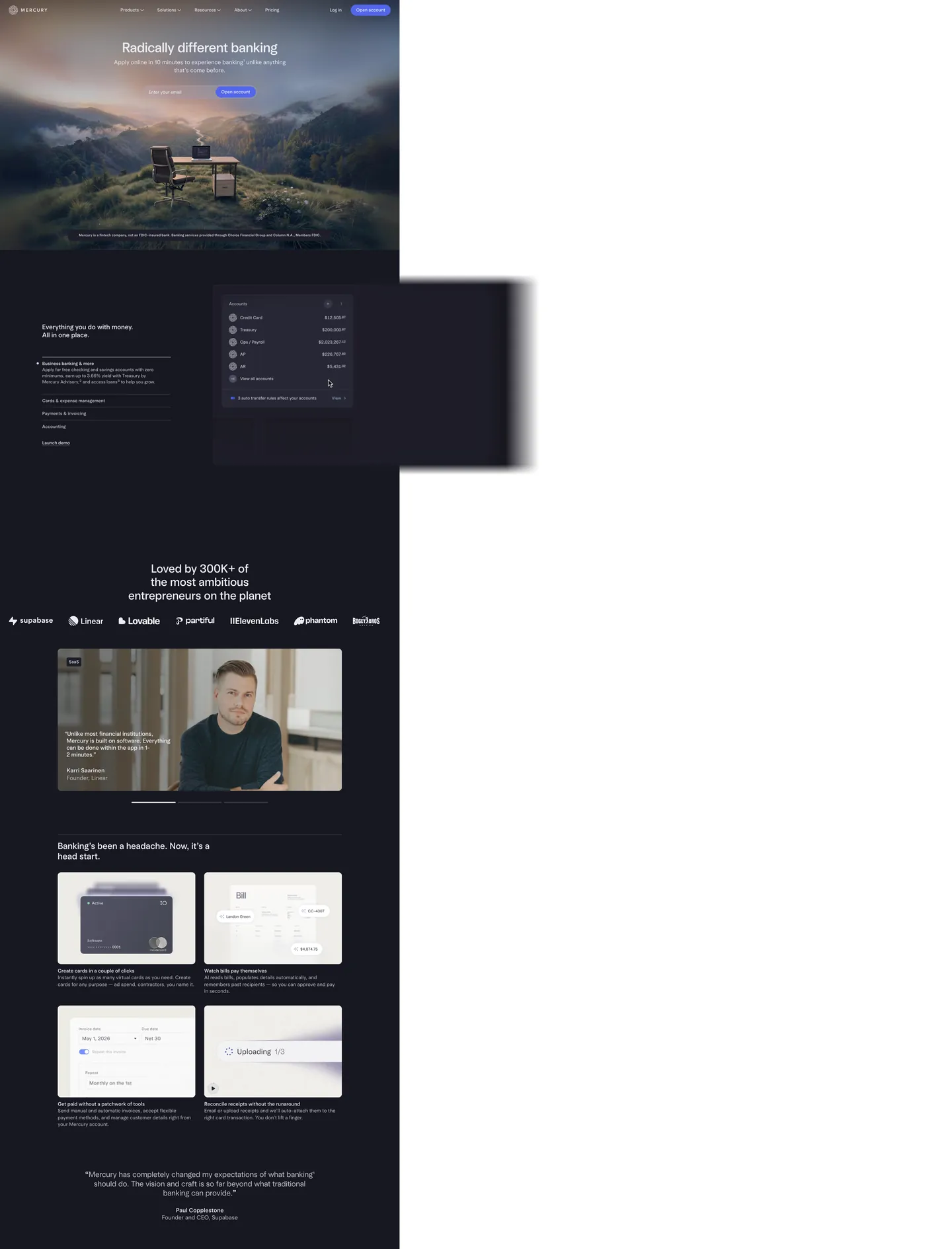
Mercury's design language is what happens when a business-banking brand decides the dark canvas is non-negotiable. The page opens on indigo-black "#171721" — a deep violet-tinted near-black, never pure "#000000" — with atmospheric mountain photography bleeding into the hero. Inverted text "#ededf3" carries the entire reading surface. The single brand voltage, indigo "#5266eb", appears only as the "Open account" pill — one filled CTA per band, never two competing in the same hero. Light blue accents "#9cb4e8" and "#cdddff" haunt the gradient washes and product mockups but are kept off buttons; they're decoration, not action. The whole system reads as a confident inversion of the Stripe-era fintech default — where most banking sites push a white canvas with indigo accents, Mercury pushes the inverse and trusts photography to do the warmth.
This page packages the full system into a single DESIGN.md file. Inside: 20 colors tokens (2 brand, 16 structural), 14 typography levels across the proprietary Arcadia and Arcadia Display families, 6 corner radii, 9 spacing values, and 18 components — buttons, the email-capture pill, the dashboard mockup chrome, the product scene card, and the inverted-canvas nav. Every hex is quoted; every Arcadia weight (360, 400, 420, 480) is reproducible. The format is the Google Labs DESIGN.md spec — plain text, machine-readable, and grep-friendly.
Feed the file to Claude, Cursor, or GitHub Copilot. The AI writes React components and Tailwind classes that match Mercury's particular dialect — dark-canvas-first surfaces, the 420-weight body register, 32px pill CTAs, and the indigo-on-near-black hierarchy — instead of a generic dark-mode fintech theme. Inter Variable at weight 420 with positive 0.4px tracking on display sizes is the closest open-source path; the Arcadia family is proprietary and not licensed for redistribution.
What makes it distinct
5
- Dark canvas as defaultevery marketing surface sits on indigo-black #171721, with #ededf3 doing all the text work
- Single voltage CTAindigo #5266eb fills exactly one pill per band, never two filled buttons in the same hero
- Arcadia weight 420Mercury's body type lives at a non-standard 420, between regular and medium, the brand's quiet typographic signature
- Positive 0.42px letter-spacing on displayopposite of the Stripe/Sohne negative-tracking convention; Mercury wants its serif-leaning display to breathe
- 32px pill CTAs on a 4px radius basethe workhorse 4px appears 91 times, the pill 9 times, with 12px and 40px as the only intermediate steps
mercury.com
Live at mercury.com
A snapshot of the brand in production. Scroll the frame to see the whole page.
Colors
20 colors
Mercury's system runs on #5266eb as its primary voltage, used in 3 of 18 components. Type is set in arcadiaDisplay across 14 tokens from 12px to 65px, weights 360–480. Shape language is soft — components average 17px corner radius, with no sharp interactive edges.
Brand & Accent
Sparing, CTA-only voltage · 6
Surface
Page and card backgrounds · 6
Text
Headlines, body, captions · 5
Borders & Hairlines
Dividers, outlines, rules · 2
Semantic
Status, errors, success, links · 1
Typography
14 type tokens
Set in arcadiaDisplay across 14 tokens, from 12px to 65px, weights 360–480. Shown in its own stack: where the font isn't installed, the fallback the file names stands in.
- display-xxl65px · weight 480 · lh 1.1 · tracking 0The quick brown fox jumps over the lazy dog
- display-xl49px · weight 480 · lh 1.1 · tracking 0The quick brown fox jumps over the lazy dog
- display-lg42px · weight 480 · lh 1.15 · tracking 0.42pxThe quick brown fox jumps over the lazy dog
- display-md32px · weight 480 · lh 1.15 · tracking 0.48pxThe quick brown fox jumps over the lazy dog
- display-sm28px · weight 480 · lh 1.2 · tracking 0.42pxThe quick brown fox jumps over the lazy dog
- display-sm-light28px · weight 360 · lh 1.2 · tracking 0.42pxThe quick brown fox jumps over the lazy dog
- heading-md24px · weight 480 · lh 1.2 · tracking 0.48pxThe quick brown fox jumps over the lazy dog
- body-lg21px · weight 360 · lh 1.35 · tracking 0The quick brown fox jumps over the lazy dog
- body-lg-emphasized21px · weight 480 · lh 1.2 · tracking 0The quick brown fox jumps over the lazy dog
- body-md18px · weight 360 · lh 1.35 · tracking 0The quick brown fox jumps over the lazy dog
- body-md-emphasized18px · weight 480 · lh 1.35 · tracking 0The quick brown fox jumps over the lazy dog
- body-default16px · weight 420 · lh 1 · tracking 0The quick brown fox jumps over the lazy dog
- body-relaxed16px · weight 400 · lh 1.4 · tracking 0The quick brown fox jumps over the lazy dog
- caption12px · weight 400 · lh 1.4 · tracking 0.24pxThe quick brown fox jumps over the lazy dog
Layout
Radii and spacing
6 corner radii and 9 spacing values. Shape language: soft.
Radii
- xs4px
- sm8px
- md12px
- lg32px
- xl40px
- pill9999px
Spacing
- xxs2px
- xs4px
- sm8px
- md12px
- base20px
- lg32px
- xl40px
- 2xl72px
- 3xl112px
Components
18 components
Each rendered from its tokens (color, type, radius, padding) on Mercury's own canvas.
- Button Primarybutton-primaryButton Primary
- Button Primary Hoverbutton-primary-hoverButton Primary Hover
- Button Primary Pressedbutton-primary-pressedButton Primary Pressed
- Button Secondarybutton-secondaryButton Secondary
- Email Capture Pillemail-capture-pillEmail Capture Pill
- Type here…text-inputText Input
- Type here…text-input-focusedText Input Focused
- Top Navtop-navTop Nav
- Nav Linknav-linkNav Link
- Card Scenecard-sceneCard Scene
- Card Product Mockupcard-product-mockupCard Product Mockup
- Card Feature Lightcard-feature-lightCard Feature Light
- Card Testimonialcard-testimonialCard Testimonial
- Pill Tag Softpill-tag-softPill Tag Soft
- Hero Disclaimerhero-disclaimerHero Disclaimer
- Logo Strip Celllogo-strip-cellLogo Strip Cell
- FooterfooterFooter
- Link Inlinelink-inlineLink Inline
In use
The system, in use
Mercury's tokens on the kind of product it builds.
Build something people actually use.
A short paragraph of marketing copy that previews how the brand's display tier and body tier read together. Two sentences is usually enough.
FAQ
Mercury design system FAQ
Common questions about Mercury's tokens, components, and how to use this DESIGN.md in your project.
Read next
Related reading
Specs, directories, and component libraries that pair with this design system.
- Browse all design systemsThe full directory of DESIGN.md files on shadcn.io, with live mockups for each.shadcn.io
- Mercury — official siteThe business-banking platform whose marketing surface this DESIGN.md captures.mercury.com (opens in a new tab)
- The DESIGN.md specificationGoogle Labs' open spec for machine-readable design system files.github.com (opens in a new tab)
Use it
Use Mercury in your project
One machine-readable file. Drop it into Claude, Cursor, or any AI tool that reads DESIGN.md.
Download the DESIGN.md
One machine-readable file: every color, type, radius, spacing, and component token of Mercury.
Feed it to your AI tool
Drop it into Claude, Cursor, or GitHub Copilot. The agent writes React components and Tailwind classes that match Mercury's visual language.
Reference the tokens directly
Or paste the values into your Tailwind config, CSS variables, or component library: every color, size and radius is a quoted, ready-to-copy value.
Read the full DESIGN.md: overview, rationale, do’s and don’ts
Overview
Mercury's marketing surface opens on a deep indigo-black "#171721" — a near-black tinted with violet at oklch h≈284, never pure "#000000" — overlaid with atmospheric mountain photography that bleeds into the hero. Inverted text "#ededf3" carries the entire reading surface, with "#c3c3cc" as the secondary register and "#272735" doing the hairline work. The single brand voltage, indigo "#5266eb", appears exactly once per band as the "Open account" pill — --surface-primary in Mercury's CSS variable layer, used as fill on the CTA and as --text-primary for inline links. Two pale-periwinkle accents, "#9cb4e8" and "#cdddff", appear in gradient washes and product-mockup highlights but are kept off interactive elements. The light track exists — --background-default is "#fbfcfd" — but the authenticated dashboard product is where it runs, not the marketing top of funnel.
Inverted canvas as signature: Where most business-banking sites (Stripe, Brex, Wise) default to a white marketing surface with indigo accents, Mercury runs the inverse and trusts atmospheric photography to do the warmth. The dark canvas is not a dark-mode toggle; it is the default state of the brand. Weight 420 as quiet signal: Mercury's body register sits at the non-standard weight 420 — between Arcadia's regular (400) and medium-equivalent (480) — a typographic tell that the brand has commissioned a proprietary type system rather than pulled a stock weight off Google Fonts. Positive-tracked display: Display sizes 28–65px carry +0.42px to +0.48px letter-spacing, the inverse of the negative-tracked Sohne/Inter convention that dominates fintech. Arcadia Display is the brand's editorial register, allowed to breathe.
Key Characteristics:
- Dark canvas as default — every marketing surface lives on "#171721", with the light "#fbfcfd" reserved for the authenticated dashboard.
- Single voltage CTA — indigo "#5266eb" fills the "Open account" pill (
--surface-primary), one filled button per band, never two. - Arcadia at weight 420 — Mercury's body register is the non-standard 420, sitting between conventional regular and medium weights.
- Positive 0.42–0.48px letter-spacing on display — Arcadia Display headings track outward, inverting the negative-tracked fintech default.
- 32px pill radius for CTAs on a 4px base — the radius scale collapses to four values (4 / 8 / 12 / 32) plus a 40px softened card variant.
- Atmospheric mountain photography — the hero ships as a wide horizontal photograph bleeding into "#171721", not a CSS gradient.
- Scene cards — product mockups composite as "#1e1e2a" elevated panels (
--surface-inverted) with 12px corners, rather than the bordered white cards of the Stripe-era convention.
Colors
Source pages: home (
/), top nav and hero, the "Everything you do with money" scene strip, the 300K+ testimonial band, the four-card product feature grid.
Brand & Accent
- Indigo (
{colors.primary}— "#5266eb") — frequency 3 (bg). Used as--surface-primary,--text-primary,--border-primary,--border-focus,--surface-magic. Reserved for the "Open account" pill and inline link emphasis — Mercury's load-bearing voltage. - Indigo Hover (
{colors.primary-hover}— "#4354c8") — frequency 0 on the captured surface. Lives in--surface-primary-hoverand--surface-magic-hover; the warmer indigo on CTA hover. - Indigo Active (
{colors.primary-active}— "#3442a6") — frequency 0. Lives in--surface-primary-active; the pressed-state lift, two stops deeper than primary. - Indigo Soft (
{colors.primary-soft}— "#5266eb") — applied at roughly 10% alpha (background-color: rgba(82, 102, 235, 0.1)). The--surface-emphasizedfill on soft tag pills and inline emphasis chips. - Accent Periwinkle (
{colors.accent-periwinkle}— "#9cb4e8") — frequency 6 (bg 2, border 13). The pale-blue decorative accent in mockup highlights and the brand's secondary atmospheric color. - Accent Mist (
{colors.accent-mist}— "#cdddff") — frequency 3 (bg). Lighter periwinkle for gradient washes and the softer product-mockup highlights.
Surface
- Canvas (
{colors.canvas}— "#171721") — the marketing default. Deep violet-tinted near-black; the theme-color meta token, never pure black. - Canvas Elevated (
{colors.canvas-elevated}— "#1e1e2a") — frequency 7 (bg).--surface-inverted; the lifted panel color on scene cards, testimonial blocks, and product mockup chrome. - Canvas Light (
{colors.canvas-light}— "#fbfcfd") — the authenticated-dashboard default. Reserved for inputs, the email-capture pill, and the rare light-track marketing surface. - Surface Default (
{colors.surface-default}— "#ededf3") — frequency 614.--surface-default; the inverted-light panel fill on feature cards when the brand needs a light interlude. - Surface Secondary (
{colors.surface-secondary}— "#f4f5f9") —--background-secondary; the cooler off-white sub-fill on stacked light cards. - Surface Hover (
{colors.surface-hover}— "#dddde5") —--surface-default-hover; the press lift on light surface cards.
Text
- Ink Default (
{colors.ink-default}— "#ededf3") —--text-default-inverted; carries all reading text on the dark canvas. Off-white, slightly cool, never pure "#ffffff". - Ink Emphasized (
{colors.ink-emphasized}— "#1e1e2a") — frequency 7 (bg).--text-emphasized; the dark text token used when the brand inverts onto a light surface. - Ink Subdued (
{colors.ink-subdued}— "#c3c3cc") — frequency 225.--text-subdued-inverted; helper text, captions, footer copy, table labels. - Ink Disabled (
{colors.ink-disabled}— "#70707d") —--text-disabled; mid-gray neutral, only for unavailable controls.
Hairlines
- Hairline (
{colors.hairline}— "#272735") —--border-emphasized; the 1px border on scene cards against the dark canvas. Just lifted from the canvas, intentionally low-contrast. - Hairline Subdued (
{colors.hairline-subdued}— "#c3c3cc") —--border-default-inverted; the lighter hairline on inverted-light cards.
Semantic
- Error (
{colors.error}— "#d03275") —--text-error,--icon-error,--border-error. A pink-magenta, never red — the brand's deliberate inversion of the universal validation-red default.
Typography
Font Family
Mercury runs two proprietary families: arcadia for body, UI, and captions, and arcadiaDisplay for headings and the hero. Both ship as variable fonts with non-standard weights — 360 (light-display), 400 (regular), 420 (UI default), and 480 (display medium). The 420 weight is the brand's quiet typographic signature — neither regular nor medium, the kind of weight you only get when you commission a custom type system.
When Arcadia is unavailable, fall back to Inter Variable at weight 420 with positive 0.4px tracking on display sizes — Inter's variable axis is the closest open-source analogue to Arcadia's modulation, though it lacks the slight serif-leaning silhouette of the Arcadia Display tier. Avoid Helvetica, Roboto, and SF Pro — all three are too geometric for Mercury's slightly humanist Arcadia look.
Hierarchy
| Token | Size | Weight | Line Height | Letter Spacing | Use |
|---|---|---|---|---|---|
{typography.display-xxl} | 65px | 480 | 1.1 | 0 | Hero headline (49.3px on the live surface, 65px on wide breakpoints) |
{typography.display-xl} | 49px | 480 | 1.1 | 0 | "Radically different banking" headline |
{typography.display-lg} | 42px | 480 | 1.15 | +0.42px | "Loved by 300K+" section opener |
{typography.display-md} | 32px | 480 | 1.15 | +0.48px | Mid-section heading |
{typography.display-sm} | 28px | 480 | 1.2 | +0.42px | Card title |
{typography.display-sm-light} | 28px | 360 | 1.2 | +0.42px | Light-weight display variant for editorial sub-headings |
{typography.heading-md} | 24px | 480 | 1.2 | +0.48px | Sub-section label |
{typography.body-lg} | 21px | 360 | 1.35 | 0 | Testimonial body lead, hero supporting copy |
{typography.body-lg-emphasized} | 21px | 480 | 1.2 | 0 | Pull-quote in scene-card |
{typography.body-md} | 18px | 360 | 1.35 | 0 | Marketing paragraph body |
{typography.body-md-emphasized} | 18px | 480 | 1.35 | 0 | Inline emphasis inside body |
{typography.body-default} | 16px | 420 | 1.0 | 0 | UI body — buttons, nav, inputs, the brand's workhorse |
{typography.body-relaxed} | 16px | 400 | 1.4 | 0 | Footer body, helper paragraph |
{typography.caption} | 12px | 400 | 1.4 | +0.24px | Hero disclaimer, table label, fine print |
Principles
- Weight 420 carries UI. The button, nav, input, and email-capture pill all render at 16px / 420. Bumping to 500 reads as too institutional; dropping to 400 reads as too generic.
- Positive tracking on display. Display tiers carry +0.42px to +0.48px letter-spacing at 28–42px sizes, inverting the negative-tracked fintech default. The hero at 49px and the wide-breakpoint 65px revert to 0 tracking.
- Two-family economy. Arcadia handles every UI surface; arcadiaDisplay handles every heading 24px and up. Don't mix Arcadia regular into display sizes or arcadiaDisplay into body sizes.
- Hero disclaimer is caption type. The "Mercury is a fintech company, not an FDIC-insured bank" line at the bottom of the hero renders at 12px / 400 / +0.24px — the same
captiontoken used for footer fine print.
Note on Font Substitutes
Arcadia is proprietary and not licensed for redistribution. Inter Variable at weight 420 with letter-spacing: 0.4px on display tiers is the closest open-source analogue. For body sizes, Inter at weight 420 is the canonical substitute; for display sizes, Inter at 480 with positive tracking approximates the Arcadia Display rhythm.
Layout
Spacing System
- Base unit: 4px, with 12px / 20px / 32px doing most of the mid-range work.
- Tokens:
{spacing.xxs}2px ·{spacing.xs}4px ·{spacing.sm}8px ·{spacing.md}12px ·{spacing.base}20px ·{spacing.lg}32px ·{spacing.xl}40px ·{spacing.2xl}72px ·{spacing.3xl}112px. - Section padding: 72–112px vertical on marketing surfaces (
--hero-padding-default72px,--layout-padding-lg112px); 32–40px on dashboard / product surfaces. - Card internal padding: 32px on scene cards and feature cards; 20px on compact product-mockup cards; 40px on the testimonial card.
- Nav padding:
0px 32pxhorizontal — the--column-gap-listings32px is the brand's repeating horizontal rhythm.
Grid & Container
- Mercury's CSS layer declares
--grid-max-width: 1952pxand--grid-total-columns: 16with--grid-gutters: 32px— a 16-column grid is wider than the Stripe-era 12-column default. --navbar-height: 72px,--navbar-banner-height: 49px,--subnav-height: 48px— the chrome stacks predictably.- Pricing collapses 4-up → 2-up → 1-up at 1024 / 768 breakpoints.
Whitespace Philosophy
Mercury runs vertical air generously — the hero --hero-padding-default is 72px and major section gaps run 112px. Inside cards the rhythm tightens to 32px. The dark canvas does the heavy lifting; whitespace is what holds the photography and the scene cards apart, not borders.
Elevation & Depth
| Level | Treatment | Use |
|---|---|---|
| 0 | Flat dark canvas | Default surface "#171721" |
| 1 | Elevated panel "#1e1e2a" | Scene cards, testimonial blocks, product mockup chrome |
| 2 | box-shadow with {colors.ink-disabled} at low alpha | Floating panels above the elevated panel |
| 3 | Atmospheric mountain photography | The brand's primary depth medium on the hero — image-based rather than literal shadow |
Decorative Depth
The atmospheric photography IS Mercury's depth system on the hero. The mountain image bleeds into "#171721" with no harsh edge, creating a horizon that reads as depth without a literal gradient. Below the fold, the brand switches to surface-ladder elevation — --surface-default "#171721" at level 0, --surface-inverted "#1e1e2a" at level 1, hairlines "#272735" doing the rest. Drop shadows are reserved for the rare floating panel above a scene card and stay subtle.
Shapes
Border Radius Scale
| Token | Value | Use |
|---|---|---|
{rounded.xs} | 4px | Nav cells, hairline tags, table chrome (frequency 91) |
{rounded.sm} | 8px | Form inputs, small product cells (frequency 13) |
{rounded.md} | 12px | Scene cards, feature cards, dashboard mockup chrome (frequency 27) |
{rounded.lg} | 32px | Pill buttons, email-capture pill, text inputs (frequency 5) |
{rounded.xl} | 40px | Soft-corner hero cards, the rare maximally-rounded surface (frequency 9) |
{rounded.pill} | 9999px | Status pills, indicator dots |
Photography Geometry
The hero atmospheric photograph runs full-bleed edge to edge with no rounded corners. Product UI scene composites sit inside {rounded.md} 12px containers. Customer logo strips (Supabase, Linear, Lovable, partiful, ElevenLabs, phantom, Bogey Bros) render as plain wordmarks against {colors.canvas} with no card chrome — the brand trusts the logos themselves to do the visual work.
Components
Buttons
button-primary — the system-wide CTA, exactly one filled pill per band.
- Background
{colors.primary}("#5266eb"), text{colors.on-primary}("#ffffff"), type{typography.body-default}(16px / 420), padding0 20px, height 40px, rounded{rounded.lg}32px. - Hover state
button-primary-hovershifts background to{colors.primary-hover}("#4354c8"); pressed statebutton-primary-pressedto{colors.primary-active}("#3442a6").
button-secondary — the outline-style alternative on the dark canvas.
- Background
{colors.canvas}("#171721"), text{colors.ink-default}("#ededf3"), 1px{colors.hairline}border, same pill geometry as primary.
Inputs & Forms
email-capture-pill — the hero email-capture pill with the embedded "Open account" CTA.
- Background
{colors.canvas-light}("#fbfcfd"), text{colors.ink-emphasized}, type{typography.body-default}(16px / 420), padding0 0 0 20px, height 46px, rounded{rounded.lg}32px. The filledbutton-primarysits flush-right inside the pill — the brand's signature double-component.
text-input — standard form field.
- Background
{colors.canvas-light}, text{colors.ink-emphasized}, 1px{colors.hairline-subdued}border, padding0 20px, height 46px, rounded{rounded.lg}32px. - Focus state
text-input-focused: border swaps to{colors.primary}("#5266eb").
Navigation
top-nav — full-width nav floating over the atmospheric hero photography.
- Background
{colors.canvas}("#171721", or transparent on first paint), text{colors.ink-default}, padding0 32px, height 72px (--navbar-height). Logo wordmark on the left, primary nav (Products, Solutions, Resources, About, Pricing) center, Log in plusbutton-primaryon the right.
nav-link — individual nav cell.
- Type
{typography.body-relaxed}(16px / 400), padding8px 12px, height 32px, rounded{rounded.xs}4px. Hover lifts to a 10%-opacity indigo background.
Cards & Containers
card-scene — product mockup scene card on the dark canvas.
- Background
{colors.canvas-elevated}("#1e1e2a"), text{colors.ink-default}, padding 32px, rounded{rounded.md}12px, 1px{colors.hairline}border. Contains nested mini-mockups: account table, transaction row, transfer rule strip.
card-product-mockup — compact product-feature card (Cards, Bills, Invoicing, Receipts).
- Background
{colors.canvas-elevated}, padding 20px, rounded{rounded.md}. Renders a single product screenshot above a 2-line label and 3-line description.
card-feature-light — feature card on the inverted-light surface track.
- Background
{colors.surface-default}("#ededf3"), text{colors.ink-emphasized}("#1e1e2a"), padding 32px, rounded{rounded.md}. Used sparingly — the brand prefers the dark scene-card.
card-testimonial — customer testimonial block with quote, photo, name, and title.
- Background
{colors.canvas-elevated}, type{typography.body-lg}(21px / 360), padding 40px, rounded{rounded.md}12px. Contains a category pill ("SaaS"), a 4-line quote, a photo, and a 2-line attribution.
Pills, Tags, and Chips
pill-tag-soft — soft indigo tag, the only place the indigo voltage runs as a fill outside of the CTA.
- Background
{colors.primary-soft}("#5266eb") at 10% alpha, text{colors.primary}("#5266eb"), type{typography.caption}, padding4px 8px, rounded{rounded.sm}8px.
Signature Components
hero-disclaimer — the fine-print line beneath the atmospheric hero ("Mercury is a fintech company, not an FDIC-insured bank…").
- Background
{colors.canvas}, text{colors.ink-subdued}, type{typography.caption}(12px / 400 / +0.24px), padding0 32px, height 41px (--hero-disclaimer-height). Width capped at--hero-disclaimer-width950px.
logo-strip-cell — customer-logo strip cell.
- Background
{colors.canvas}, padding 20px, no card chrome. Each wordmark sits flat against the dark canvas at roughly equal optical weight.
footer — site-wide footer.
- Background
{colors.canvas}("#171721"), text{colors.ink-subdued}("#c3c3cc"), type{typography.caption}, padding112px 32px. Holds product / company / resources / legal columns plus the FDIC-bank disclosure.
link-inline — inline link emphasis on the dark canvas.
- Text
{colors.primary}("#5266eb") rendered in{typography.body-relaxed}, no underline by default; underline on hover.
Do's and Don'ts
Do
- Reserve
{colors.primary}("#5266eb") for filled CTAs, inline links, and focus rings — one filled pill per band. - Default every marketing surface to
{colors.canvas}("#171721") with{colors.ink-default}("#ededf3") text — the dark canvas is the brand, not a dark-mode toggle. - Render display tiers at weight 480 with positive 0.42–0.48px tracking — the outward-tracked Arcadia Display is the typographic signature.
- Use the 420 weight for UI body (buttons, nav, inputs) — the non-standard weight is part of the brand identity.
- Pair every product feature with a scene card on
{colors.canvas-elevated}("#1e1e2a") at{rounded.md}12px — the brand argues "look at the actual product." - Treat the atmospheric mountain photography as the hero's depth medium; below the fold, switch to surface-ladder elevation.
Don't
- Don't use "#000000" anywhere as a fill or text color — Mercury's "black" is "#171721" or "#1e1e2a"; pure black breaks the violet-tinted color logic.
- Don't use "#ffffff" as a marketing text color — the dark canvas pairs with
{colors.ink-default}("#ededf3"), a slightly cool off-white. Pure white is reserved for--text-on-primaryon indigo fills only. - Don't render
body-defaultat weight 400 or 500 — the brand specifically uses weight 420. Snapping to a stock weight removes the typographic tell. - Don't apply negative letter-spacing to display sizes — Mercury's display tracks positive (+0.42px to +0.48px). The negative-tracked default reads as Stripe / Sohne, not Mercury.
- Don't fill
{colors.accent-periwinkle}("#9cb4e8") or{colors.accent-mist}("#cdddff") on buttons or interactive surfaces — they are decoration-only, scoped to gradient washes and mockup highlights. - Don't use a 16px or 20px corner radius on cards — the brand's scale collapses to 4 / 8 / 12 / 32 / 40, with 12px doing all the mid-range card work.
- Don't render
{colors.error}("#d03275") as a conventional red — the brand specifically uses pink-magenta for error states, and swapping in a red hex breaks the violet-tinted color logic of the whole system.
Responsive Behavior
Breakpoints
| Name | Width | Key Changes |
|---|---|---|
| Wide | ≥ 1440px | 16-column grid at --grid-max-width 1952px; hero display at 65.3px |
| Desktop | 1024–1440px | Default content max-width; hero display at 49.3px; product grid 4-up |
| Tablet | 768–1023px | Product grid 2-up; nav collapses sub-menus; hero display at 42px |
| Mobile | < 768px | Product grid 1-up; hamburger nav; hero display at 32px |
Touch Targets
- Pill buttons at 40px height hit ≥ 40×40px on desktop; on mobile the brand bumps the email-capture pill to 46px to maintain comfortable thumb-targets.
- Form fields stay at 46px minimum height across all breakpoints.
Collapsing Strategy
- Display tiers stair-step 65 → 49 → 42 → 32 → 28px through the breakpoints.
- The atmospheric mountain photography re-crops on mobile to keep the horizon line visible; the desk-and-chair foreground simplifies away.
- Product mockup grid stair-steps 4-up → 2-up → 1-up.
- Top-nav inline links collapse into a hamburger drawer at <768px; the
button-primary"Open account" CTA stays visible.
Known Gaps
- Dashboard semantic palette: loading states, transaction-status pills, balance-change deltas, and the green/red financial-direction colors live inside the authenticated dashboard product (
app.mercury.com) and are not part of this marketing-system spec. - Hover state colors for nav and cards: only the button hover (
button-primary-hover) and active (button-primary-pressed) states are documented. Card and nav hover specs were not reliably extractable from the captured marketing surfaces. - Atmospheric hero photography stops: the mountain image is treated here as photography, not a CSS gradient. The precise tonal map of the photograph (horizon hue, sky-to-fog ratio, fog-to-canvas blend) is not tokenized.
- Sub-brand accents: Mercury Treasury, Mercury Personal, Mercury Venture Debt each carry small accent shifts on top of the core indigo system; only the consolidated marketing palette is captured here.
- Motion specs: the scene-card hover lift, the email-capture pill focus transition, and the testimonial carousel auto-advance use
--default-transition-duration0.15s with--ease-in-outcubic-bezier(0.4,0,0.2,1), but the full motion token set (stagger durations, spring physics) is not captured. - Frosted-glass surface: the brand declares
--surface-frostedand--background-frostedas low-alpha glass-blur layers atop a slate-violet base, but the frosted-panel composition (where it's used, what sits behind it) was not visible on the captured home surface, so the panel is not tokenized in the components block.
Banking & Payments
More systems like this
More DESIGN.md files in Banking & Payments.
Pricing
Build it with Pro
The DESIGN.md files are free. Pro adds 6,000+ blocks, premium templates and the MCP server, so your AI editor builds in your system for you.
4.9/5 out of 5 · 150+ reviewsfrom 150+ founders and developers.
Billing
Billed once a year in USD. Cancel anytime.
- How many people can use the license.
- Client work, SaaS products and anything you charge for.
- Production-ready React sections: hero, pricing, features, dashboards and more.
- Complete multi-page sites you can ship as they are.
- React icons from every major library, installable with one command.
- Presets that restyle every block, in light and dark.
- Lets your AI editor search, preview and install blocks for you.
- Priority requests are answered first.
Individual
For personal projects & open source
$32instead of $49/mo
$389 billed yearly
- Seats: 1 seat
- Commercial use: Personal & open source only
- Pro blocks: 6,000+ blocks
- Templates: All 14 templates
- React icons: 294k+ icons
- Themes: All 59 themes
- MCP server: Basic usage
- Support: Standard
Team
Most popularFor freelancers, agencies & startups
$66instead of $99/mo
$789 billed yearly · ≈ $13/dev/mo
- Seats: Up to 5 seats
- Commercial use: Included
- Pro blocks: 6,000+ blocks
- Templates: All 14 templates
- React icons: 294k+ icons
- Themes: All 59 themes
- MCP server: High usage
- Support: Priority
Organization
For companies with larger teams
$132instead of $199/mo
$1,589 billed yearly
- Seats: Unlimited seats
- Commercial use: Included
- Pro blocks: 6,000+ blocks
- Templates: All 14 templates
- React icons: 294k+ icons
- Themes: All 59 themes
- MCP server: Unlimited usage
- Support: Priority
Billed once a year in USD. Cancel anytime.
Individual
For personal projects & open source
$32instead of $49/mo
$389 billed yearly
- How many people can use the license.Seats: 1 seat
- Client work, SaaS products and anything you charge for.Commercial use: Personal & open source only
- Production-ready React sections: hero, pricing, features, dashboards and more.Pro blocks: 6,000+ blocks
- Complete multi-page sites you can ship as they are.Templates: All 14 templates
- React icons from every major library, installable with one command.React icons: 294k+ icons
- Presets that restyle every block, in light and dark.Themes: All 59 themes
- Lets your AI editor search, preview and install blocks for you.MCP server: Basic usage
- Priority requests are answered first.Support: Standard
Team
Most popularFor freelancers, agencies & startups
$66instead of $99/mo
$789 billed yearly · ≈ $13/dev/mo
Everything in Individual, plus
- How many people can use the license.Seats: Up to 5 seats
- Client work, SaaS products and anything you charge for.Commercial use: Included
- Lets your AI editor search, preview and install blocks for you.MCP server: High usage
- Priority requests are answered first.Support: Priority
Organization
For companies with larger teams
$132instead of $199/mo
$1,589 billed yearly
Everything in Team, plus
- How many people can use the license.Seats: Unlimited seats
- Lets your AI editor search, preview and install blocks for you.MCP server: Unlimited usage
- Secure checkout via Stripe
- Code lives in your repo
- Keep what you've shipped if you cancel
- License terms
Your system, built for you
Every block, template and icon, installed by your AI agent in your design system. The DESIGN.md files stay free.