Lemonade Design System
Lemonade's marketing design system as a DESIGN.md file. Hot magenta #ff0083 primary, Merriweather serif display + Lato sans body, 14 colors tokens, 15 components. For React, Next.js, and AI tools.
Add shadcn.io to your AI agent. · Pro It installs blocks, icons and templates in your design system from a prompt, with Pro.
Set up MCP- Primary
- #ff0083
- Typeface
- Lato
- Shape
- Soft
- Base radius
- 10px
- Colors
- 14
- Type tokens
- 12
- Components
- 15
- Spacing values
- 8
About
About Lemonade DESIGN.md
Curated by Dov Azencot · Updated May 19, 2026 · Source lemonade.com (opens in a new tab)
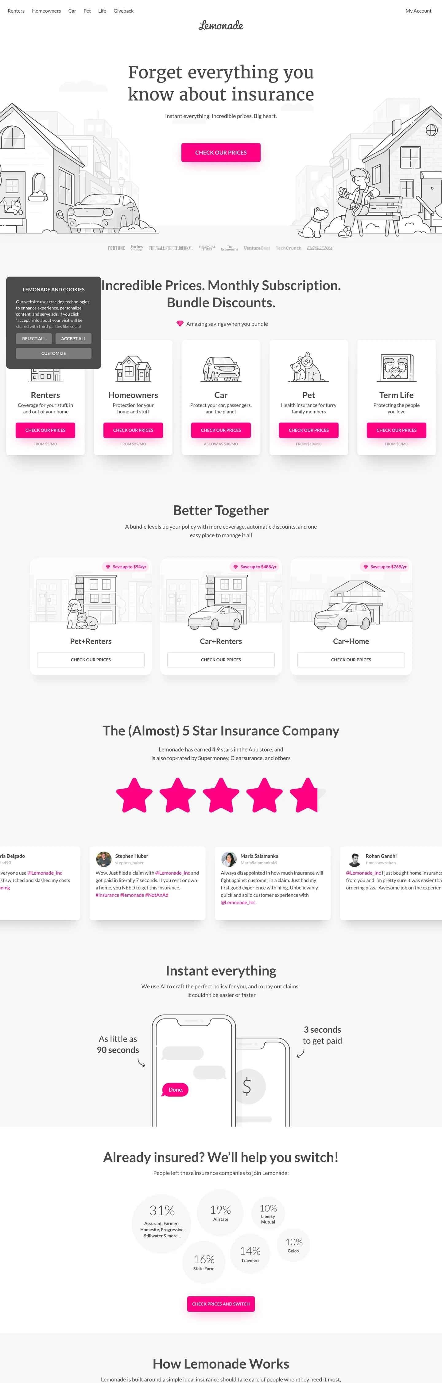
Lemonade's marketing site opens with a serif challenge: "Forget everything you know about insurance" at 55px Merriweather in weight 400, warm charcoal on white, with no gradient backdrop and no photography. The headline sits over a hand-drawn line-art illustration of a neighborhood — houses, cars, a dog — rendered in the same charcoal as the text. Below it, a single magenta pill: "CHECK OUR PRICES." This combination — editorial serif over naive illustration, pure magenta CTA, no decorative chrome — is unusual enough in the insurance category that it reads as a consumer-app brand masquerading as an insurance product. Where GEICO leads with a mascot and deep navy authority, and Progressive leads with lifestyle photography, Lemonade leads with a typographic statement.
The DESIGN.md file packages the system into 14 colors tokens anchored on hot magenta (#ff0083, wired as --primary-color, --text-link-color, --border-focus-color, and --pink-color), a warm charcoal ink (#4a4a4a at 758 total occurrences), and a pure white canvas. Typography runs two families: Merriweather (serif, proprietary-adjacent) for the hero h1 only, and Lato for every subsequent heading, body, button, and label. Twelve typography tokens capture the full range from the 55px display serif to 12px uppercase labels. Fifteen components cover the magenta pill CTA, the product-category card grid, the bundle comparison strip, the star-rating section, and the "How Lemonade Works" step strip.
Feed this spec to Claude or Cursor and it reproduces Lemonade's specific moves: Merriweather serif for the hero challenge copy, Lato for every functional tier, flat magenta pills with no gradient, charcoal-not-near-black ink, and the 50px full-pill radius that makes every CTA read as a soft, tappable button rather than a rectangular action. The one move worth studying is the typeface split: using a serif only at the hero h1 tier — where the brand makes its positioning statement — and then switching to a humanist sans for everything functional below it. The serif does not appear again after the h1.
What makes it distinct
5
- Serif-plus-sans splitMerriweather at 55px/weight 400 carries the hero h1; Lato runs every other surface; no other brand in the insurance directory pairs a serif headline with a san-serif functional layer
- Hot magenta voltage#ff0083 (--primary-color) appears 113 times as CTA fill, link text, focus ring, and shadow; the single chromatic brand moment on an otherwise grey-and-white canvas
- Pill CTAs at 50px radiusevery primary button is a fully-rounded pill; the 'CHECK OUR PRICES' buttons are the visual anchor of the product-category grid
- Hand-drawn illustration herothe above-fold hero is a line-art illustration of a neighborhood scene rather than photography, reinforcing the brand's 'built for the 21st century' narrative
- Charcoal #4a4a4a as inkthe system's text color is a warm medium-dark grey (not near-black), appearing 758 times across text and border roles
lemonade.com
Live at lemonade.com
A snapshot of the brand in production. Scroll the frame to see the whole page.
Colors
14 colors
Lemonade's system runs on #ff0083 as its primary voltage, used in 4 of 15 components. Type is set in Lato across 12 tokens from 12px to 55px, weights 400–700. Shape language is soft — components average 22px corner radius, with no sharp interactive edges.
Brand & Accent
Sparing, CTA-only voltage · 4
Surface
Page and card backgrounds · 2
Text
Headlines, body, captions · 4
Borders & Hairlines
Dividers, outlines, rules · 2
Other
Specialty colors · 2
Typography
12 type tokens
Set in Lato across 12 tokens, from 12px to 55px, weights 400–700. Shown in its own stack: where the font isn't installed, the fallback the file names stands in.
- display-serif55px · weight 400 · lh 71.5pxThe quick brown fox jumps over the lazy dog
- display-lg44px · weight 700 · lh 56pxThe quick brown fox jumps over the lazy dog
- display-md27px · weight 700 · lh 35.1pxThe quick brown fox jumps over the lazy dog
- heading-lg24px · weight 700 · lh 24pxThe quick brown fox jumps over the lazy dog
- heading-md20px · weight 700 · lh 26pxThe quick brown fox jumps over the lazy dog
- heading-sm18px · weight 400 · lh 28pxThe quick brown fox jumps over the lazy dog
- body-lg16px · weight 400 · lh 24pxThe quick brown fox jumps over the lazy dog
- body-md16px · weight 700 · lh 22pxThe quick brown fox jumps over the lazy dog
- body-sm14px · weight 400 · lh 21pxThe quick brown fox jumps over the lazy dog
- label-md14px · weight 700 · lh 18.2pxThe quick brown fox jumps over the lazy dog
- label-upper12px · weight 700 · lh 15.6pxThe quick brown fox jumps over the lazy dog
- caption14px · weight 400 · lh 18pxThe quick brown fox jumps over the lazy dog
Layout
Radii and spacing
7 corner radii and 8 spacing values. Shape language: soft.
Radii
- none0px
- sm5px
- md10px
- lg15px
- xl24px
- pill50px
- full50%
Spacing
- xxs2px
- xs4px
- sm8px
- md12px
- base15px
- lg20px
- xl24px
- 2xl32px
Components
15 components
Each rendered from its tokens (color, type, radius, padding) on Lemonade's own canvas.
- Button Primarybutton-primaryButton Primary
- Button Primary Hoverbutton-primary-hoverButton Primary Hover
- Button Secondarybutton-secondaryButton Secondary
- Top Navtop-navTop Nav
- Nav Linknav-linkNav Link
- Hero Headinghero-headingHero Heading
- Section Headingsection-headingSection Heading
- Body Paragraphbody-paragraphBody Paragraph
- Product Cardproduct-cardProduct Card
- Bundle Cardbundle-cardBundle Card
- Stat Badgestat-badgeStat Badge
- Star Ratingstar-ratingStar Rating
- Type here…text-inputText Input
- FooterfooterFooter
- Testimonial Cardtestimonial-cardTestimonial Card
In use
The system, in use
Lemonade's tokens on the kind of product it builds.
Build something people actually use.
A short paragraph of marketing copy that previews how the brand's display tier and body tier read together. Two sentences is usually enough.
- · 1 project
- · Community support
- · 10k req/mo
- · 10 projects
- · Priority support
- · 1M req/mo
- · Custom domains
- · Unlimited
- · SLA
- · Audit log
- · SSO
FAQ
Lemonade design system FAQ
Common questions about Lemonade's tokens, components, and how to use this DESIGN.md in your project.
Read next
Related reading
Specs, directories, and component libraries that pair with this design system.
- Browse all design systemsThe full directory of DESIGN.md files on shadcn.io, with live mockups for each.shadcn.io
- Lemonade — official siteLemonade's public marketing site — the source of truth for the live tokens captured in this file.lemonade.com (opens in a new tab)
- The DESIGN.md specificationGoogle Labs' open spec for machine-readable design system files — the format this page is built on.github.com (opens in a new tab)
Use it
Use Lemonade in your project
One machine-readable file. Drop it into Claude, Cursor, or any AI tool that reads DESIGN.md.
Download the DESIGN.md
One machine-readable file: every color, type, radius, spacing, and component token of Lemonade.
Feed it to your AI tool
Drop it into Claude, Cursor, or GitHub Copilot. The agent writes React components and Tailwind classes that match Lemonade's visual language.
Reference the tokens directly
Or paste the values into your Tailwind config, CSS variables, or component library: every color, size and radius is a quoted, ready-to-copy value.
Read the full DESIGN.md: overview, rationale, do’s and don’ts
Overview
Lemonade's marketing site opens with a typographic move that no other insurance brand in the category attempts. Serif-as-disruption: the hero h1 — "Forget everything you know about insurance" — runs in Merriweather serif at 55px and weight 400, warm charcoal text on white. Below it, Lato takes over every functional surface. The serif does not reappear anywhere beneath the hero fold. Unlike GEICO, which uses a mascot to carry personality and stays in a single custom sans; or Progressive, which anchors on lifestyle photography with a proprietary condensed sans; Lemonade puts the brand's positioning statement in a typeface that signals editorial authority, then drops immediately into a sans-serif functional system. The serif is not decoration — it is the challenge itself.
The single chromatic brand voltage is hot magenta ({colors.primary} — #ff0083, wired as --primary-color, --text-link-color, --border-focus-color). At 113 total occurrences, it is everywhere interactive: CTA fills, link text, focus rings, star-rating icons, shadow accents on the mobile illustration. Every "CHECK OUR PRICES" pill button in the product-category grid renders the same flat magenta with no gradient, no hover animation visible in the capture. The background is white; the ink is warm charcoal {colors.ink} (#4a4a4a) rather than near-black — at oklch lightness 0.41, it sits in a warmer register than the deep near-black GEICO uses, making the overall page feel lighter despite identical canvas values.
The hero illustration — hand-drawn line art of a neighborhood — is the second unusual design move. It renders in the same {colors.ink} charcoal as the headline text, making the illustration feel typographically consistent with the prose rather than decorative. Below the illustration is the page's only photography: real-person testimonial avatars and lifestyle photos in the "Why Progressive" grid. The rest of the page alternates between white product cards with 10px corner radius and the same magenta pill CTAs repeated at each category.
Key Characteristics:
- Hot magenta
{colors.primary}(#ff0083) is the sole chromatic brand voltage — 113 occurrences, crossing every interactive role simultaneously (fill, text, border, shadow). - Merriweather serif at 55px/400 appears once — in the hero h1 — and nowhere else; Lato runs every subsequent tier.
- Warm charcoal
{colors.ink}(#4a4a4a) is the dominant text color (758 occurrences), sitting lighter than near-black and warmer than neutral grey. - Full-pill 50px radius on every primary CTA — the "CHECK OUR PRICES" buttons are the visual signature of the product-category grid.
- Hand-drawn line-art hero illustration in charcoal — the only non-photographic illustration in the above-fold section.
- Pure white canvas throughout; no tinted or gradient backgrounds until the cookie consent dark bar.
Colors
Brand
- Primary Magenta (
{colors.primary}— #ff0083): frequency 113. Used as text (47), background (13), border (45), shadow (8). Wired as--primary-color,--text-link-color,--border-focus-color,--pink-color,--background-pink-color. The system's single chromatic voltage — every interactive surface renders this value. - Primary Dark (
{colors.primary-dark}— #dc0073): frequency 0 rendered but wired as--dark-pink-color,--background-pink-hover-color,--dark-primary-color. The hover state for primary buttons and links. - Primary Pressed (
{colors.primary-pressed}— #b40060): frequency 0 rendered but wired as--background-pink-pressed-color,--darker-primary-color,--darker-pink-color,--text-link-pressed-color. The pressed/active state for CTAs. - Primary Light (
{colors.primary-light}— #ffe4f2): frequency 3 as background. Used for tinted chip and badge fills — the pale-pink reading of the magenta system.
Structural
- Ink (
{colors.ink}— #4a4a4a): frequency 758. Used as text (379), border (372), gradient (6), background (1). Wired as--text-primary-color,--matterhorn-color,--border-dark-color,--night-color,--gray-night-color. The page's dominant voice — warm, medium-dark charcoal. - Ink Muted (
{colors.ink-muted}— #7b7b7b): frequency 3 as background. Wired as--text-secondary-color,--boulder-color,--divider-gray-color. Secondary text and divider tones. - Ink Disabled (
{colors.ink-disabled}— #b7b7b7): frequency 193. Used as text (97), border (96). Wired as--text-disabled-color,--metal-color,--inverted-text-secondary-color. Placeholder text and disabled-state UI. - Ink Secondary (
{colors.ink-secondary}— #a9a9a9): frequency 10. Used as text (5), border (5). Wired as--dark-gray-color. A lighter mid-grey for tertiary metadata. - Canvas (
{colors.canvas}— #ffffff): frequency 91. Used as background (41), text (29), border (20), gradient (1). Wired as--background-primary-color,--white-color, and many others. The page floor for every content section.
Hairline
- Hairline (
{colors.hairline}— #ececec): frequency 3 as border. Wired as--border-primary-color,--background-quaternary-color, and many related neutral names. Card borders, dividers, and section separators. - Hairline Dark (
{colors.hairline-dark}— #dadada): frequency 3 as border. Wired as--background-disabled-color,--border-hover-color. Hover-state borders and disabled input fields.
Semantic
- Surface Dark (
{colors.surface-dark}— #161616): frequency 3 as background. Wired as--darkest-night-color,--nero-color. Appears in the cookie-consent dark bar only. - Shadow (
{colors.shadow}— #000000): frequency 51. Used as shadow (49), text (1), border (1). Wired as--black-color. Box shadow ink throughout card and mobile-illustration treatments. - Positive (
{colors.positive}— #2ad5bd): frequency 0 rendered but wired as--background-positive-color,--text-positive-color,--green-color. Declared for success states and positive indicators in the product flow.
Typography
Font Families
The system runs two voices:
- Merriweather (serif) — hero h1 only ("Forget everything you know about insurance" at 55px / weight 400). Not used anywhere else in the captured marketing surface. CSS declares it as an alt font via
--alt-font-family: 'Merriweather', Georgia, serif. - Lato (humanist sans) — every other surface. Primary font via
--main-font-family: 'Lato', 'Helvetica Neue', Arial, sans-serif. Default weight 400, bold weight 700.
The split is explicit: the serif makes the brand's positioning statement, then hands off entirely to the sans for every functional surface that follows.
Hierarchy
| Token | Size | Weight | Line Height | Use |
|---|---|---|---|---|
{typography.display-serif} | 55px | 400 | 71.5px | Hero h1 (Merriweather serif — brand challenge) |
{typography.display-lg} | 44px | 700 | 56px | Section h2 ("Incredible Prices. Monthly Subscription.") |
{typography.display-md} | 27px | 700 | 35.1px | Sub-section display numbers and product titles |
{typography.heading-lg} | 24px | 700 | 24px | h4 product category titles |
{typography.heading-md} | 20px | 700 | 26px | Smaller section sub-heads |
{typography.heading-sm} | 18px | 400 | 28px | Feature description paragraphs |
{typography.body-lg} | 16px | 400 | 24px | Default body prose and nav links |
{typography.body-md} | 16px | 700 | 22px | Bold body labels and inline emphasis |
{typography.body-sm} | 14px | 400 | 21px | Card body copy, metadata rows |
{typography.label-md} | 14px | 700 | 18.2px | Button labels (uppercase treatment) |
{typography.label-upper} | 12px | 700 | 15.6px | Small-caps category chips |
{typography.caption} | 14px | 400 | 18px | Fine print, h5 metadata |
Principles
Merriweather at weight 400 reads as editorial authority — the lowercase challenge headline feels like a print ad, not a SaaS hero. Lato at weight 700 handles the h2 tier that appears immediately below, and from there the system works entirely in Lato. Weight 700 Lato headlines are common; the Merriweather/Lato handoff is the distinctive pattern. Label buttons use 14px/700 in uppercase — the only uppercase treatment in the system.
Substitutes
Merriweather is open-source (Google Fonts). Playfair Display or PT Serif at the same size and weight transfer cleanly. For Lato, Inter or DM Sans at weights 400 and 700 work at every tier in the system.
Layout
Spacing System
- Base unit: 20px (33 occurrences) and 15px (27 occurrences) — a 5px-step scale.
- Tokens:
{spacing.xxs}2px ·{spacing.xs}4px ·{spacing.sm}8px ·{spacing.md}12px ·{spacing.base}15px ·{spacing.lg}20px ·{spacing.xl}24px ·{spacing.2xl}32px. - Card internal padding: 20px across product cards and bundle comparison tiles.
- Section rhythm: ~40px vertical separation between major sections; the product-category grid and bundle strip use tighter 15px internal gaps.
Grid & Container
- Hero: centered single column, illustration spans the full content width behind the headline; CTA pill centered beneath.
- Product category grid: 5-column row (Renters, Homeowners, Car, Pet, Term Life) with icon above, category title, description, and magenta pill CTA at bottom of each card.
- Bundle comparison strip: 3-column row (Pet+Renters, Car+Renters, Car+Home) with savings badge in magenta.
- Testimonial row: 4 avatar + quote cards in a horizontal scroll; star rating section uses large magenta stars above h3 text.
- "How Lemonade Works" strip: 3-step horizontal flow with phone illustrations.
Rhythm
The page is evenly spaced and repetitive by design — the 5-column product grid, the 3-column bundle strip, and the 4-column testimonial row all share the same 10px card radius and white card surface. This grid repetition enforces trust at scale: every product category gets the same weight, same card treatment, same magenta CTA.
Elevation
The system uses light shadow + hairline borders for elevation. The shadow token (#000000) appears 51 times, predominantly as box-shadow on the mobile phone illustrations in the "Instant everything" section. Card elevation across the product and bundle grids comes from 1px {colors.hairline} borders rather than from shadows — the same pattern as Cloudflare and GEICO. The magenta CTA buttons carry a 8px shadow in the brand primary magenta at some sizes (8 shadow occurrences in the extraction), giving them a subtle glow effect against the white canvas.
Shapes
The radius scale is bimodal: a 10px default for cards and a full-pill 50px for all CTAs.
{rounded.none}0px — hero text blocks, footer dividers, section separators.{rounded.sm}5px (18 occurrences) — small chips, badge fills, icon frames.{rounded.md}10px (23 occurrences, dominant) — every product card, bundle card, testimonial card, and the main illustrated tiles.{rounded.lg}15px (3 occurrences) — larger promotional tiles.{rounded.xl}24px (3 occurrences) — large surface cards in the product flow.{rounded.pill}50px (3 occurrences) — primary CTA buttons; the signature "CHECK OUR PRICES" pill shape.{rounded.full}50% (18 occurrences) — circular avatar images, round icon containers.
There is no mid-range 20–30px radius tier. The system jumps from 10px (cards) directly to 50px (CTAs), with no intermediate option. This is the same binary logic as Cloudflare's small-step-plus-pill scale, applied at different values.
Components
button-primary — Hot magenta {colors.primary} fill, white text at {typography.label-md}, 50px pill radius, 12×24px padding, 48px height. "CHECK OUR PRICES" is the canonical instance, appearing once per product category card and in the hero.
button-primary-hover — Background shifts to {colors.primary-dark} (#dc0073) — a slightly deeper magenta. Same pill radius and padding.
button-secondary — Transparent fill, magenta {colors.primary} text and 1px magenta border, 50px pill, 10×20px padding, 44px height. Used for "CHECK PRICES AND SWITCH" in the competitor-switch section.
top-nav — White canvas, ink text, Lato body-lg, no border, 56px height. Lemonade wordmark centered (script logo), product links left, "My Account" right.
nav-link — Transparent fill, ink {colors.ink} text at {typography.body-lg}, 15px horizontal padding. Nav links render in charcoal, not magenta — links become magenta only in body prose and CTAs.
hero-heading — Ink charcoal text at {typography.display-serif} (55px Merriweather/400). Sits above the line-art neighborhood illustration in the hero column.
section-heading — Ink charcoal at {typography.display-lg} (44px Lato/700) for the below-fold section h2s ("Incredible Prices. Monthly Subscription. Bundle Discounts.").
body-paragraph — Ink charcoal at {typography.body-lg} (16px Lato/400). Default running text.
product-card — White canvas, 1px hairline border, {rounded.md} 10px radius, 20px padding. Contains icon, category title, description, and the magenta pill CTA beneath.
bundle-card — White canvas, {rounded.md} 10px radius, 15px padding. Used in the Pet+Renters, Car+Renters, Car+Home bundle comparison strip. A magenta savings badge floats at the top right corner.
stat-badge — Light magenta {colors.primary-light} (#ffe4f2) fill, magenta {colors.primary} text at {typography.label-md}. Used as the "Save up to $XXX/yr" tag overlaid on bundle cards.
star-rating — Magenta {colors.primary} used for the five-star icons in the "(Almost) 5 Star Insurance Company" section. Display-md Lato text above.
text-input — White canvas, ink text, 1px hairline border, {rounded.md} 10px radius, 12×15px padding, 48px height. Focus border shifts to 2px {colors.primary} magenta.
footer — White canvas, ink-muted text at {typography.body-sm}, multi-column link layout with Lemonade wordmark above, 24×20px padding.
testimonial-card — White canvas, 1px hairline border, {rounded.md} 10px radius, 20px padding. Holds avatar, name, review text, magenta @username link, social platform indicator.
Do's and Don'ts
Do reserve Merriweather for the hero h1 challenge copy only. The typeface switch is the brand's positioning statement — applying Merriweather to section headings or sub-copy would undermine the handoff to Lato and make the serif feel like a default rather than a deliberate moment.
Do use the flat magenta fill on primary CTAs with no gradient. The system's CTA discipline is flat color plus pill radius — adding a gradient would shift the visual register from DTC-app toward traditional fintech, and that is precisely what "forget everything you know about insurance" is positioned against.
Do treat {colors.ink} (#4a4a4a) as the text default, not a dark-mode variant or a muted secondary. At 758 total occurrences it is the dominant ink color; replacing it with a near-black measurably shifts the warmth of the page.
Do apply the {rounded.md} 10px radius uniformly across product cards, bundle tiles, and testimonial cards. The visual consistency of the card grid at 10px is what makes the product offerings feel equivalent in weight.
Don't use {colors.ink-disabled} (#b7b7b7) for anything other than disabled states and placeholder text — it has 97 text occurrences and 96 border occurrences in the captured page, all in disabled/placeholder contexts. Applying it to secondary running text or section labels would read as broken state rather than intentional muting.
Don't introduce a shadow tier on the primary CTA buttons. The 8 shadow occurrences on the magenta primary use the brand magenta itself as the shadow ink — the pink glow effect. Replacing this with neutral black shadows would shift the CTA from brand-owned to commodity fintech.
Don't use {colors.primary} (#ff0083) for heading or display text. The magenta is reserved exclusively for interactive surfaces — CTAs, links, focus rings, star ratings. Applying it to a section heading would collapse the distinction between brand voltage and content hierarchy.
Don't break the 5-column product grid to 4 or 6 columns. The product categories — Renters, Homeowners, Car, Pet, Term Life — are five, and the grid is designed for five equal columns. Uneven columns introduce a visual hierarchy among insurance products where none should exist.
Known Gaps
- Hover and focus animations: the magenta hover state (#dc0073) and pressed state (#b40060) are declared as CSS variables but not visible in the static capture. The focus ring uses 2px magenta outline which is documented from the CSS variable mapping, not from a rendered state.
- Dark mode: the system is light-only on the captured marketing surface. The CSS declares several dark-mode variables (--inverted-background-primary-color pointing to a very dark near-black, --darkest-night-color pointing to a deep charcoal) suggesting an inverted canvas exists in-product, but it does not appear in the marketing page.
- Form quote flow: Lemonade's inline quote widget (clicking "CHECK OUR PRICES" opens a guided form) is not captured; the multi-step form component set (radio selections, ZIP input, progress indicator) is not represented.
- Positive and negative semantic colors: the
{colors.positive}(#2ad5bd) and the extracted negative-state red (wired as --background-negative-color, --text-negative-color) are declared and used in the app/claims flow but do not appear in the marketing capture. - App in-product surfaces: Lemonade's mobile app and web dashboard use a richer token system; the CSS variables expose ~200 named color values for in-product states (pending, positive, negative, disabled tiers) that are not surfaced on the marketing page.
- Signature typeface: Dancing Script is declared via
--signature-font-familyfor the digital signature component in the claims flow but does not appear in the marketing capture.
Banking & Payments
More systems like this
More DESIGN.md files in Banking & Payments.
Pricing
Build it with Pro
The DESIGN.md files are free. Pro adds 6,000+ blocks, premium templates and the MCP server, so your AI editor builds in your system for you.
4.9/5 out of 5 · 150+ reviewsfrom 150+ founders and developers.
Billing
Billed once a year in USD. Cancel anytime.
- How many people can use the license.
- Client work, SaaS products and anything you charge for.
- Production-ready React sections: hero, pricing, features, dashboards and more.
- Complete multi-page sites you can ship as they are.
- React icons from every major library, installable with one command.
- Presets that restyle every block, in light and dark.
- Lets your AI editor search, preview and install blocks for you.
- Priority requests are answered first.
Individual
For personal projects & open source
$32instead of $49/mo
$389 billed yearly
- Seats: 1 seat
- Commercial use: Personal & open source only
- Pro blocks: 6,000+ blocks
- Templates: All 14 templates
- React icons: 294k+ icons
- Themes: All 59 themes
- MCP server: Basic usage
- Support: Standard
Team
Most popularFor freelancers, agencies & startups
$66instead of $99/mo
$789 billed yearly · ≈ $13/dev/mo
- Seats: Up to 5 seats
- Commercial use: Included
- Pro blocks: 6,000+ blocks
- Templates: All 14 templates
- React icons: 294k+ icons
- Themes: All 59 themes
- MCP server: High usage
- Support: Priority
Organization
For companies with larger teams
$132instead of $199/mo
$1,589 billed yearly
- Seats: Unlimited seats
- Commercial use: Included
- Pro blocks: 6,000+ blocks
- Templates: All 14 templates
- React icons: 294k+ icons
- Themes: All 59 themes
- MCP server: Unlimited usage
- Support: Priority
Billed once a year in USD. Cancel anytime.
Individual
For personal projects & open source
$32instead of $49/mo
$389 billed yearly
- How many people can use the license.Seats: 1 seat
- Client work, SaaS products and anything you charge for.Commercial use: Personal & open source only
- Production-ready React sections: hero, pricing, features, dashboards and more.Pro blocks: 6,000+ blocks
- Complete multi-page sites you can ship as they are.Templates: All 14 templates
- React icons from every major library, installable with one command.React icons: 294k+ icons
- Presets that restyle every block, in light and dark.Themes: All 59 themes
- Lets your AI editor search, preview and install blocks for you.MCP server: Basic usage
- Priority requests are answered first.Support: Standard
Team
Most popularFor freelancers, agencies & startups
$66instead of $99/mo
$789 billed yearly · ≈ $13/dev/mo
Everything in Individual, plus
- How many people can use the license.Seats: Up to 5 seats
- Client work, SaaS products and anything you charge for.Commercial use: Included
- Lets your AI editor search, preview and install blocks for you.MCP server: High usage
- Priority requests are answered first.Support: Priority
Organization
For companies with larger teams
$132instead of $199/mo
$1,589 billed yearly
Everything in Team, plus
- How many people can use the license.Seats: Unlimited seats
- Lets your AI editor search, preview and install blocks for you.MCP server: Unlimited usage
- Secure checkout via Stripe
- Code lives in your repo
- Keep what you've shipped if you cancel
- License terms
Your system, built for you
Every block, template and icon, installed by your AI agent in your design system. The DESIGN.md files stay free.