Lemon Squeezy Design System
Lemon Squeezy's marketing-site design system as a DESIGN.md file — full-bleed LS Purple hero canvas, Circular Pro Book 80px display, Inter body, 17 colors tokens, 11 typography tiers, 20 components, tuned for React, Next.js, and AI coding tools.
Add shadcn.io to your AI agent. · Pro It installs blocks, icons and templates in your design system from a prompt, with Pro.
Set up MCP- Primary
- #5423e7
- Typeface
- Inter
- Shape
- Mixed
- Base radius
- 8px
- Colors
- 17
- Type tokens
- 11
- Components
- 20
- Spacing values
- 10
About
About Lemon Squeezy DESIGN.md
Curated by Dov Azencot · Updated May 18, 2026 · Source lemonsqueezy.com (opens in a new tab)
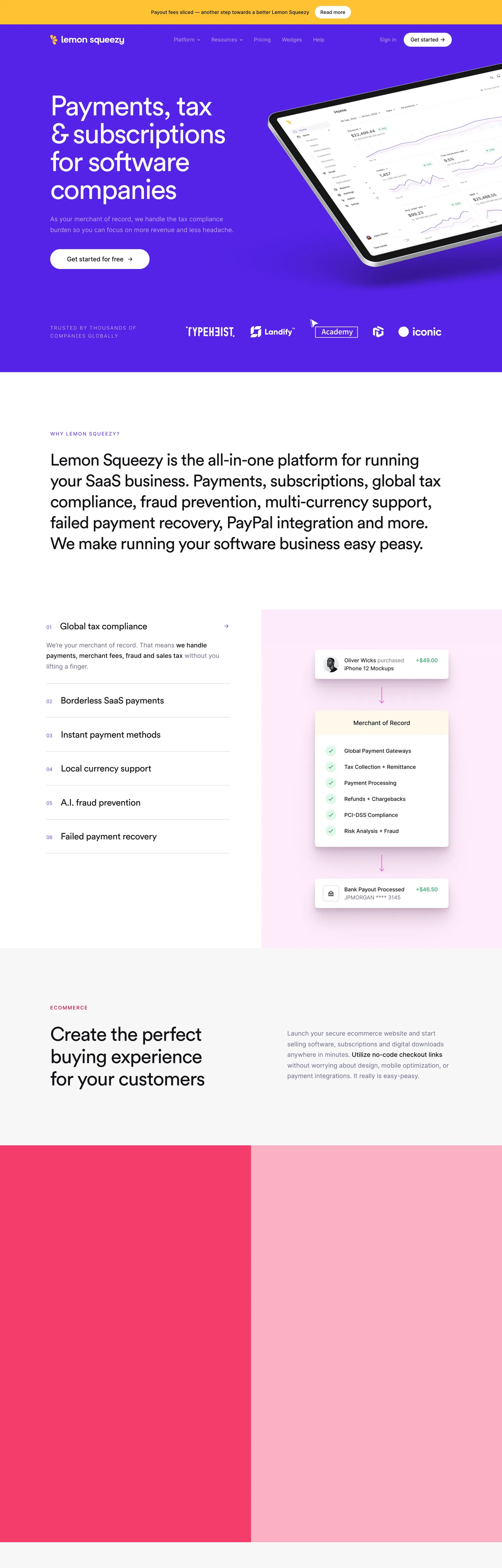
Lemon Squeezy's marketing site does what almost no other payments platform attempts: it gives the brand voltage the entire above-fold hero canvas. The hero is a full-bleed slab of LS Purple (the indigo-violet wired into the CSS as both `--blue` and `--ls-purple`), carrying an 80px Circular Pro Book display headline in pure white — "Payments, tax & subscriptions for software companies" — with a white pill CTA centered beneath and a tilted product-dashboard tablet floating in the upper-right corner. Where Stripe leans on an indigo gradient mesh and Brex sits on austere navy with white-on-black type, Lemon Squeezy paints the page with the brand color directly and trusts a single sentence to do the work. The hero is bookended by a flush-top sunshine-yellow announcement bar and, below the fold, a hot-pink ecommerce split panel — the system runs on three saturated temperatures, not one.
The DESIGN.md file packages the marketing surface into a machine-readable spec for React and AI coding tools. Inside: 17 colors tokens drawn from the 85 CSS custom properties Lemon Squeezy exposes on `:root`, organized into a brand-voltage tier (LS Purple plus the orchid plum, the orange-yellow, and the hot pink), a structural tier of near-black ink, muted gray, and pure white, and an accent family of color-100 / 200 / 500 / 700 ladders carrying the lemon-mascot palette. Eleven typography tokens split Circular Pro Book in four display tiers (80px hero, 56px section, 38px and 26px feature h3) from Inter in six body and label tiers, with a 14px / weight 500 / 2px-letter-spaced uppercase eyebrow as its own token. Twenty components cover the hero pill CTA, the announcement-bar inline pill, the white-pill secondary, the hairline-bordered feature list row, the pink ecommerce split panel, and the dashboard tablet card.
Feed this file to Claude, Cursor, or Copilot and the agent reproduces Lemon Squeezy's specific dialect: full-bleed violet canvas hero, white pill primary, yellow announcement strip, hot-pink demo panel below the fold, Circular Pro display at weight 400 (never bold), Inter body at 18px / weight 400. Reference the tokens directly in Tailwind config or as CSS variables — every hex, font name, radius, and spacing value is a quoted scalar you can paste straight in. The single move worth borrowing if you operate in a serious-money category is the willingness to lead with a warm, saturated brand color where the convention is austere navy or charcoal; the system's central wager is that payment infrastructure can read approachable without losing technical authority.
What makes it distinct
5
- Purple voltage as canvasLS Purple fills the entire above-fold hero rather than appearing as a held-in-reserve CTA accent, inverting the payments-category convention
- Two-typeface dialectCircular Pro Book at 26-80px for h1/h2/h3 display, Inter at 14-18px for body and uppercase 2px-tracked eyebrow labels
- Sunshine yellow as announcement chromea single warm yellow bar sits flush at the top with an inline 'Read more' pill, giving the system its only non-violet brand voltage above the fold
- Hot-pink split panel below the folda 50/50 Pink 700 plus Red 200 block carries the ecommerce-checkout demo, the second saturated chromatic moment in the page
- Animal- and fruit-coded CSS variables85 :root custom properties include plum, orchid, blue-violet, fox-tone orange, and sea-sponge pink, the same vocabulary the brand applies to its lemon mascot family
lemonsqueezy.com
Live at lemonsqueezy.com
A snapshot of the brand in production. Scroll the frame to see the whole page.
Colors
17 colors
Lemon Squeezy's system runs on #5423e7 as its primary voltage, used in 4 of 20 components. Type is set in Inter across 11 tokens from 14px to 80px, weights 400–500. Shape language is mixed across 20 components, blending pills, soft rounds, and squarer corners.
Brand & Accent
Sparing, CTA-only voltage · 7
Surface
Page and card backgrounds · 3
Text
Headlines, body, captions · 3
Borders & Hairlines
Dividers, outlines, rules · 1
Other
Specialty colors · 3
Typography
11 type tokens
Set in Inter across 11 tokens, from 14px to 80px, weights 400–500. Shown in its own stack: where the font isn't installed, the fallback the file names stands in.
- display-xl80px · weight 400 · lh 80px · tracking -3.2pxThe quick brown fox jumps over the lazy dog
- display-lg56px · weight 400 · lh 63.84px · tracking -1.68pxThe quick brown fox jumps over the lazy dog
- display-md38.4px · weight 400 · lh 46.08px · tracking -0.768pxThe quick brown fox jumps over the lazy dog
- display-sm26px · weight 400 · lh 31.72px · tracking -0.52pxThe quick brown fox jumps over the lazy dog
- body-lg18px · weight 400 · lh 30.6pxThe quick brown fox jumps over the lazy dog
- body-lg-strong18px · weight 500 · lh 30.6pxThe quick brown fox jumps over the lazy dog
- body-md16px · weight 400 · lh 25.6pxThe quick brown fox jumps over the lazy dog
- body-sm14px · weight 400 · lh 22.4pxThe quick brown fox jumps over the lazy dog
- label-uppercase14px · weight 500 · lh 22.4px · tracking 2pxThe quick brown fox jumps over the lazy dog
- button-md16px · weight 500 · lh 22.4px · tracking -0.16pxThe quick brown fox jumps over the lazy dog
- blockquote18px · weight 400 · lh 32.4pxThe quick brown fox jumps over the lazy dog
Layout
Radii and spacing
7 corner radii and 10 spacing values. Shape language: mixed.
Radii
- none0px
- md8px
- lg20px
- xl32px
- 2xl40px
- 3xl48px
- full9999px
Spacing
- xs6px
- sm8px
- md12px
- base16px
- lg24px
- xl32px
- 2xl40px
- 3xl56px
- 4xl120px
- 5xl160px
Components
20 components
Each rendered from its tokens (color, type, radius, padding) on Lemon Squeezy's own canvas.
- Announcement Barannouncement-barAnnouncement Bar
- Announcement Pillannouncement-pillAnnouncement Pill
- Hero Sectionhero-sectionHero Section
- Hero Headinghero-headingHero Heading
- Hero Eyebrowhero-eyebrowHero Eyebrow
- Button Primarybutton-primaryButton Primary
- Button Primary On Lightbutton-primary-on-lightButton Primary On Light
- Button Secondarybutton-secondaryButton Secondary
- Top Navtop-navTop Nav
- Nav Linknav-linkNav Link
- Section Headingsection-headingSection Heading
- Section Eyebrowsection-eyebrowSection Eyebrow
- Body Paragraphbody-paragraphBody Paragraph
- Feature Rowfeature-rowFeature Row
- Card Pinkcard-pinkCard Pink
- Card Pink Softcard-pink-softCard Pink Soft
- Checkout Cardcheckout-cardCheckout Card
- Dashboard Tabletdashboard-tabletDashboard Tablet
- BlockquoteblockquoteBlockquote
- Type here…text-inputText Input
In use
The system, in use
Lemon Squeezy's tokens on the kind of product it builds.
Build something people actually use.
A short paragraph of marketing copy that previews how the brand's display tier and body tier read together. Two sentences is usually enough.
FAQ
Lemon Squeezy design system FAQ
Common questions about Lemon Squeezy's tokens, components, and how to use this DESIGN.md in your project.
Read next
Related reading
Specs, directories, and component libraries that pair with this design system.
- Browse all design systemsThe full directory of DESIGN.md files on shadcn.io, with live mockups for each.shadcn.io
- Lemon Squeezy — official siteLemon Squeezy's public marketing site — the source of truth for the live tokens captured in this file.lemonsqueezy.com (opens in a new tab)
- The DESIGN.md specificationGoogle Labs' open spec for machine-readable design system files — the format this page is built on.github.com (opens in a new tab)
Use it
Use Lemon Squeezy in your project
One machine-readable file. Drop it into Claude, Cursor, or any AI tool that reads DESIGN.md.
Download the DESIGN.md
One machine-readable file: every color, type, radius, spacing, and component token of Lemon Squeezy.
Feed it to your AI tool
Drop it into Claude, Cursor, or GitHub Copilot. The agent writes React components and Tailwind classes that match Lemon Squeezy's visual language.
Reference the tokens directly
Or paste the values into your Tailwind config, CSS variables, or component library: every color, size and radius is a quoted, ready-to-copy value.
Read the full DESIGN.md: overview, rationale, do’s and don’ts
Overview
Lemon Squeezy inverts the payments-category convention. Purple voltage as canvas. Where Stripe leans on an indigo gradient mesh and Brex sits on austere navy with white-on-black type, Lemon Squeezy paints the entire above-fold hero with LS Purple ({colors.primary}) — a saturated indigo-violet wired into the CSS as --blue, --purple-600, and --ls-purple. The 80px Circular Pro Book hero headline reads pure white on the purple slab, a white pill CTA sits centered beneath, and a tilted product-dashboard tablet floats in the upper-right corner. The hero is not a header band sitting on a separate body canvas; it IS the page's first surface, full-bleed and unbroken from the announcement bar to the trust-strip beneath.
The system runs on three saturated temperatures rather than one held-in-reserve accent. Above the hero a flush sunshine-yellow announcement bar ({colors.secondary}) carries a short product update with an inline white pill labelled "Read more"; below the fold a hot-pink split panel ({colors.tertiary} paired with {colors.accent-pink-soft}) carries the ecommerce-checkout demo. Violet, yellow, and pink each get their own structural job — hero / announcement / demo — and the typographic discipline (Circular Pro at weight 400, never bold) keeps the multi-voltage stack from reading as chaos. The brand is one of the few payments platforms willing to use candy-bright color on a serious-money product surface, and the wager is the central design decision.
Typography splits into two voices. Circular Pro Book at weight 400 carries display only — the 80px hero h1 with -3.2px letter-spacing, the 56px section h2 at -1.68px tracking, and 38px / 26px feature h3 tiers. Inter at weights 400 and 500 carries every body and label role, plus the 14px / weight 500 / 2px-letter-spaced uppercase eyebrow above each section. There is no bold display in the system; the 80px headline reads loud through size and color contrast rather than through weight.
Key Characteristics:
- Full-bleed LS Purple (
{colors.primary}— #5423e7) hero canvas with white 80px Circular Pro display — the brand's largest single chromatic surface and the central design move. - Sunshine yellow (
{colors.secondary}— #ffc233) announcement bar flush at the top of every page, with an inline white pill "Read more" CTA. - Hot pink (
{colors.tertiary}— #db0bb9) ecommerce split panel below the fold, paired with a soft pink ({colors.accent-pink-soft}— #fbb1c4) wash on the right column. - Two-typeface dialect: Circular Pro Book for display (80 / 56 / 38 / 26px, all weight 400), Inter for body and labels (14-18px, weights 400 / 500).
- Weight 400 across every display tier — no bold moment. Confidence comes from size and saturated color, not from typographic muscle.
- Generous pill geometry on every primary action — the white hero CTA rounds at 40px (
{rounded.2xl}), the announcement-bar pill at full-pill ({rounded.full}), bypassing the 12-16px standard of dev-tools brands. - Near-true-black ink (
{colors.ink}— #121217) on body copy — wired as--black-2and--dark-mode-bg-lighter, never pure #000000 except as shadow ink. - 85 :root CSS variables expose a 100 / 200 / 500 / 700 ladder for every accent (plum, orange, blue, green, pink, yellow), letting badges and chips self-color without compromising the violet voltage.
Colors
The palette divides into a brand-voltage tier (violet, yellow, pink, plus a small set of supporting saturated colors), a structural tier of near-black ink, muted gray, and pure white, and an accent family of 100 / 200 / 500 / 700 ladders inherited from the larger product chrome.
Brand
- LS Purple (
{colors.primary}— #5423e7): frequency 5. Used as text (0), bg (5), border (0). The hero canvas voltage — fills the entire above-fold block, the top-nav surface, and any inline highlight beneath. Wired in CSS as--blue,--purple-600, and--ls-purple. The single largest chromatic surface on the page; raw count is low because one giant fill counts as five elements, not five hundred. - Sunshine Yellow (
{colors.secondary}— #ffc233): frequency 3. Used as text (1), bg (1), border (1). The announcement-bar fill and the inline accent badges. Wired as--ls-color-yellowand--yellow-500— two variable names pointing at the same hex tell you the brand treats yellow as part of the core vocabulary rather than as a utility tint. - Hot Pink (
{colors.tertiary}— #db0bb9): frequency 10. Used as text (5), bg (0), border (5). The lower ecommerce split-panel left column, plus inline highlight chips below the fold. Wired as--pink-700. - Orchid Plum (
{colors.accent-plum}— #cf75ff): frequency 11. Used as text (3), bg (5), border (3). The brightest plum tint in the system, wired as--plum-500and--orchid. Appears on feature-illustration backgrounds and on the lemon-mascot accent regions. - Vivid Orange (
{colors.accent-orange}— #ff571f): frequency 4. Used as text (0), bg (4), border (0). The orange tone in the lemon-mascot art direction, scoped to product-illustration callouts. Wired as--orange-600. - Soft Pink (
{colors.accent-pink-soft}— #fbb1c4): frequency 1. Used as text (0), bg (1), border (0). The right column of the ecommerce split panel — a wash of warm rose against the saturated{colors.tertiary}block on the left. Wired as--red-200.
Supporting saturated
- Link Blue (
{colors.accent-blue}— #0075ad): frequency 40. Used as text (20), bg (0), border (20). The structural blue used in inline links and small status indicators. Wired as--blue-700. - Trust Green (
{colors.accent-green}— #1e874c): frequency 40. Used as text (20), bg (0), border (20). The checkmark color in the merchant-of-record feature list — wired as--green-700, scoped to confirmation and trust signals. - Alert Red (
{colors.accent-red}— #d50b3e): frequency 14. Used as text (7), bg (0), border (7). The error and warning tone, wired as--red-700. Used sparingly on inline status callouts.
Surface and ink
- Ink (
{colors.ink}— #121217): frequency 750 — the dominant text color across the entire page. Display headlines below the fold, body paragraphs in dark contexts, nav labels. Wired as--black-2and--dark-mode-bg-lighter. Never pure #000000. - Ink Muted (
{colors.ink-muted}— #6c6c89): frequency 78. Used as text (39), border (39). The default body paragraph color in the post-hero sections and the bullet-point color across feature lists. Wired as--gray-500and--bullet-point-color. - Ink Soft (
{colors.ink-soft}— #333333): frequency 4. The legal-copy dark gray used in footer fine print. - Canvas (
{colors.canvas}— #ffffff): frequency 319 — the page floor below the fold, the white pill CTA fill, the dashboard tablet background. Wired as--white-900,--grey-50,--light-white, and--button-primary-light. Pure white, no cream tint. - Surface 1 (
{colors.surface-1}— #f7f7f8): the off-white card surface that lifts the checkout-card demo and the feature-row cluster off the canvas. Wired as--grey-50-51and--grey-50. - Surface 2 (
{colors.surface-2}— #feebfc): the lavender-tinted card surface that backgrounds the merchant-of-record receipt mock. Wired as--purple-50-501,--red-50-501, and--pink-50— three variable names pointing at the same hex tell you the tint is the brand's single "playful surface" treatment. - Hairline (
{colors.hairline}— #e8e8ed): the border tone for cards, dropdowns, and feature-row dividers. Wired as--grey-100-101and--grey-100. - Shadow (
{colors.shadow}— #000000): frequency 9, used as border / shadow ink. The system uses true black with low opacity for the soft elevation under the white hero CTA and the floating dashboard tablet.
Typography
Font families
The system runs two voices with a strict role split. Circular Pro Book ("Circular Pro Book", "Circularpro book", sans-serif) carries display only — h1, h2, h3. Every display tier sits at weight 400; there is no bold display moment on the page. Inter (Inter, sans-serif) carries every body, label, button, nav, and eyebrow role. Fallbacks walk to sans-serif on both stacks. There is no monospace tier on the captured marketing surface.
Circular Pro is licensed by Lineto. The closest free substitute is Geist or DM Sans at weight 400 with the same negative letter-spacing values; both transfer cleanly at the 80px hero scale.
Hierarchy
| Token | Size | Weight | Line Height | Letter Spacing | Use |
|---|---|---|---|---|---|
{typography.display-xl} | 80px | 400 | 80px | -3.2px | Hero h1 ("Payments, tax & subscriptions for software companies") |
{typography.display-lg} | 56px | 400 | 63.84px | -1.68px | Section h2 ("Lemon Squeezy is the all-in-one platform...") |
{typography.display-md} | 38.4px | 400 | 46.08px | -0.768px | Primary feature h3 |
{typography.display-sm} | 26px | 400 | 31.72px | -0.52px | Secondary feature h3 |
{typography.body-lg} | 18px | 400 | 30.6px | 0 | Default running paragraph |
{typography.body-lg-strong} | 18px | 500 | 30.6px | 0 | Emphasized body |
{typography.body-md} | 16px | 400 | 25.6px | 0 | Short caption rows |
{typography.body-sm} | 14px | 400 | 22.4px | 0 | Footer fine print, nav micro-labels |
{typography.label-uppercase} | 14px | 500 | 22.4px | 2px / uppercase | Section eyebrow ("WHY LEMON SQUEEZY?", "ECOMMERCE", "TRUSTED BY...") |
{typography.button-md} | 16px | 500 | 22.4px | -0.16px | Primary CTA pill, nav link |
{typography.blockquote} | 18px | 400 | 32.4px | 0 | Pull-quote inside testimonial blocks |
Principles
Display weight stays at 400 across every tier — the brand's typographic restraint move. The 80px hero at weight 400 with -3.2px letter-spacing reads loud through size and tracking, not through weight; bumping to 700 would push the system into the same fintech-shout register Lemon Squeezy is positioned against. The 14px / weight 500 / 2px-letter-spaced uppercase eyebrow is the only place the system stretches type; it functions as the section's structural label, sitting above every h2 and h3 like a magazine kicker.
Body runs Inter at 18px / weight 400 / 30.6px line-height — slightly larger and more generous than the 16px standard most marketing sites use. The choice reinforces the approachable register; readers are not asked to squint at compliance copy.
Layout
Spacing system
- Base unit: 8px, with 40px as the dominant section module.
- Tokens:
{spacing.xs}6px ·{spacing.sm}8px ·{spacing.md}12px ·{spacing.base}16px ·{spacing.lg}24px ·{spacing.xl}32px ·{spacing.2xl}40px ·{spacing.3xl}56px ·{spacing.4xl}120px ·{spacing.5xl}160px. - Section padding (vertical): 120-160px on the hero block; 120px between major below-fold sections. The wide vertical rhythm lets the multi-color section stack breathe rather than feel stacked.
- Card internal padding:
{spacing.xl}(32px) on the checkout-card mock,{spacing.2xl}(40px) on the dashboard tablet container. - Page horizontal padding:
{spacing.2xl}(40px) on the inside-edge gutter; the hero copy column shifts left, leaving the dashboard tablet floating in the right margin.
Grid and container
- Max content width: roughly 1200px on the hero column and 1080px below the fold.
- Hero: full-bleed violet canvas with content anchored to the left at ~720px column width, the dashboard tablet illustration floating off the right edge.
- Trust strip: the post-hero customer logo row (Typebeast, Lemlist, Academy, Iconic) sits inside the violet block on a separate horizontal line, all logos rendered in white at uniform height.
- Feature list: vertical stack of seven hairline-divided rows on the left (Global tax compliance, Borderless payments, Instant methods, Local currency, AI fraud prevention, Failed payment recovery), paired with the lavender checkout-card mock on the right.
- Ecommerce split: 50/50 horizontal split with the hot-pink fill on the left and the soft-pink wash on the right — the only full-bleed two-color split panel in the page.
Rhythm
The page alternates between saturated and breathing bands. The hero is dense saturation (full violet, white text, dashboard art); the post-hero white section breathes (160px of vertical padding around a single h2); the feature list returns to density (seven row items stacked); the lavender checkout mock breathes again; the pink split panel slams back into saturation. The rhythm is the page's structural device — no two adjacent sections share a temperature.
Elevation
The system has essentially no shadow tier. The captured page has 9 occurrences of {colors.shadow} (#000000) used as soft elevation under the white hero CTA pill and as a 1-pixel border on a few dropdown surfaces. Hairline borders ({colors.hairline} — #e8e8ed) and surface-color contrast carry the work that shadows would carry on a typical dashboard product; depth comes from the canvas / {colors.surface-1} / {colors.surface-2} ladder rather than from blurred elevation.
- Flat (no shadow): hero band, feature-list section, ecommerce pink split, footer — 95% of surfaces.
- CTA elevation: the white hero pill carries a faint
rgba(0,0,0,0.04)2-pixel shadow — readable as the only meaningfully-elevated element above the fold. - Floating tablet: the dashboard tablet in the hero is a 3D-rendered illustration with painted-in perspective shadow inside the artwork itself, not a CSS box-shadow on the container.
Shapes
The radius scale is pill-forward, anchored on 8px / 40px / 48px:
{rounded.none}0px — section blocks, full-bleed bands, the violet hero canvas.{rounded.md}8px — small UI surfaces, the dashboard tablet inner cards, feature-list chevrons (frequency 25).{rounded.lg}20px — single-use mid-tier chip (frequency 1).{rounded.xl}32px — mid-tier card surfaces, the checkout-card mock background (frequency 2).{rounded.2xl}40px — the dominant pill geometry on primary CTAs and larger cards (frequency 15).{rounded.3xl}48px — the larger pill on the hero CTA and announcement-bar tall pills (frequency 6).{rounded.full}9999px — announcement-bar inline "Read more" pill and round badges.
The scale skips the 12 / 16 / 24px middle tier that most product UIs run on. Either a surface is sharp (0px) or it leans into generous pill geometry (40-48px); the binary keeps the brand's approachable register intact.
Components
announcement-bar — The sunshine yellow strip flush at the page top. {colors.secondary} fill, ink text, 8px vertical padding, 40px tall. Houses a short product update and the inline "Read more" pill.
announcement-pill — White-on-yellow inline pill inside the announcement bar. Full-pill {rounded.full} radius, 6×14px padding, 28px tall, weight 500 button text. The smallest pill in the system and the inline rhyme with the larger hero CTA.
hero-section — Full-bleed violet {colors.primary} canvas, 120×40px padding, no border-radius. Holds the 80px hero headline in white, the body lede beneath, the white pill CTA, and the floating dashboard tablet in the upper-right margin.
hero-heading — White text on the violet canvas, Circular Pro Book at 80px / 400 / -3.2px letter-spacing. The loudest typographic moment in the system, deliberately measured at weight 400 to keep the editorial-magazine register.
hero-eyebrow — White uppercase 14px / 500 / 2px-letter-spaced label sitting above sub-sections inside the violet block.
button-primary — The signature hero CTA. White {colors.canvas} fill, ink text, full-pill {rounded.full} geometry, 12×24px padding, 48px tall. "Get started for free" is the canonical instance, centered beneath the hero headline.
button-primary-on-light — The violet-fill variant used on white surfaces below the fold. Same dimensions as {component.button-primary} but with {colors.primary} background and white text — the brand voltage carries the action when the canvas is no longer violet.
button-secondary — Transparent fill with white text and a 1px white border. Full-pill geometry, 9×30px padding, 40px tall. Used for nav action slots and for secondary CTA pairs on the hero.
top-nav — Violet {colors.primary} surface (continuous with the hero canvas — the nav has no separate background), 64px tall, 16×40px padding. Carries the Lemon Squeezy wordmark left, product links center (Platform, Resources, Pricing, Hedges, Help), and the right-aligned "Get started" pill.
nav-link — White text on the violet nav, {typography.button-md} (16px / 500), 8×12px padding. No hover background visible on the captured surface; the nav reads as flat horizontal type against the brand canvas.
section-heading — Ink {colors.ink} text below the fold, Circular Pro at {typography.display-lg} (56px / 400 / -1.68px tracking). Used for "Lemon Squeezy is the all-in-one platform..." and "Create the perfect buying experience for your customers".
section-eyebrow — LS Purple {colors.primary} uppercase 14px / 500 / 2px-letter-spaced label sitting above every section h2 below the fold ("WHY LEMON SQUEEZY?", "ECOMMERCE", "TRUSTED BY THOUSANDS OF COMPANIES GLOBALLY"). The brand color flips from canvas-fill to label-color the moment the page leaves the hero.
body-paragraph — Default {colors.ink-muted} text at {typography.body-lg} (18px / 400 / 30.6px line-height). The workhorse paragraph style — larger and more generous than the 16px convention.
feature-row — White canvas, ink heading, hairline {colors.hairline} bottom border, 24×0px padding. Stacks vertically into the seven-item merchant-of-record feature list ("Global tax compliance," "Borderless SaaS payments," "Instant payment methods," etc.).
card-pink — Hot-pink {colors.tertiary} fill, white text, 120×40px padding. The left column of the ecommerce split panel — full-bleed saturation against the soft pink right column.
card-pink-soft — Soft pink {colors.accent-pink-soft} wash, ink text, same 120×40px padding. The right column of the ecommerce split panel — a quiet rose against the saturated left side.
checkout-card — Lavender {colors.surface-2} fill, ink text, 32px radius {rounded.xl}, 32px padding. The merchant-of-record receipt mock that pairs with the feature-list column on the right.
dashboard-tablet — White {colors.canvas} fill with 1px hairline border, 20px radius {rounded.lg}, 0 padding. The floating product-dashboard illustration in the hero upper-right — rendered as a tilted 3D card with painted-in perspective.
blockquote — Ink text, Inter 18px / 400 / 32.4px line-height. The pull-quote treatment in customer testimonial blocks.
text-input — White surface, ink text, 1px hairline border, {rounded.md} 8px radius, 12×16px padding, 44px tall. The form-field outline thickens to 2px on focus.
Do's and Don'ts
Do treat LS Purple {colors.primary} (#5423e7) as a canvas color, not just an accent. The single move that defines this system is the full-bleed violet hero — holding the purple in reserve for a CTA fill misses the point. The white pill on top inverts the figure-ground, and the violet returns as link text and section-eyebrow color below the fold rather than as a continuous surface.
Do keep display weight at 400 across every tier. The 80px hero headline reads loud through size and -3.2px letter-spacing, not through weight; bumping to 700 turns the editorial register into a fintech shout and undercuts the approachable positioning.
Do use the yellow announcement bar ({colors.secondary} — #ffc233) flush at the top of the page rather than as an inline section banner. The bar is the brand's persistent above-fold chrome, not a one-off callout — embedding it mid-page breaks the structural role.
Do pair the hot pink split panel ({colors.tertiary} — #db0bb9) with the soft pink wash ({colors.accent-pink-soft} — #fbb1c4) on a 50/50 horizontal split. The two-pink combination is the system's only full-bleed split treatment, and it carries the ecommerce demo as a single coherent block.
Don't use {colors.hairline} (#e8e8ed) as a background fill or as text — it is a border-only token (every captured occurrence is a borderColor). For a light surface use {colors.canvas} (#ffffff) or {colors.surface-1} (#f7f7f8) instead.
Don't render display headlines at weight 600 or 700. The system sits at weight 400 with negative letter-spacing across all four display tiers; intermediate weights read as a different typeface and break the magazine register.
Don't introduce a 12-24px middle radius tier on primary CTAs. The system is binary — sharp (0px) on full-bleed blocks or full pill (40-48px) on every action. Adding a 16px middle softens the contrast between section chrome and the two pill surfaces, and the approachable register collapses.
Don't mix LS Purple {colors.primary} (#5423e7) with the orchid plum {colors.accent-plum} (#cf75ff) on the same hero composition. The two violets are close enough on the color wheel to muddy each other; the system uses orchid only inside illustration callouts and on accent badges below the fold, never on the hero canvas.
Known Gaps
- Dark mode: the captured marketing surface is light-only, though
--dark-mode-bg-lighterand a darker--black-2are declared on:root. A dark variant likely exists in the product dashboard (app.lemonsqueezy.com) but is not represented here. - Hover and focus states: documented for the primary pill CTA only. The full state matrix (focus rings, active press, disabled tints, form-validation borders) was not visible on the captured marketing surface.
- Checkout-product UI: the embedded checkout drawer that Lemon Squeezy ships into customer sites carries its own token system (payment-method tabs, address autocomplete, currency selector) that is not exposed on the marketing chrome.
- Lemon mascot illustration set: the brand's hand-drawn lemon characters and chrome decorations appear only as art-direction context, not as systematized tokens. The 85 :root variables include named accent slots that match the mascot palette but the full character library is not catalogued.
- Motion: the dashboard tablet in the hero has subtle parallax on mouse-move and the pink split panel animates on scroll-into-view, but the spec captures end-state values only. Easing curves and stagger timing live in the live page runtime.
- Documentation and academy surfaces: the marketing site at
lemonsqueezy.comis captured here. The customer-facing Academy and Help Center surfaces carry their own typographic ladder and component set that are not represented.
Banking & Payments
More systems like this
More DESIGN.md files in Banking & Payments.
Pricing
Build it with Pro
The DESIGN.md files are free. Pro adds 6,000+ blocks, premium templates and the MCP server, so your AI editor builds in your system for you.
4.9/5 out of 5 · 150+ reviewsfrom 150+ founders and developers.
Billing
Billed once a year in USD. Cancel anytime.
- How many people can use the license.
- Client work, SaaS products and anything you charge for.
- Production-ready React sections: hero, pricing, features, dashboards and more.
- Complete multi-page sites you can ship as they are.
- React icons from every major library, installable with one command.
- Presets that restyle every block, in light and dark.
- Lets your AI editor search, preview and install blocks for you.
- Priority requests are answered first.
Individual
For personal projects & open source
$32instead of $49/mo
$389 billed yearly
- Seats: 1 seat
- Commercial use: Personal & open source only
- Pro blocks: 6,000+ blocks
- Templates: All 14 templates
- React icons: 294k+ icons
- Themes: All 59 themes
- MCP server: Basic usage
- Support: Standard
Team
Most popularFor freelancers, agencies & startups
$66instead of $99/mo
$789 billed yearly · ≈ $13/dev/mo
- Seats: Up to 5 seats
- Commercial use: Included
- Pro blocks: 6,000+ blocks
- Templates: All 14 templates
- React icons: 294k+ icons
- Themes: All 59 themes
- MCP server: High usage
- Support: Priority
Organization
For companies with larger teams
$132instead of $199/mo
$1,589 billed yearly
- Seats: Unlimited seats
- Commercial use: Included
- Pro blocks: 6,000+ blocks
- Templates: All 14 templates
- React icons: 294k+ icons
- Themes: All 59 themes
- MCP server: Unlimited usage
- Support: Priority
Billed once a year in USD. Cancel anytime.
Individual
For personal projects & open source
$32instead of $49/mo
$389 billed yearly
- How many people can use the license.Seats: 1 seat
- Client work, SaaS products and anything you charge for.Commercial use: Personal & open source only
- Production-ready React sections: hero, pricing, features, dashboards and more.Pro blocks: 6,000+ blocks
- Complete multi-page sites you can ship as they are.Templates: All 14 templates
- React icons from every major library, installable with one command.React icons: 294k+ icons
- Presets that restyle every block, in light and dark.Themes: All 59 themes
- Lets your AI editor search, preview and install blocks for you.MCP server: Basic usage
- Priority requests are answered first.Support: Standard
Team
Most popularFor freelancers, agencies & startups
$66instead of $99/mo
$789 billed yearly · ≈ $13/dev/mo
Everything in Individual, plus
- How many people can use the license.Seats: Up to 5 seats
- Client work, SaaS products and anything you charge for.Commercial use: Included
- Lets your AI editor search, preview and install blocks for you.MCP server: High usage
- Priority requests are answered first.Support: Priority
Organization
For companies with larger teams
$132instead of $199/mo
$1,589 billed yearly
Everything in Team, plus
- How many people can use the license.Seats: Unlimited seats
- Lets your AI editor search, preview and install blocks for you.MCP server: Unlimited usage
- Secure checkout via Stripe
- Code lives in your repo
- Keep what you've shipped if you cancel
- License terms
Your system, built for you
Every block, template and icon, installed by your AI agent in your design system. The DESIGN.md files stay free.