Ledger Design System
Ledger's marketing system runs pure black and white with a single vivid orange CTA and lavender feature highlights. Inter at weight 600 for display, HMAlphaMono for category labels. 15 colors, 16 components for React and Next.js.
Add shadcn.io to your AI agent. · Pro It installs blocks, icons and templates in your design system from a prompt, with Pro.
Set up MCP- Primary
- #ff5300
- Typeface
- Inter
- Shape
- Soft
- Base radius
- 8px
- Colors
- 15
- Type tokens
- 12
- Components
- 16
- Spacing values
- 8
About
About Ledger DESIGN.md
Curated by Dov Azencot · Updated May 19, 2026 · Source ledger.com (opens in a new tab)
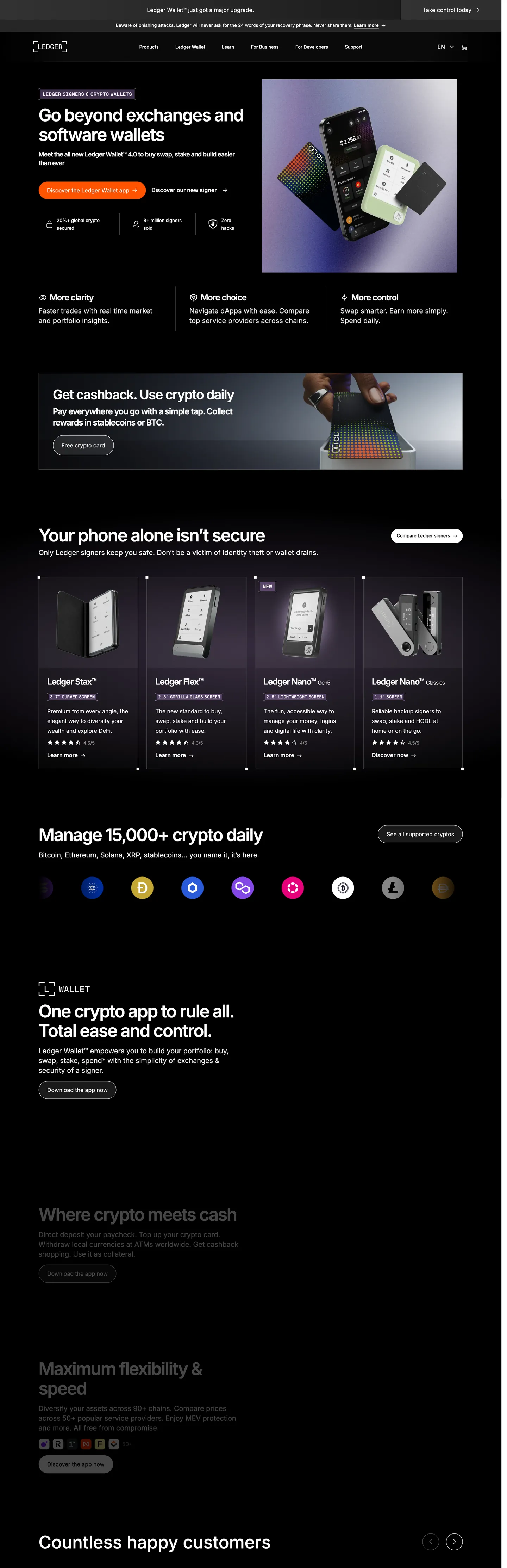
Ledger's homepage is built on a premise most crypto brands abandon: pure restraint. The hero is jet black (#000000) with a white Inter headline at 50px and weight 600. No gradient, no illustration, no abstract art — just black canvas, white text, and a vivid orange-red pill CTA centered beneath. Below the fold, the page inverts to pure white with black Inter body text and gray secondary labels. Then it inverts again for the product section (black), then back to white for testimonials and footer. The page runs a strict two-surface alternation — dark then light then dark then light — with no intermediate gray canvas between them. Where Phantom fills its hero with abstract ribbon art and Coinbase lays down cobalt blue, Ledger commits to monochrome contrast and lets the hardware product photography carry every visual interest.
The DESIGN.md packages the system for React and AI tools. Inside: 15 colors tokens dominated by white (frequency 1066) and black (frequency 612), with mid-grays for muted text. The single chromatic exception is a soft lavender (#d4a0ff) used as background fills in 6 feature highlight tiles and one card accent — 8 total occurrences. The orange-red CTA (#ff5300) appears once. Two typefaces share the system: Inter for everything spoken and HMAlphaMono for everything labeled — category chips, small-caps product tags, section eyebrow text. Display sits at 50px / 600 with tight -2.25px tracking; body at 16px / 400; mono labels at 12px / 500 in uppercase.
Feed this spec to an AI tool and it will reproduce Ledger's specific choices: strict black-white band alternation (no charcoal, no off-white), a single saturated warm CTA dropped onto the achromatic system, Inter at weight 600 for display (not 700), and HMAlphaMono uppercase for category chips. The move worth borrowing broadly is the band alternation — it creates page rhythm without any surface-level decoration, the page's sections read as structurally distinct without a single background-color decision being made.
What makes it distinct
5
- Binary black-white alternationhero sections are jet black with white text; body sections are pure white with black text; no gray canvas exists
- Single orange CTAthe primary button fills with vivid orange-red (#ff5300) on an otherwise achromatic page, the only warm-temperature accent
- HMAlphaMono for category chipsuppercase monospace labels at 12–14px sit over section headings, creating a technical-editorial split between display and annotation
- Lavender highlight fillsa soft purple (#d4a0ff) appears 8 times as a feature-tile background, the only hue besides the CTA orange on the marketing surface
- Weight 600 displayInter at 50px / weight 600 with -2.25px tracking is the heaviest typographic moment; no 700 or 800 tier
ledger.com
Live at ledger.com
A snapshot of the brand in production. Scroll the frame to see the whole page.
Colors
15 colors
Ledger's system runs on #ff5300 as its primary voltage, used in 1 of 16 components. Type is set in Inter across 12 tokens from 12px to 50px, weights 400–600. Shape language is soft — components average 48px corner radius, with no sharp interactive edges.
Brand & Accent
Sparing, CTA-only voltage · 2
Surface
Page and card backgrounds · 2
Text
Headlines, body, captions · 6
Borders & Hairlines
Dividers, outlines, rules · 2
Other
Specialty colors · 3
Typography
12 type tokens
Set in Inter across 12 tokens, from 12px to 50px, weights 400–600. Shown in its own stack: where the font isn't installed, the fallback the file names stands in.
- display-xl50px · weight 600 · lh 56px · tracking -2.25pxThe quick brown fox jumps over the lazy dog
- display-lg38px · weight 600 · lh 42px · tracking -1.71pxThe quick brown fox jumps over the lazy dog
- heading-md24px · weight 600 · lh 32px · tracking -1.08pxThe quick brown fox jumps over the lazy dog
- heading-sm20px · weight 400 · lh 28pxThe quick brown fox jumps over the lazy dog
- body-lg18px · weight 600 · lh 25.2pxThe quick brown fox jumps over the lazy dog
- body-md16px · weight 400 · lh 28pxThe quick brown fox jumps over the lazy dog
- body-sm13px · weight 400 · lh 19.5pxThe quick brown fox jumps over the lazy dog
- label-md14px · weight 500 · lh 19.6pxThe quick brown fox jumps over the lazy dog
- button-md16px · weight 400 · lh 24pxThe quick brown fox jumps over the lazy dog
- nav-link16px · weight 400 · lh 24pxThe quick brown fox jumps over the lazy dog
- mono-label12px · weight 500 · lh 16px · tracking 0.36pxThe quick brown fox jumps over the lazy dog
- mono-label-lg14px · weight 500 · lh 18px · tracking 0.42pxThe quick brown fox jumps over the lazy dog
Layout
Radii and spacing
5 corner radii and 8 spacing values. Shape language: soft.
Radii
- none0px
- sm4px
- md8px
- pill100px
- full100%
Spacing
- xs8px
- sm16px
- md20px
- base24px
- lg40px
- xl80px
- 2xl100px
- section40px 40px 100px
Components
16 components
Each rendered from its tokens (color, type, radius, padding) on Ledger's own canvas.
- Button Primarybutton-primaryButton Primary
- Button Secondarybutton-secondaryButton Secondary
- Top Navtop-navTop Nav
- Nav Linknav-linkNav Link
- Hero Headinghero-headingHero Heading
- Section Headingsection-headingSection Heading
- Body Paragraphbody-paragraphBody Paragraph
- Body Paragraph Mutedbody-paragraph-mutedBody Paragraph Muted
- Mono Eyebrowmono-eyebrowMono Eyebrow
- Card Darkcard-darkCard Dark
- Card Lightcard-lightCard Light
- Card Lavendercard-lavenderCard Lavender
- Type here…text-inputText Input
- Category Chipcategory-chipCategory Chip
- Product Tileproduct-tileProduct Tile
- FooterfooterFooter
In use
The system, in use
Ledger's tokens on the kind of product it builds.
Build something people actually use.
A short paragraph of marketing copy that previews how the brand's display tier and body tier read together. Two sentences is usually enough.
- · 1 project
- · Community support
- · 10k req/mo
- · 10 projects
- · Priority support
- · 1M req/mo
- · Custom domains
- · Unlimited
- · SLA
- · Audit log
- · SSO
FAQ
Ledger design system FAQ
Common questions about Ledger's tokens, components, and how to use this DESIGN.md in your project.
Read next
Related reading
Specs, directories, and component libraries that pair with this design system.
- Browse all design systemsThe full directory of DESIGN.md files on shadcn.io, with live mockups for each.shadcn.io
- Ledger — official siteLedger's public marketing site — the source of truth for the live tokens captured in this file.ledger.com (opens in a new tab)
- The DESIGN.md specificationGoogle Labs' open spec for machine-readable design system files — the format this page is built on.github.com (opens in a new tab)
Use it
Use Ledger in your project
One machine-readable file. Drop it into Claude, Cursor, or any AI tool that reads DESIGN.md.
Download the DESIGN.md
One machine-readable file: every color, type, radius, spacing, and component token of Ledger.
Feed it to your AI tool
Drop it into Claude, Cursor, or GitHub Copilot. The agent writes React components and Tailwind classes that match Ledger's visual language.
Reference the tokens directly
Or paste the values into your Tailwind config, CSS variables, or component library: every color, size and radius is a quoted, ready-to-copy value.
Read the full DESIGN.md: overview, rationale, do’s and don’ts
Overview
Ledger's marketing site runs the most binary chromatic system in the hardware-security category. Security Through Contrast. The page alternates between jet black and pure white in strict bands — no gray middle-ground canvas, no charcoal, no off-white tint. Where Phantom uses a lavender-washed surface and Spline uses a near-black charcoal, Ledger commits to absolute values: #000000 dark sections and #ffffff light sections, cut hard against each other. The effect is a claim of certainty — a brand that deals in absolute protection uses absolute tones.
The chromatic restraint is almost total. The only warm-temperature color on the page is the primary CTA button in vivid orange-red (#ff5300) — one instance, one button, one temperature break from the achromatic system. A second chromatic note is soft lavender (#d4a0ff) used as background fills in 6 feature-highlight tiles. Everything else — 1066 white occurrences, 612 black occurrences, 181 gray occurrences — is grayscale.
Typography splits between Inter (display through body) and HMAlphaMono (category chips and uppercase eyebrow labels). Display sits at 50px / weight 600 with -2.25px tracking — tight, authoritative, but measured (not 700+). The mono voice appears for product category labels ("SECURITY CHIP", "HARDWARE WALLET") in uppercase 12–14px — the technical annotation layer over the editorial display.
Key Characteristics:
- Strict jet-black / pure-white band alternation; no intermediate canvas tone anywhere on the page.
- Single vivid orange-red (#ff5300) CTA — one occurrence — as the only warm-temperature accent on an achromatic system.
- Soft lavender (#d4a0ff) fills 6 feature-highlight tiles — 8 total occurrences; the only hue besides the orange CTA.
- Inter at weight 600 for display (50px, -2.25px tracking); weight 400 for body. No 700+ tier.
- HMAlphaMono in uppercase for category chips and eyebrow labels — technical annotation distinct from editorial display.
- Near-total pill radius for buttons and email inputs (100px); 4–8px for cards; no mid-range 12–24px tier.
- Hardware product photography (Nano S, Nano X, Stax, Flex devices) carries every visual accent — no illustration or abstract art.
- Gray muted text (#949494 — 181 occurrences) serves the secondary/tertiary text role across both dark and light sections.
Colors
Brand
- CTA Orange (
{colors.cta-orange}— #ff5300): frequency 1. Used as background only — the single primary CTA button fill. The only warm-temperature accent on the page. A vivid orange-red that reads with maximum temperature contrast against both the black hero and the white body canvas. - Accent Lavender (
{colors.accent-lavender}— #d4a0ff): frequency 8. Used as background (6), border (1), text (1). The only hue beside the orange on the marketing surface — fills feature-highlight tile backgrounds and a single category-chip border. - Accent Lavender Light (
{colors.accent-lavender-light}— #f2e2ff): frequency 2. A paler lavender used as background in secondary feature tiles. - Deep Violet (
{colors.deep-violet}— #6a3794): frequency 4. Used as text (2) and border (2) — appears as the text color inside lavender category chips, creating a tonal pairing.
Canvas & Surfaces
- Canvas (
{colors.canvas}— #000000): frequency 612. Used as text (276), background (17), border (274), shadow (10), gradient (35). The dark-band surface — pure black, the floor of all dark sections. Wired as --wp--preset--color--black. - Surface-1 (
{colors.surface-1}— #ffffff): frequency 1066. Used as text (507), background (52), border (496), gradient (11). The light-band surface — pure white for all white-band sections. Wired as --wp--preset--color--white.
Text
- Ink (
{colors.ink}— #ffffff): frequency 507 as text — the dominant text color on dark-band sections. - Ink On Light (
{colors.ink-on-light}— #000000): frequency 276 as text — the dominant text color on white-band sections. - Ink Muted (
{colors.ink-muted}— #949494): frequency 181. Used as text (91) and border (90) — the dominant muted-text tone across both surfaces. Secondary body copy, muted labels, caption rows. - Ink Soft (
{colors.ink-soft}— #525252): frequency 41. Used as text (14) and border (27) — slightly darker than ink-muted, used for input field borders and tertiary text. - Ink Medium (
{colors.ink-medium}— #6a6a6a): frequency 16. Used as text (8) and border (8) — a mid-gray text tone for less-prominent body elements. - Ink Dark (
{colors.ink-dark}— #262626): frequency 37. Used as text (18) and border (18) — near-black for text on light surfaces where pure black would feel too heavy.
Hairlines
- Hairline (
{colors.hairline}— #e5e5e5): frequency 22. Used as text (11) and border (11). Light card borders on the white-band sections. - Hairline Dark (
{colors.hairline-dark}— #a3a3a3): frequency 6. Used as text (3) and border (3). Card dividers and input-field borders where the standard hairline is too faint.
Semantic
- Shadow (
{colors.shadow}— #000000): frequency 10 as shadow ink — neutral black used for card drop shadows on the white-band sections.
Typography
Font Families
The system runs two voices: Inter for every spoken surface and HMAlphaMono for every annotated surface. The Inter stack includes "Times New Roman" and arial as fallbacks — an unusual pairing for a grotesk, suggesting the fallback declaration may be a CMS artifact rather than a deliberate typographic choice. HMAlphaMono is a proprietary mono face used for uppercase category labels.
The Inter / HMAlphaMono split divides labor cleanly: Inter speaks for the brand (headlines, body, buttons, nav); HMAlphaMono labels the product (categories, feature types, section eyebrows). The mono voice is uppercase-only and tiny (12–14px) — it reads as technical metadata rather than a display accent.
Hierarchy
| Token | Size | Weight | Line Height | Letter Spacing | Use |
|---|---|---|---|---|---|
{typography.display-xl} | 50px | 600 | 56px | -2.25px | Hero h2 / section h2 ("Go beyond exchanges") |
{typography.display-lg} | 38px | 600 | 42px | -1.71px | Sub-section display headings |
{typography.heading-md} | 24px | 600 | 32px | -1.08px | Feature-tile headings, card titles |
{typography.heading-sm} | 20px | 400 | 28px | 0 | Section sub-headings, pull-quote |
{typography.body-lg} | 18px | 600 | 25.2px | 0 | Strong/bold inline text inside body |
{typography.body-md} | 16px | 400 | 28px | 0 | Default body paragraphs |
{typography.body-sm} | 13px | 400 | 19.5px | 0 | Captions, legal text, footnotes |
{typography.label-md} | 14px | 500 | 19.6px | 0 | Medium label weight for secondary UI |
{typography.button-md} | 16px | 400 | 24px | 0 | CTA button label |
{typography.nav-link} | 16px | 400 | 24px | 0 | Top-nav link labels |
{typography.mono-label} | 12px | 500 | 16px | 0.36px | Uppercase category chips, eyebrow labels |
{typography.mono-label-lg} | 14px | 500 | 18px | 0.42px | Larger uppercase mono labels, h1 eyebrow |
Principles
Display weight stops at 600, not 700+. The 50px / 600 / -2.25px combination at the top of the hierarchy delivers authority through tight tracking and substantial size — weight 600 is already more assertive than Cloudflare or Spline (both 500), but stops short of the aggressive 700+ that gaming or high-energy brands use. The gap between display weight (600) and body weight (400) creates clear visual hierarchy without requiring a bold tier.
The monospace uppercase labels sit at the opposite extreme from the display scale — small, tracked, functional. They carry no decorative weight; they are system annotations for feature categorization.
Note on Font Substitutes
Inter is already open-source and freely available. For HMAlphaMono, JetBrains Mono or IBM Plex Mono in uppercase with 0.4em letter-spacing are the closest open-source substitutes. Preserve the uppercase rendering — the HMAlphaMono labels only work at uppercase; lowercase monospace would read as code rather than product taxonomy.
Layout
Spacing System
- Base unit: 8px (73 occurrences — the dominant padding value).
- Tokens:
{spacing.xs}8px ·{spacing.sm}16px ·{spacing.md}20px ·{spacing.base}24px ·{spacing.lg}40px ·{spacing.xl}80px ·{spacing.2xl}100px ·{spacing.section}40px top, 40px side, 100px bottom. - Card internal padding: 24px on product tiles; 12–24px on content cards.
- Top-nav padding: 12px vertical, 24px horizontal.
- Section rhythm: 40px top / 100px bottom on dark sections; tighter on white sections.
Grid & Container
- Max content width: ~1200px at desktop — the page is wide by marketing standards, accommodating 4-column product grids.
- Hero band: full-bleed black canvas, centered headline + body + CTA stack at ~700px max-width.
- Product comparison section (white): 4-column device grid showing Nano S, Nano X, Stax, and Flex side-by-side with price + rating beneath.
- Feature grid: 3-column card grid on the white surface; lavender feature tiles sit in alternating slots.
- App section (dark): full-bleed black with centered headline, app-store badge row, and feature-chip cluster.
Rhythm
The band-alternation pattern creates rhythm without decoration. Each black band is large and sparse — one or two focal elements with generous vertical padding. Each white band is dense and informational — product grids, feature lists, comparison tables. The contrast in density between the two surface types is as important as the contrast in color.
Elevation
The system uses neutral drop shadows on white-band cards and near-zero elevation on dark-band surfaces.
- Flat (no shadow): hero, dark sections, footer — surfaces on the black canvas have no shadow (the background is dark enough to eliminate any meaningful shadow contrast).
- Soft shadow on white: product tiles and content cards on the white surface use
rgba(0,0,0,*)neutral drops — 10 shadow occurrences total. The depth is subtle; hairline borders (22 occurrences at{colors.hairline}) carry most of the card-delineation work. - No tinted shadows: no lavender or warm-tinted shadow is used. All shadows are neutral black-alpha.
Shapes
The radius scale is binary: pill for buttons and inputs, small-step for cards.
{rounded.none}0px — nav bar, hero section, band dividers.{rounded.sm}4px (8 instances) — small card elements, chip backgrounds.{rounded.md}8px (6 instances) — product-tile cards, content cards.{rounded.pill}100px (9 instances) — primary CTA button, email newsletter input, secondary action buttons.{rounded.full}100% (18 instances) — avatar circles, brand-logo circles in the testimonial strip, circular icon badges.
There is no 16px or 24px mid-range radius. Like Cloudflare, Ledger is binary: small-step (4–8px) for content surfaces, pill (100px) for interactive elements, circles for avatar/logo marks.
Components
button-primary — Vivid orange-red {colors.cta-orange} fill, white {colors.ink} text, 100px pill radius, 13×24 padding, 50px height. "Discover the Ledger Wallet app" is the hero canonical instance. The only warm-temperature element on the page.
button-secondary — Transparent fill, {colors.ink-on-light} text, 1px {colors.hairline-dark} border, pill radius, 12×20 padding, 46px height. Used for secondary product-comparison CTAs.
top-nav — Black {colors.canvas} surface on the hero; switches to white on scroll-sticky states. 56px height, 12×24 padding. Ledger wordmark flush left, product nav links (Products, App, Enterprise, Support) centered, contact/cart right.
nav-link — Transparent, {colors.ink-on-light} text at {typography.nav-link} (16px / 400), 24px horizontal padding.
hero-heading — White {colors.ink} text, Inter 50px / 600, -2.25px tracking. "Go beyond exchanges and software wallets" is the canonical hero h2.
section-heading — {colors.ink-on-light} text on white-band sections, same {typography.display-xl} token (50px / 600 / -2.25px).
body-paragraph — {colors.ink-on-light} at {typography.body-md} (16px / 400 / 28px line-height). The default body paragraph — generous line-height for hardware-comparison readability.
body-paragraph-muted — {colors.ink-muted} (#949494) at {typography.body-sm} — secondary captions, legal footnotes.
mono-eyebrow — HMAlphaMono uppercase at {typography.mono-label} (12px / 500 / 0.36px tracking), in {colors.ink-muted}. The section-eyebrow annotation above major headings ("HARDWARE WALLET", "SECURITY CHIP").
card-dark — Black {colors.canvas} fill, white text, {rounded.md} 8px radius, 24px padding, {colors.hairline-dark} border. Dark-band content cards.
card-light — White {colors.surface-1} fill, black text, {rounded.md} 8px radius, 24px padding, {colors.hairline} border. White-band content and feature tiles.
card-lavender — Soft lavender {colors.accent-lavender} fill, black text, {rounded.md} 8px radius, 24px padding. Feature-highlight tiles — the only hued card surface on the page.
text-input — White {colors.surface-1} fill, black text, 100px pill radius, 13×13×13×30 padding, 52px height, {colors.ink-soft} border. The email newsletter input at the footer — pill radius matching the CTA button.
category-chip — Lavender {colors.accent-lavender} fill, {colors.deep-violet} text, HMAlphaMono uppercase at {typography.mono-label}, 100px pill radius, 4×12 padding.
product-tile — White {colors.surface-1} fill, black text, {rounded.md} 8px, 16px padding, {colors.hairline} border. The product-comparison grid tile (Nano S, Nano X, Stax, Flex) with device image + name + price + rating below.
footer — Black {colors.canvas} fill, muted {colors.ink-muted} text at {typography.body-sm}, 40×24 padding. No bottom border — the page terminates on the dark canvas.
Do's and Don'ts
Do preserve the black-white band alternation without introducing intermediate surfaces. The binary contrast is the system's structural device — a single gray or off-white section insertion collapses the rhythm.
Do use {colors.cta-orange} (#ff5300) for exactly one primary CTA per view. The orange is the page's only temperature break; multiplying it into section accents or illustration elements reduces it from a signal to a palette.
Do render HMAlphaMono labels in uppercase only. The monospace voice reads as product taxonomy at uppercase; at mixed case it reads as code or terminal output.
Do use Inter at weight 600 — not 700 — for display headlines. The system stops at 600 with -2.25px tracking; the tightness does the authority work that weight 700 would normally carry. Weight 700 tips from authoritative to aggressive in an achromatic system.
Don't use {colors.accent-lavender} (#d4a0ff) for more than 6–8 card fills. The lavender appears exactly 8 times on the marketing surface; it is a feature-highlight accent, not a brand color. Using it for background bands or nav elements would redefine it as a primary color it is not.
Don't introduce a mid-range radius (12–24px) between the small-step (4–8px) and pill (100px) tiers. The binary radius scale is as deliberate as the binary canvas scale; a 16px radius on a button would feel like an entirely different system.
Don't use product photography for illustration. Ledger's visual interest comes from real device photography against the black or white canvas — not renders, not lifestyle photos, not abstract art. The hardware objects are the brand.
Don't apply the gray muted tones ({colors.ink-muted}, {colors.ink-soft}) to canvas surfaces. They are text-only tones — 91 and 14 text occurrences respectively. Using them as card or section backgrounds introduces a gray tier the system explicitly avoids.
Known Gaps
- Dark-mode body sections: the white-band sections are light-only; whether a complete dark variant exists for the dashboard or product pages is not captured here.
- Hover and focus states: only resting-state components are documented. The orange CTA hover state, input focus rings, and nav-link hover fills are not captured from the marketing surface.
- Motion and transitions: the page appears to have scroll-triggered section reveals, but easing curves and timing are not part of the marketing-surface extraction.
- Ledger Live app surface: the
{component.card-dark}and mobile UI shown in product screenshots carries a richer token system (status colors, balance displays, transaction states) not represented in the marketing-only capture. - Product-tier pricing colors: pricing tables for Nano S, Nano X, Stax, and Flex may carry per-product accent colors not visible on the captured marketing surface.
- Form validation states:
{component.text-input}documents the resting state only; error, success, and focus variants are undocumented. - Tablet breakpoints: the 4-column product grid collapses at tablet width; no responsive spacing tokens are captured.
Fintech & Crypto
More systems like this
More DESIGN.md files in Fintech & Crypto.
Pricing
Build it with Pro
The DESIGN.md files are free. Pro adds 6,000+ blocks, premium templates and the MCP server, so your AI editor builds in your system for you.
4.9/5 out of 5 · 150+ reviewsfrom 150+ founders and developers.
Billing
Billed once a year in USD. Cancel anytime.
- How many people can use the license.
- Client work, SaaS products and anything you charge for.
- Production-ready React sections: hero, pricing, features, dashboards and more.
- Complete multi-page sites you can ship as they are.
- React icons from every major library, installable with one command.
- Presets that restyle every block, in light and dark.
- Lets your AI editor search, preview and install blocks for you.
- Priority requests are answered first.
Individual
For personal projects & open source
$32instead of $49/mo
$389 billed yearly
- Seats: 1 seat
- Commercial use: Personal & open source only
- Pro blocks: 6,000+ blocks
- Templates: All 14 templates
- React icons: 294k+ icons
- Themes: All 59 themes
- MCP server: Basic usage
- Support: Standard
Team
Most popularFor freelancers, agencies & startups
$66instead of $99/mo
$789 billed yearly · ≈ $13/dev/mo
- Seats: Up to 5 seats
- Commercial use: Included
- Pro blocks: 6,000+ blocks
- Templates: All 14 templates
- React icons: 294k+ icons
- Themes: All 59 themes
- MCP server: High usage
- Support: Priority
Organization
For companies with larger teams
$132instead of $199/mo
$1,589 billed yearly
- Seats: Unlimited seats
- Commercial use: Included
- Pro blocks: 6,000+ blocks
- Templates: All 14 templates
- React icons: 294k+ icons
- Themes: All 59 themes
- MCP server: Unlimited usage
- Support: Priority
Billed once a year in USD. Cancel anytime.
Individual
For personal projects & open source
$32instead of $49/mo
$389 billed yearly
- How many people can use the license.Seats: 1 seat
- Client work, SaaS products and anything you charge for.Commercial use: Personal & open source only
- Production-ready React sections: hero, pricing, features, dashboards and more.Pro blocks: 6,000+ blocks
- Complete multi-page sites you can ship as they are.Templates: All 14 templates
- React icons from every major library, installable with one command.React icons: 294k+ icons
- Presets that restyle every block, in light and dark.Themes: All 59 themes
- Lets your AI editor search, preview and install blocks for you.MCP server: Basic usage
- Priority requests are answered first.Support: Standard
Team
Most popularFor freelancers, agencies & startups
$66instead of $99/mo
$789 billed yearly · ≈ $13/dev/mo
Everything in Individual, plus
- How many people can use the license.Seats: Up to 5 seats
- Client work, SaaS products and anything you charge for.Commercial use: Included
- Lets your AI editor search, preview and install blocks for you.MCP server: High usage
- Priority requests are answered first.Support: Priority
Organization
For companies with larger teams
$132instead of $199/mo
$1,589 billed yearly
Everything in Team, plus
- How many people can use the license.Seats: Unlimited seats
- Lets your AI editor search, preview and install blocks for you.MCP server: Unlimited usage
- Secure checkout via Stripe
- Code lives in your repo
- Keep what you've shipped if you cancel
- License terms
Your system, built for you
Every block, template and icon, installed by your AI agent in your design system. The DESIGN.md files stay free.