Kraken Design System
Kraken's design system as a DESIGN.md file. Kraken Purple #7132f5, dual Kraken-Brand + Kraken-Product fonts, 12px button radius. For React, Next.js, and AI tools.
Add shadcn.io to your AI agent. · Pro It installs blocks, icons and templates in your design system from a prompt, with Pro.
Set up MCP- Primary
- #7132f5
- Typeface
- Kraken-Product
- Shape
- Mixed
- Base radius
- 8px
- Colors
- 14
- Type tokens
- 10
- Components
- 7
- Spacing values
- 15
About
About Kraken DESIGN.md
Curated by Dov Azencot · Updated May 12, 2026 · Source kraken.com (opens in a new tab)
Kraken's design system is built around two ideas: trust through restraint, and a single owned color. Kraken Purple ("#7132f5") is the brand voltage — it drives every primary CTA, every text link, and the outlined-button stroke at "#5741d8". The remainder of the page is white "#ffffff" canvas, near-black "#101114" ink, and a cool blue-gray neutral ladder running through "#686b82", "#9497a9", and a "#dedee5" hairline. There is no second accent color. Green "#149e61" exists only for positive/success badges, scoped to trading contexts where green has a precise meaning.
This DESIGN.md packages the full Kraken visual contract into one machine-readable file. Inside: the three-step purple scale, a cool-gray neutral set, a green semantic pair, a dual-family typography stack (Kraken-Brand for display at 48/36/28px in 700 weight with negative tracking, Kraken-Product for UI body/buttons/captions at 16/14/12/7px), 5 button variants, 2 badge styles, 15 spacing tokens (1–25px), and 8 radius tokens. The file follows the Google Labs DESIGN.md spec — drop it into Claude, Cursor, or Copilot and the model writes React that matches Kraken's voice instead of a generic exchange template.
Two details earn the system its identity. First, the 12px radius ceiling on buttons — rounded enough to feel approachable, never pill-shaped, which is the fintech tell that separates Kraken from consumer brands like Stripe Press or Linear. Second, the whisper-level elevation: a single shadow at "rgba(0,0,0,0.03) 0px 4px 24px" floats white buttons, and a 1px "rgba(16,24,40,0.04)" micro tier handles everything else. Crypto exchanges live and die on perceived trust; Kraken builds that trust by refusing to over-design.
What makes it distinct
5
- Single brand voltageKraken Purple (#7132f5) drives CTAs and links, with #5741d8 and #5b1ecf as outlined and deep variants
- Dual proprietary typeKraken-Brand at 700 weight handles display, Kraken-Product (IBM Plex Sans fallback) handles UI
- 12px is the radius ceilingbuttons stay rounded but never pill, a deliberate fintech tell separating Kraken from consumer brands
- Whisper-level elevationone subtle shadow at rgba(0,0,0,0.03) 0px 4px 24px and a 1px micro tier, nothing more
- Green #149e61 at 16% opacity carries positive states; semantic color is reserved for trading data, never decoration
kraken.com
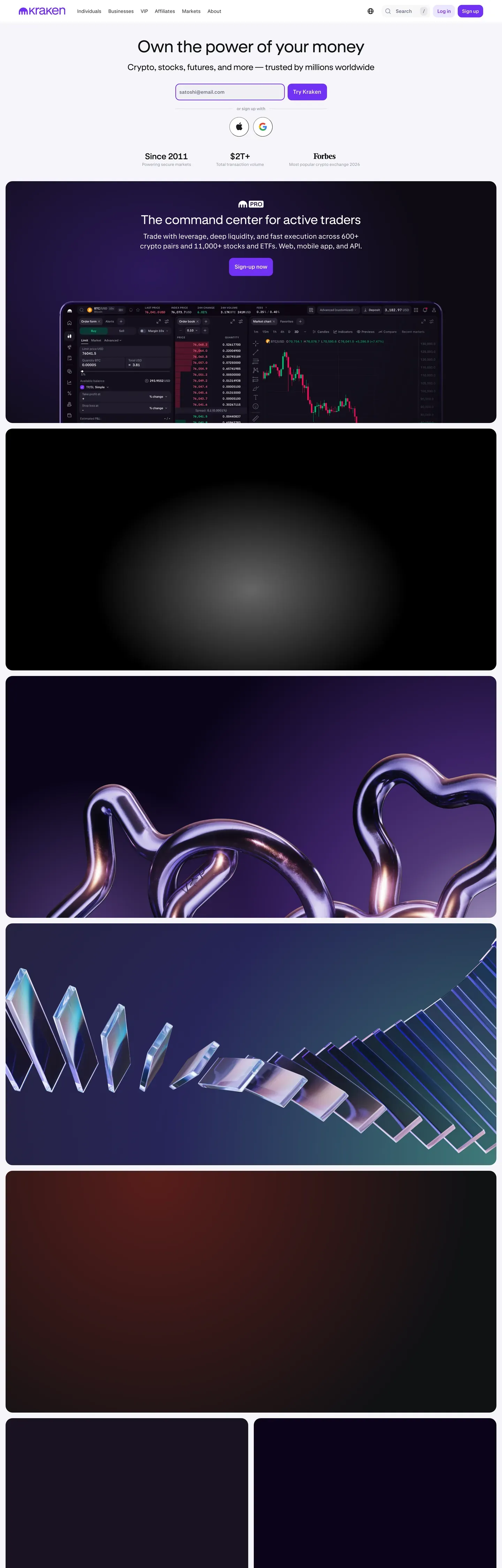
Live at kraken.com
A snapshot of the brand in production. Scroll the frame to see the whole page.
Colors
14 colors
Kraken's system runs on #7132f5 as its primary voltage, used in 2 of 7 components. Type is set in Kraken-Product across 10 tokens from 7px to 48px, weights 400–700. Shape language is mixed across 7 components, blending pills, soft rounds, and squarer corners.
Brand & Accent
Sparing, CTA-only voltage · 4
Surface
Page and card backgrounds · 1
Text
Headlines, body, captions · 2
Borders & Hairlines
Dividers, outlines, rules · 1
Semantic
Status, errors, success, links · 2
Other
Specialty colors · 4
Typography
10 type tokens
Set in Kraken-Product across 10 tokens, from 7px to 48px, weights 400–700. Shown in its own stack: where the font isn't installed, the fallback the file names stands in.
- display-hero48px · weight 700 · lh 1.17 · tracking -1pxThe quick brown fox jumps over the lazy dog
- section-heading36px · weight 700 · lh 1.22 · tracking -0.5pxThe quick brown fox jumps over the lazy dog
- sub-heading28px · weight 700 · lh 1.29 · tracking -0.5pxThe quick brown fox jumps over the lazy dog
- feature-title22px · weight 600 · lh 1.2 · tracking normalThe quick brown fox jumps over the lazy dog
- body16px · weight 400 · lh 1.38 · tracking normalThe quick brown fox jumps over the lazy dog
- body-medium16px · weight 500 · lh 1.38 · tracking normalThe quick brown fox jumps over the lazy dog
- button16px · weight 500 · lh 1.38 · tracking normalThe quick brown fox jumps over the lazy dog
- caption14px · weight 400 · lh 1.43 · tracking normalThe quick brown fox jumps over the lazy dog
- small12px · weight 400 · lh 1.33 · tracking normalThe quick brown fox jumps over the lazy dog
- micro7px · weight 500 · lh 1 · tracking normalThe quick brown fox jumps over the lazy dog
Layout
Radii and spacing
8 corner radii and 15 spacing values. Shape language: mixed.
Radii
- xs3px
- sm6px
- md8px
- lg10px
- xl12px
- xxl16px
- full9999px
- circle50%
Spacing
- px1px
- xxs2px
- xxs-plus3px
- xs4px
- xs-plus5px
- sm6px
- sm-plus8px
- md10px
- md-plus12px
- base13px
- base-plus15px
- lg16px
- lg-plus20px
- xl24px
- xl-plus25px
Components
7 components
Each rendered from its tokens (color, type, radius, padding) on Kraken's own canvas.
- Button Primary Purplebutton-primary-purpleButton Primary Purple
- Button Purple Outlinedbutton-purple-outlinedButton Purple Outlined
- Button Purple Subtlebutton-purple-subtleButton Purple Subtle
- Button Whitebutton-whiteButton White
- Button Secondary Graybutton-secondary-grayButton Secondary Gray
- Badge Successbadge-successBadge Success
- Badge Neutralbadge-neutralBadge Neutral
In use
The system, in use
Kraken's tokens on the kind of product it builds.
Build something people actually use.
A short paragraph of marketing copy that previews how the brand's display tier and body tier read together. Two sentences is usually enough.
FAQ
Kraken design system FAQ
Common questions about Kraken's tokens, components, and how to use this DESIGN.md in your project.
Read next
Related reading
Specs, directories, and component libraries that pair with this design system.
- Browse all design systemsThe full directory of DESIGN.md files on shadcn.io, with live mockups for each.shadcn.io
- Kraken.comKraken's live exchange — the source surface this DESIGN.md was extracted from.kraken.com (opens in a new tab)
- The DESIGN.md specificationGoogle Labs' open spec for machine-readable design system files — the format this page is built on.github.com (opens in a new tab)
Use it
Use Kraken in your project
One machine-readable file. Drop it into Claude, Cursor, or any AI tool that reads DESIGN.md.
Download the DESIGN.md
One machine-readable file: every color, type, radius, spacing, and component token of Kraken.
Feed it to your AI tool
Drop it into Claude, Cursor, or GitHub Copilot. The agent writes React components and Tailwind classes that match Kraken's visual language.
Reference the tokens directly
Or paste the values into your Tailwind config, CSS variables, or component library: every color, size and radius is a quoted, ready-to-copy value.
Read the full DESIGN.md: overview, rationale, do’s and don’ts
Overview
Kraken's website is a clean, trustworthy crypto exchange that uses purple as its commanding brand color. The design operates on white backgrounds with Kraken Purple ({colors.primary} — "#7132f5", {colors.primary-dark} — "#5741d8", {colors.primary-deep} — "#5b1ecf") creating a distinctive, professional crypto identity. The proprietary Kraken-Brand font handles display headings with bold (700) weight and negative tracking, while Kraken-Product (with IBM Plex Sans fallback) serves as the UI workhorse.
Key Characteristics:
- Kraken Purple (
{colors.primary}— "#7132f5") as primary brand with darker variants ({colors.primary-dark}— "#5741d8",{colors.primary-deep}— "#5b1ecf") - Kraken-Brand (display) + Kraken-Product (UI) dual font system
- Near-black (
{colors.ink}— "#101114") text with cool blue-gray neutral scale - 12px radius buttons (
{rounded.xl}) — rounded but not pill - Subtle shadows (
rgba(0,0,0,0.03) 0px 4px 24px) — whisper-level - Green accent (
{colors.success}— "#149e61") for positive/success states
Color Palette & Roles
Primary
- Kraken Purple (
{colors.primary}— "#7132f5"): Primary CTA, brand accent, links - Purple Dark (
{colors.primary-dark}— "#5741d8"): Button borders, outlined variants - Purple Deep (
{colors.primary-deep}— "#5b1ecf"): Deepest purple - Purple Subtle (
{colors.primary-subtle}— "rgba(133,91,251,0.16)"): Purple at 16% — subtle button backgrounds - Near Black (
{colors.ink}— "#101114"): Primary text
Neutral
- Cool Gray (
{colors.neutral}— "#686b82"): Primary neutral, borders at 24% opacity - Silver Blue (
{colors.neutral-soft}— "#9497a9"): Secondary text, muted elements - White (
{colors.canvas}— "#ffffff"): Primary surface - Border Gray (
{colors.hairline}— "#dedee5"): Divider borders
Semantic
- Green (
{colors.success}— "#149e61"): Success/positive at 16% opacity for badges - Green Dark (
{colors.success-text}— "#026b3f"): Badge text
Typography Principles
The system runs a dual-family stack. Kraken-Brand (fallbacks: IBM Plex Sans, Helvetica, Arial) handles display headings — the 48px hero at 700 weight with -1px tracking, the 36px section heading at -0.5px, and the 28px sub-heading at -0.5px. Kraken-Product (fallbacks: Helvetica Neue, Helvetica, Arial) carries everything else: the 22px / 600 feature title, 16px / 400 body, 16px / 500–600 buttons, 14px caption, 12px small, and a 7px / 500 uppercase micro label for the densest UI affordances.
Layout Principles
Spacing scale: 1px, 2px, 3px, 4px, 5px, 6px, 8px, 10px, 12px, 13px, 15px, 16px, 20px, 24px, 25px — a granular ladder that supports the dense data layout of a trading product.
Border radius scale: 3px, 6px, 8px, 10px, 12px, 16px, 9999px, 50% — with 12px as the documented ceiling for buttons. 9999px is reserved for circular avatars; 50% handles perfect circles.
Depth & Elevation
- Subtle:
rgba(0,0,0,0.03) 0px 4px 24px— floats the White Button variant - Micro:
rgba(16,24,40,0.04) 0px 1px 4px— the slightest card and dropdown separation
There are no progressive elevation tiers beyond these two. Depth comes from white-on-white surface separation and 1px {colors.hairline} ("#dedee5") borders.
Do's and Don'ts
Do
- Use Kraken Purple ("#7132f5") for CTAs and links
- Apply 12px radius on all buttons
- Use Kraken-Brand for headings, Kraken-Product for body
Don't
- Don't use pill buttons — 12px is the max radius for buttons
- Don't use other purples outside the defined scale
Responsive Behavior
Breakpoints: 375px, 425px, 640px, 768px, 1024px, 1280px, 1536px — a 7-step ladder that maps cleanly onto Tailwind's defaults with two extra small-mobile steps (375, 425) for narrow-device tuning.
Agent Prompt Guide
Quick color reference
- Brand: Kraken Purple (
{colors.primary}— "#7132f5") - Dark variant:
{colors.primary-dark}— "#5741d8" - Text: Near Black (
{colors.ink}— "#101114") - Secondary text:
{colors.neutral-soft}— "#9497a9" - Background: White (
{colors.canvas}— "#ffffff")
Example component prompt
- "Create hero: white background. Kraken-Brand 48px weight 700, letter-spacing -1px. Purple CTA ('#7132f5', 12px radius, 13px 16px padding)."
Fintech & Crypto
More systems like this
More DESIGN.md files in Fintech & Crypto.
Pricing
Build it with Pro
The DESIGN.md files are free. Pro adds 6,000+ blocks, premium templates and the MCP server, so your AI editor builds in your system for you.
4.9/5 out of 5 · 150+ reviewsfrom 150+ founders and developers.
Billing
Billed once a year in USD. Cancel anytime.
- How many people can use the license.
- Client work, SaaS products and anything you charge for.
- Production-ready React sections: hero, pricing, features, dashboards and more.
- Complete multi-page sites you can ship as they are.
- React icons from every major library, installable with one command.
- Presets that restyle every block, in light and dark.
- Lets your AI editor search, preview and install blocks for you.
- Priority requests are answered first.
Individual
For personal projects & open source
$32instead of $49/mo
$389 billed yearly
- Seats: 1 seat
- Commercial use: Personal & open source only
- Pro blocks: 6,000+ blocks
- Templates: All 14 templates
- React icons: 294k+ icons
- Themes: All 59 themes
- MCP server: Basic usage
- Support: Standard
Team
Most popularFor freelancers, agencies & startups
$66instead of $99/mo
$789 billed yearly · ≈ $13/dev/mo
- Seats: Up to 5 seats
- Commercial use: Included
- Pro blocks: 6,000+ blocks
- Templates: All 14 templates
- React icons: 294k+ icons
- Themes: All 59 themes
- MCP server: High usage
- Support: Priority
Organization
For companies with larger teams
$132instead of $199/mo
$1,589 billed yearly
- Seats: Unlimited seats
- Commercial use: Included
- Pro blocks: 6,000+ blocks
- Templates: All 14 templates
- React icons: 294k+ icons
- Themes: All 59 themes
- MCP server: Unlimited usage
- Support: Priority
Billed once a year in USD. Cancel anytime.
Individual
For personal projects & open source
$32instead of $49/mo
$389 billed yearly
- How many people can use the license.Seats: 1 seat
- Client work, SaaS products and anything you charge for.Commercial use: Personal & open source only
- Production-ready React sections: hero, pricing, features, dashboards and more.Pro blocks: 6,000+ blocks
- Complete multi-page sites you can ship as they are.Templates: All 14 templates
- React icons from every major library, installable with one command.React icons: 294k+ icons
- Presets that restyle every block, in light and dark.Themes: All 59 themes
- Lets your AI editor search, preview and install blocks for you.MCP server: Basic usage
- Priority requests are answered first.Support: Standard
Team
Most popularFor freelancers, agencies & startups
$66instead of $99/mo
$789 billed yearly · ≈ $13/dev/mo
Everything in Individual, plus
- How many people can use the license.Seats: Up to 5 seats
- Client work, SaaS products and anything you charge for.Commercial use: Included
- Lets your AI editor search, preview and install blocks for you.MCP server: High usage
- Priority requests are answered first.Support: Priority
Organization
For companies with larger teams
$132instead of $199/mo
$1,589 billed yearly
Everything in Team, plus
- How many people can use the license.Seats: Unlimited seats
- Lets your AI editor search, preview and install blocks for you.MCP server: Unlimited usage
- Secure checkout via Stripe
- Code lives in your repo
- Keep what you've shipped if you cancel
- License terms
Your system, built for you
Every block, template and icon, installed by your AI agent in your design system. The DESIGN.md files stay free.