Klarna Design System
Klarna's payments design system as a DESIGN.md file. Pink #ffa8cd, Klarna Title, 22 colors, 18 components. For React, Next.js, and AI tools.
Add shadcn.io to your AI agent. · Pro It installs blocks, icons and templates in your design system from a prompt, with Pro.
Set up MCP- Primary
- #ffa8cd
- Typeface
- Klarna Title
- Shape
- Soft
- Base radius
- 16px
- Colors
- 22
- Type tokens
- 11
- Components
- 18
- Spacing values
- 9
About
About Klarna DESIGN.md
Curated by Dov Azencot · Updated May 13, 2026 · Source klarna.com (opens in a new tab)
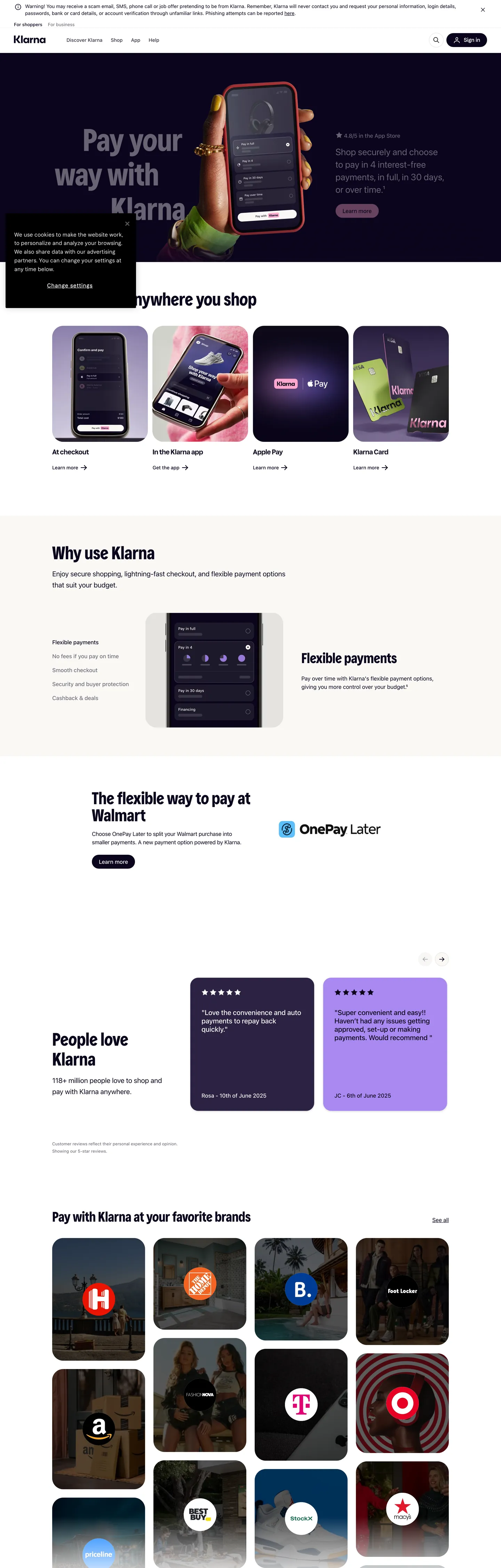
Klarna's marketing surface opens on a dark violet-near-black hero "#0b051d" — the brand's "Klarna Black" — overlaid with a phone-mockup that carries the only saturated pink moment on the page: a soft pink-wash badge ("#ffd0e2") behind a checkout illustration. Inverted text "#ffffff" runs across the hero copy. Below the fold the canvas inverts: a white "#ffffff" page surface carries the "Use Klarna anywhere you shop" tile strip, the four product cards, and the "Pay with Klarna at your favorite brands" merchant grid, with "#0b051d" doing all the text work and "#c4c3ca" plus "#e2e2e7" carrying the input chrome and tile hairlines. The single brand voltage, Klarna Pink "#ffa8cd", appears exactly once — the "Sign up" pill in the top nav (`--colors-btn-brand`). Every other surface that needed a pink mood receives it via the softer "#ffd0e2" wash or, more often, a flat illustration of a phone screen.
This page packages the system into a single DESIGN.md file written to the Google Labs open specification. Inside: 22 colors tokens grouped into brand (Klarna Pink, Klarna Eggplant, the Stickynote lime), surface (canvas, page, ink-inverse, the elevated panel), text (the brand's ink, a four-step grayscale ramp), and semantic (positive green, negative red, warning amber, the focus indigo "#7b57d8"); 11 typography levels split across Klarna Title for display, Klarna Text for brand UI, and the platform-stack `-apple-system` family for body and nav; a 6-step rounded vocabulary that's effectively three values (2px hairlines, 16px panels, 32px pills); a 9-step spacing scale anchored on the observed 4px / 8px / 16px / 32px / 48px / 80px rhythm; and 18 components entries covering the dark "Sign in" pill, the pink "Sign up" pill, the merchant tile, the product card, the testimonial purple card, the email-capture input, the footer-CTA strip, and the dashboard mockup chrome.
Feed the file to Claude, Cursor, or GitHub Copilot and the agent reproduces Klarna's particular dialect — the dark hero that inverts to a white canvas, the once-per-page pink pill that signals "Sign up" and only "Sign up", the 32px pill geometry that hits 89 times, and the two-family Klarna Title / Klarna Text register — instead of inventing a generic fintech checkout theme with rounded purple gradients. The proprietary Klarna Title and Klarna Text faces are not licensed for redistribution; Inter Display at weight 700 with -0.2px tracking is the closest open-source approximation for the title role, and Inter Variable at weight 400 for the body register. The reason this system rewards study is the discipline of its brand-voltage allocation: where most BNPL competitors fill every CTA with a saturated pink or violet, Klarna ships one pink pill per page and lets the rest of the chrome speak in indigo-black.
What makes it distinct
5
- Ink-as-canvas inversionKlarna Black #0b051d carries 1321 uses split between text (681) and border (635), the rare token that does both jobs at once
- Rationed pink voltageKlarna Pink #ffa8cd appears exactly one time on the homepage, scoped to the navigation sign-up pill, with #ffd0e2 doing the soft-wash background work
- 32px pill as house geometrythe 32px radius hits 89 times across buttons, cards, dashboard chrome, and the hero phone mockup, with 2px hairlines and 16px panels filling the rest
- Two-typeface economyKlarna Title at 41–90px handles display, Klarna Text at 14–24px handles brand UI, and a platform-stack fallback runs every body paragraph at 14–16px / weight 400
- Hero at 90px / weight 700 with line-height 99pxdisplay is the most-confident voice in the system, and the body register holds at weight 400 underneath
klarna.com
Live at klarna.com
A snapshot of the brand in production. Scroll the frame to see the whole page.
Colors
22 colors
Klarna's system runs on #ffa8cd as its primary voltage, used in 1 of 18 components. Type is set in Klarna Title across 11 tokens from 12px to 90px, weights 400–700. Shape language is soft — components average 17px corner radius, with no sharp interactive edges.
Brand & Accent
Sparing, CTA-only voltage · 5
Surface
Page and card backgrounds · 5
Text
Headlines, body, captions · 6
Borders & Hairlines
Dividers, outlines, rules · 2
Semantic
Status, errors, success, links · 1
Other
Specialty colors · 3
Typography
11 type tokens
Set in Klarna Title across 11 tokens, from 12px to 90px, weights 400–700. Shown in its own stack: where the font isn't installed, the fallback the file names stands in.
- display-xl90px · weight 700 · lh 1.1 · tracking 0The quick brown fox jumps over the lazy dog
- display-lg52px · weight 500 · lh 1.05 · tracking 0The quick brown fox jumps over the lazy dog
- display-md49px · weight 700 · lh 1 · tracking 0The quick brown fox jumps over the lazy dog
- display-sm41px · weight 500 · lh 1.05 · tracking 0The quick brown fox jumps over the lazy dog
- heading-md24px · weight 700 · lh 1.05 · tracking -0.048pxThe quick brown fox jumps over the lazy dog
- heading-sm20px · weight 700 · lh 1.3 · tracking -0.2pxThe quick brown fox jumps over the lazy dog
- body-lg20px · weight 500 · lh 1.2 · tracking 0The quick brown fox jumps over the lazy dog
- body-md16px · weight 400 · lh 1.5 · tracking 0The quick brown fox jumps over the lazy dog
- body-sm14px · weight 400 · lh 1.43 · tracking 0The quick brown fox jumps over the lazy dog
- label-md16px · weight 500 · lh 1.05 · tracking -0.048pxThe quick brown fox jumps over the lazy dog
- caption12px · weight 400 · lh 1.05 · tracking 0The quick brown fox jumps over the lazy dog
Layout
Radii and spacing
6 corner radii and 9 spacing values. Shape language: soft.
Radii
- hairline2px
- sm8px
- md16px
- lg24px
- pill32px
- full9999px
Spacing
- xxs2px
- xs4px
- sm8px
- md12px
- base16px
- lg24px
- xl32px
- 2xl48px
- 3xl80px
Components
18 components
Each rendered from its tokens (color, type, radius, padding) on Klarna's own canvas.
- Button Primarybutton-primaryButton Primary
- Button Brandbutton-brandButton Brand
- Button Secondarybutton-secondaryButton Secondary
- Button Ghostbutton-ghostButton Ghost
- Type here…text-inputText Input
- Type here…text-input-focusedText Input Focused
- Top Navtop-navTop Nav
- Nav Linknav-linkNav Link
- Card Hero Mockupcard-hero-mockupCard Hero Mockup
- Card Productcard-productCard Product
- Card Merchant Tilecard-merchant-tileCard Merchant Tile
- Card Testimonial Lightcard-testimonial-lightCard Testimonial Light
- Card Testimonial Lavendercard-testimonial-lavenderCard Testimonial Lavender
- Badge Soft Pinkbadge-soft-pinkBadge Soft Pink
- Pill Stickynotepill-stickynotePill Stickynote
- Section Header Lightsection-header-lightSection Header Light
- FooterfooterFooter
- Hairline Dividerhairline-dividerHairline Divider
In use
The system, in use
Klarna's tokens on the kind of product it builds.
Build something people actually use.
A short paragraph of marketing copy that previews how the brand's display tier and body tier read together. Two sentences is usually enough.
FAQ
Klarna design system FAQ
Common questions about Klarna's tokens, components, and how to use this DESIGN.md in your project.
Read next
Related reading
Specs, directories, and component libraries that pair with this design system.
- Browse all design systemsThe full directory of DESIGN.md files on shadcn.io, with live mockups for each.shadcn.io
- Klarna — official siteThe buy-now-pay-later payments product whose marketing surface this DESIGN.md captures.klarna.com (opens in a new tab)
- The DESIGN.md specificationGoogle Labs' open spec for machine-readable design system files.github.com (opens in a new tab)
Use it
Use Klarna in your project
One machine-readable file. Drop it into Claude, Cursor, or any AI tool that reads DESIGN.md.
Download the DESIGN.md
One machine-readable file: every color, type, radius, spacing, and component token of Klarna.
Feed it to your AI tool
Drop it into Claude, Cursor, or GitHub Copilot. The agent writes React components and Tailwind classes that match Klarna's visual language.
Reference the tokens directly
Or paste the values into your Tailwind config, CSS variables, or component library: every color, size and radius is a quoted, ready-to-copy value.
Read the full DESIGN.md: overview, rationale, do’s and don’ts
Overview
Klarna's homepage opens on Klarna Black "#0b051d" — a violet-tinted near-black at oklch hue 291, never pure black — and the very next section flips to a pure white "#ffffff" canvas with the same indigo doing every job that used to be inverted text. The token is genuinely bidirectional: 681 uses as text, 635 as border, 5 as background fill. The single saturated brand voltage, Klarna Pink "#ffa8cd" (--colors-bg-brand, --colors-btn-brand), appears exactly once on the page — the "Sign up" pill in the top navigation, paired with a dark "Sign in" pill on Klarna Black. Every other pink moment is the softer wash "#ffd0e2" (--cta40, --sale-background), reserved for tile backgrounds and the soft-pink badge atop the hero phone-mockup illustration. A lavender "#aa89f2" carries the testimonial card on the "People love Klarna" band; the brand's sticky-note lime "#e6ffa9" lives in --colors-klarna-sticky-note but doesn't appear on the home surface. The structural ramp runs "#c4c3ca" (frequency 254) for inputs, "#373544" for secondary text, "#615f6d" for tertiary, and "#e2e2e7" for hairlines.
Black-as-voltage inversion: Where most buy-now-pay-later competitors (Affirm, Afterpay, Sezzle) push a saturated pink or violet on every CTA and use a neutral text color underneath, Klarna inverts the assignment — the indigo-black IS the voltage, and the pink is rationed to a single sign-up pill per page. Klarna Black does the work of both text and border at the same time, which is the rare token assignment that genuinely earns "load-bearing." 32px pill as repeating geometry: The 32px radius appears 89 times on the captured surface — applied to a 40px-tall element it becomes a circular pill, applied to a 400px card it becomes the soft-cornered scene container, applied to the hero phone-mockup it becomes the wide brand frame. Klarna's house shape is the same value at every scale. Two-family economy with platform fallback: Klarna Title handles display 41–90px, Klarna Text handles brand UI 14–24px, and everything else falls through to -apple-system, system-ui, Segoe UI, Roboto, Arial at 14–16px / weight 400 — three layers of typography with no overlap.
Key Characteristics:
- Bidirectional ink token — Klarna Black "#0b051d" carries 1321 uses split between text (681), border (635), and background (5), the rare token that does all three jobs.
- Single pink pill per page — Klarna Pink "#ffa8cd" appears exactly once (the "Sign up" nav CTA), with "#ffd0e2" doing the soft-wash work everywhere else.
- 32px pill geometry — 89 occurrences of the same radius across CTAs, scene cards, the hero phone-mockup, merchant tiles, and product feature cards.
- Klarna Title at 90px / weight 700 — the hero "Pay your way with Klarna" headline is the most-confident voice in the system, with body holding at weight 400 underneath.
- Dark hero, light page — the marketing surface inverts: hero is Klarna Black with "#ffffff" text, the rest of the page is "#ffffff" with "#0b051d" text.
- Lavender testimonial card — the "People love Klarna" band swaps in "#aa89f2" as a chromatic interlude, but only on the testimonial tile, never on a button.
- Storefront-merchandising variable layer — the CSS layer declares 11
--ribbon-*chip tokens (sale, popular, trending, watched, rank, in-stock, out-of-stock) reused from the Klarna shopping product, an unusual residue on a marketing home page.
Colors
Source pages: home (
/us/), top nav and dark "Pay your way with Klarna" hero, the white-canvas "Use Klarna anywhere you shop" tile strip, the four-card product feature grid, the "People love Klarna" testimonial band, the "Pay with Klarna at your favorite brands" merchant grid.
Brand & Accent
- Klarna Pink (
{colors.primary}— "#ffa8cd") — frequency 1 (bg). Used as--colors-bg-brand,--colors-badge-brand,--colors-btn-brand,--cta30,--cta60,--colors-klarna-pink. Reserved for the single "Sign up" pill in the top nav — Klarna's rationed voltage, never as a body fill, never as a hairline. - Klarna Pink Wash (
{colors.primary-wash}— "#ffd0e2") — frequency 1 (bg).--cta40,--sale-background,--ribbon-sale-background. The softer pink that carries tile-background and badge-fill duties when the brand needs a pink mood without spending the voltage. - Accent Eggplant (
{colors.accent-eggplant}— "#2c2242") — frequency 1 (bg).--brand90,--support-primary90,--colors-text-body. A deep purple-violet two stops up from Klarna Black, used as a body text color on the rare dark-canvas card. - Accent Lavender (
{colors.accent-lavender}— "#aa89f2") — frequency 1 (bg).--brand40,--support-primary40,--info40. The chromatic moment on the "People love Klarna" testimonial card — Klarna's only saturated purple on the home surface. - Accent Stickynote (
{colors.accent-stickynote}— "#e6ffa9") — frequency 1 (bg).--colors-klarna-sticky-note,--stickynote10,--ribbon-watched-background. A pastel lime tied to the Klarna shopping merchandising layer; appears in the CSS layer but not on the captured home band.
Surface
- Canvas (
{colors.canvas}— "#ffffff") — frequency 153 (text 44, bg 63, border 44).--background-page,--background-primary,--colors-bg-page. The page surface below the hero — every product band, every merchant tile sits on white. - Canvas Inverse (
{colors.canvas-inverse}— "#0b051d") — frequency 5 as bg.--colors-bg-inverse,--background-inverse,--footer-background,--illustration-background. The dark hero, the footer, and the hero phone-mockup frame all run on this single token. - Canvas Elevated (
{colors.canvas-elevated}— "#1d192a") — frequency 7 (bg).--border95. A near-black with a touch more violet than the canvas inverse, used on the rare elevated panel above the hero. - Surface Subtle (
{colors.surface-subtle}— "#f3f3f5") — frequency 0 (declared in--colors-bg-subtle,--background-secondary,--background-loading1,--ribbon-foreign-store-background). The off-white tile fill for the four product feature cards and the merchant grid wash. - Surface Tertiary (
{colors.surface-tertiary}— "#c4c3ca") — frequency 254 (text 129, border 125).--input-decoration,--colors-border-neutral,--grayscale30. The chrome of the email input and the secondary tile dividers.
Text
- Ink (
{colors.ink}— "#0b051d") — frequency 1321 (text 681, border 635, bg 5).--colors-text-default,--brand,--colors-klarna-black,--text-content-primary,--primary-action-base. Carries every line of body copy on the white canvas and every primary CTA fill in the same token. - Ink Secondary (
{colors.ink-secondary}— "#373544") — frequency 13.--text-secondary,--text-content-secondary,--input-placeholder,--grayscale80. The slightly-lifted ink for secondary captions and the email-input placeholder. - Ink Tertiary (
{colors.ink-tertiary}— "#615f6d") — frequency 14.--text-tertiary,--grayscale60,--border60. The footer link color and the captions under merchant tile names. - Ink Disabled (
{colors.ink-disabled}— "#96959f") — frequency 0 (declared in--text-disabled,--colors-text-placeholder,--grayscale40). Mid-gray neutral reserved for unavailable controls and disabled labels.
Hairlines
- Hairline (
{colors.hairline}— "#e2e2e7") — frequency 12 (border 8, bg 2, shadow 2).--border,--colors-border-default,--header-border,--colors-klarna-herring. The 1px divider on tiles, the input-secondary border, the header-border separating nav from content. - Hairline Strong (
{colors.hairline-strong}— "#0b051d") — same ink token doubling as a strong-border color on the "Sign in" pill and any element needing a 1px Klarna-Black outline.
Semantic
- Focus (
{colors.focus}— "#7b57d8") —--focus,--brand50,--colors-badge-accent-inverse. A violet-leaning indigo used on focus rings — chromatic enough to be visible against the page but tied to the brand's violet-axis palette. - Positive (
{colors.positive}— "#046234") —--colors-text-positive,--colors-bg-positive. A forest green for in-stock badges and success state. - Negative (
{colors.negative}— "#931414") —--colors-text-negative. A dark wine red for validation errors. - Warning (
{colors.warning}— "#664600") —--colors-text-warning. A muted ochre for non-blocking warnings.
Typography
Font Family
Klarna runs two proprietary families: Klarna Title for display (hero, h2, h3) and Klarna Text for the brand-tinted UI register (the 24px / 700 spans, the 20px / 700 h4 cards, the 16px / 500 brand label with -0.048px letter-spacing). Everything else — buttons, body paragraphs, nav links, footer copy — falls through to the platform stack -apple-system, system-ui, Segoe UI, Roboto, Arial, sans-serif. The economy is a deliberate three-layer arrangement: Klarna Title carries the most-confident voice, Klarna Text carries the brand UI accents, and the platform stack carries everything that should look native on each operating system.
When the Klarna families are unavailable, fall back to Inter Display at weight 700 with -0.2px letter-spacing for the title role, and Inter Variable at weight 400 for the platform-stack body. Avoid Helvetica, Roboto Slab, and SF Pro Display — they each carry too much geometric stiffness for the slight humanist softening Klarna Title brings to its 90px hero.
Hierarchy
| Token | Size | Weight | Line Height | Letter Spacing | Use |
|---|---|---|---|---|---|
{typography.display-xl} | 90px | 700 | 1.1 | 0 | Hero "Pay your way with Klarna" headline on the dark canvas |
{typography.display-lg} | 52px | 500 | 1.05 | 0 | "Use Klarna anywhere you shop" section opener |
{typography.display-md} | 49px | 700 | 1.0 | 0 | "300K+ users love Klarna" stat headline |
{typography.display-sm} | 41px | 500 | 1.05 | 0 | "Why use Klarna" mid-section heading |
{typography.heading-md} | 24px | 700 | 1.05 | -0.048px | Card title in Klarna Text |
{typography.heading-sm} | 20px | 700 | 1.3 | -0.2px | h4 inside the product feature cards |
{typography.body-lg} | 20px | 500 | 1.2 | 0 | Lead paragraph beneath a section heading |
{typography.body-md} | 16px | 400 | 1.5 | 0 | Marketing paragraph body |
{typography.body-sm} | 14px | 400 | 1.43 | 0 | Card description, footer link copy, the body workhorse |
{typography.label-md} | 16px | 500 | 1.05 | -0.048px | Klarna Text label on merchant tiles and product card pills |
{typography.caption} | 12px | 400 | 1.05 | 0 | Hero disclaimer, footer fine print, badge text |
Principles
- Title for display, Text for brand UI, platform for body. The three layers don't overlap — never set body paragraphs in Klarna Title, never set a nav link in Klarna Text. The platform stack is the largest territory.
- Negative tracking only on Klarna Text. The -0.048px and -0.2px tracking values are scoped to the Klarna Text family. Klarna Title runs at 0 tracking; platform-stack body runs at 0 tracking. Don't paint negative letter-spacing across all three layers.
- Weight 700 on display. The hero 90px and the 49px h3 hit weight 700; the secondary display tiers (52px, 41px) drop to weight 500. The brand specifically uses 700 as the loudest voice and never goes higher.
- Body holds at 400. Every paragraph, every footer line, every nav link runs at weight 400 / 14–16px. Bumping body to 500 reads as the wrong category — Klarna's body register stays restrained underneath the loud display.
Note on Font Substitutes
Klarna Title and Klarna Text are proprietary and not licensed for redistribution. Inter Display at weight 700 with -0.2px tracking is the closest open-source approximation for the title role; Inter Variable at weight 400 with 0 tracking is canonical for the platform-stack body. For the Klarna Text brand UI, Inter Variable at weight 500 / 700 with -0.048px tracking is the closest match.
Layout
Spacing System
- Base unit: 4px, with 8px / 16px / 32px doing most of the mid-range work and 48px / 80px carrying the vertical section rhythm.
- Tokens:
{spacing.xxs}2px ·{spacing.xs}4px ·{spacing.sm}8px ·{spacing.md}12px ·{spacing.base}16px ·{spacing.lg}24px ·{spacing.xl}32px ·{spacing.2xl}48px ·{spacing.3xl}80px. - Section padding: 80px vertical on marketing bands (the observed
80px 0pxspacing repeats 8 times); 48px between the product card and its description; 32px inside the testimonial card. - Card internal padding: 32px on testimonial cards; 16–24px on product feature cards and merchant tiles; 48px on the hero phone-mockup frame.
- Nav padding:
8px 16pxper nav link; the top-nav bar itself sits at 60px tall with a 16px horizontal gutter.
Grid & Container
- The home surface runs a centered max-width with 32px–80px outer gutters on desktop; the hero phone-mockup card spans the full 1440px wide-breakpoint width.
- The "Use Klarna anywhere you shop" tile strip runs a 4-up grid that collapses to 2-up at tablet and 1-up at mobile.
- The merchant grid runs a 6-up grid (Amazon, Macy's, Walmart, Target, eBay, Wayfair, plus several more) at desktop, collapsing to 3-up then 2-up at narrower breakpoints.
Whitespace Philosophy
Klarna runs vertical air at an 80px section rhythm — most marketing bands sit with 80px of vertical padding above and below the content, and the hero phone-mockup card receives a 48px internal pad. The dark hero does heavy contrast work against the light bands below it, so the section breaks rely on canvas-color change rather than added whitespace. Inside cards, the rhythm tightens to 16–24px.
Elevation & Depth
| Level | Treatment | Use |
|---|---|---|
| 0 | Flat white canvas | Default surface "#ffffff" |
| 1 | Flat tile fill "#f3f3f5" | Product feature cards, merchant tile backgrounds |
| 2 | Lavender or pink-wash tile | Testimonial card "#aa89f2", soft-pink badge "#ffd0e2" |
| 3 | Klarna Black scene frame | The hero phone-mockup card "#0b051d" carrying inverse-text product UI |
Decorative Depth
Klarna's depth system is largely flat — the hero is a single dark band with a phone illustration sitting flat against it, and the bands below alternate between a white "#ffffff" canvas and a subtle "#f3f3f5" tile fill. There are no atmospheric gradients on the home surface, and box-shadows are scoped to the rare hovering testimonial card (extracted as a low-alpha black at 6 shadow uses). The deep canvas-vs-tile contrast does the work of elevation: a 32px-radius "#f3f3f5" tile against the "#ffffff" page reads as one step up without a shadow.
Shapes
Border Radius Scale
| Token | Value | Use |
|---|---|---|
{rounded.hairline} | 2px | Hairline dividers, the radio-button outlines, the email-input chrome (frequency 42) |
{rounded.sm} | 8px | Small product cells, secondary tag chips (frequency 5) |
{rounded.md} | 16px | Mid-size panels, the four product feature cards inside the section (frequency 15) |
{rounded.lg} | 24px | Larger product cards, the secondary panel inside the hero (frequency 5) |
{rounded.pill} | 32px | The brand's house geometry — pill CTAs, scene cards, dashboard mockup chrome, merchant tiles (frequency 89) |
{rounded.full} | 9999px | Circular pill buttons at 40px height, status dots, the rating circles (frequency 80) |
Geometry Notes
The 32px pill is Klarna's repeating signature — the same radius appears 89 times on the home surface, applied at every scale: on a 40px-tall pill it produces a fully circular pill (the "Sign in" CTA), on a 400px-wide card it produces a soft-cornered scene-card (the testimonial), on a 600px hero illustration it produces the wide brand frame around the phone-mockup. The 2px hairline radius is the second-most-frequent shape (42 uses), used on hairline strokes and the email-input border. The brand deliberately skips 12px, 20px, and 40px — those values don't appear in the system.
Components
Buttons
button-primary — the dark "Sign in" pill on Klarna Black, used as the primary auth CTA in the top nav.
- Background
{colors.ink}("#0b051d"), text{colors.on-inverse}("#ffffff"), type{typography.body-md}(16px / 400, platform stack), padding10px 20px, height 40px, rounded{rounded.full}9999px.
button-brand — the pink "Sign up" pill, Klarna's rationed voltage, exactly one per page.
- Background
{colors.primary}("#ffa8cd"), text{colors.on-primary}("#0b051d") — the ink reads against pink rather than the inverse, padding10px 20px, height 40px, rounded{rounded.full}.
button-secondary — the white-with-black-outline alternative.
- Background
{colors.canvas}("#ffffff"), text{colors.ink}, 1px{colors.hairline-strong}border, same pill geometry as primary. Used on the "Learn more" CTA below the hero.
button-ghost — the unbordered text-only CTA, used inside the merchant grid tile.
- Background
{colors.canvas}, text{colors.ink}, no border, same pill geometry.
Inputs & Forms
text-input — standard form field.
- Background
{colors.canvas}, text{colors.ink}, 1px{colors.surface-tertiary}border, padding8px 12px, height 40px, rounded{rounded.md}16px. - Focus state
text-input-focused: border swaps to a 2px{colors.ink}outline rather than a colored focus ring.
Navigation
top-nav — full-width nav at the top of every page, white-canvas with a 1px hairline below.
- Background
{colors.canvas}("#ffffff"), text{colors.ink}, padding8px 16px, height 60px, with a 1px{colors.hairline}bottom border. Logo wordmark on the left, primary nav (Pay later, Pay in 4, Business, Klarna Card, Sign in, Sign up) on the right.
nav-link — individual nav cell.
- Type
{typography.body-md}(16px / 400, platform stack), padding0 16px, height 26px. Hover state lifts to a subtle "#f3f3f5" pill background but holds the same 16px / 400 text size.
Cards & Containers
card-hero-mockup — the phone-mockup card occupying the right half of the hero band.
- Background
{colors.canvas-inverse}("#0b051d"), text{colors.on-inverse}("#ffffff"), padding 48px, rounded{rounded.pill}32px. Composites a phone screen showing the Klarna checkout flow with a soft-pink badge ("#ffd0e2") over the screenshot.
card-product — the four "Why use Klarna" product feature cards.
- Background
{colors.canvas}("#ffffff"), text{colors.ink}, padding 16px, rounded{rounded.pill}32px, 1px{colors.hairline}border.
card-merchant-tile — the cells in the "Pay with Klarna at your favorite brands" grid.
- Background
{colors.surface-subtle}("#f3f3f5"), text{colors.ink}, type{typography.label-md}(16px / 500, Klarna Text, -0.048px), padding 16px, rounded{rounded.pill}. Each tile holds a merchant logo at center and an optional product photo.
card-testimonial-light — the off-white testimonial tile in the "People love Klarna" band.
- Background
{colors.surface-subtle}, text{colors.ink}, padding 32px, rounded{rounded.pill}. Holds a quote, attribution, and a 5-star rating.
card-testimonial-lavender — the lavender testimonial tile, Klarna's only saturated-purple band on the home surface.
- Background
{colors.accent-lavender}("#aa89f2"), text{colors.ink}, padding 32px, rounded{rounded.pill}. Sits adjacent to the off-white testimonial card to break up the white repetition.
Pills, Tags, and Chips
badge-soft-pink — the soft-wash pink badge overlaid on the hero phone-mockup.
- Background
{colors.primary-wash}("#ffd0e2"), text{colors.ink}, type{typography.caption}, padding4px 8px, rounded{rounded.full}. Carries the "Pay in 4 interest-free installments" callout.
pill-stickynote — the sticky-note lime pill, declared in --colors-klarna-sticky-note but absent from the home capture.
- Background
{colors.accent-stickynote}("#e6ffa9"), text{colors.ink}, type{typography.caption}, padding4px 8px, rounded{rounded.full}. The token exists in the CSS layer for the Klarna shopping merchandising chips.
Signature Components
section-header-light — section opener band on the white canvas.
- Background
{colors.surface-subtle}or{colors.canvas}, text{colors.ink}, type{typography.display-sm}(41px / 500, Klarna Title), padding80px 0px.
footer — site-wide footer on Klarna Black.
- Background
{colors.canvas-inverse}("#0b051d"), text{colors.on-inverse}("#ffffff"), type{typography.body-sm}(14px / 400), padding80px 0px. Holds the Pay later / Business / Resources / About columns plus regional links and the Klarna app QR.
hairline-divider — the 1px line separating bands and the inside-tile dividers.
- Background
{colors.hairline}("#e2e2e7"), height 1px, no padding. Carries 635 of the 1321 Klarna Black uses when it switches to a strong dark divider on the dark canvas instead.
Do's and Don'ts
Do
- Reserve
{colors.primary}("#ffa8cd") for one CTA per page — the "Sign up" pill in the top nav. The voltage is what it is because the rest of the chrome is monochrome. - Use
{colors.ink}("#0b051d") for both text and border on the light canvas — the token's frequency split (681 text, 635 border) is the brand's bidirectional ink assignment. - Apply the 32px pill radius (
{rounded.pill}) at every card scale — buttons at 40px height become circular pills, product cards at 200px+ become soft-cornered scene-cards, the hero phone-mockup card carries the same value. - Set display tiers in Klarna Title at weight 700 for the hero and weight 500 for secondary display headings — the brand uses 700 as its loudest voice and never goes higher.
- Hold body copy at 14–16px / weight 400 in the platform stack — Klarna Title and Klarna Text are the brand registers, but the body workhorse is the OS font.
- Pair the dark "Sign in" pill with the pink "Sign up" pill side by side in the nav — two CTAs, two voltages, one auth pair.
- Render the testimonial band with one lavender "#aa89f2" tile and one off-white "#f3f3f5" tile — the lavender is the only saturated purple permitted on the home surface.
Don't
- Don't use Klarna Pink "#ffa8cd" on more than one CTA per page — the moment a second pink pill appears, the voltage flattens and the brand reads as a generic BNPL competitor.
- Don't use pure black anywhere as text or fill — Klarna's "black" is "#0b051d" (violet-tinted, oklch hue 291). A pure-black hex breaks the violet-axis palette and reads as the wrong category.
- Don't paint body copy in Klarna Title or Klarna Text — those families are display and brand UI only. Body and nav fall through to the platform stack
-apple-system, system-ui, Segoe UI, Roboto, Arial. - Don't set Klarna Title at weight 400 or 600 — the brand specifically uses 500 (secondary display) and 700 (hero). Snapping to 600 reads as Inter at Inter-default settings and removes the typographic tell.
- Don't apply the -0.048px or -0.2px letter-spacing globally — those negative-tracking values are scoped to Klarna Text only. Platform-stack body and nav run at 0 tracking.
- Don't use a 12px or 20px corner radius on a card — the brand's scale collapses to 2 / 8 / 16 / 24 / 32 / 9999, and the 32px pill is the dominant geometry. Intermediate radii read as a different system.
- Don't fill
{colors.accent-stickynote}("#e6ffa9") on a CTA — it's reserved for the Klarna shopping merchandising chips (--ribbon-watched-background) and reads wrong on a marketing surface as a button color.
Responsive Behavior
Breakpoints
| Name | Width | Key Changes |
|---|---|---|
| Wide | ≥ 1440px | Hero display at 90px, product grid 4-up, merchant grid 6-up |
| Desktop | 1024–1440px | Hero display at 72px, product grid 4-up, merchant grid 5-up |
| Tablet | 768–1023px | Hero display at 52px, product grid 2-up, merchant grid 3-up |
| Mobile | < 768px | Hero display at 41px, product grid 1-up, merchant grid 2-up, hamburger nav |
Touch Targets
- Pill buttons at 40px height clear the 40×40px minimum on desktop; on mobile the buttons stay at 40px since the pill height is already at the floor of the WCAG target spec.
- Form fields hold at 40px minimum height across all breakpoints.
Collapsing Strategy
- Display tiers stair-step 90 → 72 → 52 → 41px through the breakpoints.
- Product feature grid stair-steps 4-up → 2-up → 1-up.
- Merchant tile grid stair-steps 6-up → 5-up → 3-up → 2-up.
- Top-nav inline links collapse into a hamburger drawer at <768px; the "Sign in" and "Sign up" pills stay visible in the collapsed header.
Known Gaps
- Checkout widget palette: the merchant-side iframe with the Pay-in-4, Pay-in-30, and Financing tabs uses a different sub-palette (and a different button geometry) than the home marketing surface, and is not captured here.
- Klarna Card product mockup: the physical card-front and card-back illustrations appear on different breakpoints and during different campaign cycles; only the phone-mockup hero is captured in this snapshot.
- Dashboard product UI: the authenticated dashboard behind the "Sign in" pill carries a separate dark-canvas theme with the same Klarna Black "#0b051d" but a different component vocabulary, and is not part of this marketing-system spec.
- Klarna shopping app surface: the shopping product reuses the same CSS variable layer (notice the
--ribbon-*chip tokens declared on the marketing home) but renders a different storefront-merchandising chrome on top. The shopping-app palette would need its own DESIGN.md. - Motion specs: the hero phone-mockup hover-lift, the pink-pill press-state, and the testimonial-card auto-rotation use a transition system that was not extractable from the captured marketing surfaces.
- Hover and pressed states: only the primary button geometry is captured. Card hover, nav-link hover, and merchant-tile hover specs were not reliably extractable from the home snapshot.
- Regional sub-brand palettes: Klarna US, UK, EU, AU, and the local-currency sub-sites each carry small accent shifts on top of the core Klarna Black + Klarna Pink system; only the US homepage is captured here.
Banking & Payments
More systems like this
More DESIGN.md files in Banking & Payments.
Pricing
Build it with Pro
The DESIGN.md files are free. Pro adds 6,000+ blocks, premium templates and the MCP server, so your AI editor builds in your system for you.
4.9/5 out of 5 · 150+ reviewsfrom 150+ founders and developers.
Billing
Billed once a year in USD. Cancel anytime.
- How many people can use the license.
- Client work, SaaS products and anything you charge for.
- Production-ready React sections: hero, pricing, features, dashboards and more.
- Complete multi-page sites you can ship as they are.
- React icons from every major library, installable with one command.
- Presets that restyle every block, in light and dark.
- Lets your AI editor search, preview and install blocks for you.
- Priority requests are answered first.
Individual
For personal projects & open source
$32instead of $49/mo
$389 billed yearly
- Seats: 1 seat
- Commercial use: Personal & open source only
- Pro blocks: 6,000+ blocks
- Templates: All 14 templates
- React icons: 294k+ icons
- Themes: All 59 themes
- MCP server: Basic usage
- Support: Standard
Team
Most popularFor freelancers, agencies & startups
$66instead of $99/mo
$789 billed yearly · ≈ $13/dev/mo
- Seats: Up to 5 seats
- Commercial use: Included
- Pro blocks: 6,000+ blocks
- Templates: All 14 templates
- React icons: 294k+ icons
- Themes: All 59 themes
- MCP server: High usage
- Support: Priority
Organization
For companies with larger teams
$132instead of $199/mo
$1,589 billed yearly
- Seats: Unlimited seats
- Commercial use: Included
- Pro blocks: 6,000+ blocks
- Templates: All 14 templates
- React icons: 294k+ icons
- Themes: All 59 themes
- MCP server: Unlimited usage
- Support: Priority
Billed once a year in USD. Cancel anytime.
Individual
For personal projects & open source
$32instead of $49/mo
$389 billed yearly
- How many people can use the license.Seats: 1 seat
- Client work, SaaS products and anything you charge for.Commercial use: Personal & open source only
- Production-ready React sections: hero, pricing, features, dashboards and more.Pro blocks: 6,000+ blocks
- Complete multi-page sites you can ship as they are.Templates: All 14 templates
- React icons from every major library, installable with one command.React icons: 294k+ icons
- Presets that restyle every block, in light and dark.Themes: All 59 themes
- Lets your AI editor search, preview and install blocks for you.MCP server: Basic usage
- Priority requests are answered first.Support: Standard
Team
Most popularFor freelancers, agencies & startups
$66instead of $99/mo
$789 billed yearly · ≈ $13/dev/mo
Everything in Individual, plus
- How many people can use the license.Seats: Up to 5 seats
- Client work, SaaS products and anything you charge for.Commercial use: Included
- Lets your AI editor search, preview and install blocks for you.MCP server: High usage
- Priority requests are answered first.Support: Priority
Organization
For companies with larger teams
$132instead of $199/mo
$1,589 billed yearly
Everything in Team, plus
- How many people can use the license.Seats: Unlimited seats
- Lets your AI editor search, preview and install blocks for you.MCP server: Unlimited usage
- Secure checkout via Stripe
- Code lives in your repo
- Keep what you've shipped if you cancel
- License terms
Your system, built for you
Every block, template and icon, installed by your AI agent in your design system. The DESIGN.md files stay free.