Jenkins Design System
Jenkins' marketing site uses 64px Georgia for the wordmark, sky-blue for the butler-mascot banner, and a Bootstrap 5 body stack. Machine-readable tokens for React, Next.js, and AI coding tools.
Add shadcn.io to your AI agent. · Pro It installs blocks, icons and templates in your design system from a prompt, with Pro.
Set up MCP- Primary
- #168bb9
- Typeface
- system-ui
- Shape
- Mixed
- Base radius
- 10.56px
- Colors
- 7
- Type tokens
- 11
- Components
- 14
- Spacing values
- 8
About
About Jenkins DESIGN.md
Curated by Dov Azencot · Updated May 19, 2026 · Source jenkins.io (opens in a new tab)
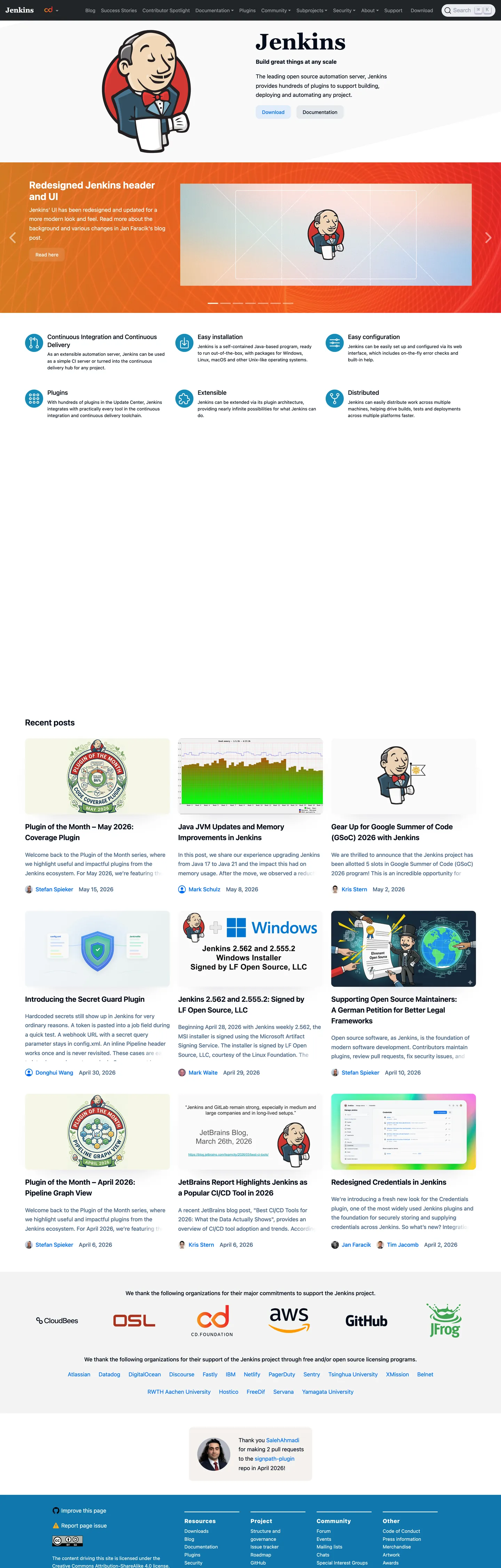
Jenkins.io opens with a serif "Jenkins" wordmark at 64px that no other CI/CD brand would dare attempt in 2026. While CircleCI runs Inter at enormous scale and GitHub Actions wraps itself in a dark Primer surface, Jenkins uses Georgia — a web-safe font from the 1990s, weight 700 — for its above-fold h1. The effect is not dated; it reads as community conviction. The butler mascot (a tuxedoed figure carrying a server tray) sits in a sky-blue feature tile directly below, the only chromatic moment on an otherwise fully monochrome page. Below that: recent blog posts, plugin spotlight cards, sponsor logos, and a footer in near-navy. There is no hero gradient, no animated product screenshot, no pricing strip. The page is an open-source community hub, and it does not pretend otherwise.
The DESIGN.md file packages the system into machine-readable tokens for React and AI tools. Inside: 7 colors tokens anchored by the near-navy structural ink (#000c1a) and a steely slate secondary (#476485), with one brand-layer sky-blue (#168bb9) used exclusively on the mascot-spotlight banner; 11 typography tokens spanning Georgia at the 64px display tier, system-ui at h2 through caption, and a system monospace for code; a radius scale centered on 10.56px with circle and pill variants for avatar and mascot treatments; 8 spacing tokens on a 4px base. Components cover the serif wordmark heading, the sky-blue mascot banner, blog post cards, sponsor logo chips, and the Bootstrap-style secondary navigation strip.
Feed this spec to an AI coding tool and it reproduces Jenkins' moves: serif display in a sans-dominated category, a single sky-blue accent held for the mascot rather than for the CTA, near-navy ink instead of pure black, and Bootstrap-proportion spacing. The move worth considering for community-software sites: the willingness to look like a 2014 open-source hub — because the audience trusts that signal more than a commercial SaaS surface.
What makes it distinct
5
- Georgian serif wordmarkthe 64px / weight 700 Georgia h1 is the only serif display in the major CI/CD category, carrying old-school community credibility over commercial polish
- Single sky-blue momentthe butler-mascot feature banner at sky blue is the sole chromatic element on an otherwise monochrome-structural page
- Near-navy structural inkthe dominant text and border tone is a slightly-blue near-black (#000c1a), warmer and more anchored than pure black
- Bootstrap 5 architecturethe page runs the full Bootstrap custom-property stack, with system-ui as the body typeface and no custom web font in use
- Community-first contentrecent posts, plugin announcements, and sponsor logos fill the below-fold rather than feature-grid marketing copy
jenkins.io
Live at jenkins.io
A snapshot of the brand in production. Scroll the frame to see the whole page.
Colors
7 colors
Jenkins's system runs on #168bb9 as its primary voltage, used in 2 of 14 components. Type is set in system-ui across 11 tokens from 12.8px to 64px, weights 400–700. Shape language is mixed across 14 components, blending pills, soft rounds, and squarer corners.
Brand & Accent
Sparing, CTA-only voltage · 1
Surface
Page and card backgrounds · 2
Text
Headlines, body, captions · 2
Borders & Hairlines
Dividers, outlines, rules · 1
Other
Specialty colors · 1
Typography
11 type tokens
Set in system-ui across 11 tokens, from 12.8px to 64px, weights 400–700. Shown in its own stack: where the font isn't installed, the fallback the file names stands in.
- display-xl64px · weight 700 · lh 1The quick brown fox jumps over the lazy dog
- display-md28px · weight 700 · lh 33.6pxThe quick brown fox jumps over the lazy dog
- heading-md24px · weight 600 · lh 28.8pxThe quick brown fox jumps over the lazy dog
- heading-sm20.8px · weight 650 · lh 31.2pxThe quick brown fox jumps over the lazy dog
- heading-xs17.6px · weight 500 · lh 22.88pxThe quick brown fox jumps over the lazy dog
- body-lg16px · weight 400 · lh 26.56pxThe quick brown fox jumps over the lazy dog
- body-md16px · weight 450 · lh 26.56pxThe quick brown fox jumps over the lazy dog
- body-sm12.8px · weight 400 · lh 19.2pxThe quick brown fox jumps over the lazy dog
- nav-link14px · weight 450 · lh 23.24pxThe quick brown fox jumps over the lazy dog
- label-md16px · weight 500 · lh 26.56pxThe quick brown fox jumps over the lazy dog
- mono-sm14px · weight 400 · lh 21pxThe quick brown fox jumps over the lazy dog
Layout
Radii and spacing
5 corner radii and 8 spacing values. Shape language: mixed.
Radii
- none0px
- sm5px
- md10.56px
- full50%
- pill9999px
Spacing
- xs4px
- sm8px
- md12px
- base16px
- lg20px
- xl24px
- 2xl32px
- 3xl48px
Components
14 components
Each rendered from its tokens (color, type, radius, padding) on Jenkins's own canvas.
- Button Primarybutton-primaryButton Primary
- Button Secondarybutton-secondaryButton Secondary
- Top Navtop-navTop Nav
- Nav Linknav-linkNav Link
- Hero Headinghero-headingHero Heading
- Mascot Bannermascot-bannerMascot Banner
- Section Headingsection-headingSection Heading
- Body Paragraphbody-paragraphBody Paragraph
- CardcardCard
- Card Headingcard-headingCard Heading
- Type here…text-inputText Input
- Sponsor Chipsponsor-chipSponsor Chip
- AvataravatarAvatar
- FooterfooterFooter
In use
The system, in use
Jenkins's tokens on the kind of product it builds.
Build something people actually use.
A short paragraph of marketing copy that previews how the brand's display tier and body tier read together. Two sentences is usually enough.
FAQ
Jenkins design system FAQ
Common questions about Jenkins's tokens, components, and how to use this DESIGN.md in your project.
Read next
Related reading
Specs, directories, and component libraries that pair with this design system.
- Browse all design systemsThe full directory of DESIGN.md files on shadcn.io, with live mockups for each.shadcn.io
- Jenkins — official siteJenkins' public marketing site — the source of truth for the live tokens captured in this file.jenkins.io (opens in a new tab)
- The DESIGN.md specificationGoogle Labs' open spec for machine-readable design system files — the format this page is built on.github.com (opens in a new tab)
Use it
Use Jenkins in your project
One machine-readable file. Drop it into Claude, Cursor, or any AI tool that reads DESIGN.md.
Download the DESIGN.md
One machine-readable file: every color, type, radius, spacing, and component token of Jenkins.
Feed it to your AI tool
Drop it into Claude, Cursor, or GitHub Copilot. The agent writes React components and Tailwind classes that match Jenkins's visual language.
Reference the tokens directly
Or paste the values into your Tailwind config, CSS variables, or component library: every color, size and radius is a quoted, ready-to-copy value.
Read the full DESIGN.md: overview, rationale, do’s and don’ts
Overview
Jenkins' marketing site leads with a serif wordmark no other automation platform would use. Community Serif Authority. The 64px Georgia h1 at the top of jenkins.io reads as an artifact of the open-source community rather than a brand decision — which is exactly the point. Where CircleCI uses Space Grotesk at 170px in a stadium-type treatment and GitHub Actions wraps everything in Primer dark surfaces, Jenkins plants a web-safe serif from the early web era and signals: this is community software, not a commercial product.
The sole chromatic moment is the sky-blue mascot-spotlight tile ({colors.primary} — #168bb9) directly below the wordmark. Mr. Jenkins — a tuxedoed butler with a server tray — occupies this tile exclusively. Every other surface on the page is either pure white canvas or near-navy ink. The structural bones come from Bootstrap 5's custom-property stack, so the spacing, radii, and typeface defaults follow Bootstrap's conventions rather than a bespoke design system.
Key Characteristics:
- 64px Georgia serif wordmark — the only serif display headline in the CI/CD category among major hosted platforms.
- Near-navy structural ink (
{colors.ink}— #000c1a) as the dominant text and border tone, slightly blue rather than pure black. - Sky-blue mascot banner (
{colors.primary}— #168bb9) — the sole chromatic element, appearing 6 times as background fills around the butler illustration. - Bootstrap 5 system-sans body: system-ui / Segoe UI / Roboto, no custom web font loaded.
- Steely slate secondary tone (
{colors.ink-secondary}— #476485) for body text and de-emphasized borders. - Blog-first below-fold: plugin announcements, community posts, and sponsor logos occupy the scroll depth that product-led brands give to feature grids.
- No primary CTA button in the captured render — the community downloads rather than converts.
- Radius scale centered on 10.56px (Bootstrap's
border-radiusdefault of 0.375rem) with 50% circles for avatar thumbnails.
Colors
Brand
- Sky Blue (
{colors.primary}— #168bb9): frequency 6, all as background fills. The butler-mascot spotlight banner background. The only chromatic brand element on the page — every occurrence wraps the mascot illustration. Undeclared as a CSS custom property in the captured surface; rendered via a direct color value on the banner element.
Structural Text and Border
- Near-Navy Ink (
{colors.ink}— #000c1a): frequency 258 (text 129, border 129). The dominant color of the system — all body text, all borders, the wordmark character. Wired as--colorin CSS. Slightly blue-shifted rather than pure black, carrying a subtle anchored warmth. - Steely Slate (
{colors.ink-secondary}— #476485): frequency 54 (text 27, border 27). Body paragraph text and secondary borders. Wired as--color--secondary. A mid-tone blue-gray that makes body copy feel less stark against the white canvas while keeping it clearly legible.
Surface
- Canvas (
{colors.canvas}— #ffffff): the body floor. All blog cards, sponsor logo areas, and the top-nav sit on pure white. Wired as--backgroundand--bs-body-bg. - Warm Gray (
{colors.surface-1}— #dad1c6): frequency 1 (background). A warm beige declared as--bs-gray-400and--bs-dark-bg-subtle. Appears as a subtle chip or tag background; the warmest surface in the system.
Shadow
- Shadow Ink (
{colors.shadow}— #000028): frequency 9, all as shadow ink. A deep navy used for element drop shadows — darker and bluer than the body ink, producing a perceptible depth rather than a gray shadow.
Hairline
- Hairline (
{colors.hairline}— #000000): frequency 10 (text 8, bg 1, border 1). Pure black appearing in small annotation and separator contexts, distinct from the slightly-blue near-navy body ink.
Typography
Font Families
The system runs two families: Georgia for the primary wordmark h1, and the Bootstrap 5 system-sans stack for every other typographic surface. Georgia is web-safe (no load cost, universally available). The system-sans stack cascades: system-ui → Segoe UI → Roboto → Noto Sans → Ubuntu → Cantarell → Fira Sans → Droid Sans → Helvetica Neue → Arial. No custom web font is loaded on the marketing site.
The serif-plus-system-sans split is the defining typographic choice. The wordmark in serif signals community age and authority; everything below it in system-sans signals pragmatic utility. The two families do not mix within body content.
Hierarchy
| Token | Size | Weight | Line Height | Use |
|---|---|---|---|---|
{typography.display-xl} | 64px | 700 | 1.0 | "Jenkins" wordmark h1 — Georgia only |
{typography.display-md} | 28px | 700 | 33.6px | Section h2 announcements (system-sans) |
{typography.heading-md} | 24px | 600 | 28.8px | h2 sub-section headers |
{typography.heading-sm} | 20.8px | 650 | 31.2px | h5 card titles |
{typography.heading-xs} | 17.6px | 500 | 22.88px | h5 feature labels |
{typography.body-lg} | 16px | 400 | 26.56px | Standard body paragraphs |
{typography.body-md} | 16px | 450 | 26.56px | Body paragraphs (slight medium weight) |
{typography.body-sm} | 12.8px | 400 | 19.2px | Captions, post metadata |
{typography.nav-link} | 14px | 450 | 23.24px | Top-nav and footer link labels |
{typography.label-md} | 16px | 500 | 26.56px | Section labels and strong inline text |
{typography.mono-sm} | 14px | 400 | 21px | Code snippets in plugin announcements |
Principles
The wordmark is the only moment where weight 700 meets a serif. Below it, headings use 600–700 in the system-sans stack, and body text settles at 400–450 — a soft mid-weight rather than the usual 400 / 600 binary. There is no display size between 28px and 64px; the jump is intentional and creates visual distance between the wordmark tier and the content tier.
Note on Font Substitutes
Georgia is freely available and universally installed — no substitute is necessary. For a more contemporary editorial serif at the same weight, Lora or Source Serif 4 at weight 700 transfer the intent. For the body stack, Inter at the same weight values is a drop-in that narrows slightly; the system-ui default renders acceptably across every major OS without any trade-off.
Layout
Spacing System
- Base unit: 4px, with 16px and 20px as the dominant content values.
- Tokens:
{spacing.xs}4px ·{spacing.sm}8px ·{spacing.md}12px ·{spacing.base}16px ·{spacing.lg}20px ·{spacing.xl}24px ·{spacing.2xl}32px ·{spacing.3xl}48px. - Top-nav padding: 8px vertical, 16px horizontal.
- Card internal padding: 20px on blog cards; blog post thumbnails fill edge-to-edge within the card.
- Mascot banner padding: 20px vertical, 24px horizontal.
- Footer padding: 48px top, 24px horizontal.
Grid and Container
- Architecture: Bootstrap 5 12-column grid with standard breakpoints (576 / 768 / 992 / 1200 / 1400px).
- Max container width: approximately 1320px at the xxl breakpoint.
- Masthead: full-width navigation with wordmark flush left, plugin-download link and sign-in CTA flush right.
- Feature row: 2-column split — mascot banner tile on the left, text-and-download panel on the right.
- Blog grid: 3-column post grid at desktop, collapsing to 2-column at md and 1-column at sm.
- Sponsor row: single flex row of partner logos (CloudBees, DSL, od, AWS, GitHub) at uniform height.
Rhythm
The page follows a content-first rhythm rather than an editorial band structure. Each section is a grid of cards or a list of posts; there is no alternating full-bleed section. The mascot banner is the only full-width decorative moment. Below it, the page returns immediately to card-grid content and maintains that pattern to the footer.
Elevation
The system uses subtle box shadows rather than tonal surface lifts. Blog cards at desktop sit on the pure-white canvas with a box-shadow: 0 0.5rem 1rem rgba(0, 0, 0, 0.15) — the Bootstrap default shadow tier. The shadow ink is {colors.shadow} (#000028), a deep navy rather than gray, giving shadows a cool depth tone. There are three declared shadow tiers from Bootstrap 5 (--bs-box-shadow-sm, --bs-box-shadow, --bs-box-shadow-lg) but only the standard box-shadow renders on the captured surface.
Shapes
The radius scale follows Bootstrap 5's defaults:
{rounded.none}0px — the mascot banner and the masthead are square-edged, no rounding.{rounded.sm}5px — small UI chrome (buttons, inputs), corresponding to Bootstrap'sborder-radius-sm.{rounded.md}10.56px — the dominant card radius (Bootstrapborder-radius= 0.375rem at 16px base, rendered as ~6px; the captured 10.56px corresponds to a larger element). Appears 12 times.{rounded.full}50% — avatar thumbnails, mascot illustration chips in the blog grid. Appears 7–8 times.{rounded.pill}9999px — Bootstrap pill variant for badge-style labels.
The system does not have a generous-soft ladder; rounding is either tight-square (0–5px) or fully circular (50%). The mid-radius at 10.56px covers the blog post cards.
Components
button-primary — Sky-blue {colors.primary} fill, white text, {rounded.sm} 5px radius, 8×18px padding, 40px height. Appears on the mascot banner as the download CTA ("Download Jenkins"). The only rendered button instance on the page that uses the brand color.
button-secondary — White {colors.canvas} fill, near-navy text, 1px near-navy border, {rounded.sm} radius. Used for secondary actions like "Get started" links in the feature row.
top-nav — Pure-white surface, 56px height, near-navy ink. Jenkins wordmark flush left; navigation links and a right-aligned CTA cluster. The Bootstrap navbar renders in the system-sans stack at 14px / 450 weight.
nav-link — Transparent background, near-navy ink text, 0×15px horizontal padding. Standard Bootstrap nav-link treatment.
hero-heading — 64px Georgia at weight 700, near-navy ink on transparent background. The wordmark element. The only Georgia instance on the page.
mascot-banner — Sky-blue {colors.primary} full-bleed tile, 20×24px padding. Contains the butler-mascot illustration, a section heading in white system-sans, a body paragraph, and the primary download button. The branded centerpiece of the page.
section-heading — White text in {typography.display-md} (28px / 700 system-sans) — appears inside the dark mascot-banner background.
body-paragraph — Steely-slate {colors.ink-secondary} text at {typography.body-md}. Body copy sits at a slightly-blue medium gray rather than near-navy, softening the reading contrast.
card — White canvas, 1px {colors.ink-secondary} border, {rounded.md} 10.56px radius, 20px internal padding. The blog post card pattern — holds a thumbnail image, h5 card title, metadata (date + author), and a body excerpt.
card-heading — Near-navy ink text in {typography.heading-sm} (20.8px / 650). The blog card h5 title style.
text-input — White canvas, 1px {colors.ink-secondary} border, {rounded.sm} 5px radius, 8×12px padding, 38px height. The site-search input in the top-nav.
sponsor-chip — White canvas, {rounded.full} circular, small body text. Partner-logo chips rendered in the sponsor acknowledgment row.
avatar — Fully circular ({rounded.full} — 50%), 48px square. Author avatars and mascot-derivative plugin illustrations in the blog card grid.
footer — Near-navy {colors.ink} background, white text, 48×24px padding. Four-column footer links in system-sans at {typography.body-sm}.
Do's and Don'ts
Do use Georgia exclusively for the top-level wordmark h1 and let the system-sans stack handle every other typographic tier. The two families create a clear hierarchy signal: serif = identity, sans = content. Bleeding Georgia into section headings would dilute the distinction.
Do reserve sky blue ({colors.primary} — #168bb9) for the mascot-spotlight context only. The page's visual identity depends on this color appearing exactly where the community-facing mascot lives. Using it for generic CTAs or section accents would flatten the emphasis.
Do let blog content and plugin announcements carry the below-fold scroll depth. The community-software convention is to show real activity (posts, releases, PRs) rather than marketing feature grids; replacing the blog grid with a commercial feature section would read as out-of-character.
Do render author and mascot avatars as fully circular ({rounded.full} — 50%). The community-contributor identity relies on avatar circles; rectangular thumbnail crops would feel like a product catalog, not a community hub.
Don't load a custom web font. The system's "no-web-font" stance has a real-world benefit for a community server: the page loads without a font FOUT and renders on any network quality. Adding a custom font would require a build pipeline change and introduce a load dependency that contradicts the open-source-server audience's expectations.
Don't use the steely-slate secondary tone ({colors.ink-secondary} — #476485) for borders on interactive elements. At 27 frequency it reads as a body-text and passive-border color; interactive borders should use the near-navy {colors.ink} (#000c1a) to signal clear affordance.
Don't introduce a gradient on the mascot banner. The sky-blue tile is a flat, unadorned background. Gradients would signal a commercial redesign rather than a community announcement page.
Don't swap the near-navy ink ({colors.ink} — #000c1a) for pure black (#000000). The barely-blue shift in the near-navy is consistent across text, borders, and shadow; swapping to pure black loses the slight warmth that keeps the high-contrast white-on-near-navy from feeling clinical.
Known Gaps
- Primary CTA button: the captured render does not include a primary button outside the mascot banner; the general download-page flow exists at get.jenkins.io and is not represented here.
- Dark mode: the site has no dark-mode surface in the captured marketing pages; the Jenkins UI/UX itself ships a dark theme inside the CI/CD dashboard, not represented here.
- Plugin directory surface: the plugin.jenkins.io subdomain carries its own card layout and search interface with a distinct token set not captured here.
- Mobile navigation: the Bootstrap collapsed navbar menu pattern is not captured; the hamburger menu, off-canvas panel, and mobile nav-link spacing are inferred from Bootstrap defaults, not measured.
- Form validation states: no form submit is visible on the marketing surface; error and success states from Bootstrap's validation system are declared as custom properties but not captured in render.
- Motion: the page does not use scroll animations or transition effects on the captured surface; the Jenkins UI ships entrance animations in its dashboard that are not represented here.
Backend, Database & DevOps
More systems like this
More DESIGN.md files in Backend, Database & DevOps.
Pricing
Build it with Pro
The DESIGN.md files are free. Pro adds 6,000+ blocks, premium templates and the MCP server, so your AI editor builds in your system for you.
4.9/5 out of 5 · 150+ reviewsfrom 150+ founders and developers.
Billing
Billed once a year in USD. Cancel anytime.
- How many people can use the license.
- Client work, SaaS products and anything you charge for.
- Production-ready React sections: hero, pricing, features, dashboards and more.
- Complete multi-page sites you can ship as they are.
- React icons from every major library, installable with one command.
- Presets that restyle every block, in light and dark.
- Lets your AI editor search, preview and install blocks for you.
- Priority requests are answered first.
Individual
For personal projects & open source
$32instead of $49/mo
$389 billed yearly
- Seats: 1 seat
- Commercial use: Personal & open source only
- Pro blocks: 6,000+ blocks
- Templates: All 14 templates
- React icons: 294k+ icons
- Themes: All 59 themes
- MCP server: Basic usage
- Support: Standard
Team
Most popularFor freelancers, agencies & startups
$66instead of $99/mo
$789 billed yearly · ≈ $13/dev/mo
- Seats: Up to 5 seats
- Commercial use: Included
- Pro blocks: 6,000+ blocks
- Templates: All 14 templates
- React icons: 294k+ icons
- Themes: All 59 themes
- MCP server: High usage
- Support: Priority
Organization
For companies with larger teams
$132instead of $199/mo
$1,589 billed yearly
- Seats: Unlimited seats
- Commercial use: Included
- Pro blocks: 6,000+ blocks
- Templates: All 14 templates
- React icons: 294k+ icons
- Themes: All 59 themes
- MCP server: Unlimited usage
- Support: Priority
Billed once a year in USD. Cancel anytime.
Individual
For personal projects & open source
$32instead of $49/mo
$389 billed yearly
- How many people can use the license.Seats: 1 seat
- Client work, SaaS products and anything you charge for.Commercial use: Personal & open source only
- Production-ready React sections: hero, pricing, features, dashboards and more.Pro blocks: 6,000+ blocks
- Complete multi-page sites you can ship as they are.Templates: All 14 templates
- React icons from every major library, installable with one command.React icons: 294k+ icons
- Presets that restyle every block, in light and dark.Themes: All 59 themes
- Lets your AI editor search, preview and install blocks for you.MCP server: Basic usage
- Priority requests are answered first.Support: Standard
Team
Most popularFor freelancers, agencies & startups
$66instead of $99/mo
$789 billed yearly · ≈ $13/dev/mo
Everything in Individual, plus
- How many people can use the license.Seats: Up to 5 seats
- Client work, SaaS products and anything you charge for.Commercial use: Included
- Lets your AI editor search, preview and install blocks for you.MCP server: High usage
- Priority requests are answered first.Support: Priority
Organization
For companies with larger teams
$132instead of $199/mo
$1,589 billed yearly
Everything in Team, plus
- How many people can use the license.Seats: Unlimited seats
- Lets your AI editor search, preview and install blocks for you.MCP server: Unlimited usage
- Secure checkout via Stripe
- Code lives in your repo
- Keep what you've shipped if you cancel
- License terms
Your system, built for you
Every block, template and icon, installed by your AI agent in your design system. The DESIGN.md files stay free.