Intuit Design System
Intuit's parent-brand marketing system as a DESIGN.md file. Saturated Superblue #236cff as hero canvas and brand voltage, AvenirNext forINTUIT at 72px / 400, soft sand surfaces, 19 components.
Add shadcn.io to your AI agent. · Pro It installs blocks, icons and templates in your design system from a prompt, with Pro.
Set up MCP- Primary
- #236cff
- Typeface
- AvenirNext forINTUIT
- Shape
- Soft
- Base radius
- 32px
- Colors
- 14
- Type tokens
- 11
- Components
- 19
- Spacing values
- 9
About
About Intuit DESIGN.md
Curated by Dov Azencot · Updated May 19, 2026 · Source intuit.com (opens in a new tab)
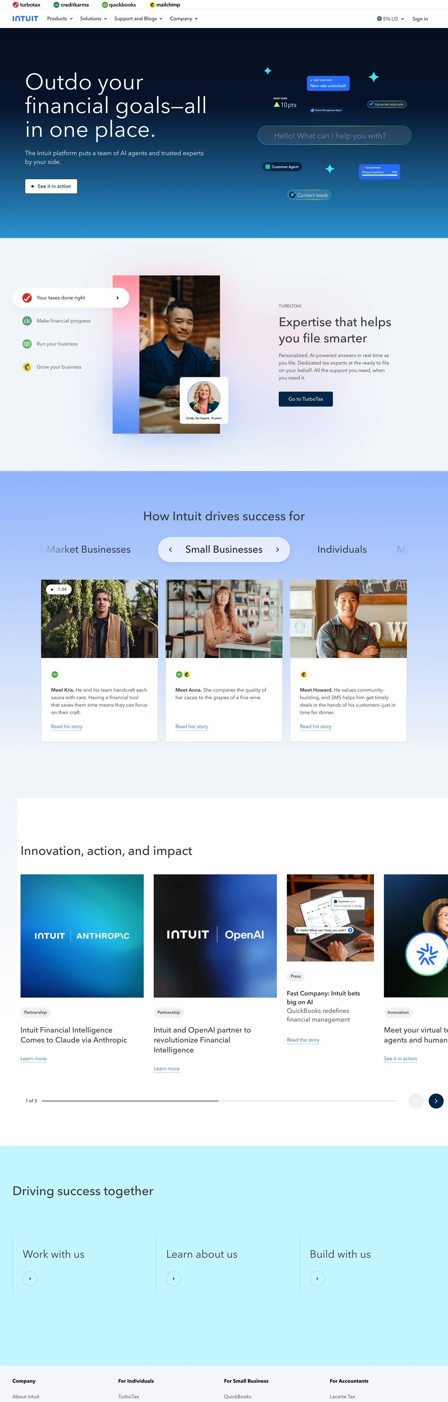
Intuit's marketing site is a parent-brand portal rather than a product page. The hero is a saturated Superblue block at `--color-ies-super-blue` #236cff, carrying a 72px AvenirNext forINTUIT h1 in white that reads "Outdo your financial goals — all in one place." A skyblue 100px pill CTA sits beneath the h1, with a small product-photo card floating to the right showing a portrait above the line "Expertise that helps you file smarter." Below the fold the page inverts to white over a soft sand surface #f4f5f8, runs a 3-tab segment control ("Consumer / Small Business / Individuals") that drives a 3-column card switch, then a row of dark-Superblue product tiles for the partnerships (Intuit AssistOpenAI, etc.).
The DESIGN.md file packages the system into a machine-readable spec. Inside: 14 colour tokens drawn from the Superblue voltage, the deep blueberry #00254a accent, a structural tier of greyscale ink and the soft sand surface, and a small set of muted accents that appear in below-the-fold illustrations; 11 typography tokens running AvenirNext forINTUIT (a custom proprietary family wired as `--font-primary`) at sizes 12-72px and weights 400-700, with the 72px / 400 hero h1 as the loudest typographic moment; 4 radius tokens centred on 6px small chips, 32px rounded cards, and 100px pills; 8 spacing tokens on a 4px base; and 19 components covering the Superblue hero block, the pill CTA, the tabbed segment, the 3-column tabbed card grid, the dark Superblue partner tile, and the standard top-nav cluster.
Feed this file to Claude or Cursor and it will reproduce Intuit's specific moves: saturated Superblue hero block instead of a gradient, voltage-as-canvas discipline, 72px / 400 AvenirNext-equivalent display, soft sand surfaces below the fold instead of pure white, tabbed segment control for product taxonomy, and the sub-brand colour reserve (the parent-brand chrome carries zero TurboTax / QuickBooks / Credit Karma / Mailchimp accent). The token references resolve cleanly. The one move worth borrowing only if you have a true parent-brand portfolio: the tabbed segment that swaps the whole card grid — it only earns its place when the audience splits cleanly into three groups that need different proof points, which is rare outside fintech / commerce parent brands.
What makes it distinct
5
- Superblue as both canvas and voltage#236cff fills the hero block AND carries the primary CTA AND the link text; the single brand colour does three jobs
- AvenirNext forINTUIT across every tierdisplay at 72px / 400 in white-on-Superblue, body at 14-16px / 400-500, with weight 700 reserved for h-eyebrow labels
- Soft sand tierthe off-canvas surface is #f4f5f8 (warm pale grey), not pure white; wired into both `--color-grey-rw-tofu` and `--web-refresh-skyblue-01`
- Tabbed segment grida 3-tab control ('Consumer / Small Business / Individuals') drives a 3-column card switch, mirroring the parent-brand's product taxonomy
- Sub-brand colour disciplinethe page itself shows zero TurboTax green, QuickBooks blue, Credit Karma cyan, or Mailchimp yellow; sub-brand voltages live only on their own product pages
intuit.com
Live at intuit.com
A snapshot of the brand in production. Scroll the frame to see the whole page.
Colors
14 colors
Intuit's system runs on #236cff as its primary voltage, used in 4 of 19 components. Type is set in AvenirNext forINTUIT across 11 tokens from 14px to 72px, weights 400–700. Shape language is soft — components average 64px corner radius, with no sharp interactive edges.
Brand & Accent
Sparing, CTA-only voltage · 4
Surface
Page and card backgrounds · 4
Text
Headlines, body, captions · 4
Other
Specialty colors · 2
Typography
11 type tokens
Set in AvenirNext forINTUIT across 11 tokens, from 14px to 72px, weights 400–700. Shown in its own stack: where the font isn't installed, the fallback the file names stands in.
- display-xl72px · weight 400 · lh 76pxThe quick brown fox jumps over the lazy dog
- display-lg40px · weight 500 · lh 52pxThe quick brown fox jumps over the lazy dog
- display-md34px · weight 400 · lh 44pxThe quick brown fox jumps over the lazy dog
- heading-lg32px · weight 500 · lh 42pxThe quick brown fox jumps over the lazy dog
- heading-md24px · weight 500 · lh 32pxThe quick brown fox jumps over the lazy dog
- heading-sm20px · weight 400 · lh 28pxThe quick brown fox jumps over the lazy dog
- body-md16px · weight 400 · lh 24pxThe quick brown fox jumps over the lazy dog
- body-sm14px · weight 400 · lh 20pxThe quick brown fox jumps over the lazy dog
- label-md14px · weight 500 · lh 20pxThe quick brown fox jumps over the lazy dog
- label-bold16px · weight 700 · lh 24pxThe quick brown fox jumps over the lazy dog
- button-md16px · weight 500 · lh 24pxThe quick brown fox jumps over the lazy dog
Layout
Radii and spacing
8 corner radii and 9 spacing values. Shape language: soft.
Radii
- none0px
- xs2px
- sm6px
- md32px
- lg40px
- xl80px
- pill100px
- full9999px
Spacing
- xs4px
- sm8px
- md10px
- base12px
- lg16px
- xl20px
- 2xl24px
- 3xl32px
- 4xl40px
Components
19 components
Each rendered from its tokens (color, type, radius, padding) on Intuit's own canvas.
- Button Primarybutton-primaryButton Primary
- Button Primary Hoverbutton-primary-hoverButton Primary Hover
- Button Secondarybutton-secondaryButton Secondary
- Button Tertiarybutton-tertiaryButton Tertiary
- Top Navtop-navTop Nav
- Nav Linknav-linkNav Link
- Hero Blockhero-blockHero Block
- Hero Headinghero-headingHero Heading
- Hero Subhero-subHero Sub
- Section Headingsection-headingSection Heading
- Card Eyebrowcard-eyebrowCard Eyebrow
- Body Paragraphbody-paragraphBody Paragraph
- Segment Tabssegment-tabsSegment Tabs
- Segment Tab Activesegment-tab-activeSegment Tab Active
- Segment Tab Inactivesegment-tab-inactiveSegment Tab Inactive
- Product Cardproduct-cardProduct Card
- Hero Product Cardhero-product-cardHero Product Card
- Partner Tilepartner-tilePartner Tile
- FooterfooterFooter
In use
The system, in use
Intuit's tokens on the kind of product it builds.
Build something people actually use.
A short paragraph of marketing copy that previews how the brand's display tier and body tier read together. Two sentences is usually enough.
FAQ
Intuit design system FAQ
Common questions about Intuit's tokens, components, and how to use this DESIGN.md in your project.
Read next
Related reading
Specs, directories, and component libraries that pair with this design system.
- Browse all design systemsThe full directory of DESIGN.md files on shadcn.io, with live mockups for each.shadcn.io
- Intuit — official siteIntuit's public parent-brand marketing site — the source of truth for the live tokens captured in this file.intuit.com (opens in a new tab)
- The DESIGN.md specificationGoogle Labs' open spec for machine-readable design system files — the format this page is built on.github.com (opens in a new tab)
Use it
Use Intuit in your project
One machine-readable file. Drop it into Claude, Cursor, or any AI tool that reads DESIGN.md.
Download the DESIGN.md
One machine-readable file: every color, type, radius, spacing, and component token of Intuit.
Feed it to your AI tool
Drop it into Claude, Cursor, or GitHub Copilot. The agent writes React components and Tailwind classes that match Intuit's visual language.
Reference the tokens directly
Or paste the values into your Tailwind config, CSS variables, or component library: every color, size and radius is a quoted, ready-to-copy value.
Read the full DESIGN.md: overview, rationale, do’s and don’ts
Overview
Intuit's marketing site does something almost no other consumer-financial brand does. Voltage as canvas. The hero is a saturated Superblue block at {colors.primary} (#236cff) — not a gradient mesh, not a photographic image, just a flat colour fill — carrying a 72px AvenirNext forINTUIT h1 in white. The same Superblue carries the primary CTA pill, the link text, the focus ring, and the active segment tab. One hex does the work of canvas, voltage, link, and focus. Where Stripe runs an iridescent gradient under its hero and Wise paints a soft mint hero block with a green CTA, Intuit's hero is the most stripped-back of the financial-software parent brands — a single saturated blue carrying a single editorial sentence.
The system's restraint shows most clearly in what is absent. Intuit owns TurboTax (green), QuickBooks (blue-green), Credit Karma (cyan), Mailchimp (yellow), and Mint — five sub-brands with distinctive primary voltages. The parent-brand chrome on intuit.com renders none of those colours. The captured page shows zero TurboTax green, zero Mailchimp yellow, zero Credit Karma cyan, zero QuickBooks blue-green; the sub-brand voltages are reserved for the sub-brand pages. The parent surface trusts the single Superblue plus a deep blueberry {colors.navy-deep} (#00254a) for the partner-tile band, and that is the whole brand palette.
Below the fold the page inverts to a soft sand surface {colors.surface-sand} (#f4f5f8) — a warm pale grey wired as --color-grey-rw-tofu AND --web-refresh-skyblue-01 (note the multi-namespace aliasing into a "skyblue-01" alias that signals the colour is technically a blue-tinted grey). Pure white {colors.canvas} is reserved for card fills, so the sand surface serves as the page floor against which white product cards lift. A 3-tab segment control ("Consumer / Small Business / Individuals") sits between the hero and the card grid, swapping a 3-column card switch beneath as the active tab changes — the most domain-specific component in the system, mirroring the parent's audience taxonomy.
Key Characteristics:
- Single Superblue voltage (
{colors.primary}— #236cff) carries hero canvas AND CTA AND link AND focus ring. One hex, four jobs. - AvenirNext forINTUIT across every tier — wired as
--font-primary, no second family in active use. - Soft sand below-fold surface (
{colors.surface-sand}— #f4f5f8), wired into both grey and "skyblue" alias namespaces; warmer than pure white. - 100px pill CTAs at 40px height, paired with 32px-rounded segment-tab containers and 6px-rounded product cards — three-tier radius scale.
- Sub-brand colour reserve: the parent-brand chrome carries zero TurboTax / QuickBooks / Credit Karma / Mailchimp accent. Sub-brand voltages live only on their own pages.
- Tabbed segment control with 3-column card swap below — the audience-split component is the page's most domain-specific move.
- Deep blueberry
{colors.navy-deep}(#00254a) partner-tile band below the fold; the only dark surface in the system, used for "Intuit AssistOpenAI" and similar partnership tiles. - Hero h1 at 72px / 400 in white-on-Superblue is the loudest typographic moment; weight 700 is reserved for small 16px section eyebrow labels.
Colors
Brand
- Superblue (
{colors.primary}— #236cff): frequency 43. Used as text (18), bg (4), border (18), shadow (2), gradient (1). Wired into 12 CSS variables across--color-ies-super-blue,--web-refresh-intuit-superblue,--web-refresh-omni-brand-blue,--color-blue-07,--focusStateBorderColor. The single brand voltage — carries hero block fill, CTA fill, link text, and focus ring. - Superblue Dark (
{colors.primary-dark}— #0655ee): frequency 1 (gradient only). Reserved for hover/press states on the primary CTA pill. Slightly more saturated than the rest state. - Navy Deep (
{colors.navy-deep}— #00254a): frequency 24. Used as text (1), bg (9), border (11), gradient (3). Wired as--color-blue-08and--web-refresh-blueberry-110. The secondary brand accent — fills the partner-tile band below the fold. - Navy Darkest (
{colors.navy-darkest}— #06132b): frequency 1 (gradient only). Reserved for the deepest gradient endpoint on dark partner tiles.
Structural
- Ink (
{colors.ink}— #21262a): frequency 236. Used as text (119), border (117). Wired as--web-refresh-grey-03,--web-refresh-omni-text-primary,--color-blue-grayish-blue. The dominant text colour on white surfaces. - Ink Soft (
{colors.ink-soft}— #393a3d): frequency 470. Used as text (235), border (235). Wired as--color-text-primaryand--color-ui-secondary. The most-used colour on the page by raw count — every section heading, eyebrow label, and most secondary text uses this slightly-cool dark grey. - Ink Near-Black (
{colors.ink-near-black}— #101010): frequency 4. Used as text (2), border (2). The deepest UI grey, reserved for the partner-tile heading text and a single hairline. - Ink Pure Black (
{colors.ink-pure-black}— #000000): frequency 381. Used as text (195), border (183), gradient (3). Wired as--color-black,--color-shadow,--color-overlay. Pure black is reserved for the page's small-text legal disclaimer copy and as the shadow colour.
Surface
- Canvas (
{colors.canvas}— #ffffff): frequency 159. Used as text (72 on dark surfaces), bg (14), border (73). The card-fill surface — every product tile, hero card, and segment-tab background. - Surface Sand (
{colors.surface-sand}— #f4f5f8): frequency 7 as bg. Wired as--color-grey-rw-tofu,--web-refresh-skyblue-01,--color-page-background-secondary. The below-fold page-floor tone; a warm pale grey that reads warmer than pure white. - Surface Mint (
{colors.surface-mint}— #c2f5ff): frequency 1 as bg. Wired as--color-container-background-infoand--color-agave-20. Reserved for info-state container fills; surfaces only inside the below-fold dashboard mockup. - Surface Pink (
{colors.surface-pink}— #ffd1e9): frequency 1 (gradient only). Wired as--color-container-background-newand--color-container-background-negative-secondary. Used only inside the dashboard illustration; not part of the marketing chrome.
Accent (illustration only)
- Accent Cyan (
{colors.accent-cyan}— #33b5ff): frequency 1 (gradient only). Wired as--color-link-text-complementaryand--color-blue-05. Surfaces only in the dashboard illustration above the fold; not used in chrome. - Accent Red (
{colors.accent-red}— #ff3232): frequency 1 (gradient only). The destructive / alert tone, surfaces only in illustration. The marketing chrome carries no error states.
Typography
Font Family
The system runs AvenirNext forINTUIT across every tier — a custom proprietary variant of Avenir Next licensed for Intuit's exclusive use, declared in CSS as the --font-primary value with the fallback Helvetica, Arial, sans-serif (some samples also include Avenir between the primary and Helvetica). There is no separate display family, no serif tier, no mono. The entire visible type ladder belongs to one variable-weight sans.
Hierarchy
| Token | Size | Weight | Line Height | Use |
|---|---|---|---|---|
{typography.display-xl} | 72px | 400 | 76px | Hero h1 ("Outdo your financial goals — all in one place.") |
{typography.display-lg} | 40px | 500 | 52px | Sub-hero statistic |
{typography.display-md} | 34px | 400 | 44px | Section "Work with us" h3 |
{typography.heading-lg} | 32px | 500 | 42px | h3 sub-heading |
{typography.heading-md} | 24px | 500 | 32px | Card title |
{typography.heading-sm} | 20px | 400 | 28px | Sub-card title |
{typography.body-md} | 16px | 400 | 24px | Default running text |
{typography.body-sm} | 14px | 400 | 20px | Caption rows |
{typography.label-md} | 14px | 500 | 20px | Eyebrow label, segment-tab label |
{typography.label-bold} | 16px | 700 | 24px | Small section h2 ("Expertise that helps you file smarter") |
{typography.button-md} | 16px | 500 | 24px | Primary CTA pill label |
Principles
Display tier sits at weights 400-500, never 600-700. The hero h1 at 72px / 400 is the system's loudest typographic moment — heavier than the surrounding chrome but deliberately not bold. The 32-40px heading tier runs at weight 500. Weight 700 is reserved for one specific role: small 16px section h2s such as "Expertise that helps you file smarter" — the eyebrow / sub-section labels that need to stand out at body size. There is no display-weight 700, no body-weight 700. The split is deliberate: large text earns visual weight from size, small text earns it from weight.
Note on Font Substitutes
AvenirNext forINTUIT is proprietary. The closest open-source substitute is Nunito Sans at the same weights — Avenir Next's geometric counters transfer cleanly. Inter at 95% line-height is a tighter alternative if you need slightly denser body sizes. DM Sans at the same weights is a passable swap for the 72px display tier specifically — its proportions read close. Keep the 72px / 400 hero weight when substituting; bumping to 500 to compensate for substitute family weight differences will break the airy display tone.
Layout
Spacing System
- Base unit: 4px (with 8px as the dominant module on padding shorthands).
- Tokens:
{spacing.xs}4px ·{spacing.sm}8px ·{spacing.md}10px ·{spacing.base}12px ·{spacing.lg}16px ·{spacing.xl}20px ·{spacing.2xl}24px ·{spacing.3xl}32px ·{spacing.4xl}40px. - Hero block padding: ~32px top, 0 horizontal — the Superblue extends edge-to-edge with the heading floating in a 1280px-capped content stack.
- Card internal padding: 20-24px on the 3-column product tiles, 24px on the hero product-photo card.
- Section padding (vertical): ~64-80px between major bands.
- Segment-tab padding: 4px around the inner pills, 8x16 on each tab label.
Grid & Container
- Max content width: ~1280px with 40px gutters at desktop.
- Hero: full-bleed Superblue
{colors.primary}block, content stack centred-left. Heading + sub-paragraph + primary CTA pill (left column) + product-photo card with "Expertise that helps you file smarter" overlay (right column). - Tabbed segment: 3-tab control ("Consumer / Small Business / Individuals") centered on the sand-surface band, with the active tab visible as a Superblue pill.
- Tabbed card grid: 3-column grid of white product cards swap below the segment, each carrying a portrait photograph and a "How {audience} drives success" header.
- Partner-tile row: below the card grid, a row of dark blueberry
{colors.navy-deep}tiles for "Intuit AssistOpenAI" and similar partnership cards. The only dark surface on the marketing page. - "Driving success together" band: a sand-surface footer-style block with 3 columns ("Work with us / Learn about us / Build with us") capped by a slim disclaimer band.
Rhythm
The page alternates between Superblue hero at the top, sand-surface editorial bands carrying the tabbed grid and partner tiles, white cards lifting off the sand surface, and a sand-surface footer terminating the flow. There is no atmospheric gradient between bands — each block terminates cleanly at the next. The visual rhythm is driven by the on/off switch between Superblue fill, sand fill, and white card lift.
Layout
The system has essentially no shadow tier on the marketing surface. Cards lift through colour-contrast against the sand surface, not drop shadows.
Elevation
- Flat surfaces: the hero, the editorial bands, the footer — ~98% of the page sits at z=0.
- Tonal lift:
{colors.canvas}(#ffffff) cards sit on{colors.surface-sand}(#f4f5f8) — the ~3-point lightness gap reads as elevation against the warm sand floor. - Soft shadow:
{colors.ink-pure-black}(#000000) wired as--color-shadowis used at low alpha for the lift on the hero product-photo card — the only place a true shadow renders on the marketing surface. - Hairline outlines:
{colors.surface-sand}doubles as the divider tone for top-nav and footer-edge borders, reading as a soft line on the white chrome.
Shapes
The radius scale is small-step plus pill, with 6px as the dominant content radius:
{rounded.none}0px — section blocks and editorial bands.{rounded.xs}2px — frequency 19. Small inline chips and labels.{rounded.sm}6px — frequency 9. The dominant content radius. Product cards, partner tiles, small content surfaces.{rounded.md}32px — frequency 5. Larger surface tiles, segment-tab container.{rounded.lg}40px — frequency 7. Larger card surfaces.{rounded.xl}80px — frequency 2. Reserved for the large blueberry partner-tile end-caps.{rounded.pill}100px — frequency 4. Primary CTA pill, segment-tab active state, small status chips.{rounded.full}9999px / 50% — frequency 21. Avatar circles, icon buttons.
The 6px tier is the most-used content radius — softer than Salesforce's 4px-corner CTA, sharper than Stripe's 12px-and-up softness. The system reads as "small radii for content, full pills for actions, circles for icons."
Components
button-primary — The Superblue pill CTA. {colors.primary} (#236cff) fill, white text in {typography.button-md} (16px / 500), {rounded.pill} (100px) radius, 6x12 padding, 40px height. "Start for free" and similar action labels are the canonical instances.
button-primary-hover — Background flips from {colors.primary} to {colors.primary-dark} (#0655ee) — a slightly more saturated Superblue for the press state.
button-secondary — White fill with {colors.primary} text and 1px border. Same {rounded.pill} 100px radius, 6x12 padding, 40px height. Used as the secondary CTA in the hero stack.
button-tertiary — Transparent fill, {colors.ink} text, {typography.label-md} (14px / 500), 8x0 padding. Used for "Learn more" tertiary actions inside cards.
top-nav — White canvas, 72px height, 8x0 padding. Houses the Intuit wordmark with the sub-brand mini-logos (TurboTax, QuickBooks, Mailchimp wordmarks rendered at ~24px in their native colour), the centre nav cluster, and a right-aligned login pair.
nav-link — Transparent background, {colors.ink} text in {typography.body-md} (16px / 400), 8px padding.
hero-block — {colors.primary} (#236cff) Superblue fill, white text, {typography.display-xl} heading, 32px top padding extending edge-to-edge. The full-bleed top-of-page block.
hero-heading — Transparent, white text, {typography.display-xl} (72px / 400). The signature 72px / 400 hero h1, rendered on the Superblue canvas.
hero-sub — Transparent, white text, {typography.body-md} (16px / 400). The hero sub-paragraph beneath the h1.
section-heading — Transparent, {colors.ink-soft} text, {typography.display-md} (34px / 400). The "Work with us" / "Driving success together" section heads on the sand surface.
card-eyebrow — Transparent, {colors.ink-soft} text, {typography.label-bold} (16px / 700). The small "Expertise that helps you file smarter" eyebrow label inside the hero product-photo card.
body-paragraph — {colors.ink-pure-black} text at {typography.body-sm} (14px / 400). The footnote / legal-disclaimer copy at the bottom of the page.
segment-tabs — White canvas, {rounded.md} 32px container radius, 4px padding, 48px height. Houses the three tab pills.
segment-tab-active — {colors.primary} (#236cff) fill, white text, {typography.label-md} (14px / 500), {rounded.pill} 100px radius, 8x16 padding. The selected segment ("Small Business" in the captured state).
segment-tab-inactive — Transparent fill, {colors.ink-soft} text, same {typography.label-md} and {rounded.pill} 100px. "Consumer" and "Individuals" in the captured state.
product-card — White canvas, {colors.ink} text, {rounded.sm} 6px radius, 20px padding. The 3-column tabbed product tiles, each carrying a portrait photograph (top), a "How {audience} drives success" label (middle), and a body paragraph (bottom).
hero-product-card — White canvas, {colors.ink-soft} text, {rounded.md} 32px radius, 24px padding. The card floating on the right of the hero ("Expertise that helps you file smarter"), with rounder corners than the product cards below the fold and a soft shadow lift.
partner-tile — {colors.navy-deep} (#00254a) blueberry fill, white text in {typography.heading-md} (24px / 500), {rounded.sm} 6px radius, 24px padding. The "Intuit AssistOpenAI" partnership tile and similar dark cards in the partner row.
footer — White canvas with {colors.surface-sand} 1px top divider, {colors.ink-soft} text, {typography.body-sm} (14px / 400), 40px padding. Multi-column link grid plus the legal disclaimer band beneath.
Do's and Don'ts
Do treat the Superblue {colors.primary} (#236cff) as both canvas and voltage. The hero is a Superblue block; the CTA is the same Superblue with a pill radius; the link text is the same Superblue. One hex carries the brand identity; introducing a paler "secondary blue" for any of those three roles dilutes the load-bearing signal.
Do reserve the sand surface {colors.surface-sand} (#f4f5f8) for the page floor on below-fold bands. White is for cards only. Inverting the relationship (white floor + sand cards) makes the cards disappear against the surface and breaks the parent-brand-portal visual structure.
Do keep AvenirNext forINTUIT at weight 400 for the 72px display. The hero h1 is the system's only 72px moment and the airy weight is the brand signature; bumping to 500 or 600 turns the editorial hero into a generic enterprise shout.
Do keep sub-brand voltages out of the parent-brand chrome. TurboTax green, QuickBooks blue-green, Credit Karma cyan, and Mailchimp yellow each belong to their sub-brand pages. The parent surface trusts the single Superblue.
Don't apply the {colors.navy-deep} (#00254a) blueberry to body text or eyebrow labels. The hex is partner-tile-fill only; using it as a color value for paragraphs breaks the warm Superblue / cool blueberry split (Superblue does light-on-dark, blueberry does dark-on-dark backgrounds with white text).
Don't introduce a 12-16px corner-radius tier on cards. The system is binary at small sizes — 6px for product cards, 32px+ for larger surfaces. A 12px card radius falls into the visual no-man's-land between "tight chip" and "soft surface" and breaks the rhythm.
Don't render the segment-tab inactive state with a coloured background. The pattern is "active = Superblue pill / inactive = transparent" so the selected tab carries 100% of the chromatic weight. Filling inactive tabs with a pale grey makes the segment read as 3 selected tabs simultaneously.
Don't swap the 100px pill CTA for a square-cornered button. The pill geometry is the consumer-finance signature that distinguishes Intuit's chrome from enterprise CRMs like Salesforce (which uses 4px corners on the same kind of hero CTA). The radius is part of the brand position.
Known Gaps
- Hover and focus states: the captured page exposes the primary-CTA hover only. Full focus rings, disabled tints, error states for inputs are not visible on the parent-brand chrome.
- Form inputs: the parent-brand site has no
<input>field on the captured page; the sign-up surface lives one click away on the sub-brand sites (TurboTax, QuickBooks). Form styling is documented in the per-product systems, not here. - Sub-brand surfaces: TurboTax, QuickBooks, Credit Karma, and Mailchimp each carry their own design systems with different primary voltages, typographic tiers, and component palettes. This file captures the parent-brand chrome only.
- Mobile and tablet layouts: the capture is desktop-only. The mobile experience collapses the 3-column tabbed grid into a vertical scroll with the segment control as a horizontal-scrolling chip row.
- Motion: the hero product-photo card carries a slow horizontal slide on load, and the segment tabs animate the underlying card swap. Easing curves and durations are not captured.
- Dark mode: the marketing surface is light-only. Dark variants exist in the per-product apps (QuickBooks Online has a dark mode) but are not represented here.
- Below-fold illustration colours:
{colors.surface-mint},{colors.surface-pink},{colors.accent-cyan},{colors.accent-red}appear only inside illustration assets, not in chrome. Their token roles in the broader system (semantic / accent) are not documented in the marketing CSS.
Fintech & Crypto
More systems like this
More DESIGN.md files in Fintech & Crypto.
Pricing
Build it with Pro
The DESIGN.md files are free. Pro adds 6,000+ blocks, premium templates and the MCP server, so your AI editor builds in your system for you.
4.9/5 out of 5 · 150+ reviewsfrom 150+ founders and developers.
Billing
Billed once a year in USD. Cancel anytime.
- How many people can use the license.
- Client work, SaaS products and anything you charge for.
- Production-ready React sections: hero, pricing, features, dashboards and more.
- Complete multi-page sites you can ship as they are.
- React icons from every major library, installable with one command.
- Presets that restyle every block, in light and dark.
- Lets your AI editor search, preview and install blocks for you.
- Priority requests are answered first.
Individual
For personal projects & open source
$32instead of $49/mo
$389 billed yearly
- Seats: 1 seat
- Commercial use: Personal & open source only
- Pro blocks: 6,000+ blocks
- Templates: All 14 templates
- React icons: 294k+ icons
- Themes: All 59 themes
- MCP server: Basic usage
- Support: Standard
Team
Most popularFor freelancers, agencies & startups
$66instead of $99/mo
$789 billed yearly · ≈ $13/dev/mo
- Seats: Up to 5 seats
- Commercial use: Included
- Pro blocks: 6,000+ blocks
- Templates: All 14 templates
- React icons: 294k+ icons
- Themes: All 59 themes
- MCP server: High usage
- Support: Priority
Organization
For companies with larger teams
$132instead of $199/mo
$1,589 billed yearly
- Seats: Unlimited seats
- Commercial use: Included
- Pro blocks: 6,000+ blocks
- Templates: All 14 templates
- React icons: 294k+ icons
- Themes: All 59 themes
- MCP server: Unlimited usage
- Support: Priority
Billed once a year in USD. Cancel anytime.
Individual
For personal projects & open source
$32instead of $49/mo
$389 billed yearly
- How many people can use the license.Seats: 1 seat
- Client work, SaaS products and anything you charge for.Commercial use: Personal & open source only
- Production-ready React sections: hero, pricing, features, dashboards and more.Pro blocks: 6,000+ blocks
- Complete multi-page sites you can ship as they are.Templates: All 14 templates
- React icons from every major library, installable with one command.React icons: 294k+ icons
- Presets that restyle every block, in light and dark.Themes: All 59 themes
- Lets your AI editor search, preview and install blocks for you.MCP server: Basic usage
- Priority requests are answered first.Support: Standard
Team
Most popularFor freelancers, agencies & startups
$66instead of $99/mo
$789 billed yearly · ≈ $13/dev/mo
Everything in Individual, plus
- How many people can use the license.Seats: Up to 5 seats
- Client work, SaaS products and anything you charge for.Commercial use: Included
- Lets your AI editor search, preview and install blocks for you.MCP server: High usage
- Priority requests are answered first.Support: Priority
Organization
For companies with larger teams
$132instead of $199/mo
$1,589 billed yearly
Everything in Team, plus
- How many people can use the license.Seats: Unlimited seats
- Lets your AI editor search, preview and install blocks for you.MCP server: Unlimited usage
- Secure checkout via Stripe
- Code lives in your repo
- Keep what you've shipped if you cancel
- License terms
Your system, built for you
Every block, template and icon, installed by your AI agent in your design system. The DESIGN.md files stay free.