Gemini Design System
Gemini crypto exchange's marketing-site design system as a DESIGN.md file. Geist type family, editorial-photo hero, pure-black pill CTA, orange brand logo mark, 10 colors tokens, 15 components. For React, Next.js, and AI tools.
Add shadcn.io to your AI agent. · Pro It installs blocks, icons and templates in your design system from a prompt, with Pro.
Set up MCP- Primary
- #999a9b
- Typeface
- Geist
- Shape
- Mixed
- Base radius
- 20px
- Colors
- 10
- Type tokens
- 12
- Components
- 15
- Spacing values
- 8
About
About Gemini DESIGN.md
Curated by Dov Azencot · Updated May 19, 2026 · Source gemini.com (opens in a new tab)
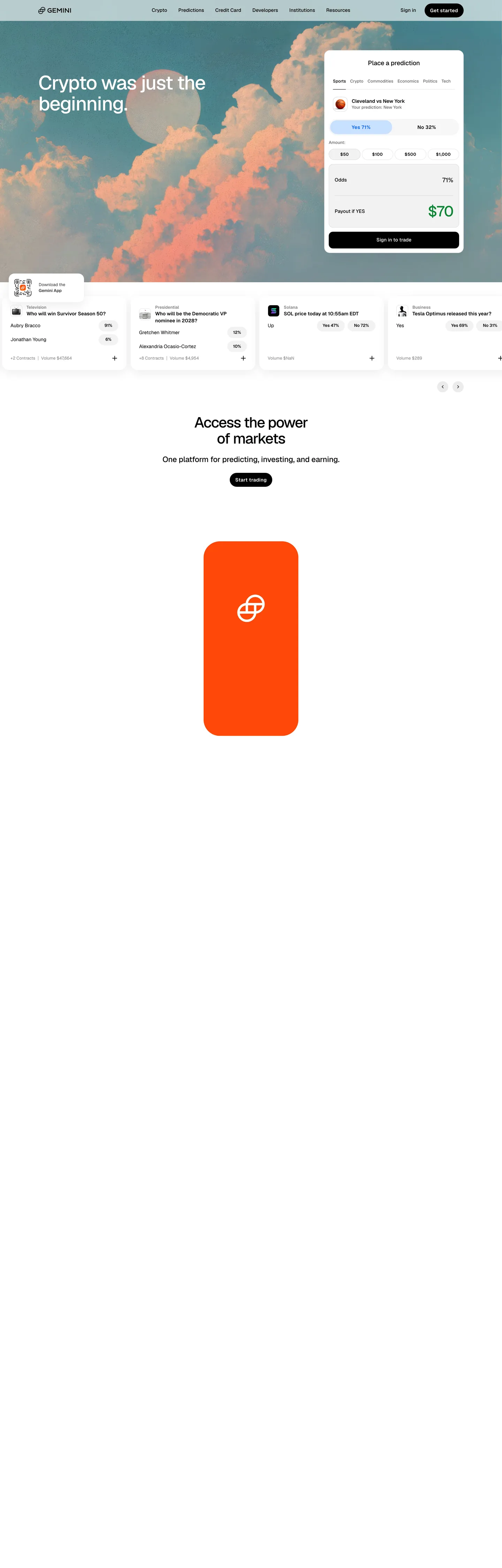
Gemini's homepage does not look like a crypto exchange. The hero is a full-bleed editorial photograph — pale teal sky and billowing orange-pink clouds — with "Crypto was just the beginning." in white Geist at 56px / 500. A "Place a prediction" card floats to the right showing live market data with Yes/No buttons, amount chips, odds percentage, and payout. The trading card is the product experience rendered in the marketing context, but Gemini keeps the surrounding hero anchored in photography rather than in brand chrome. Where Coinbase uses a dark-navy gradient canvas and crypto-product screenshots, and Kraken wraps its hero in a deep purple surface, Gemini removes the brand surface entirely and puts the image world first.
Below the fold, the page inverts to a pure white canvas with near-black (#010304) text and a single bold orange card holding the Gemini twin-arc logo mark — the only chromatic brand moment below the fold. The primary CTA throughout is a pure-black pill ("Get started," "Start trading") — no brand color fill, no hue at all. This monochromatic interactive discipline is unusual for crypto, where branded-color CTAs (Coinbase blue, Binance yellow) are the norm. Gemini's black pill reads as exchange-confident rather than marketing-bright.
The DESIGN.md file packages this into machine-readable tokens. Geist runs the entire type system — Vercel's open-source sans at tight negative letter-spacing (-1.6px at 56px, -3% at larger display sizes) carries both the bold editorial headline and the dense 12px / 600 data labels inside the trading card. The spacing base is 8px, with 20px cards and 24px section panels. Feeding this file to an AI coding tool reproduces Gemini's specific moves: editorial-image hero over a plain-white canvas, monochromatic black pill CTA, Geist at tight tracking, and orange brand mark used once below the fold as the system's sole visual exclamation point.
What makes it distinct
5
- Editorial photo herothe above-fold canvas is a full-bleed photograph of teal sky and orange clouds, not a brand-colored surface; white display type floats at 56px / weight 500
- Pure-black pill CTAthe primary button is black fill with white text and a 9999px radius; no brand-color fill, no gradient, no hue on the interactive primary action
- Geist at tight negative trackingdisplay type at 56px runs with -1.6px letter-spacing; the Vercel-developed open-source sans carries the entire type system from 96px to 12px
- Orange logo mark cardthe Gemini twin-arc symbol on a bold orange rectangle is the sole chromatic brand moment on the below-fold white canvas
- Prediction market densitythe above-fold trading card shows a full prediction UI (tabs, Yes/No percentage buttons, amount chips, odds, payout, CTA) at real data density
gemini.com
Live at gemini.com
A snapshot of the brand in production. Scroll the frame to see the whole page.
Colors
10 colors
Gemini's system runs on #999a9b as its primary voltage, used in 1 of 15 components. Type is set in Geist across 12 tokens from 12px to 56px, weights 400–600. Shape language is mixed across 15 components, blending pills, soft rounds, and squarer corners.
Brand & Accent
Sparing, CTA-only voltage · 1
Surface
Page and card backgrounds · 2
Text
Headlines, body, captions · 5
Borders & Hairlines
Dividers, outlines, rules · 1
Other
Specialty colors · 1
Typography
12 type tokens
Set in Geist across 12 tokens, from 12px to 56px, weights 400–600. Shown in its own stack: where the font isn't installed, the fallback the file names stands in.
- display-xl56px · weight 500 · lh 60px · tracking -1.6pxThe quick brown fox jumps over the lazy dog
- display-lg42px · weight 500 · lh 45px · tracking -1.6pxThe quick brown fox jumps over the lazy dog
- display-md32px · weight 500 · lh 37px · tracking -1.6pxThe quick brown fox jumps over the lazy dog
- heading-lg22px · weight 500 · lh 28px · tracking -1%The quick brown fox jumps over the lazy dog
- heading-md18px · weight 500 · lh 24px · tracking -0.5%The quick brown fox jumps over the lazy dog
- body-md14px · weight 400 · lh 20pxThe quick brown fox jumps over the lazy dog
- body-sm12px · weight 400 · lh 17pxThe quick brown fox jumps over the lazy dog
- label-md14px · weight 600 · lh 20px · tracking 0.35pxThe quick brown fox jumps over the lazy dog
- label-sm12px · weight 600 · lh 17pxThe quick brown fox jumps over the lazy dog
- button-md14px · weight 600 · lh 20px · tracking 0.35pxThe quick brown fox jumps over the lazy dog
- nav-link16px · weight 400 · lh 18pxThe quick brown fox jumps over the lazy dog
- caption12px · weight 500 · lh 17pxThe quick brown fox jumps over the lazy dog
Layout
Radii and spacing
5 corner radii and 8 spacing values. Shape language: mixed.
Radii
- none0px
- sm8px
- md20px
- lg24px
- pill9999px
Spacing
- xs4px
- sm8px
- md12px
- base16px
- lg24px
- xl32px
- 2xl48px
- 3xl104px
Components
15 components
Each rendered from its tokens (color, type, radius, padding) on Gemini's own canvas.
- Button Primarybutton-primaryButton Primary
- Button Secondarybutton-secondaryButton Secondary
- Top Navtop-navTop Nav
- Nav Linknav-linkNav Link
- Hero Headinghero-headingHero Heading
- Section Headingsection-headingSection Heading
- Body Paragraphbody-paragraphBody Paragraph
- Body Paragraph Mutedbody-paragraph-mutedBody Paragraph Muted
- CardcardCard
- Prediction Cardprediction-cardPrediction Card
- Market Rowmarket-rowMarket Row
- Type here…text-inputText Input
- Amount Chipamount-chipAmount Chip
- Prediction Tabprediction-tabPrediction Tab
- FooterfooterFooter
In use
The system, in use
Gemini's tokens on the kind of product it builds.
Build something people actually use.
A short paragraph of marketing copy that previews how the brand's display tier and body tier read together. Two sentences is usually enough.
FAQ
Gemini design system FAQ
Common questions about Gemini's tokens, components, and how to use this DESIGN.md in your project.
Read next
Related reading
Specs, directories, and component libraries that pair with this design system.
- Browse all design systemsThe full directory of DESIGN.md files on shadcn.io, with live mockups for each.shadcn.io
- Gemini — official siteGemini's public marketing site — the source of truth for the live tokens captured in this file.gemini.com (opens in a new tab)
- The DESIGN.md specificationGoogle Labs' open spec for machine-readable design system files — the format this page is built on.github.com (opens in a new tab)
Use it
Use Gemini in your project
One machine-readable file. Drop it into Claude, Cursor, or any AI tool that reads DESIGN.md.
Download the DESIGN.md
One machine-readable file: every color, type, radius, spacing, and component token of Gemini.
Feed it to your AI tool
Drop it into Claude, Cursor, or GitHub Copilot. The agent writes React components and Tailwind classes that match Gemini's visual language.
Reference the tokens directly
Or paste the values into your Tailwind config, CSS variables, or component library: every color, size and radius is a quoted, ready-to-copy value.
Read the full DESIGN.md: overview, rationale, do’s and don’ts
Overview
Gemini's marketing site opens with a move borrowed from editorial publishing rather than from crypto-exchange convention. Photo over brand. The hero is a full-bleed atmospheric photograph — pale teal sky and orange-pink clouds — with white display type ("Crypto was just the beginning.") in Geist weight 500 at 56px with -1.6px letter-spacing. A prediction-trading card floats to the upper right, rendering live market data (Yes 71% / No 32%, "Cleveland vs New York," payout $70) at real product density. The editorial photograph and the trading card together frame Gemini's pitch: this is a serious financial platform, and the hero is confident enough to open with imagery rather than with a branded canvas. Where Coinbase uses a dark-navy gradient and Kraken anchors on a deep purple surface, Gemini refuses to paint the walls.
Below the fold, the page runs on pure white with near-black ink ({colors.ink} — #010304) and a pure-black pill as the only CTA treatment. The sole chromatic moment below the fold is an orange rectangle carrying the Gemini twin-arc logo mark — the brand's visual signature, placed once, used as punctuation rather than as wallpaper. The interactive system is monochromatic: black pill on white, no brand-color accent in any CTA or link.
Typography is Geist — Vercel's open-source sans, declared across every CSS variable for every type tier. Display runs at tight negative tracking (-1.6px at 56px); body and label sizes run flat at 0px or slight negative. The system's data-label tier at 12px / 600 carries the prediction card's percentage readouts and market category chips.
Key Characteristics:
- Editorial photo hero — the brand canvas is an atmospheric photograph, not a surface fill; no brand color fills the above-fold area.
- Pure-black pill CTA (
{colors.shadow}— #000000 on{colors.canvas}) at{rounded.pill}(9999px) — the single CTA treatment on a white canvas; no hue. - Geist across every typographic tier — tight negative tracking at display sizes (-1.6px at 56px), flat at body sizes.
- Near-black ink (
{colors.ink}— #010304, not pure black) — a trace of blue chroma keeps the near-black from reading as harsh against the white canvas. - Prediction market card as hero product element — tabs (Sports/Crypto/Commodities/Economics/Politics/Tech), Yes/No percentage buttons, amount chips, odds, payout, and sign-in CTA at full product density.
- Orange brand mark card — a single below-fold visual exclamation point; the twin-arc Gemini symbol on a bold orange background rectangle is the system's only chromatic brand moment.
- Warm grey muted tones (
{colors.ink-muted}— #808181,{colors.ink-subtle}— #999a9b) for secondary labels and fine print — the grey is slightly warm, not cool.
Colors
Text / Ink
- Ink (
{colors.ink}— #010304): frequency 1927 (966 text, 959 border). The near-black that runs the entire system — slightly blue-tinted rather than pure black, wired as--color-base-black. The trace chroma avoids the harsh read of pure black on white. - Ink Muted (
{colors.ink-muted}— #808181): frequency 400 (200 text, 200 border). Secondary body text, market category labels, and hairline borders. Wired as--color-gray-500. - Ink Subtle (
{colors.ink-subtle}— #999a9b): frequency 94. Tertiary text — fine print, disclaimer copy, footer legal text. Wired as--color-gray-400. - Ink Dark (
{colors.ink-dark}— #676868): frequency 20. Fourth-level grey — used for dense data-label contexts inside the prediction card. Wired as--color-gray-600. - Ink Deep (
{colors.ink-deep}— #343536): frequency 4. Near-black warm grey for select emphasis contexts. Wired as--color-gray-800.
Surface
- Canvas (
{colors.canvas}— #ffffff): frequency 277 (100 text on colored backgrounds, 86 as fill, 91 as border). The page floor below the fold and all card surfaces. Pure white. - Surface-1 (
{colors.surface-1}— #ececec): frequency 7, all in gradients. A light grey used for section dividers and market-row separators. Wired as--color-gray-100.
Interactive
- Shadow (
{colors.shadow}— #000000): frequency 139 (26 text, 8 background, 28 border, 77 shadow). The pure black used for the primary CTA pill background, shadow ink at 77 occurrences, and select high-contrast interactive borders. Wired as--color-black.
Hairline
- Hairline (
{colors.hairline}— #808181): shared with ink-muted. The 200 border occurrences in the muted cluster serve dual duty as both secondary text and card-divider borders — the same warm grey does both jobs.
Brand Accent
- Brand Light (
{colors.brand-light}— #c9e0ff): frequency 1, as a background fill. The sole entry marked layer: brand — a pale sky blue. Appears once as a hover tint or chip background on the marketing surface; not a dominant accent.
Typography
Font Family
The system runs Geist exclusively — Vercel's open-source sans-serif, available freely and declared across every CSS variable (body-xs through marketing-desktop-display-xl). Fallback is "Geist Fallback" — a metric-matched system font for CLS prevention. There is no secondary family. The variable font supports weights from 100 to 900; the marketing surface uses 400 (regular), 500 (medium), and 600 (semibold). The display tier at 500 weight trusts tight negative letter-spacing (-1.6px to -3%) rather than heavy weight for visual authority.
Hierarchy
| Token | Size | Weight | Line Height | Letter Spacing | Use |
|---|---|---|---|---|---|
{typography.display-xl} | 56px | 500 | 60px | -1.6px | Hero headline ("Crypto was just the beginning.") |
{typography.display-lg} | 42px | 500 | 45px | -1.6px | Section display, "Access the power of markets" |
{typography.display-md} | 32px | 500 | 37px | -1.6px | Sub-display, promotional section headlines |
{typography.heading-lg} | 22px | 500 | 28px | -1% | Section sub-headings and prediction card market titles |
{typography.heading-md} | 18px | 500 | 24px | -0.5% | Feature section headings |
{typography.body-md} | 14px | 400 | 20px | 0 | Card body text and prediction market descriptions |
{typography.body-sm} | 12px | 400 | 17px | 0 | Caption text and fine print |
{typography.label-md} | 14px | 600 | 20px | 0.35px | Interactive labels, CTA text, and market category chips |
{typography.label-sm} | 12px | 600 | 17px | 0 | Data readouts inside prediction card (percentages, amounts) |
{typography.button-md} | 14px | 600 | 20px | 0.35px | Primary CTA pill labels ("Get started," "Start trading") |
{typography.nav-link} | 16px | 400 | 18px | 0 | Top nav links (Crypto, Predictions, Credit Card, Developers) |
{typography.caption} | 12px | 500 | 17px | 0 | Footer legal text and disclaimer labels |
Principles
The display system uses weight 500 plus tight negative tracking as its authority signal — not weight 700. At 56px with -1.6px letter-spacing, Geist at 500 reads as self-assured rather than loud. Body and label sizes invert the tracking: labels at {typography.button-md} and {typography.label-md} use +0.35px (slight positive tracking) for legibility at small sizes, while display types go sharply negative. The data-label tier at 12px / 600 inside the prediction card handles percentage readouts and odds display — the heaviest weight appears at the smallest size, where it ensures legibility for financial data.
Note on Font Substitutes
Geist is open-source and free — use it directly. Install via npm install geist and import with import { GeistSans } from 'geist/font/sans' in Next.js. If you specifically cannot use Geist, Inter is the closest substitute in geometry and proportion; adjust display letter-spacing to -0.04em at 56px to approximate Geist's -1.6px. DM Sans at the same weights is a second option, though its counters are slightly rounder at large sizes.
Layout
Spacing System
- Base unit: 8px — appearing 449 times as the dominant gap value.
- Tokens:
{spacing.xs}4px ·{spacing.sm}8px ·{spacing.md}12px ·{spacing.base}16px ·{spacing.lg}24px ·{spacing.xl}32px ·{spacing.2xl}48px ·{spacing.3xl}104px. - Hero heading padding:
{spacing.3xl}(104px) horizontal — the display text is inset from the photo edges. - Card internal padding:
{spacing.md}(12px) for the compact prediction card;{spacing.sm}(8px) for market-row compact items. - Section padding:
{spacing.lg}(24px) standard;{spacing.xl}(32px) on major section transitions.
Grid & Container
- Hero: full-bleed atmospheric photograph, approximately 100vh, with the prediction card as an absolute-positioned floating element at the upper right.
- Prediction market strip: a horizontal scroll of 4 market category cards (Sports, Predictions, Space, Business) below the fold, each at equal width.
- Mid-page CTA: single centered column — large display headline, one-sentence sub-copy, and a single black pill CTA.
- Brand mark card: a bold orange rounded rectangle centered in its section — standalone, no sibling elements.
- Max content width: 80rem (1280px) from the
--container-7xlCSS variable.
Rhythm
The page has two registers: dense (the hero prediction card, the market category strip) and spacious (the mid-page editorial sections with large display type and breathing room). The alternation signals the dual product surface — data-dense trading tools and confident editorial brand statements — without either overwhelming the other.
Elevation
The system uses shadow as the primary elevation tool on a white canvas. The extraction shows 77 occurrences of {colors.shadow} (#000000) as shadow ink — the prediction card and floating UI elements all use a drop-shadow-md (0 3px 3px rgba(0,0,0,0.12)) for lift against the white page.
- Flat: editorial sections, footer, nav — default white canvas state.
- Card shadow: the floating prediction card uses a soft black drop shadow for the primary elevation signal — no colored or tinted shadow.
- Pill buttons: no shadow; the black fill on white canvas provides sufficient contrast without elevation.
Shapes
The radius scale runs from pill to tight:
{rounded.none}0px — input fields in the hero overlay and text fields within the trading card.{rounded.sm}8px — amount chips ($50,$100,$500,$1,000buttons in the prediction card) and small compact UI surfaces.{rounded.md}20px — the prediction card and market category cards below the fold. 75 occurrences.{rounded.lg}24px — larger promotional panels.{rounded.pill}9999px — the primary CTA button ("Get started"), the prediction-tab strip (Sports / Crypto / Commodities / etc.), and the percentage vote buttons (Yes 71% / No 32%). 170 occurrences — the dominant radius in the system by count.
The pill is the signature shape. The vast majority of interactive surfaces (CTA pills, tab rows, vote buttons) use 9999px rounding — a convention common in crypto and fintech where pill-shaped controls signal tappability. The prediction card itself uses 20px, which creates a card-ier container for the dense data inside.
Components
button-primary — Pure black {colors.shadow} fill, white text in {typography.button-md} (14px / 600 / 0.35px), {rounded.pill} 9999px, 0×16px padding, 40px height. "Get started" and "Start trading" are the canonical instances on a white canvas.
button-secondary — White fill, near-black text, 1px near-black border, same pill radius and size. Used in contexts where a second action sits alongside the primary pill.
top-nav — White canvas, near-black text in {typography.nav-link} (16px / 400), no radius, 52px height. Houses the Gemini wordmark and twin-arc logo, product links (Crypto, Predictions, Credit Card, Developers, Institutions, Resources), and "Sign in" / "Get started" at the right.
nav-link — Transparent background, near-black text, 0×12px padding. No hover decoration captured; the active link likely underlines or adds a subtle ink tint.
hero-heading — White text on the photo hero at {typography.display-xl} (56px / 500 / -1.6px), 0×104px horizontal padding. The editorial headline — "Crypto was just the beginning." — carries the above-fold message.
section-heading — Near-black {colors.ink} at {typography.display-md} (32px / 500 / -1.6px). "Access the power of markets" is the canonical below-fold instance.
body-paragraph — Near-black {colors.ink} at {typography.body-md} (14px / 400). The sub-copy beneath section headings.
body-paragraph-muted — {colors.ink-subtle} (#999a9b) at {typography.body-sm} for legal text and secondary captions.
card — White canvas fill, 1px {colors.hairline} (#808181) border, {rounded.md} 20px radius, 8×12px padding. The market category cards below the fold — each holds a category icon, label, prediction question list, and a volume summary.
prediction-card — White canvas fill, {colors.hairline} border, {rounded.md} 20px, 12px padding. The hero-overlay trading card — holds tabs, match display (Cleveland vs New York), Yes/No percentage pill buttons, amount chip row, odds, payout display, and "Sign in to trade" CTA.
market-row — White fill, 1px {colors.surface-1} bottom divider, {rounded.none}, 4px top/bottom padding. Each prediction item within a category card — question text, percentage readouts, yes/no count, and a + button.
text-input — Transparent fill, white text (appears within the dark overlay on the hero), {rounded.none}, 10×16px padding, 38px height. Email input inside the hero sign-up or app-download module.
amount-chip — White fill, {rounded.sm} 8px, {colors.hairline} border, 0×6px padding, 24px height. The preset-amount buttons ($50 / $100 / $500 / $1,000) inside the prediction card.
prediction-tab — White fill, {rounded.pill} radius, 1×16px padding, 24px height. The category tab strip at the top of the prediction card (Sports / Crypto / Commodities / Economics / Politics / Tech). Active tab: black fill with white text.
footer — White canvas, {colors.ink-subtle} text at {typography.caption} (12px / 500), 0×16px padding. Legal disclaimers, trust company disclosures, and copyright.
Do's and Don'ts
Do keep the primary CTA pill pure black ({colors.shadow} — #000000) on the white canvas. The monochromatic interactive discipline is what separates Gemini from consumer crypto brands; adding a hue to the button fill shifts the register from exchange-credible to marketing-bright.
Do use tight negative letter-spacing (-1.6px) at display sizes. The -1.6px tracking at 56px is the system's editorial authority signal — without it, Geist at 500 weight reads as generic rather than considered. At 32px the same -1.6px applies; at body sizes (14–18px) tracking returns to 0.
Do use the orange brand mark card as a singular below-fold punctuation point — not repeated. The visual impact of the Gemini orange on white depends on scarcity; multiplying orange elements across the page would turn a confident statement into wallpaper.
Do treat the prediction card as a real product UI, not a simplified illustration. The card's value comes from its data density — showing actual percentages, payout math, and market names signals platform credibility. Simplifying it to a generic "place a trade" sketch loses the distinguishing move.
Don't introduce a brand-color surface in the hero. The editorial photograph is the hero canvas; replacing it with a colored fill (even the Gemini orange or a deep purple) would shift the brand register from established exchange toward aggressive crypto startup.
Don't use {colors.brand-light} (#c9e0ff) as a decorative accent. The pale blue appears only once in the captured surface and is not a system design token — using it in secondary UI would invent a brand accent that does not exist in the marketing language.
Don't soften the display type to weight 400 at large sizes. The system uses weight 500 with tight tracking as its authority signal; weight 400 at 56px would read as light and uncertain rather than editorial and confident.
Don't mix pill and non-pill CTAs in the same action cluster. The system's interactive surfaces are either pills (all CTAs) or small-radius amount chips (data-card context). A {rounded.md} 20px CTA button alongside a {rounded.pill} CTA would break the binary shape grammar.
Known Gaps
- Dark mode: the hero photograph implicitly provides a dark surface above the fold, but the below-fold system is light-only. Gemini's product surfaces (the exchange trading UI at gemini.com/trade) use a dark mode extensively; it is not represented here.
- Authenticated exchange UI: this DESIGN.md captures the marketing site only. The trading dashboard, order book, chart surfaces, and portfolio views carry a separate high-density token system not represented here.
- Orange brand color token: the Gemini orange (visible on the logo mark card and in the logo itself) does not appear as a CSS variable in the extracted token set; it is likely an SVG fill or Tailwind one-off rather than a declared custom property.
- Hover and focus states: the top nav hover, pill button focus ring, and prediction-tab active states are not captured from the marketing surface.
- Motion: the hero photograph may have parallax or atmospheric animation; the market category strip scrolls horizontally. End-state values only are captured here.
- Credit card product surface: Gemini offers a crypto credit card; its marketing page likely has specialized card-product tokens not captured on the main marketing surface.
Fintech & Crypto
More systems like this
More DESIGN.md files in Fintech & Crypto.
Pricing
Build it with Pro
The DESIGN.md files are free. Pro adds 6,000+ blocks, premium templates and the MCP server, so your AI editor builds in your system for you.
4.9/5 out of 5 · 150+ reviewsfrom 150+ founders and developers.
Billing
Billed once a year in USD. Cancel anytime.
- How many people can use the license.
- Client work, SaaS products and anything you charge for.
- Production-ready React sections: hero, pricing, features, dashboards and more.
- Complete multi-page sites you can ship as they are.
- React icons from every major library, installable with one command.
- Presets that restyle every block, in light and dark.
- Lets your AI editor search, preview and install blocks for you.
- Priority requests are answered first.
Individual
For personal projects & open source
$32instead of $49/mo
$389 billed yearly
- Seats: 1 seat
- Commercial use: Personal & open source only
- Pro blocks: 6,000+ blocks
- Templates: All 14 templates
- React icons: 294k+ icons
- Themes: All 59 themes
- MCP server: Basic usage
- Support: Standard
Team
Most popularFor freelancers, agencies & startups
$66instead of $99/mo
$789 billed yearly · ≈ $13/dev/mo
- Seats: Up to 5 seats
- Commercial use: Included
- Pro blocks: 6,000+ blocks
- Templates: All 14 templates
- React icons: 294k+ icons
- Themes: All 59 themes
- MCP server: High usage
- Support: Priority
Organization
For companies with larger teams
$132instead of $199/mo
$1,589 billed yearly
- Seats: Unlimited seats
- Commercial use: Included
- Pro blocks: 6,000+ blocks
- Templates: All 14 templates
- React icons: 294k+ icons
- Themes: All 59 themes
- MCP server: Unlimited usage
- Support: Priority
Billed once a year in USD. Cancel anytime.
Individual
For personal projects & open source
$32instead of $49/mo
$389 billed yearly
- How many people can use the license.Seats: 1 seat
- Client work, SaaS products and anything you charge for.Commercial use: Personal & open source only
- Production-ready React sections: hero, pricing, features, dashboards and more.Pro blocks: 6,000+ blocks
- Complete multi-page sites you can ship as they are.Templates: All 14 templates
- React icons from every major library, installable with one command.React icons: 294k+ icons
- Presets that restyle every block, in light and dark.Themes: All 59 themes
- Lets your AI editor search, preview and install blocks for you.MCP server: Basic usage
- Priority requests are answered first.Support: Standard
Team
Most popularFor freelancers, agencies & startups
$66instead of $99/mo
$789 billed yearly · ≈ $13/dev/mo
Everything in Individual, plus
- How many people can use the license.Seats: Up to 5 seats
- Client work, SaaS products and anything you charge for.Commercial use: Included
- Lets your AI editor search, preview and install blocks for you.MCP server: High usage
- Priority requests are answered first.Support: Priority
Organization
For companies with larger teams
$132instead of $199/mo
$1,589 billed yearly
Everything in Team, plus
- How many people can use the license.Seats: Unlimited seats
- Lets your AI editor search, preview and install blocks for you.MCP server: Unlimited usage
- Secure checkout via Stripe
- Code lives in your repo
- Keep what you've shipped if you cancel
- License terms
Your system, built for you
Every block, template and icon, installed by your AI agent in your design system. The DESIGN.md files stay free.