Fidelity Design System
Fidelity Investments' design system as DESIGN.md — extracted from the public marketing gate page. Near-monochrome palette, two-family type split (Cambria serif + Arial sans), blue link accent. For React, Next.js, and AI tools.
Add shadcn.io to your AI agent. · Pro It installs blocks, icons and templates in your design system from a prompt, with Pro.
Set up MCP- Primary
- #0f57c2
- Typeface
- arial
- Shape
- Sharp
- Base radius
- 0px
- Colors
- 5
- Type tokens
- 7
- Components
- 12
- Spacing values
- 6
About
About Fidelity DESIGN.md
Curated by Dov Azencot · Updated May 19, 2026 · Source fidelity.com (opens in a new tab)
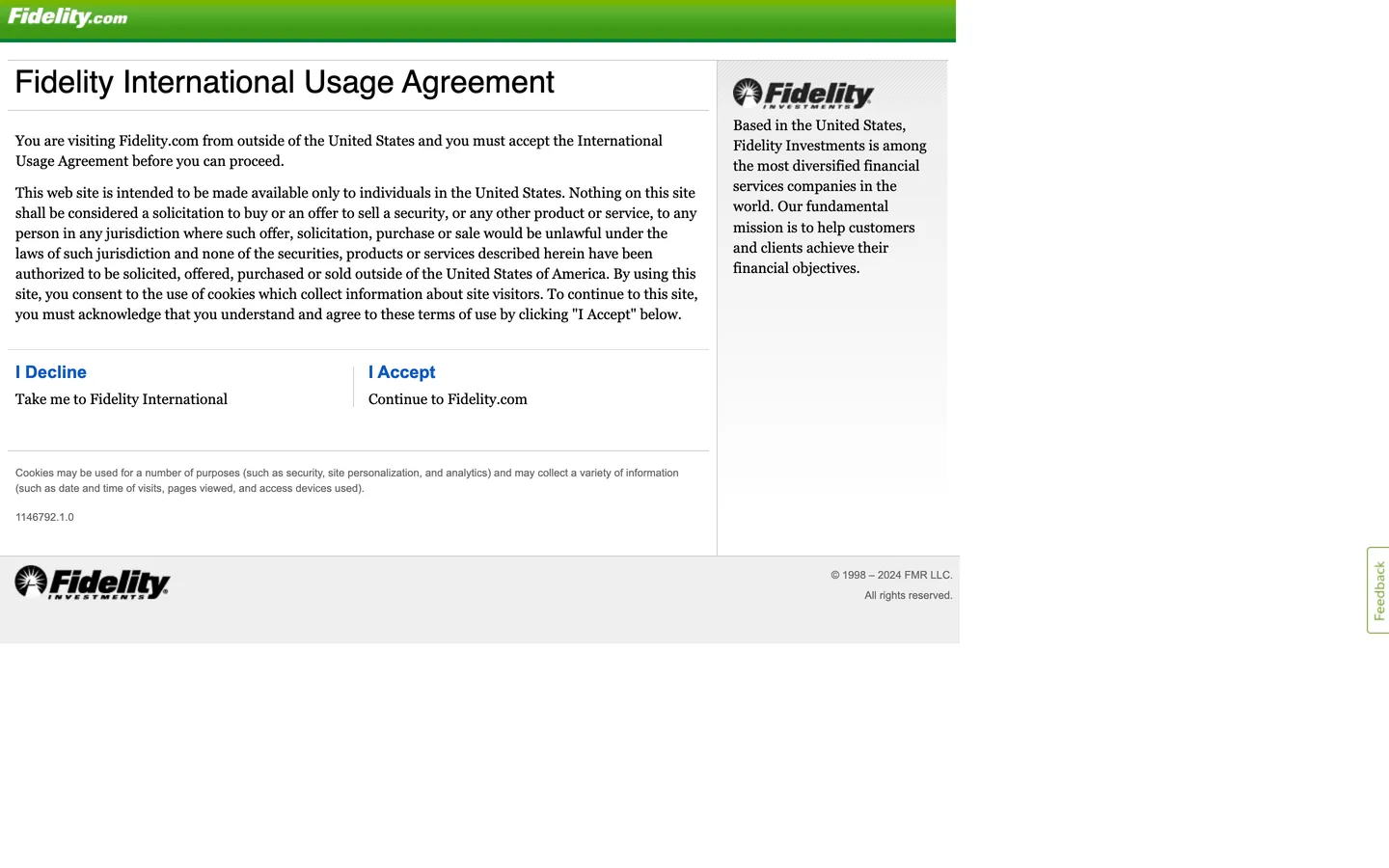
Fidelity's captured public URL resolves to the International Usage Agreement gate page — an interstitial that greets non-US visitors before the main Fidelity.com experience. What it reveals is the brand's utility layer stripped of marketing chrome: a two-column layout with Cambria serif prose on the left (the legal agreement text), the Fidelity Investments logo and a brief company description in Arial on the right, and a green gradient header bar carrying the Fidelity wordmark in white. The page has no CSS custom properties, no JavaScript-driven components, and no decorative surface fills — it is institutional document design from an era when that was the highest-signal approach for a financial firm communicating across regulatory jurisdictions. Where Barclays and Morgan Stanley both deploy large-format photography and brand-voltage color to assert presence, Fidelity's gate page asserts presence through text density and the absence of distraction.
The DESIGN.md file packages the system elements observable from this surface. Inside: 5 colors tokens covering ink black, mid gray, steel blue for link text, white canvas, and a light gray form surface. Seven typography tokens map Cambria/Georgia at 15px and Helvetica/Arial at 11-32px across body, heading, navigation, and label roles. No border-radius values were captured on the gate surface — every element renders with square corners. The green gradient header bar, visible in the screenshot as a diagonal green sweep behind the Fidelity wordmark, does not resolve to a single hex in the extraction; it is rendered as a CSS gradient not captured in the color-clustering output. Six spacing tokens reflect the page's modest internal padding.
Feed this file to Claude or Cursor to reproduce the Fidelity gate-page aesthetic: serif prose in Cambria for legal and editorial copy, Arial for navigation labels and headings, pure ink-on-white with a single blue link accent, and zero decorative surface treatments. One important caveat: this DESIGN.md represents the gate page only. The full Fidelity.com authenticated experience, including the investment dashboard, research tools, and account management surfaces, runs a substantially richer design system that this page does not expose. Treat these tokens as a signal of Fidelity's brand floor — the minimum expression — rather than a complete surface specification.
What makes it distinct
5
- Serif-for-prose, sans-for-labelsCambria/Georgia runs legal and editorial copy; Arial/Helvetica carries navigation and headings
- Near-monochrome paletteink black (#000000) as the dominant structural token; blue (#0f57c2) appears only as link text and borders
- Green gradient header barthe Fidelity wordmark sits on a diagonal green-to-dark-green gradient, the only chromatic brand signal on the page
- No CSS custom propertiesno design-token system is exposed on the captured surface; all values are hardcoded per-element
- Two-column gate layoutlegal prose on the left, Fidelity Investments logo and brand statement on the right, separated by a hairline
fidelity.com
Live at fidelity.com
A snapshot of the brand in production. Scroll the frame to see the whole page.
Colors
5 colors
Fidelity's system runs on #0f57c2 as its primary voltage, used in 3 of 12 components. Type is set in arial across 7 tokens from 11px to 32px, weights 400–700. Shape language is sharp — components average 0px corner radius, favoring crisp rectangles.
Brand & Accent
Sparing, CTA-only voltage · 1
Surface
Page and card backgrounds · 2
Text
Headlines, body, captions · 2
Typography
7 type tokens
Set in arial across 7 tokens, from 11px to 32px, weights 400–700. Shown in its own stack: where the font isn't installed, the fallback the file names stands in.
- display-xl32px · weight 400 · lh 35pxThe quick brown fox jumps over the lazy dog
- heading-md18px · weight 700 · lh 21pxThe quick brown fox jumps over the lazy dog
- body-lg15px · weight 400 · lh 21pxThe quick brown fox jumps over the lazy dog
- body-md15px · weight 400 · lh 21pxThe quick brown fox jumps over the lazy dog
- body-sm11px · weight 400 · lh 15pxThe quick brown fox jumps over the lazy dog
- label-md18px · weight 700 · lh 21pxThe quick brown fox jumps over the lazy dog
- caption11px · weight 400 · lh 16pxThe quick brown fox jumps over the lazy dog
Layout
Radii and spacing
1 corner radii and 6 spacing values. Shape language: sharp.
Radii
- none0px
Spacing
- xs5px
- sm8px
- base10px
- md15px
- lg21px
- xl45px
Components
12 components
Each rendered from its tokens (color, type, radius, padding) on Fidelity's own canvas.
- Button Primarybutton-primaryButton Primary
- Button Secondarybutton-secondaryButton Secondary
- Top Navtop-navTop Nav
- Nav Linknav-linkNav Link
- Hero Headinghero-headingHero Heading
- Body Paragraphbody-paragraphBody Paragraph
- Body Paragraph Mutedbody-paragraph-mutedBody Paragraph Muted
- CardcardCard
- Link Textlink-textLink Text
- Section Dividersection-dividerSection Divider
- Logo Marklogo-markLogo Mark
- FooterfooterFooter
In use
The system, in use
Fidelity's tokens on the kind of product it builds.
Build something people actually use.
A short paragraph of marketing copy that previews how the brand's display tier and body tier read together. Two sentences is usually enough.
FAQ
Fidelity design system FAQ
Common questions about Fidelity's tokens, components, and how to use this DESIGN.md in your project.
Read next
Related reading
Specs, directories, and component libraries that pair with this design system.
- Browse all design systemsThe full directory of DESIGN.md files on shadcn.io, with live mockups for each.shadcn.io
- Fidelity — official siteFidelity Investments' public marketing site — the source of truth for the live tokens captured in this file.fidelity.com (opens in a new tab)
- The DESIGN.md specificationGoogle Labs' open spec for machine-readable design system files — the format this page is built on.github.com (opens in a new tab)
Use it
Use Fidelity in your project
One machine-readable file. Drop it into Claude, Cursor, or any AI tool that reads DESIGN.md.
Download the DESIGN.md
One machine-readable file: every color, type, radius, spacing, and component token of Fidelity.
Feed it to your AI tool
Drop it into Claude, Cursor, or GitHub Copilot. The agent writes React components and Tailwind classes that match Fidelity's visual language.
Reference the tokens directly
Or paste the values into your Tailwind config, CSS variables, or component library: every color, size and radius is a quoted, ready-to-copy value.
Read the full DESIGN.md: overview, rationale, do’s and don’ts
Overview
Fidelity's captured marketing surface is not the homepage — it is the International Usage Agreement gate page that fidelity.com serves to non-US visitors before allowing access to the main site. Document authority: the page strips every decorative element and presents the brand through two typefaces, near-monochrome ink, and a two-column legal layout that signals institutional trust through document-design discipline rather than marketing surface investment. Unlike Barclays, which asserts presence through an 80px display headline on a photography hero, or Morgan Stanley, which holds its display in a semi-serif editorial font at measured weight, Fidelity's gate-layer asserts presence through density and informational clarity.
The chromatic vocabulary of the gate surface reduces to three signals. First, a green gradient banner — the Fidelity wordmark sits on a diagonal green sweep in the header; the gradient is the brand's primary voltage, the only chromatic surface on an otherwise ink-on-white page, but it does not resolve to a single hex in the extraction. Second, a steel blue (#0f57c2) at 6 occurrences as link text and borders — the interactive layer for the "I Accept" and "I Decline" action links. Third, everything else is pure black ink on white canvas. Where Barclays concentrates its brand blue into 37 CSS custom properties across every interactive surface, Fidelity's gate page uses hardcoded link-color defaults with no CSS custom-property architecture at all.
Typography runs in two strict voices. Cambria (falling back to Georgia) carries the legal prose at 15px / weight 400 — a deliberate serif choice that signals regulatory-grade document legibility. Arial (Helvetica fallback) carries the heading, navigation labels, and the "I Accept" / "I Decline" action links at 11-32px. No CSS variables, no design-token system — this is direct-hardcoded institutional document design from Fidelity's pre-design-system era.
Key Characteristics:
- Near-monochrome palette — ink black (#000000) as the structural dominant; no chromatic fills beyond the header gradient and 6 blue link occurrences.
- Two-typeface split — Cambria/Georgia serif for prose, Arial/Helvetica sans for labels and navigation.
- No CSS custom properties — the gate page exposes no token-based theming; all values are hardcoded.
- Zero border-radius — every element renders with square corners; no rounded surfaces captured.
- Green gradient header bar — the Fidelity wordmark floats over the brand's primary voltage, a diagonal green sweep not resolved to a single extractable hex.
- Two-column gate layout — legal prose (left, ~727px) + brand statement (right, ~200px) separated by a hairline.
- Steel blue (#0f57c2) as the interactive layer — link text and borders for the "I Accept" / "I Decline" actions only.
- No shadow tier — flat document with hairline borders only.
Colors
Ink
- Ink (
{colors.ink}— #000000): frequency 53. Used as text (28), border (25). The page's structural dominant — heading text, body prose headings, form labels, and all borders. Near-monochrome pages in the pre-CSS-variables era default to this value for almost everything non-interactive. - Ink Muted (
{colors.ink-muted}— #666666): frequency 10. Used as text (5), border (5). The secondary body copy tone — used on the cookie-notice paragraph and smaller footnote rows.
Interactive
- Primary (
{colors.primary}— #0f57c2): frequency 6. Used as text (3), border (3). The interactive layer — the "I Accept" and "I Decline" link labels, styled in steel blue as conventional hyperlinks. The only chromatic surface on the page outside the header gradient.
Canvas
- Canvas (
{colors.canvas}— #ffffff): frequency 1, background only. The page floor for the legal content area and the right-column logo panel. - Surface-1 (
{colors.surface-1}— #eeeeee): frequency 1, background only. Used as the background for the cookie-notice strip below the main content — the single tonal surface variation on the page.
Typography
Font Families
The system runs Cambria / Georgia serif for legal and editorial prose and Arial / Helvetica sans-serif for navigation, headings, and labels. The division is absolute and role-based: legal copy is always serif; wayfinding and action text is always sans. This two-family pattern was the dominant convention for financial-institution document design through the 2000s and 2010s; it remains on the gate page as a stable, browser-safe type system that does not require font-loading infrastructure.
Hierarchy
| Token | Size | Weight | Line Height | Use |
|---|---|---|---|---|
{typography.display-xl} | 32px | 400 | 35px | Page h1 ("Fidelity International Usage Agreement") |
{typography.heading-md} | 18px | 700 | 21px | "I Decline" / "I Accept" action headings |
{typography.body-lg} | 15px | 400 | 21px | Legal agreement prose (Cambria) |
{typography.body-md} | 15px | 400 | 21px | Body copy, Cambria variant |
{typography.body-sm} | 11px | 400 | 15px | Cookie notice and footnote strips |
{typography.label-md} | 18px | 700 | 21px | Action link labels ("I Accept," "I Decline") |
{typography.caption} | 11px | 400 | 16px | Version number, footer copyright |
Principles
The h1 at 32.5px / weight 400 is a functional heading — not a brand headline. Weight 400 at this size says "section label" rather than "editorial statement." The choice makes sense for a gate page where the reader needs to find and process the legal text quickly, not be impressed by the brand voice. The bold weight (700) appears only on the action labels ("I Accept," "I Decline") — the only typographic moment that carries interactive urgency.
Note on Font Substitutes
Both Cambria and Arial are system-level fonts available on Windows and macOS without loading. Cambria is a Windows-native serif with excellent screen legibility at small sizes. For a current open-source replacement, Georgia is the direct fallback already in the stack; Lora or Merriweather are open-source alternatives for the serif prose voice. For Arial, Inter is the standard sans-serif substitute.
Layout
Spacing System
- Base unit: approximately 8-10px — the smallest padding values applied to content insets and form rows.
- Tokens:
{spacing.xs}5px ·{spacing.sm}8px ·{spacing.base}10px ·{spacing.md}15px ·{spacing.lg}21px ·{spacing.xl}45px. - Content inset: the h1 heading carries a 12px bottom padding and 7px left inset, placing it slightly inside the left content column.
- Cookie notice: 15×10px top and bottom padding, 8px left inset.
- Vertical rhythm: no declared section padding; the layout is document-flow with natural paragraph spacing driven by the serif body's 21px line height.
Grid & Container
- Max content width: approximately 960px for the two-column layout; the left column is ~727px, the right column is ~200px.
- Two-column structure: the left column holds the legal prose and action links; the right column holds the Fidelity Investments logo mark and the brand description paragraph.
- Header: full-width green gradient bar at approximately 50px height carrying the Fidelity wordmark in white Fidelity-brand lettering.
- Footer: full-width strip with copyright ("© 1998 – 2024 FMR LLC. All rights reserved.") right-aligned in Arial 11px, plus a "Feedback" sidebar tab floating at the right edge of the viewport.
Rhythm
The page has a single reading tempo — document linear, top to bottom. There are no visual bands or section breaks beyond the horizontal hairlines separating the header, two-column content, cookie notice, and footer. The rhythm is dictated by the prose itself rather than by layout geometry.
Elevation
The page has no shadow tier and no elevation signals beyond the 1px black border separating the two-column content area from the surrounding white canvas. The cookie notice strip uses the surface-1 gray (#eeeeee) fill as a tonal lift — the only depth signal on the page.
The header green gradient is the single surface that carries visual weight; its diagonal sweep reads as depth-by-color rather than depth-by-elevation.
Shapes
The radius scale is zero-only. No border-radius values were captured in the extraction — every surface (the content box, the action links, the cookie notice) renders with square corners. This is consistent with browser-default rendering for un-styled block elements: Fidelity's gate page applies minimal CSS and lets the browser's default document layout handle the visual structure.
{rounded.none}0px — all surfaces, all elements.
Components
button-primary — Rendered as an unstyled anchor link in steel blue ({colors.primary}) at 18px / weight 700. "I Accept" is the primary action. No fill, no border-radius, no explicit padding — the link reads as a conventional browser hyperlink elevated to heading size.
button-secondary — "I Decline" — same rendering as the primary link. The two actions are visually equivalent; their distinction is semantic only.
top-nav — The green gradient header bar, approximately 50px tall. The Fidelity wordmark sits white on the gradient. The visual entry point to the brand.
nav-link — The Fidelity.com text link in the header if present; uses white text on the green surface.
hero-heading — The h1 "Fidelity International Usage Agreement" — Helvetica/Arial 32.5px / weight 400, 35px line height, 12px bottom padding, 7px left inset. Ink black on white.
body-paragraph — The legal agreement prose — Cambria 15px / weight 400, 21px line height. The dominant typographic mass on the page, running approximately 250 words.
body-paragraph-muted — The cookie notice text — Arial 11px / weight 400, medium gray (#666666). Below the action links in a light gray strip.
card — The two-column content box outlined by a hairline black border. No radius, no surface fill — a pure document container.
link-text — Steel blue (#0f57c2) inline links for the "I Accept" and "I Decline" action headings.
section-divider — The light gray (#eeeeee) cookie-notice strip — 15×10px padding, ink-muted text, Arial 11px.
logo-mark — The Fidelity Investments eagle logo and wordmark in the right column, accompanied by the brand description paragraph in Arial at approximately 14px.
footer — White canvas, ink-muted copyright text right-aligned, Arial 11px / weight 400.
Do's and Don'ts
Do use Cambria (or Georgia as a fallback) for legal, regulatory, and compliance prose. The serif body at 15px gives financial-document density legitimacy — sans-serif at the same size reads as a tech product, not a financial institution.
Do keep the action links ("I Accept," "I Decline") visually equivalent — no fill hierarchy between them. The gate-page pattern treats the two actions as a balanced choice rather than a primary/secondary CTA split, which is the correct framing for a consent gate.
Do treat the green gradient header as the brand's primary chromatic moment. On the gate page it is the only chromatic surface; any competing fill color elsewhere would dilute the brand signal.
Don't add border-radius to the content containers. The square geometry of the document layout is the gate page's institutional signal — rounded cards would import product-UI vocabulary into a regulatory-document context.
Don't render the prose heading ("Fidelity International Usage Agreement") at weight 700. The 32px h1 at weight 400 signals a functional section label, not a marketing headline — bumping to 700 creates a false sense of brand emphasis in a legal-document context.
Don't introduce a CSS custom-property architecture based on this extraction alone. The gate page has no token system — inferring a full design-token architecture from 5 color values and 7 typography signatures would over-extrapolate from a minimal utility page into a false system specification.
Don't assume this palette represents Fidelity's full brand. Steel blue (#0f57c2) here is the browser-default hyperlink blue applied to anchor elements, not a deliberately chosen brand interactive accent. The full Fidelity.com system uses green as its primary voltage — none of the green gradient infrastructure resolved to a hex in this extraction.
Known Gaps
- Gate-page limitation: the entire extraction represents the International Usage Agreement interstitial, not Fidelity's marketing homepage or product surfaces. The authenticated homepage, investment research tools, account management dashboard, and product marketing pages run a substantially different and richer design system.
- Green brand color: the Fidelity green gradient header bar — the brand's primary chromatic voltage — did not resolve to a single hex in the color extraction. The gradient is likely rendered as
background: linear-gradient(...)with multiple stops that the extractor's single-hex clustering cannot capture. - No CSS custom properties: the gate page uses hardcoded values with no CSS variable infrastructure. Fidelity's main site and authenticated product surfaces likely use a token-based theming system, but it is not visible from the gate layer.
- Navigation system: the primary Fidelity.com navigation (Research / Planning / Customer Service / Open an Account) is not present on the gate page. All navigation tokens here are inferred from the minimal header.
- Interactive states: no hover, focus, or active states were captured for the action links. The full main-site interactive layer is absent.
- Responsive behavior: no responsive breakpoint tokens were extracted; the gate page appears to use a fixed-width layout targeting desktop only.
- Brand font: the Fidelity Investments wordmark uses what appears to be a proprietary brand typeface in the header bar, but this did not appear as a loaded web font in the extraction — it may be rendered as an SVG or image asset.
Banking & Payments
More systems like this
More DESIGN.md files in Banking & Payments.
Pricing
Build it with Pro
The DESIGN.md files are free. Pro adds 6,000+ blocks, premium templates and the MCP server, so your AI editor builds in your system for you.
4.9/5 out of 5 · 150+ reviewsfrom 150+ founders and developers.
Billing
Billed once a year in USD. Cancel anytime.
- How many people can use the license.
- Client work, SaaS products and anything you charge for.
- Production-ready React sections: hero, pricing, features, dashboards and more.
- Complete multi-page sites you can ship as they are.
- React icons from every major library, installable with one command.
- Presets that restyle every block, in light and dark.
- Lets your AI editor search, preview and install blocks for you.
- Priority requests are answered first.
Individual
For personal projects & open source
$32instead of $49/mo
$389 billed yearly
- Seats: 1 seat
- Commercial use: Personal & open source only
- Pro blocks: 6,000+ blocks
- Templates: All 14 templates
- React icons: 294k+ icons
- Themes: All 59 themes
- MCP server: Basic usage
- Support: Standard
Team
Most popularFor freelancers, agencies & startups
$66instead of $99/mo
$789 billed yearly · ≈ $13/dev/mo
- Seats: Up to 5 seats
- Commercial use: Included
- Pro blocks: 6,000+ blocks
- Templates: All 14 templates
- React icons: 294k+ icons
- Themes: All 59 themes
- MCP server: High usage
- Support: Priority
Organization
For companies with larger teams
$132instead of $199/mo
$1,589 billed yearly
- Seats: Unlimited seats
- Commercial use: Included
- Pro blocks: 6,000+ blocks
- Templates: All 14 templates
- React icons: 294k+ icons
- Themes: All 59 themes
- MCP server: Unlimited usage
- Support: Priority
Billed once a year in USD. Cancel anytime.
Individual
For personal projects & open source
$32instead of $49/mo
$389 billed yearly
- How many people can use the license.Seats: 1 seat
- Client work, SaaS products and anything you charge for.Commercial use: Personal & open source only
- Production-ready React sections: hero, pricing, features, dashboards and more.Pro blocks: 6,000+ blocks
- Complete multi-page sites you can ship as they are.Templates: All 14 templates
- React icons from every major library, installable with one command.React icons: 294k+ icons
- Presets that restyle every block, in light and dark.Themes: All 59 themes
- Lets your AI editor search, preview and install blocks for you.MCP server: Basic usage
- Priority requests are answered first.Support: Standard
Team
Most popularFor freelancers, agencies & startups
$66instead of $99/mo
$789 billed yearly · ≈ $13/dev/mo
Everything in Individual, plus
- How many people can use the license.Seats: Up to 5 seats
- Client work, SaaS products and anything you charge for.Commercial use: Included
- Lets your AI editor search, preview and install blocks for you.MCP server: High usage
- Priority requests are answered first.Support: Priority
Organization
For companies with larger teams
$132instead of $199/mo
$1,589 billed yearly
Everything in Team, plus
- How many people can use the license.Seats: Unlimited seats
- Lets your AI editor search, preview and install blocks for you.MCP server: Unlimited usage
- Secure checkout via Stripe
- Code lives in your repo
- Keep what you've shipped if you cancel
- License terms
Your system, built for you
Every block, template and icon, installed by your AI agent in your design system. The DESIGN.md files stay free.